







A modular scale is a mathematical rule that one can use to create intentional and harmonious typography sizing. A scale is represented as a number that gets multiplied against a base size again and again, creating 'steps'.
If we take a base unit of 16px and multiply it by a scale of 1.618 (the golden section), we get 25.88px - our first 'step'. Then we can multiply that by 1.618 to get our second step: 41.88px. And again to calculate the third step as 67.77px. We can apply those sizes to our HTML elements to get beautifully sized typography.
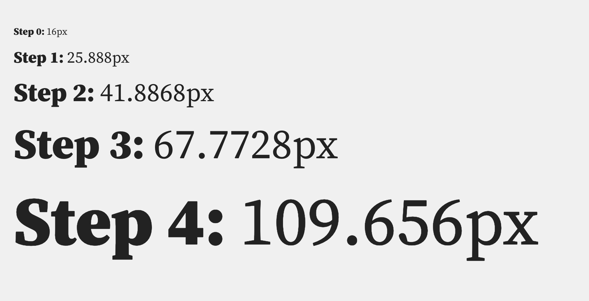
| Step | Element | Size | Gap |
|---|---|---|---|
| 0 | Body | 16px | |
| 1 | H4 | 25.88px | 9.88px |
| 2 | H3 | 41.88px | 16px |
| 3 | H2 | 67.77px | 25.88px |
| 4 | H1 | 109.65px | 41.88px |
On a large device, a 110px H1 might be just what we're after, but on a small screen, it almost certainly wouldn't be. One solution would be to reduce the base unit, but then our body copy would become illegible. Another solution would be to reduce the scale multiplier, but then we'd lose the intentionally large heading size.
It might seem tempting to throw out this scale, or the concept of scales altogether. But fear not, there's a solution if we combine some CSS fluidity with modular scales.
My colleague at Clearleft, James Gilyead, has worked on the idea of fluidly interpolating between two modular scales, one for smaller screens, and one for larger screens. His post outlines the huge benefits of relying on these scales within a design system.
James and I have also put together a page demonstrating these fluid scales in action. Resize the page, and watch the type breathe into the space.
It uses a combination of CSS locks, CSS custom properties and modular scales:
:root {
  --fluid-min-width: 320;
  --fluid-max-width: 1500;
  --fluid-min-size: 17;
  --fluid-max-size: 20;
  --fluid-min-ratio: 1.2;
  --fluid-max-ratio: 1.33;
}

:root {
  --fluid-screen: 100vw;
  --fluid-bp: calc((var(--fluid-screen) - ((var(--fluid-min-width) / 16) * 1rem)) / ((var(--fluid-max-width) / 16) - (var(--fluid-min-width) / 16)));
}

@media screen and (min-width: 1500px) {
  :root {
    --fluid-screen: calc(var(--fluid-max-width) * 1px);
  }
}

:root {
  --fluid-min-scale-0: var(--fluid-min-ratio);
  --fluid-min-scale-1: var(--fluid-min-scale-0) * var(--fluid-min-ratio);
  --fluid-min-scale-2: var(--fluid-min-scale-1) * var(--fluid-min-ratio);

  --fluid-max-scale-0: var(--fluid-max-ratio);
  --fluid-max-scale-1: var(--fluid-max-scale-0) * var(--fluid-max-ratio);
  --fluid-max-scale-2: var(--fluid-max-scale-1) * var(--fluid-max-ratio);

  --fluid-min-size-0: (var(--fluid-min-size)) / 16;
  --fluid-min-size-1: (var(--fluid-min-size) * var(--fluid-min-scale-0)) / 16;
  --fluid-min-size-2: (var(--fluid-min-size) * var(--fluid-min-scale-1)) / 16;

  --fluid-max-size-0: (var(--fluid-max-size)) / 16;
  --fluid-max-size-1: (var(--fluid-max-size) * var(--fluid-max-scale-0)) / 16;
  --fluid-max-size-2: (var(--fluid-max-size) * var(--fluid-max-scale-1)) / 16;

  --fluid-0: calc(((var(--fluid-min-size-0) * 1rem) + (var(--fluid-max-size-0) - var(--fluid-min-size-0)) * var(--fluid-bp)));
  --fluid-1: calc(((var(--fluid-min-size-1) * 1rem) + (var(--fluid-max-size-1) - var(--fluid-min-size-1)) * var(--fluid-bp)));
  --fluid-2: calc(((var(--fluid-min-size-2) * 1rem) + (var(--fluid-max-size-2) - var(--fluid-min-size-2)) * var(--fluid-bp)));
}
That's a lot of code! Let's break the key sections down:
:root {
  --fluid-min-width: 320;
  --fluid-max-width: 1500;
  --fluid-min-size: 17;
  --fluid-max-size: 20;
  --fluid-min-ratio: 1.2;
  --fluid-max-ratio: 1.33;
}
These are the settings for the fluid scales. We define a small and large breakpoint, in this case: 320px and 1500px.
Next up are the two base units; 17px for the smallest breakpoint, and 20px for the largest. These are our body type sizes, which we’ll refer to as scale step 0.
Finally, we set out the two modular scales: 1.2 and 1.33.
:root {
  --fluid-screen: 100vw;
  --fluid-bp: calc((var(--fluid-screen) - ((var(--fluid-min-width) / 16) * 1rem)) / ((var(--fluid-max-width) / 16) - (var(--fluid-min-width) / 16)));
}

@media screen and (min-width: 1500px) {
  :root {
    --fluid-screen: calc(var(--fluid-max-width) * 1px);
  }
}
This section of the code handles the responsive, screen-width dependant stuff. On the back of a CSS lock, there's a calculation used to scale the font-size based on viewport width. It's capped off with a media query to prevent the scaling going on forever.
Traditionally, every CSS lock needs that media query, which can lead to an awful lot of duplicate code. This section extracts that query into a CSS custom property that caps every CSS lock in one line!
The remaining code is broadly boilerplate; it calculates the steps along the modular scale, and can be duplicated to add additional scale steps. At the time of writing, mathematical powers aren't possible in CSS. So there is a lot of repetitive calculation to do. We've made a generator that creates as many steps as you require.
The most important lines are the final few, where we surface our three fluid scale steps: --fluid-0, --fluid-1 and --fluid-2.
Applying these scales are entirely opt-in, and used in the same way as any other CSS custom property:
body {
  font-size: var(--fluid-0);
}

h3 {
  font-size: var(--fluid-2);
}
These scales are intended to be referenced across the design and development phase. They work equally well both for typography as well as spacing.
When setting up symbol libraries, the design team can choose the two modular scales and base units. It can be made clear in documentation that, for example, H2's in prose should follow the second step of the scale. Achieving that in code is as follows:
.prose h2 {
  font-size: var(--fluid-2);
}
That one declaration gives us fully fluid heading styles without writing a breakpoint!
We've been told that pixel perfection is a myth, and to Kellie Kowalski's definition, I would agree. The plethora of screen sizes and resolutions out in the wild makes it impossible to account for every device eventuality. Chasing that goal is fruitless. Each device will render things ever so slightly differently, and accepting that is an important step to embracing truly responsive design.
Building upon fluid type scales is a radically different approach for those who still aim match a design to the pixel. It requires a relinquishing of control from specific values and an embrace of fluidity. But by 'letting go' of tedious and flawed breakpoint control, and passing it back to the browser, we actually gain a solidity and trust that every device that loads your page will be inherently served a tailored experience.
This approach has been coined 'Intrinsic Web Design' by Jen Simmons, and we feel this approach feeds into that embrace of the 'ebb and flow' of our fluid web.
Many designers already think in terms of modular scales. A system like this give us the opportunity to synchronise our language, and better understand the design intention in the flat files we receive.
此内容由惯性聚合(RSS阅读器)自动聚合整理,仅供阅读参考。 原文来自 — 版权归原作者所有。