


1、先看效果
就是点击之后反转成蓝色的过程,不知道用什么软件能录制个gif(如果你有什么好的录制gif软件可以告诉我,哈哈),就将就着看吧。
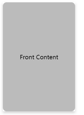
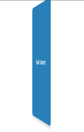
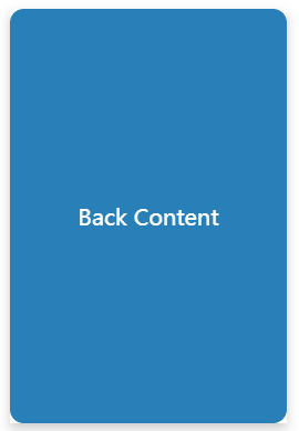
上代码,html版本
<!DOCTYPE html>
<html lang="en">
<head>
<meta charset="UTF-8">
<meta name="viewport" content="width=device-width, initial-scale=1.0">
<title>CSS Flip Card Example</title>
<style>
  .flip-card {
    background-color: transparent;
    width: 200px;
    height: 300px;
    perspective: 1000px; /* Remove if not needed, but adds a 3D effect */
  }

  .flip-card-inner {
    position: relative;
    width: 100%;
    height: 100%;
    text-align: center;
    transition: transform 0.6s;
    transform-style: preserve-3d;
    box-shadow: 0 4px 8px 0 rgba(0,0,0,0.2);
  }

  .flip-card-front, .flip-card-back {
    position: absolute;
    width: 100%;
    height: 100%;
    -webkit-backface-visibility: hidden; /* Safari */
    backface-visibility: hidden;
    border-radius: 10px;
  }

  .flip-card-front {
    background-color: #bbb;
    color: black;
    display: flex;
    align-items: center;
    justify-content: center;
  }

  .flip-card-back {
    background-color: #2980b9;
    color: white;
    transform: rotateY(180deg);
    display: flex;
    align-items: center;
    justify-content: center;
  }

  /* 翻转时的状态 */
  .flip-card.is-flipped .flip-card-inner {
    transform: rotateY(180deg);
  }
</style>
</head>
<body>

<div class="flip-card" onclick="this.classList.toggle('is-flipped')">
  <div class="flip-card-inner">
    <div class="flip-card-front">
      <p>Front Content</p>
    </div>
    <div class="flip-card-back">
      <p>Back Content</p>
    </div>
  </div>
</div>

</body>
</html>
vue版本,vue2的哦
<template>
  <div>
    <button @click="flipCard">Flip Card</button>
    <div class="flip-card" :class="{ 'flipped': isFlipped }">
      <div class="flip-card-inner">
        <div class="flip-card-front">
          <p>Front Content</p>
        </div>
        <div class="flip-card-back">
          <p>Back Content</p>
        </div>
      </div>
    </div>
  </div>
</template>

<script>
export default {
  data() {
    return {
      isFlipped: false,
    };
  },
  methods: {
    flipCard() {
      this.isFlipped = !this.isFlipped;
    },
  },
};
</script>

<style scoped>
.flip-card {
  background-color: transparent;
  width: 200px;
  height: 300px;
  perspective: 1000px; /* 3D效果 */
  box-shadow: 0 4px 8px 0 rgba(0, 0, 0, 0.2);
}

.flip-card-inner {
  position: relative;
  width: 100%;
  height: 100%;
  text-align: center;
  transition: transform 0.6s;
  transform-style: preserve-3d;
  border-radius: 10px;
}

.flip-card-front, .flip-card-back {
  position: absolute;
  width: 100%;
  height: 100%;
  backface-visibility: hidden;
  border-radius: 10px;
}

.flip-card-front {
  background-color: #bbb;
  color: black;
  display: flex;
  align-items: center;
  justify-content: center;
}

.flip-card-back {
  background-color: #2980b9;
  color: white;
  transform: rotateY(180deg);
  display: flex;
  align-items: center;
  justify-content: center;
}

.flipped .flip-card-inner {
  transform: rotateY(180deg);
}
</style>
此内容由惯性聚合(RSS阅读器)自动聚合整理,仅供阅读参考。 原文来自 — 版权归原作者所有。