
惯性聚合 高效追踪和阅读你感兴趣的博客、新闻、科技资讯
阅读原文 在惯性聚合中打开

推荐订阅源

N
News and Events Feed by Topic
GbyAI
GbyAI
博客园 - Franky
宝玉的分享
宝玉的分享
Blog — PlanetScale
Blog — PlanetScale
Google DeepMind News
Cyber Security Advisories - MS-ISAC
人人都是产品经理
人人都是产品经理
Microsoft Azure Blog
The Register - Security
腾讯CDC
freeCodeCamp Programming Tutorials: Python, JavaScript, Git & More
I
InfoQ
The Cloudflare Blog
OSCHINA 社区最新新闻
OSCHINA 社区最新新闻
Engineering at Meta
Engineering at Meta
MongoDB | Blog
MongoDB | Blog
有赞技术团队
有赞技术团队
CTFtime.org: upcoming CTF events
F
Full Disclosure
cs.AI updates on arXiv.org
Vercel News
Vercel News
博客园 - 【当耐特】
Exploit-DB.com RSS Feed
S
Schneier on Security
cs.CV updates on arXiv.org
Project Zero
Project Zero
量子位
M
MIT News - Artificial intelligence
Stack Overflow Blog
Stack Overflow Blog
C
Cyber Attacks, Cyber Crime and Cyber Security
美团技术团队
Attack and Defense Labs
C
Cybersecurity and Infrastructure Security Agency CISA
T
The Blog of Author Tim Ferriss
cs.CL updates on arXiv.org
T
Troy Hunt's Blog
Google Online Security Blog
罗磊的独立博客
P
Proofpoint News Feed
Schneier on Security
Spread Privacy
Spread Privacy
S
SegmentFault 最新的问题
L
LINUX DO - 最新话题
Simon Willison's Weblog
爱范儿
爱范儿
博客园 - 聂微东
A
About on SuperTechFans
PCI Perspectives
PCI Perspectives
D
Docker

Defensive CSS

Defensive CSS - Button minimum width Defensive CSS - Input zoom on iOS Safari Defensive CSS - Default flexbox stretching Defensive CSS - Image inner border Defensive CSS - Accidental hover on mobile Defensive CSS - Vertical media queries Defensive CSS - Text over image Defensive CSS - Using space-between Defensive CSS - Scrollbars on demand Defensive CSS - Scrollbar gutter Defensive CSS - Scroll chaining Defensive CSS - Position sticky with CSS Grid Defensive CSS - Image maximum width Defensive CSS - Grouping vendor selectors Defensive CSS - Minimum Content Size In CSS Flexbox Defensive CSS - Fixed sizes Defensive CSS - CSS Variable Fallback Defensive CSS - CSS grid fixed values Defensive CSS - Background repeat Defensive CSS - Auto-fit Vs Auto-fill Defensive CSS - Component Spacing Defensive CSS - Long Content Defensive CSS - Image Distortion Defensive CSS - Flexbox Wrapping
Defensive CSS - Minimum Content Size In CSS grid
2022-04-20 · via Defensive CSS

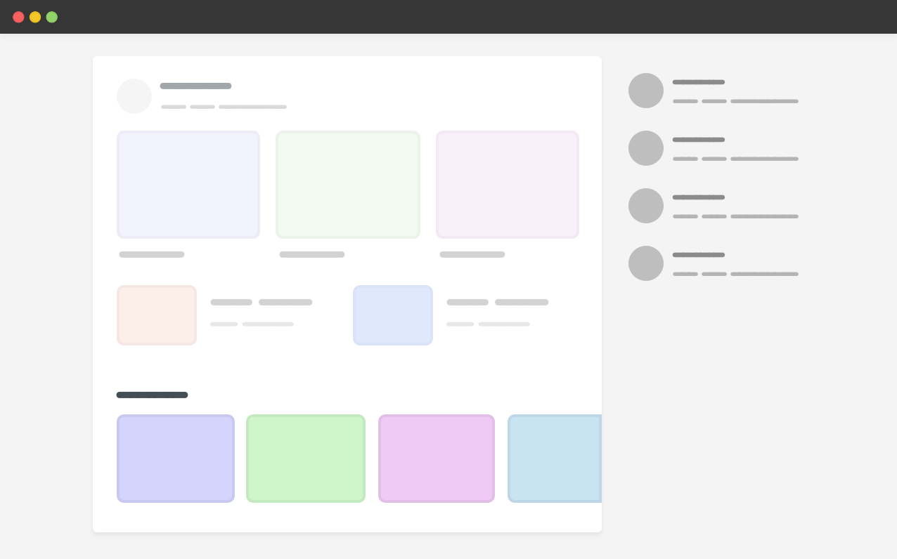
Similar to flexbox, CSS grid has a default minimum content size for its child items which is auto. That means, if there is an element that is larger than the grid item, it will overflow.

In the example above, we have a carousel within the main section. For context, here is the HTML and CSS.

<div class="wrapper">
<main>
<section class="carousel"></section>
</main>
<aside></aside>
</div>
@media (min-width: 1020px) {
.wrapper {
display: grid;
grid-template-columns: 1fr 248px;
grid-gap: 40px;
}
}

.carousel {
display: flex;
overflow-x: auto;
}

Since the carousel is a flex container that doesn’t wrap, its width is larger than the main section, and thus the grid item respected that. As a result, there is horizontal scrolling.

To fix that, we have three different solutions:

  • Using minmax()
  • Applying min-width to the grid item
  • Adding overflow: hidden to the grid item

As a defensive CSS mechanism, it doesn't matter which solution to pick, but for this example I will go with the min-width one.
I wrote about that in more detail. I also highly recommend checking "Preventing a Grid Blowout" and "You want minmax(10px, 1fr) not 1fr" by Chris Coyier.

Examples and use cases

Main and aside

Based on the previous illustrated demo, we have a page that contains a main and an aside sections. The main section has a scrollable element (a carousel).

<div class="page">
<div class="page__item page__item--main">
<div class="slider">
<div class="slider__item"></div>
<!-- more items -->
</div>
</div>
<div class="page__item page__item--aside"></div>
</div>
.slider {
display: flex;
}

.page {
display: grid;
grid-template-columns: 1fr 100px;
grid-gap: 1rem;
}

The element .page__item--main is a grid item, and when the .slider doesn't wrap its child items, the main grid item will expand to fit all the slider items.

To overcome that, we can pick one of the solutions mentioned above. For this example, I will pick min-width: 0.

Try to click the "Toggle Defensive" option to see the solution in action.

.page__item--main {
/* prevent the grid item from respecting the
* minimum content size
*/

min-width: 0;
}