


In a previous article, I showed you how to create filling CSS loaders collection where each loader was built using a single HTML element. Here, you’ll learn more about loaders by creating the Zig-Zag collection.
Here is an overview of what you’ll be building:
You can also check my online collection to see up to 20 variations using a zig-zag shape.
We won’t study all the variations but I will show you a few tricks that’ll help you create as many variations as you want.
The first step is to create a zig-zag shape. For this, you can grab the code from my CSS shape website: https://css-shape.com/zig-zag-line/.
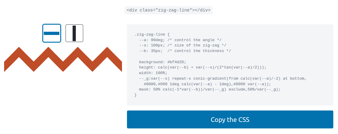
You can adjust the different variables to get the zig-zag you want. In our case, I will use an easier version with no variables.
.loader {
  height: 47px; /* control the size */
  aspect-ratio: 5;
  background:
   conic-gradient(from 135deg at top,#000 90deg,#0000 0) top,
   conic-gradient(from 135deg at top,#0000 90deg,#000 0) bottom;
  background-size: 20% 50%;
  background-repeat: repeat-x;
}
And here is a figure to illustrate how those gradients create the shape:
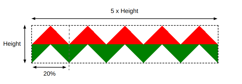
The first gradient created the red part while the second one created the green part. We have two triangle shapes that repeat horizontally.
Since we have five repetitions, I used aspect-ratio: 5 and 20% (100%/5) in the background-size. You can make it more generic by introducing a variable to control the number of repetitions but as I said previously, I am going to keep things simple.
I want to point out that when using gradients, you can achieve the same result by using different syntaxes. For example, I can update the previous code with the following:
.loader {
  height: 47px; /* control the size */
  aspect-ratio: 5;
  background:
   conic-gradient(from 135deg at top   ,#000 90deg,#0000 0),
   conic-gradient(from -45deg at bottom,#000 90deg,#0000 0) 12.5% 100%;
  background-size: 20% 50%;
  background-repeat: repeat-x;
}
It’s still the same output but with a different syntax for the second gradient. Did you notice the repeated part within the gradients? That part controls the coloration and we can define it as a variable to avoid repetition and be able to update the color only once in the code.
.loader {
  height: 47px; /* control the size */
  aspect-ratio: 5;
  --c:#000 /* the color */ 90deg,#0000 0;
  background:
   conic-gradient(from 135deg at top   ,var(--c)),
   conic-gradient(from -45deg at bottom,var(--c)) 12.5% 100%;
  background-size: 20% 50%;
  background-repeat: repeat-x;
}
Now we have our zig-zag shape and we are ready to animate it.
How to Animate the Zig-Zag Shape
Since we’re using a background, we’ll animate the background-position to get our first loader. The idea is to move the gradients horizontally and create an infinite movement.
.loader {
  height: 47px; /* control the size */
  aspect-ratio: 5;
  --c:#000 /* the color */ 90deg,#0000 0;
  background:
   conic-gradient(from 135deg at top   ,var(--c)),
   conic-gradient(from -45deg at bottom,var(--c)) 12.5% 100%;
  background-size: 20% 50%;
  background-repeat: repeat-x;
  animation: loading .8s infinite linear;
}

@keyframes loading {
  0%   {background-position: 0   0,12.5% 100%}
  100% {background-position: 25% 0,37.5% 100%}
}
Note how we increased the X value of the background-position by 25%. In case you are wondering what the logic behind that value is, here is the formula:
0.2 / (1 - 0.2) = .25 = 25%
.2 corresponds to the 20% used inside the background-size.
We have our first loader! Actually, two loaders because we can easily change the direction of the movement by adding animation-direction: reverse.
Let’s try a different animation: using clip-path and the inset() value. We can easily adjust this technique to create many variations.
Let’s start with a basic example:
.loader {
  /* same code as previously */
  animation: loading .8s infinite linear;
}
@keyframes loading {
  0%   {clip-path: inset(0 100% 0 0)}
  100% {clip-path: inset(0 0    0 0)}
}
The inset() value creates a rectangle where only the part inside it will be visible. For this, we define a distance from each side of the element (top, right, bottom, left).
Logically, inset(0 0 0 0) shows the whole element since all the distances are equal to 0, but inset(0 100% 0 0) completely hides the element since the right value is equal to 100%. So it will touch the opposite edge, creating an empty rectangle.
By animating that right value from 100% to 0 we create a reveal animation. Another loader variation!
If you inspect the code of the second animation, you will see that I did the same thing but with the left side.
We can also have a sliding effect if we animate both the left and right values while keeping their difference constant.
.loader {
  /* same code as previously */
  animation: loading .8s infinite linear;
}
@keyframes loading {
  0%   {clip-path: inset(0 60% 0 0  )}
  100% {clip-path: inset(0 0   0 60%)}
}
The right value animates from 60% to 0 and the left one from 0 to 60%, so we have a constant difference equal to 60% which will create the illusion of a sliding rectangle. Another cool loader!
By trying different combinations of inset() values, you can get a lot of CSS loaders. Give it a try! You can also check my online collection and try to identify the variations that use clip-path: inset().
How to Create a Discrete Animation
To achieve a discrete animation, you can use the steps() timing function instead of linear. Let’s start with the first example using steps(2).
We can do the same with almost all the variations. Let’s try with the ones that use clip-path: inset().
.loader {
  /* same code as previously */
  animation: loading .8s infinite steps(5);
}
@keyframes loading {
  0%   {clip-path: inset(0 100% 0 0)}
  100% {clip-path: inset(0 0    0 0)}
}
We have five repetitions so let’s see what we’ll get with steps(5).
At the moment, it’s not good because we don’t see all the repetition. The animation stops at 4 repetitions, but we need to see the whole element (5 repetitions). The count starts from 0 so what we really need is 6 steps instead of 5 to show all the repetitions.
.loader {
  /* same code as previously */
  animation: loading .8s infinite steps(6);
}
@keyframes loading {
  0%   {clip-path: inset(0 100% 0 0)}
  100% {clip-path: inset(0 0    0 0)}
}
Even with 6 steps, the result is still not good but don’t worry, it’s not a bug. The default behavior of steps() gives us that output but we can update it to get the expected output:
.loader {
  /* same code as previously */
  animation: loading .8s infinite steps(6,jump-none);
}
@keyframes loading {
  0%   {clip-path: inset(0 100% 0 0)}
  100% {clip-path: inset(0 0    0 0)}
}
If you’re not familiar with jump-none, it’s a value that can fix most of your issues when working with steps(). I wrote a short article about it if you want more details: “How to correctly use steps() with animations“
Our animation looks perfect now! We can also make it an 11-step animation (5×2 + 1) and get another cool loader.
Even the sliding effect can have its discrete variation.
Can you figure out why I am using 4 and 7 steps? I’ll let you do the calculation as a small exercise.
Conclusion
This article showed you how to create zig-zag shapes, how to animate them using clip-path, and how to make a discrete animations. You can also consider more tricks like using both pseudo-elements to have two shapes.
I didn’t explore all the variations but you now have the recipe to create most of them!
You can explore my Zig-Zag loaders collection to study other variations and try to create your own loader. It’s a good opportunity to practice what you have learned from this article.
Learn to code for free. freeCodeCamp's open source curriculum has helped more than 40,000 people get jobs as developers. Get started