


Have you ever noticed those fancy ribbons on websites that alert users to some special feature or event? They're great to have, but for many developers, it's a nightmare to create them.
You can easily find a lot of ready-to-use code for such a component, but they are not easy to update. You also have to deal with a lot of trial and error until you get them to work correctly.
In this post, I will show you how to create two types of ribbons with some simple CSS code where you don't need to bother yourself with tweaking a lot of values.
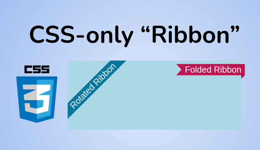
Here's what we'll create in this article:

Rotated Ribbon & Folded Ribbon
Below is the full code for both ribbons so you can see how simple it is:
Click to see the full code
    Folded Ribbon

  Rotated Ribbon
  Rotated Ribbon
  .ribbon-1 {
    position: fixed;
    background: #08769b;
    box-shadow: 0 0 0 999px #08769b;
    clip-path: inset(0 -100%);
  }
  .left {
    inset: 0 auto auto 0;
    transform-origin: 100% 0;
    transform: translate(-29.3%) rotate(-45deg);
  }
  .right {
    inset: 0 0 auto auto;
    transform-origin: 0 0;
    transform: translate(29.3%) rotate(45deg);
  }

  .ribbon-2 {
    --f: 10px; / control the folded part/
    --r: 15px; / control the ribbon shape /
    --t: 10px; / the top offset /

    position: absolute;
    inset: var(--t) calc(-1var(--f)) auto auto;
    padding: 0 10px var(--f) calc(10px + var(--r));
    clip-path:
      polygon(0 0,100% 0,100% calc(100% - var(--f)),calc(100% - var(--f)) 100%,
        calc(100% - var(--f)) calc(100% - var(--f)),0 calc(100% - var(--f)),
        var(--r) calc(50% - var(--f)/2));
    background: #BD1550;
    box-shadow: 0 calc(-1var(--f)) 0 inset #0005;
  }


  .box {
    max-width:500px;
    height:200px;
    margin:50px auto 0;
    background:lightblue;
    position:relative;
  }
How to create a Rotated Ribbon with CSS
This type of ribbon is, in most cases, used to place a piece of fixed information on the top of the screen. But we can also use it inside an element within the page.
To understand how to create such a ribbon, let's look at a step-by-step illustration:

Step-by-Step illustration of the Rotated Ribbon
First, we start by placing our element on the top left corner of the screen. The red borders in the illustration are the boundaries of the screen (or the element where you want to place the Ribbon).
.ribbon {
  position: fixed;
  inset: 0 auto auto 0;
  background: #08769b;
}
Nothing complex so far. If you are not familiar with the inset property, it's nothing but the shorthand for top, right, bottom, and left.
Next, we perform a translation to the left by using translate(-29.3%).
After the translation, we rotate our element using rotate(-45deg) and the code becomes this:
.ribbon {
  position: fixed;
  inset: 0 auto auto 0;
  background: #08769b;
  transform-origin: 100% 0; /* or top left */
  transform: translate(-29.3%) rotate(-45deg);
}
You are probably wondering what is the secret of the strange value 29.3%? Well, it's equal to 100% * (1 - cos(45deg)).
I will avoid starting a "boring" math explanation, but you can see that after we did the rotation, the element is perfectly placed (both its top corners are touching the edges). The translation is the key to having that perfect placement.
You can also notice the use of transform-origin: top left. In the third step, I had to rotate the element from its top left corner.
Now our element is correctly placed but we have a few gaps to fill. I will use a "big" box-shadow to do that. In the figure, I used a green color to illustrate but you should consider it as the same color as the background.
Next we need to clip the shadow to only show the left and right parts of it. To do this I will be using clip-path. I will use inset(0 -100%) which means clip the top and bottom shadow (the value 0) and show some of the left right shadow (-100%).
100% is a random value that needs to be very big. It can be for example 999px or 100vmax – any value to make sure we keep the left and right part of the shadow.
Now we'll see the final result in the sixth step. We still have some overflowing shadows but no one can see them since we are placing our element at the corner of the screen.
If you will be placing the ribbon inside another element don't forget to use overflow: hidden on the parent element and also replace fixed with absolute
Our final code will be:
.ribbon-1 {
  position: fixed;
  inset: 0 auto auto 0;
  background: #08769b;
  transform-origin: 100% 0;
  transform: translate(-29.3%) rotate(-45deg);
  box-shadow: 0 0 0 999px #08769b;
  clip-path: inset(0 -100%);
}
With only 7 declarations we have our rotated ribbon. You will note that our code is generic and doesn't depend on the text content. Whatever the content of the ribbon, it will always get placed correctly. You can even have multi-lines of text.
To place the ribbon at the top right corner, we just need to update a few values. Even better, let's have two classes to easily control the placement:
.ribbon-1 {
  position: fixed;
  background: #08769b;
  box-shadow: 0 0 0 999px #08769b;
  clip-path: inset(0 -100%);
}
.left {
  inset: 0 auto auto 0; /* top and left equal to 0 */
  transform-origin: 100% 0; /* OR top right */
  transform: translate(-29.3%) rotate(-45deg);
}
.right {
  inset: 0 0 auto auto; /* top and right equal to 0 */
  transform-origin: 0 0; /* OR top left */
  transform: translate(29.3%) rotate(45deg);
}
I think the code is self-explanatory and the changes between right and left are simple to understand.
How to Create a Folded Ribbon with CSS
Let's tackle the second type of ribbon the same way we did with the previous one using a step-by-step illustration.

Step-by-Step illustration of the Folded Ribbon
First, we'll start by placing our element at the right side of the parent element.
.ribbon-2 {
  --t: 10px; /* the top offset */

  position: absolute;
  inset: var(--t) 0 auto auto;
  padding:0 10px;
  background: #BD1550;

}
I will consider a variable to control the offset from the top which means that we can easily control the position of the Ribbon by adjusting that variable. Since we are using position: absolute, we should not forget to add position: relative to the parent element of the Ribbon.
I will also add some padding on the left and right sides. There is no particular logic behind the 10px – you can choose the value you want.
Now I will introduce another variable that will control the folded part. I will be using this variable to define an inset shadow box-shadow: 0 calc(-1*var(--f)) 0 #0005.
As you can see in the figure above, this shadow will add a semi-transparent black overlay on the bottom having a height equal to the variable --f. I will also increase the bottom padding to contain that shadow padding: 0 10px var(--f).
Next, using the same variable --f I will move the ribbon a bit to the right by replacing right:0 with right: calc(-1*var(--f)).
The code so far looks like this:
.ribbon-2 {
  --t: 10px; /* the top offset */
  --f :10px /* control the folded part */

  position: absolute;
  inset: var(--t) calc(-1*var(--f)) auto auto; /* the right value is here*/
  padding:0 10px var(--f);
  background: #BD1550;
  box-shadow: 0 calc(-1*var(--f)) 0 inset #0005;
}
The code may look strange (and the result as well) but everything will make sense in the next step when we create the final shape.
In the fourth step (the last one), we will introduce clip-path to cut our element. I will also add another variable --r to control the arrow shape of the ribbon.
Before adding the clip-path, I will first increase the left padding to have the necessary space for the arrow shape:
padding: 0 10px var(--f) calc(10px + var(--r));
The top padding is equal to
0.The right padding is equal to
10px(a random value)The bottom padding is defined by
--fThe left padding is equal to
10px(same as right) plus a value defined by the new variable--r
Now let's add the clip-path. Here is an illustration to understand the path that will lead us to the final shape.

Illustration of the clip-path
The path is defined using 7 points. Starting for point (1) and following the arrow we have the following code:
clip-path: polygon(
  0 0,  /* (1) */
  100% 0, /* (2) */
  100% calc(100% - var(--f)), /* (3) */
  calc(100% - var(--f)) 100%, /* (4) */
  calc(100% - var(--f)) calc(100% - var(--f)), /* (5) */
  0 calc(100% - var(--f)), /* (6) */
  var(--r) calc(50% - var(--f)/2) /* (7) */
)
Don't worry if you are not familiar with clip-path – this may look a bit strange to you. You don't need to manipulate that path. All you need to update the CSS variables to control the overall shape.
This said it's good to play with that path by changing some values in order to better understand how it works.
We are done. Our final code is:
.ribbon-2 {
  --f: 10px; /* control the folded part*/
  --r: 15px; /* control the ribbon shape */
  --t: 10px; /* the top offset */

  position: absolute;
  inset: var(--t) calc(-1*var(--f)) auto auto;
  padding: 0 10px var(--f) calc(10px + var(--r));
  clip-path:
    polygon(0 0,100% 0,100% calc(100% - var(--f)),calc(100% - var(--f)) 100%,
      calc(100% - var(--f)) calc(100% - var(--f)),0 calc(100% - var(--f)),
      var(--r) calc(50% - var(--f)/2));
  background: #BD1550;
  box-shadow: 0 calc(-1*var(--f)) 0 inset #0005;
}
You can adjust the values of the variables to get different results:
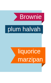
Like we did with the rotated ribbon, we can update a few values to change the position of this one from right to left – but this time I will not give you the code. I will let you try to find it alone 😉
It's a good exercise to figure out which value you have to update especially for the clip-path. You can always reach out to me if you have any questions.
Wrapping Up
Now you know how to create beautiful ribbons for your websites using just CSS.
If you want more, check my online collection of Ribbon Shapes where you will find different variations similar to what we did in this article.
Learn to code for free. freeCodeCamp's open source curriculum has helped more than 40,000 people get jobs as developers. Get started