


In a previous tutorial, I described how to create a simple fluid card grid with CSS Grid. In this tutorial, we’ll take it a step further and create promotional spaces that morph in interesting ways.
Using Grid, we’ll gain the following advantages:
To do this, we’ll use:
{% include ad-space.html %}
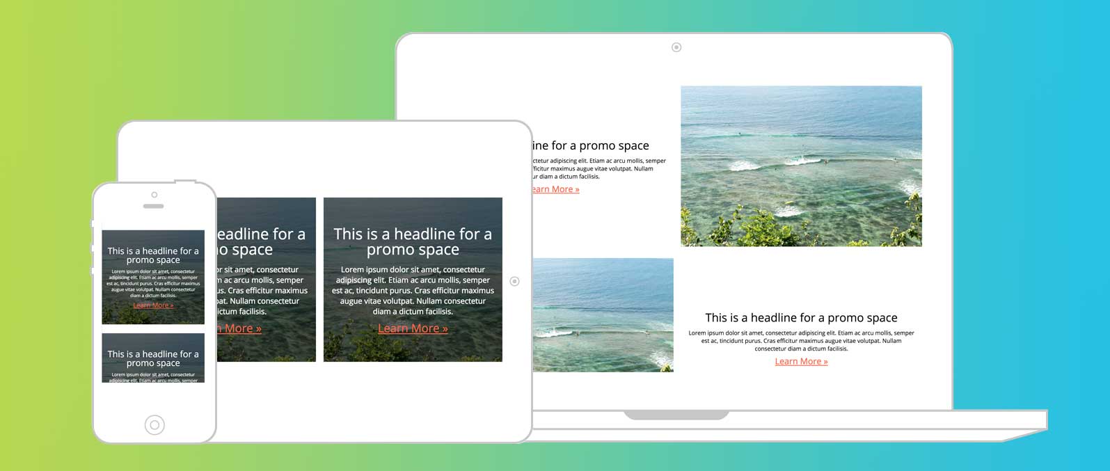
We’ll be setting up three different designs for our promo space.
On mobile, we’ll have an image with a darkened overlay in the background and the text and button in the foreground.
On larger screens — tablets and landscape mobile phones — we’ll use the same promo design but have them two across.
On devices bigger than tablets, we’ll have a full row for each promo with the image beside the text and no overlay.
<section class="promos">
<div class="promo">
<h3 class="promo__headline">This is a headline for a promo space</h3>
<img class="promo__image" src="https://images.unsplash.com/photo-1521379770009-7bafd3ec7a23?ixlib=rb-0.3.5&q=85&fm=jpg&crop=entropy&cs=srgb&ixid=eyJhcHBfaWQiOjE0NTg5fQ&s=ce4848266618366ad30d7d35764c0bf4" alt="Ocean Scape">
<p class="promo__text">Lorem ipsum dolor sit amet, consectetur adipiscing elit. Etiam ac arcu mollis, semper est ac, tincidunt purus. Cras efficitur maximus augue vitae volutpat. Nullam consectetur diam a dictum facilisis. </p>
<a href="#" class="promo__button">Learn More »</a>
</div>
<div class="promo">
... etc
</div>
</div>
Sweet and simple. One parent container for the promos and one child container per promo. Inside that, we’ve got our content. A h2/3/4, p, a and an img. That’s right, we’re using an <img> tag for a background image.
If you consider your image to be part of your content and not there for ambiance, then using an <img> tag is the proper, semantic way to write it. We’ll see in the next section how we make it appear to be a background image.
.promo {
    display: grid;
    grid-template-rows: 10vh repeat(3, auto) 10vh;
    grid-template-columns: 1fr;
    grid-template-rows: 10vh auto auto auto 10vh;
    grid-template-areas: '....'
                         'headline'
                         'text'
                         'button'
                         '....';
}
.promo__headline {
    grid-area: headline;
    align-self: end;
}
.promo__text {
    grid-area: text;
}
.promo__button {
    grid-area: button;
}
Here’s where the power starts. We’re going to define our grid with one column and five rows.
The five rows allow for us to vertically center our content. The first and last rows will be blank, but have an equal height set. Each of the middle three rows is sized by its content with the auto keyword.
Finally, we tell the browser where to put our content by assigning a grid area name in grid-template-areas. We then assign headline, text, and button keywords to the classes of content that match.
In this declaration, each row is represented by one string with columns separated by spaces. In this case, there’s only one column and five rows. The first and last rows are represented by one or more periods. This allows for these grid cells to be blank.
One quick note: By assigning align-self: end to our headline, we create a stronger tie between headline and text.
At this point, you may have noticed we haven’t styled our <img>.
To make the image span the full height and width our container, we need to tell it to fill all the rows. We could use grid-row: 1 / 6 but then we’d need to redefine this at various breakpoints.
The current specification of Grid doesn’t account for overlap in grid-template-areas. So, we’ll create “named lines” instead by redefining our grid-template-columns and -rows.
.promo {
      grid-template-columns: [image-start] 1fr [image-end];
      grid-template-rows: [image-start] 10vh auto auto auto 10vh [image-end];
}
Three big things are happening here:
[image-start] creates a named line.-start and -end will create a named area.By defining these four lines, we can now call grid-area: image on our image and it will fill the entire promo.
.promo__image {
        grid-area: image;
        align-self: stretch;
        object-fit: cover;
}
You’ll note two other properties: align-self and object-fit.
Align-self will allow the image to fill the entire grid cell. By allowing the image to stretch, it fills the space. Object-fit and the keyword cover allow an <img> tag to have the same functionality as background-size: cover.
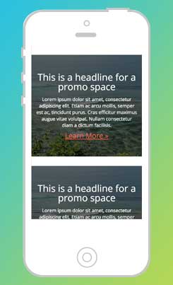
Normally, I’d advocate for an ::after element in CSS to handle the darkened overlay. In this instance, because our main background is an <img> tag, an ::after element won’t work.
To address this, we can add a background-color to the entire promo area and use mix-blend-mode on the image to blend the two.
To avoid blending all the elements, we can add a z-index to affect our stacking context. By giving our image a z-index of 0 and our text elements a z-index of 1 (or more), only the image and background color will be blended.
This is the easy part. For larger phones and tablets, let’s set a breakpoint to put our promos side-by-side.
In this example, we have two promos, so we’ll set our grid to two columns. If you have dynamic content, you could explore creating a fluid card grid.
@media (min-width: 640px) and (max-width: 1024px) {
    .promos {
        display: grid;
        grid-template-columns: 1fr 1fr;
        grid-gap: 1rem;
    }
}
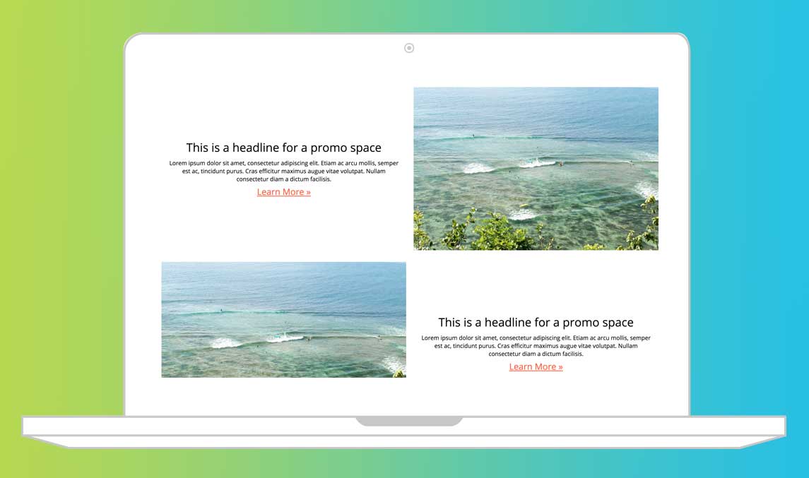
Tablets were easy: Add an extra column. Done. For desktop, let’s create a row for each promo and let them breathe a bit.
To build our new grid template, all we need to do is add a column and adjust our grid-template-areas.
    grid-template-columns: 1fr 1fr;
    grid-template-areas: '.......  image'
                         'headline image'
                         '  text   image'
                         ' button  image'
                         '.......  image';
    grid-column-gap: 20px;
Since we named our grid areas, they’ll automatically flow into their new homes.
With our grid now in place, let’s make a few stylistic choices to solidify this design.
Let’s add a little white space on either side of our promos by setting a width and auto margins.
We’ll also reset our font color and background color for the promos to values that make sense for the space the promos take up and align the text left instead of center.
    .promos {
        width: 95vw;
        margin: auto;
    }
    .promo {
        background-color: transparent; // Turns background color off
        color: black; // Inverts text color
        text-align: left; // My preference for this style of promo
    }
If you’re anything like me, it bothers you to see those images repeating down the right side of the screen. We can fix this with the addition of a class and one more grid-template-area reset.
.promo.even {
    grid-template-areas: 'image ....'
                         'image headline'
                         'image text'
                         'image button'
                         'image ....';
}
With that, we have an interesting set of design patterns that best match the device on which they’re viewed. As always, you can play with the code on CodePen.
What are some other design patterns that would work well together with the power of Grid?
此内容由惯性聚合(RSS阅读器)自动聚合整理,仅供阅读参考。 原文来自 — 版权归原作者所有。