
惯性聚合 高效追踪和阅读你感兴趣的博客、新闻、科技资讯
阅读原文 在惯性聚合中打开

推荐订阅源

WordPress大学
WordPress大学
Security Latest
Security Latest
C
Cisco Blogs
P
Palo Alto Networks Blog
Know Your Adversary
Know Your Adversary
Project Zero
Project Zero
C
Cyber Attacks, Cyber Crime and Cyber Security
NISL@THU
NISL@THU
Exploit-DB.com RSS Feed
S
Secure Thoughts
P
Privacy International News Feed
V
Vulnerabilities – Threatpost
D
Docker
Google Online Security Blog
K
KPMG report finds enterprise disconnect between AI and its ROI | CIO
Recent Announcements
T
The Exploit Database - CXSecurity.com
G
Google Developers Blog
Schneier on Security
小众软件
小众软件
爱范儿
爱范儿
GbyAI
GbyAI
J
Java Code Geeks
T
Tailwind CSS Blog
Cisco Talos Blog
Cisco Talos Blog
The Hacker News
The Hacker News
D
DataBreaches.Net
Blog — PlanetScale
Blog — PlanetScale
TaoSecurity Blog
TaoSecurity Blog
MyScale Blog
MyScale Blog
B
Blog RSS Feed
Cyberwarzone
Cyberwarzone
有赞技术团队
有赞技术团队
Martin Fowler
Martin Fowler
C
CXSECURITY Database RSS Feed - CXSecurity.com
S
Securelist
L
Lohrmann on Cybersecurity
cs.CL updates on arXiv.org
Y
Y Combinator Blog
S
Schneier on Security
Latest news
Latest news
Apple Machine Learning Research
博客园 - 叶小钗
F
Fortinet All Blogs
M
MIT News - Artificial intelligence
PCI Perspectives
PCI Perspectives
V
V2EX
V2EX - 技术
V2EX - 技术
O
OpenAI News
W
WeLiveSecurity

Bryan Robinson's Blog

Does our technology still work for us? Product pricing, dev bad habits, and the role of the pit of success Astro Server Island for latest Bluesky post (heavily cached!) Type-safe environment variables in Astro 5.0 New Website, but really is it? Netlify Durable Cache: Caching for a third-party world Introducing the Hygraph Astro Content Loader Integrating Astro.js Starlight Documentation into a Next.js Project Using Proxies Jamstack is meaningless 😱 Book Release: Eleventy by Example – Learn 11ty with 5 in-depth projects 11ty Second 11ty: Creating Template Filters 11ty Second 11ty: Global Data files (JS and JSON) 11ty second 11ty: The Render Plugin Part 1 Help needed: Netlify Frontend environment variables with Astro.js Quick experiment with the Slinkity 11ty plugin Creating a dynamic color converter with 11ty Serverless Using 11ty JavaScript Data files to mix Markdown and CMS content into one collection How to show your template code in 11ty blog posts New City, New Job, New Content Using Nunjucks Climbing the 11ty Performance leaderboard with Cloudinary, critical CSS and more Three JAMstack movements to watch in 2020 Create a Codepen promo watermark with no additional HTML, CSS or JS 3 underused CSS features to learn for 2020 Use CSS Subgrid to layout full-width content stripes in an article template Adapt client-side JavaScript for use in 11ty (Eleventy) data files CSS Gap creates a bright future for margins in Flex as well as Grid Create your first CSS Custom Properties (Variables) Use CSS Grid to create a self-centering full-width element Creating an 11ty Plugin - SVG Embed Tool Now offering design and code reviews at PeerReviews.dev Routing contact-form emails to different addresses with Netlify, Zapier and SendGrid Create an Eleventy (11ty) theme based on a free HTML template Client work and the JAMstack Grid vs. Flex: A Tale of a "Simple" Promo Space Using Eleventy The Tech Barrier to Entry What Can We Learn from CERN Let Practical CSS Grid - Launching My First Course Build Trust on the Web incorporating User Worries with your User Stories 2019 The Year of Markup-First Development Refactoring CSS into a Sass mixin Starting a new journey with Code Contemporary Dynamic Static Sites with Netlify and iOS Shortcuts Top 3 uses for the ::before and ::after CSS pseudo elements How To: Use CSS Grid to Mix and Match Design Patterns Use CSS ::before and ::after for simple, spicy image overlays Modern CSS: Four Things Every Developer and Designer Should Know About CSS CSS Tip: Use rotate() and skew() together to introduce some clean punk rock to your CSS The 5 Stages of Grid Love How To: A CSS-Only Mobile Off Canvas Navigation How To: Use CSS Grid Layout to Make a Simple, Fluid Card Grid Make a More Flexible Cover Screen with CSS Grid Can CSS Grid open up interesting CMS Layout options? Firefox 52 to Introduce New Box-Alignment Values Falling Forward — Rethinking Progressive Enhancement, Graceful Degradation and Developer Morality Start Exploring the Magic of CSS Grid Layout I Converted My Blog to CSS Grid Layout and Regret Nothing Feature Queries are on the Rise CSS Shapes — Let the Text Flow Around You Flexbox -- Let Memorializing Prince and Print vs. The Web I went to Italy and noticed UX fails How to Get Designers to Contribute in Open Source The True Gift of Your Former Code
3 Strategies for Getting Started with CSS Grid
2018-01-29 · via Bryan Robinson's Blog

CSS Grid Layout has been in major browsers for a little less than a year now. Despite the excitement around it by people in the know, not everyone has jumped on board.

I understand. Despite its browser adoption happening in record time, we still live in an IE world sometimes.

While 2017 was the year of CSS Grid’s browser adoption, 2018 will be the year of its developer adoption.

If you’re wondering how to start, here are three strategies for adopting it into your workflow.

Reduce Excessive Markup

Our appetite for better designs has increased in the past five years. With that — and our reliance on old layout techniques — we’ve seen an explosion in nested markup.

Take this simple promotional grid layout for example.
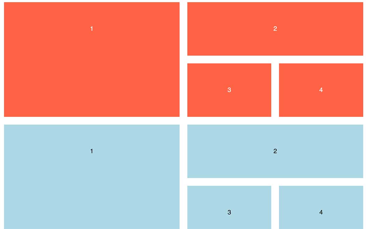
Side-by-side comparison of a flex grid to a grid layout grid

To make this happen, we have to introduce a slew of markup to add rows inside of rows.

<section class="flexgrid">
<div class="left-side">
    <div class="item">1</div>
</div>

<div class="right-side">
    
    <div class="right-top">
        <div class="item">2</div>
    </div>

    <div class="right-bottom">
        <div class="item">3</div>
        <div class="item">4</div>
    </div>

</div>
</section>

Keeping track of the nesting is a headache. It also fights against clean, semantic HTML. 

Let’s take the same design and build out the HTML we need for CSS Grid.

<section class="grid">
    <div class="grid__item">1</div>
    <div class="grid__item">2</div>
    <div class="grid__item">3</div>
    <div class="grid__item">4</div>
</section>

With one parent and four direct children, we can pull off uneven rows and columns. 

The promise of Grid Layout is the promise of semantic markup and true separation of concerns.

View my CodePen of the layouts side-by-side

Build a Multi-Column Form

While you’re simplifying your markup, you might as well take a look at upping your form game.

Sure a one-column form will get the job done, but why not add a little spice with multiple columns.
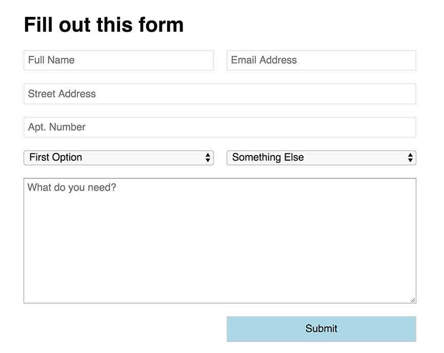
A simple form with both 2-column elements and 1-column full width elements

Instead of setting up rows of content inside of a form, tell the form to be two columns and let certain areas stretch.

In this example, we want the street address and comment box to have more room for comfortable writing.

By creating a “fullwidth” class that uses grid-column: span 2, we can have a single input change its layout. The other inputs that can be smaller remain side by side.

.form {
    display: grid;
    grid-template-columns: 1fr 1fr;
    grid-gap: 20px;
}
.fullwidth {
    grid-column: span 2;
}

View the example on CodePen

Use Grid Layout instead of the Bootstrap or Foundation Grid

I try to write a lot about Grid Layout bringing new design options to the table, but sometimes it’s worthwhile to use tested methods.

If you want to take a baby step into Grid, try recreating your 12-column Bootstrap or Foundation grid.

Start with a simple grid declaration and setup.

.grid {
    display: grid;
    grid-template-columns: repeat(12, 1fr);
    grid-column-gap: 10px;
}

From there, you can set up classes that span various column counts.

.span3 {
    grid-column: span 3;
}
.span9 {
    grid-column: span 9;
}

I bet you can figure out the rest.

If you’re looking to get started, this is an easy shift in your workflow. This isn’t the best use of Grid. Start expanding your mindset to work outside of traditional ideas of what a grid is.

One of the absolute coolest features in Grid layout is the combination of repeat() and minmax() functions.

I wrote a blog post on how to make a fluid grid of cards with no media queries. It’s pretty slick.

Start Experimenting with Grid

More than anything else, this represents a shift in the way we develop websites. It will require you playing and working in it.

Whatever strategy you implement to learn Grid, start learning it.