
惯性聚合 高效追踪和阅读你感兴趣的博客、新闻、科技资讯
阅读原文 在惯性聚合中打开

推荐订阅源

F
Full Disclosure
The Register - Security
F
Fortinet All Blogs
aimingoo的专栏
aimingoo的专栏
V
Visual Studio Blog
H
Help Net Security
S
Secure Thoughts
U
Unit 42
P
Palo Alto Networks Blog
A
About on SuperTechFans
S
Securelist
IT之家
IT之家
P
Privacy & Cybersecurity Law Blog
The Cloudflare Blog
C
CXSECURITY Database RSS Feed - CXSecurity.com
Scott Helme
Scott Helme
MyScale Blog
MyScale Blog
M
MIT News - Artificial intelligence
N
Netflix TechBlog - Medium
P
Proofpoint News Feed
T
Tor Project blog
Simon Willison's Weblog
博客园 - 聂微东
C
CERT Recently Published Vulnerability Notes
阮一峰的网络日志
阮一峰的网络日志
P
Privacy International News Feed
C
Cyber Attacks, Cyber Crime and Cyber Security
量子位
Security Latest
Security Latest
L
LangChain Blog
The Last Watchdog
The Last Watchdog
Hugging Face - Blog
Hugging Face - Blog
雷峰网
雷峰网
Exploit-DB.com RSS Feed
有赞技术团队
有赞技术团队
Know Your Adversary
Know Your Adversary
大猫的无限游戏
大猫的无限游戏
Cyber Security Advisories - MS-ISAC
W
WeLiveSecurity
Hacker News: Ask HN
Hacker News: Ask HN
www.infosecurity-magazine.com
博客园 - 三生石上(FineUI控件)
T
The Exploit Database - CXSecurity.com
博客园 - 【当耐特】
博客园 - 司徒正美
Blog — PlanetScale
Blog — PlanetScale
Threat Intelligence Blog | Flashpoint
Latest news
Latest news
S
Schneier on Security
H
Hacker News: Front Page

Bryan Robinson's Blog

Does our technology still work for us? Product pricing, dev bad habits, and the role of the pit of success Astro Server Island for latest Bluesky post (heavily cached!) Type-safe environment variables in Astro 5.0 New Website, but really is it? Netlify Durable Cache: Caching for a third-party world Introducing the Hygraph Astro Content Loader Integrating Astro.js Starlight Documentation into a Next.js Project Using Proxies Jamstack is meaningless 😱 Book Release: Eleventy by Example – Learn 11ty with 5 in-depth projects 11ty Second 11ty: Creating Template Filters 11ty Second 11ty: Global Data files (JS and JSON) 11ty second 11ty: The Render Plugin Part 1 Help needed: Netlify Frontend environment variables with Astro.js Quick experiment with the Slinkity 11ty plugin Creating a dynamic color converter with 11ty Serverless Using 11ty JavaScript Data files to mix Markdown and CMS content into one collection How to show your template code in 11ty blog posts New City, New Job, New Content Using Nunjucks Climbing the 11ty Performance leaderboard with Cloudinary, critical CSS and more Three JAMstack movements to watch in 2020 Create a Codepen promo watermark with no additional HTML, CSS or JS 3 underused CSS features to learn for 2020 Use CSS Subgrid to layout full-width content stripes in an article template Adapt client-side JavaScript for use in 11ty (Eleventy) data files CSS Gap creates a bright future for margins in Flex as well as Grid Create your first CSS Custom Properties (Variables) Use CSS Grid to create a self-centering full-width element Creating an 11ty Plugin - SVG Embed Tool Now offering design and code reviews at PeerReviews.dev Routing contact-form emails to different addresses with Netlify, Zapier and SendGrid Create an Eleventy (11ty) theme based on a free HTML template Client work and the JAMstack Grid vs. Flex: A Tale of a "Simple" Promo Space Using Eleventy The Tech Barrier to Entry What Can We Learn from CERN Let Practical CSS Grid - Launching My First Course Build Trust on the Web incorporating User Worries with your User Stories 2019 The Year of Markup-First Development Refactoring CSS into a Sass mixin Starting a new journey with Code Contemporary Dynamic Static Sites with Netlify and iOS Shortcuts Top 3 uses for the ::before and ::after CSS pseudo elements How To: Use CSS Grid to Mix and Match Design Patterns Use CSS ::before and ::after for simple, spicy image overlays Modern CSS: Four Things Every Developer and Designer Should Know About CSS 3 Strategies for Getting Started with CSS Grid CSS Tip: Use rotate() and skew() together to introduce some clean punk rock to your CSS The 5 Stages of Grid Love How To: A CSS-Only Mobile Off Canvas Navigation Make a More Flexible Cover Screen with CSS Grid Can CSS Grid open up interesting CMS Layout options? Firefox 52 to Introduce New Box-Alignment Values Falling Forward — Rethinking Progressive Enhancement, Graceful Degradation and Developer Morality Start Exploring the Magic of CSS Grid Layout I Converted My Blog to CSS Grid Layout and Regret Nothing Feature Queries are on the Rise CSS Shapes — Let the Text Flow Around You Flexbox -- Let Memorializing Prince and Print vs. The Web I went to Italy and noticed UX fails How to Get Designers to Contribute in Open Source The True Gift of Your Former Code
How To: Use CSS Grid Layout to Make a Simple, Fluid Card Grid
2017-07-26 · via Bryan Robinson's Blog

In this tutorial, I’m going to show you how to take one of the most common tropes of web design — the card grid — and make it fluid. 

We could build this via a float- or flex-based grid and a handful of breakpoints. Why deal with breakpoints if Grid Layout can handle everything for us?

Grid can do so much more than recreating old design patterns. If you’re looking for a good place to start, though, this is the best introduction to its power.

Video: For those who learn by watching

Step 1: Create your markup

In this example, I’ve got a simple card with a title, photo, description and link. I’ve duplicated this markup 10 times to have content to show the grid in action.

Place all the .card items inside a .card-container element.

<section class="card-container">
    <article class="card">
        <header class="card__title">
            <h3>Hello World</h3>
        </header>
        <figure class="card__thumbnail">
            <img src="http://placekitten.com/700/287">
        </figure>
        <main class="card__description">
            Lorem Ipsum dolor amet sun Lorem Ipsum dolor amet sun Lorem Ipsum dolor amet sun
        </main>
        <a href="#" class="button">Call to Action</a>
    </article>
</section>

{% include ad-space.html %}

Step 2: Visually style your cards

In this case, I chose very simple style elements. You can style your cards however you would like. Keep in mind that your styles and cards should work at multiple sizes, as we’re building a fluid grid. Don’t use direct pixel values to avoid odd spacing.

.card {
    box-shadow: 0px 1px 5px #555;
    background-color: white;
}
.card__title {
    font-size: 2rem;
    padding: .5rem;
}
.card__description {
    padding: .5rem;
    line-height: 1.6em;
}
.button {
    display: block;
    background-color: tomato;
    padding: 10px 20px;
    color: white;
    text-decoration: none;
    text-align: center;
    transition: .3s ease-out;
}

Step 3: Define your Grid

We’ll start by changing the display value of our .card-container from “block” to “grid.” This will create the grid context for the cards.

Using that context, we’ll define our “grid-template-columns.” This is where the fun begins. We could specify a finite number of columns, but then we’d be in the same situation as a flex or float grid.

Instead, we’ll use the power of some special keywords to create a fluid amount of columns per row.

3A: repeat(repeat value, size value)

First, we’ll use the “repeat()” function. repeat() takes two arguments: number of times to repeat and the value to repeat.

For Example:

grid-template-columns: repeat(3, 100px)

will compute to

grid-template-columns: 100px 100px 100px

3B: auto-fit

Next, instead of specifying a finite number of times to repeat, we’ll use the “auto-fit” keyword. This will tell the browser to have as many columns as will work based on the size specified in the repeat syntax. There’s also “auto-fill” which works the same. The difference between the two is what happens with extra tracks (see Rachel Andrews’ Grid By Example).

3C: minmax(smallest size, largest size)

Replacing the size value in our repeat() function will be a minmax() function. minmax() allows you to specify the smallest and largest you want a track to be.

In our example, we want our cards to be able to size down to fit in mobile (I use 320px for this) and size up to be a fraction of the space available. Thus, our minmax() function will be

minmax(320px, 1fr)

Put all this together and you get a CSS declaration block that looks like this:

.card-container {
    display: grid;
    grid-template-columns: repeat(auto-fit, minmax(320px, 1fr));
}

Step 4: Spacing

We now have a fluid grid, but all our cards are jammed together. Instead of reaching for our old stand-by “margin,” we’ll use another new property: grid-gap.

Grid-gap will place a space between the tracks of our grid (columns and rows). This doesn’t add space around the grid, so we’ll couple that with some padding of our container. Our CSS is now complete and looks like this:

.card-container {
    display: grid;
    padding: 1rem;
    grid-template-columns: repeat(auto-fit, minmax(320px, 1fr));
    grid-gap: 1rem;
}

And voila! A fluid, responsive grid created with no breakpoints.

Below is the CodePen that contains this example in its entirety. If you have any questions, post them in the comments or feel free to contact me on Twitter. If you’re interest in implementing Grid and still supporting older browsers, take a look at this post.

See the Pen MvwbMa by Bryan Robinson (@brob) on CodePen.
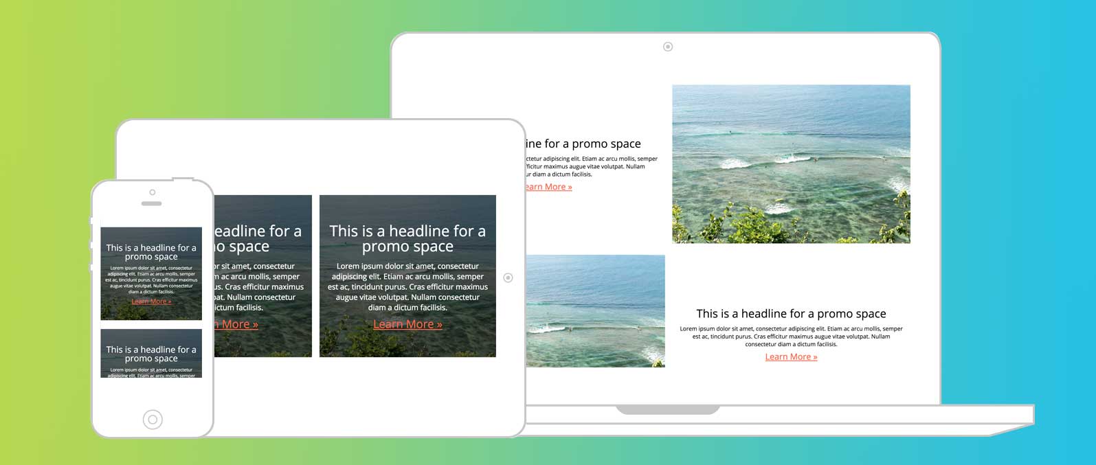
Next Up: Learn how to mix and match design patterns for each screen size

Various design patterns per screen size using grid

See the power of grid in creating different layouts for different screen sizes with the simplest media queries.

See it in action »