


More and more in web design, we find ourselves putting text on top of images. More often than not, this is a dangerous game. Images have dynamic color and lighting and text for the most part is one color. This is often a nightmare for readability and accessibility.
This means we want to introduce an overlay to sit between the image and the text. Sometimes this darkens the background image enough for readability. Other times it’s a branding opportunity. Either way we need a simple CSS technique to introduce this sort of overlay.
Since I prefer not to introduce new markup for an embelishment, we’ll use the CSS ::after pseudo-element.
The process looks something like this:
::before or ::after element to create your bannerz-index issues caused by absolute positioningmix-blend-mode for fun and profit{% include ad-space.html %}
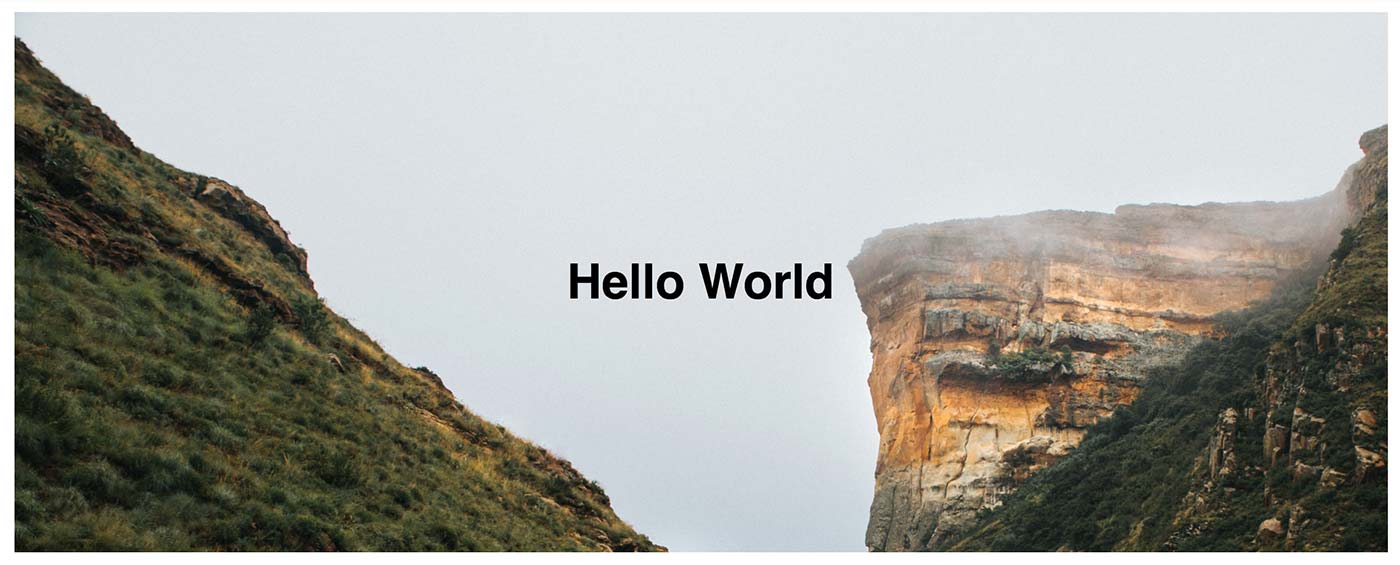
In a banner, all we really want is the banner’s container and any content that banner needs to contain.
<section class="banner">
    <h1>Hello World</h1>
</section>
In this example, we’ll just utilize a section container and an <h1>. If you added more content, it could be siblings to the <h1> or you could place all of your content in a content container of some sort to do any positioning.
A little CSS magic is happening here for the added height of the banner as well as the centering of the text. That’s not important for this demo, but if you’re curious, it exists in the CodePen.
Natively, CSS gives us the powerful ::before and ::after elements for adding stylistic content to the page that shouldn’t affect markup.
By apply ::before or ::after to an element, you can insert a dynamic element into the DOM before or after the selected elements children.
One important note, all pseudo-elements require a content CSS property to display. In our case, this will just be a blank string.
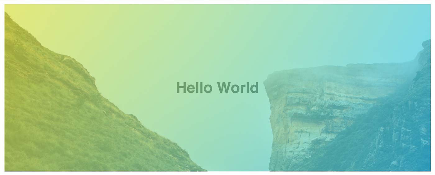
.banner::after {
    content: ""; // ::before and ::after both require content
    position: absolute;
    top: 0;
    left: 0;
    width: 100%;
    height: 100%;
    background-image: linear-gradient(120deg, #eaee44, #33d0ff);
    opacity: .7;
}
Now we have an element that is full-width and -height. To do this, we utilize absolute positioning, as we don’t want to affect the content flow of the document.
We make the overlay slightly transparent utilizing the opacity property.
In this example, I chose a fun gradient, but you could use a simple background color or even another image to overlay.
The keen-eyed observer would notice that something isn’t quite right in the example. Our friendly overlay is covering not just the background image, but also the text in the banner.
By using absolute positioning, we’ve actually put the overlay on top of the stacking context of our banner. To fix this, your overlay and your content will need to have a z-index applied to them. I usually give the overlay a 1 and my content 100.
.banner::after {
    ...
    z-index: 1;
}
.banner > * {
    z-index: 100;
}
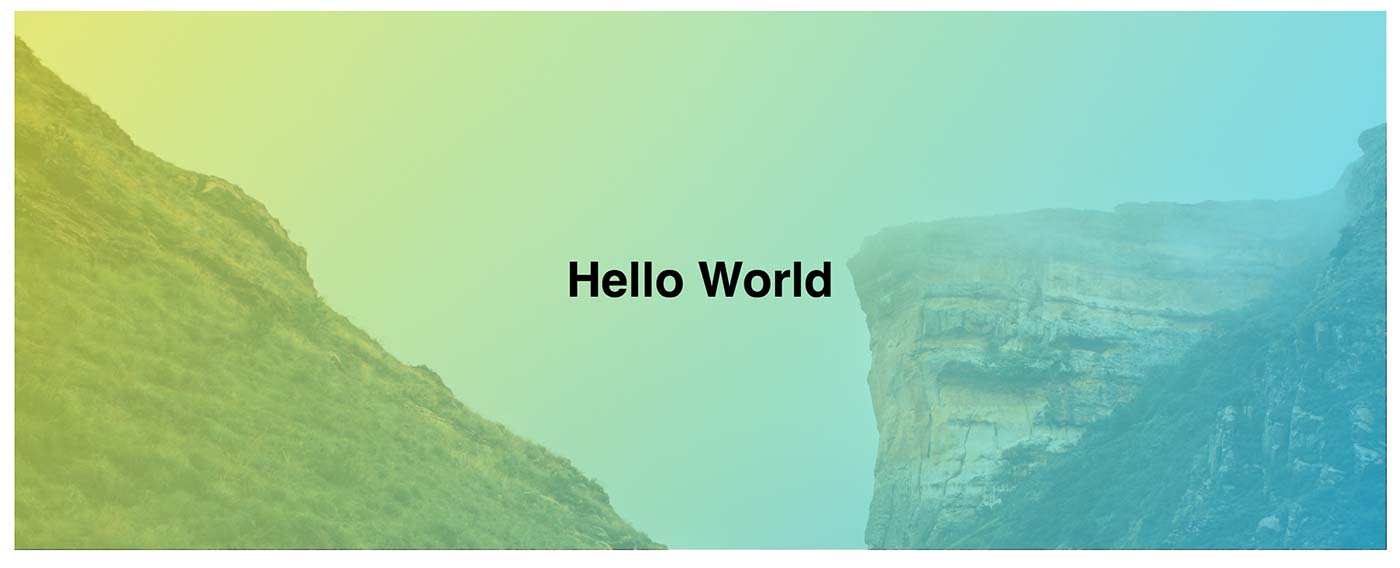
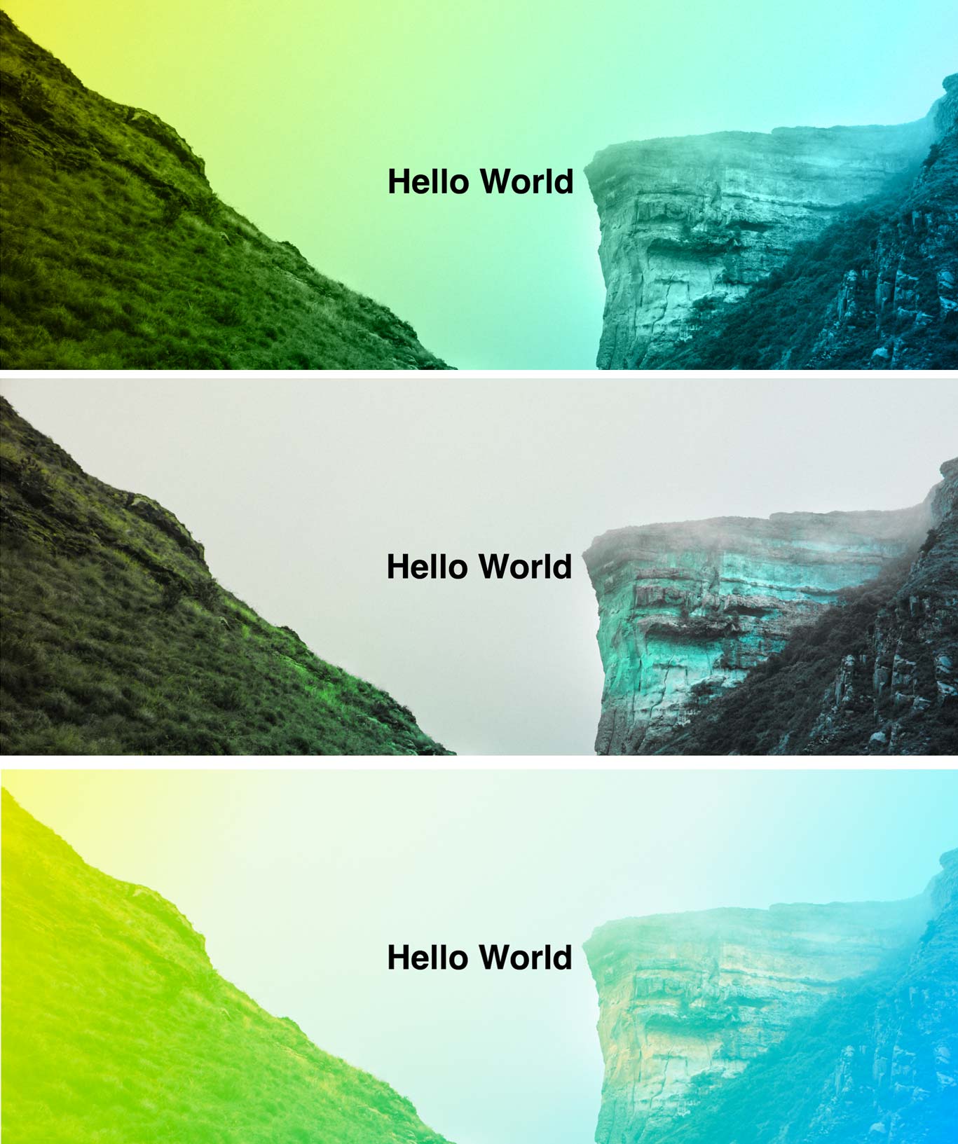
I’ve been toying with background blend modes for a little while now, but it blew me away when I discovered mix-blend-mode. This allows a developer to blend multiple elements together!
Use mix-blend-mode on your overlay and you’ve got some fun new combinations to try out.
.banner::after {
    /* opacity: .7; */
    mix-blend-mode: color;
    mix-blend-mode: hue;
    mix-blend-mode: hard-light;
}
The support for various blend modes are pretty weak in the Microsoft browsers, but you can still use them today with clever progressive enhancement. If you want them to be built in Edge, you can let Microsoft know about your passion here.
Until that time, let’s use @supports queries to make sure our code still respects our friends using Edge and IE. The above code removes the transparency from our overlay and lets the blend mode do it for us. Instead of removing it, let’s negate it behind a support query.
.banner::after {
    opacity: .7;

    @supports (mix-blend-mode: hue) {
        opacity: 1;
        mix-blend-mode: color;
        mix-blend-mode: hard-light;
        mix-blend-mode: hue;
    }
}
This way in browsers that don’t support blend modes, we get our average, but nice overlay and in browsers that do, we get some really neat effects on our banner.
So, we have a full width overlay. Then, we took it even further with blend modes. Can we turn it all the way up to 11?
As it turns out, we can add a second overlay using a ::before pseudo element, as well.
Starting with the code we have before, we’re going to modify our original overlay to be skewed and centered.
Using a CSS transform, we can skew the element a number of degree or turns. In our example, we’ll skew it 15 degrees using transform: skew(15deg). You’ll notice it now overflows the left and right sides of the container. To fix this, we’ll do two things.
First, we’ll apply overflow: hidden to our banner element. This will guarantee that we never have overflow from any transforms we do on our pseudo elements. Then, we’ll adjust the width from 100% down to 75% to contain the element a little better.

Those of you with a discerning eye will notice this is a little awkward still. The background isn’t centered! Since this is an absolutely positioned item, we’ll center it with a simple CSS trick.
Instead of a left value of 0, we’ll use 50%. That pushes the element over to start it’s left edge from the 50% mark of the parent container. We can then use another transform value to pull the element back left: translateX(-50%). When using the translate method, the percentages are based on the width of the element you’re applying it to. In this case, it’s 50% the width of the ::after element. This creates a perfectly centered element that is position: absolute;. Handy!
Your code should now look like this:
.banner {
    overflow: hidden;
}

.banner::after {
    content: "";  // :before and :after both require content
    position: absolute;
    width: 75%; // Makes the overlay smaller to accommodate the skew
    height: 100%;
    top: 0;
    left: 50%; // Push the element 50% of the container's width to the right
    transform: skew(15deg) // Puts the element on an angle
               translateX(-50%); // Moves the element 50% of its width back to the left
    background-image: linear-gradient(120deg,#eaee44,#33d0ff);
}
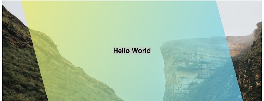
This itself is a fun take on this design pattern, but we’re going to move it one more step.
Let’s create an identical pseudo element using ::before. To do this, we’re going to add the selector to our ::after block.
Your selector should look like this:
.banner::after, .banner::before {
    ...
}
This will handle the creation, positioning, and base styles for the element.
Then, we override the specific pieces we need to override. In this case, we’ll change our skew.
.banner::before {
    transform: skew(-15deg)
               translateX(-50%);
}
When we do this, we also have to redeclare the translateX method. This is because we redeclared the whole transform property. If we didn’t, the browser would assume we don’t have a translateX for the ::before due to the cascade. This is fixed in the latest transform specification, giving CSS individual transform properties, but that’s not cross-browser compliant yet.
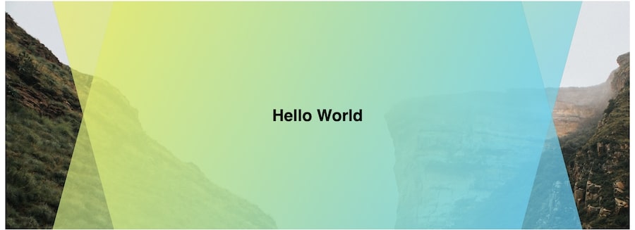
That’s it. We now have two overlays that are creating an interesting geometric view at their intersection!
Here’s the final code:
.banner::after, .banner::before {
    content: "";
    position: absolute;
    top: 0;
    left: 50%;
    transform: skew(15deg)
               translateX(-50%);
    width: 75%;
    height: 100%;
    background-image: linear-gradient(120deg,#eaee44,#33d0ff);
    background-color: #333;
    opacity: .7;
}

.banner::before {
    transform: skew(-15deg)
               translateX(-50%);
}

.banner {
    overflow: hidden;
}
Overlays should be simple and clean and never bloat your HTML with additional markup. This is one of my favorite uses of ::after elements. It just makes so much sense.
If you want to play with the code in this tutorial, the CodePens are embedded below:
此内容由惯性聚合(RSS阅读器)自动聚合整理,仅供阅读参考。 原文来自 — 版权归原作者所有。