惯性聚合 高效追踪和阅读你感兴趣的博客、新闻、科技资讯
阅读原文 在惯性聚合中打开

推荐订阅源

L
Lohrmann on Cybersecurity
Martin Fowler
Martin Fowler
Engineering at Meta
Engineering at Meta
腾讯CDC
钛媒体:引领未来商业与生活新知
钛媒体:引领未来商业与生活新知
Microsoft Azure Blog
G
Google Developers Blog
TaoSecurity Blog
TaoSecurity Blog
博客园_首页
Vercel News
Vercel News
Hugging Face - Blog
Hugging Face - Blog
D
Darknet – Hacking Tools, Hacker News & Cyber Security
Last Week in AI
Last Week in AI
cs.CL updates on arXiv.org
T
The Exploit Database - CXSecurity.com
量子位
Project Zero
Project Zero
A
Arctic Wolf
小众软件
小众软件
NISL@THU
NISL@THU
C
CERT Recently Published Vulnerability Notes
有赞技术团队
有赞技术团队
MongoDB | Blog
MongoDB | Blog
博客园 - 聂微东
OSCHINA 社区最新新闻
OSCHINA 社区最新新闻
N
News and Events Feed by Topic
宝玉的分享
宝玉的分享
freeCodeCamp Programming Tutorials: Python, JavaScript, Git & More
T
Troy Hunt's Blog
P
Privacy & Cybersecurity Law Blog
Security Latest
Security Latest
B
Blog
酷 壳 – CoolShell
酷 壳 – CoolShell
D
DataBreaches.Net
Schneier on Security
The Hacker News
The Hacker News
K
Kaspersky official blog
C
Check Point Blog
Hacker News: Ask HN
Hacker News: Ask HN
cs.AI updates on arXiv.org
Webroot Blog
Webroot Blog
www.infosecurity-magazine.com
人人都是产品经理
人人都是产品经理
AI
AI
Cisco Talos Blog
Cisco Talos Blog
MyScale Blog
MyScale Blog
Cloudbric
Cloudbric
B
Blog RSS Feed
S
Schneier on Security
P
Palo Alto Networks Blog

Bryan Robinson's Blog

Does our technology still work for us? Product pricing, dev bad habits, and the role of the pit of success Astro Server Island for latest Bluesky post (heavily cached!) Type-safe environment variables in Astro 5.0 New Website, but really is it? Netlify Durable Cache: Caching for a third-party world Introducing the Hygraph Astro Content Loader Integrating Astro.js Starlight Documentation into a Next.js Project Using Proxies Jamstack is meaningless 😱 Book Release: Eleventy by Example – Learn 11ty with 5 in-depth projects 11ty Second 11ty: Creating Template Filters 11ty Second 11ty: Global Data files (JS and JSON) 11ty second 11ty: The Render Plugin Part 1 Help needed: Netlify Frontend environment variables with Astro.js Quick experiment with the Slinkity 11ty plugin Creating a dynamic color converter with 11ty Serverless Using 11ty JavaScript Data files to mix Markdown and CMS content into one collection How to show your template code in 11ty blog posts New City, New Job, New Content Using Nunjucks Climbing the 11ty Performance leaderboard with Cloudinary, critical CSS and more Three JAMstack movements to watch in 2020 Create a Codepen promo watermark with no additional HTML, CSS or JS 3 underused CSS features to learn for 2020 Use CSS Subgrid to layout full-width content stripes in an article template Adapt client-side JavaScript for use in 11ty (Eleventy) data files CSS Gap creates a bright future for margins in Flex as well as Grid Create your first CSS Custom Properties (Variables) Use CSS Grid to create a self-centering full-width element Creating an 11ty Plugin - SVG Embed Tool Now offering design and code reviews at PeerReviews.dev Routing contact-form emails to different addresses with Netlify, Zapier and SendGrid Create an Eleventy (11ty) theme based on a free HTML template Client work and the JAMstack Grid vs. Flex: A Tale of a "Simple" Promo Space Using Eleventy The Tech Barrier to Entry What Can We Learn from CERN Let Practical CSS Grid - Launching My First Course Build Trust on the Web incorporating User Worries with your User Stories 2019 The Year of Markup-First Development Refactoring CSS into a Sass mixin Starting a new journey with Code Contemporary Dynamic Static Sites with Netlify and iOS Shortcuts Top 3 uses for the ::before and ::after CSS pseudo elements How To: Use CSS Grid to Mix and Match Design Patterns Use CSS ::before and ::after for simple, spicy image overlays Modern CSS: Four Things Every Developer and Designer Should Know About CSS 3 Strategies for Getting Started with CSS Grid CSS Tip: Use rotate() and skew() together to introduce some clean punk rock to your CSS The 5 Stages of Grid Love How To: A CSS-Only Mobile Off Canvas Navigation How To: Use CSS Grid Layout to Make a Simple, Fluid Card Grid Can CSS Grid open up interesting CMS Layout options? Firefox 52 to Introduce New Box-Alignment Values Falling Forward — Rethinking Progressive Enhancement, Graceful Degradation and Developer Morality Start Exploring the Magic of CSS Grid Layout I Converted My Blog to CSS Grid Layout and Regret Nothing Feature Queries are on the Rise CSS Shapes — Let the Text Flow Around You Flexbox -- Let Memorializing Prince and Print vs. The Web I went to Italy and noticed UX fails How to Get Designers to Contribute in Open Source The True Gift of Your Former Code
Make a More Flexible Cover Screen with CSS Grid
2017-03-21 · via Bryan Robinson's Blog

Our design trends are about to get a facelift. Grid Layout is coming in the next release of modern browsers. It’s important to get a grip on its utility. 

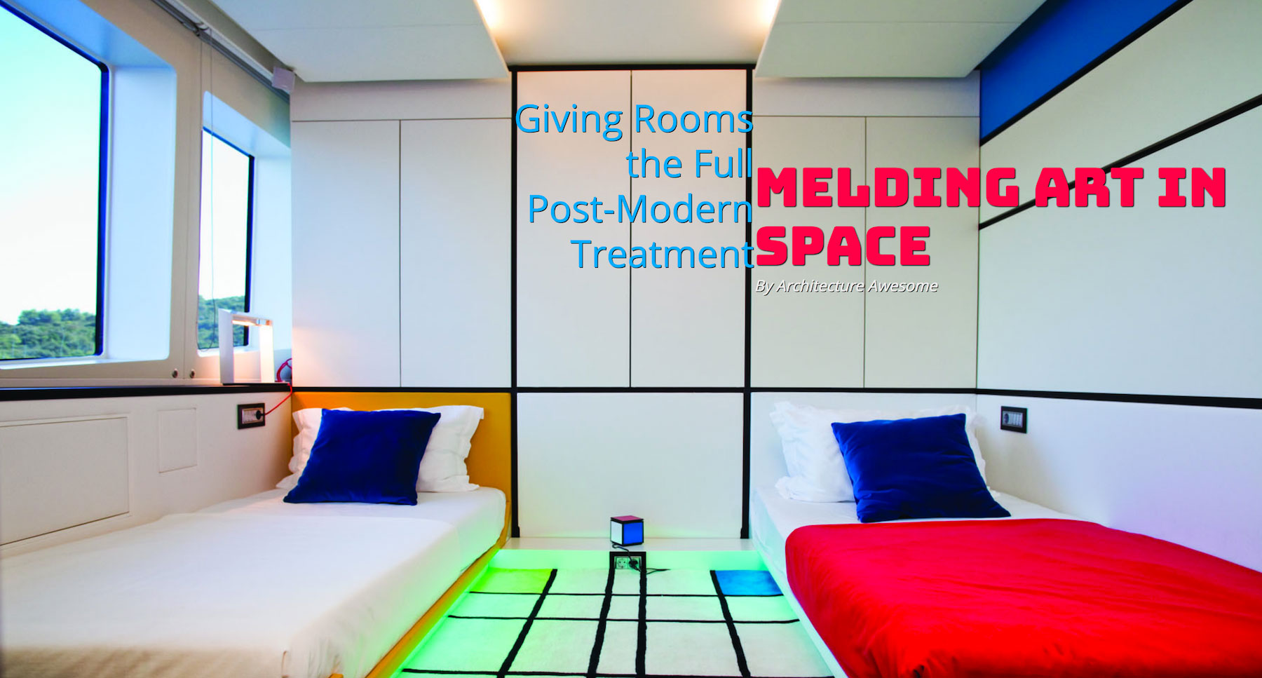
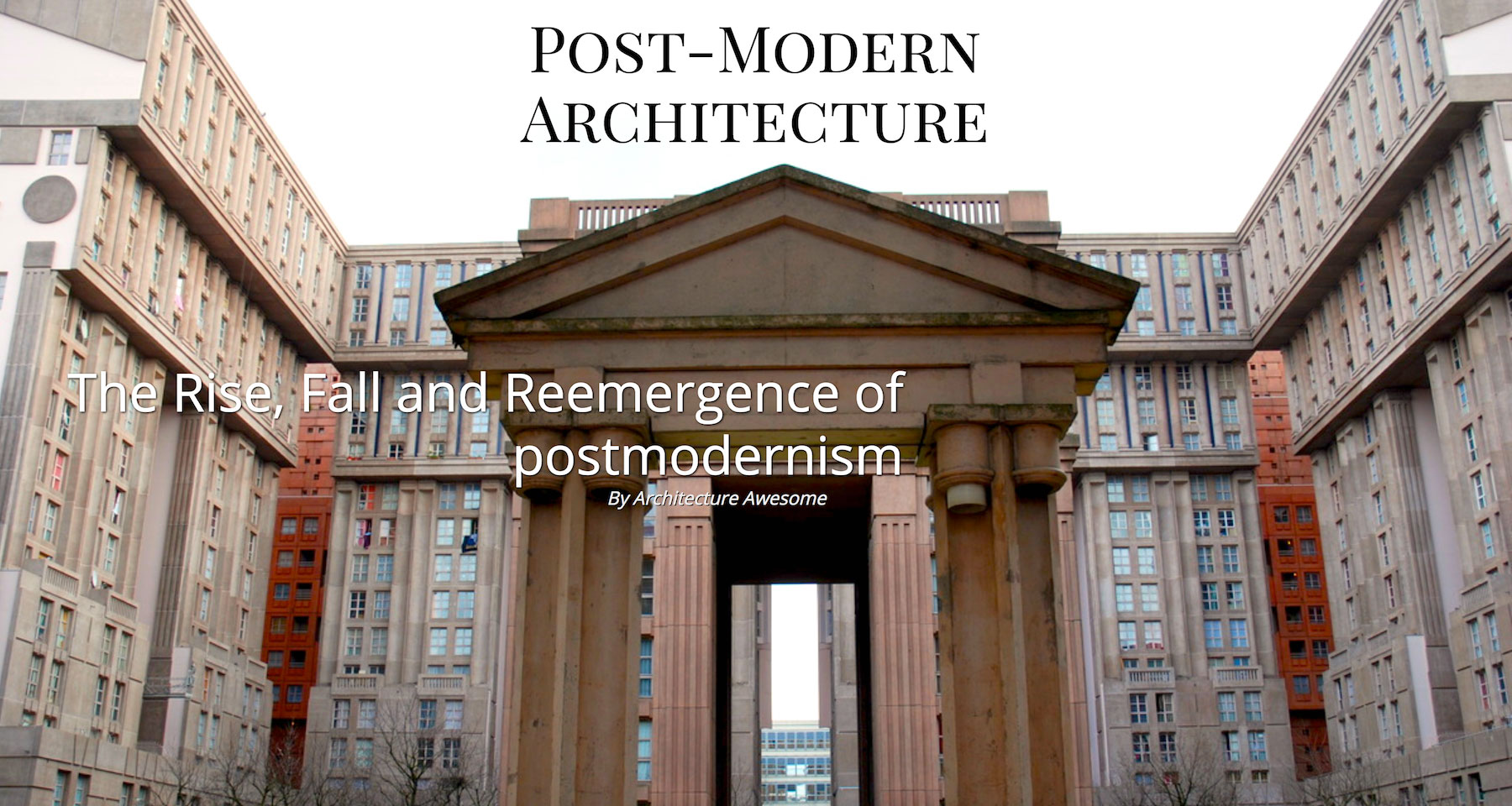
Let’s take a common trend in editorial and marketing design: the “cover page” banner area.
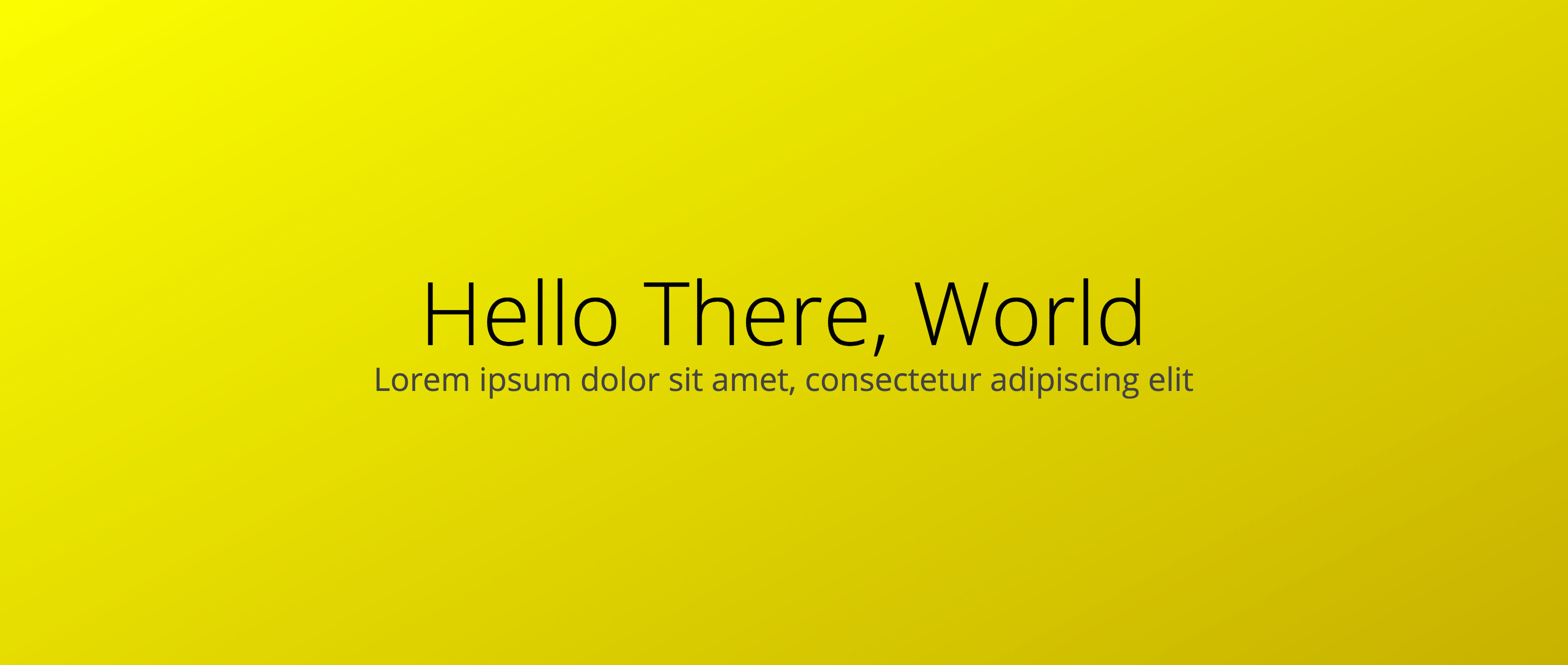
At its simplest, this contains five elements: headline, subhead, byline, photo and photo credit.

This is a bold design pattern. 

With current CSS, it’s also a static design pattern. Each article detail page is laid out the same. The only difference is the background image.

With CSS Grid, we take similar markup on each page and can apply unique layout. This opens the door to art direction for each article. 

Author’s note: For simplification the examples in this article won’t use Feature Queries to ensure support. See my post on Feature Queries for more information on implementing Grid while supporting non-compliant browsers.

Second author’s note: I can envision some great CMS interfaces using this method. Selectable grid areas in a CMS would be amazing and super flexible.

To get to the point of flexibility, we first have to set up our template.  The .headline, .subhead and .secondary are all children under our grid container.

.cover {
    box-sizing: border-box;
    width: 100%;
    height: 100vh; // Always 100% of the viewport's height
    padding: 20px;
    display: grid;
    grid-template-rows: 1fr 1fr 1fr 1fr 1fr; // 5 rows
    grid-template-columns: 1fr 1fr 1fr 1fr 1fr; // 5 columns
    grid-gap: 5px; // 5x5 works well for centering
}

After we write our HTML and set up our grid in CSS, we’re ready to place our content. Here’s an example of the basic “cover” layout:
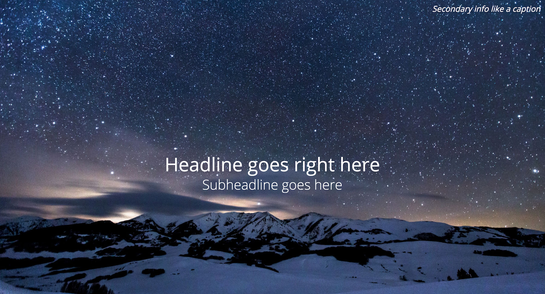
To layout a headline, subhead and caption this simply, Grid may be a bit of overkill. Here’s the code for the image above:

.headline {
    grid-row: 3;
    grid-column: 2 / 5;
    text-align: center;
    align-self: center;
    align-self: end;
}
.subhead {
    grid-row: 4;
    grid-column: 2 / 5;
    text-align: center;
}
.secondary {
    grid-column: 4 / 6;
    text-align: right;
}

Flexbox and absolute positioning would probably have made this easier. This setup also allows us to use the 5x5 grid to create new and powerful combinations based on the same markup.

We can allow our image to dictate the needs of our content. We can also allow the text to speak to our articles theme. In other words, we can art direct on the web (inspiration from Jen Simmons for this language).

Example 1: Skyline

In our first example, we’ve got a beautiful shot of a city skyline blazing in the night.

There would still be impact if we left our headline in its default position, but the headline will compete with the image. What if the text could mirror the shape of a skyscraper? What if it could also fit within the negative space afforded by the walkway?

.headline {
    grid-row: 2 / 6;
    grid-column: 3 / 4;
    text-align: center;
    align-self: end;
}
.secondary {
    grid-row: 5 / 6;
    grid-column: 4 / 6;
    text-align: right;
}

Example 2: Connecting eye line to headline

The images we choose can also help direct a user’s eye where we want it to go.

Not only does this image have a striking subject and color scheme, it also places its subject in an awkward spot for designers.

In this example, we can eschew the tradition of placing our headline at the center or on the left side of the screen. Instead, we work with our image to allow the woman’s eye line to connect the user to our headline in an atypical design.

Again, we can simply change our CSS to change our layout. No need to modify markup.

.headline {
    grid-row: 2 / 5;
    grid-column: 5 / 6;
    text-align: right;
    font-family: 'Stalemate', cursive;
}
.subhead {
    grid-column: 3 / 6;
    grid-row: 6;
    text-align: right;
}
.secondary {
    grid-row: 6;
    grid-column: 1 / 3;
}

More examples

Here are other screenshots for ways of laying out content in a cover page via the same grid and markup we’ve used so far. All of these layouts are available to play with in my CodePen collection. If you use them in CodePen, keep in mind, you’ll need to have a Grid-enabled browser.