
惯性聚合 高效追踪和阅读你感兴趣的博客、新闻、科技资讯
阅读原文 在惯性聚合中打开

推荐订阅源

N
News and Events Feed by Topic
GbyAI
GbyAI
博客园 - Franky
宝玉的分享
宝玉的分享
Blog — PlanetScale
Blog — PlanetScale
Google DeepMind News
Cyber Security Advisories - MS-ISAC
人人都是产品经理
人人都是产品经理
Microsoft Azure Blog
The Register - Security
腾讯CDC
freeCodeCamp Programming Tutorials: Python, JavaScript, Git & More
I
InfoQ
The Cloudflare Blog
OSCHINA 社区最新新闻
OSCHINA 社区最新新闻
Engineering at Meta
Engineering at Meta
MongoDB | Blog
MongoDB | Blog
有赞技术团队
有赞技术团队
CTFtime.org: upcoming CTF events
F
Full Disclosure
cs.AI updates on arXiv.org
Vercel News
Vercel News
博客园 - 【当耐特】
Exploit-DB.com RSS Feed
S
Schneier on Security
cs.CV updates on arXiv.org
Project Zero
Project Zero
量子位
M
MIT News - Artificial intelligence
Stack Overflow Blog
Stack Overflow Blog
C
Cyber Attacks, Cyber Crime and Cyber Security
美团技术团队
Attack and Defense Labs
C
Cybersecurity and Infrastructure Security Agency CISA
T
The Blog of Author Tim Ferriss
cs.CL updates on arXiv.org
T
Troy Hunt's Blog
Google Online Security Blog
罗磊的独立博客
P
Proofpoint News Feed
Schneier on Security
Spread Privacy
Spread Privacy
S
SegmentFault 最新的问题
L
LINUX DO - 最新话题
Simon Willison's Weblog
爱范儿
爱范儿
博客园 - 聂微东
A
About on SuperTechFans
PCI Perspectives
PCI Perspectives
D
Docker

Bryan Robinson's Blog

Does our technology still work for us? Product pricing, dev bad habits, and the role of the pit of success Astro Server Island for latest Bluesky post (heavily cached!) Type-safe environment variables in Astro 5.0 New Website, but really is it? Netlify Durable Cache: Caching for a third-party world Introducing the Hygraph Astro Content Loader Integrating Astro.js Starlight Documentation into a Next.js Project Using Proxies Jamstack is meaningless 😱 Book Release: Eleventy by Example – Learn 11ty with 5 in-depth projects 11ty Second 11ty: Creating Template Filters 11ty Second 11ty: Global Data files (JS and JSON) 11ty second 11ty: The Render Plugin Part 1 Help needed: Netlify Frontend environment variables with Astro.js Quick experiment with the Slinkity 11ty plugin Creating a dynamic color converter with 11ty Serverless Using 11ty JavaScript Data files to mix Markdown and CMS content into one collection How to show your template code in 11ty blog posts New City, New Job, New Content Using Nunjucks Climbing the 11ty Performance leaderboard with Cloudinary, critical CSS and more Three JAMstack movements to watch in 2020 Create a Codepen promo watermark with no additional HTML, CSS or JS 3 underused CSS features to learn for 2020 Use CSS Subgrid to layout full-width content stripes in an article template Adapt client-side JavaScript for use in 11ty (Eleventy) data files CSS Gap creates a bright future for margins in Flex as well as Grid Create your first CSS Custom Properties (Variables) Use CSS Grid to create a self-centering full-width element Creating an 11ty Plugin - SVG Embed Tool Now offering design and code reviews at PeerReviews.dev Routing contact-form emails to different addresses with Netlify, Zapier and SendGrid Create an Eleventy (11ty) theme based on a free HTML template Client work and the JAMstack Grid vs. Flex: A Tale of a "Simple" Promo Space Using Eleventy The Tech Barrier to Entry What Can We Learn from CERN Let Practical CSS Grid - Launching My First Course Build Trust on the Web incorporating User Worries with your User Stories 2019 The Year of Markup-First Development Refactoring CSS into a Sass mixin Starting a new journey with Code Contemporary Dynamic Static Sites with Netlify and iOS Shortcuts Top 3 uses for the ::before and ::after CSS pseudo elements How To: Use CSS Grid to Mix and Match Design Patterns Use CSS ::before and ::after for simple, spicy image overlays Modern CSS: Four Things Every Developer and Designer Should Know About CSS 3 Strategies for Getting Started with CSS Grid CSS Tip: Use rotate() and skew() together to introduce some clean punk rock to your CSS The 5 Stages of Grid Love How To: Use CSS Grid Layout to Make a Simple, Fluid Card Grid Make a More Flexible Cover Screen with CSS Grid Can CSS Grid open up interesting CMS Layout options? Firefox 52 to Introduce New Box-Alignment Values Falling Forward — Rethinking Progressive Enhancement, Graceful Degradation and Developer Morality Start Exploring the Magic of CSS Grid Layout I Converted My Blog to CSS Grid Layout and Regret Nothing Feature Queries are on the Rise CSS Shapes — Let the Text Flow Around You Flexbox -- Let Memorializing Prince and Print vs. The Web I went to Italy and noticed UX fails How to Get Designers to Contribute in Open Source The True Gift of Your Former Code
How To: A CSS-Only Mobile Off Canvas Navigation
2017-08-02 · via Bryan Robinson's Blog

Before we get started, I’d like to state for the record: I like JavaScript. There’s nothing wrong with using the third language of the browser. It’s a great tool for many solutions. But for simple interactions, why complicate matters?

There’s so much HTML and CSS can do on their own for presentation. Take for instance, the mobile nav icon and slide-out navigation. The “Hamburger” nav design pattern. 

There is a lot of writing on the usability side of things. For development, though, we see things happening the same way over and over again. 

Click events and state management being built in JavaScript.

That’s not unusual. These tasks are perfect for JavaScript. If we’re hiding the navigation on mobile, though, should we be adding another dependency to the page to display it?

Why don’t we go old school? The only thing keeping us from a JavaScriptless mobile navigation is state management. How can we trigger a “show” state on tap or click, right? 

The original “stated” element

As it turns out, we have states in HTML that are accessible by CSS. <input type="checkbox"> has a checked and unchecked state. This functionality has been in the browser since HTML 2.

We need to structure our HTML to make the best use of out CSS. 

<nav class="navigation">
    <input type="checkbox" id="nav-toggle">
    <label for="nav-toggle">Menu</label>

    <ul class="nav-list">
        <li><a href="#">Nav Item 1</a></li>
        <li><a href="#">Nav Item 2</a></li>
        <li><a href="#">Nav Item 3</a></li>
    </ul>

</nav>

First, it’s imporant for our label to have a “for” attribute. This will allow it to function in place of the checkbox itself later. Also notice in this example, our <ul> for our navigation is a sibling to our #nav-toggle checkbox. We’re going to use this relationship to select it in CSS.
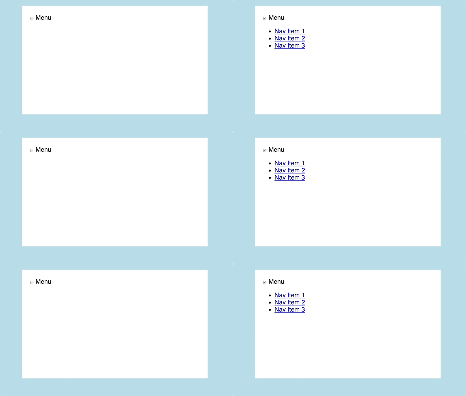
Reading the State in CSS

Gif of checkbox toggling state

Now that we’ve got a stated element on the page, we need to read that in CSS.

Here’s the simplest CSS example to use the state:

We start with our initial state. In the case of a mobile nav it shouldn’t be shown. So .nav-list is display: none. When we select .nav-list, we want to couple it to its stateful element. In this case, we’ll use the CSS sibling selector ~.

To check the state of #nav-toggle, we’ll use the :checked pseudo class.

#nav-toggle ~ .nav-list {
    display: none; // Initial state
}
#nav-toggle:checked ~ .nav-list {
    display: block; // Toggled State using the :checked pseudo-class
}

Now, we have state built into our CSS for our navigation. All we have left is to style elements to look like we expect a mobile navigation to look.

This is where the “for” attribute on the label comes in handy. I’ve never seen a mobile navigation button with a checkbox. So first, we’ll hide the checkbox and do our main styling on the label. This work is usually done on an anchor tag.

This is where preference you can deviate. Make it the mobile nav style you like best. You will need to change the <label>’s display property from “inline” to “block.” Past that, I put my money on the word “Menu” and not a hamburger Icon, with a simple border style.

#nav-toggle ~ label {
    display: block;

    // Styling
    background-color: white;
    padding: 15px 0;
    border: 1px solid grey;
    border-radius: 3px;
    width: 100px;
    text-align: center;
}

”Off-canvas” Navigation

While a show/hide navigation would work, “off-canvas” navigation is still in vogue. So, we’ll take our actual navigation and move it to the right out of the visible viewport.

.nav-list {
    position: fixed; // Absolute positioning would work as well
    right: -100%;
    top: 0;

    height: 100%;
    width: 250px; // In most sites, I’d use a VW instead of a hard pixel value
}

Animating

Gif of nav toggling

I’m not great with animation, but I know animation is key to a good user interface. Instead of having the off-canvas nav magically show up on page, we’ll have it slide in.

To do this, we’ll use CSS transform’s translateX function and a nice bouncy transition. For consistency, you’ll want to use the same movement and transition on the label AND .nav-list.

#nav-toggle ~ .nav-list, #nav-toggle ~ label {
	// Nice bouncy transition
    transition: .5s transform;
    transition-timing-function: cubic-bezier(.38,.52,.37,1.27);
}

#nav-toggle:checked ~ .nav-list, #nav-toggle:checked ~ label {
    transform: translateX(-$flyout);
}

Finished Product

That’s it. You now have a functioning mobile navigation with no JavaScript necessary.

See the Pen Mobile Nav no JS by Bryan Robinson (@brob) on CodePen.

I created the mobile navigation on this site that way. [Una Kravets' "Power of CSS" slides](https://codepen.io/una/full/Wjvdqm) and [youmightnotneedjs.com](http://youmightnotneedjs.com/) inspired me to create this for my site and share the process.