


I spent years teaching CSS layout on this blog. I put everything I know into The Layout Maestro course: 70+ lessons and 150+ interactive examples that teach you how to think CSS layouts, not just memorize syntax.
Building the design of a component in HTML&CSS can be considered something easy or hard, depending on how you like them. Nowadays, there are lots of ready-made frameworks and tools that can speed up the implementation of a UI, but how interesting is that?
In the last few years, CSS has got lots of new features that are really interesting and useful, and this made a frontend developer job even harder, not because CSS is hard, of course. It’s the challenge of having so many options or solutions for implementing a UI. I think some of you might already felt the same.
That being said, I expect that it will be interesting to dig into the mind of a frontend developer while they are working on implementing a component. The most important thing here is the thinking process, not the CSS outcome as sometimes it can get fairly straightforward to understand.
In this article, I will take you into the journey of building a hero section by showing you my thought process, why I picked a certain solution over another, the pros and cons of it, and if there are any potential challenges or issues along the way.
Are you ready? Let’s deep dive into the mind of a frontend developer.

At the first glance, it might seem obvious like: “Are you writing an article to show your thinking for this simple hero component?”. Building such a component and making it handle different content variations needs real thinking and talking out loud or asking myself lots of questions, especially if I’m not the person who designed it.
The first thing that got to my mind is the layout. How it should work in that case?
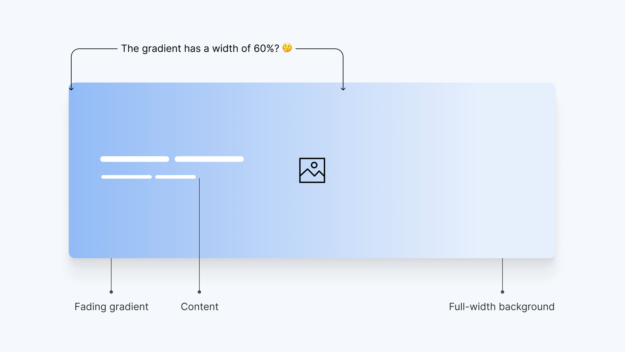
We have the following:
All of the hero items are stacked on top of each other. From a layout perspective, it appears that the content with the gradient is taking almost 60% of the hero’s width. In reality, the gradient element might take the full width, but the gradient itself shouldn’t.
To start things off, I would go and stack the above items on top of each other. I still don’t know how. What should I use? My mind will default to absolute positioning, but now we can do the same with CSS grid.
Here is what I thought about from an HTML perspective:
<section class="hero">
  <div class="wrapper hero__wrapper">
    <div class="hero__content"></div>
    <img src="berries.jpg" alt="" />
  </div>
</section>
The content and image are straightforward here. The tricky thing that got me to think is the gradient. Should this be a gradient background to the content wrapper? Or maybe a separate element (pseudo-element or a <div>)?
For this one, I thought about adding a background to the .hero__content. I got too excited when I thought about it, only to discover that the .wrapper maximum width won’t make it work on larger screens.
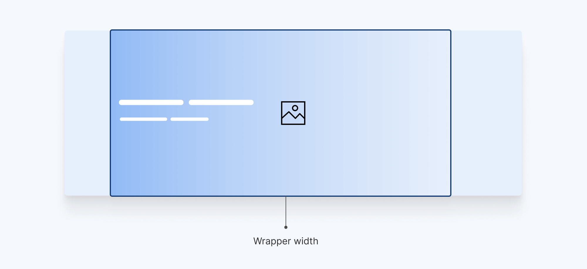
For that one, we need an element to cover the whole hero. Ideally, we used to implement that by making the element positioned absolutely to the .hero section.
.hero {
  position: relative;
}

.hero:after {
  content: "";
  position: absolute;
  inset: 0;
  background: linear-gradient(to right, #000 35%, transparent) left center/100%
    no-repeat;
}

/* We need that in order to position the content on top of the gradient. */
.hero__content {
  position: relative;
  z-index: 1;
}
That works, but later on, I will introduce a different solution using CSS grid stacking instead of position: absolute.
How should that look on mobile? Should the gradient fade from the bottom to the top? Or maybe we need a solid color instead? What if this component needs to have different variations on mobile based on where it’s being used?
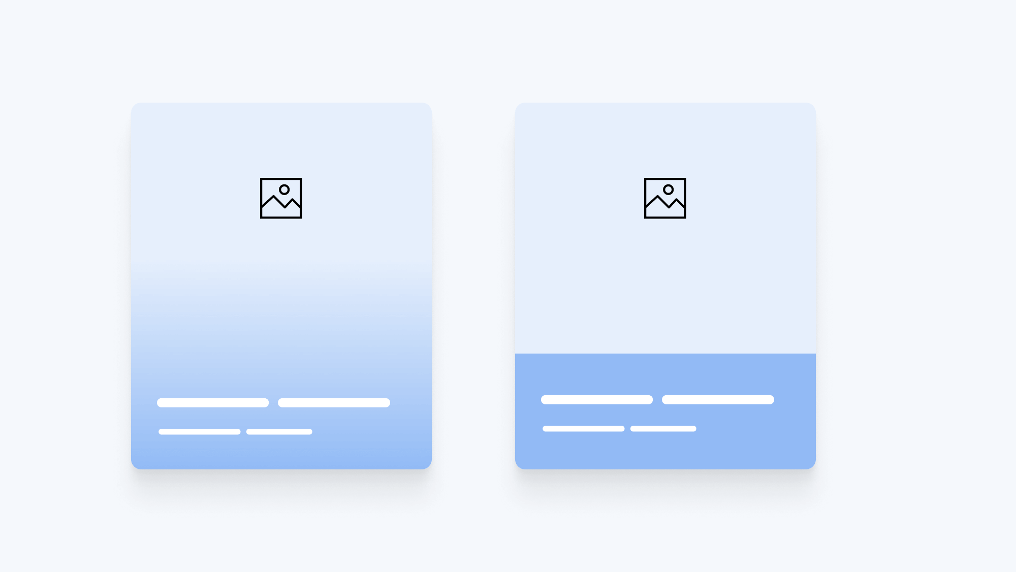
Accounting for both use-cases in CSS can save us a lot of time while we’re trying to build a new variation in the future. Thankfully, the CSS above can help us in making both solutions work.
Let’s agree that the hero section must not have a fixed height in any case. Content is dynamic and it can change at any time.
I like to use min-width with a mix of a fixed value and a dynamic one.
.hero {
  min-height: calc(300px + 15vw);
}
That way, I don’t have to use a media query to change the height on smaller screens.
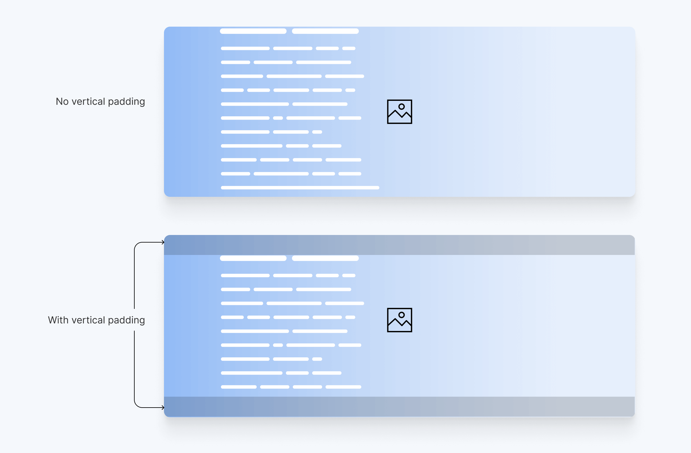
Oh, and I need to add vertical padding. That is very important in case we have very long content, it won’t overlap with the edges.
Sometimes, a frontend developer might overlook such detail because the problem isn’t visible yet, but it’s really important to remind ourselves of those edge cases along the way.
.hero {
  min-height: calc(300px + 15vw);
  padding-top: 1rem;
  padding-bottom: 1rem;
}
Using CSS grid for stacking the hero items on each other requires a markup change which is moving the image up and making it a direct child of the .hero.
<section class="hero">
  <img class="hero__image" src="berries.jpg" alt="" />
  <div class="wrapper hero__wrapper">
    <div class="hero__content"></div>
  </div>
</section>
With that, we can do the following:
.hero {
  display: grid;
  min-height: calc(300px + 15vw);
}

.hero__image,
.hero__content,
.hero:after {
  grid-area: 1 / -1;
}
This will position both the hero image, content, and gradient on the same grid area, resulting in stacking them on top of each other.
One downside to this is not having control of the hero height in case we add a portrait image. We can add a max-height to the <img> element, but there will be a point where the hero section height is larger than the image.

We can fix that by replacing min-height with height, but come on, Ahmad! This is against your perfection standards.
.hero {
  display: grid;
  height: calc(300px + 15vw);
}

/* other styles */
That can work, but if the content grows past the fixed height, you’ll be in trouble. Anyway, I wrote an article titled Less absolute position with modern CSS where you can find more details about this approach.
The content is centered vertically, and left-aligned. My mind has gotten so used to flexbox which is very well supported now, so no need to use positioning at all.
When using flexbox, the downside is too much nesting. We need to have three levels of flexbox in order to reach the content. Here it is:
.hero {
  display: flex;
  flex-direction: column;
}

.hero__wrapper {
  flex: 1;
  display: flex;
  flex-direction: column;
}

.hero__content {
  flex: 1;
  display: flex;
  flex-direction: column;
  justify-content: center;
}
Can we do better? Yes! With CSS grid, we need less direction and centering properties.
.hero {
  display: grid;
  /* other styles */
}

.hero__wrapper {
  display: grid;
  place-items: center start;
  /* other styles */
}
That’s much better, right? CSS grid for the win.
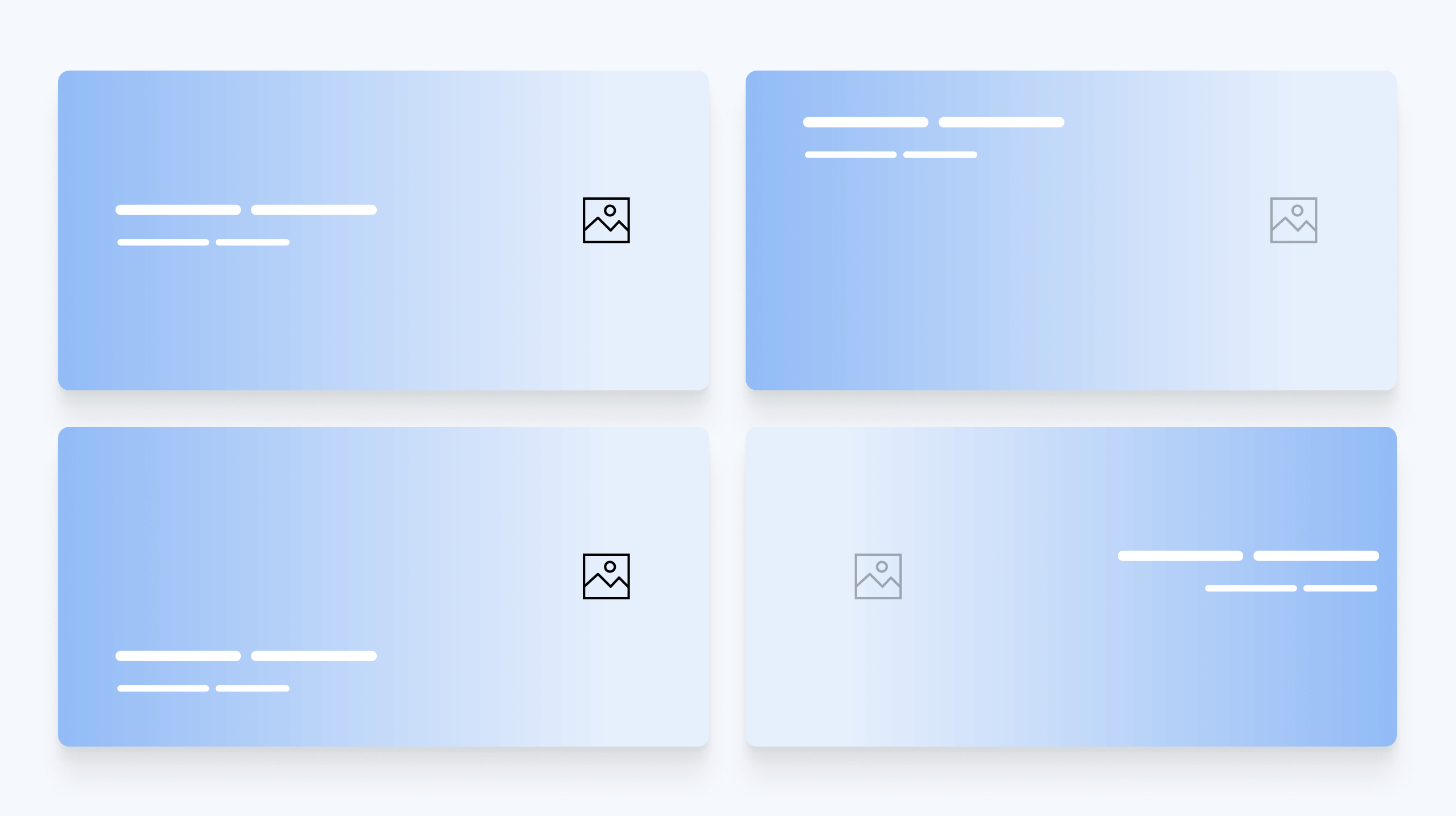
While enjoying the moment, I thought for a bit about the possibility of changing the position of the content.
Oftentimes, the design team or the product people got creative and asked things like:
Hey, I know that this was designed like that. But can we change the positioning to the top center?
Thankfully, using CSS grid made this easy. We can change the position as we want without any issues.
I tend to think about writing mobile-specific styles after I’m done with the basis for the desktop CSS. That’s how I approach such a thing, but it’s up to you of course.
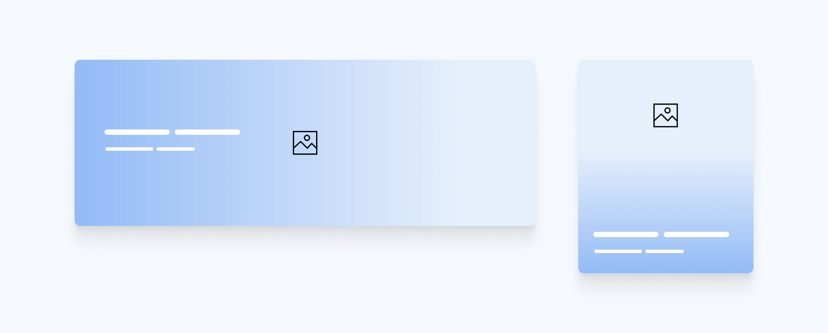
On mobile, the gradient should start from bottom to top, and the content will be aligned to the very end. We can use a CSS variables to save the direction so we can change it instead of overriding the whole background property.
.hero {
  --gradient-dir: to top;
}

.hero:after {
  background: linear-gradient(var(--gradient-dir), ...);
}

@media (min-width: 800px) {
  .hero {
    --gradient-dir: to right;
  }
}
Then, we need to position the content to be at the end of the wrapper. Since I’m using place-content, that will be straightforward.
.hero__wrapper {
  place-content: end start;
}

@media (min-width: 800px) {
  .hero__wrapper {
    place-content: center start;
  }
}
Now that we’ve solved the main problems, it’s time to focus on enhancing the gradient. One thing I don’t like about the default gradients in CSS is that they feel too hard on the eye. There is a CSSWG proposal about that with no support in any browser yet.
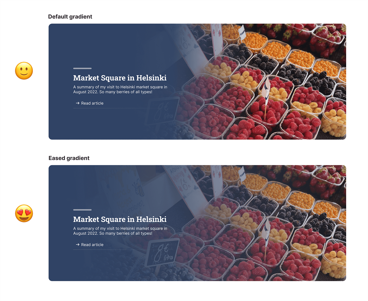
Thankfully, Andreas Larsen created a handy tool that generates an eased gradient by adding too many color stops. There is also a PostCSS plugin available.
The default gradient is the following:
.hero:after {
  background: linear-gradient(to right, #000 35%, transparent) left center/100%
    no-repeat;
}
With Andreas’s tool, all we need to do is to enter the start and end color stops, then control the cubic-bezier as we see fit.
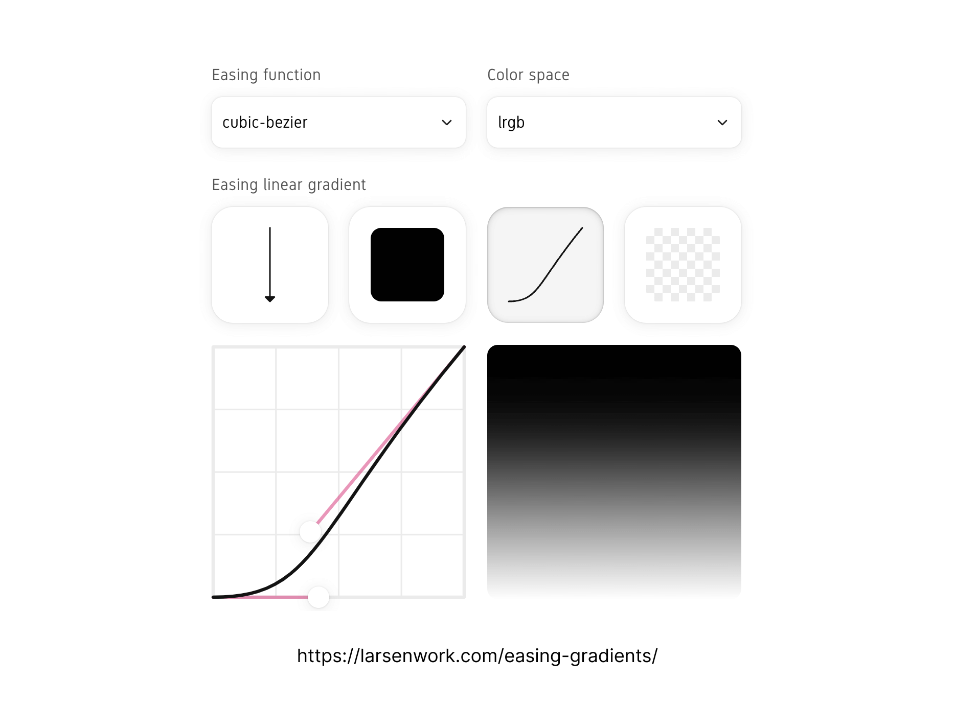
Here is what that gradient will look like in the future.
/* This is a proposal. Doesn't work in any browser. */
.hero:after {
  linear-gradient(
    to bottom,
    hsla(330, 0%, 0%, 1),
    cubic-bezier(0.42, 0, 0.39, 0.26),
    hsla(210, 0%, 0%, 0)
  );
};
For now, the tool generates an output that contains many colors stops as you see below. This is totally fine and easy to understand.
.hero:after {
  background: linear-gradient(
      to right,
      hsl(0, 0%, 0%) 0%,
      hsla(0, 0%, 0%, 0.995) 8.2%,
      hsla(0, 0%, 0%, 0.981) 16%,
      hsla(0, 0%, 0%, 0.958) 23.4%,
      hsla(0, 0%, 0%, 0.926) 30.4%,
      hsla(0, 0%, 0%, 0.885) 37.3%,
      hsla(0, 0%, 0%, 0.835) 43.8%,
      hsla(0, 0%, 0%, 0.776) 50.2%,
      hsla(0, 0%, 0%, 0.709) 56.5%,
      hsla(0, 0%, 0%, 0.633) 62.6%,
      hsla(0, 0%, 0%, 0.548) 68.7%,
      hsla(0, 0%, 0%, 0.455) 74.8%,
      hsla(0, 0%, 0%, 0.354) 81%,
      hsla(0, 0%, 0%, 0.244) 87.2%,
      hsla(0, 0%, 0%, 0.126) 93.5%,
      hsla(0, 0%, 0%, 0) 100%
    ) left center/100% no-repeat;
}
And finally, a little touch would be to reduce the opacity of the gradient by 0.1. It would make it more realistic.
Now that we have CSS clamp() support, I prefer to use it over CSS media queries for fluid font sizing.
.hero__headline {
  font-size: clamp(1.35rem, 6vw, 2.15rem);
}

.hero p {
  font-size: clamp(1rem, 5vw, 1.25rem);
}
To make the hero work as expected on right to left documents (e.g: Arabic), the gradient should be flipped too. While thinking about this, I tweeted about an idea to bring CSS logical properties to gradients.
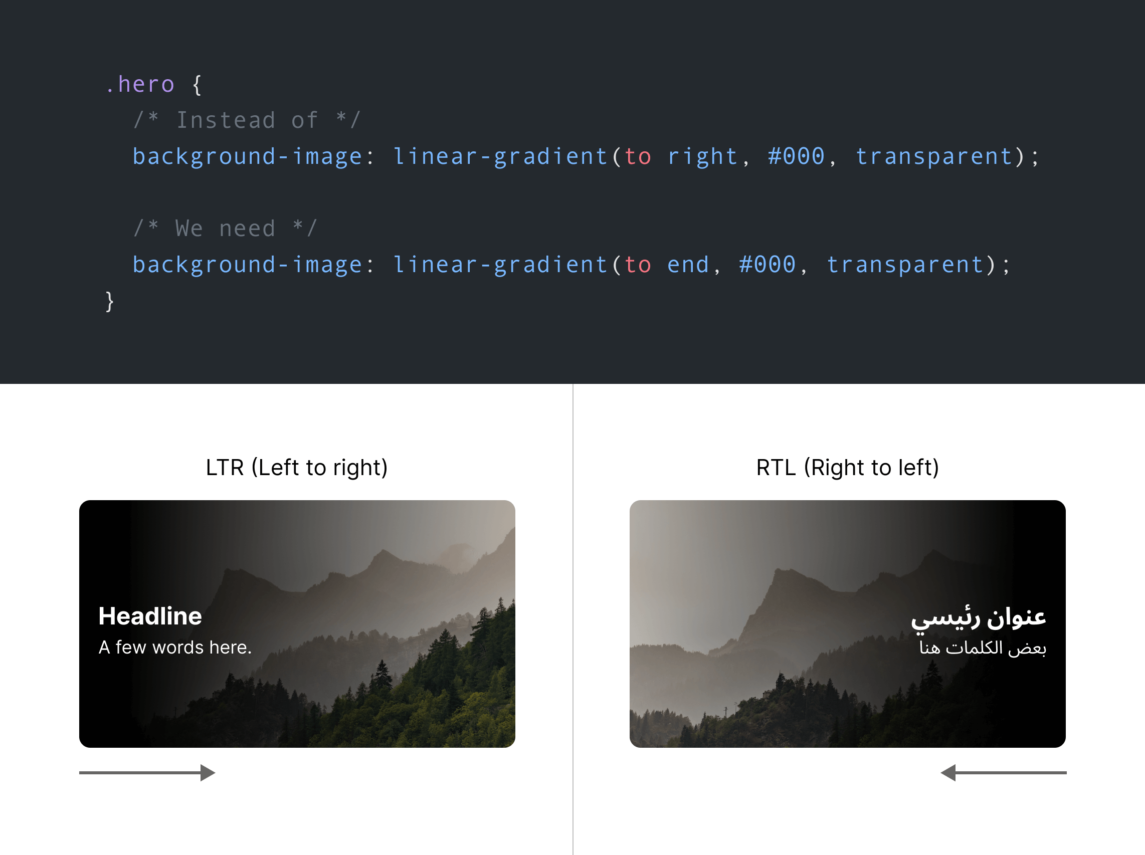
.hero {
  background: linear-gradient(to inline-end, #000, transparent);
}
That way, the inline-end will be to right for LTR and to left for RTL.
Currently, we can use CSS variables and change them based on the root document direction.
.hero {
  --gradient-dir: to top;
}

.hero:after {
  background: linear-gradient(var(--gradient-dir), ...);
}

@media (min-width: 800px) {
  .hero {
    --gradient-dir: to right;
  }

  html[dir="rtl"] {
    .hero {
      --gradient-dir: to left;
    }
  }
}
Since the gradient isn’t covering the whole hero section, the text must stay within the gradient boundaries so it can be easy to read and accessible.
To do that, we can set max-width and use the CSS ch unit as it’s a perfect fit for this use-case.
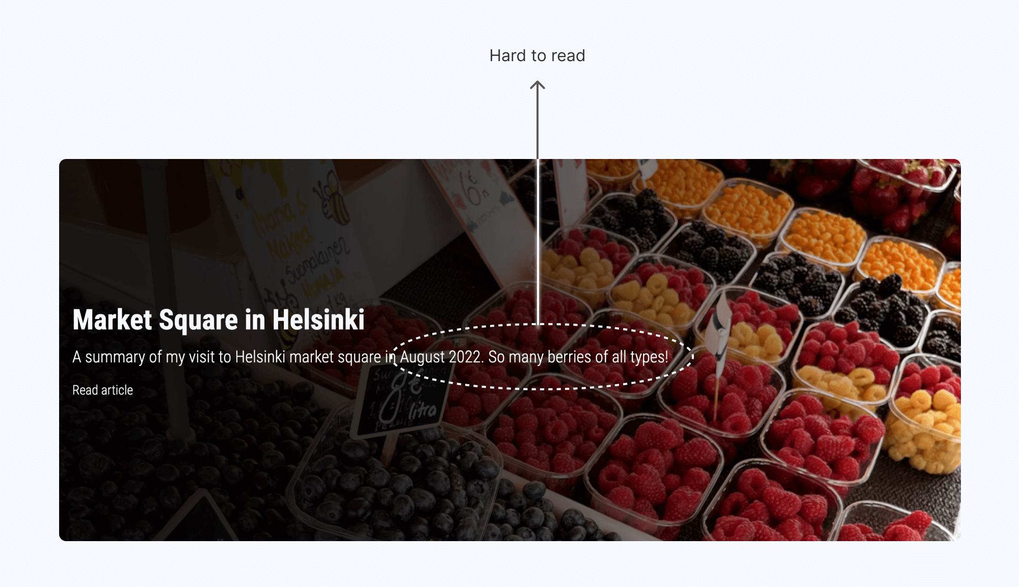
To fix that, I need to limit the width of the .hero__content element.
.hero__content {
  max-width: 65ch;
}
Much better, right?
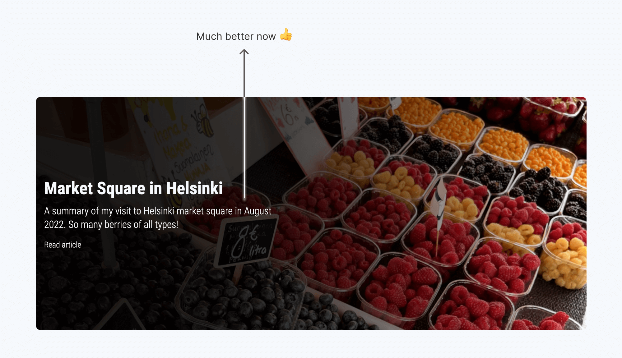
When dealing with text over an image, I usually follow the approach in this defensive CSS approach by adding a background-color to the <img>. Since there is a gradient, this isn’t really needed.
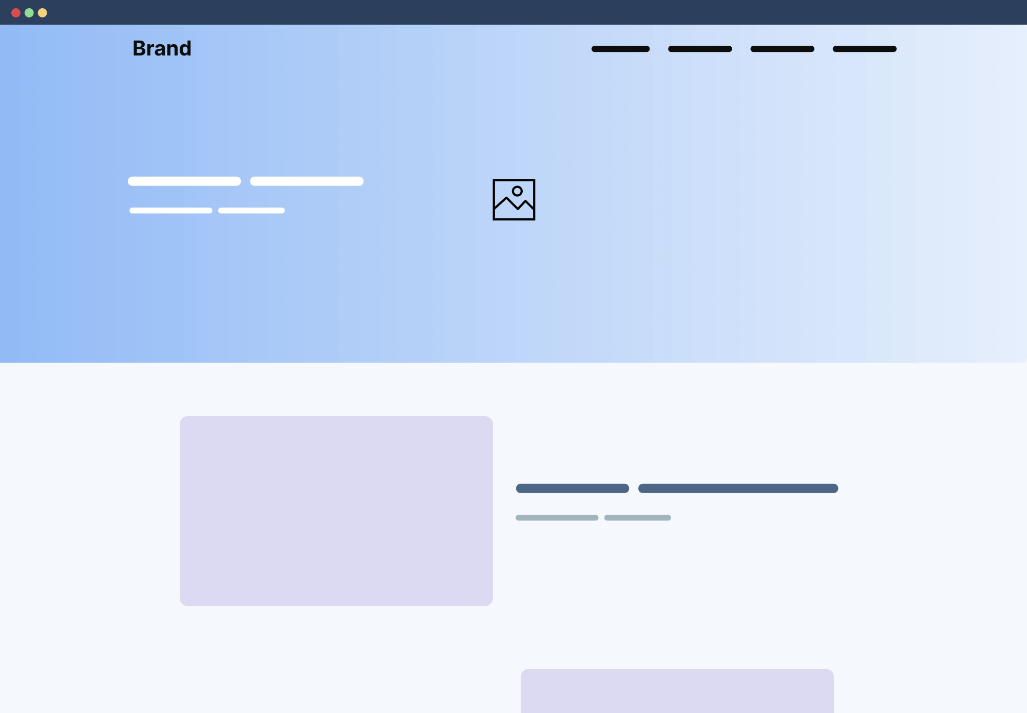
In some cases, we might have a header that is positioned on the top of the hero section. If so, it’s necessary to increase the padding-top of the hero with an amount that is equal to the header/navigation height.

What we can do is simply increase the padding. It will give more breathing space to the hero.
.hero--with-nav {
  padding-top: 3rem;
}
If CSS :has got more support, I might do that instead.
html:has(.site-header--fixed) .hero {
  padding-top: 3rem;
}
I hope that you enjoyed this exploration of how I thought about building a hero section. The process might seem too long, but it usually happens in a much shorter time since I think and decides quickly while building a real thing for a client.
Let me know if you have any comments or feedback on Twitter (@shadeed9), I would love to hear from you.
此内容由惯性聚合(RSS阅读器)自动聚合整理,仅供阅读参考。 原文来自 — 版权归原作者所有。