


I spent years teaching CSS layout on this blog. I put everything I know into The Layout Maestro course: 70+ lessons and 150+ interactive examples that teach you how to think CSS layouts, not just memorize syntax.
One of the decisions that a front-end developer needs to make while building a website is the technique to include an image. It could be an HTML <img>, or an image via CSS backgrounds, or maybe SVG <image>. Choosing the correct technique is important and can play a huge role in performance and accessibility.
In this article, we’ll learn the various ways of including an image in addition to mentioning the advantages and disadvantages of each one, and the context of when and why to use each.
<img> element
<image>
<img> elementThe image element in its simplest cases must contain an src attribute as it’s required.
<img src="cool.jpg" alt="" />
On page load, they will be some layouts shifts while the page’s images are loading. To avoid that, we can set the width an height attributes for it:
<img src="cool.jpg" width="200" height="100" alt="" />
While this might look a bit old school for some, but it’s useful. Let’s visualize this to understand the concept clearly:
Did you notice how the image on the right has its space reserved even if it’s still not loaded yet? That’s because width and height are set. It makes a noticeable difference!
An image can be hidden with CSS. However, it will still be loaded in the page. For that reason, please be careful when doing that. If an image should be hidden, then probably it’s for decorative purposes.
img {
  display: none;
}
Again, the above won’t prevent the browser from loading the image, even if it’s visually hidden. The reason is that an <img> is considered a replaced element, so we don’t have control over the content that it loads.
HTML images should be accessible by setting the alt attribute to a meaningful description. This can be very helpful for screen readers users.
However, if an alt description is not needed, please don’t remove it and if you do, the image src will be read out! This is very bad for accessibility.
Not only that, but if the image didn’t load for some reason and it has a clear alt, it will be shown as a fallback. Let’s talk visually since there are interesting things I want to make sure that you know about.
We have the following images:
<img
  class="food-thumb"
  width="300"
  height="200"
  src="cheescake.jpg"
/>

<img
  class="food-thumb"
  width="300"
  height="200"
  src="cheescake.jpg"
  alt=""
/>
The src is invalid and didn’t load. The first one don’t have an alt attribute while the second one has an empty alt. Can you expect the visual result of this?
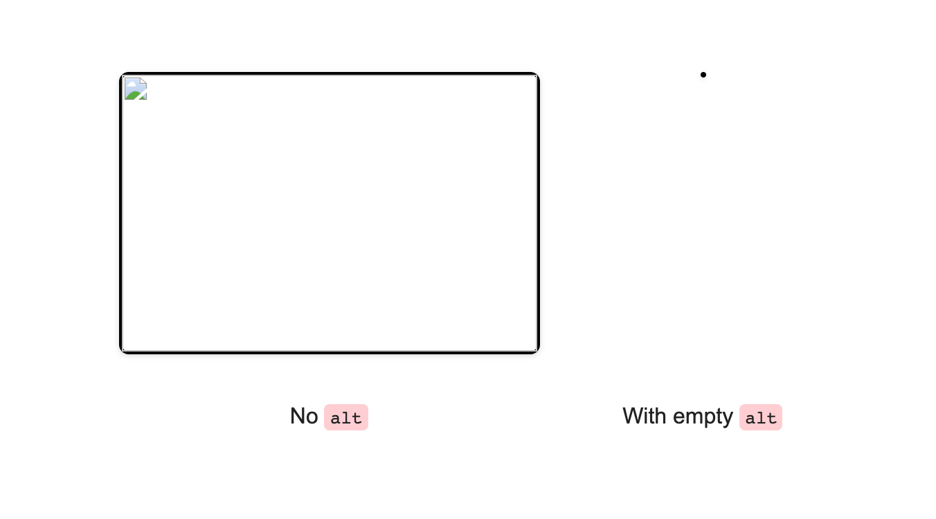
The image without an alt still have its space reserved, which is confusing, and bad for accessibility. While the other one collapsed to fit the content of its empty alt attribute, that caused it to appear as a tiny dot due to the border it has.
However, when there is an alt attribute value, it will look like this:
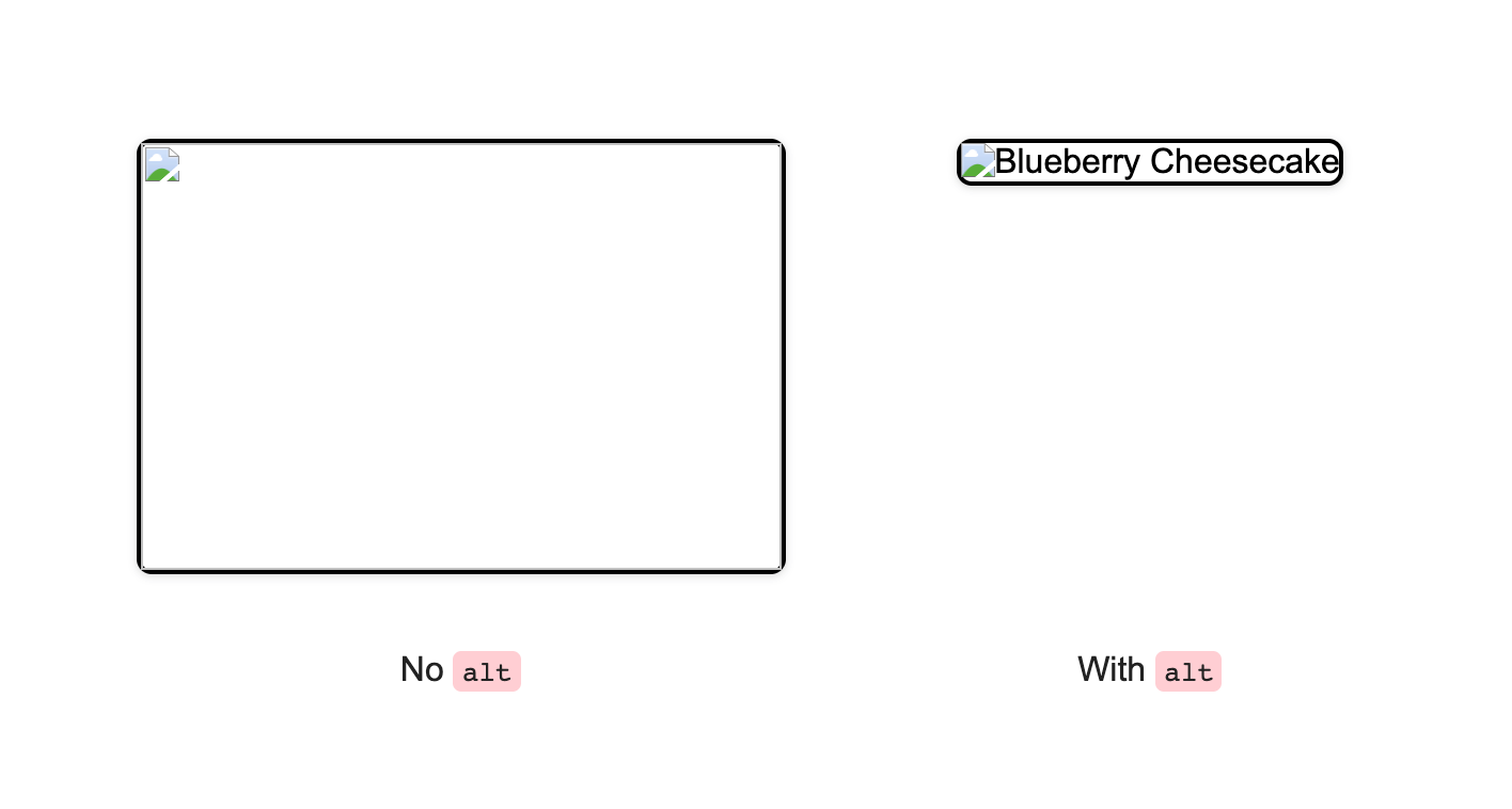
Isn’t that a good feedback? Also, when the image source fail, you can add pseudo-element to them.
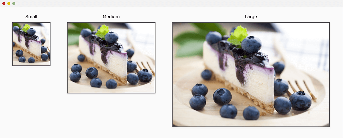
The good thing about <img> is that it can be extended to have multiple versions of a photo for specific viewport sizes. This can be used for article images, for example.
We have two different ways of having a responsive set of images:
srcset Attribute<img
src="small.jpg"
srcset="medium.jpg 500w, large.jpg 800w"
alt=""
/>
This is a simple one. For me, I don’t see that using srcset is a perfect solution to have multiple image sizes that appear based on the screen width. The choice is only for the browser to pick the appropriate image, and we don’t have control over that.
<picture>
  <source srcset="large.jpg" media="(min-width: 800px)" />
  <source srcset="medium.jpg" media="(min-width: 500px)" />
  <img src="small.jpg" />
</picture>
Another option is using the <picture> element. I prefer this one as it’s easier and more predictable.
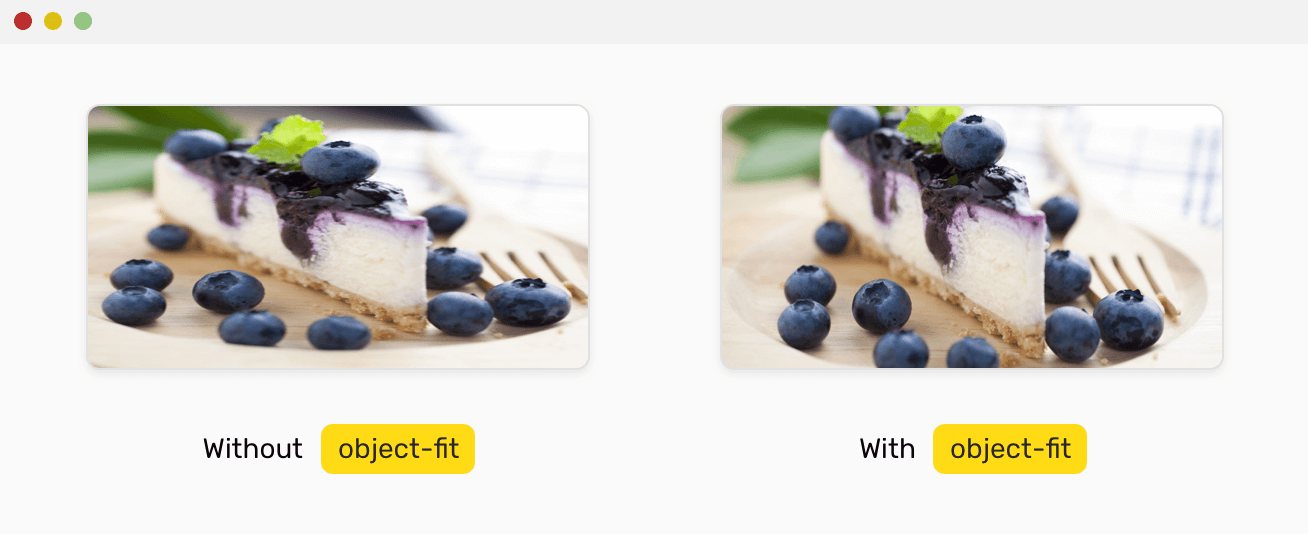
The one great thing we can use with an <img> is the object-fit and object-position properties. They give us control over how an <img>s content can be resized and positioned, just like CSS background images.
The possible values for object-fit are: fill, contain, cover, none, scale-down
It can be used like that:
img {
  object-fit: cover;
  object-position: 50% 50%;
}
Now that we took an introduction about the <img> element, it’s time to move forward and explore the second technique.
When using a CSS background to show an image, it needs an element with content or a specific width or height. Usually, the main use for a background image should be for decorative purposes.
Simply, we need an element.
<div class="element">Some content</div>
.element {
  background: url("cool.jpg");
}
The good thing with CSS background images is having multiple backgrounds that can be controlled easily with CSS. Consider the following example:
.element {
  background: url("cool-1.jpg"), url("cool-2.jpg");
}
We can hide and show an image on a specific viewport, without getting it downloaded. If the image is not set with CSS, it won’t be downloaded. This is an added benefit over using an <img>.
@media (min-width: 700px) {
  .element {
    background: url("cool-1.jpg");
  }
}
In the example above, we have a background image that is only shown when the viewport width is greater than 700px.
When used incorrectly, a background image can be bad for accessibility. For example, using it for an article thumb which is vital for the article.
You might find that funny, but normal people know that if you want to save an image, you simply left-click and then choose to save. This isn’t the case with CSS background images.
It’s not possible to download an image that is being added with CSS until you inspect the element, and then open the link inside the url in the DevTools.
It’s possible to use pseudo-elements along with CSS background images, for example to show an overlay at the top of an image. With an <img>, this is not possible until we add a separate element for the overlay.
<image>An SVG is considered as an image and its greatest power is in scaling without affecting the quality. Adding on that, with SVG, we can embed a JPG, PNG, or SVG image. See the HTML below:
<svg width="200" height="200">
  <image
    href="cheesecake.jpg"
    height="100%"
    width="100%"
    preserveAspectRatio="xMidYMid slice"
  />
</svg>
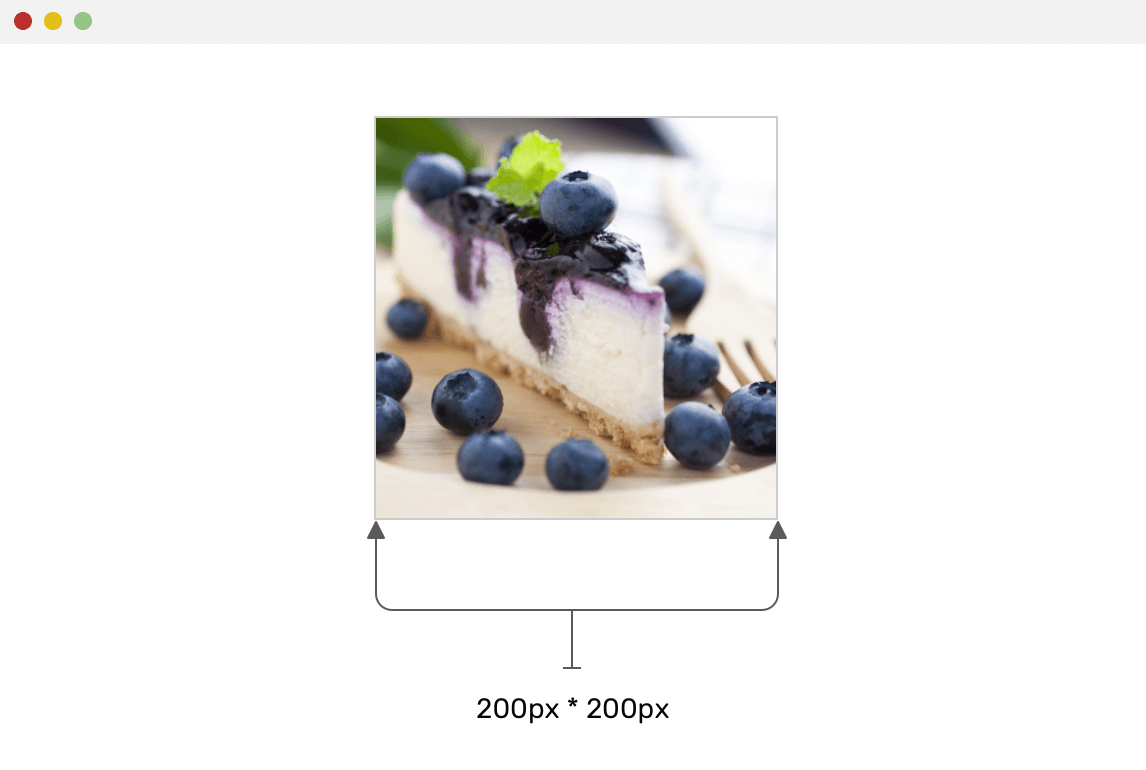
Did you notice the preserveAspectRatio? This is the thing that keeps the image taking the full width and height of the SVG, without getting stretched or compressed.
When the <image> width is bigger, it will fill its parent (The SVG) width without stretching.
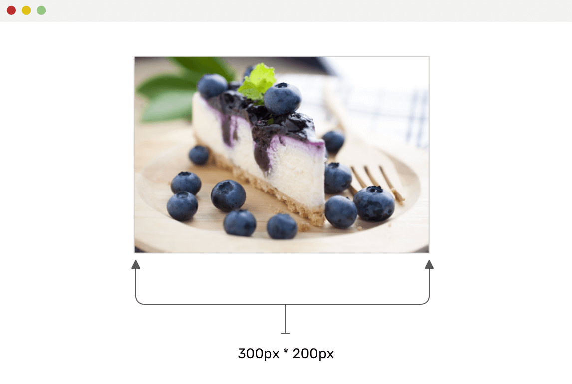
This very similar to object-fit: cover or background-size: cover in CSS.
When it comes to accessibility with SVG, this reminds me with the <title> element. For example, we can add it like the below:
<svg width="200" height="200">
  <title>A photo of blueberry Cheescake</title>
  <image
    href="cheesecake.jpg"
    height="100%"
    width="100%"
    preserveAspectRatio="xMidYMid slice"
  />
</svg>
Even more, we can use the <desc> element:
<svg width="200" height="200">
  <title>A photo of blueberry Cheescake</title>
  <desc>A meaningful description about the image</desc>
  <image
    href="cheesecake.jpg"
    height="100%"
    width="100%"
    preserveAspectRatio="xMidYMid slice"
  />
</svg>
It’s not possible to download an image embedded in an SVG until you inspect the element and copy the URL of the image. However, this might be a good thing in case we want to prevent the users from downloading a specific image. At least, it will reduce the chances of downloading the image easily.
When building a hero section, we sometimes need an image that will be underneath the title and other content. See the figure below:

Notice that there is an image. How would you approach building this? Well, let me add some requirements before:
Before starting with solutions, let’s ask ourselves about the nature of this background. Here are some starter questions:
By using multiple CSS backgrounds, we can have one for the overlay, and the other for the actual image. See the CSS below:
.hero {
  background-image: linear-gradient(
      rgba(0, 0, 0, 0.4),
      rgba(0, 0, 0, 0.4)
    ), url("landscape.jpg");
  background-repeat: no-repeat;
  background-size: 100%, cover;
}
While this solution works, it’s possible to change the background-image dynamically with JavaScript. See the below:
<section
  class="hero"
  style="background: linear-gradient(rgba(0, 0, 0, 0.5), rgba(0, 0, 0, 0.5)), url('landscape.jpg');"
>
  <!-- Hero content -->
</section>
I added the background as an inline CSS. While this works, it looks ugly, and it’s not practical.
Maybe we can use CSS variables? Let’s explore that.
<section class="hero" style="--bg-url: url('landscape.jpg')">
  <!-- Hero content -->
</section>
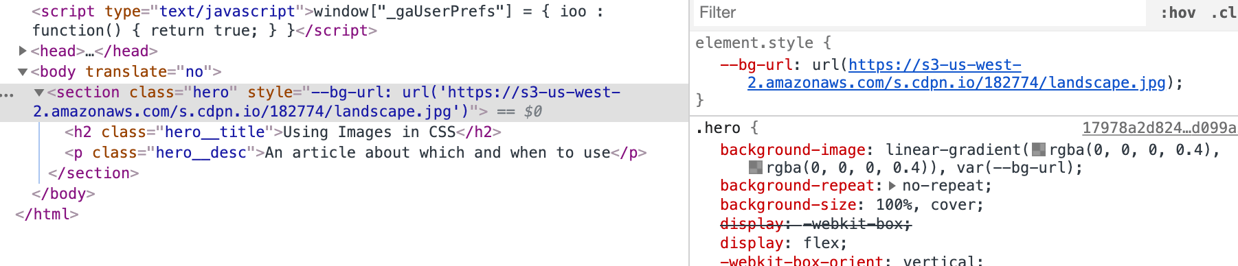
Now, we can easily update the --bg-url variable and this will dynamically change the background. This is a million times better than the inline thingy.
For this solution we will use an HTML image. See the below:
<section class="hero">
  <h2 class="hero__title">Using Images in CSS</h2>
  <p class="hero__desc">An article about which and when to use</p>
  <img src="landscape.jpg" alt="" />
</section>
In CSS, we need to absolutely position the image below the content, and also we will need a pseudo-element to act as an overlay.
.hero {
  position: relative;
}

.hero img {
  position: absolute;
  left: 0;
  top: 0;
  z-index: -1;
  width: 100%;
  height: 100%;
  object-fit: cover;
}

.hero:after {
  content: "";
  position: absolute;
  left: 0;
  top: 0;
  z-index: -1;
  width: 100%;
  height: 100%;
  background: rgba(0, 0, 0, 0.4);
}
The good thing about this solution is that it’s easy to change the src attribute of the image. Also, it will be more useful if the image is important to have.
Also, what I like about using an HTML <img> is the ability to add a fallback in case the image didn’t loaded. This fallback may at least keep the content readable.
.hero img {
  /* Other styles */
  background: #2962ff;
}

The good thing is that background will work only in case the source failed. Isn’t that cool?
A logo is an important thing to have as it differentiates a website from another. To embed a logo, we have a couple of options:
<img>: png, jpg, or svgLet’s learn what technique to use and how to choose the right one.
When a logo has a lot of details or shapes, it might not be that beneficial to use it as inline SVG. I recommend using an <img> and the image type can be png, jpg, or svg.

<a href="#"><img src="logo.svg" alt="Nature Food" /></a>

We have a simple logo which consists of a shape and text. On hover, the shape and text need to change in color. How to do that? The best solution for me is using an inline SVG.
<a href="#">
  <svg
    class="logo"
    width="115"
    height="47"
    xmlns="http://www.w3.org/2000/svg"
  >
    <g transform="translate(-5 -5)" fill="none" fill-rule="evenodd">
      <rect
        fill="#D8D8D8"
        transform="rotate(45 28.5 28.5)"
        x="9"
        y="9"
        width="39"
        height="39"
        rx="11"
      />
      <text
        font-family="Rubik-Medium, Rubik"
        font-size="25"
        font-weight="400"
        fill="#6F6F6F"
      >
        <tspan x="63.923" y="36.923">Rect</tspan>
      </text>
    </g>
  </svg>
</a>
.logo rect,
.logo text {
  transition: 0.3s ease-out;
}

.logo:hover rect,
.logo:hover text {
  fill: #4a7def;
}
This reminds me of Smashing Magazine’s logo. I like that it changes from a small icon to a full logo. See the mockup below:

The perfect solution for this is the <picture> element, where can add two versions of the logo. See below:
<a class="logo" href="/">
  <picture>
    <source media="(min-width: 1350px)" srcset="sm-logo--full.svg" />
    <img src="sm-logo.svg" alt="Smashing Magazine"
  /></picture>
</a>
And in CSS, we need to change the width on viewports equal or greater than 1350px.
.logo {
  display: inline-block;
  width: 45px;
}

@media (min-width: 1350px) {
  .logo {
    width: 180px;
  }
}
Simple and straightforward solution.

When there is a logo that has a gradient, the process of exporting it from a design application like Illustrator or Sketch might not be perfect and sometimes it breaks.
With SVG, we can add a gradient to a logo easily. I added a <linearGradient> and applied it as a fill to the text.
<svg
  class="logo"
  width="115"
  height="47"
  xmlns="http://www.w3.org/2000/svg"
>
  <defs>
    <linearGradient id="gradient" x1="0%" y1="100%" x2="0%" y2="0%">
      <stop offset="0%" stop-color="#4a7def"></stop>
      <stop offset="50%" stop-color="#ab4787"></stop>
    </linearGradient>
  </defs>
  <g transform="translate(-5 -5)" fill="none" fill-rule="evenodd">
    <rect
      fill="#AB4787"
      transform="rotate(45 28.5 28.5)"
      x="9"
      y="9"
      width="39"
      height="39"
      rx="11"
    />
    <text
      font-family="Rubik-Medium, Rubik"
      font-size="30"
      font-weight="400"
      fill="url(#gradient)"
    >
      <tspan x="63.923" y="36.923">Rect</tspan>
    </text>
  </g>
</svg>
For a user avatar, they have a lot of shapes but the most common are rectangular or rounded ones. In this use-case, I’m interested in explaining an important tip that you might find useful.
First, let’s see the below mockup. Notice that we have a perfect avatars and they are 100% clear.

However, when the user upload a semi-white avatar or a very light one, this design will fail.

Notice in the mockup above, it’s not clear that there is a circle in there until you focus really well. That’s an issue. To fix that, we should add a border inside the avatar, that will be as a fallback in case the image is too light.

We have a couple of options to do that:
<img> element<img> with a <div><div> with CSS background<image>Which one of them is the best? Let’s explore.
<img>The first thing you might thought about is adding a border, right? Let’s explore that (Sorry, you might see my face a lot in the below sections).
.avatar {
  border: 2px solid #f2f2f2;
}

Our goal is to have an inner border that blends with the image. Having solid border is not practical.
<img> with a <div>The issue now is that to add an inner border, we can’t use an inset box-shadow as it won’t work on an image. The solution is to wrap the avatar in a <div>, and to add an element that is dedicated for the inner border.
<div class="avatar-wrapper">
  <img
    class="avatar"
    src="shadeed2.jpg"
    alt="A photo of Ahmad Shadeed"
  />
  <div class="avatar-border"></div>
</div>
.avatar-wrapper {
  position: relative;
  width: 150px;
  height: 150px;
}

.avatar-border {
  position: absolute;
  left: 0;
  top: 0;
  width: 100%;
  height: 100%;
  border-radius: 50%;
  border: 2px solid rgba(0, 0, 0, 0.1);
}
By having a border on the <div> with a 10% black, we can ensure that the border will blend with a dark image, and will only be visible in case the image is light. See the mockup below:

<div> with CSS backgroundIf I will be using a <div> to show an avatar, it probably mean that the image is decorative. I remembered a use case for that, which is a random avatars scattered in the page.
We can have something like this:
<div class="avatar" style="--img-url: url(shadeed2.jpg)"></div>
.avatar {
  background: var(--img-url) center/cover;
  width: 150px;
  height: 150px;
  border-radius: 50%;
  box-shadow: inset 0 0 0 2px rgba(#000, 0.1);
}
<image>This is the most interesting solution for me. I noticed it while inspecting Facebook’s new design.
<svg role="none" style="height: 36px; width: 36px;">
  <mask id="avatar">
    <circle cx="18" cy="18" fill="white" r="18"></circle>
  </mask>
  <g mask="url(#avatar)">
    <image
      x="0"
      y="0"
      height="100%"
      preserveAspectRatio="xMidYMid slice"
      width="100%"
      xlink:href="avatar.jpg"
      style="height: 36px; width: 36px;"
    ></image>
    <circle cx="18" cy="18" r="18"></circle>
  </g>
</svg>
Let me dissect it first, it contains the following:
preserveAspectRatio="xMidYMid"In CSS, we will have the following:
circle {
  stroke-width: 2;
  stroke: rgba(0, 0, 0, 0.1);
  fill: none;
}
That’s all for the user avatar use-case.

It’s common to see an input with an icon, How to add it? What happens when the input is focused? Let’s explore that.
<p>
  <label for="name">Full name</label>
  <input type="text" id="name" />
</p>
For me, the best solution to handle this case is CSS background images. It’s easy, quick and doesn’t require adding more elements.
input {
  background-color: #fff;
  background-image: url("user.svg");
  background-size: 20px 20px;
  background-position: left 10px center;
  background-repeat: no-repeat;
}
And to change the icon color on focus, we can use a URL-encoded SVG and do that easily. This tool by Yoksel is great.
A user might need to print a web page. Say we have a recipe and you want to print it so can look at it in the kitchen without the need to checking your phone or computer.
For a recipe that include illustrative steps, it’s important to show them in print, otherwise the user won’t get any benefit at all from printing the web page.
When an image is included as a CSS background, it won’t be printed and instead, an empty space will appear for it. See the below figure:
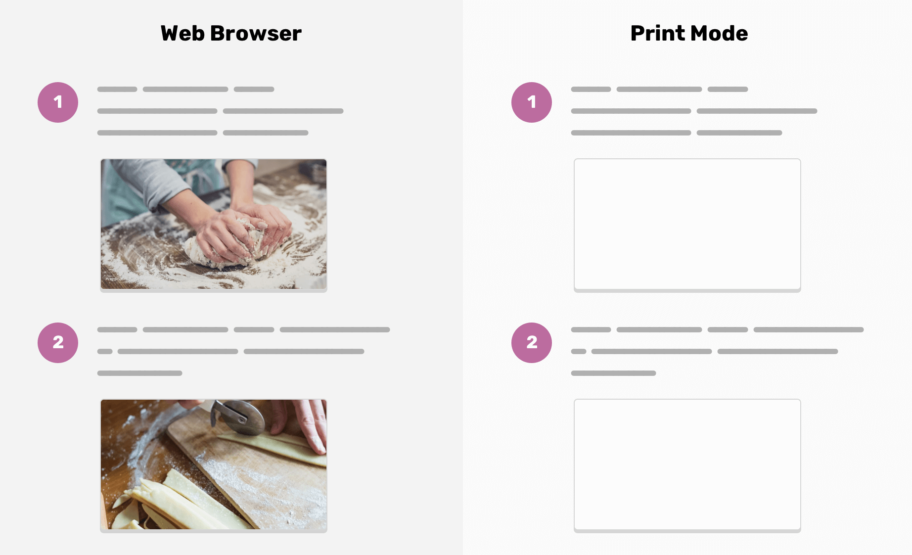
That’s what happens. We can fix that issue by forcing the browser to show the image, though this doesn’t work for Firefox and IE.
.element {
  background: url("cheesecake.png") center/cover no-repeat;
  -webkit-print-color-adjust: exact; /* Force the browser to render the background in print mode */
}
However, it’s safer to use an HTML <img> as it will print without any issues.
That’s a wrap. Do you have a comment or a suggestion? Please feel free to ping me on @shadeed9.
此内容由惯性聚合(RSS阅读器)自动聚合整理,仅供阅读参考。 原文来自 — 版权归原作者所有。
