


I spent years teaching CSS layout on this blog. I put everything I know into The Layout Maestro course: 70+ lessons and 150+ interactive examples that teach you how to think CSS layouts, not just memorize syntax.
We can check with CSS to know if the number of a group element is less than or equal to a number. For example, having a grid with three or more items. You might be wondering, why is that even needed. In some cases, a component or a layout might change based on the number of child elements.
This has been in CSS for years, but it becoming more powerful now with CSS :has. We can combine both the nth-last-child selector along with :has to do magic, yes! You heard that right.
Earlier this year, I published a post titled Conditional CSS where I showed how some CSS features help us to create conditional UIs. In this article, I will highlight a few examples of where we can combine a CSS selector with :has to have a conditional component/layout states.
:nth-last-child:nth-last-childOne of the main factors in this article is the :nth-last-child pseudo-class. We can use that selector to mock counting child elements.
Let’s explore how it works. I will try my best to explain how it works with plain words.
Consider the following figure:
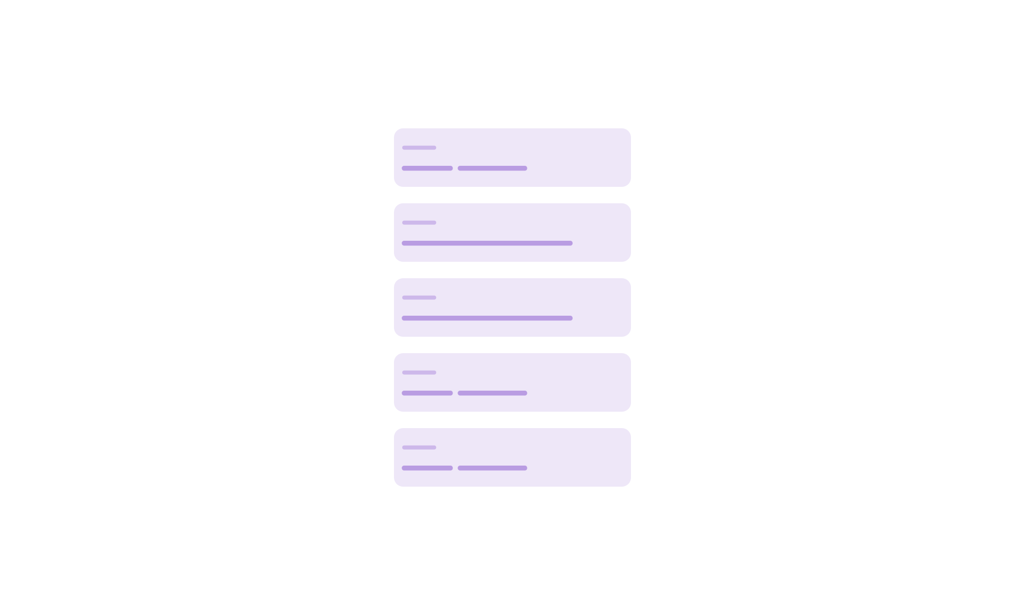
We have a list of 5 cards. I will use that as an example to demonstrate what we can do with :nth-last-child.
In the following CSS, we have n + 3 which means:
li:nth-last-child(n + 3) {
  /* styles */
}
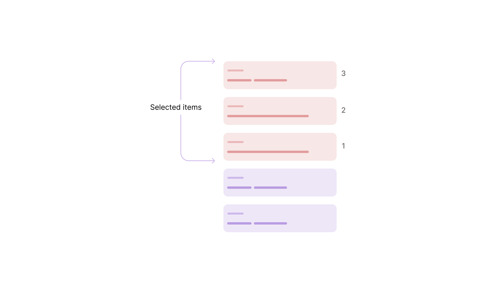
Select the first three items from the end, counting from the third item.
Let’s take a closer look. First, we need to count 3 items from the end. With that, the 3rd item is actually the first item that we will count till the end of the list.
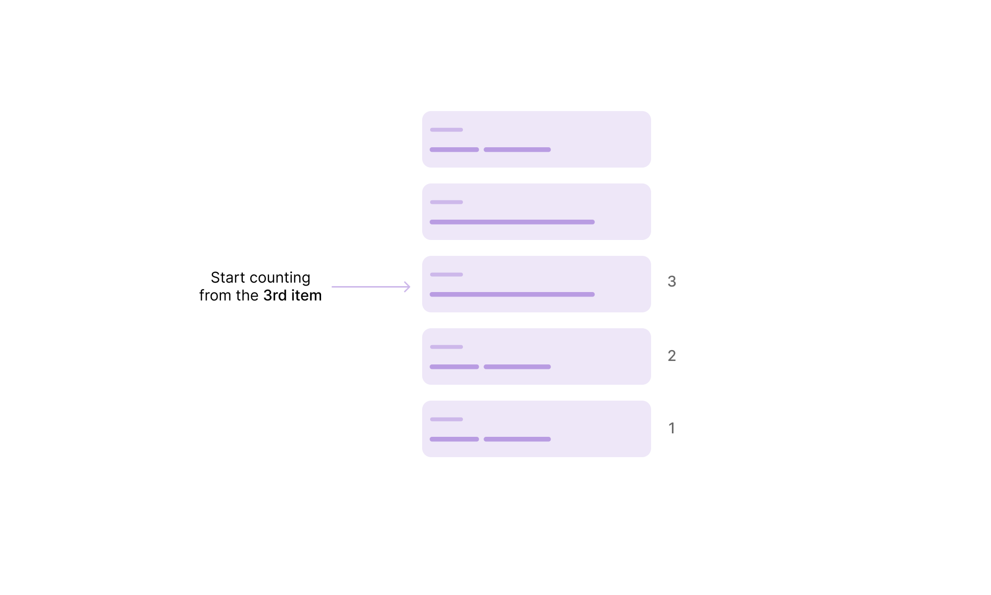
When we count from the 3rd item till the end, here are the selected items:
As explained in this great article by Heydon Pickering, we can use the :nth-last-child as a quantity query.
Consider the following figure:
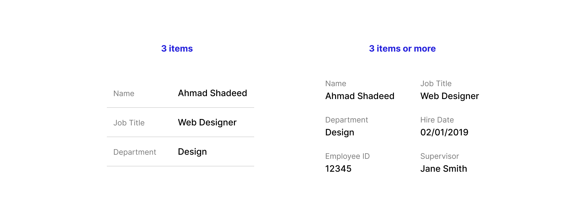
We have a list of information that is displayed differently when we have 5 or more items.
<ul>
  <li></li>
  <li></li>
  <li></li>
  <!-- more items -->
</ul>
li {
  /* default styles */
}

/* If the list has 5 or more items */
li:nth-last-child(n + 5),
li:nth-last-child(n + 5) ~ li {
  width: 50%;
  display: inline-block;
  border-bottom: 0;
}
While that works, it is still a bit limiting in some ways.
Imagine that we need to add display: flex to each <li> when there are 5 or more items. We can’t do that with the :nth-last-child pseudo-class selector.
The reason is that adding display: flex will force each item to stay in its own row, which doesn’t align with the design to achieve.
li:nth-last-child(n + 5),
li:nth-last-child(n + 5) ~ li {
  width: 50%;
  display: flex;
  flex-direciton: column;
}
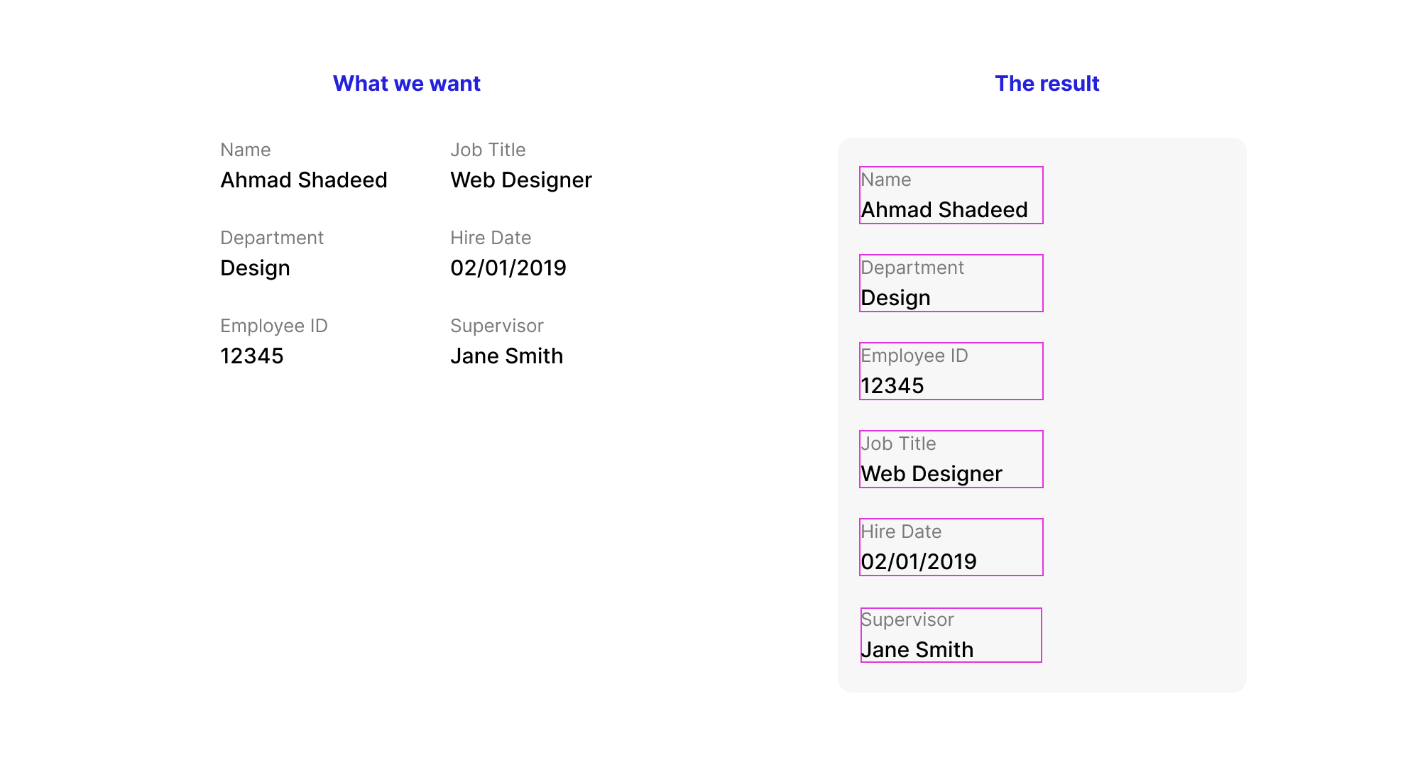
We can fix that with display: inline-flex instead, but it’s still not the optimal solution for me. The reason is that the browser will account for the spacing between the HTML elements, they should be like that:
<ul>
  <li></li>
  <li></li>
  <li></li>
  <!-- more items -->
</ul>
If we don’t do that, display: inline-flex will have the same effect as display: flex. One hack to fix that is to reduce the width by 1%.
li:nth-last-child(n + 5),
li:nth-last-child(n + 5) ~ li {
  width: 49%;
  display: flex;
  flex-direciton: column;
}
Without the ability to have control over the parent, it’s not that straightforward to style the layout of the listing. For example, when the container or viewport width is smaller, we need to show 1 item per row.
When there are 3 items or fewer, the spacing is horizontal, and when it’s 5 or more, the spacing is vertical. We can manage that manually by flipping the margin from horizontal to vertical, or by using CSS gap with Flexbox. But again, we are forced to use inline-flex for that case.
The CSS :nth-last-child pseudo-class is the key to building conditional layouts. By combining it with the CSS :has selector, we can check if a parent element has at least a specific number of items and style it accordingly. The possibilities are endless!
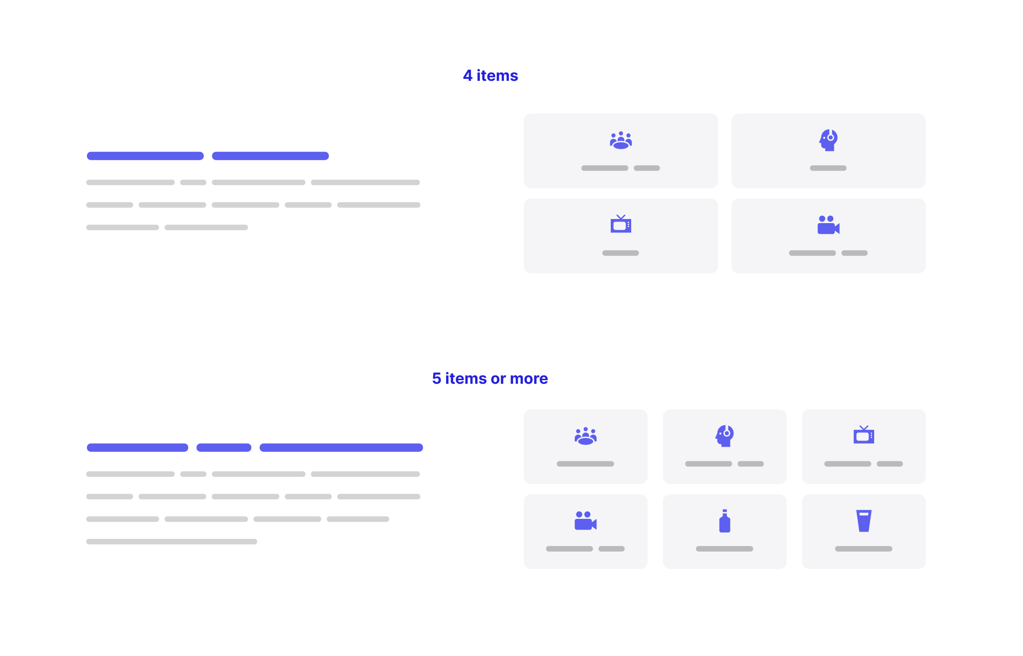
When we need to change a grid based on the number of items, this isn’t possible with the current CSS. In CSS grid, we can use the minmax() function to have a dynamic grid that changes based on the available space.
Here is my take on CSS grid minmax():
.list {
  display: grid;
  grid-template-columns: repeat(auto-fit, minmax(150px, 1fr));
  gap: 1rem;
}
The result might look like this:
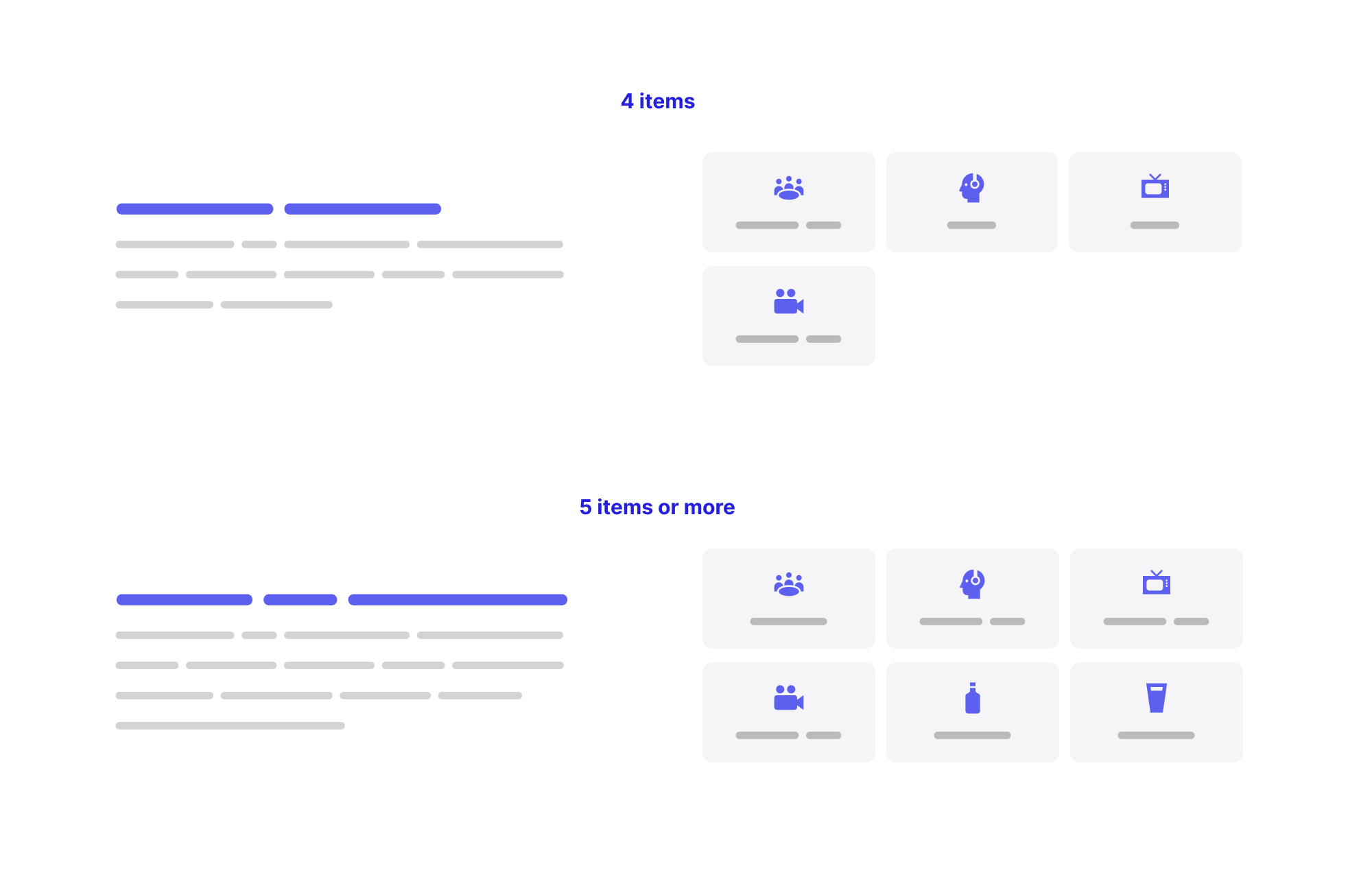
This isn’t perfect. We don’t have much control, as we need to tweak the value of 150px in the minmax(). It can work great when having 4 items or less, and break for 5 items or more.
The solution? We can check with CSS :has if there are more than 5 items or more, and change the minmax() value based on that.
/* default grid */
.list {
  --item-size: 200px;
  display: grid;
  grid-template-columns: repeat(
    auto-fit,
    minmax(var(--item-size), 1fr)
  );
  gap: 1rem;
}

/* If the grid has 5+ items, change the --item-size width to 150px */
.list:has(li:nth-last-child(n + 5)) {
  --item-size: 150px;
}
I only changed the --item-size variable to make the code easier to read and to avoid duplication.
See the following video and notice how the grid columns change as I add or remove items.
Isn’t that powerful?
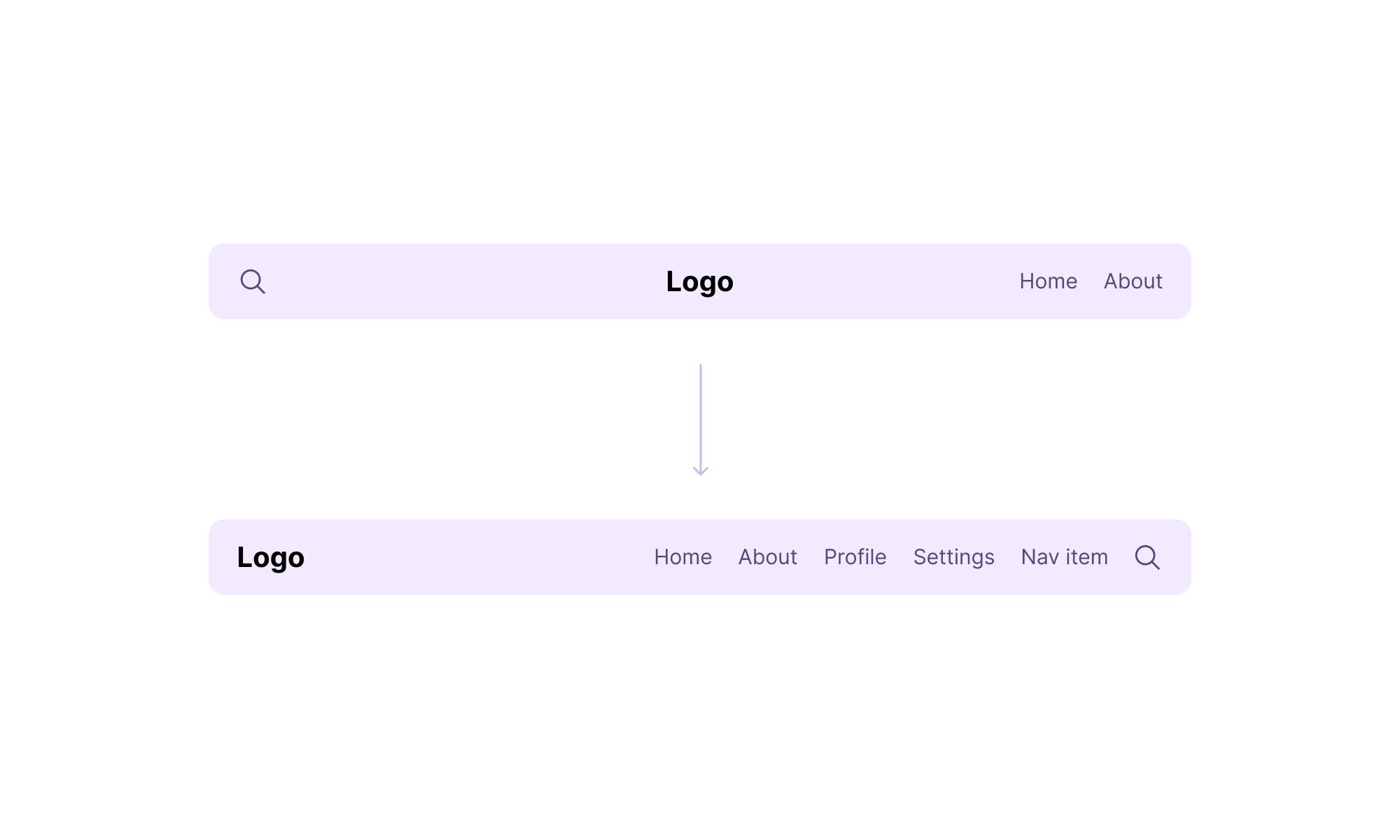
In the following figure, we have a header that should change its layout when the navigation items are 4 or more. With CSS :has and :nth-last-child, we can detect that and change the layout.
.site-header:has(li:nth-last-child(n + 4)) {
  .site-header__wrapper > * {
    flex: initial;
  }

  .site-header__start {
    order: 2;
  }

  .site-header__middle {
    order: -1;
    text-align: start;
  }

  .site-header__end {
    margin-left: auto;
  }
}
The above is the Sass code. It might look a bit too much when written in vanilla CSS.
.site-header:has(li:nth-last-child(n + 4)) .site-header__wrapper > * {
  flex: initial;
}

.site-header:has(li:nth-last-child(n + 4)) .site-header__start {
  order: 2;
}

.site-header:has(li:nth-last-child(n + 4)) .site-header__middle {
  order: -1;
  text-align: start;
}

.site-header:has(li:nth-last-child(n + 4)) .site-header__end {
  margin-left: auto;
}
Can we do better? Yes! But this isn’t supported well (yet!). We can add a boolean CSS variable that will be toggled when the header has 4 items or more, and then use a style query to change the header.
.site-header:has(li:nth-last-child(n + 4)) {
  --layout-2: true;
}
With that, we set the variable --layout-2 when the navigation items are 4 or more.
/* This will only works if the --layout-2 CSS variable is set */
@container style(--layout-2: true) {
  .site-header__wrapper {
    > * {
      flex: initial;
    }
  }

  .site-header__start {
    order: 2;
  }

  .site-header__middle {
    order: -1;
    text-align: start;
  }

  .site-header__end {
    margin-left: auto;
  }
}
For me, this looks clean and much better than nesting all CSS styles within the :has selector.
The following is a news section design that should change its layout when the number of items is 3 or more.
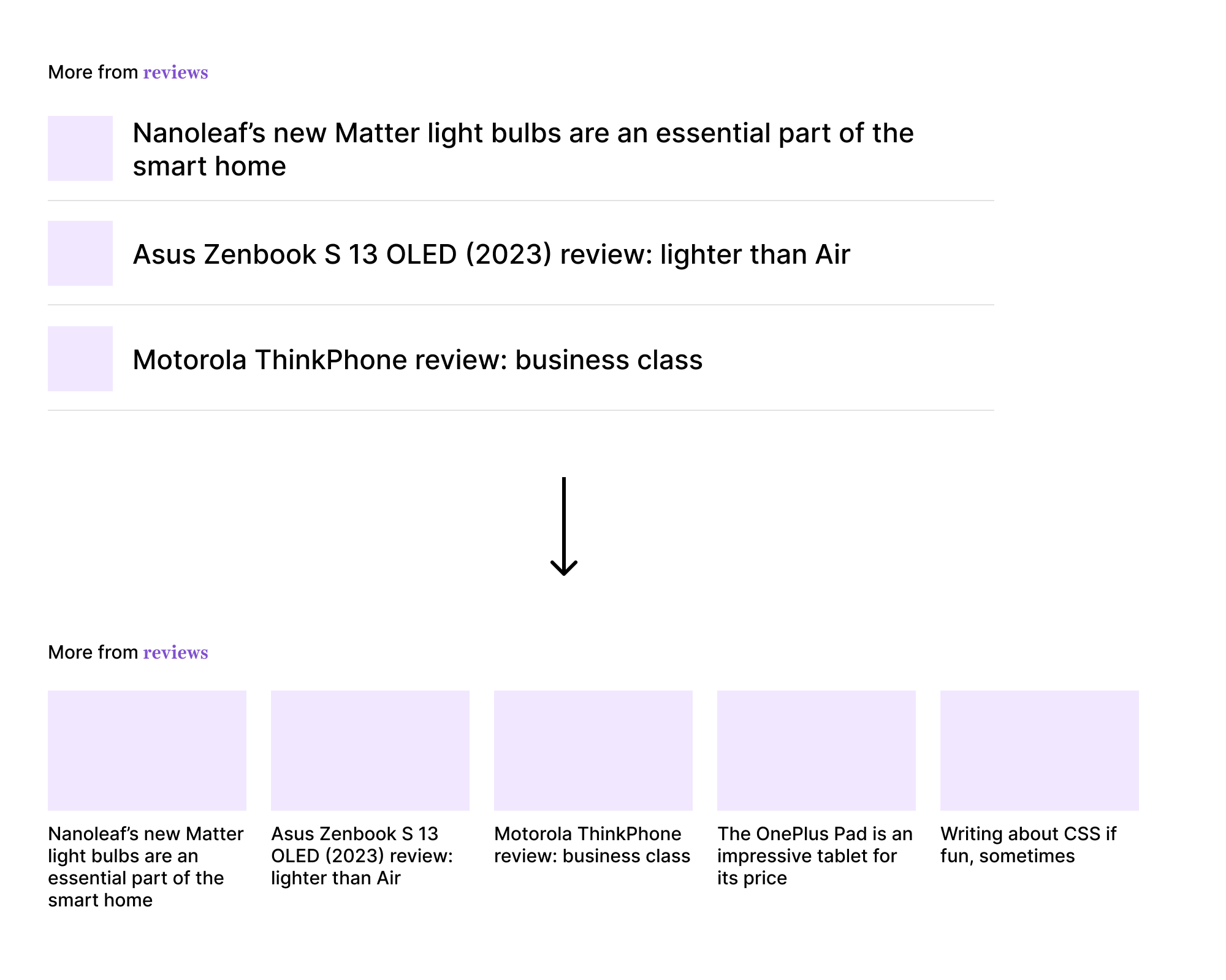
By combining CSS :has and :nth-last-child, we can create a toggle CSS variable that will be checked by a style query.
First, I will assume that the default card style is the horizontal one.
<div class="layout">
  <article class="card"></article>
  <article class="card"></article>
  <article class="card"></article>
</div>
.layout {
  display: grid;
  grid-gap: 1rem;
}

.card {
  display: flex;
  gap: 1rem;
  align-items: center;
}
After that, I need to check the number of .card elements.
.layout:has(.card:nth-last-child(n + 4)) {
  --layout-4: true;
  grid-template-columns: repeat(auto-fit, minmax(180px, 1fr));
}
Now, we have the CSS variable --layout-4 that will be toggled only when we have 4 items or more. We can check that with a style query and update the .card style accordingly.
@container style(--layout-4: true) {
  .card {
    flex-direction: column;
  }

  .card__thumb {
    flex: 1;
    width: 100%;
    aspect-ratio: 4 / 3;
  }
}
In a design system, we might need to dynamically control the alignment of the modal actions based on how many actions we have.
Consider the following figure:
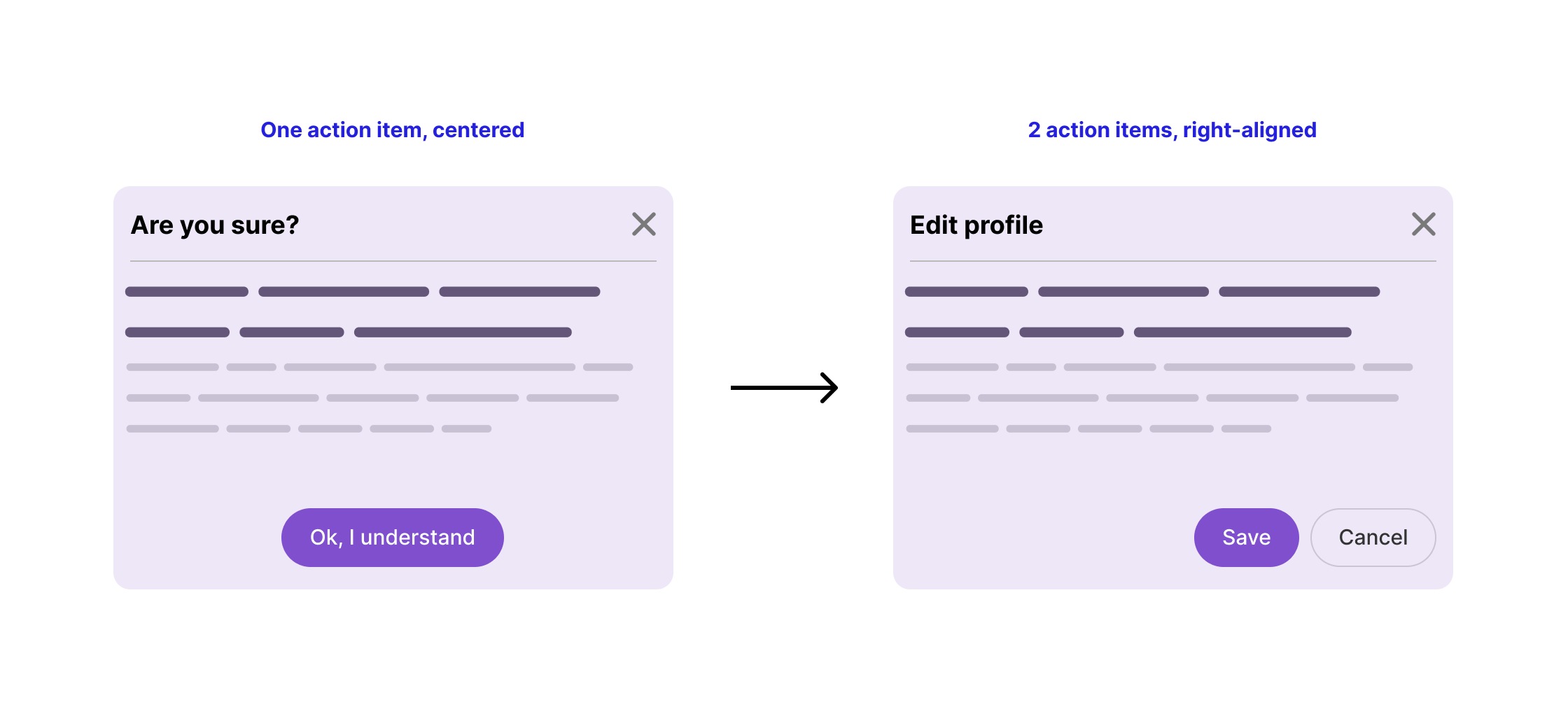
For example, if we have one action, it should be centered. Otherwise, right-align them.
Here is the CSS:
.modal__footer {
  display: flex;
  justify-content: center;
  gap: 0.5rem;
}

/* If there are 2 buttons or more */
.modal__footer:has(a:nth-last-child(n + 2)) {
  justify-content: flex-end;
}
Simple, isn’t it? Here is a demo in action.
On editorial websites, an article might be written by multiple authors. A common pattern is to stack the author images with negative spacing when we have multiple authors.
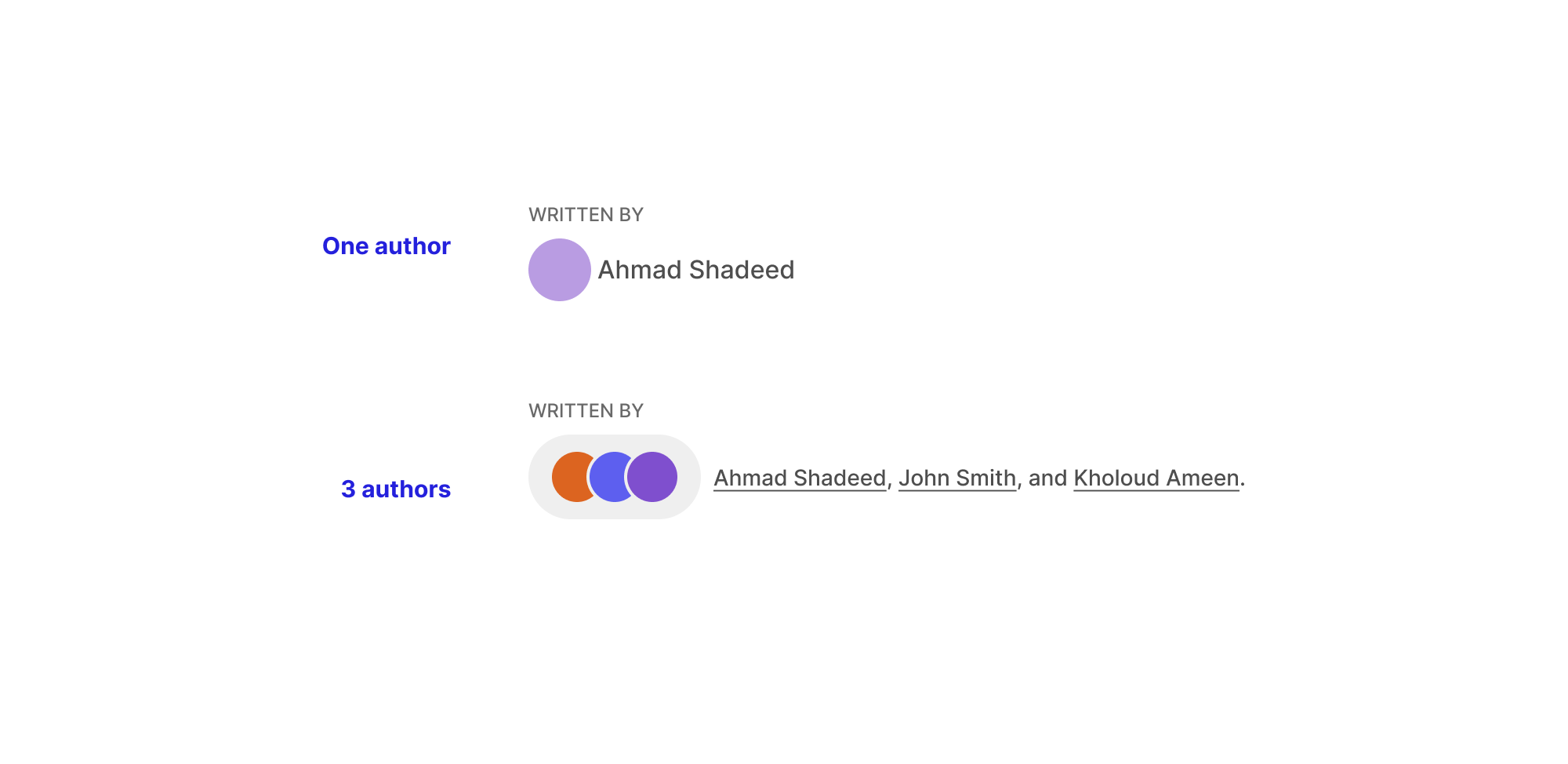
By using quantity queries alone, we can achieve the minimum, which is to:
img:nth-last-child(n + 2) ~ img {
  border: 2px solid #fff;
  margin-left: -0.25rem;
  width: 30px;
  height: 30px;
}
The above works, but it’s limiting. What if we want to style the container itself? Well, that’s where CSS :has becomes powerful.
First, we need to check and toggle a CSS variable:
.post-author:has(img:nth-last-child(n + 2)) {
  --multiple-avatars: true;
}
If that CSS variable is true, we then apply the styles for multiple avatars:
@container style(--multiple-avatars: true) {
  .avatars-list {
    display: flex;
    background-color: #efefef;
    padding: 8px 12px;
    border-radius: 50px;
  }

  img:not(:first-child) {
    border: solid 2px #fff;
    margin-left: -0.25rem;
  }
}
Check out the following video:
Another interesting example where conditional CSS works well is a timeline component.
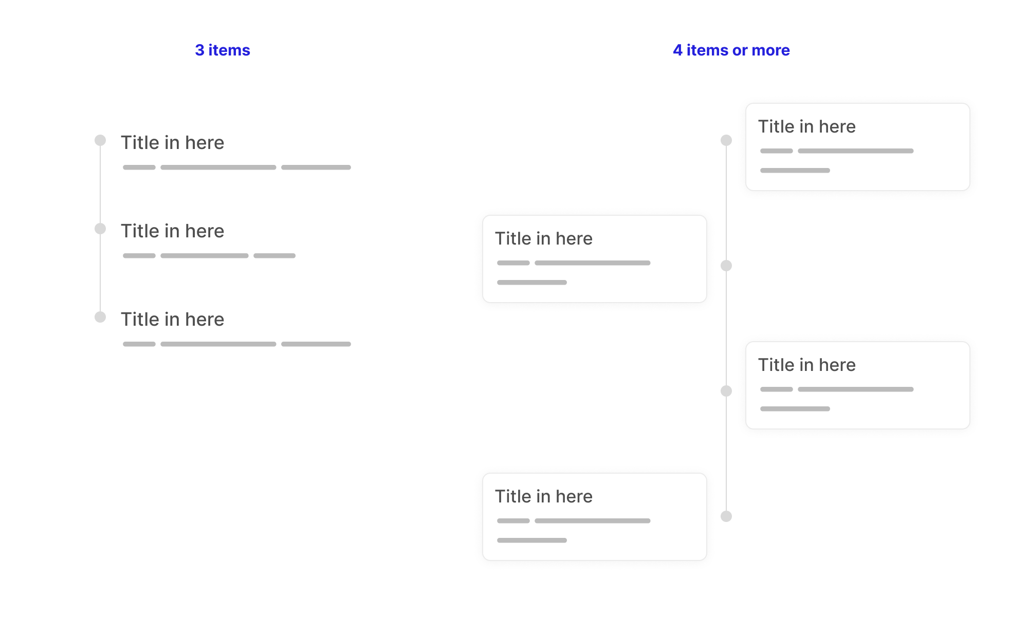
In this example, I want the timeline to switch from a vertical listing to an alternating style when it has 4 or more items.
First, I used the :nth-last-child with CSS :has:
.timeline-wrapper:has(.timeline__item:nth-last-child(n + 4)) {
  --alternating: true;
}
If the above is met, the following CSS will be applied:
@container style(--alternating: true) {
  /* Alternating timeline styles. */
}
What’s useful about using style queries here is that we can reuse that styling on another page. It doesn’t have to be a conditional CSS.
I might do something like this:
.timeline-wrapper--page-10 {
  --alternating: true;
}
Please don’t mind .timeline-wrapper--page-10, this is an intentional random class name. The CSS variable can be assigned anywhere we want, and the CSS will work out of the box.
Write it once, and it works for many cases.
Note: this demo breaks in Chrome Canary and I guess the reason is that I’m using pseudo-elements within style queries. I’m investigating that in more detail and will update the article as I got more information.
One of the tricky things to deal with in CSS is aligning multiple logos and making sure they all look good. With conditional CSS, we can detect the number of logos and shrink their size a bit.
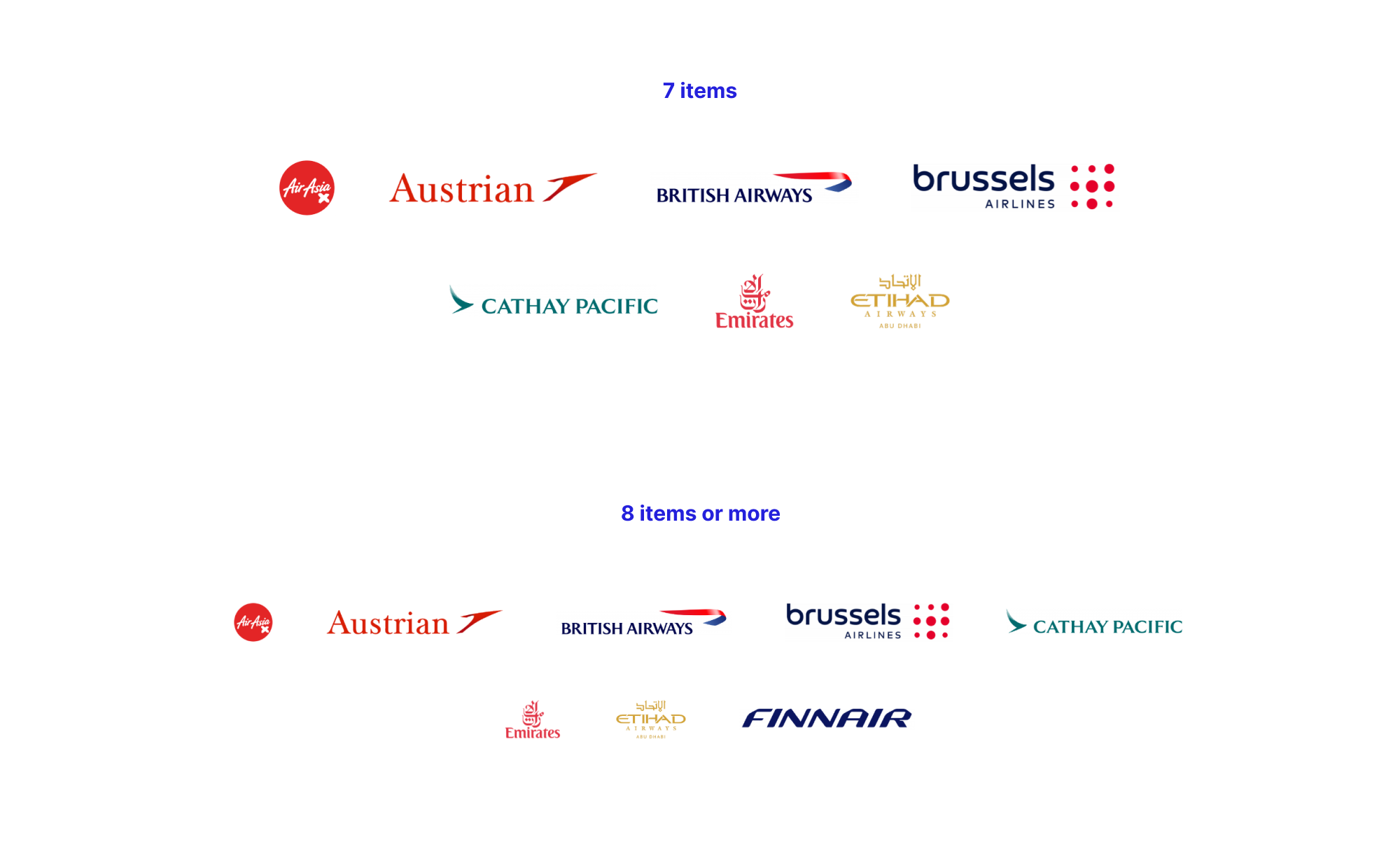
ul:has(li:nth-last-child(n + 8)) img {
  max-width: 160px;
  height: 35px;
}
This was one of the interesting articles that I worked on. Combining modern CSS features can let to exciting new ways to build layouts, and this article’s examples were no exception.
Changing a style based on the number of items might not be a one-off usage; it can be extracted to different use cases. By using style queries, we can write once and reuse them everywhere.
此内容由惯性聚合(RSS阅读器)自动聚合整理,仅供阅读参考。 原文来自 — 版权归原作者所有。