


I spent years teaching CSS layout on this blog. I put everything I know into The Layout Maestro course: 70+ lessons and 150+ interactive examples that teach you how to think CSS layouts, not just memorize syntax.
Have you ever removed a flexbox from a container or wrapped some elements in a new container just to have more control over the spacing between the items? You are not alone.
When I use flexbox or grid gap, I sometimes wonder if I can control the gap between some elements.
Consider the following example:
<div class="card">
  <img src="thumb.jpg" alt="" />
  <div class="cardContent">
    <h3>Title</h3>
    <p>Description</p>
    <p><a href="#">Link</a></p>
  </div>
</div>
.card {
  display: flex;
  flex-direction: column;
  gap: 1rem;
}
This will add vertical spacing between the flex items.
Spacer opacity:
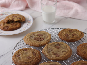
The best in class cookies at the comfort of your home.
View the recipe
If I need to reduce the space between the title and description, what are the options that I have?
I tried adjusting the margin first.
.card-description {
  margin-top: calc(var(--space) / 2 * -1);
}
Here is a working demo with the result. Play with the spacer opacity to get a feel of the spacing.
Spacer opacity:
The best in class cookies at the comfort of your home.
View the recipe
While that works, it comes with a few issues.
Let’s assume that we want to remove the title, maybe we need to use this card in a place where a title is not needed.
The best in class cookies at the comfort of your home.
View the recipe
Since the space is added to the description, it will still be there. In that case, we need to remove it.
.card--without-title .card-description {
  margin-top: 0;
}
It works, but it feels hacky.
First, we need to wrap the title and description in a new container.
<div class="card">
  <img src="thumb.jpg" alt="" />
  <div class="card-content">
    <div class="card-item">
      <h3>Title</h3>
      <p>Description</p>
    </div>
    <p><a href="#">Link</a></p>
  </div>
</div>
Then, we need to apply flexbox on the new container with flex-direction: column and set the space we need with gap.
.card-item {
  display: flex;
  flex-direction: column;
  gap: 0.5rem;
}
Here is the result:
Spacer opacity:
The best in class cookies at the comfort of your home.
View the recipe
While that works and it sounds less hacky than the first option, the biggest drawback is that we need to change the HTML.
Can we do better?
We can use the flow layout (default one) and use margins with CSS variables. A few years ago, I learned about the flow utility from Andy Bell. I use it in almost all of my projects.
The idea is to use the universal CSS selector to select sibling elements and add margins to each.
.u-flow {
  > * + * {
    margin-top: var(--space);
  }
}
The above CSS will add a margin-top to all elements between the first and last child. In our example, we can do this:
.card {
  --space: 12px;
}

.card-content {
  > * + * {
    margin-top: var(--space);
  }
}
Then, we can override the space variable on per element basis.
.card-description {
  --space: 4px;
}
Here is the result:
Spacer opacity:
The best in class cookies at the comfort of your home.
View the recipe
The best in class cookies at the comfort of your home.
View the recipe
To me, this is the best option for now:
This got me to think about having a native way to do this with CSS gap. Since the gap property is added to the container, we need a way to allow the flex or grid items to have a custom gap.
<div class="card">
  <img src="thumb.jpg" alt="" />
  <div class="card-content">
    <h3>Title</h3>
    <p>Description</p>
    <p><a href="#">Link</a></p>
  </div>
</div>
I didn’t think deeply about the naming, but I reused a similar naming convention in CSS from align-self.
Here, I used CSS scope to scope the selection between two HTML elements. This isn’t valid in the browser as per my testing.
.card-content {
  @scope (h3) to (p) {
    gap-self: 4px;
  }
}
Or maybe something like this:
.card-content {
  p {
    gap-above: 4px;
  }
}
What do you think?
此内容由惯性聚合(RSS阅读器)自动聚合整理,仅供阅读参考。 原文来自 — 版权归原作者所有。