


I spent years teaching CSS layout on this blog. I put everything I know into The Layout Maestro course: 70+ lessons and 150+ interactive examples that teach you how to think CSS layouts, not just memorize syntax.
Back in the school days, the math teacher said that what he likes about math is that you can have many solutions for the same problem.
Some solutions are easier or harder than others. I think the same about solving UI problems with CSS.
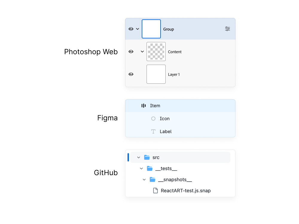
In a nutshell, the problem is to build a UI that contains nested components with an increasing indentation for each one. The problem is common on the web, but I will highlight the ones from Github, Figma, Adobe and more.
Let’s dive in.
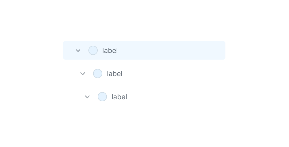
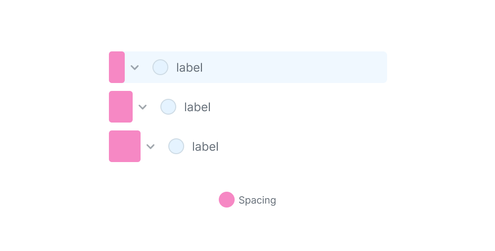
In the following figure, we have a list of three components. The difference between them is that the deeper the nesting, the more spacing the component has.
Here is another version with spacing highlighted:
How would you solve that in CSS? Well, that’s the topic of the article. I will show you how GitHub, Figma, and Adobe solved this problem.
This UI pattern is very common on the web. Here are examples of the same concept with different UIs:
Now that you have an idea about what each UI looks like, let’s explore how each of them built it.
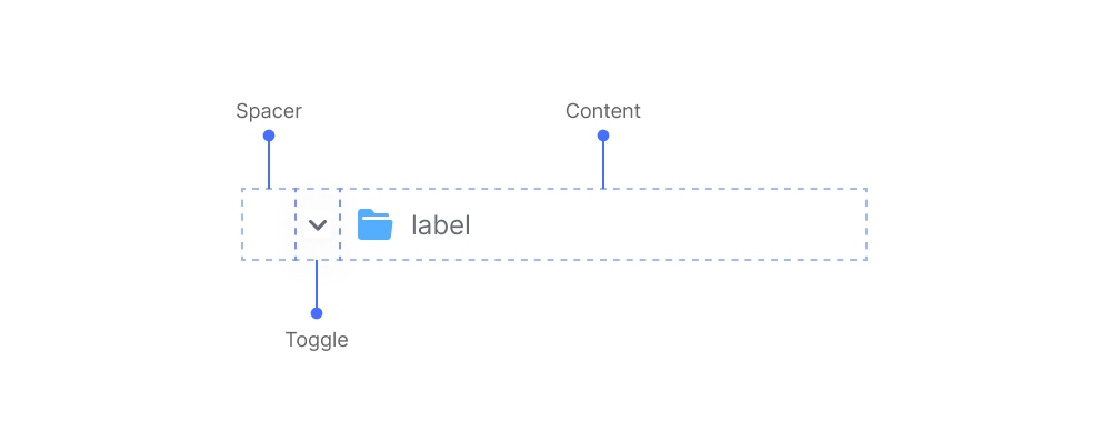
In GitHub, the component consists of the following:
Here is the HTML:
<div class="TreeView-item">
  <div class="spacer"></div>
  <div class="toggle"></div>
  <div class="content">
    <div class="TreeView-item-visual"></div>
    <span class="TreeView-item-text">ReactART-test.js.snap</span>
  </div>
</div>
In CSS, the team used CSS grid to handle the layout.
.TreeView-item {
  --toggle-width: 1rem;
  --spacer-col: 1rem; /* will go into this later */
  display: grid;
  grid-template-columns: var(--spacer-col) var(--toggle-width) 1fr;
  grid-template-areas: "spacer toggle content";
}

.spacer {
  grid-area: spacer;
}

.toggle {
  grid-area: toggle;
}

.content {
  grid-area: content;
}
Here is a closer look at the UI:
The usage of CSS grid for the UI is useful. Here are a few reasons:
grid-area, we can assign the column for each item in the component.In the CSS, the first column is for the spacer. See the following:
.TreeView-item {
  --toggle-width: 1rem;
  --spacer-col: 1rem; /* will go into this later */
  display: grid;
  grid-template-columns: var(--spacer-col) var(--toggle-width) 1fr;
  grid-template-areas: "spacer toggle content";
}
To calculate the spacer column width, the CSS in GitHub uses the toggle width and the depth level.
.TreeView-item {
  --spacer-col: calc(
    calc(var(--level) - 1) * (var(--toggle-width) / 2)
  );
}
The minimum spacing is 8px. While this works, I’m thinking about the reason to use the --toggle-width variable. I found no reason except for having a minimum spacing of 8px.

In the web version of Photoshop, the layers UI has a similar structure to the tree view in GitHub.
Here is the HTML
<psw-tree-view-item indent="0" layer-visible can-open dir="ltr" open>
  <div id="link">
    <span id="first-column"></span>
    <span id="second-column"></span>
    <span id="label"></span>
  </div>
</psw-tree-view-item>
And a closer look at the tree view item:
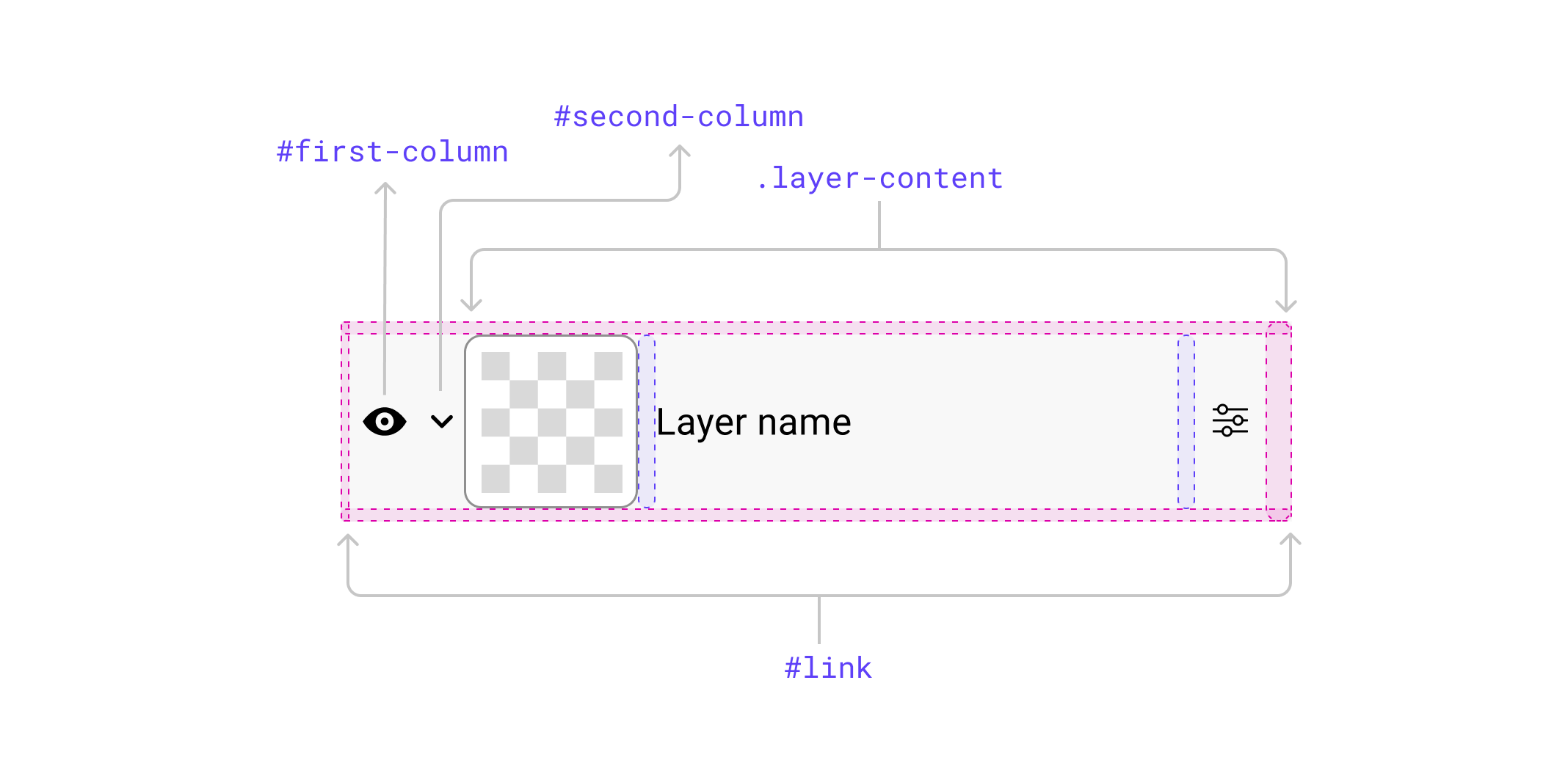
The layout is built with CSS flexbox. For the nested items, the spacing is managed via padding-right on the first column.
:host([dir="ltr"][indent="1"]) #first-column {
  padding-right: var(--spectrum-global-dimension-size-200);
}

:host([dir="ltr"][indent="2"]) #first-column {
  padding-right: calc(2 * var(--spectrum-global-dimension-size-200));
}

/* and so on */
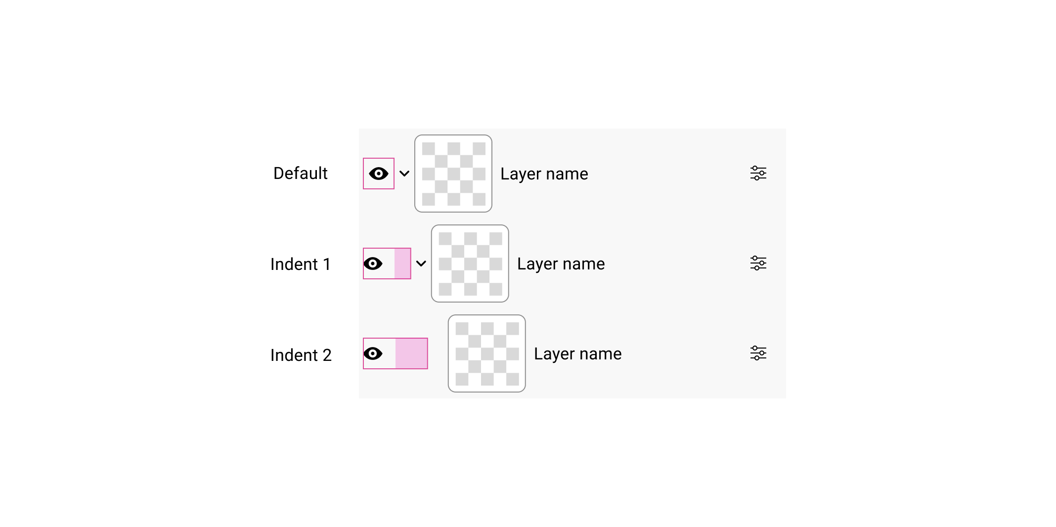
While this works, it’s not the best solution for me. I can make it a bit better and use CSS logical properties.
:host([indent="2"]) #first-column {
  padding-inline-end: calc(
    2 * var(--spectrum-global-dimension-size-200)
  );
}
I’m not a fan of using hardcoded values in CSS.
Figma’s solution is different from Adobe and GitHub. Here is the UI:
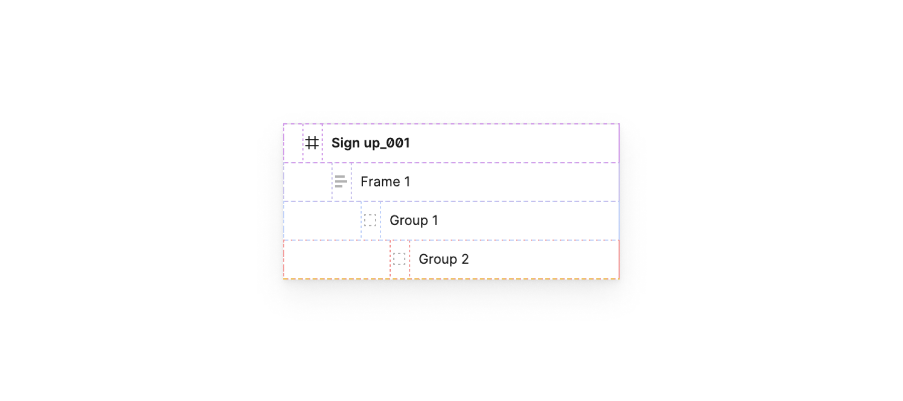
<div class="object_row">
  <span class="object_row--indents">
    <span class="object_row--indent"></span>
    <!-- The more nesting, the more indent items.. -->
    <span class="svg-container object_row--expandCaret"></span>
  </span>
  <span class="object_row--layerIcon"></span>
  <span class="object_row--rowText"></span>
  <span class="object_row--rowActions"></span>
</div>
The layout is built with Flexbox, similar to Photoshop Web. Here are a few differences:
position: absolute) to take it out of the flow.In the following figure, notice how four spans represent the spacing.
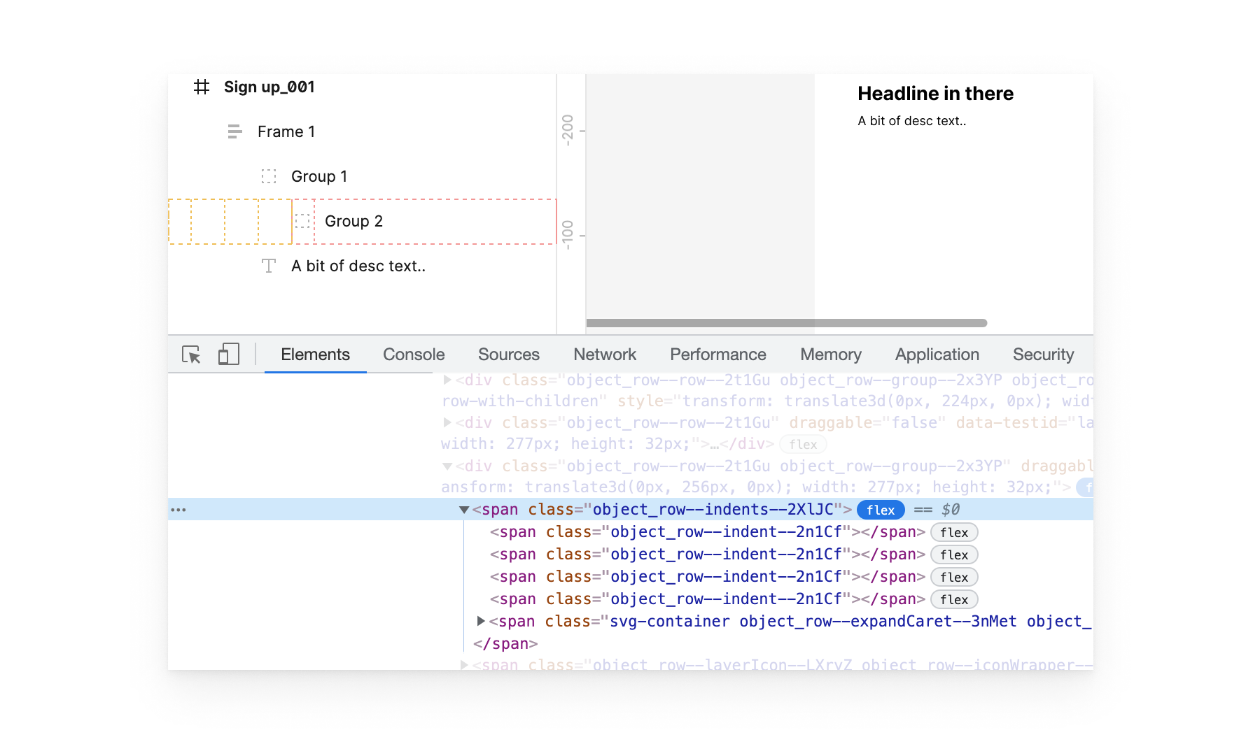
Not my favorite solution.
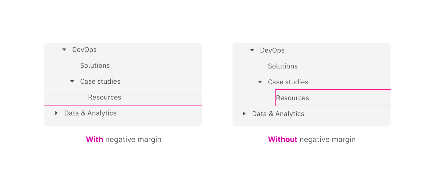
The tree view items in Carbon design system don’t use depth but instead have more padding from the left side.
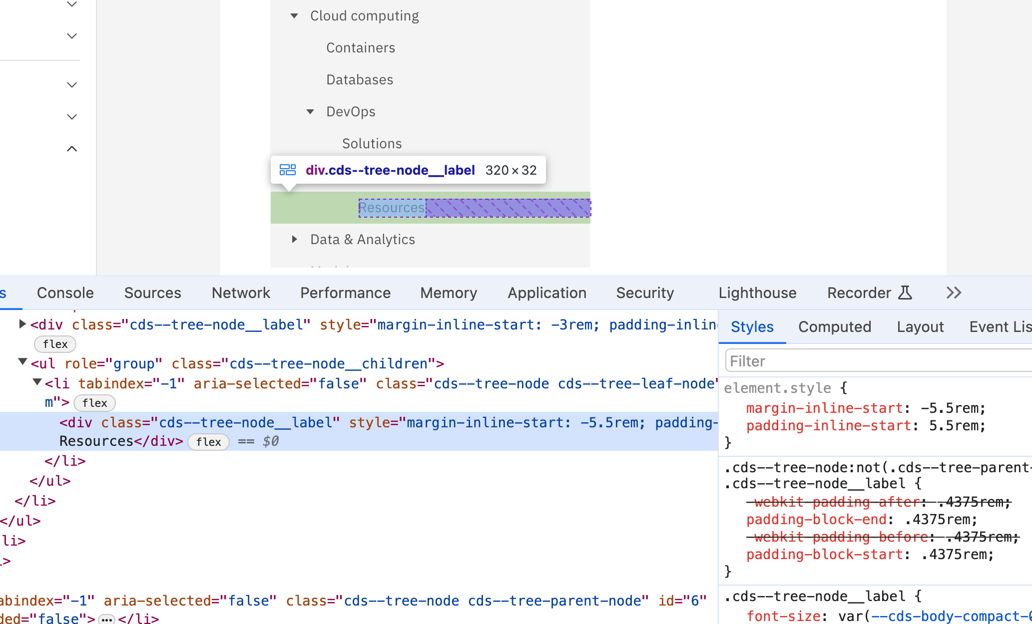
The reason you see a negative margin in the screenshot above is that the selected item should be clickable. Without the negative margin, the clickable area will only be at the start of the text till the end of the element.
While it works, I would prefer to flatten all lists and keep the depth per item level.
Each tree view component is indented based on the nesting level. However, to make an item fully clickable, they used a pseudo-element that fills the entire space.
See the following video:
For me, using a pseudo-element is much better than dealing with negative margins (Like in Carbon design system).
I like how GitHub solved this. Here is why:
We can do the same by using CSS max() function.
.TreeView-item {
  --spacer-col: max(8px, var(--level) * 8px);
}
This is much cleaner and easier to understand for me. The minimum value is 8px and the maximum value depends on the nesting depth.
The final thing to mention is using content-visibility on each treeview item. I spotted this:
.PRIVATE_TreeView-item-container {
  content-visibility: auto;
  contain-intrinsic-size: auto 2rem;
}
This is very useful for performance. Imagine browsing a tree view with thousands of sub items.
According to MDN:
Size containment allows a user agent to lay out an element as though it had a fixed size, preventing unnecessary reflows by avoiding the re-rendering of child elements to determine the actual size (thereby improving user experience).
That was a fun exploration. The interesting thing is that it’s only about the indentation part. There are many more areas to cover, but this is what caught my eye. I hope you enjoyed it and thank you for reading.
此内容由惯性聚合(RSS阅读器)自动聚合整理,仅供阅读参考。 原文来自 — 版权归原作者所有。