


I spent years teaching CSS layout on this blog. I put everything I know into The Layout Maestro course: 70+ lessons and 150+ interactive examples that teach you how to think CSS layouts, not just memorize syntax.
The support for CSS logical properties is getting better by time. However, I still struggle to memorize them each time I want to use them in a project. What does start mean? And what does end mean? It’s a bit tricky to grasp all the details without trial and error.
In this article, I aim to get you up and running to use logical properties today with a solid understanding from the perspective of a designer who speaks and writes in English and Arabic. I tried to come up with a visual way of thinking of the logical properties that I hope will be clear to grasp. Are you ready? Let’s dive in.
The basic idea of CSS logical properties is that we won’t use physical directions in CSS properties. Instead, we will use properties that depend on the direction of the HTML document. Those properties are called logical properties.
Let’s take a basic example.
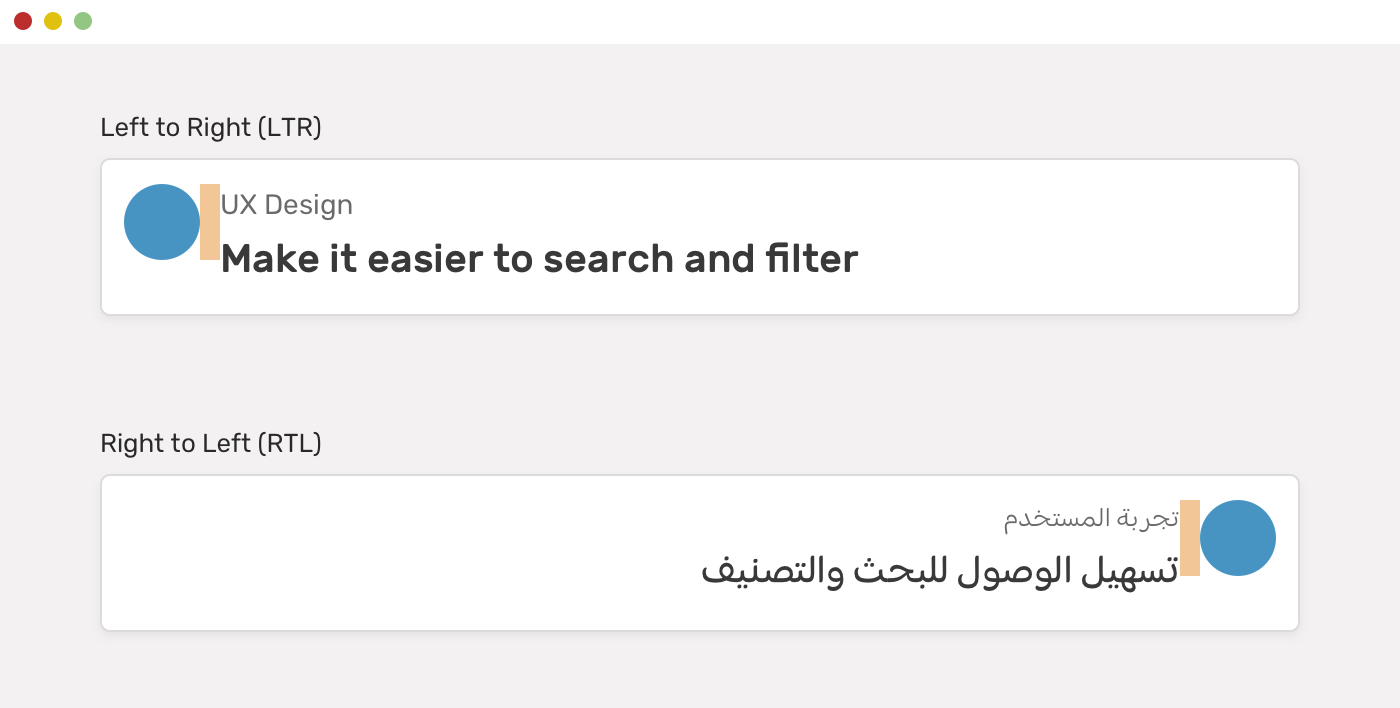
We have a card that contains an avatar and text content. For left-to-right (LTR) layouts, the margin is on the right of the avatar. For right-to-left (RTL) layouts, the margin should be flipped (to the left).
Here is how we can do this without CSS logical properties.
.avatar {
  margin-right: 1rem;
}

html[dir="rtl"] .avatar {
  margin-right: 0;
  margin-left: 1rem;
}
Notice that margin-right is being reset to 0 for RTL layouts since it’s not needed there. Imagine doing that for a large-scale project? It’s too much. CSS logical properties came to solve this for us.
.avatar {
  margin-inline-end: 1rem;
}
We will only need to set margin-inline-end, and this will work differently based on the direction of the HTML document. Isn’t that powerful?
When using CSS logical properties, you will often see the keywords inline or block. Let’s explore what they mean.
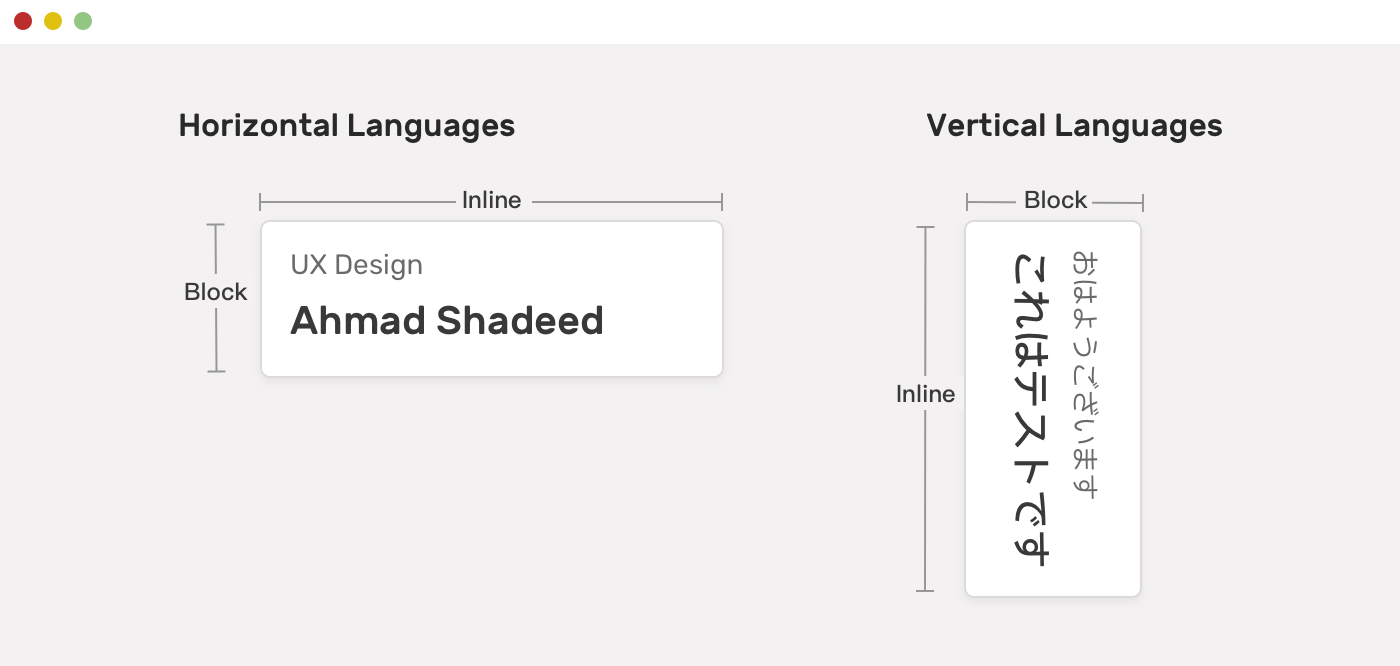
Based on the writing mode, the meaning of inline or block changes. For languages like English, the inline is the horizontal dimension, where the block is the vertical one. For languages like Japanese, the inline is the vertical dimension, and the block is the horizontal one.
For this article, I will focus more on handling logical properties for horizontal languages.
It’s the horizontal dimension for languages like English or Arabic. While start means left for left-to-right layouts (e.g: English) and right for right-to-left layouts (e.g: Arabic), and the end means left for RTL layouts and right for LTR layouts.
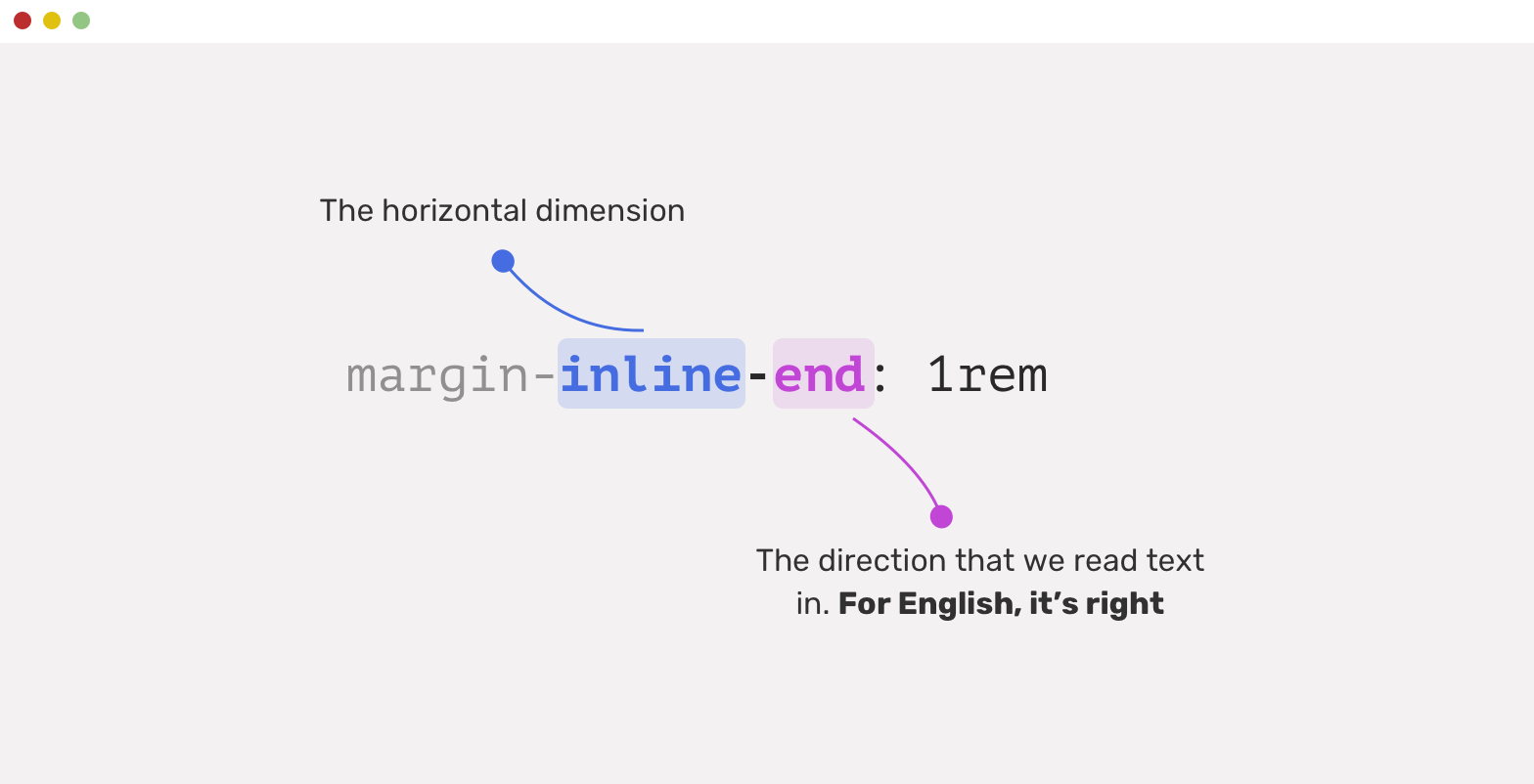
In the example below, the circle has a margin on the right side. For an RTL layout, the margin should be on the left side. You need to learn that the start and end work based on the context (LTR or RTL).
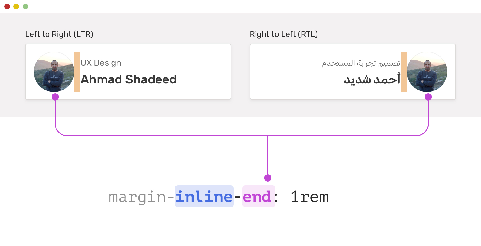
start and endTo make it even more clear what start and end means, here is a visual that explains them.
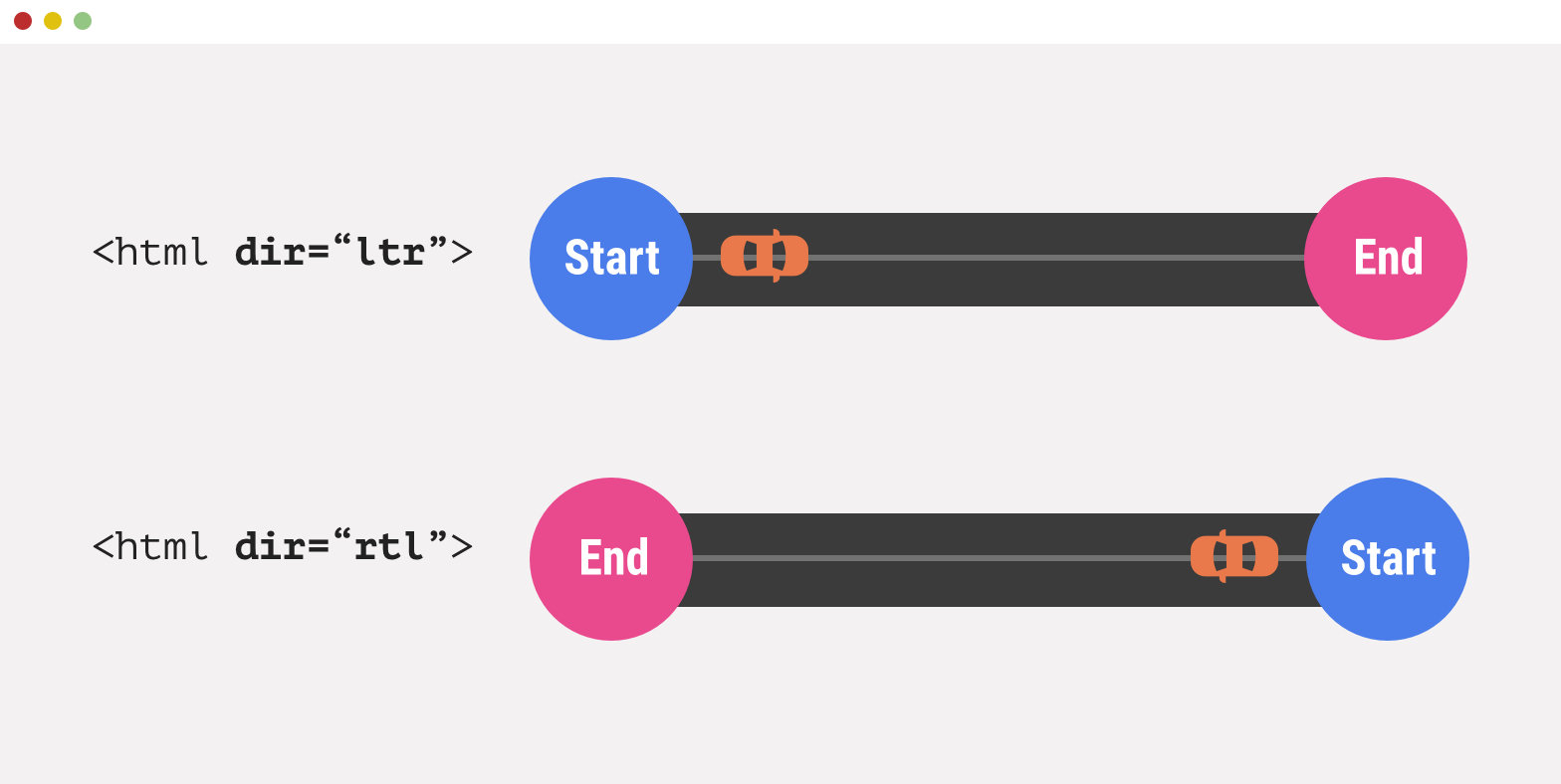
I like to imagine the start and end as a street. When the direction is LTR, the start is on the left, and the end is on the right. In the case of RTL, it’s vice versa.
Another way to memorize the meaning of start and end is to remember the direction of reading. For English, the reading starts from left and ends on the right. For Arabic, the reading starts from the right and ends on the left.
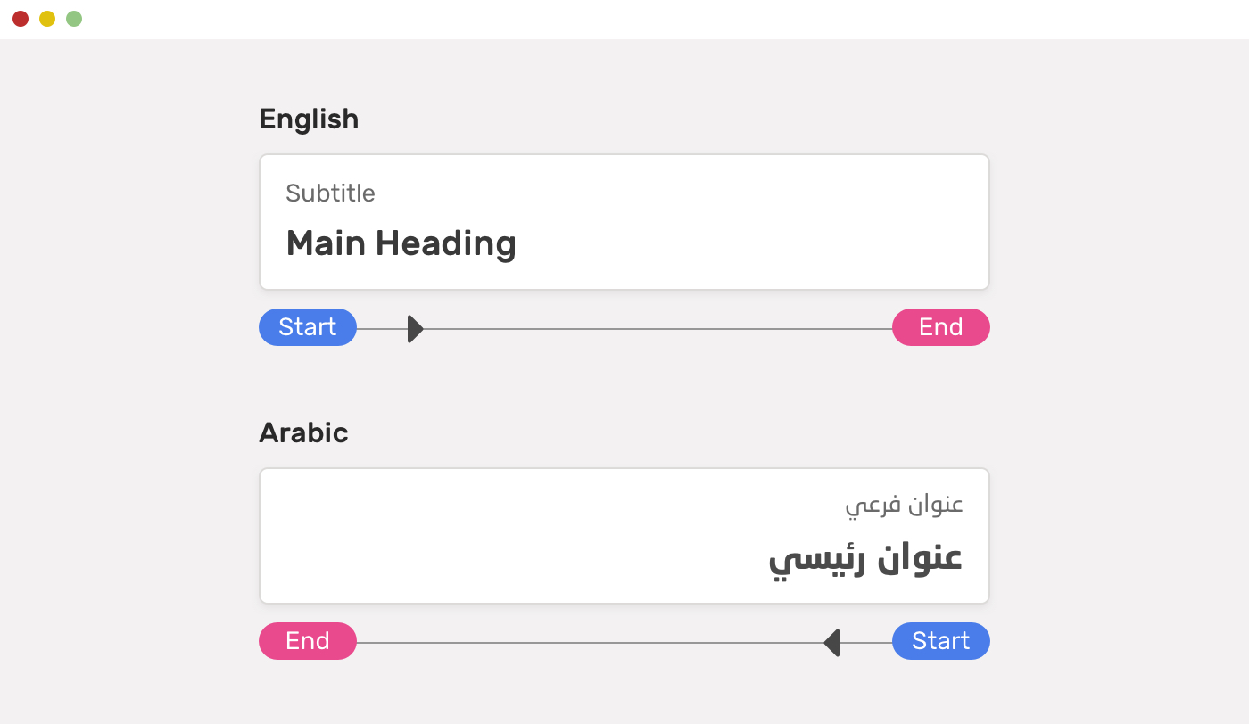
Most CSS properties can be used as logical properties. Here are the general ones:
I can’t list all the logical properties in this article as there are a lot. Please read the full list on MDN.
Now that I explained the basics above, let’s apply some of them to a more detailed UI example to ensure you have a solid understanding.
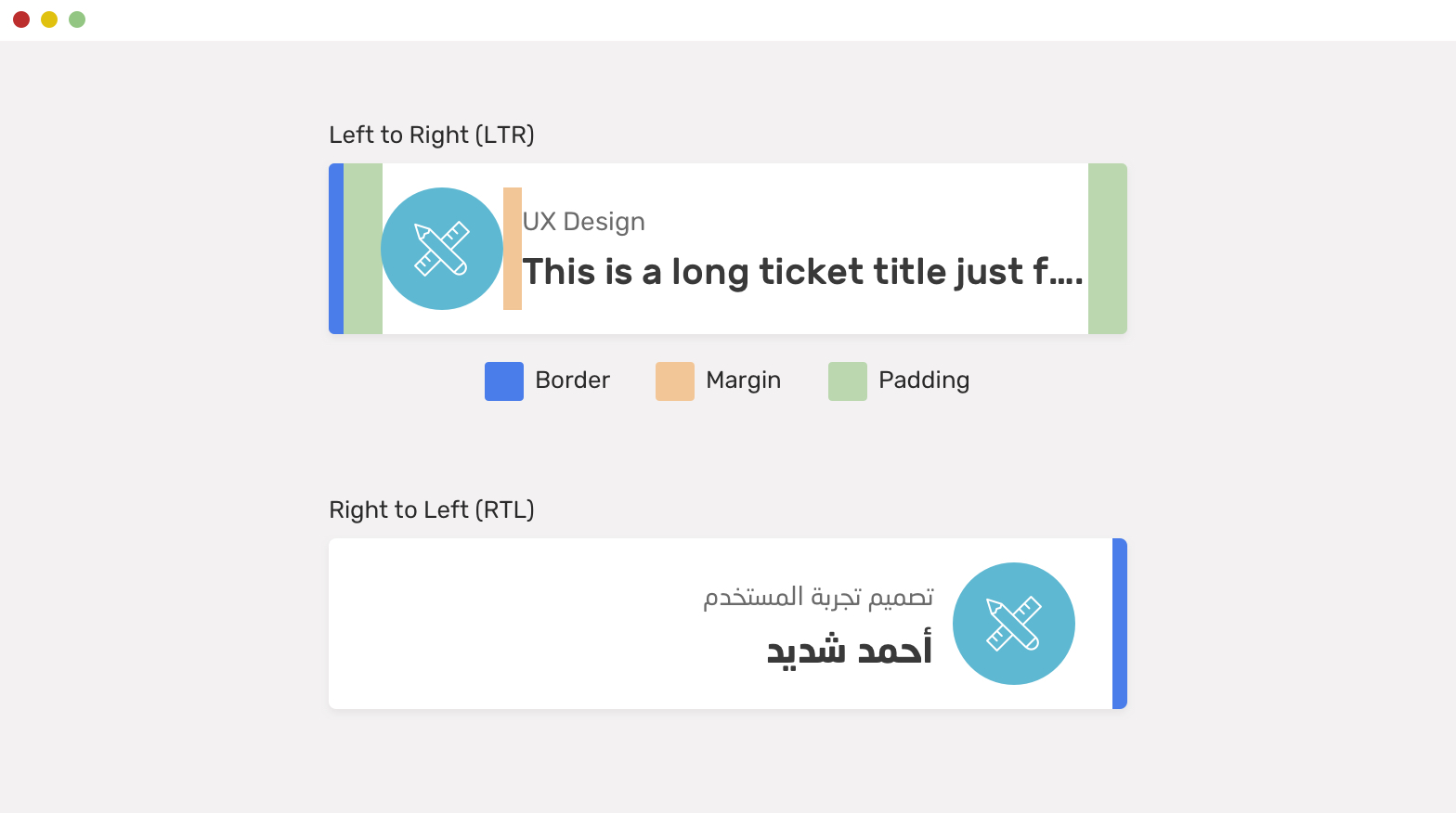
We have a component with the following:
Let’s see how we can manage the CSS for an LTR layout.
.card {
  padding-left: 2.5rem;
  padding-right: 1rem;
  border-left: 6px solid blue;
}

.card__icon {
  margin-right: 1rem;
}
And for an RTL layout, the directions should be flipped.
html[dir="rtl"] .card {
  padding-right: 2.5rem;
  padding-left: 1rem;
  border-left: 0;
  border-right: 6px solid blue;
}

html[dir="rtl"] .card__icon {
  margin-right: 1rem;
}
Again, that’s a lot of work. With CSS logical properties, we can minimize the CSS above to the following.
.card {
  padding-inline-start: 2.5rem;
  padding-inline-end: 1rem;
  border-inline-start: 6px solid blue;
}

.card__icon {
  margin-inline-end: 1rem;
}
Sometimes, we need to align an English text to the right. See the below example. We have an input with a limited number of characters. To help the user understand that, there is a label after the input to show that.
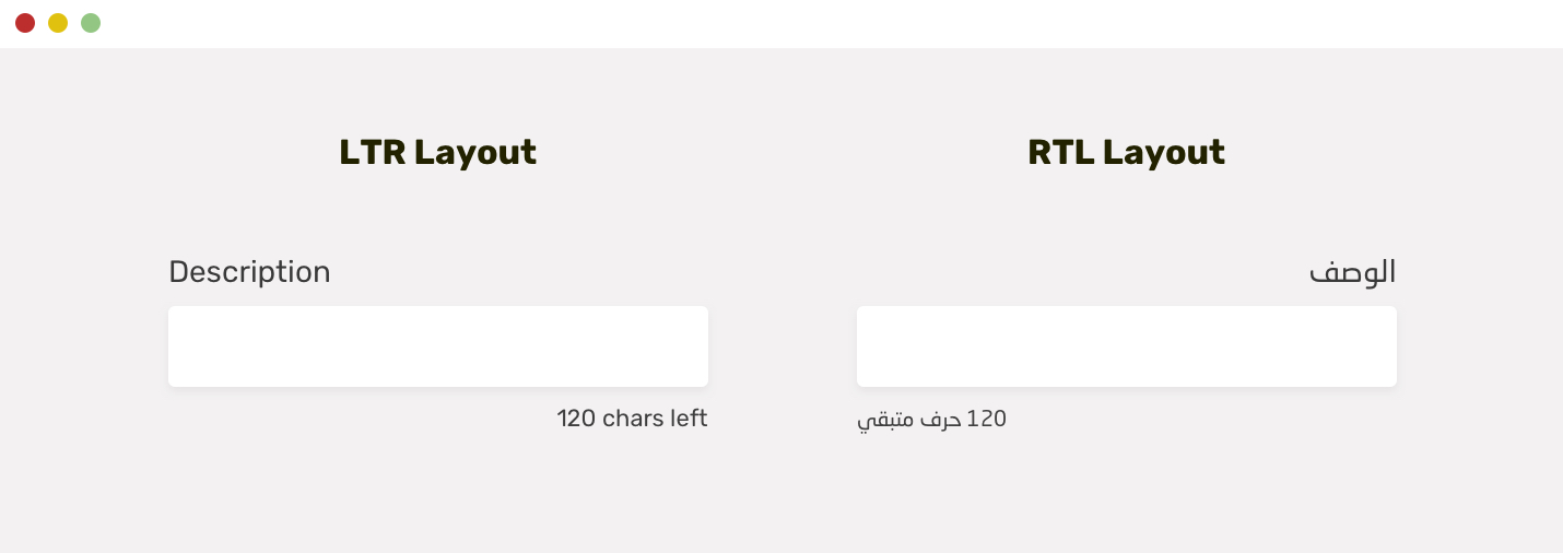
In English, this should be aligned to the right, while in Arabic, it should be aligned to the left. This is a great candidate for CSS logical properties.
.indicator {
  text-align: end;
}
Without logical properties, here is how we will do the above:
.indicator {
  text-align: right;
}

html[dir="rtl"] .indicator {
  text-align: left;
}
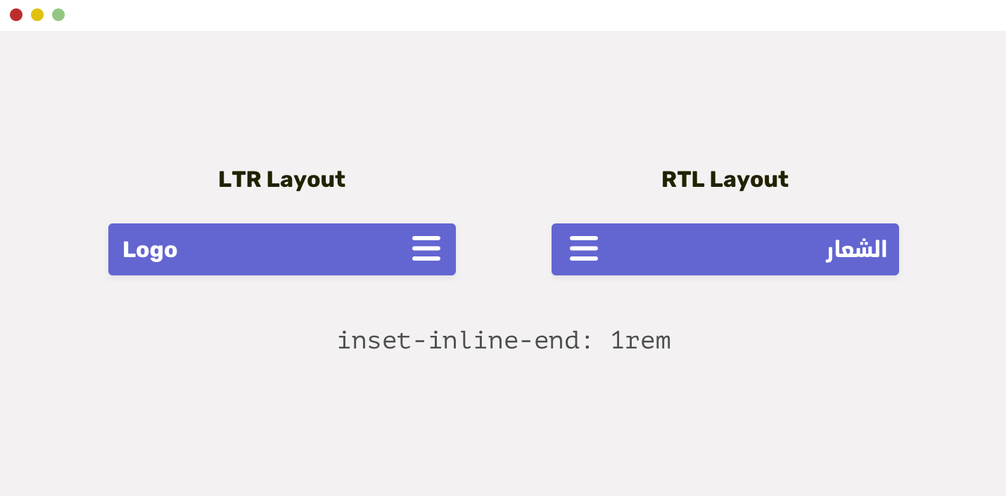
When an element is positioned absolutely, we need to take care of the left or/and right properties. Let’s take a basic example.
.menu__toggle {
  position: absolute;
  right: 1rem;
  top: 1rem;
}

html[dir="rtl"] .menu__toggle {
  right: auto;
  left: 1rem;
}
We can reduce the above by using the inset property. The support for it is not perfect, but this is the future.
The property inset-inline-end is equivalent to right for LTR layouts, and to left for RTL layouts. The example above can be done as the following:
.menu__toggle {
  position: absolute;
  inset-inline-end: 1rem;
  top: 1rem;
}
Also, the top can be inset-block-start, but it’s not needed for that case as we are not dealing with a Japanese or eastern-language website.
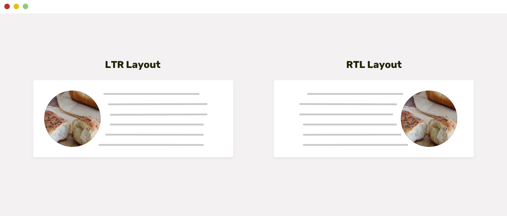
You might be wondering about using float in 2021. When we have a shape and we want the text to wrap around it, it won’t work without using the good old float.
Here is how we can do it:
img {
  float: left;
  shape-outside: circle(50%);
  margin-right: 20px;
}
This will only work for LTR layouts. For RTL ones, the CSS above should be like this:
html[dir="rtl"] img {
  float: right;
  margin-right: 0;
  margin-left: 20px;
}
With CSS logical properties, we can shorten the CSS to the following.
img {
  float: inline-start;
  shape-outside: circle(50%);
  margin-inline-end: 20px;
}
Isn’t that much easier?
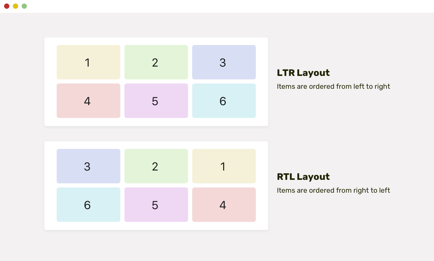
Grid and flexbox are both logical by default. That means, they will flip automatically based on the document direction. By using CSS grid and flexbox, you will minimize the effort needed to build multilingual grids and components.
In the following example, we have a grid wrapper. Notice how the items are arranged based on the direction of the document.
For now, the only wish I have for CSS logical properties is to support CSS background-position.
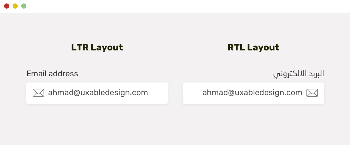
The goal is to add an icon as a background image, and it should flip based on the direction. Unfortunately, there isn’t a property like background-position-inline. For now, here is what I do:
.input {
  background: url("mail.svg") left 0.5rem center/24px no-repeat;
  padding-inline-start: 2.4rem;
}

html[dir="rtl"] .input {
  background: url("icon.svg") right 0.5rem center/24px no-repeat;
}
If you want to dig more into RTL styling, I wrote an extensive guide on how to style for RTL in CSS. I hope you will like it!
I’m excited to let you know that I wrote an ebook about Debugging CSS.
If you’re interested, head over to debuggingcss.com for a free preview…
此内容由惯性聚合(RSS阅读器)自动聚合整理,仅供阅读参考。 原文来自 — 版权归原作者所有。