
Learning how to steam milk


Fluid sizing with clamp() and container query units is powerful, but the computed values often land on numbers like 19.7px or 143.2px. The CSS round() function lets you snap those values to a predictable step, which is useful for typography, spacing, and layout rhythm.
In this article, I’ll show the problem, how round() works, and some examples you can try in the demos.
While comparison functions provide us with a way to do fluid sizing, they can become quite annoying when used. For example, a designer might request for fluid sizing to be more predictable.
Let’s take the following example. We have a headline that has a fluid sizing with the clamp() function.
.title {
  font-size: clamp(1rem, 1rem + 5cqw, 4rem);
}
Observing time!
Resize the container.
While resizing, the font size doesn’t follow a specific pattern, it just increases or decreases based on the container width. Nothing wrong here, it’s how the clamp() function works.
Let’s take another look at the same heading, but with the round() function applied.
Observing time!
Resize the following container and observe the font size. Is it better?
This is using the CSS round() function to round the clamped value down to the nearest 2px.
If the clamped value will change based on every resize of a component or a viewport, it can lead to inconsistent results when used with spacing, typography, and sizing properties (width, height).
round(), mod(), and rem()
Baseline 2024 newly available
Supported in Chrome: yes.
 Supported in Edge: yes.
 Supported in Firefox: yes.
 Supported in Safari: yes.

Since May 2024 this feature works across the latest devices and browser versions. This feature might not work in older devices or browsers.
From its name, the round() function helps us round a value up or down to the nearest given step.
It takes the following arguments:
up, down, nearest, or to-zero.Take the following example:
.title {
  font-size: round(down, 15px, 2px);
}
This will round the font size down to the nearest 2px. I made the following demo where you can experiment with different values for the round modes and interval.
Observing time!
Some ideas to try:
Font size
Interval (px)
Computed24px
CSS is awesome
Can this function really help in actual use cases? For example, what effect will it have on a complete layout? Say a card component.
In the following demos, I will showcase how it works with real examples.
In this demo, I used CSS clamp() for the font size. Keep in mind that cqw is used as per the card container.
.card {
  container-type: inline-size;
}

.title {
  --size: clamp(1rem, 1rem + 2cqw, 2rem);
  font-size: var(--size);
}
The title font size for both cards is without round(). Toggle the checkbox to see what happens when round() is applied.
Observing time!
round().Learning how to steam milk
Learning how to steam milk
By Ahmad Shadeed
.title {
  --size: clamp(1rem, 1rem + 2cqw, 2rem);
  font-size: round(down, var(--size), var(--round-interval, 4px));
}
As you’ve noticed (in case you played with the demo above) the font sizes will follow the specified interval: 4, 8, 12, 16, 20, 24, 28, 32, etc.
This is very useful for UIs where we want to have predictability in the font sizes, spacing, and sizing properties.
Another example is having consistent increments for a type scale. Take the following demo where we have five font sizes.
Without round(), the font sizes are not consistent, see the current values in the list below:
Toggle the checkbox and see the change. The font sizes will round down to the nearest 4px.
Hello, world!
Hello, world!
Hello, world!
Hello, world!
Hello, world!
In editorial layouts, we might need to snap a component to a specific line. Imagine having a striped line background, and we want to snap a square to the nearest line.
Observing time!
Take the following demo. We have a square that is aligned to the nearest line, right? Resize the container and observe the square. Does it stay aligned to the nearest line?
Let me explain.
The lines are a CSS gradient background with a full width and a fixed height. Notice the --base variable.
.content {
  --base: 48px;
  --line-color: rgba(0, 0, 0, 0.2);
  background-image: linear-gradient(
    to bottom,
    transparent calc(100% - 1px),
    var(--line-color) 0
  );
  background-size: 100% var(--base);
}
And the square is a simple element with clamp() used for a fluid width.
.item {
  --size: clamp(2rem, 2rem + 30cqw, 20rem);
  aspect-ratio: 1;
  width: var(--size);
  background-color: deepskyblue;
}
To make it snap to the nearest line, we need to use round() to round the width to the nearest --base value.
When omitting the round mode, it will default to nearest.
.item {
  --size: clamp(2rem, 2rem + 30cqw, 20rem);
  aspect-ratio: 1;
  width: round(var(--size), var(--base));
  background-color: deepskyblue;
}
Take a look and resize the container. Notice how the square snaps to the nearest line.
We can even take this further and make the --base smaller to see it better.
This is an abstract example of the technique, but can be used to do stuff that wasn’t possible before. Take the following layout:
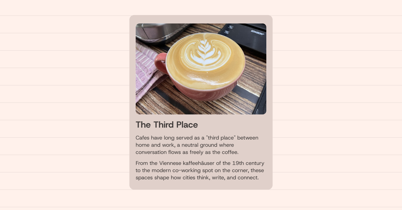
How can we ensure that the card’s height will always be snapped to the nearest line from top and bottom?
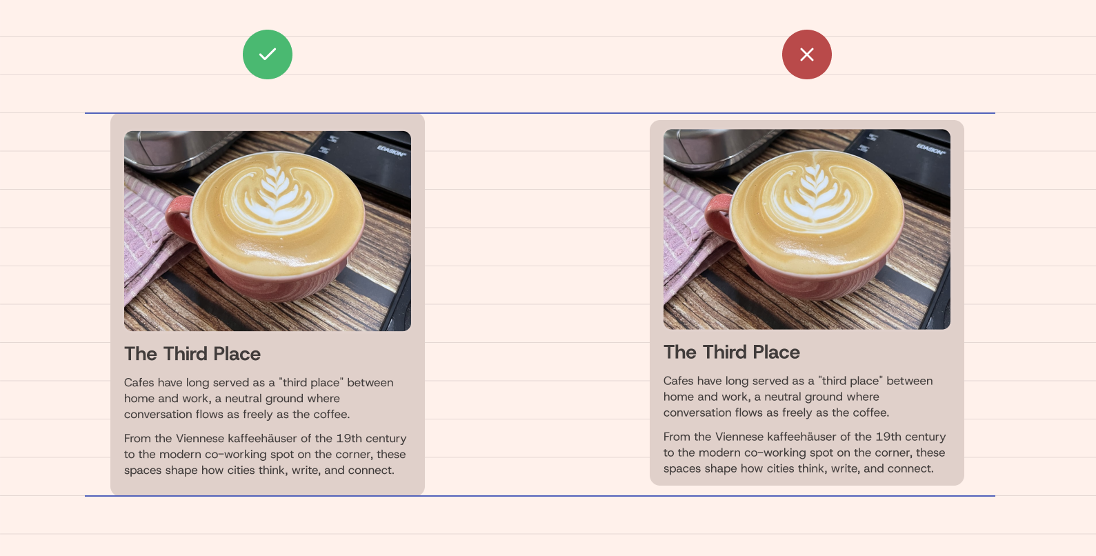
We can’t use a fixed height, because the content can change, but how to snap the current height to the nearest line?
The trick here is to use 100% as the value to round to. Given that the lines are a CSS gradient image, I will use the --base variable as the interval.
.item {
  height: round(up, 100%, var(--base));
}
With that, the height will be rounded to the nearest --base value. In the round() function, the 100% will compute to the current element’s height.
Words: 7
Cafes have long served as a "third
While that looks like it’s working, there is something off with the layout. If we want to have multiple cards and lay them out using CSS grid, the 100% will compute to the current element’s height for the grid.
In the figure below, the highlighted area is the grid item’s height. Notice how it’s smaller than the actual card height.
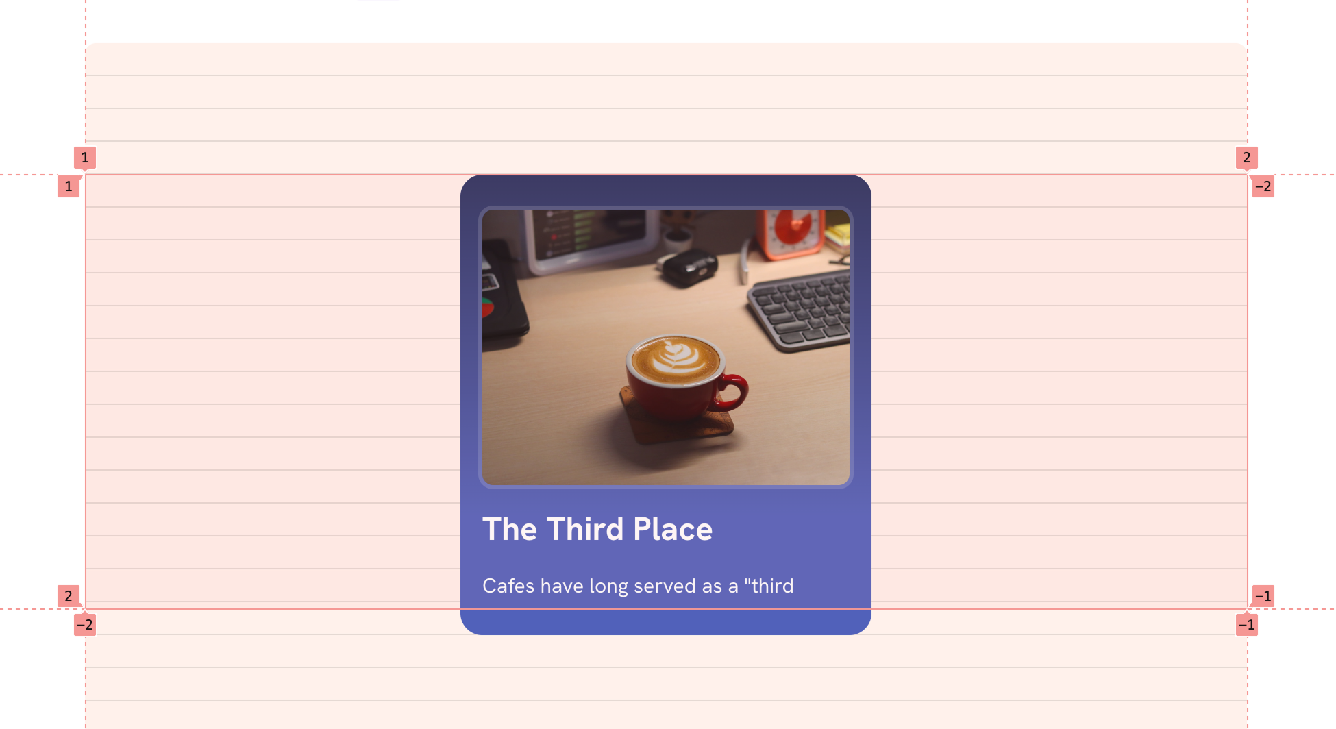
To fix that, we can use the new calc-size() function which will help us in getting the actual card height and then round it to the nearest --base value.
.item {
  height: calc-size(auto, round(up, size, var(--base)));
}
Here is the version with the calc-size() function.
Words: 7
Cafes have long served as a "third
I took it further and made an editorial layout with multiple cards. Take a look at the following CodePen demo.
See the Pen CSS round() by Ahmad Shadeed (@shadeed) on CodePen.
round() is a small addition to your fluid-sizing toolkit, but it pays off when you want predictable steps like typography scales, spacing tokens, or snapping components to a layout grid. Pair it with clamp() and container query units when you want fluid and stepped values.
While this is fairly new, I’d use it with care and mostly as an enhancement.
Thank you for reading.
Building layouts can be a challenging task, specially if you don’t know the core mental model of CSS layouts. You don’t have to worry about that anymore. I released an interactive CSS layout course, and I called it, The Layout Maestro.
Check it out here.
此内容由惯性聚合(RSS阅读器)自动聚合整理,仅供阅读参考。 原文来自 — 版权归原作者所有。