


I spent years teaching CSS layout on this blog. I put everything I know into The Layout Maestro course: 70+ lessons and 150+ interactive examples that teach you how to think CSS layouts, not just memorize syntax.
A few weeks ago, Adobe released a web version of Photoshop that is built with the web technologies like WebAssembly, web components, P3 colors, and a lot more.
Photoshop was the first professional design app that I learned when I was 14 years old. It was one of the reasons that I became a designer, and eventually a front-end developer. Because of that, I thought it would be interesting to see how the CSS was written for such a massive app like Photoshop.
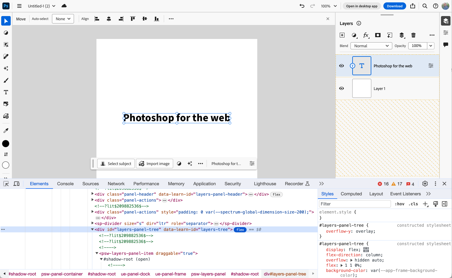
In this article, I will share the CSS findings that I find interesting. Let’s do it!
The first thing that I noticed is using an old logo of Photoshop (1990-1991) in the browser console.
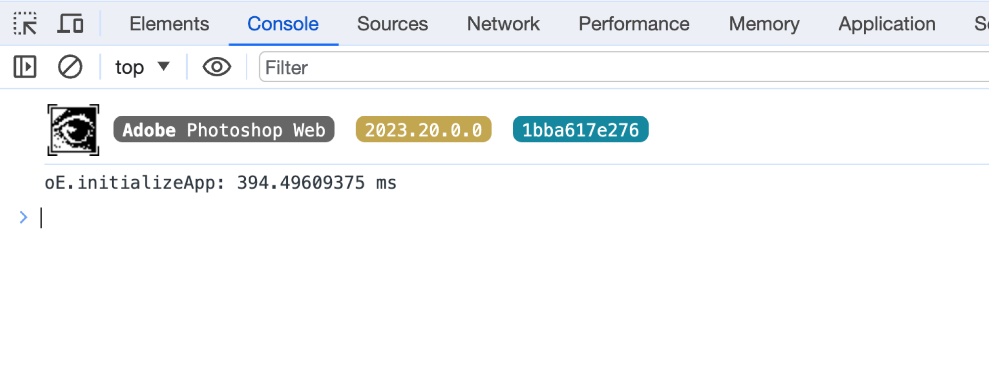
Such a nice little detail. If you’re curious about how such a thing is made, here is the code:
console.info(
  "%c %cAdobe %cPhotoshop Web%c  %c2023.20.0.0%c  %c1bba617e276",
  "padding-left: 36px; line-height: 36px; background-image: url('data:image/gif;base64,R0lGODlhIAAgAPEBAAAAAPw==');"
)
To make an app like Photoshop feel like a real app on the web, the first thing is to prevent scrolling. To achieve that, the <body> element has position: fixed along with overflow: hidden.
body,
html {
  height: 100%;
}

body {
  font-family: adobe-clean, sans-serif;
  margin: 0;
  overflow: hidden;
  position: fixed;
  width: 100%;
}
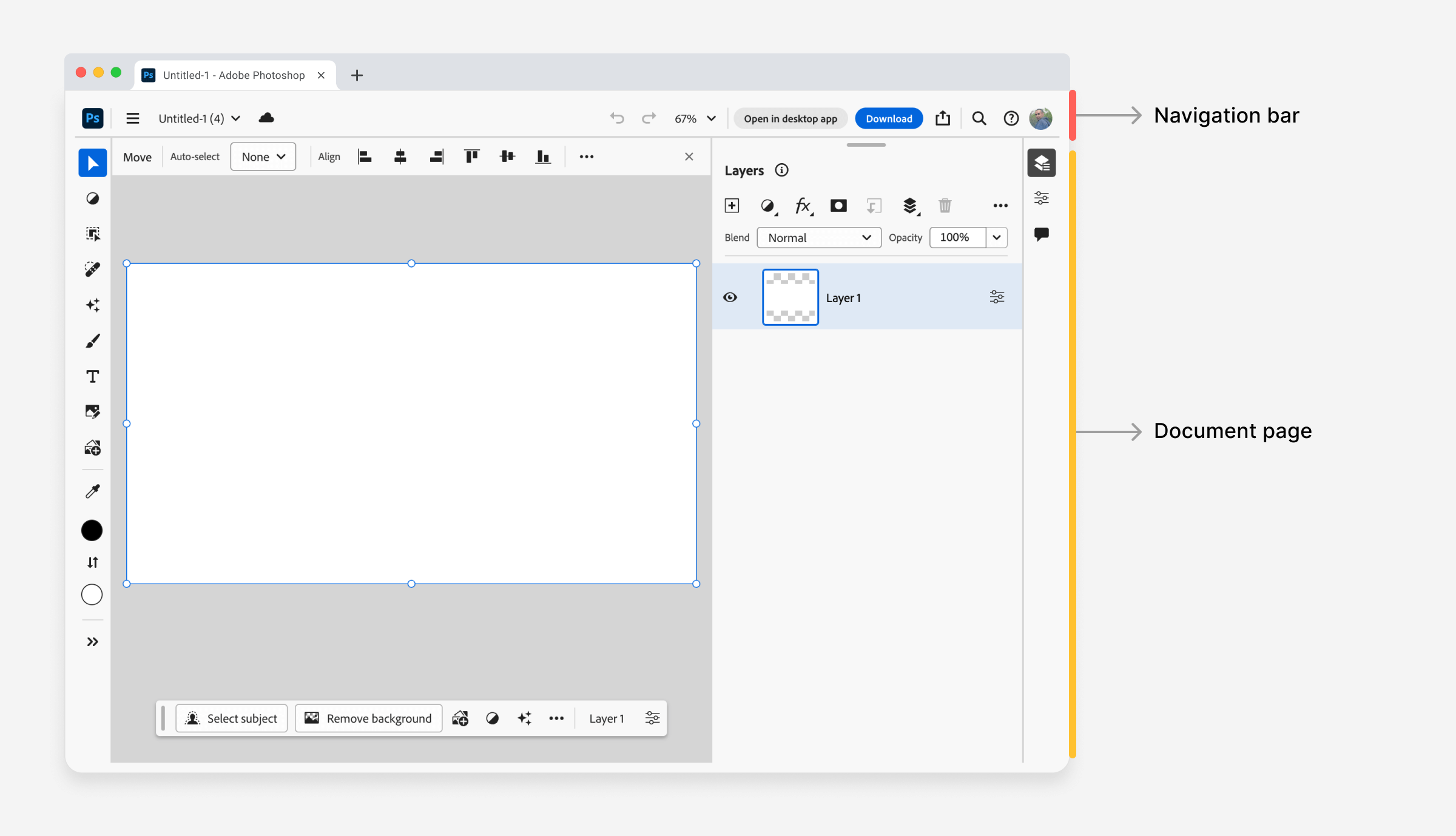
This is the basic step. Inside the <body> element, there are multiple root elements, too.
<psw-app>
  <psw-app-context>
    <ue-video-surface>
      <ue-drawer>
        <div id="appView">
          <psw-app-navbar></psw-app-navbar>
          <psw-document-page></psw-document-page>
        </div>
      </ue-drawer>
    </ue-video-surface>
  </psw-app-context>
</psw-app>
Finally, there is the element that contains the navigation and the document page.
#appView {
  background-color: var(--editor-background-color);
  color: var(--spectrum-global-color-gray-800);
  display: flex;
  flex-direction: column;
}
* {
  touch-action: manipulation;
}

:host {
  position: relative;
}
When building a web app these days, using flexbox is very beneficial for many reasons. I have mixed feelings when I think about Flexbox and Photoshop.
Photoshop is a well-known design app that was the way many people entered the design field. On the other hand, Flexbox made it easier to build components and made CSS a bit easier for newcomers.
Instead of using the clearfix hack, simply add display: flex and then style the child items as you want. Let’s explore the many flexbox use cases in Photoshop.
Let’s explore a few examples of using flexbox.
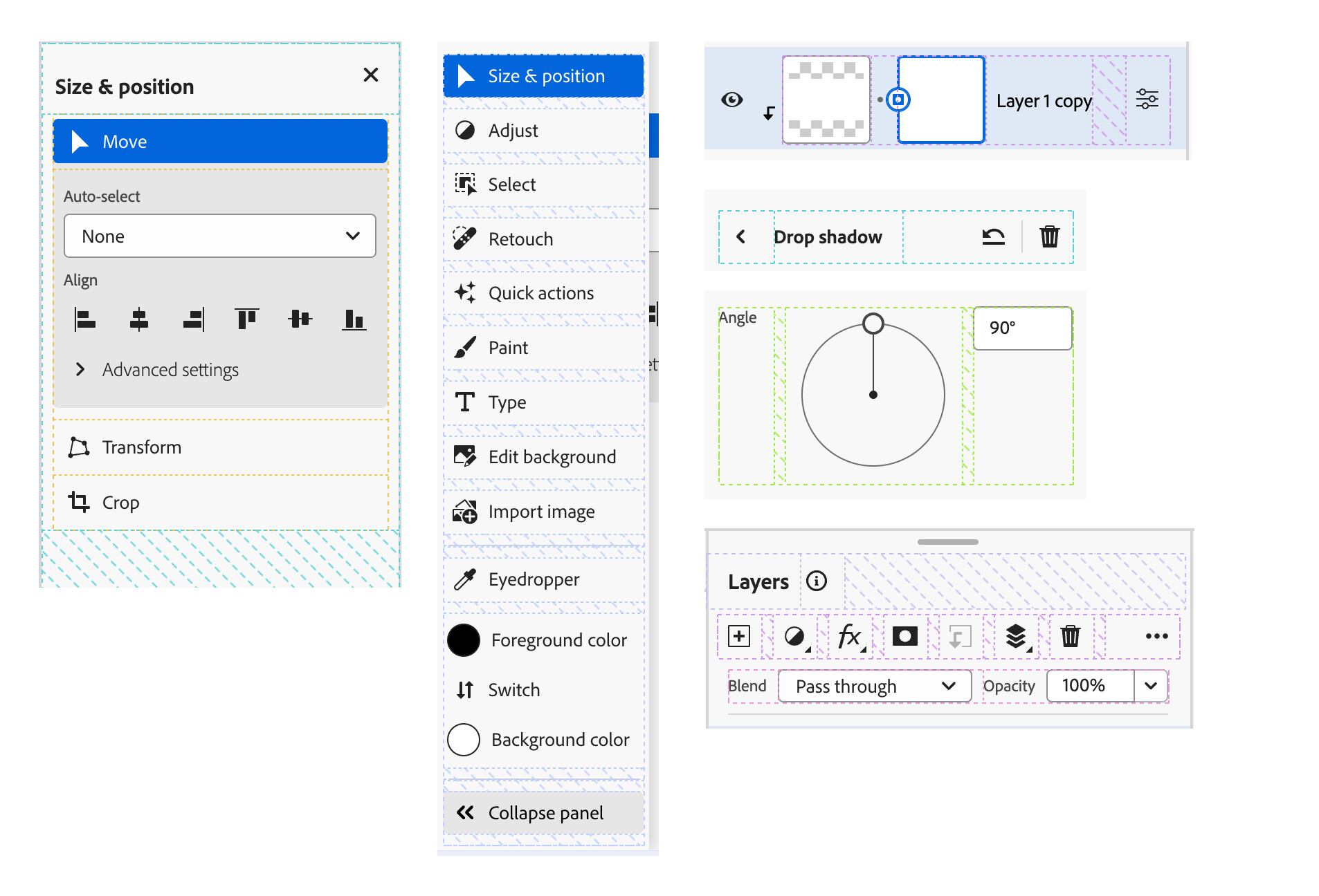
I like the naming of the sections here. Instead of using “left, center, right”, they used “start”, “center”, and “end”.
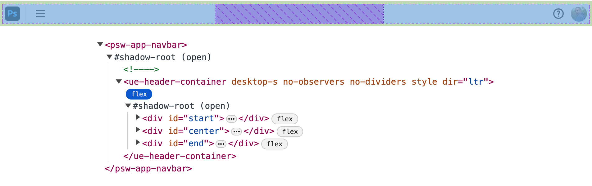
That logical naming is the right thing to do for an app that can work from left-to-right (LTR) or right-to-left (RTL).
I explained about this exact technique in my RTL Styling 101 guide.
Nested flexbox containers are necessary when building a complex app like Photoshop. In the following figure, I highlighted the two containers in the context bar.
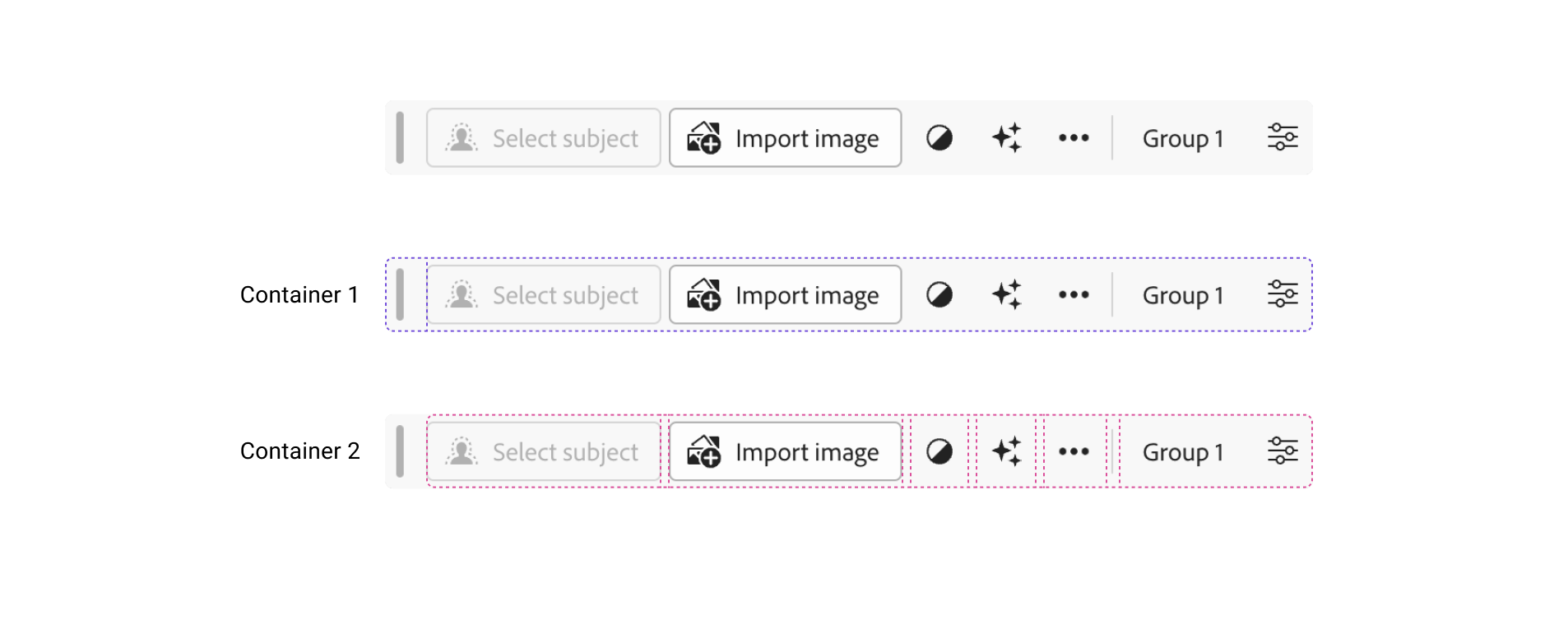
The first container is used for the grab handle and the rest of the content. The second container contains all the actions and buttons.
.container {
  display: flex;
  flex-wrap: nowrap;
  align-items: center;
  gap: var(--spectrum-global-dimension-size-50);
}
gap helped a lot to define the spacing. I couldn’t imagine using margin or padding for this..container is too generic but it works very well here, since this is a web component, so all styles are encapsulated.Since the layers feature is an important part of Photoshop, it’s probably one of the first few things that a newcomer will learn. I got curious to check the CSS behind them.
I looked closely at the CSS and it was all flexbox. To make my life easier, I replicated the design in Figma so I could highlight stuff for the article.
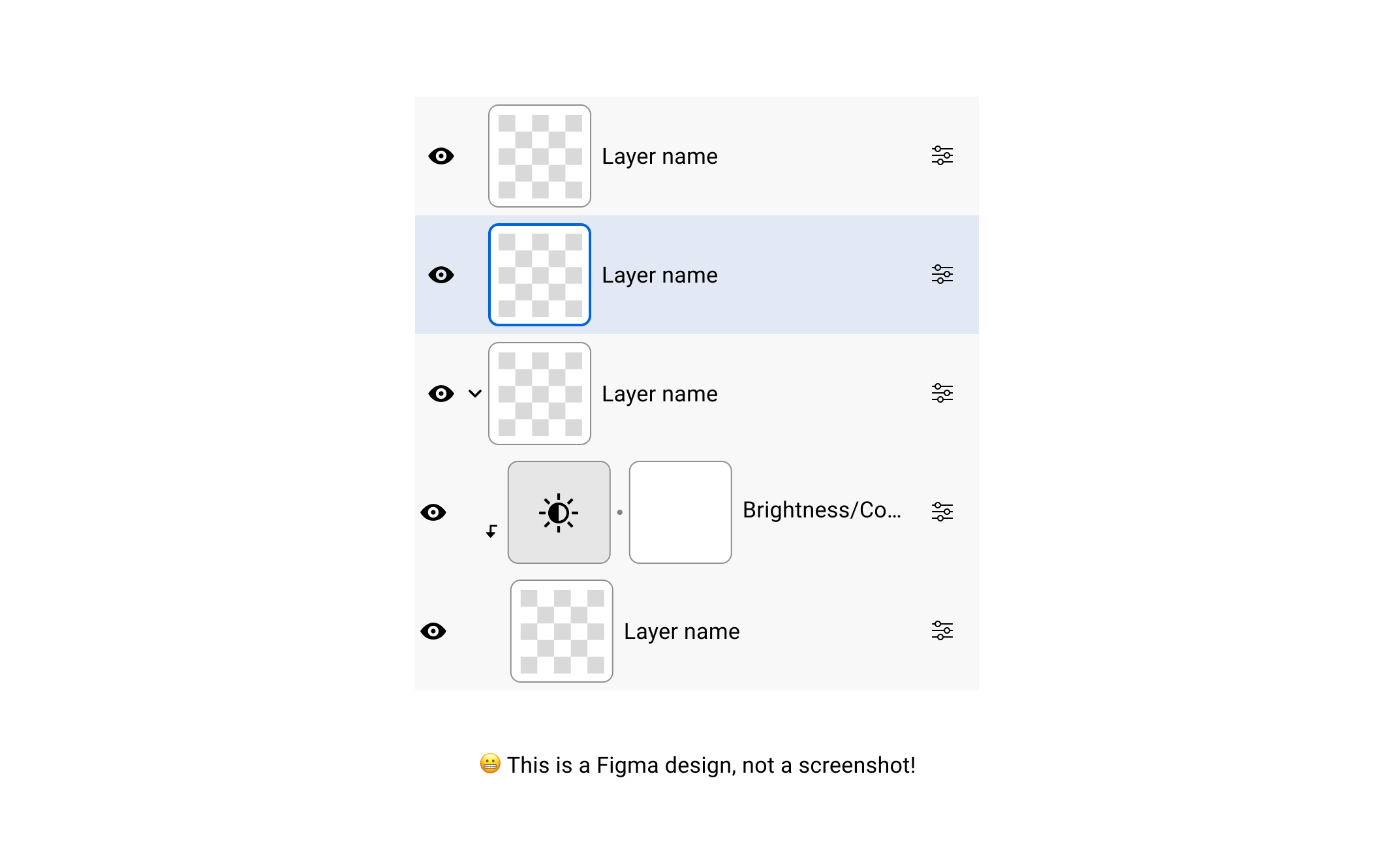
Digging deeper, here is the HTML markup for the layer component:
<psw-tree-view-item indent="0" layer-visible can-open dir="ltr" open>
  <div id="link">
    <span id="first-column"></span>
    <span id="second-column"></span>
    <span id="label"></span>
  </div>
</psw-tree-view-item>
I’m not a fan of the naming here, but do you see how using IDs is totally fine here? Since this is a web component, it doesn’t matter how many times the #first-column ID is present on the page.
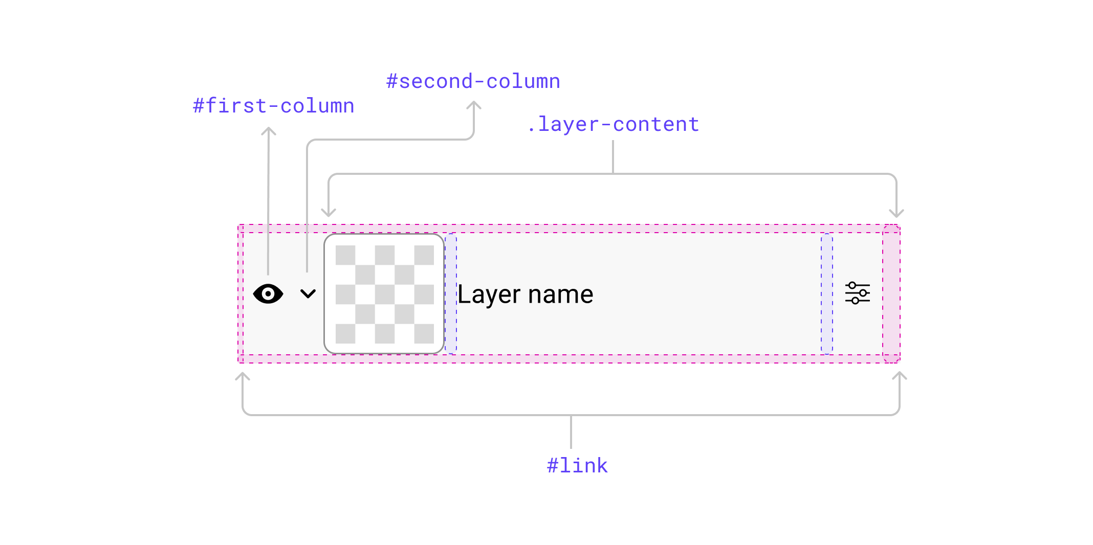
The #link element is the main flexbox wrapper, and the element within the #label is a flexbox wrapper, too.
<div class="layer-content layer-wrapper selected">
  <psw-layer-thumbnail></psw-layer-thumbnail>
  <div class="name" title="Layer name">Layer name</div>
  <div class="actions"></div>
  <overlay-trigger></overlay-trigger>
</div>
Let’s take an example of how indentation of child layers is done.
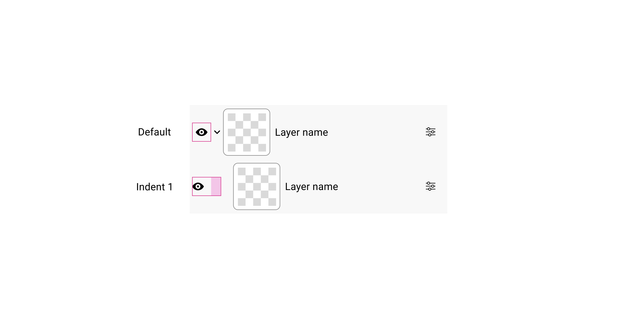
:host() represents the layer componentindent=1 HTML attribute is there, then change the padding-right for the first column.:host([dir="ltr"][indent="1"]) #first-column {
padding-right: var(--spectrum-global-dimension-size-200);
}
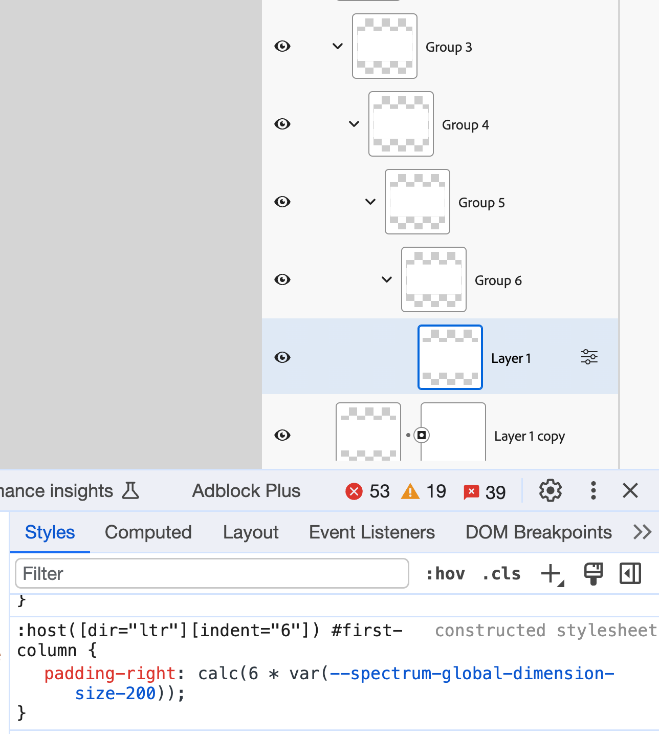
If the indent is two levels, then the padding-right value is multiplied by 2 via CSS calc() function.
:host([dir="ltr"][indent="2"]) #first-column {
  padding-right: calc(2 * var(--spectrum-global-dimension-size-200));
}
In the browser, I tried nesting till level 6. Here is a real screenshot:
While looking at this, I remembered when I inspected the CSS behind Figma. They used a spacer component to add spacing for nested layers.
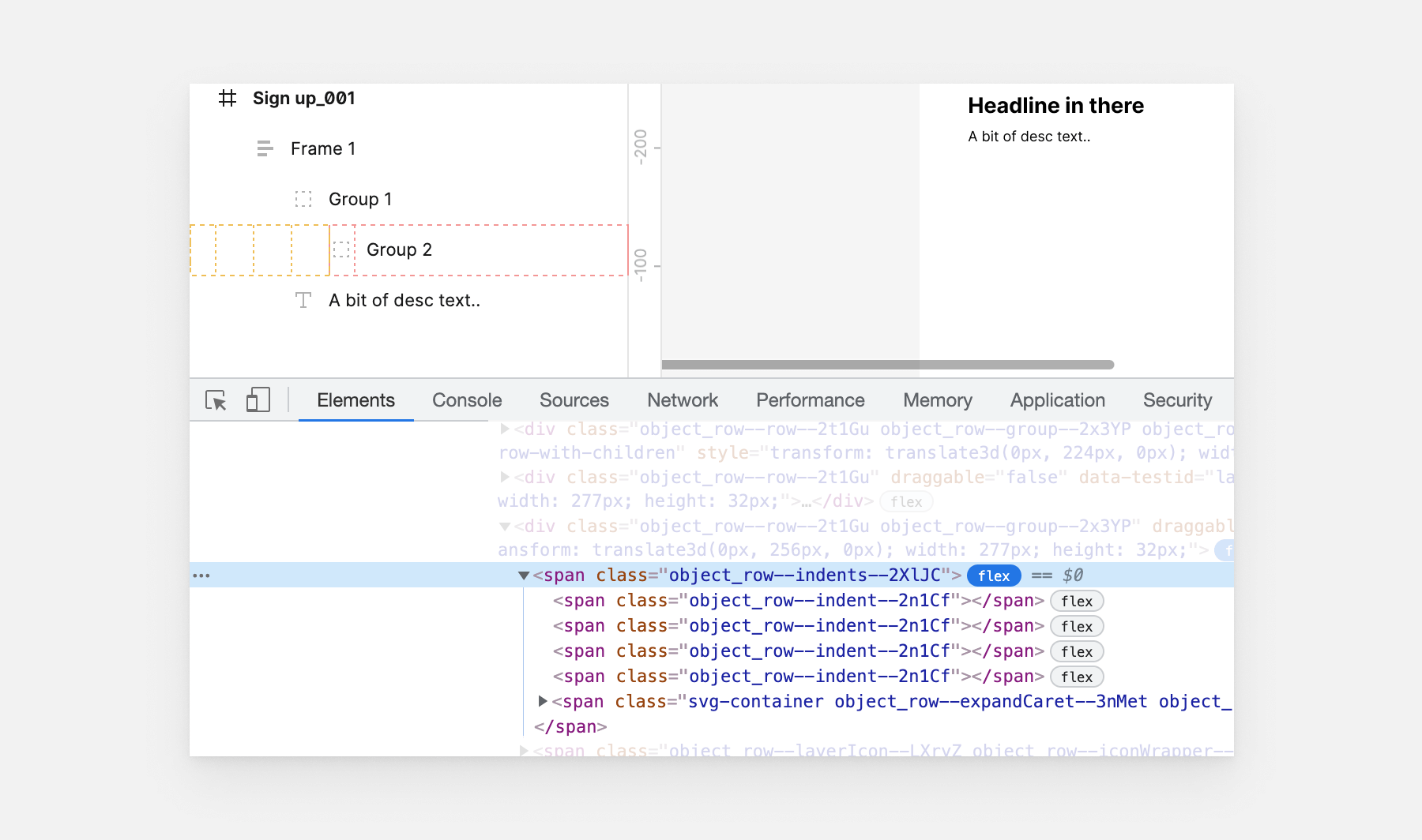
It’s interesting to see how two major design apps use different techniques for the same goal.
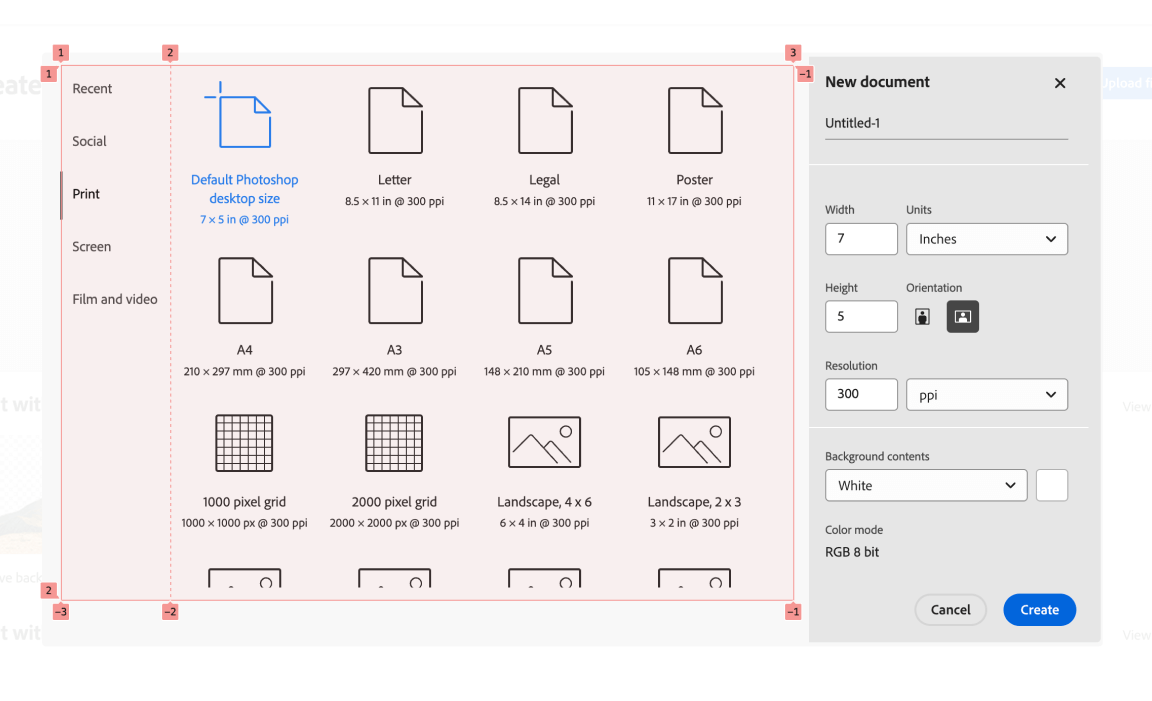
When creating a new Photoshop file, you have the option to select a pre-defined list of sizes. To achieve that, there is a layout that contains multiple tabs and an active panel.
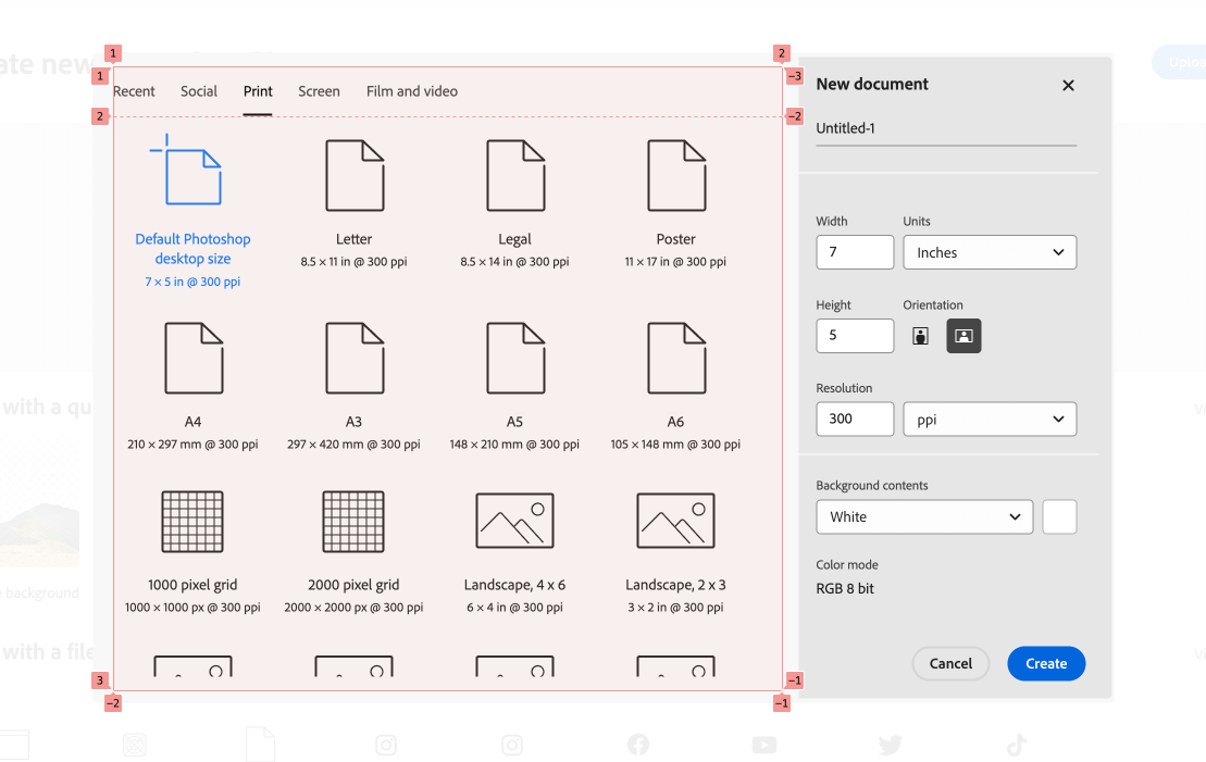
Here is what the HTML looks like:
<sp-tabs
  id="tabs"
  quiet=""
  selected="2"
  size="m"
  direction="horizontal"
  dir="ltr"
  focusable=""
>
  <div id="list"></div>
  <slot name="tab-panel"></slot>
</sp-tabs>
In CSS, there is a main grid with 1 column and 2 rows. The first row is auto and the second one spans the available space.
:host {
  display: grid;
  grid-template-columns: 100%;
}

:host(:not([direction^="vertical"])) {
  grid-template-rows: auto 1fr;
}
There are a few things going on here:
:not() selector[attr^=value] selector to exclude HTML elements that have the attribute direction with a value that starts with vertical.I consider this as a conditional CSS technique.
I tried changing the direction attribute to vertical, and it worked as expected.
Here is the CSS based on the attribute change:
:host([direction^="vertical"]) {
  grid-template-columns: auto 1fr;
}

:host([direction^="vertical-right"]) #list #selection-indicator,
:host([direction^="vertical"]) #list #selection-indicator {
  inline-size: var(
    --mod-tabs-divider-size,
    var(--spectrum-tabs-divider-size)
  );
  inset-block-start: 0px;
  inset-inline-start: 0px;
  position: absolute;
}
To highlight which tab item is active, there is a #selection-indicator element that is positioned relative to the tabs list.
I like this usage of CSS grid here. It’s suitable for the problem, which is to align many elements in a grid.
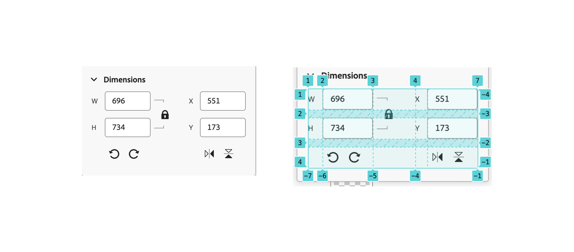
Digging into the CSS, I noticed this:
.content {
  position: relative;
  display: grid;
  grid-template-rows: [horizontal] min-content [vertical] min-content [transforms] min-content [end];
  grid-template-columns: [size-labels] min-content [size-inputs] auto [size-locks] min-content [space] min-content [position-labels] min-content [position-inputs] auto [end];
  row-gap: var(--spectrum-global-dimension-size-150);
}
I couldn’t resist but to rebuild the grid myself so I could get a better idea of how it works.
Here is the grid in Firefox. I like how the DevTools here generate a mimic grid layout. When highlighting a rectangle, it will show the actual grid item that is placed within it.
See the following video:
The technique used here is called named grid lines. The idea is that you name each column or grid and then define its width. The width of the column and rows is either auto or min-content. This is a great way to make a dynamic grid.
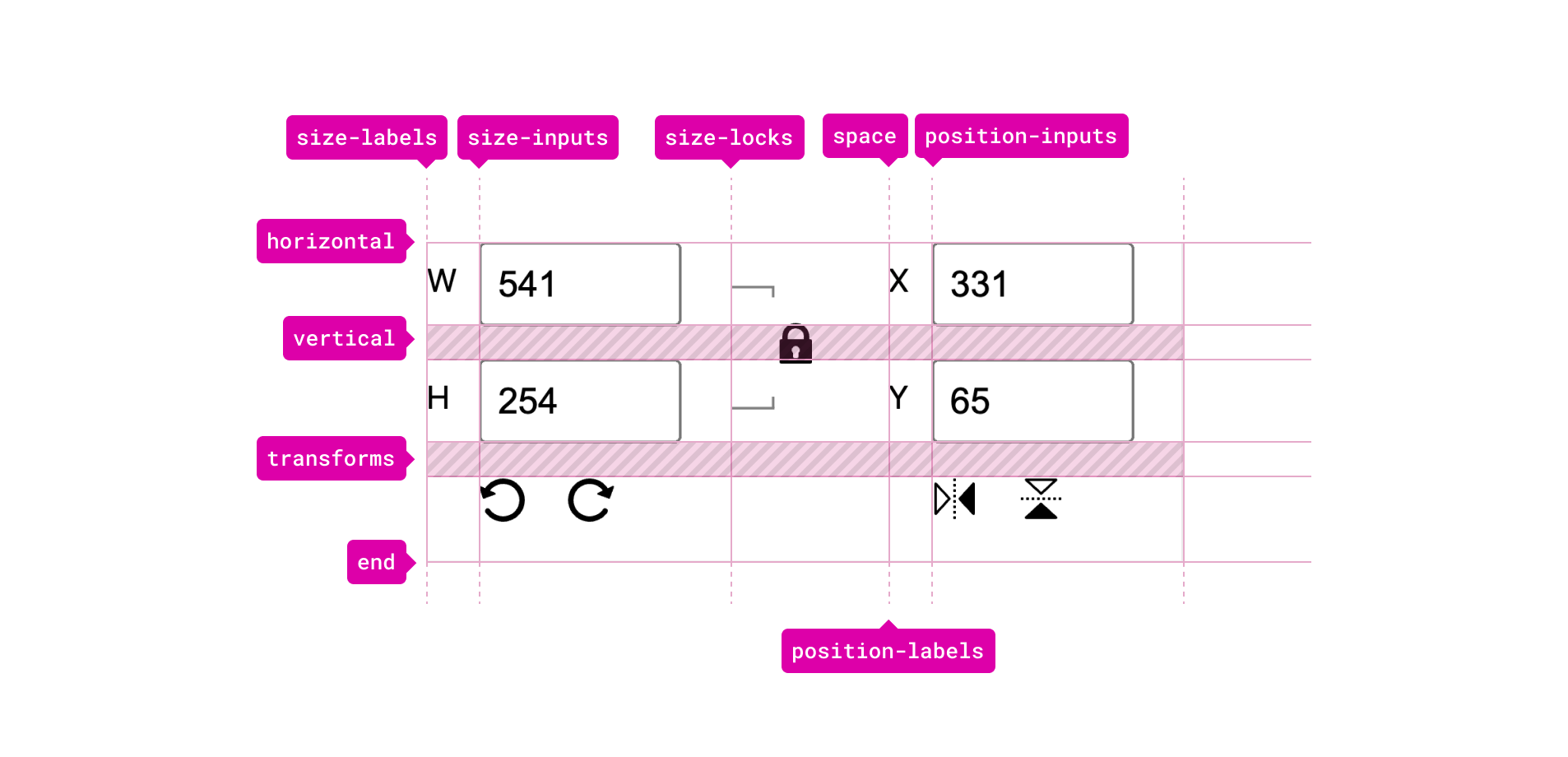
With that, each grid item should be positioned within the grid. Here are a few examples:
.horizontal-size-label {
  grid-area: horizontal / size-labels / horizontal / size-labels;
}

.vertical-position-input {
  grid-area: vertical / position-inputs / vertical / position-inputs;
}

.horizontal-position-input {
  grid-area: horizontal / position-inputs / horizontal /
    position-inputs;
}
Another detail that caught my attention is the use of position: absolute for a grid item. The lock button is placed at the center of the grid, but it needs a slight inset from the left and top positions.
.lock-button {
  grid-area: horizontal / size-locks / horizontal / size-locks;
  position: absolute;
  left: 8px;
  top: 22px;
}
I probably will write another write-up just about this CSS grid technique and its various use cases.
This is an example of many where CSS grid is being used for the layout of an input field.
:host([editable]) {
  display: grid;
  grid-template-areas:
    "label ."
    "slider number";
  grid-template-columns: 1fr auto;
}

:host([editable]) #label-container {
  grid-area: label / label / label / label;
}

:host([editable]) #label-container + div {
  grid-area: slider / slider / slider / slider;
}

:host([editable]) sp-number-field {
  grid-area: number / number / number / number;
}
When inspecting this in the browser, you can either see the grid line names or grid area names. Here are two figures that show the difference.
Grid area names
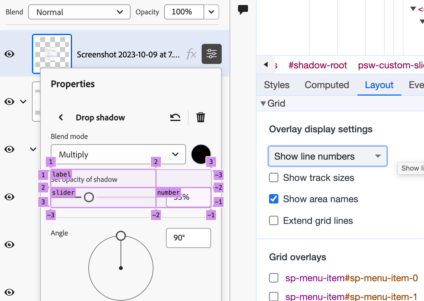
Grid line names
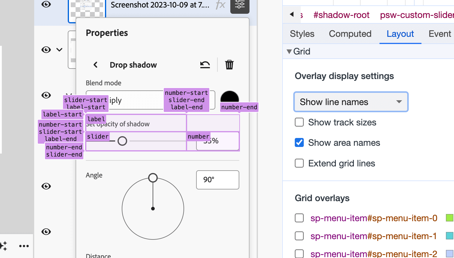
I like that you can view the layout in two different ways. Very useful for debugging or understanding the layout that you’re trying to build/fix.
CSS grid should be used more in our web apps, but definitely not like the following example.
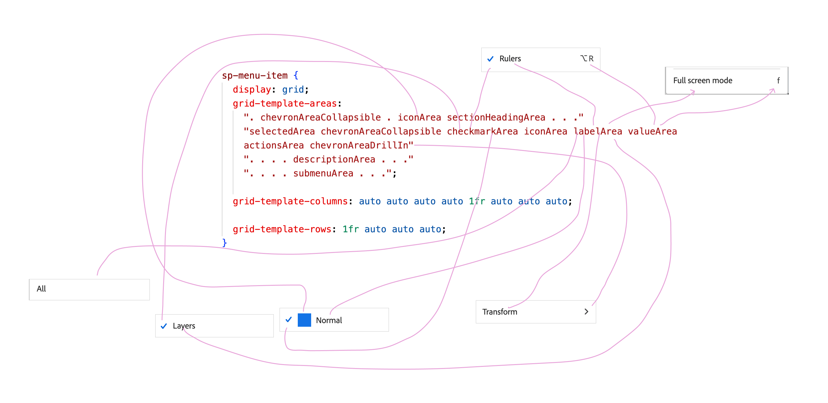
The use of CSS grid here is an overkill in my opinion. Let me show you what I mean.
sp-menu-item {
  display: grid;
  grid-template-areas:
    ". chevronAreaCollapsible . iconArea sectionHeadingArea . . ."
    "selectedArea chevronAreaCollapsible checkmarkArea iconArea labelArea valueArea actionsArea chevronAreaDrillIn"
    ". . . . descriptionArea . . ."
    ". . . . submenuArea . . .";
  grid-template-columns: auto auto auto auto 1fr auto auto auto;
  grid-template-rows: 1fr auto auto auto;
}
This is a grid that contains 8 columns * 4 rows. From the time I spent on understanding why they did this, it seems like one grid row is active at a time, the other rows will collapse due to empty content, or the absence of HTML elements.
Fun fact, the CSS above is after I simplified it. The original version looked like this. The team used grid-template shorthand.
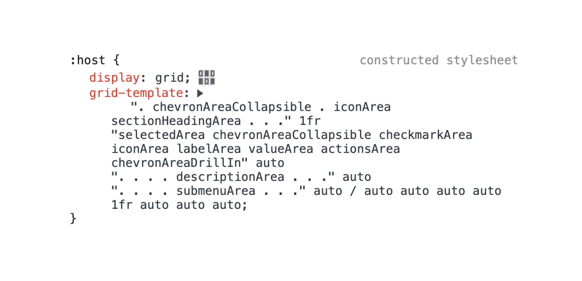
Here are the menu item variations that I could find across the app.
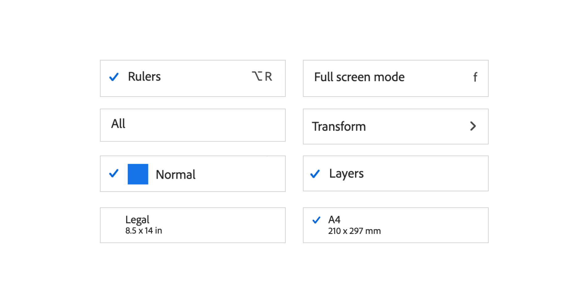
Yes, that CSS grid is for this tiny component. I’m not convinced about using CSS grid here at all. Again, it’s an overkill.
Here is an example of using the grid.
.checkmark {
  align-self: start;
  grid-area: checkmarkArea / checkmarkArea / checkmarkArea /
    checkmarkArea;
}

#label {
  grid-area: labelArea / labelArea / labelArea / labelArea;
}

::slotted([slot="value"]) {
  grid-area: valueArea / valueArea / valueArea / valueArea;
}
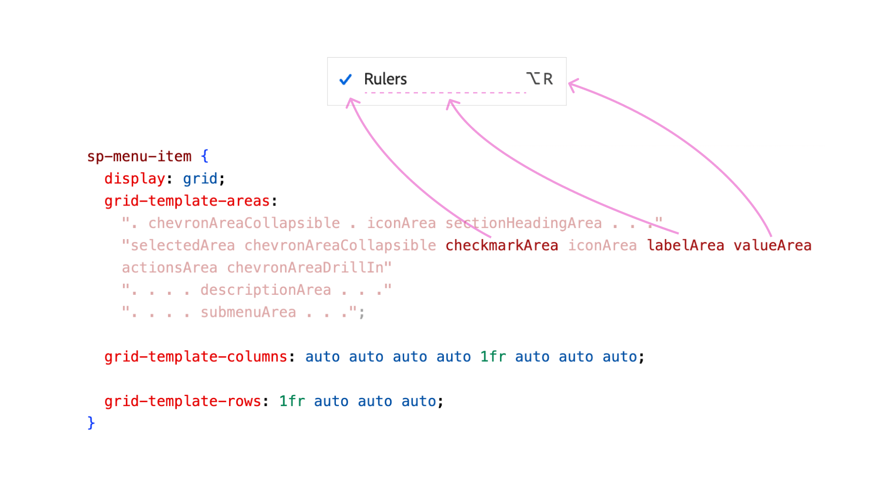
Notice how the dimmed part of the CSS grid is inactive. They collapsed since there was no content. For this specific example, the author can do this too:
.checkmark {
  align-self: start;
  grid-area: checkmarkArea;
}

#label {
  grid-area: labelArea;
}

::slotted([slot="value"]) {
  grid-area: valueArea;
}
No need to define the start and end of each column and row when they are the same value.
I really like how CSS variables are used to change the UI. There are multiple examples of this that I will highlight.
If you are familiar with Photoshop, it’s possible to control the thumbnail size and make them smaller. This is useful when you have a lot of layers, and want to view more layers in less space.
See the following figure:
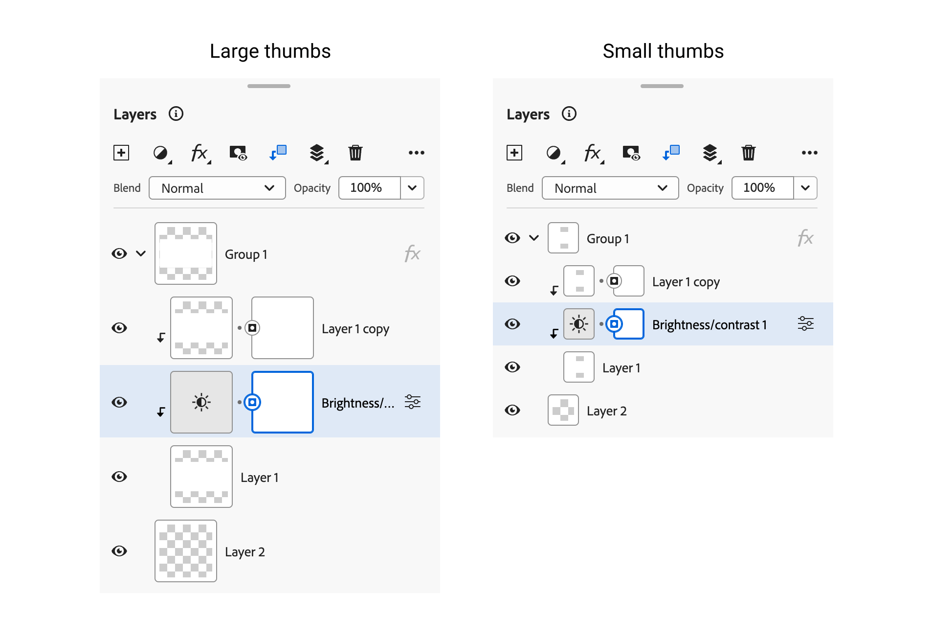
I like how the Adobe team built that. First, there is an HTML attribute large-thumbs on the main container for the layers panel.
<psw-layers-panel large-thumbs></psw-layers-panel>
In the CSS, there is :host([large-thumbs]) which assigns specific CSS variables.
:host([large-thumbs]) {
  --psw-custom-layer-thumbnail-size: var(
    --spectrum-global-dimension-size-800
  );
  --psw-custom-layer-thumbnail-border-size: var(
    --spectrum-global-dimension-size-50
  );
}
For each layer, there is an element with the name psw-layer-thumbnail. This is where the CSS variables will be applied. It will inherit it from the main container.
<psw-layers-panel-item>
  <psw-tree-view-item>
    <psw-layer-thumbnail class="thumb"></psw-layer-thumbnail>
  </psw-tree-view-item>
</psw-layers-panel-item>
Here, the CSS variables are assigned to the thumbnail.
:host {
  --layer-thumbnail-size: var(
    --psw-custom-layer-thumbnail-size,
    var(--spectrum-global-dimension-size-400)
  );
  --layer-badge-size: var(--spectrum-global-dimension-size-200);
  position: relative;
  width: var(--layer-thumbnail-size);
  min-width: var(--layer-thumbnail-size);
  height: var(--layer-thumbnail-size);
}
Managing the size of the component is done by using the attribute size. The CSS variables change based on the size.
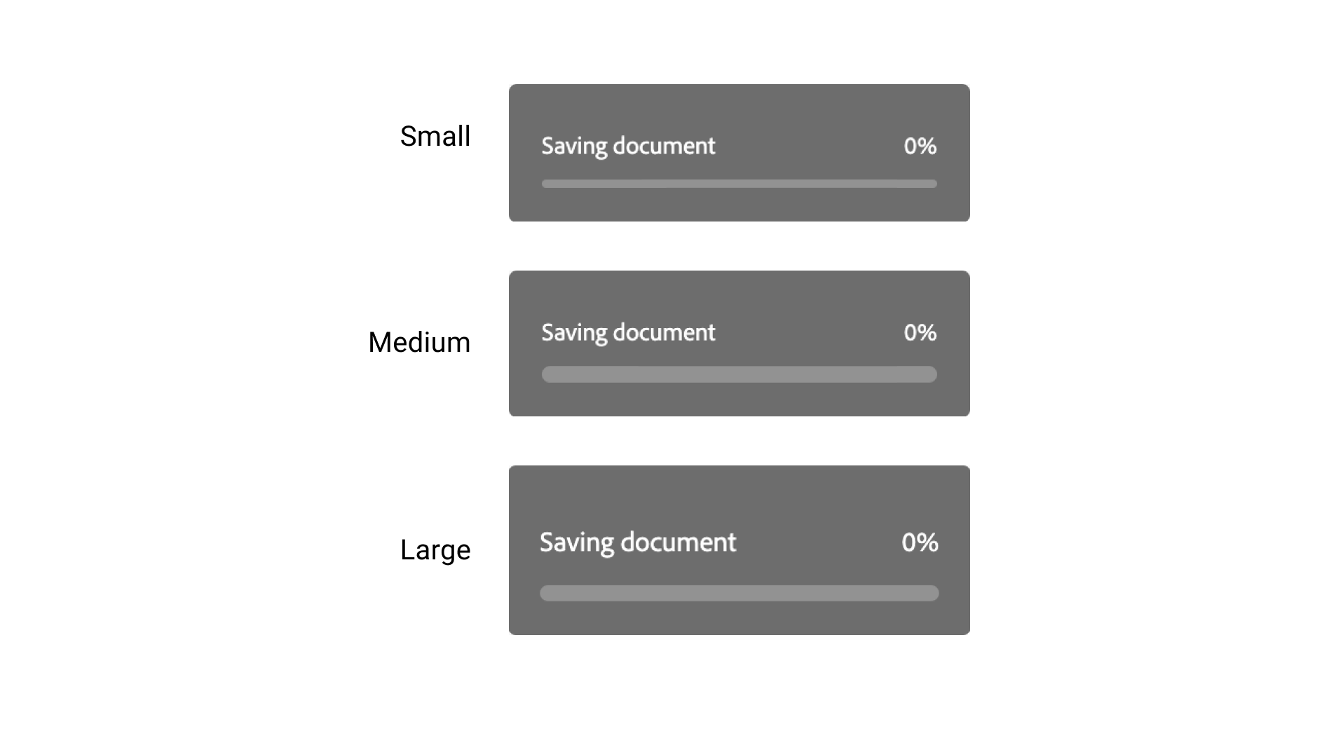
:host([size="m"]) {
  --spectrum-progressbar-size-default: var(
    --spectrum-progressbar-size-2400
  );
  --spectrum-progressbar-font-size: var(--spectrum-font-size-75);
  --spectrum-progressbar-thickness: var(
    --spectrum-progress-bar-thickness-large
  );
  --spectrum-progressbar-spacing-top-to-text: var(
    --spectrum-component-top-to-text-75
  );
}
I like the naming here. If the HTML attribute quite is present, then the UI is simpler (doesn’t have a border).
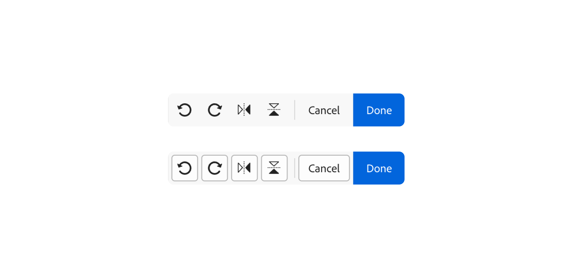
This is also done via CSS variables.
:host([quiet]) {
  --spectrum-actionbutton-background-color-default: var(
    --system-spectrum-actionbutton-quiet-background-color-default
  );
  --spectrum-actionbutton-background-color-hover: var(
    --system-spectrum-actionbutton-quiet-background-color-hover
  );
  /* And a lot more styles that I removed for the purpose of keeping the article clean. */
}
In this example, the team used CSS variables to change the size of a radio button based on the size HTML attribute.

<sp-radio size="m" checked="" role="radio"></sp-radio>
:host([size="m"]) {
  --spectrum-radio-height: var(--spectrum-component-height-100);
  --spectrum-radio-button-control-size: var(
    --spectrum-radio-button-control-size-medium
  );
  /* And a lot more styles that I removed for the purpose of keeping the article clean. */
}
When the main menu is active, there is a “holder” element that fills the whole screen and is positioned below the menu.
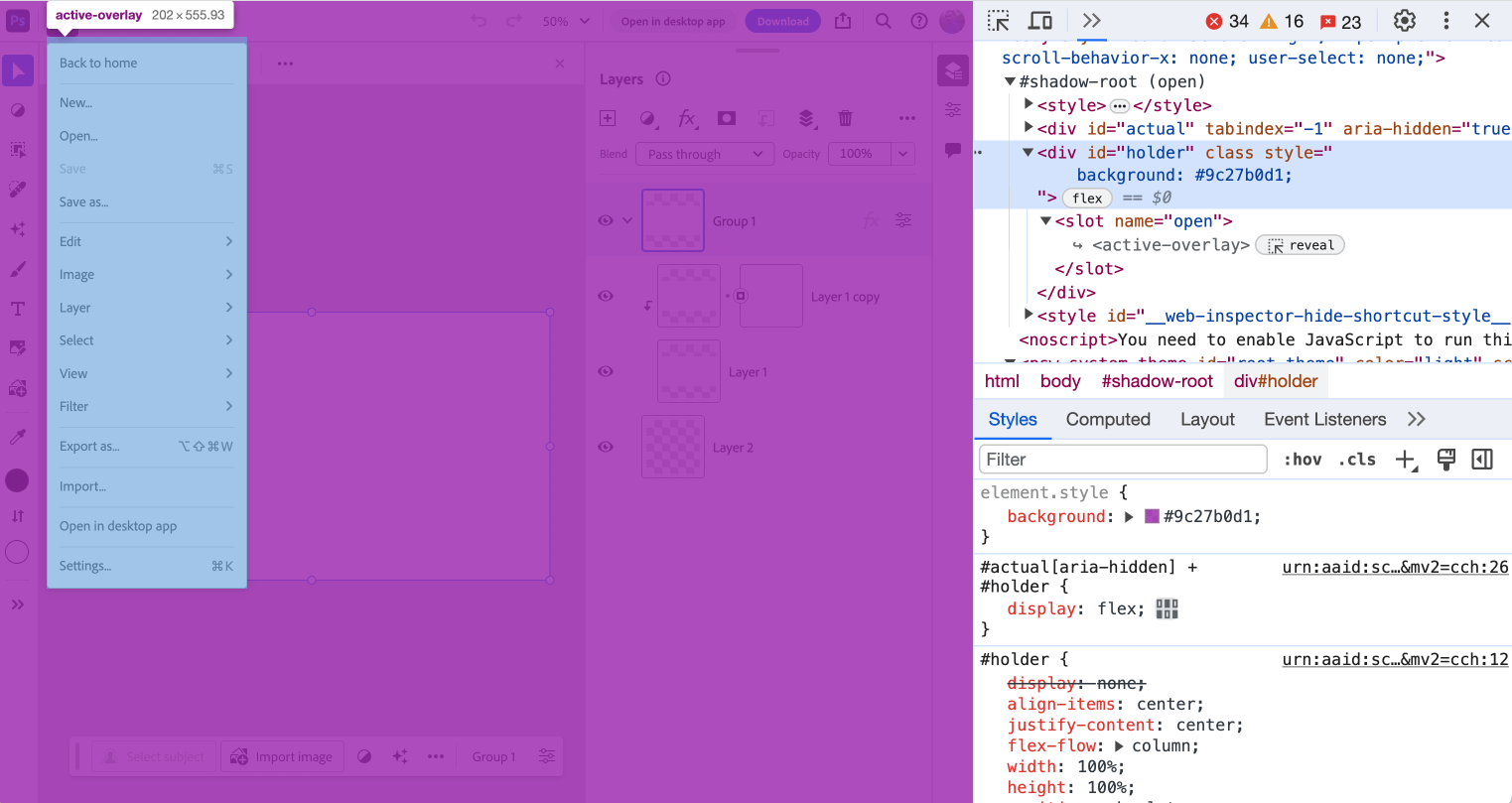
#actual[aria-hidden] + #holder {
  display: flex;
}

#holder {
  display: none;
  align-items: center;
  justify-content: center;
  flex-flow: column;
  width: 100%;
  height: 100%;
  position: absolute;
  top: 0;
  left: 0;
}
This element is to prevent users from clicking or hovering on other parts of the page. I think it’s here to mimic desktop apps.
I spotted a use for CSS viewport units in here. The blending modes menu has a maximum height of 55vh.
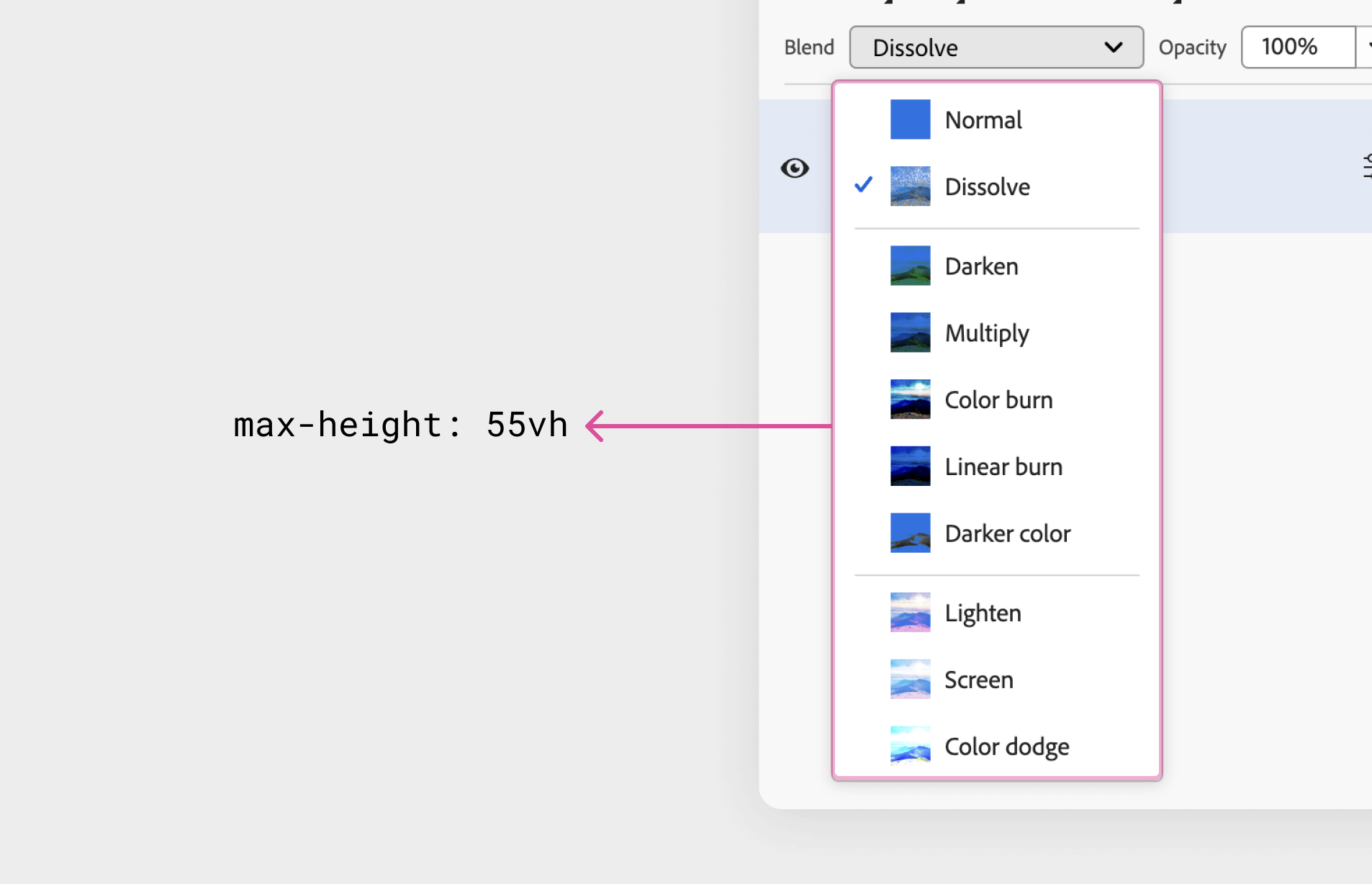
sp-menu {
  max-height: 55vh;
  --mod-menu-item-min-height: auto;
}

::slotted(*) {
  overscroll-behavior: contain;
}
Oh, and also overscroll-behavior: contain is used. This is a great feature to avoid scrolling the body content. See this article for more details.
See the video of how it behaves on resize:
The user can either pin a comment or a drawing anywhere on the canvas. I inspected the annotations component to see how it was built.
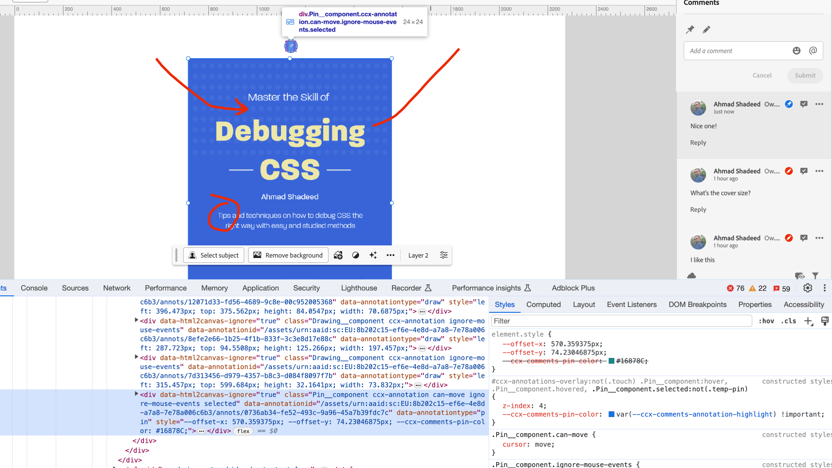
To position each comment in the position that the user chose, the team used CSS variables that are fed via JS to handle that.
<div
  data-html2canvas-ignore="true"
  class="Pin__component ccx-annotation"
  style="--offset-x: 570.359375px;
           --offset-y: 74.23046875px;
           --ccx-comments-pin-color: #16878C;"
></div>
.Pin__component {
  --pin-diameter: 24px;
  left: calc(var(--offset-x) - var(--pin-diameter) / 2);
  top: calc(var(--offset-y) - var(--pin-diameter) / 2);
  position: absolute;
  height: var(--pin-diameter);
  width: var(--pin-diameter);
  border-radius: var(--pin-diameter);
  border: 1px solid white;
  background: var(--ccx-comments-pin-color);
}
This is nice until you zoom out. The SVG stroke won’t resize and it will look very thick.
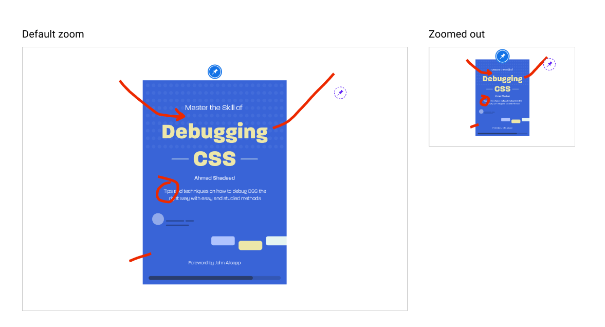
As per my knowledge, this can be fixed by adding vector-effect: non-scaling-stroke. I didn’t try it though.
object-fit: contain for the layer thumbnailIn the layers panel, the thumbnail has object-fit: contain to avoid distortion.
See the following video:
Thanks a lot for following along. I hope that you enjoyed it and learned something new. If you are interested in more articles like this, I already written a few:
此内容由惯性聚合(RSS阅读器)自动聚合整理,仅供阅读参考。 原文来自 — 版权归原作者所有。