


I spent years teaching CSS layout on this blog. I put everything I know into The Layout Maestro course: 70+ lessons and 150+ interactive examples that teach you how to think CSS layouts, not just memorize syntax.
When building a layout in CSS, we apply a layout module like flexbox or grid to the container element, and its children will get affected. That is how it works normally.
Say that one of those child items is also a container with multiple items with their layout system. At some point, we might need the children of this child element to join their siblings in the upper container.
Let’s take an example to see how display: content works.
In this example, I have a page header with a title and description.
<div class="page-header">
  <h1>Recent articles</h1>
  <p>A look at my recent articles about CSS</p>
</div>
When I change the display to contents for the parent element, the box element of the .page-header will be removed.
.page-header {
  display: contents;
}
When applying the above, the div isn’t there at all.
<!-- <div class="page-header"> -->
<h1>Recent articles</h1>
<p>A look at my recent articles about CSS</p>
<!-- </div> -->
Play with the following demo and activate the checkbox. Notice how the background, border, and padding are gone.
Recent articles
A look at my recent articles about CSS
Interesting, right?
You might be wondering, why this is even useful. Well, that’s why I wrote this article. Let’s extend the previous example to showcase why display: contents is useful.
In the following example, we have a page header that contains a title and a link, then we have a description text underneath.
Here is the HTML markup:
<div class="page-header">
  <div class="page-header-row">
    <h2>Recent articles</h2>
    <a class="link" href="#">View all</a>
  </div>
  <p>A look at my recent articles about CSS</p>
</div>
.page-header-row {
  display: flex;
  justify-content: space-between;
}
Let’s suppose that we want to move the link to be directly under the description so the visual order in the UI will be like this:
Something like this:
One idea is to use position: absolute. The default design will be that all elements are stacked. However, this isn’t a scalable solution.
.link {
  position: aboslute;
  right: 0;
  top: 0;
}
Enter display: contents, it can solve the issue perfectly. What we need to do is to add display: contents to the main element that contains the title and link.
Try the demo below and activate the toggle.
<div class="page-header">
<div class="page-header-row">
<h2>Recent articles</h2>
<a class="link" href="#">View all</a>
</div>
<p>A look at my recent articles about CSS</p>
</div>
.page-header-row {
display: flex;
}
.link {
order: 2;
}
We have flattened the layout. Now the title and link belong to the .page-header. Here is the CSS:
.page-header {
  display: flex;
  flex-direction: column;
  gap: 0.5rem;
}
We can use order to place the link at the very end.
.link {
  order: 2;
}
Try to right-click on the page header. This is what feels like to use display: contents.
Right-click on the page header and click ungroup.
Did you notice how the title and link are now ungrouped and not part of the box anymore? This is like providing us with a tool to do stuff we couldn’t do before while using CSS grid or flexbox.
In markdown, for example, when you add an image, the generated HTML looks like this:
<p><img src="image.jpg" alt="" /></p>
This can cause an issue if you want to style the <p>, like giving it a maximum width.
.content p {
  max-width: 60ch;
}
See the following example.
Coffee is one of the most beloved beverages in the world, cherished for its rich flavors and energizing qualities.
Cafés serve as hubs for conversation, creativity, and connection.
Noticed how the image is as equal as the paragraph? We can fix that!
Coffee is one of the most beloved beverages in the world, cherished for its rich flavors and energizing qualities.
Cafés serve as hubs for conversation, creativity, and connection.
<div class="content">
<p>
<img src="image.jpg" alt="" />
</p>
</div>
.content p:has(img) {
}
By using CSS :has(), I checked if there is an image inside a <p> and then used display: contents to fix that.
.content p:has(img) {
  display: contents;
}
Done.
In a header layout, we might need to contain the header in a fixed-width container. In the following HTML, the header’s content is in a container.
<div class="site-header">
  <div class="container">
    <h1 class="logo">Post title</h1>
    <div class="nav"><!-- Nav items --></div>
  </div>
</div>
To style the header layout, we should give the styles to the .container element.
.container {
  max-width: 1100px;
  margin-inline: auto;
}

.site-header .container {
  display: flex;
  justify-content: space-between;
}
What if we want to ignore the .container without altering the HTML? Well, that’s where display: contents comes in handy.
We can remove the container like so:
.site-header .container {
  display: contents;
}
Then move the layout for the .site-header element.
See the following interactive demo and notice how the HTML and CSS change when display: contents is active.
<div class="site-header">
<div class="container">
<h1 class="logo">Post title</h1>
<div class="nav">
</div>
</div>
</div>
.site-header .container {
display: flex;
justify-content: space-between;
}
.site-header {
}
In this example, we have a website header that contains:
Both the logo and search are grouped in a container.
Take a look at the HTML markup:
<header>
  <div class="header">
    <!-- Logo and Search -->
    <div class="logo-search">
      <a href="#" class="logo">iShadeed</a>
      <form action="#" class="search"></form>
    </div>

    <!-- Navigation -->
    <nav class="nav"></nav>
  </div>
</header>
At some point, we decided to reposition the search and center it. What are the options we have without display: contents?
.logo-search {
  flex: 1;
  display: flex;
  padding-right: 2rem;
}

.search {
  margin-left: auto;
}
Here is the result. While it looks “fine” at first glance, this can fail quickly. For example, if we increase the number of navigation items, it will be off-centered.
See the demo below and try to add or remove navigation items. Notice how it looks off-centered.
We can solve this by ungrouping the logo and search wrapper with display: contents.
.header {
  display: flex;
}

.logo,
.search,
.menu {
  flex: 1;
}

.logo-search {
  display: contents;
}
With that, the search now belongs to the header grid layout and it’s centered. Try to add or remove navigation items.
We can even reposition the search to be on the right side. Again, it now belongs to the header grid.
.search {
  order: 2;
}
It’s useful, isn’t it?
In this example, we have a layout that consists of a figure with a group of photos and a caption. I’m using the <figure> element, see the following markup.
<figure>
  <div class="photo-group">
    <img src="thumb-1.jpg" alt="Thumbnail 1" />
    <img src="thumb-2.jpg" alt="Thumbnail 2" />
    <img src="thumb-3.jpg" alt="Thumbnail 3" />
  </div>
  <figcaption>At the summit...</figcaption>
</figure>
Here is how the layout looks.
At a certain viewport size, say that we want to achieve the following layout. How can we do that?
With the current HTML structure, it’s not possible to let the <figcaption> be part of the grid. Thanks to display: contents, we can ungroup the .photo-group element and make it work.
.photo-group {
  display: contents;
}
Now the HTML looks like this to the browser:
<figure>
  <!-- <div class="photo-group"> -->
  <img src="thumb-1.jpg" alt="Thumbnail 1" />
  <img src="thumb-2.jpg" alt="Thumbnail 2" />
  <img src="thumb-3.jpg" alt="Thumbnail 3" />
  <!-- </div> -->
  <figcaption>At the summit.</figcaption>
</figure>
We can then apply the new layout to the <figure> element.
figure {
  display: grid;
  grid-template-columns: 1fr 1fr;
  gap: 0.5rem;
}
Play with the demo below and toggle the display: contents checkbox. Keep your eye on the HTML and CSS and notice how they change accordingly.
<figure>
<div class="photo-group">
<img src="thumb-1.jpg" alt="Thumbnail 1">
<img src="thumb-2.jpg" alt="Thumbnail 2">
<img src="thumb-3.jpg" alt="Thumbnail 3">
</div>
<figcaption>Caption text goes here.</figcaption>
</figure>
.photo-group {
display: flex;
}
That’s it.
I recently worked on a layout similar to this for a client project. At first glance, I thought it was a good candidate to use with CSS grid.
Personalized Plans
Get meal plans tailored to your goals and preferences.
Expert Recipes
Enjoy recipes crafted by nutritionists for balanced meals.
Easy Integration
Create shopping lists with a tap for easy ingredient buying.
Track Progress
Monitor your health journey with intuitive tracking tools.
Support
Connect with others, share experiences, and stay motivated.
Take a look at the HTML.
<section>
  <header>
    <h2>Why us?</h2>
  </header>
  <div class="features">
    <div class="features__item">
      <span class="icon"></span>
      <h3 class="title"></h3>
      <p class="desc"></p>
    </div>
    <!-- more items -->
  </div>
</section>
At first, I tried the following solution. The idea is to move the items on the right side down by 40px for each.
.features {
  display: grid;
  grid-template-columns: 1fr 1fr;
  gap: 1rem;
}

.features__item:nth-child(2n) {
  transform: translateY(40px);
}
While this visually works, it can quickly fail if the content changes. In this variation, I made the content longer.
Notice how the grid items are stretched. This is a default behavior of CSS grid. I thought about changing the align-items for the main layout, but it didn’t work.
Personalized Plans
Get meal plans tailored to your goals and preferences.
Expert-Approved Recipes
Enjoy recipes crafted by nutritionists for balanced meals, designed to support your overall well-being daily. Enjoy recipes crafted by nutritionists for balanced meals, designed to support your overall well-being daily.
Easy Integration
Create shopping lists with a tap for easy ingredient buying.
Track Your Progress
Monitor your health journey with intuitive tracking tools, keeping you motivated and on the right path.
Support
Connect with others, share experiences, and stay motivated.
It’s not working. I thought about dividing the items into two groups, and later using display: contents to handle the layout.
<section>
  <header>
    <h2>Why us?</h2>
  </header>
  <div class="features">
    <div class="features__group"><!-- 3 items --></div>
    <div class="features__group"><!-- 2 items --></div>
  </div>
</section>
Try to increase the slider below, the items will still be vertically centered.
Personalized Plans
Get meal plans tailored to your goals and preferences.
Expert-Approved Recipes
Enjoy recipes crafted by nutritionists for balanced
Easy Integration
Create shopping lists with a tap for easy ingredient buying.
Track Your Progress
Monitor your health journey with intuitive tracking tools, keeping you motivated and on the right path.
Support
Connect with others, share experiences, and stay motivated.
On small sizes, we can simply ungroup the items and convert them to a normal grid.
.features {
  display: grid;
  grid-template-columns: repeat(auto-fit, minmax(150px, 1fr));
  gap: 1rem;
}

.features__group {
  display: contents;
}
Try to resize the container below and notice how the items will ungroup at small sizes, thanks to display: contents.
Personalized Plans
Get meal plans tailored to your goals and preferences.
Expert Recipes
Enjoy recipes crafted by nutritionists for balanced meals.
Easy Integration
Create shopping lists with a tap for easy ingredient buying.
Track Progress
Monitor your health journey with intuitive tracking tools.
Support
Connect with others, share experiences, and stay motivated.
In this example, we have two separate layouts. One of a quote and the other contains a few features for a marketing website.
Coffee is more than just a drink; it’s an experience. From the first aromatic sip to the rich, lingering aftertaste, every cup tells a story of careful cultivation.
Rich Flavor Profile
Each cup offers a symphony of taste, from bold and robust.
Freshness Guaranteed
Our coffee is roasted to order, ensuring you enjoy the freshest beans.
Sustainable Sourcing
We are committed to ethical practices, sourcing our beans from farms that prioritize safety.
On small sizes, we want to reposition the quote and include it between the features.
Coffee is more than just a drink; it’s an experience. From the first aromatic sip to the rich, lingering aftertaste, every cup tells a story of careful cultivation.
Rich Flavor Profile
Each cup offers a symphony of taste, from bold and robust.
Freshness Guaranteed
Our coffee is roasted to order, ensuring you enjoy the freshest beans.
Sustainable Sourcing
We are committed to ethical practices, sourcing our beans from farms that prioritize safety.
Let’s learn how to do that. Here is the HTML markup:
<section class="layout">
  <div class="quote"></div>
  <div class="features-list">
    <!-- List of feature items -->
  </div>
</section>
First, we need to ungroup the features list by default.
/* Ungroup the items */
.features-list {
  display: contents;
}

.layout {
  display: grid;
  grid-template-columns: 1fr;
  gap: 1rem;
}

.features-item:nth-child(2) {
  order: -1;
}
Then, on larger viewport sizes, we group them again and change the main layout.
@media (min-width: 700px) {
  .layout {
    grid-template-columns: 1fr 1fr;
  }

  .features-list {
    display: flex;
    flex-direction: column;
    gap: 0.5rem;
  }

  .features-item:nth-child(2) {
    order: initial;
  }
}
In this example, we have a footer layout. For design purposes, two of the columns are in the same group. That means they aren’t below the main grid.
See the following demo and try to resize the layout. Do you notice that the group looks odd in small sizes?
Here is the CSS:
.footer {
  display: grid;
  grid-template-columns: repeat(auto-fit, minmax(120px, 1fr));
  gap: 1rem;
}
What I want to do is to ungroup the element that contains the two footer items and let the items belong to the main grid. I want that to happen on:
All we need to do is this:
@container footer (min-width: 700px) {
  .footer-group {
    display: contents;
  }
}
Toggle display: contents and see it in action.
This is a similar example to the above but it’s a bit more complex. In this layout, we have the following key items to note:
See the following figure that maps the footer’s layout:
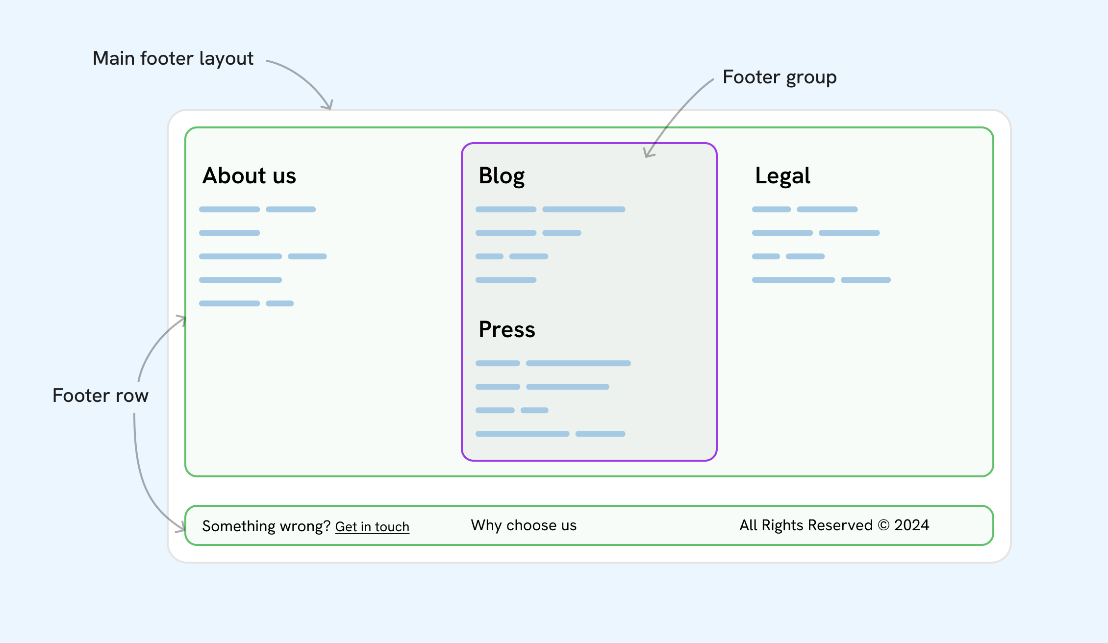
What we want to achieve is to move the last footer row into the grid, and also to ungroup the current “Footer group” element.
Here is a visual that shows what we need to achieve:
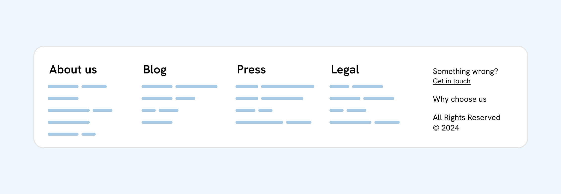
To achieve that, we will need to use display: contents multiple times. Here is the default styling:
.footer {
  display: grid;
  grid-template-columns: 1fr;
  gap: 2rem;
}

.footer-row {
  display: grid;
  grid-template-columns: repeat(auto-fit, minmax(110px, 1fr));
  gap: 1rem;
}
To achieve the layout, we need to apply the following CSS:
@container footer (min-width: 1200px) {
  .footer-row.top,
  .footer-group {
    display: contents;
  }

  /* The Footer already has grid, I just changed the cols. */
  .footer {
    grid-template-columns: repeat(auto-fit, minmax(110px, 1fr));
  }
}
Here is a demo that shows in action. Try to hover over the legends to see each item.
CSS subgrid became stable in all browsers in Sep 2023, and I wrote about it two years ago. We can use display: contents to mimic CSS subgrid.
See the following example where we have a post layout that contains:
Here is the HTML markup:
<div class="page">
  <h1>Post title</h1>
  <div class="prose">
    <!-- Content here -->
    <img src="thumb.jpg" alt="" />
  </div>
</div>
What I want to do is to make the image break out of its container. Something like the following example:
This is a title for the post
Espresso is the heart of any coffee experience. It's rich, bold, and packed with flavor.
A perfect shot in every cup.
The beauty of espresso lies in its simplicity—a blend of finely ground coffee and hot water.
First, here is the main layout grid:
.page {
  display: grid;
  grid-template-columns: 1fr 50ch 1fr;
  gap: 1rem;
}
Using CSS subgrid will look like this:
.prose {
  /* [1] Making the prose element take the full width. */
  grid-column: 1 / -1;
  display: grid;
  /* [2] Applying subgrid, inheriting the columns from the .page element. */
  grid-template-columns: subgrid;
  gap: 1rem;

  /* [3] Every item in .prose is in the middle column. */
  > * {
    grid-column: 2 / 3;
  }

  /* [4] The image is taking the full width. */
  img {
    grid-column: 1 / -1;
  }
}
While that works, you might not be able to use subgrid. We can use display: contents instead. The following CSS, it’s similar to the previous one but without any new grid definition.
.prose {
  display: contents;

  > * {
    grid-column: 2 / 3;
  }

  img {
    grid-column: 1 / -1;
  }
}
It’s interesting, right? Below is the display: contents version.
display: contents
Show columns
This is a title for the post
Espresso is the heart of any coffee experience. It's rich, bold, and packed with flavor.
A perfect shot in every cup.
The beauty of espresso lies in its simplicity—a blend of finely ground coffee and hot water.
CSS display: contents is known to cause accessbility issues when used with HTML tables, headings, buttons, and lists. Please make sure to avoid using it on such elements. Here are some further resources:
That’s it. CSS display: contents is a useful feature when you don’t have control over some parts of the HTML and can make you achieve things that aren’t possible without markup change. That’s being said, it’s important to make sure that you test for accessbility when using it with HTML elements like <nav>, for example.
Enjoyed the read? If you'd like to support my work, consider buying me a coffee. This interactive guide took 6 weeks, which translates to 54 coffee cups. Thanks a latte!

此内容由惯性聚合(RSS阅读器)自动聚合整理,仅供阅读参考。 原文来自 — 版权归原作者所有。
