


I spent years teaching CSS layout on this blog. I put everything I know into The Layout Maestro course: 70+ lessons and 150+ interactive examples that teach you how to think CSS layouts, not just memorize syntax.
CSS comparison functions have been supported since almost April 2020, and I wrote an introductory article about them back then. I like to use all of them, but my favorite one of them is clamp() and it’s the top used one for me.
In this article, I will explore a few use-cases for comparison functions, and explain each one in detail. Mostly, the use cases will be about situations other than using them for fluid sizing, as this is the most popular use case and I will keep that to the last.
If you don’t know about comparison functions, that’s totally fine. I recommend reading this introduction article first and then coming back here for the use cases.
In this example, we have a section with a mobile phone, along with two images that are positioned on top. Initially, it will look like the following figure:
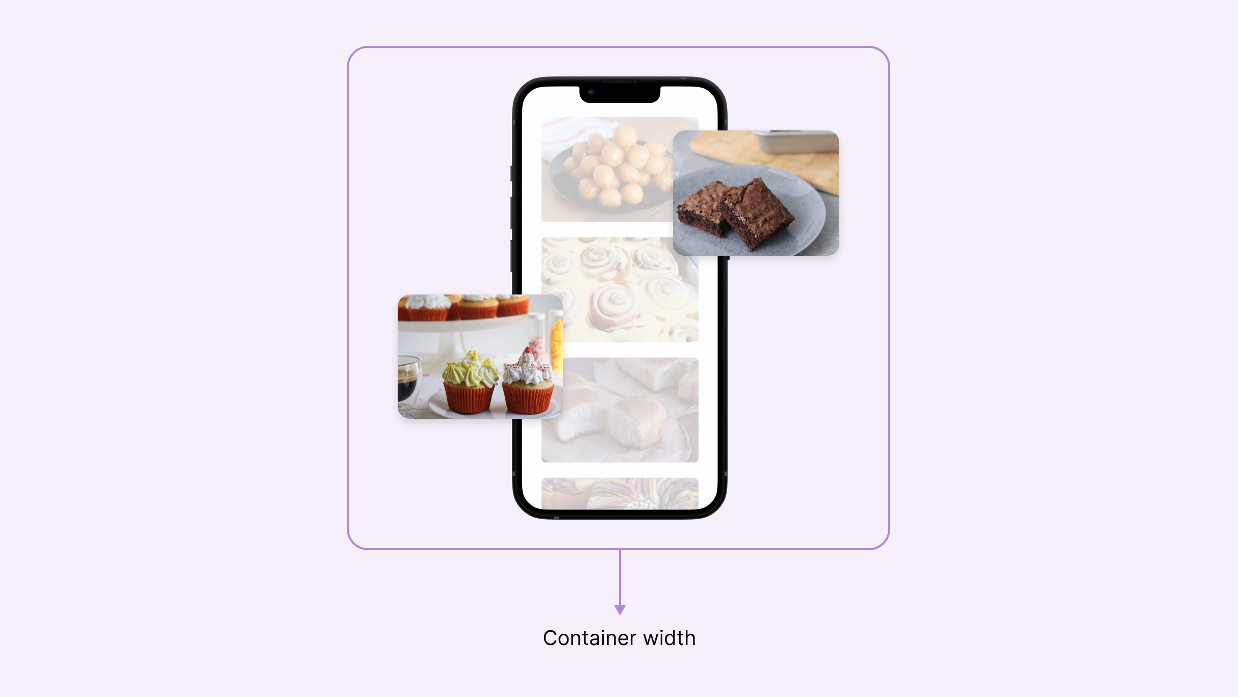
When the width of the container becomes smaller, we want to shrink the size of the images to accommodate the available space. We can do that by using a percentage value for the width or the height (e.g: width: 20%) but this doesn’t give us much control.
We want to be able to have a fluid size, that respects a minimum and a maximum value at the same time. This is where clamp come to the rescue!
.section-image {
  width: clamp(70px, 80px + 15%, 180px);
}
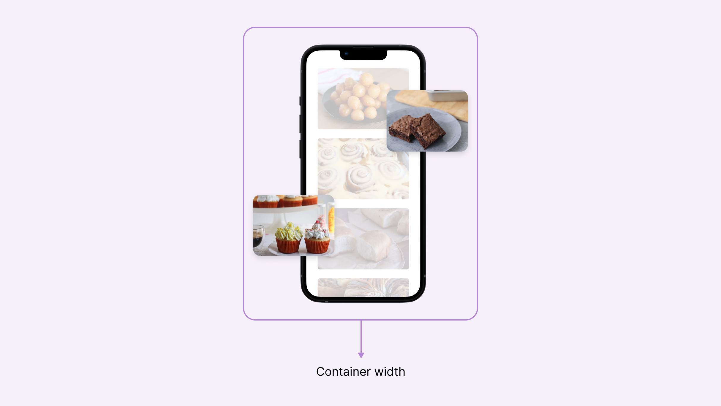
By setting a minimum, preferred, and maximum width, the image will shrink or grow as per its container width. This is due to using a mix of a fixed value and percentage 80px + 15%.
Check the video below and notice how the thumbnails shrink on resize.
Have you ever needed to add a decorative element to a section? Most of the time, the element needs to be responsive and might need to be positioned differently based on the viewport size.
Consider the following example.

There are two decorative elements on both sides. On mobile, they will occupy too much space and so we want to show only a little of each one.

To fix that, we can use media queries to offset them on mobile.
.decorative--1 {
  left: 0;
}

.decorative--2 {
  right: 0;
}

@media (max-width: 600px) {
  .decorative--1 {
    left: -8rem;
  }

  .decorative--2 {
    right: -8rem;
  }
}
While this works, we can use a media query-less solution with CSS clamp() function.
@media (max-width: 600px) {
  .decorative--1 {
    left: clamp(-8rem, -10.909rem + 14.55vw, 0rem);
  }

  .decorative--2 {
    right: clamp(-8rem, -10.909rem + 14.55vw, 0rem);
  }
}
Let me dissect the above CSS to make it easier for you:
left offset as -8rem, and the maximum value as 0rem.clamp() to decide on the preferred value and respect the minimum and maximum values we set.
I used this calculator to get the above clamp() numbers.
Related to the previous example, a hero section height can be different based on the viewport size. As a result, we tend to change that via a media query or by using viewport units.

.hero {
  min-height: 250px;
}

@media (min-width: 800px) {
  .hero {
    min-height: 500px;
  }
}
We can use a mix of fixed value and viewport units, but we need to be careful to not have a huge height on larger viewports, and then we need to set a max height.
.hero {
  min-height: calc(350px + 20vh);
}

@media (min-width: 2000px) {
  .hero {
    min-height: 600px;
  }
}
With CSS clamp(), we can set a minimum, preferred, and maximum height with only one CSS declaration.
.hero {
  min-height: clamp(250px, 50vmax, 500px);
}
When resizing the screen, you will notice that the height changes gradually based on the viewport width. In the example above, 50vmax means “50% of the viewport’s largest dimension.

This example is inspired by this tweet from Andy Bell. I really like the use of CSS clamp() for this use case!

The bar thumb is supposed to animate from the left to right and vice versa. In CSS, the thumb can be positioned absolutely to the left.
.loading-thumb {
  left: 0%;
}
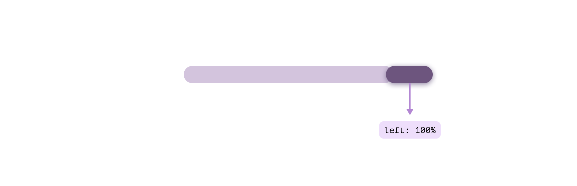
To position the thumb to the far right, we can use left: 100% but this will introduce an issue. The thumb will blow out of the loading bar container.
.loading-thumb {
  left: 100%;
}
That is expected, because 100% in this context starts from the end of the thumb, thus pushing it out.
We can use CSS calc() to subtract the thumb width and it will work, but this isn’t 100% flexible.
.loading-thumb {
  /* 40px represents the thumb width. */
  left: calc(100% - 40px);
}
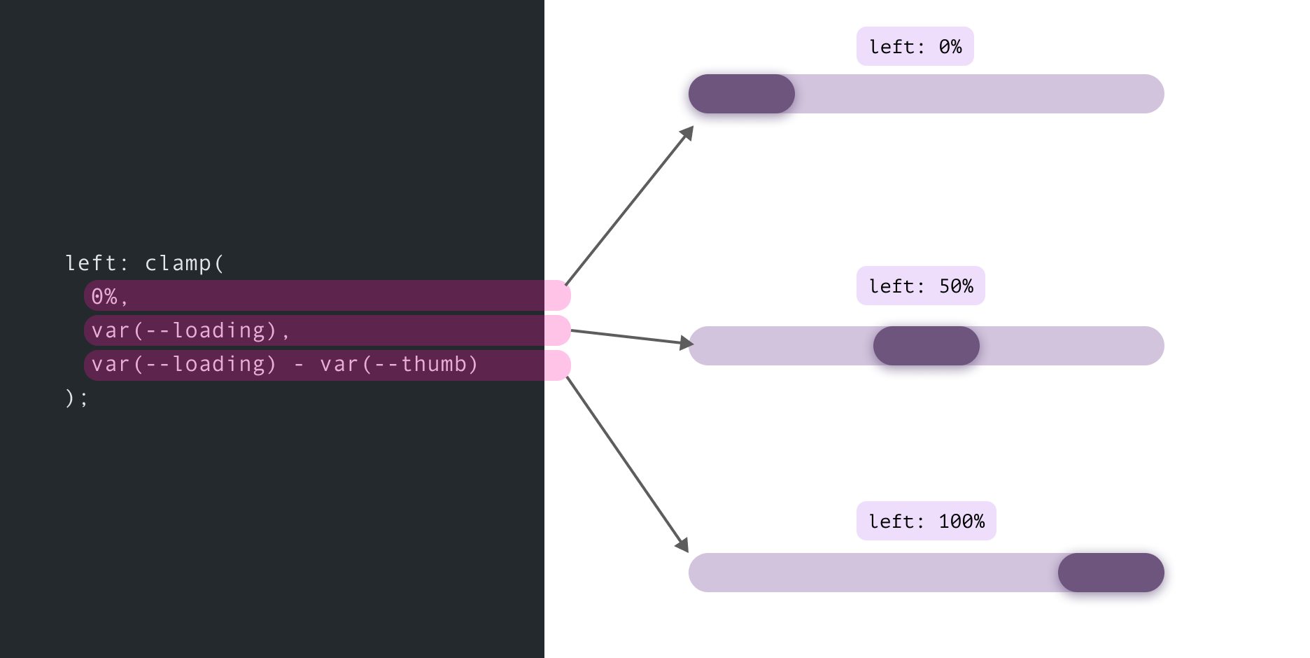
Let’s explore how to better CSS for that using CSS variables and comparison functions.
.loading-thumb {
  --loading: 0%;
  --loading-thumb-width: 40px;
  position: absolute;
  top: 4px;
  left: clamp(
    0%,
    var(--loading),
    var(--loading) - var(--loading-thumb-width)
  );
  width: var(--loading-thumb-width);
  height: 16px;
}
Here is how the above CSS works:
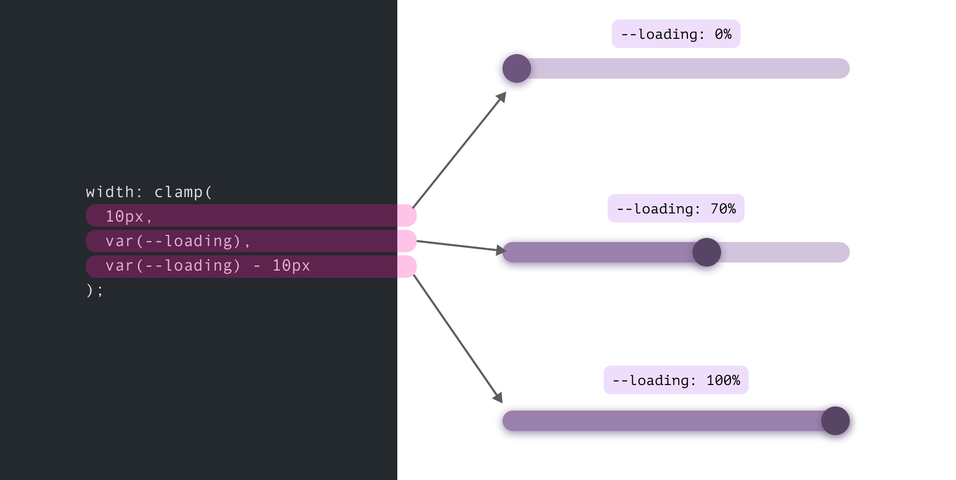
0%.--loading CSS variable.CSS clamp() here provide us with three different stats for this component. I personally like this solution!
Not only that, we can extend the same concept for a different design. Consider the following figure:

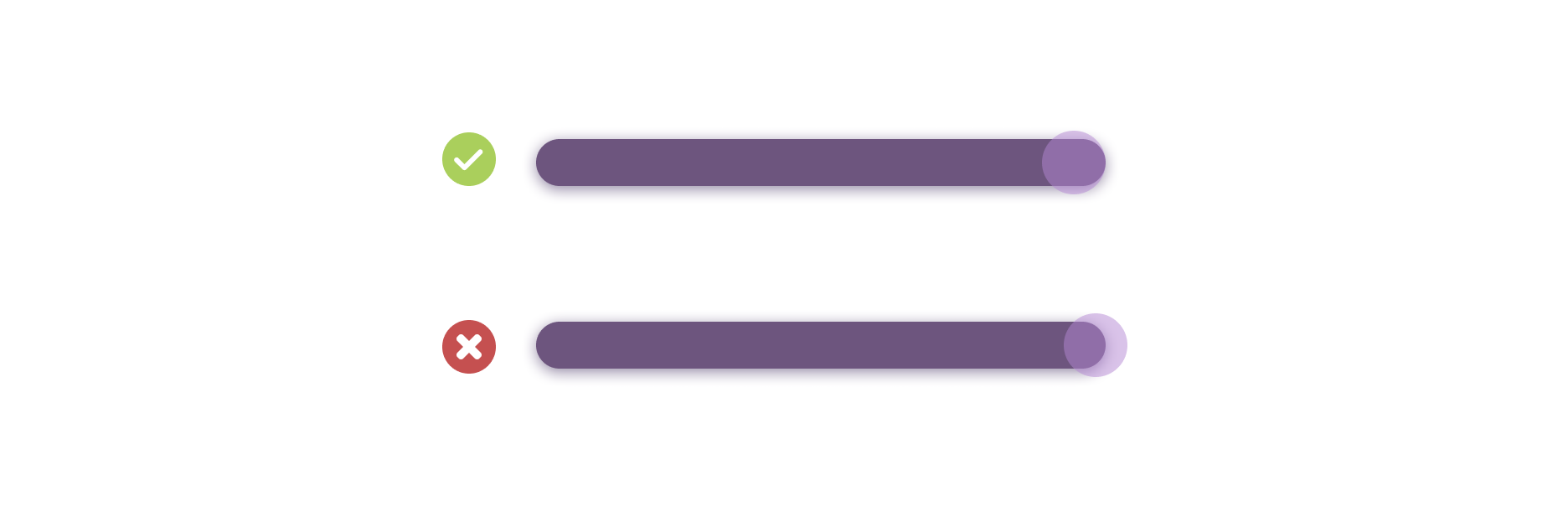
The current progress value has a little handle on top of it. When the value is 100%, we need the width to respect that.
As you see in the figure below, the circle must end at the far right side. If we don’t take care of that, it will end up blowing out by half of the handle width (See the second row with the red sign).
In such a case, we can use CSS clamp() function.
.loading-progress {
  width: clamp(10px, var(--loading), var(--loading) - 10px);
}
The minimum value is equal to half the circle width, the preferred value is the current loading percentage, and the maximum value is the subtraction result of the current percentage from half of the circle.
Earlier this year, I published an article about an interesting CSS solution for a UI I was working on.
Consider the following figure where we have a line separator between two sections.

On mobile, that separator should become horizontal as below.

My solution was to use a border and flexbox. The idea is that a pseudo-element with a border can expand to fill the available space for both the vertical and horizontal states.
.section {
  display: flex;
  flex-direction: column;
  gap: 1rem;
}

.section:before {
  content: "";
  border: 1px solid #d3d3d3;
  align-self: stretch;
}

@media (min-width: 700px) {
  .section {
    align-items: center;
    flex-direction: row;
  }
}
We can even do better by using CSS clamp. Temani Afif suggested a solution that doesn’t need a media query at all.
.section {
  --breakpoint: 400px;
  display: flex;
  flex-wrap: wrap;
}

.section:before {
  content: "";
  border: 2px solid lightgrey;
  width: clamp(0px, (var(--breakpoint) - 100%) * 999, 100%);
}
Let’s dissect the above CSS:
0px: the minimum value, used for the vertical separator. It’s zero because we’re using a CSS border instead.(var(--breakpoint) - 100%) * 999 a toggle that switch between 0px or 100% based on the viewport width.Here is a video:
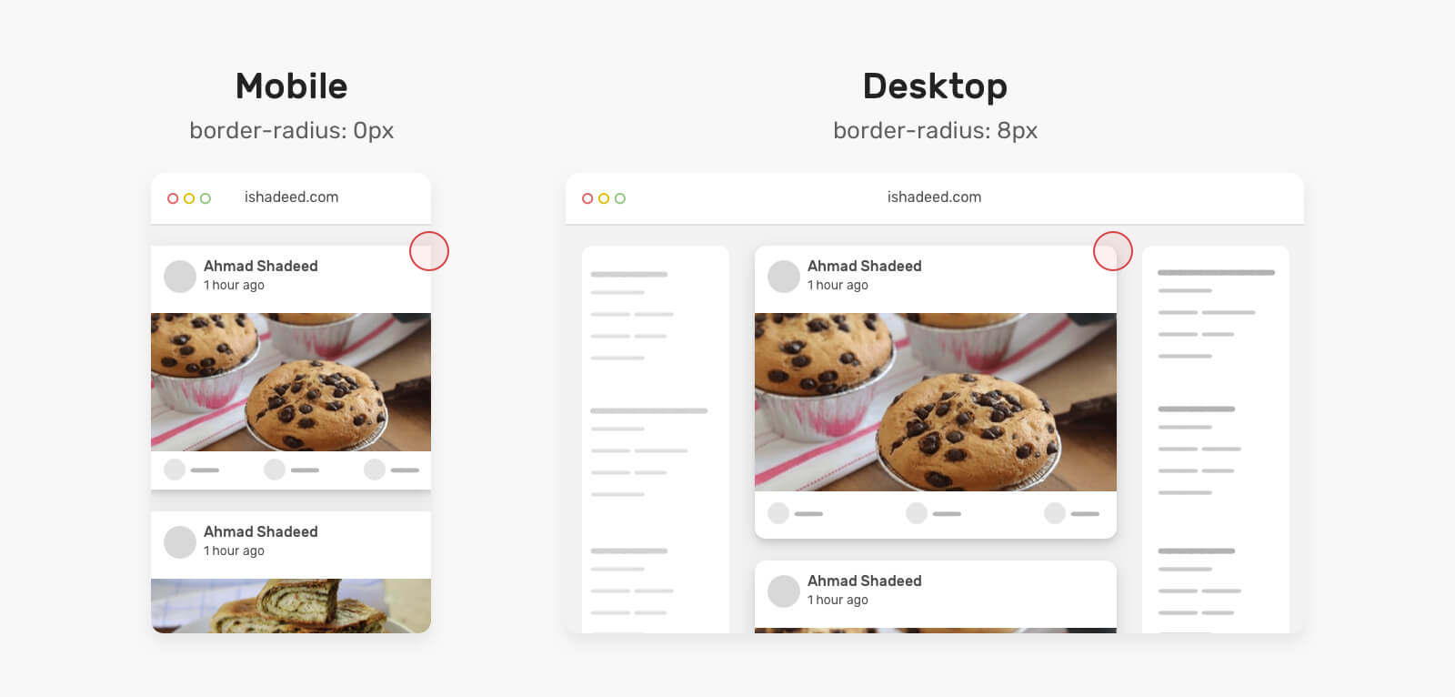
Almost a year ago, I spotted a neat CSS trick in the Facebook feed CSS. It’s about using CSS max() comparison function to switch the radius of a card from 0px to 8px depending on the viewport width.
.card {
  border-radius: max(
    0px,
    min(8px, calc((100vw - 4px - 100%) * 9999))
  );
}
Let’s walk through the above CSS in detail.
Let’s dissect the above CSS:
max() function that compares between 0px and the computed value of the min(). It will pick the larger value.min() function compares between 8px and a computed value from calc((100vw - 4px - 100%) * 9999). This will result in a very large positive or negative number.9999 is a large number to force the value to be either 0px or 8px.With the above, the card will have a zero radius when it’s taking the full viewport width, or 8px on larger screens. Neat, right?
You can read more here about the full details of the technique.
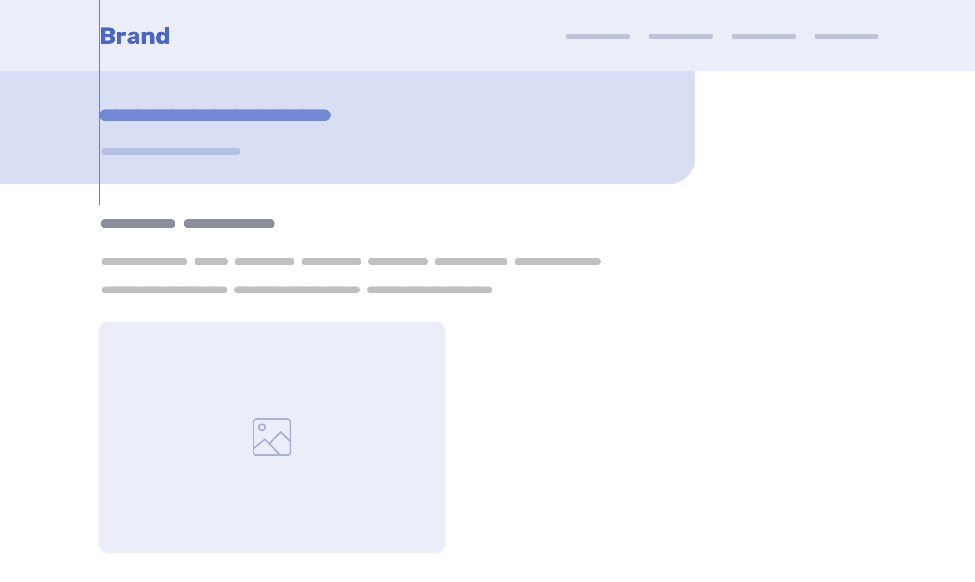
While building the article header for [Defensive CSS][https://defensivecss.dev/], I needed a way to add dynamic padding to the content while maintaining a minimum value on smaller viewports.
The idea is that the article header isn’t contained with a wrapper element, so we need a way to mimic that the content is actually wrapped and aligned with the content underneath.
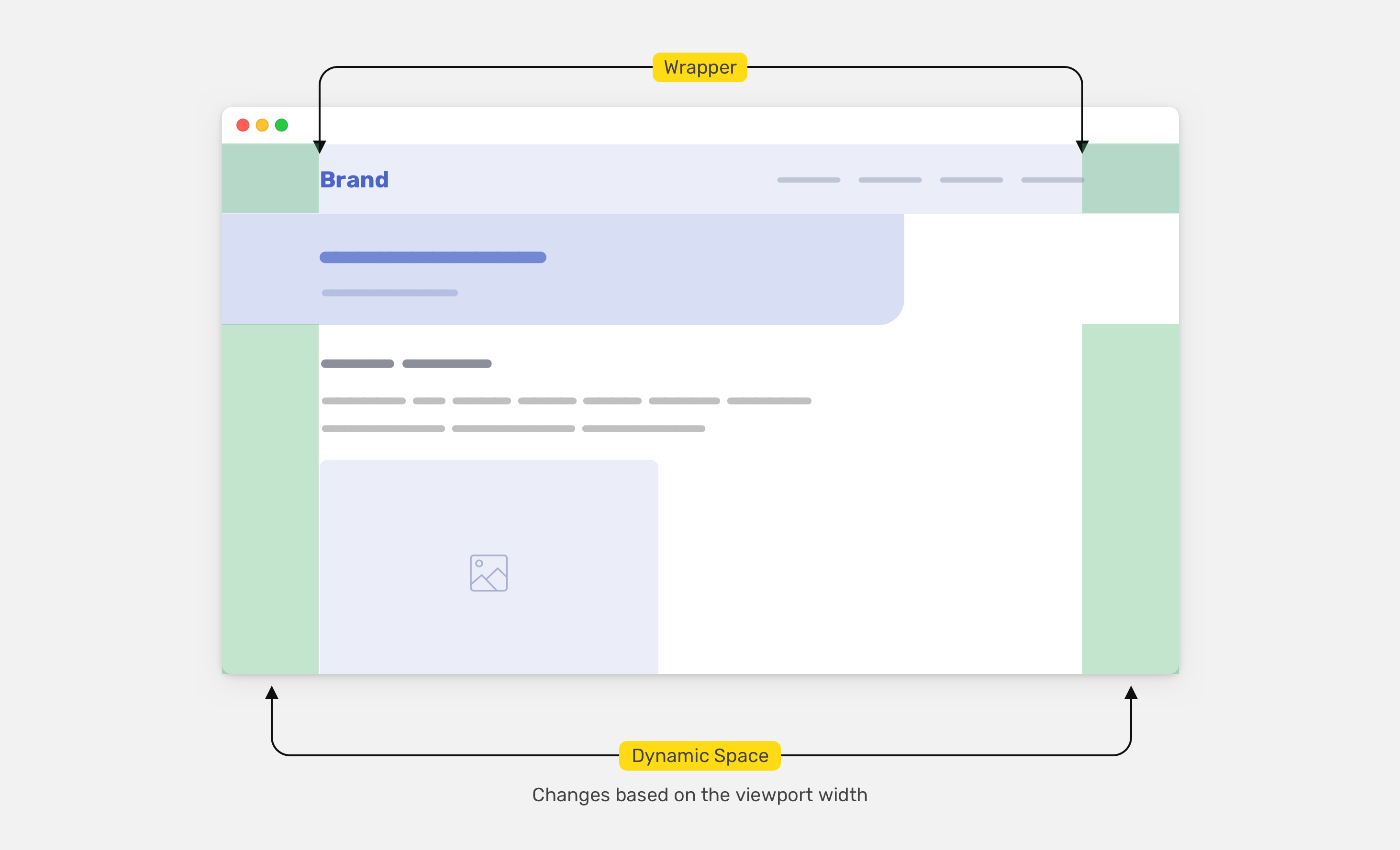
To do that, we need a way to use the following formula in CSS:
dynamic padding = (viewport width - wrapper width) / 2
Thanks to the CSS max() function, we can add minimum padding, and a way to switch to the dynamic padding when needed.
:root {
  --wrapper-width: 1100px;
  --wrapper-padding: 16px;
  --space: max(
    1rem,
    calc(
      (
          100vw - calc(var(--wrapper-width) - var(--wrapper-padding) *
                2)
        ) / 2
    )
  );
}

.article-header {
  padding-left: var(--space);
}
The idea is that we need the minimum padding to be 1rem, and then it will be dynamic based on the viewport width.
For more details, you can read the full article on this technique.
Sometimes, we might need to change the spacing for a component or a grid based on the viewport width. Not with CSS comparison functions! We only need to set it once.
.wrapper {
  display: grid;
  grid-template-columns: repeat(3, 1fr);
  grid-gap: min(2vmax, 32px);
}
To learn more about spacing in CSS, I wrote a deep-dive article on that.
此内容由惯性聚合(RSS阅读器)自动聚合整理,仅供阅读参考。 原文来自 — 版权归原作者所有。