


I spent years teaching CSS layout on this blog. I put everything I know into The Layout Maestro course: 70+ lessons and 150+ interactive examples that teach you how to think CSS layouts, not just memorize syntax.
When I first learned CSS clip-path back in the days, I took more time than I had expected, and I struggled to memorize it, too. I don’t know the exact reason, but maybe because I didn’t use it that much? Anyway, I will re-learn it with you.
In this article, I aim to provide you with a clear explanation of how clip-path works in detail when to use it, and how you can use it today in your web development projects. Are you ready? Let’s dive in.
The clip-path property creates a clipping region where content within it is visible, and content outside it is invisible. Here is a basic example of a circle clip-path.
.card {
  background-color: #77cce9;
  clip-path: circle(80px at 50% 50%);
}
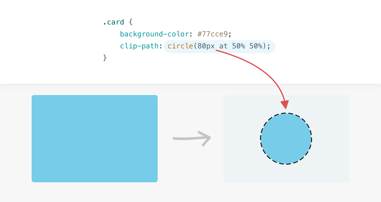
With the clip-path applied, the visible area is only the blue circle. Anything outside the circle is invisible. Here is an animation that shows a clipping of the circle in the previous example.
Before diving into the details of clip-path, it’s worth mentioning how the coordinate system works. The origin is the top-left corner with the x-axis pointing to the right and the y-axis pointing down.
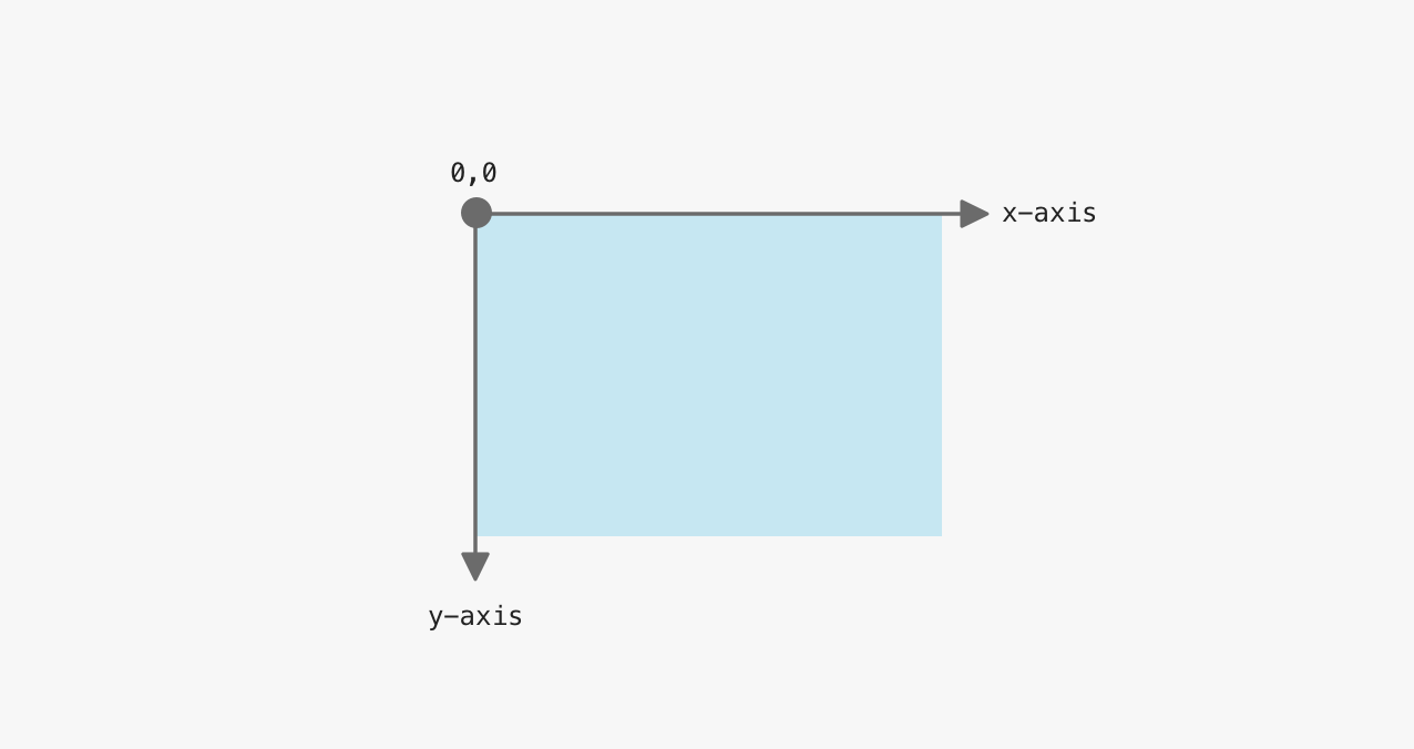
With that in mind, let’s take a simple example to see how an element is clipped. In the example, the clipped area is a circle with a size of 100px, and its center is positioned at the 0,0 (top left).
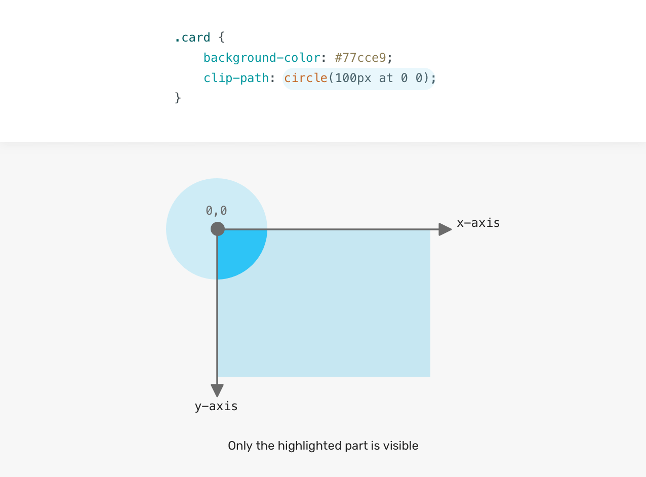
Notice that only the highlighted area (in dark blue) is visible to the user. The rest of the circle is clipped. The question is, how can we make the full circle visible? Well, we need to change the x-axis and y-axis points.
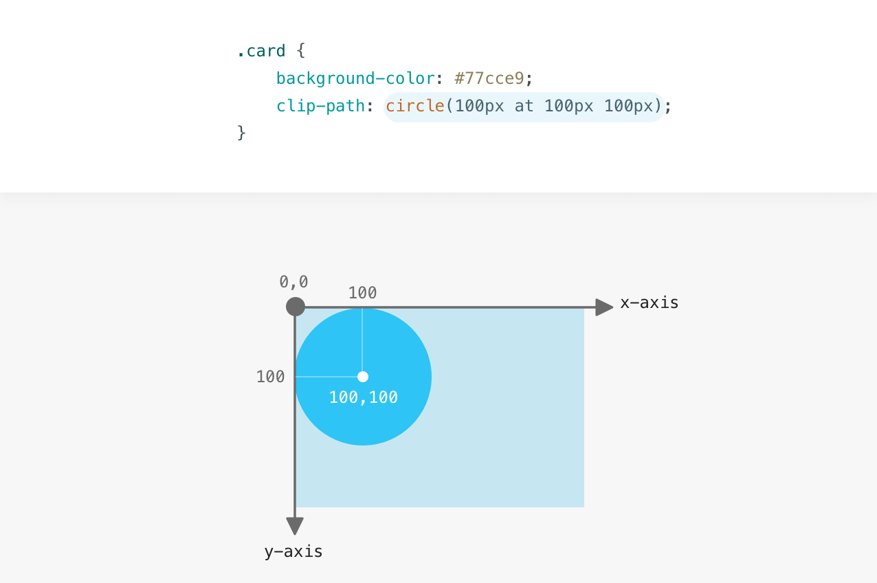
The circle’s center is positioned 100px from the left and 100px from the top. Now that you understand how the coordinate system works, I will explain the possible values for the clip-path property.
clip-path valuesThe inset value defines an inset rectangle. We can control the four edges, just like we deal with margin or padding. In the following example, the card has an inset of 20px from all the edges (top, right, bottom, and left).
.card {
  clip-path: inset(20px);
}
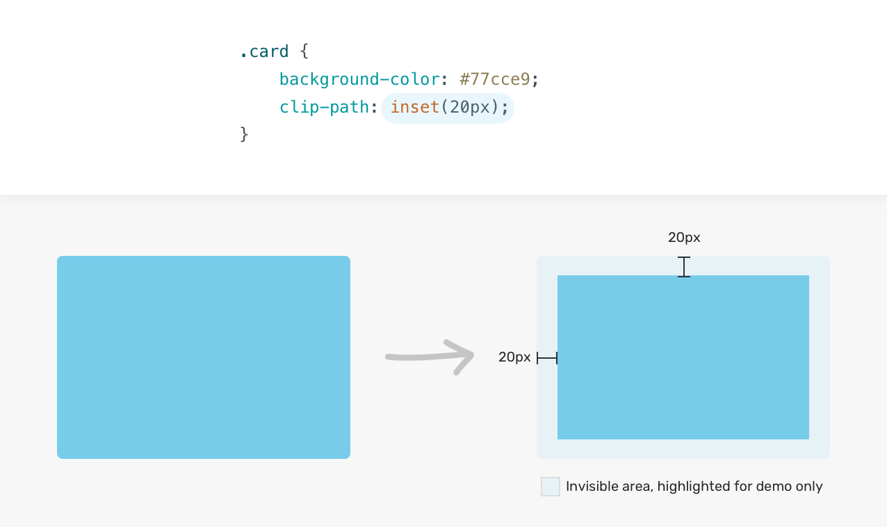
If you need to tweak the inset from one of the edges, you can. Here is another example:
.card {
  clip-path: inset(20px 20px 50px 20px);
}
The element has a 50px inset from the bottom.
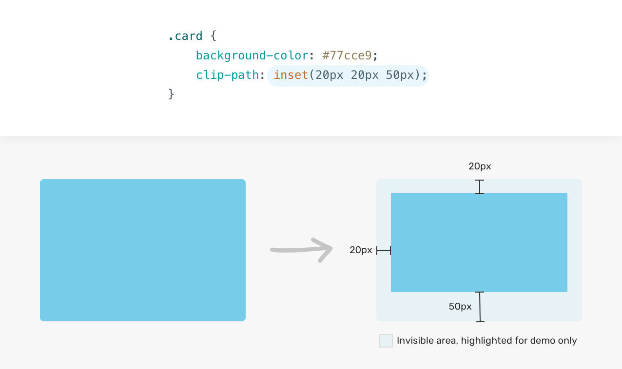
The question is, can we have a rounded inset? Yes! It’s possible thanks to the round keyword. Appending the keyword round <border-radius> can round the corners.
.card {
  clip-path: inset(20px 20px 50px round 15px);
}
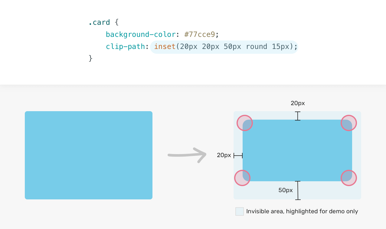
Not only that, but we can tweak the radius for each side separately. Here is an example with a zero radius for the top-right and bottom-left corners.
.card {
  clip-path: inset(20px 20px 50px round 15px 0);
}
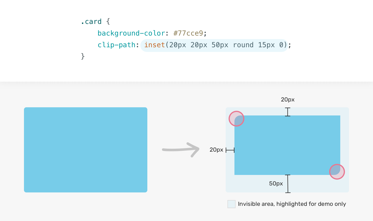
To use the circle() value, we need the radius and the position of it. Here is an example:
.card {
  clip-path: circle(80px at 50% 50%);
}
The radius of the circle is 80px and it’s positioned 50% on the x-axis, and 50% on the y-axis.
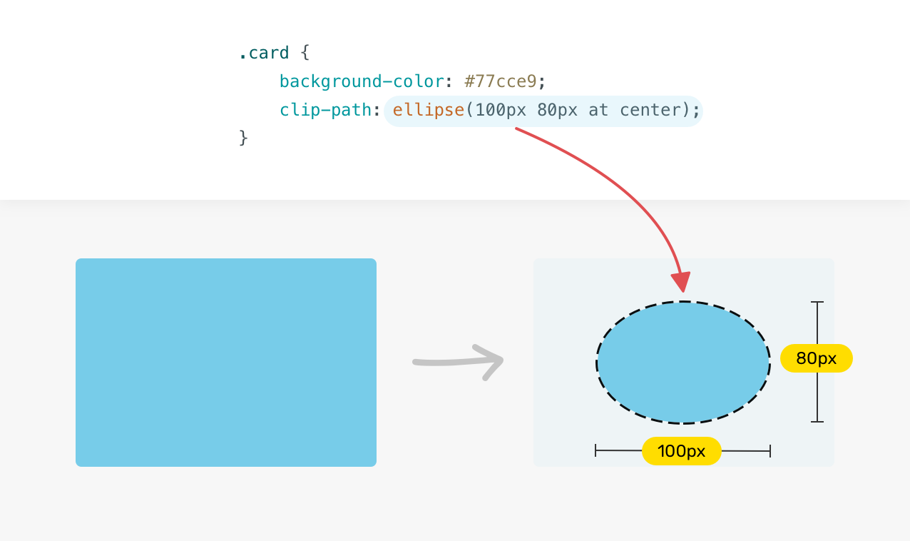
With the ellipse(), we can set a width and height to create an oval shape clipping.
.card {
  clip-path: ellipse(100px 80px at center);
}
For me, the polygon() value is the most interesting one. We have the ability to control multiple different sets of x-axis and y-axis values.
.card {
  clip-path: polygon(x y, x y, x y, x y);
}
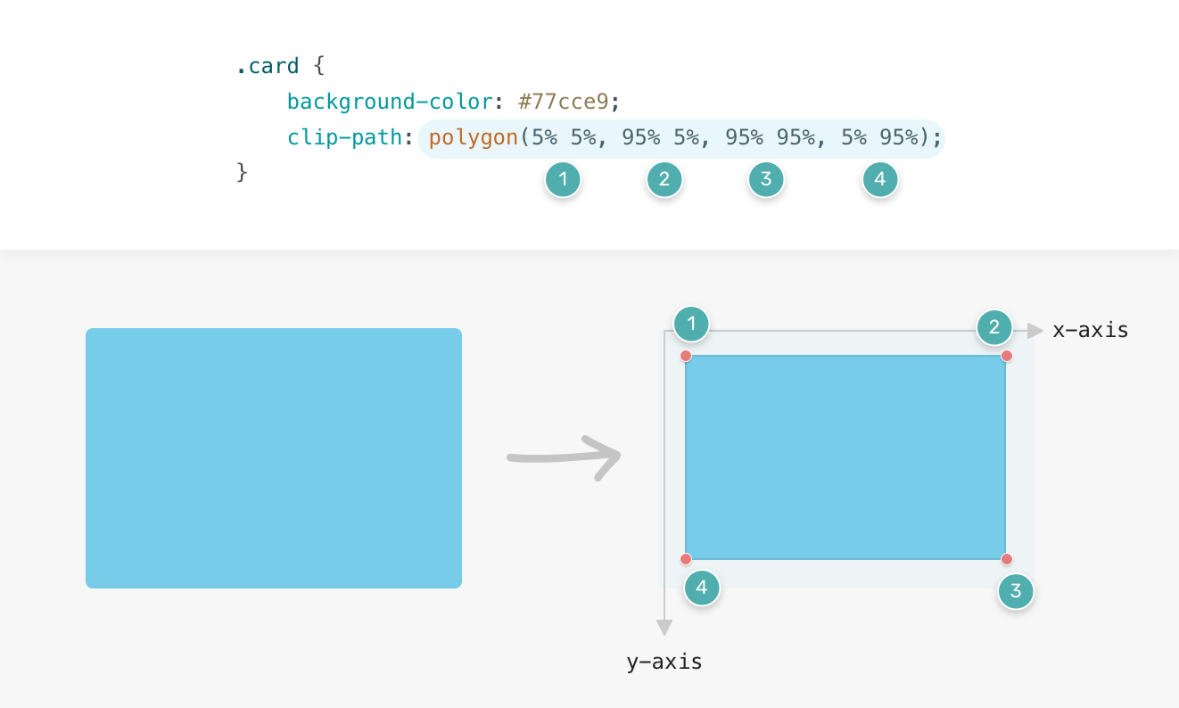
Here is an example that uses polygon() to clip a rectangle. Notice how I mapped each set of points to its coordinates on the axes.
.card {
  clip-path: polygon(5% 5%, 95% 5%, 95% 95%, 5% 95%);
}
We can draw complex shapes with multiple points using the polygon value, too.
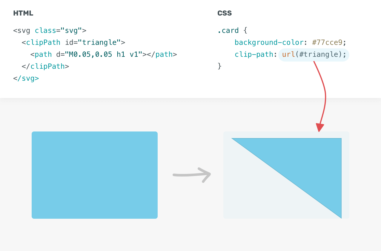
The path() value allows us to use an SVG path to clip a specific area. For now, the browser support is inconsistent. To make it work across different browsers, we need to use an inline SVG, and then use the url() as a value for clip-path.
<svg class="svg">
  <clipPath id="triangle" clipPathUnits="objectBoundingBox">
    <path d="M0.05,0.05 h1 v1"></path>
  </clipPath>
</svg>
In CSS, we need to append the path using url() value.
.card {
  clip-path: url("#triangle");
}
Now that we went through the theory of clip-path and it’s possible values, it’s time to use it in action and explore some use-cases. Are you ready?
In a way or another, you might have seen this pattern on the web where a section has a slightly angled background. That is a perfect use-case for clip-path.
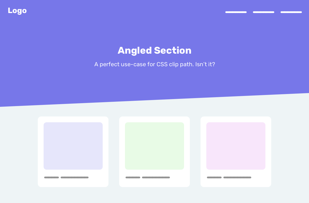
Can you guess how to implement the angled effect? We need to use the polygon().
.section {
  clip-path: polygon(0 0, 100% 0, 100% 80%, 0 100%);
}
In some cases, it might be annoying to tweak 8 numbers for the polygon value. For that reason, I have a little trick for you which is to depend on the browser to create the shape we want. First, we need to add the following:
.section {
  clip-path: polygon(0 0, 100% 0, 100% 100%, 0 100%);
}
Then, we need to inspect that section of the DevTools. Once that is done, notice that there is a little polygon icon at the left side of the polygon() value.
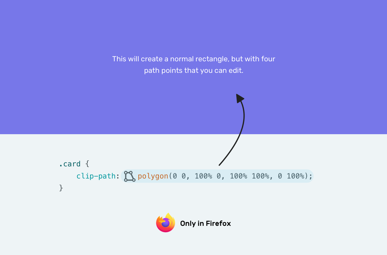
Once that icon is clicked, we can edit the polygon in the browser. Isn’t that amazing? See the video below.
We can also use CSS calc() mixed with CSS viewport units to make the angle relative to the viewport’s width. I learned about this from this great article by Kilian Valkhof.
.section {
  clip-path: polygon(0 0, 100% 0, 100% calc(100% - 5vw), 0 100%);
}
I got a question in my mind about if we want multiple angled sections? See the figure below.
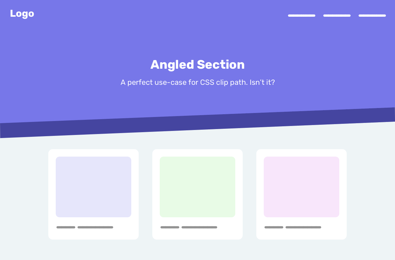
The first thing I thought about is to simply add a box-shadow or a border. Unfortunately, those will be clipped, so even if we added one of them, it will not appear as expected.
In such a case, the solution is to use multiple elements, with each one of them having a different clipping point. Here is how we can do that.
<div class="hero">
  <img src="bg.jpg" alt="" />
</div>
.hero {
  position: relative;
  min-height: 350px;
}

.hero img {
  position: absolute;
  left: 0;
  top: 0;
  width: 100%;
  height: 100%;
  clip-path: polygon(0 0, 100% 0, 100% 80%, 0 90%);
}

.hero:after {
  content: "";
  position: absolute;
  left: 0;
  bottom: -20%;
  z-index: -1;
  width: 100%;
  height: 100%;
  background-color: #4545a0;
  clip-path: polygon(0 0, 100% 0, 100% 80%, 0 90%);
}
We have a pseudo-element with the same size and clip-path as the other element. The difference is that it’s positioned underneath it with bottom: -20% and z-index: -1. I used the value 20% since it’s the result of 100 - 80.
By using the IntersectionObserver API, we can reveal certain elements on the page while the user is scrolling.
The most clip-path value I found useful for this effect is inset. You might be thinking about, why? Well, I will tell you in the next figure.
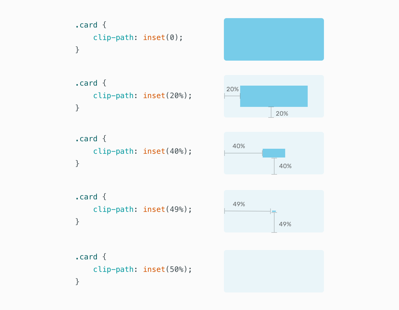
Notice how the blue rectangle can be completely invisible by applying inset(50%). Yes, the value that makes it invisible is 50% because we are applying an inset from the four sides. In other words, the inset is being applied from the edge to the center of the rectangle.
In the figure below, inset is being used to show images while the user is scrolling.
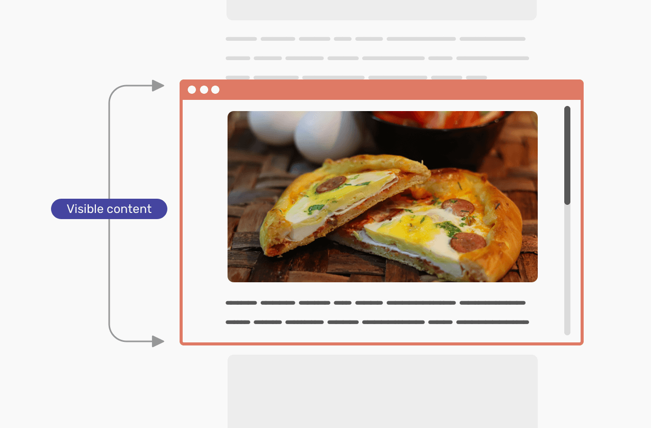
The javascript code below adds the class is-visible to each image that is within the viewport. With that, we can make the image reveal by scrolling.
const images = document.querySelectorAll("img")

function check(entries) {
  entries.map((entry) => {
    if (entry.isIntersecting) {
      entry.target.classList.add("is-visible")
      observer.unobserve(entry.target)
    }
  })
}

const observer = new IntersectionObserver(check)
images.forEach((image) => observer.observe(image))
img {
  clip-path: inset(50%);
  transition: 1.2s ease-in;
}

img.is-visible {
  clip-path: inset(0);
}
Isn’t it simple? We created a simple scroll effect with a few lines of CSS and Javascript.
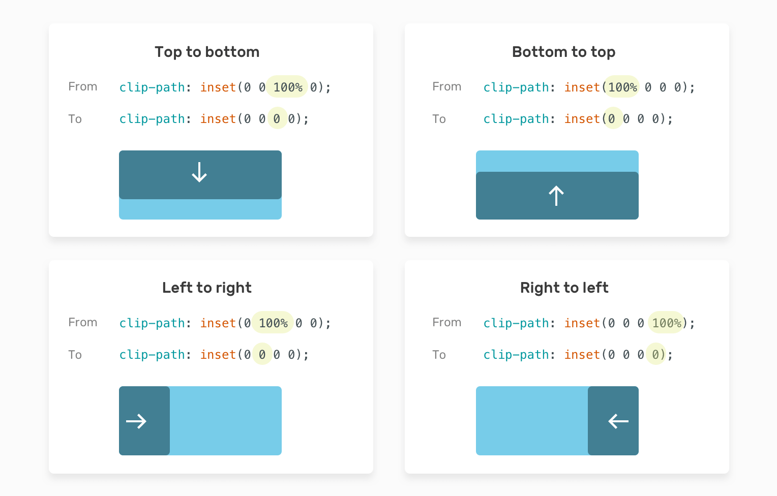
Not only that, but we can also control the direction of the reveal transition. To do that, we need to only use one value from the four sides. For example, if we want a top to bottom transition, the bottom value should be transitioned from 100% to 0. Here is a visual that explains that.
And here is an interactive demo.
See the Pen Animations - Clip Path - Inset by Ahmad Shadeed (@shadeed) on CodePen.
The possibilities of creating hover and animation effects with clip-path are endless. Consider the following example.
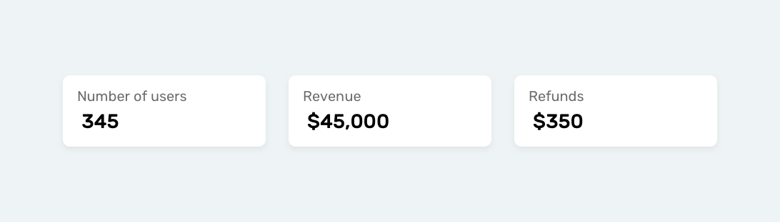
What we need to do is adding a hover effect that scales from an already specified position. In this case, let’s go with a circle() value.
To make it easier and more maintainable, let’s use CSS variables. That way, we won’t duplicate the whole clip-path. We will only change the CSS variables needed.
:root {
  --pos: left center;
  --size: 0;
}

.stats__item:before {
  position: absolute;
  left: 0;
  top: 0;
  width: 100%;
  height: 100%;
  background-color: #7777e9;
  clip-path: circle(var(--size) at var(--pos));
  transition: 0.4s linear;
}

.stats__item:hover:before {
  --size: 300px;
}
See the video below for how it works.
Not only that, we can change the position of the animation very easily. I created an interactive demo with the ability to change the position from a dropdown menu.
See the Pen Animations - Clip Path by Ahmad Shadeed (@shadeed) on CodePen.
If you want to dig more into animation effects, Mr. Adam Argyle created a very useful CSS animation library that relies 100% on CSS clip-path. Check it out.
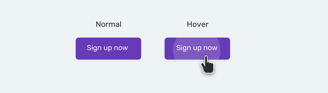
The ripple effect has been popular since the release of Material design. With clip-path, we can easily replicate this effect.
<button class="button"><span>Sign up now</span></button>
.button {
  position: relative;
}

.button span {
  position: relative;
  z-index: 1;
}

.button:before {
  content: "";
  position: absolute;
  left: 0;
  top: 0;
  width: 100%;
  height: 100%;
  background-color: #fff;
  opacity: 0.1;
  clip-path: circle(0 at center);
  transition: 0.3s ease-out;
}

.button:hover:before {
  clip-path: circle(100px at center);
}
See the Pen Button Ripple Effect by Ahmad Shadeed (@shadeed) on CodePen.
clip-pathWhen an area is clipped, anything outside it won’t receive any pointer events. That means the user can’t hover over it.
Do you want to make a clip-path relative to the font-size? You can! Use em or rem values for the clip-path and you’re done.
I’m excited to let you know that I wrote an ebook about Debugging CSS.
If you’re interested, head over to debuggingcss.com for a free preview.
此内容由惯性聚合(RSS阅读器)自动聚合整理,仅供阅读参考。 原文来自 — 版权归原作者所有。