


I spent years teaching CSS layout on this blog. I put everything I know into The Layout Maestro course: 70+ lessons and 150+ interactive examples that teach you how to think CSS layouts, not just memorize syntax.
In CSS, we can have control over an element when its content is too big to fit in. The property for that is overflow, which is a shorthand for overflow-x and overflow-y properties.
For this article, I will give an introduction to those properties, and then we will dive together into some concepts and use-cases that are related to overflow. Are you ready? Let’s dive in!
To use the overflow property, we need to be sure that the element we’re applying it to has the following:
div, section) with a height set via height or max-height. By set height, I mean that the item should have content (not empty), not to add an explicit height.white-space set to nowrap.The overflow property can accept the following possible values:
visible, hidden, scroll, auto
.element {
  height: 200px;
  overflow: [overflow-x] [overflow-y];
}
Since overflow is a short hand property, it can accept one or two values. The first value is for the horizontal axis, and the second one is for the vertical axis.
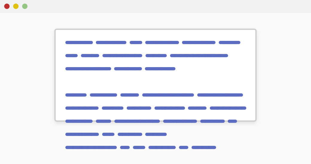
The default value, where the content can extend beyond its parent. It can be set like:
.element {
  height: 200px;
  overflow: visible;
}
An interesting fact that you should know is that when one axis is set to visible, and another axis is set to auto, the axis with visible will compute to the auto keyword.
According to Mozilla Developer Network MDN:
Setting one axis to visible (the default) while setting the other to a different value results in visible behaving as auto.
For example, if we set an element with the following:
.element {
  height: 200px;
  overflow: visible auto;
}
The overflow property computed value will be auto auto.
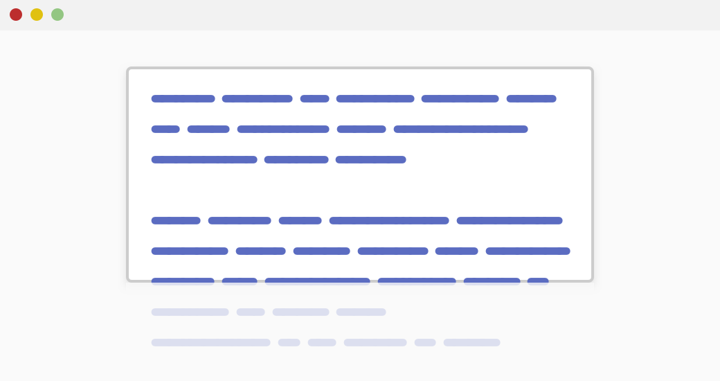
When content is longer than its parent, it will be clipped. However, the content can be scrolled by using Javascript.
The scroll value Allows scrolling to reveal the clipped content, and it can be horizontal or vertical.
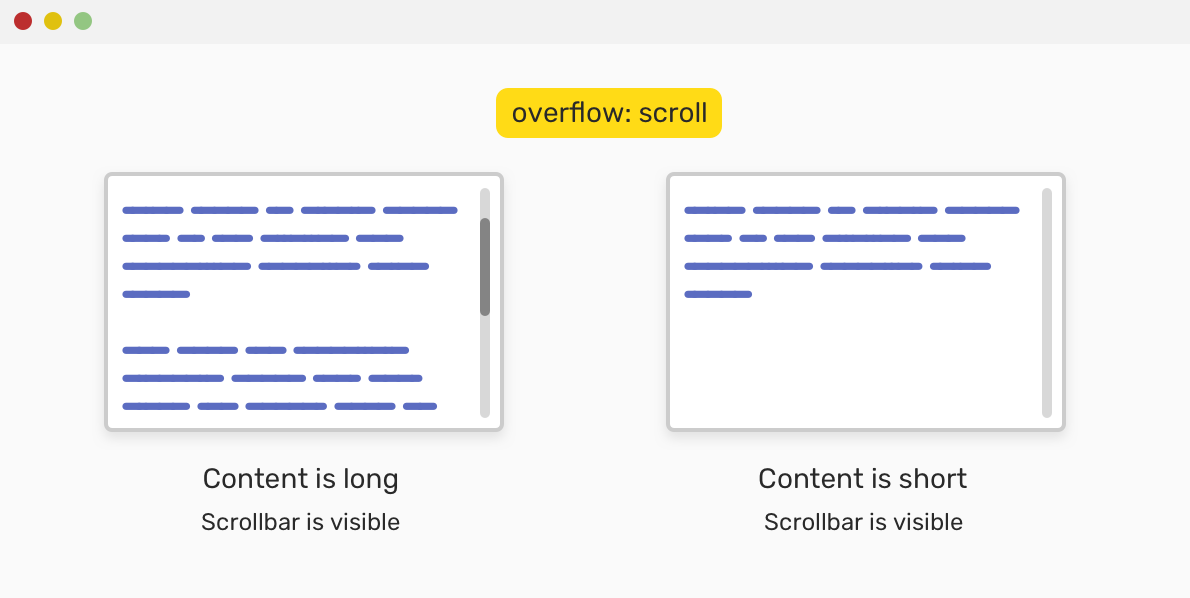
In the figure above, the scrollbar is always visible regardless if the content is long or not. Note that this depends on the operating system.
I consider this a smart keyword! It shows the scrollbar only if the content is longer than its container.

Notice that in the figure, the scrollbar is only visible in case the content is longer than its container. Next, we will go through the longhand properties that are related to overflow.
This is responsible for the x-axis, or the horizontal sides of an element.
overflow-yThis is responsible for the y-axis, or the vertical sides of an element.
We can create a quick and simple slider by clipping the content horizontally and allowing it to scroll.
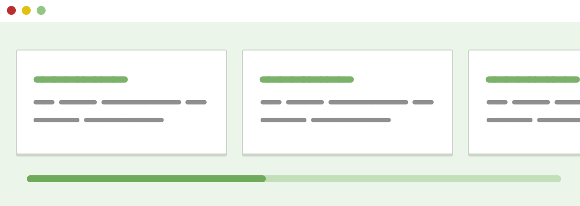
In the mockup above, we have cards that laid out horizontally, and there is a scrollbar that allows us to scroll and reveal more content. To implement that, we will need to do the following:
flexbox for that.overflow-x to the container..wrapper {
display: flex;
overflow-x: auto;
}
And it works on desktop browsers. However, while testing this on Safari for iOS (12.4.1), the scrolling didn’t work. After some trial and error, the scrolling worked when I added width to the child items. It works without issues for iOS (13.3).
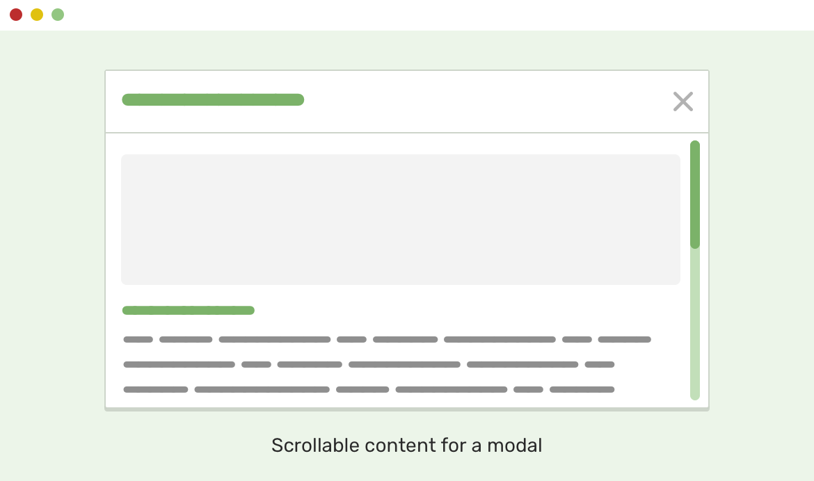
When the modal content is too long, we can easily make the area scrollable. To accomplish that, we should have the following:
.modal {
  display: flex;
  flex-direction: column;
  max-height: 400px;
  max-width: 450px;
}

/* 1. Letting the modal body take the remaining available space */
/* 2. Allow scrolling if the content is long. I used auto because it won't show a scrollbar until the content is long enough. */
.modal__content {
  flex-grow: 1; /* [1] */
  overflow-y: auto; /* [1] */
}
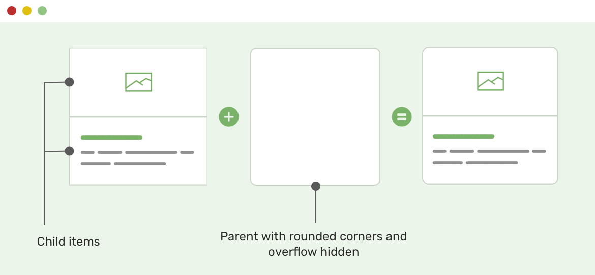
When we have a card and we want its corners to be rounded, we tend to do add border-radius for the top and bottom corners as below:
.card-image {
  border-top-right-radius: 7px;
  border-top-left-radius: 7px;
}

.card-content {
  border-bottom-right-radius: 7px;
  border-bottom-left-radius: 7px;
}
This could be a lot of work, especially if the card has a different design on mobile. For example, instead of stacking its child items, they will be next to each other.
For that case, it’s good to use overflow: hidden on the wrapper, and then add border-radius to it. See below:
.card {
  overflow: hidden;
  border-radius: 7px;
}
However, this solution has some caveats that might make it perfect for all cases. Please test properly.
To account for long content, we can truncate the text by using text-overflow property.
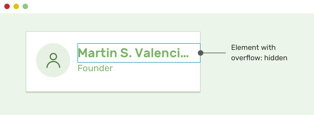
On the element we want it to truncate, I added the following:
.user__name {
  overflow: hidden;
  white-space: nowrap;
  text-overflow: ellipsis;
}
And that’s it! Notice that overflow: hidden is important for that to work.
When it comes to animation, the benefit of overflow: hidden lies in clipping hidden elements that can be shown on hover. Consider the figure below:
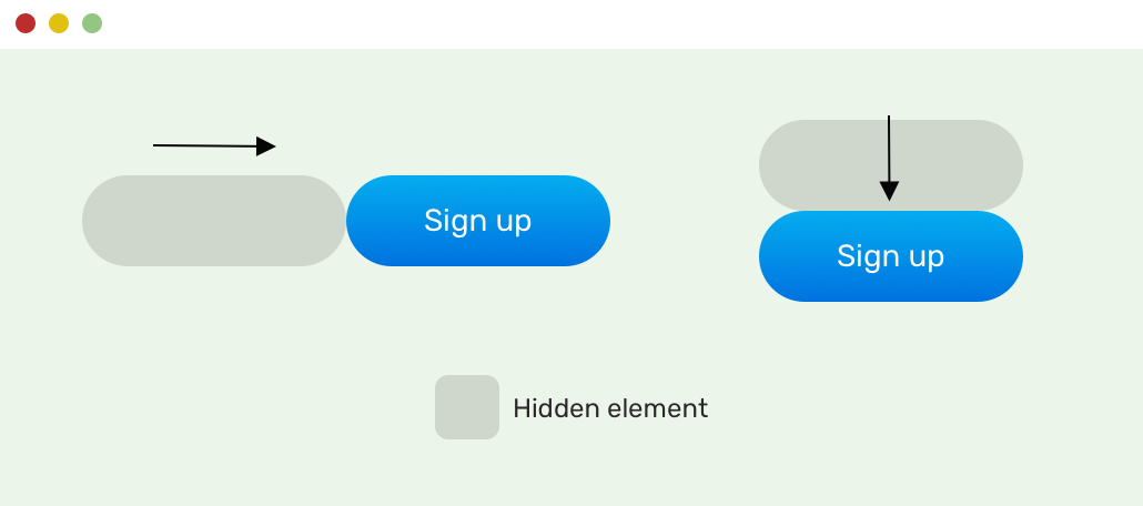
In CSS, it will look like this:
.button.slide-left {
  overflow: hidden;
}

.button.slide-left:after {
  content: "";
  position: absolute;
  left: 0;
  top: 0;
  right: 0;
  bottom: 0;
  background: #000;
  opacity: 0.25;
  border-radius: 100px;
  transform: translateX(-100%);
  transition: 0.2s ease-in;
}
We have two buttons and each one has a pseudo-element that is translated to the left and bottom, accordingly. See the video below:
When we have a slider, for example, it’s not enough to add overflow-x and call it a day. On Chrome iOS, we need to keep scrolling and moving the content manually. See the video below:
Luckily, there is a property that can enhance the scrolling experience.
.wrapper {
  overflow-x: auto;
  -webkit-overflow-scrolling: touch;
}
This is called momentum-based scrolling. According to MDN:
where the content continues to scroll for a while after finishing the scroll gesture and removing your finger from the touchscreen.
Here is how the result looks with the momentum-based scrolling.
As per the CSS spec:
The baseline of an ‘inline-block’ is the baseline of its last line box in the normal flow unless it has either no in-flow line boxes or if its ‘overflow’ property has a computed value other than ‘visible’, in which case the baseline is the bottom margin edge.
When an inline-block element has overflow value other than visible, this will cause the bottom edge of the element to be aligned based on the text baseline of its siblings.
Consider the following example.
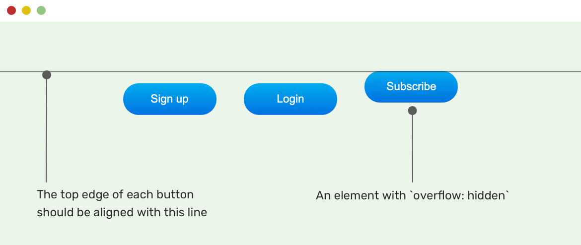
To solve that issue, we should change the alignment of the button that has overflow: hidden.
.button {
  vertical-align: top;
}
Often times, we face the issue of horizontal scrolling and it gets harder when the reason is unknown. In this section, I will list some common causes for horizontal scrolling so you can account for them while building layouts.
When there is an element that has a position value of absolute or fixed, there is a possibility for it to cause horizontal scrolling. This can happen when one of the left, right values is positioning the element outside the body element.
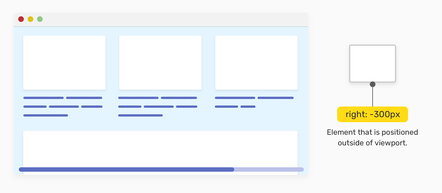
To solve that, you need to check why this element is positioned outside the viewport in the first place. If it’s not necessary, then it has to be removed or the position value should be edited.
CSS grid has three cases that can lead to horizontal scrolling. Let’s see them.
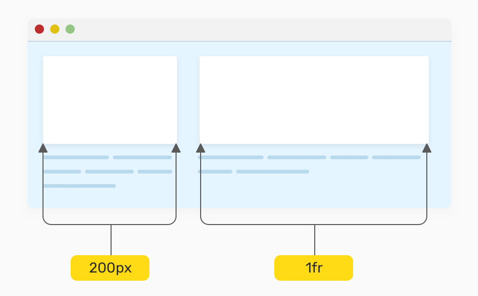
When using pixel values, this will cause issues when the viewport width is small. See below:
.wrapper {
  display: grid;
  grid-template-columns: 200px 1fr;
  grid-gap: 1rem;
}
The solution is to reset the columns and only use the one above on viewports that have enough space.
.wrapper {
  display: grid;
  grid-template-columns: 1fr;
  grid-gap: 1rem;
}

@media (min-width: 400px) {
  grid-template-columns: 200px 1fr;
}
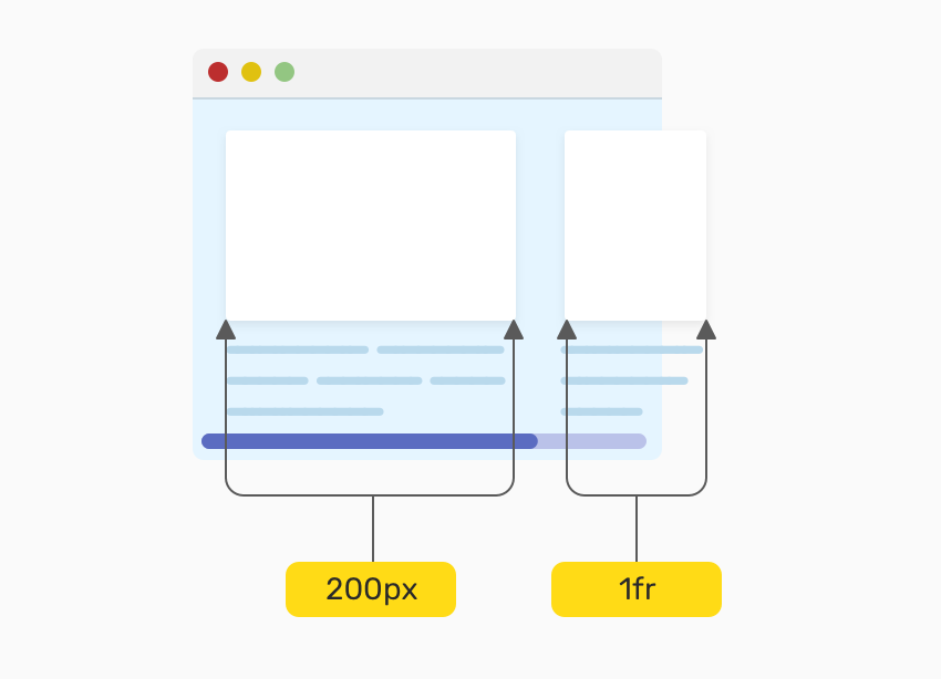
.wrapper {
  display: grid;
  grid-template-columns: repeat(auto-fit, minmax(300px, 1fr));
  grid-gap: 1rem;
}
It might be tempting to forget about testing this for mobile, as it will cause horizontal scrolling at some point since the minimum width is 300px.
A simple fix for that is to reset the grid-template-columns to 1fr and on changing it when the viewport is larger.
.wrapper {
  display: grid;
  grid-template-columns: 1fr;
  grid-gap: 1rem;
}

@media (min-width: 400px) {
  grid-template-columns: repeat(auto-fit, minmax(300px, 1fr));
}
As per this tweet by Jake Archibald, if we used a percentage for the grid columns, and then added a grid-gap, this will cause horizontal scrolling. The reason is that the grid-gap value is added to the width of the container.
.wrapper {
  display: grid;
  grid-template-columns: repeat(4, 25%);
  grid-gap: 10px;
}
To fix that, avoid using percentages for the grid columns, and use 1fr instead. When used, the grid-gap will deduct from the available space.
For flex items, it’s important to add flex-wrap to the container or things might get messy for smaller viewports.
.wrapper {
  display: flex;
}
The above is not enough. Make sure to add flex-wrap to avoid any unexpected overflows.
.wrapper {
  display: flex;
  flex-wrap: wrap;
}
When dealing with long words or links that are placed within content, it should break to a new line or otherwise, you guessed it! There will be a horizontal scrolling.
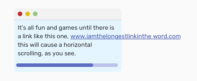
To fix that, we need to break long words and links. Here is how we can do it:
.post-content a {
  word-wrap: break-word;
}
Or we can use text-overflow:
.post-content a {
  overflow: hidden;
  text-overflow: ellipsis;
}
max-width: 100% Set on ThemIf you’re someone who doesn’t use a CSS reset, you might accidentally forget to use max-width: 100% for all imgs as this will make them responsive on mobile. If not, this will cause issues. Please test well.
A fixed width can cause problems if used and generally, I try to avoid it as much as I can. If it’s really necessary, then it’s better to use it with max-width, so if space is not enough for the width value, then the max-width will do the work.
.element {
  width: 800px;
}
Adding max-width will avoid any horizontal scrolling.
.element {
  width: 800px;
  max-width: 100%;
}
Now that we know the causes of horizontal scrolling, I will explain some ways that can help us identify those issues and solve them.
This is the first thing that I usually do to debug.
*,
*:before,
*:after {
  outline: solid 1px #000;
}
By adding that, we can notice which elements that have a big width so we can solve the issue. Addy Osmani took this further with his simple script:
;[].forEach.call(document.querySelectorAll("*"), function (a) {
  a.style.outline =
    "1px solid #" + (~~(Math.random() * (1 << 24))).toString(16)
})
What this script does is that it randomizes the outline colors, which will make it easier instead of having all the outlines with a single color.
scroll LabelIn Firefox, there is a little label added to elements that cause horizontal scrolling. Isn’t that awesome?

Sometimes, the techniques above don’t work. What I do in that case is to open up the DevTools, and then I start deleting elements and notice. Once the horizontal scrolling is gone, I can identify the element that is causing the issue.
Lastly, you can use overflow-x: hidden to solve the issue of horizontal scrolling, but please make that your last option.
That’s a wrap. Do you have a comment or a suggestion? Please feel free to ping me on @shadeed9.
此内容由惯性聚合(RSS阅读器)自动聚合整理,仅供阅读参考。 原文来自 — 版权归原作者所有。