


I spent years teaching CSS layout on this blog. I put everything I know into The Layout Maestro course: 70+ lessons and 150+ interactive examples that teach you how to think CSS layouts, not just memorize syntax.
Looking at a layout at first glance might imply that it’s easy and straightforward to build. The moment you start building the initial layout, you will face challenges that you didn’t think about in your initial look at the design.
In this article, I will rethink how to build the featured news section on Vox.com and try to see if modern CSS will be helpful or not. For example, do we need to use container queries? Or fluid sizing? That’s the goal of this article. It’s a journey as I think aloud about building a layout that seems simple.
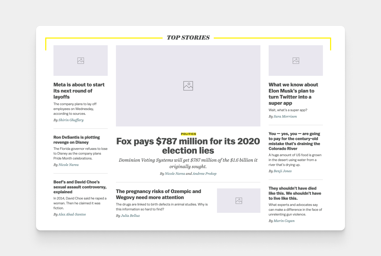
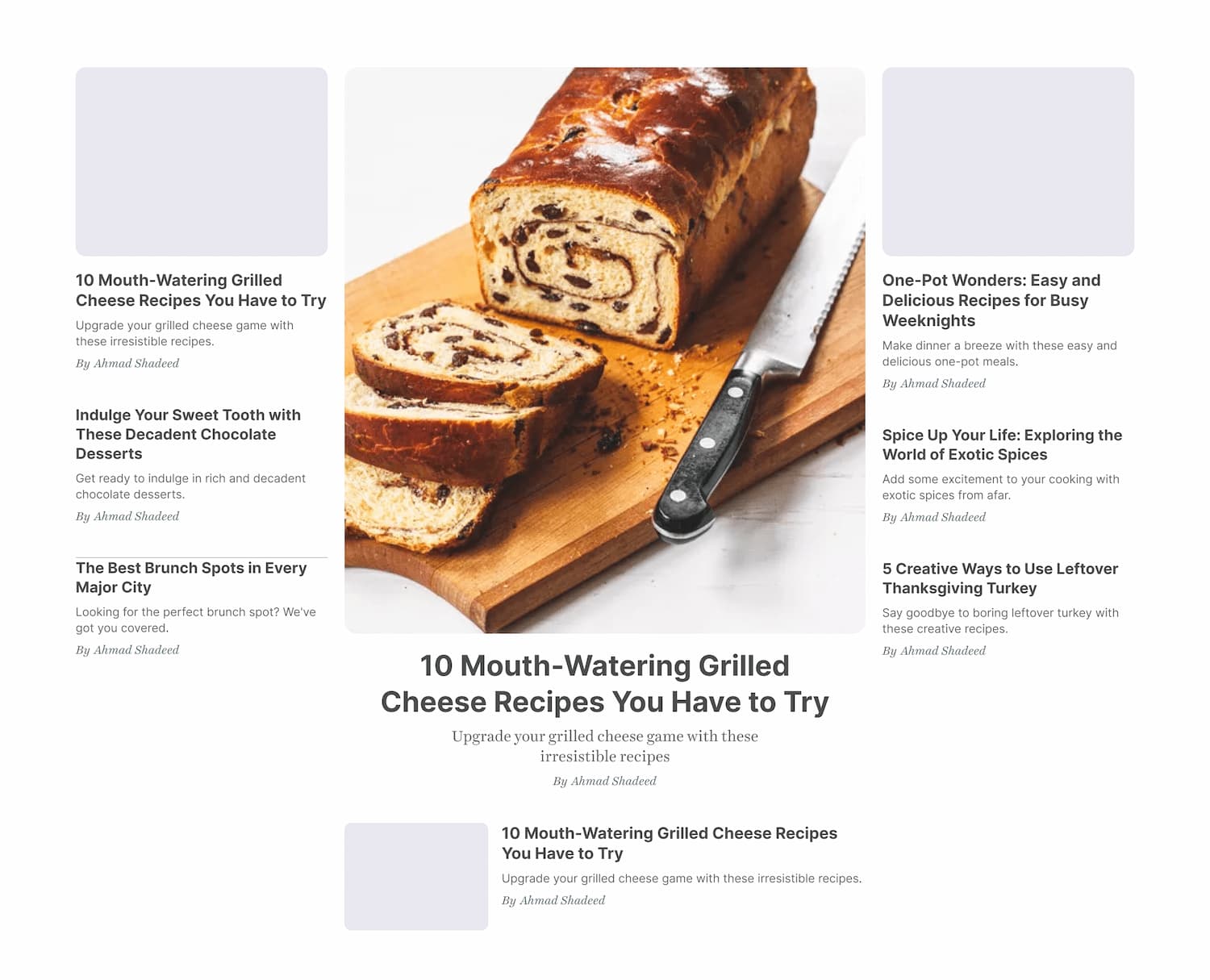
In the largest viewport, we have a 3 columns layout. Two of the columns take 25% of the width, and the middle one takes 50%. Here is a visual that shows them:
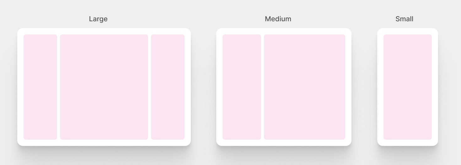
Now that we have an idea about the columns, let’s take a look at the components within them.

It might look a bit confusing to spot the differences, but I will walk you through each change so we can have an idea about what’s changing on each viewport size.
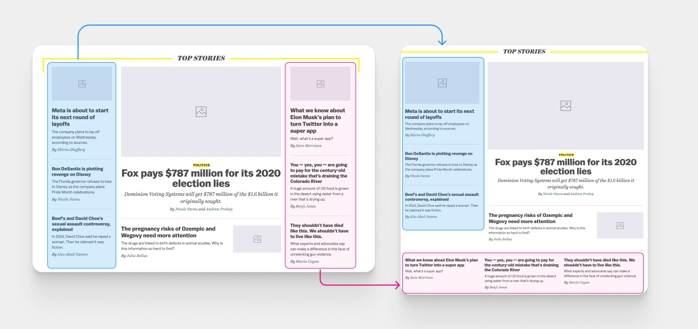

With that in mind, we have a basic outline of how the layout is behaving on different viewport sizes. The next step is to build the layout and handle the ordering of the columns.
In vox.com, CSS flexbox is being used to handle the layout. I’m not a fan of using flexbox for such a purpose as this feels more like a CSS grid use case. I believe the Vox team used flexbox since it was better supported at the time of building the layout.
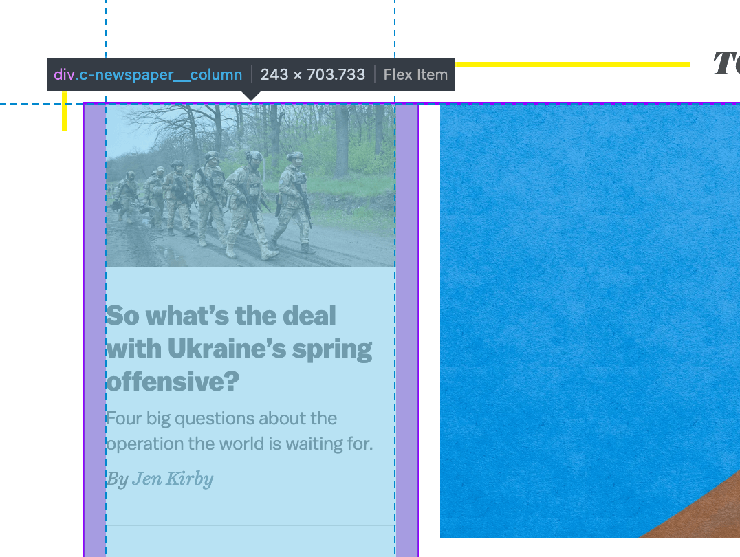
@media (min-width: 880px)
    .c-newspaper__column {
        width: 22.5%;
        padding: 0 16px;
    }
}
The CSS above is responsible for the following:
width property for that works fine, but we can also use the flex property.gap property!We can use the flex property like this:
@media (min-width: 880px)
    .c-newspaper__column {
        flex: 0 0 22.5%;
        padding: 0 16px;
    }
}
..but the good news is that we don’t have to use flexbox.
Nowadays, CSS grid has excellent browser support and it’s easier to deal with the sizing and spacing. Also, I’m an advocate of using grid for layouts and flexbox for components.
Consider the following HTML markup:
<div class="c-newspaper">
  <!-- Featured column -->
  <div class="c-newspaper__col">1</div>

  <!-- Other columns -->
  <div class="c-newspaper__col">2</div>
  <div class="c-newspaper__col">3</div>
</div>
I added numbers for illustrating how each layout column will be reordered on different viewport sizes.
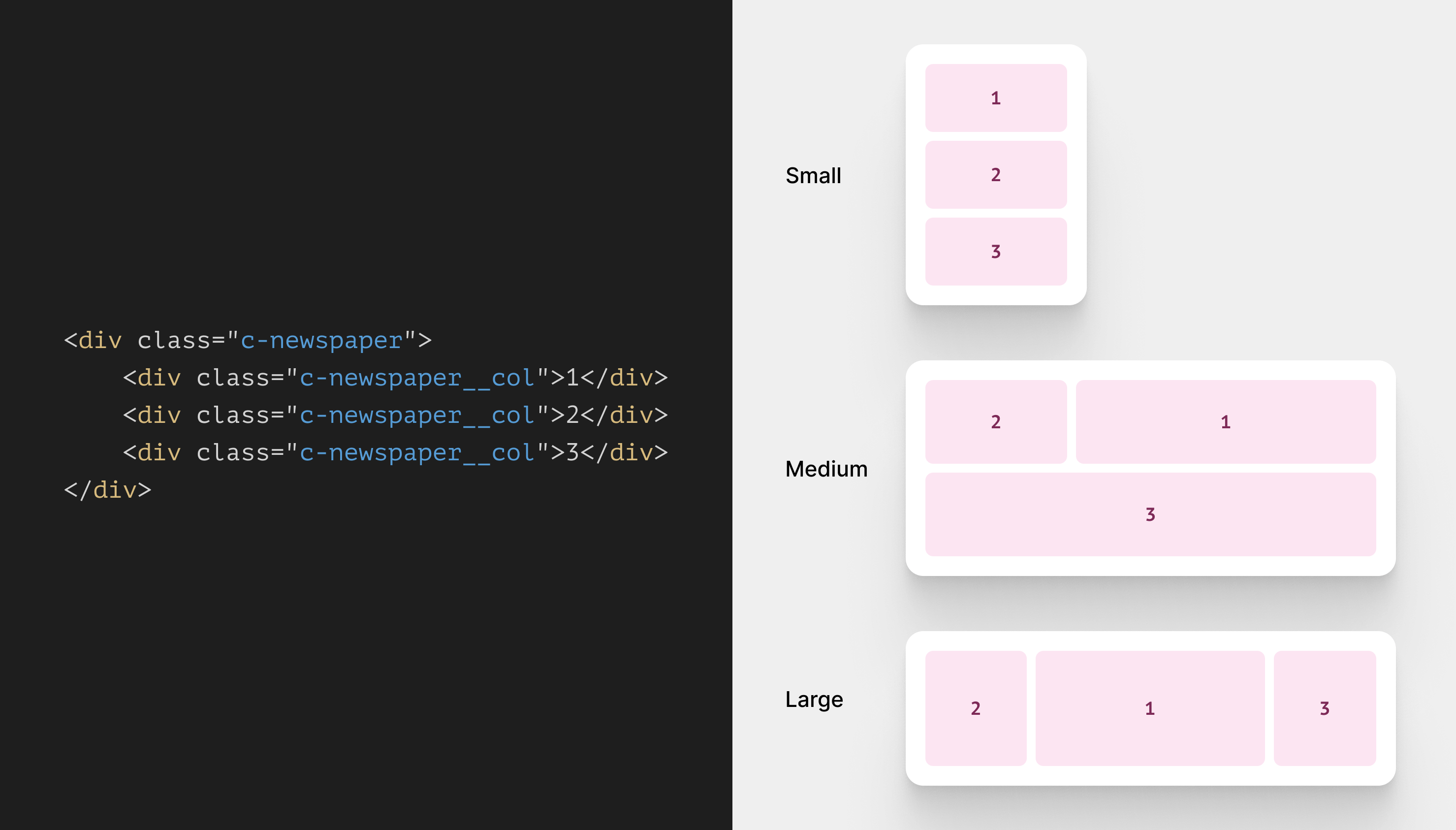
CSS grid sounds perfect for the above, right?
First, we need to set up the grid for all sizes.
.c-newspaper {
  display: grid;
  grid-template-columns: 1fr;
  gap: 1rem;
}

@media (min-width: 550px) {
  .c-newspaper {
    grid-template-columns: 1fr 1fr 1fr;
  }
}

@media (min-width: 880px) {
  .c-newspaper {
    grid-template-columns: 1fr 2fr 1fr;
  }
}
A few things to keep in mind:
gap property for spacing.550px or larger, the grid will have 3 columns. The same happens on the larger viewport 880px, but the second column is double the size of its sibling columns.The vox.com styles for the columns are built with the order property to reposition the columns on different sizes.
@media (min-width: 880px) {
  .c-newspaper__column:first-child {
    order: 1;
  }

  .c-newspaper__column:last-child {
    order: 3;
  }
}
With CSS grid, the above isn’t needed at all as we can reorder the layout by positioning an element on any grid lines we want.
Let’s explore how to place the layout columns with CSS grid.
We need to position the columns as per the viewport width. For the medium size:
@media (min-width: 550px) {
  .c-newspaper {
    grid-template-columns: 1fr 1fr 1fr;
  }

  .c-newspaper__col:first-child {
    grid-column: 2/4;
  }

  .c-newspaper__col:nth-child(2) {
    grid-column: 1/2;
    grid-row: 1;
  }

  .c-newspaper__col:last-child {
    display: flex;
    grid-column: 1/4;
  }
}
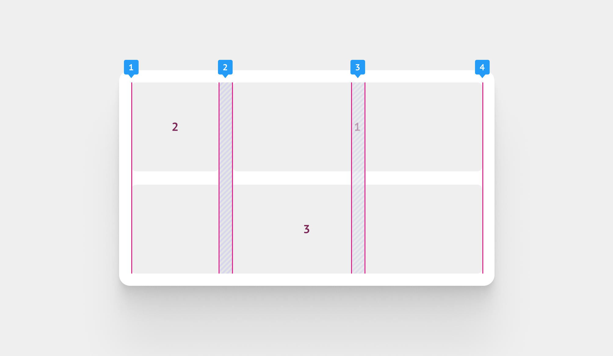
And for the large size, remember that the second column is now 2fr, so it will have to double the size of the side column.
@media (min-width: 880px) {
  .c-newspaper {
    grid-template-columns: 1fr 2fr 1fr;
  }

  .c-newspaper__col:first-child {
    grid-column: 2/3;
  }

  .c-newspaper__col:last-child {
    grid-column: 3/4;
  }
}
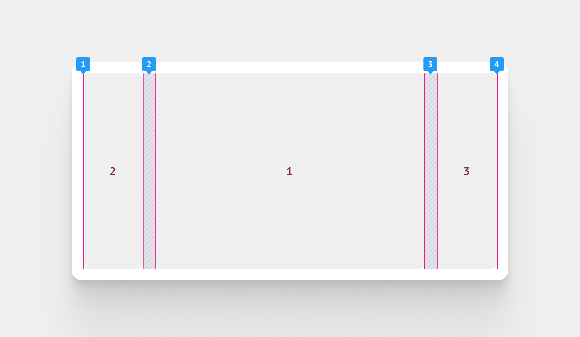
Now that we have a working grid, we can start thinking about the inner components and how to build them.
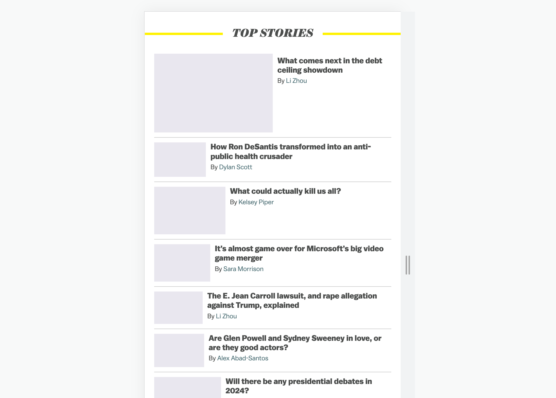
This is the core focus of this article, the card component. I compiled a visual of all the variations we have:
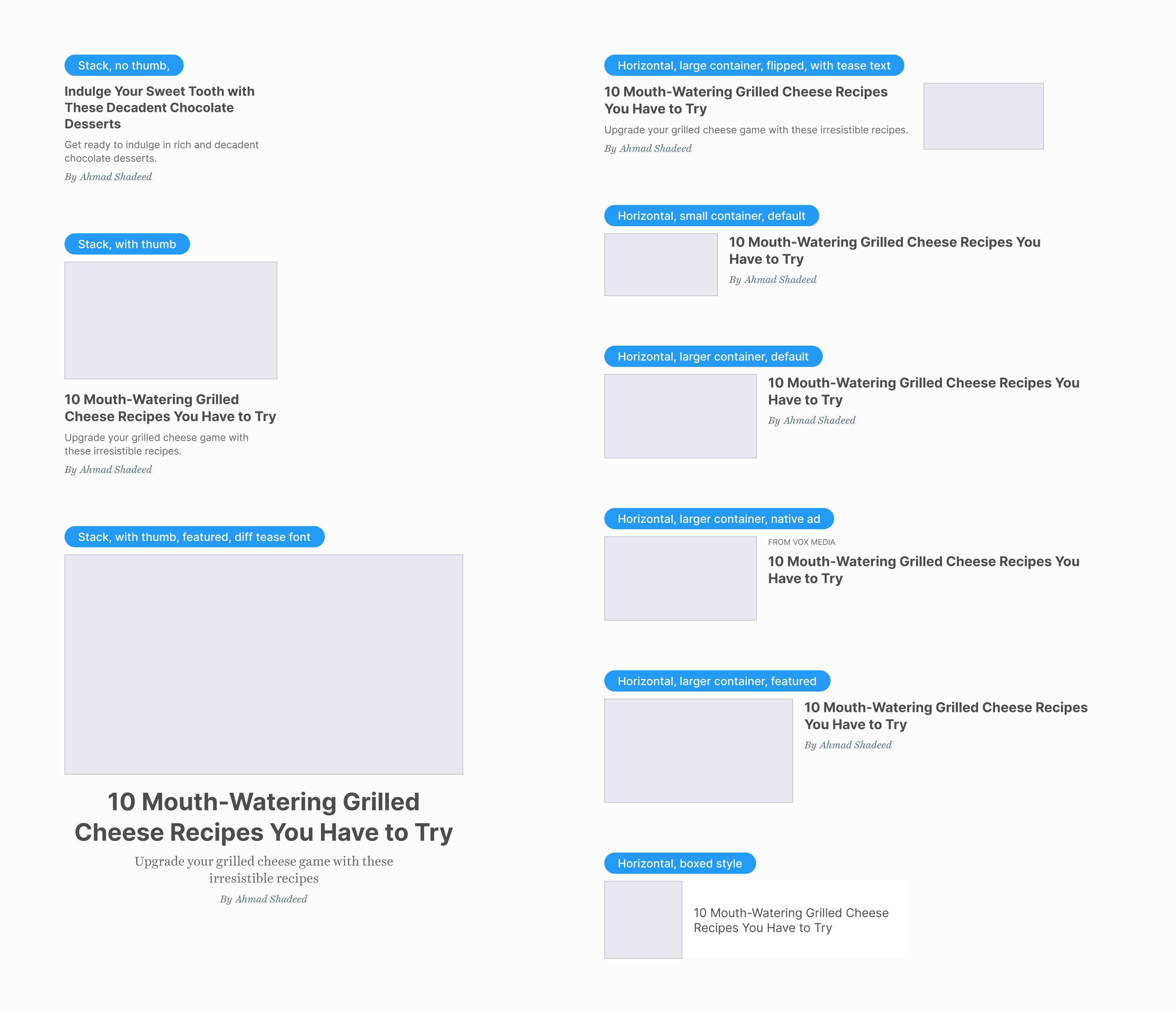
All of those can live within the featured section but with a different design variation for each card.
Let’s take the default card as an example:
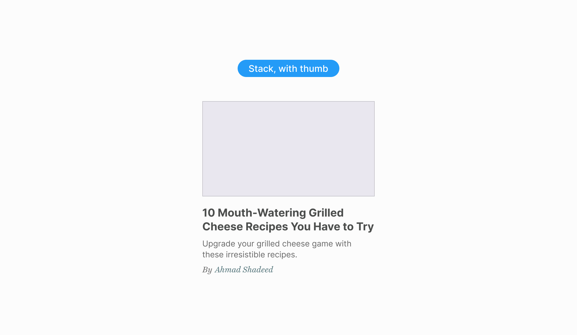
In vox.com HTML, the card has the following CSS classes:
<div
  class="c-entry-box--compact c-entry-box--compact--article c-entry-box--compact--hero c-entry-box--compact--2"
></div>
That is a long list of CSS classes, and the class name itself is lengthy, too.
The card component is built in a way that uses a lot of variation classes. For example, here is how the thumbnail is hidden in the plain card:
.c-entry-box--compact--7 .c-entry-box--compact__image-wrapper {
  display: none;
}
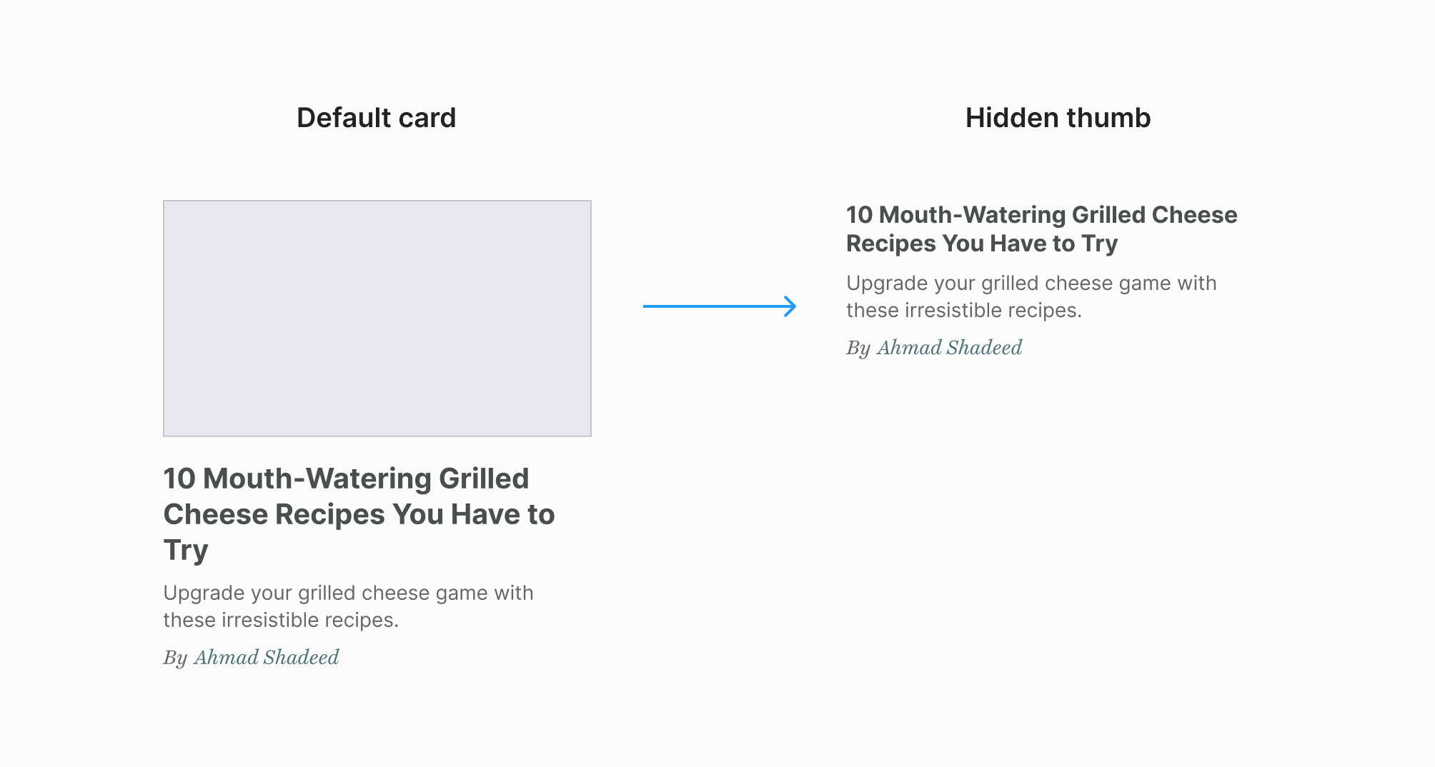
A custom variation class is used for every single card in the featured section. In total, the CSS looks like this:
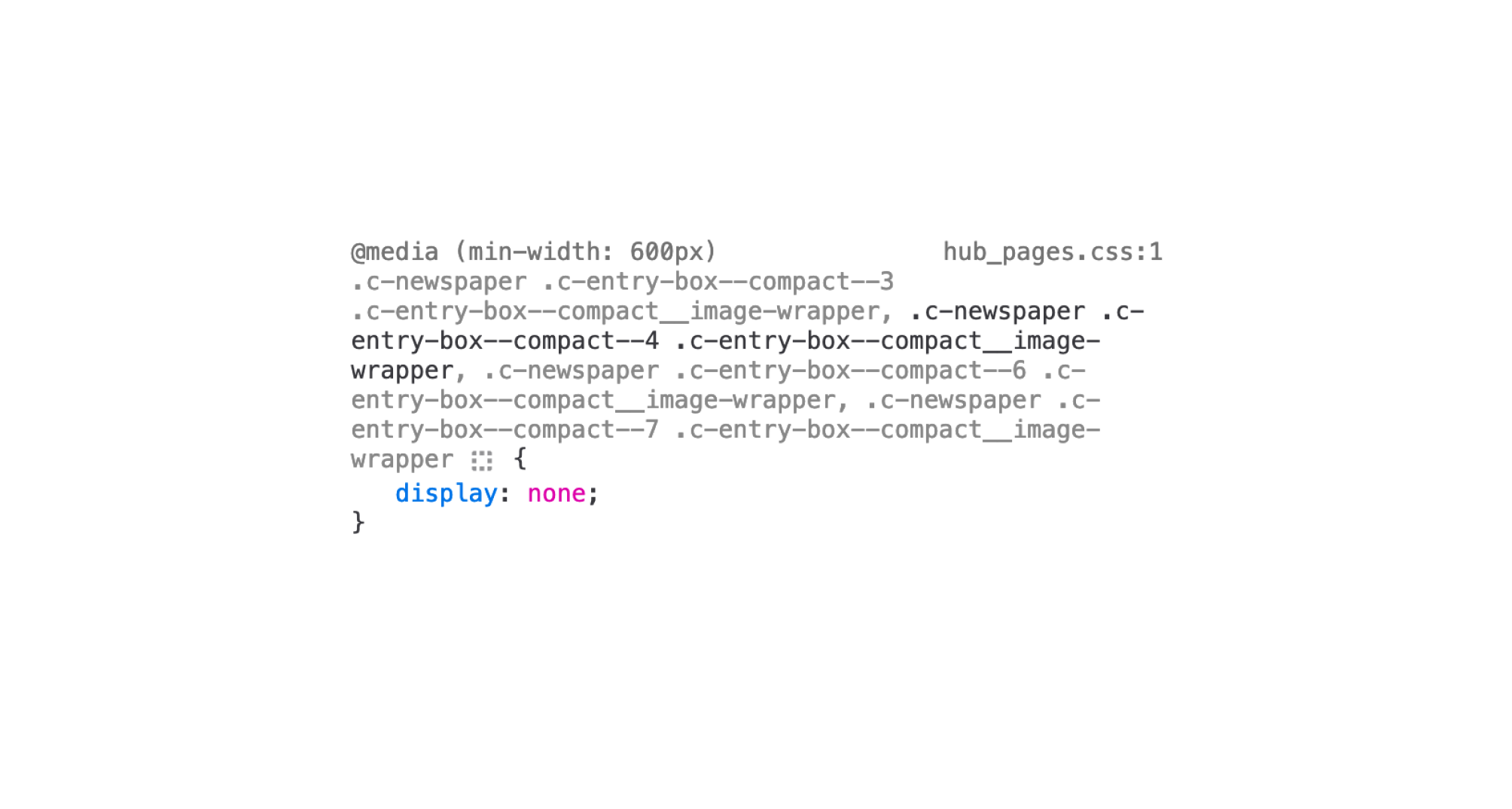
That is too much, I think.
The title size for the default card is 20px and 16px for the plain card (without a thumbnail).
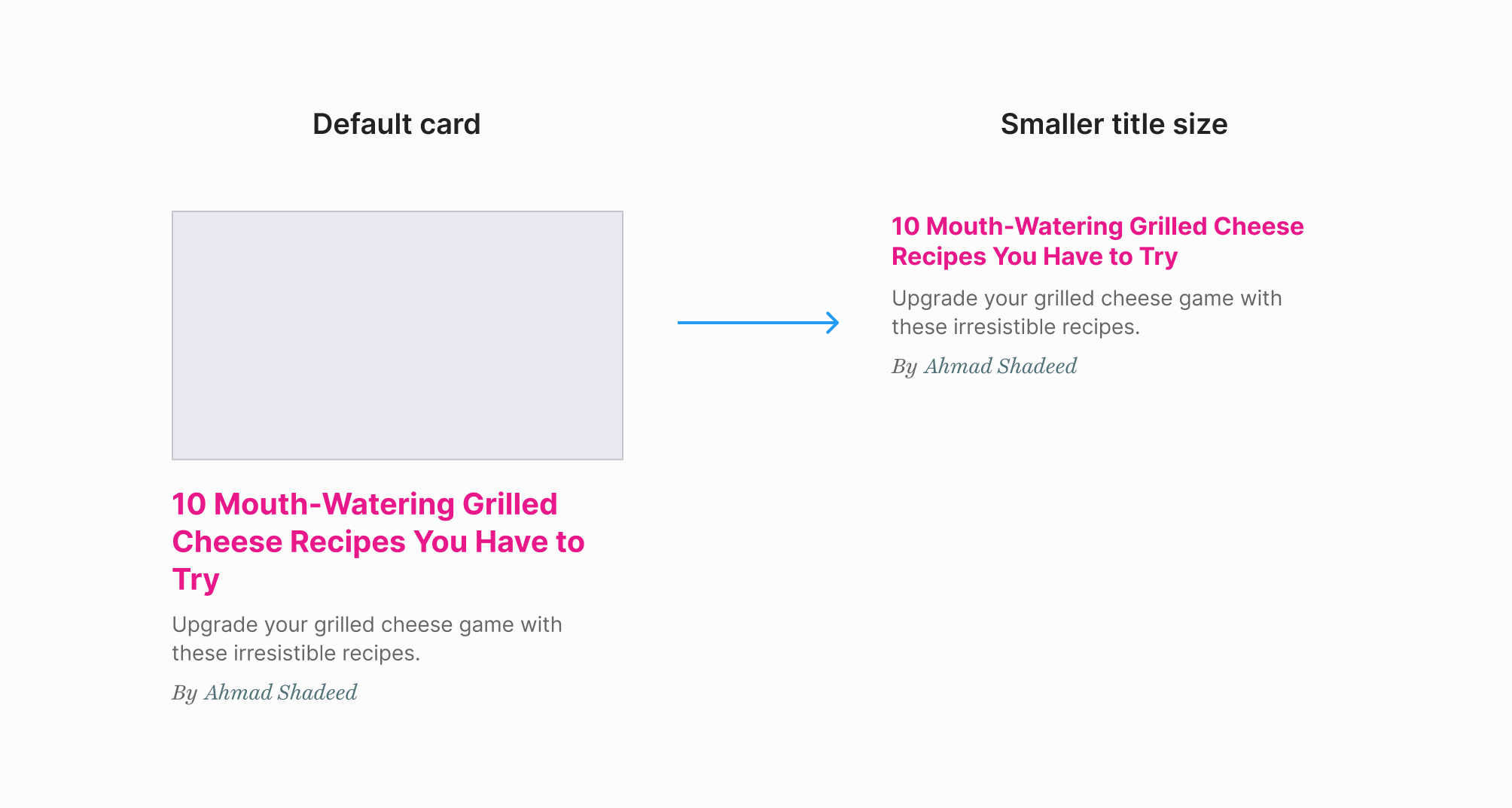
Here is how that is handled on vox.com:
@media (min-width: 880px)
    .c-newspaper .c-entry-box--compact__title {
        font-size: .9em;
    }
}
The .c-newspaper is the main element that contains all the cards, so using it like that to tag the title element doesn’t look right to me. What if that needs to be used in another container that doesn’t have the class .c-newsppaper?
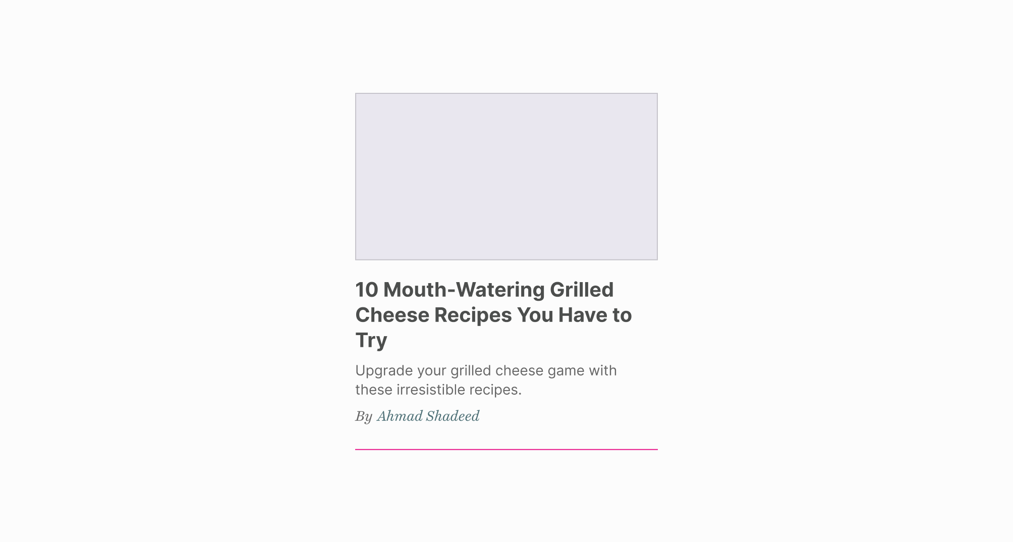
There is a line separate between cards. It’s being handled in the CSS like this:
.c-newspaper .c-entry-box--compact {
  border-bottom: 1px solid #d1d1d1;
}
Two things that don’t look good to me here:
.c-newspaper element to select the card.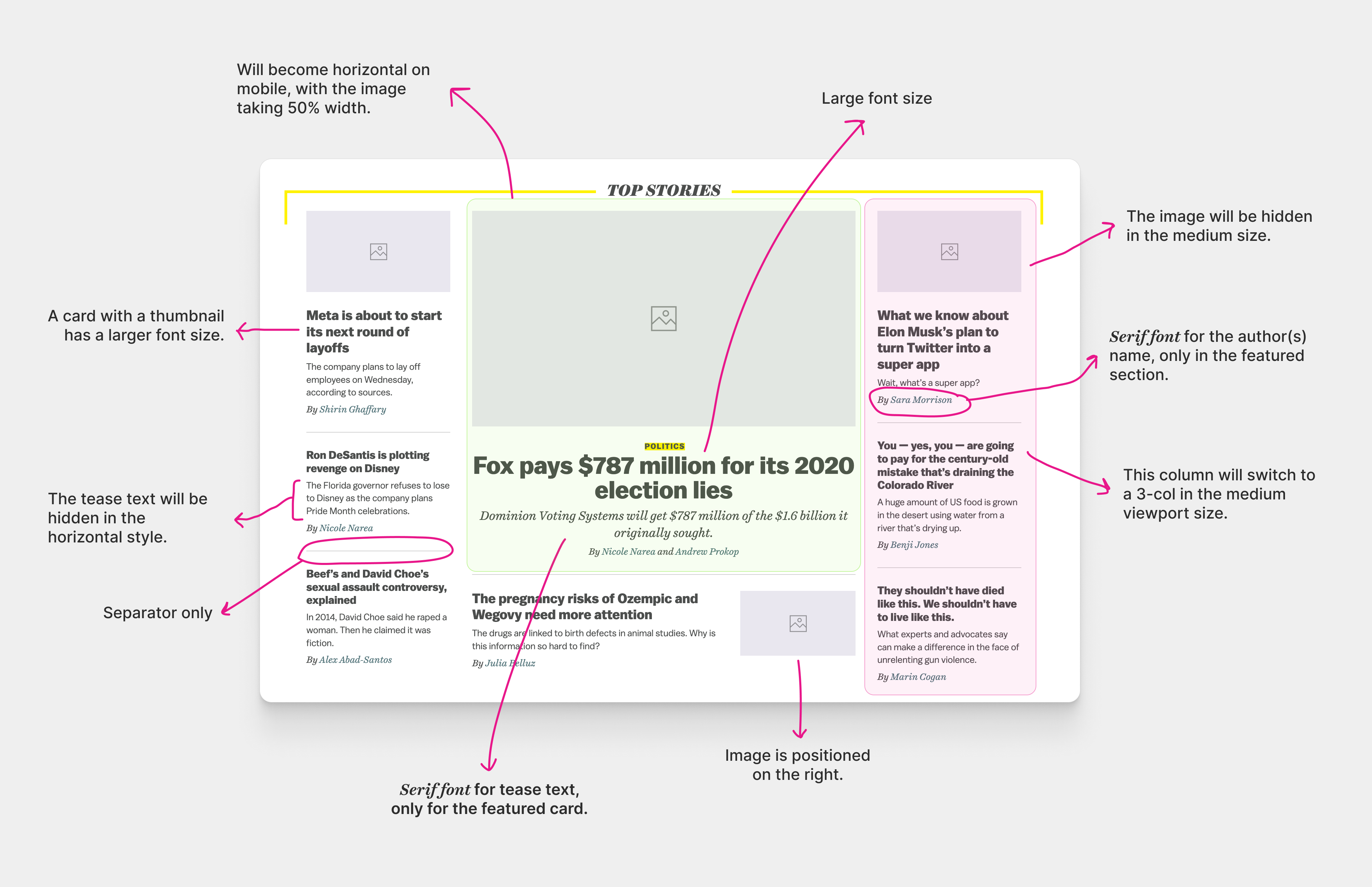
The main motivation for this article is the card component. When I started thinking about it, I got the idea to use some or all of these features:
I already explored using CSS grid for the main layout. Here is what the HTML markup looks like:
<div class="c-newspaper">
  <div class="c-newspaper__col">
    <div class="c-newspaper__item">
      <article class="c-card">
        <!-- Card component -->
      </article>
    </div>
    <div class="c-newspaper__item"></div>
    <div class="c-newspaper__item"></div>
  </div>
  <!-- Other columns -->
</div>
The card component lives within the .c-newspaper__item, which acts as the card container.
Generally speaking, I like to wrap the component in an abstract container. This is useful for:
When the card component is within the featured section, the font family of the author’s name is different. To do that, we can check if the following container query works, and if yes, the font will be applied.
@container main (min-width: 1px) {
  .c-card__meta {
    font-family: "Playfair Display", serif;
  }
}
We need to set a default card style that we can style. In this case, both the horizontal and stacked styles are used equally, but I will assume that the stacked card is used more, just for the sake of the article.
<article class="c-card">
  <div class="c-card__thumb"></div>
  <div class="c-card__content">
    <h3 class="c-card__title"></h3>
    <p class="c-card__tease"></p>
    <p class="c-card__meta"></p>
  </div>
</article>
Cool! Let’s from there for the rest of the variations.
The card will flip to the horizontal style when its container is larger than 300px and the CSS variable --horizontal: true has been set on the container.
<div class="c-newspaper__item" style="--horizontal: true;">
  <article class="c-card"></article>
</div>
.c-newspaper__item {
  container-type: inline-size;
  container-name: card;
}

@container card (min-width: 300px) and style(--horizontal: true) {
  .c-card {
    display: flex;
    gap: 1rem;
  }
}
Notice that I combined a size and a style container query. The size query works based on the container width. While the style query works by checking if the CSS variable is there.
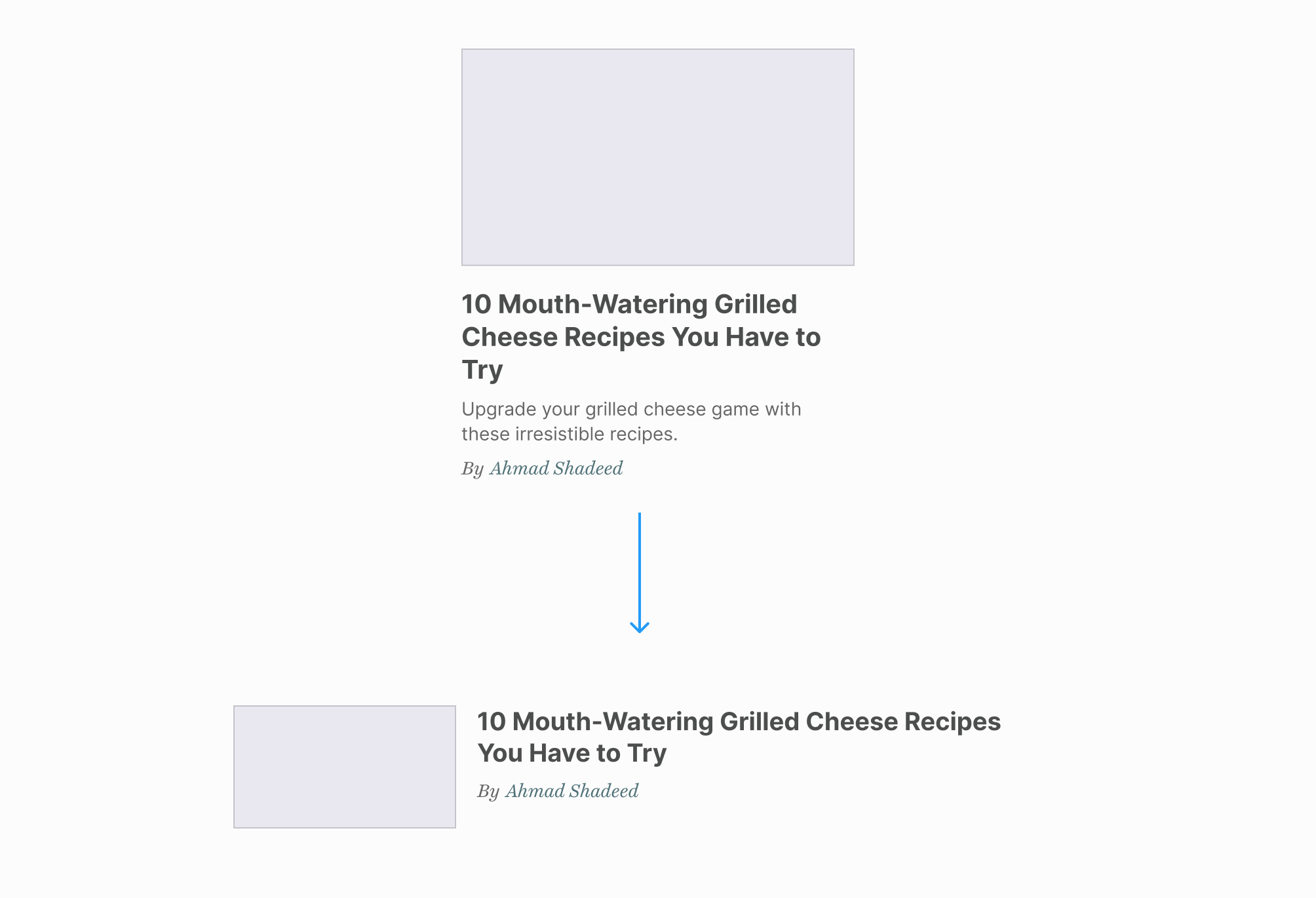
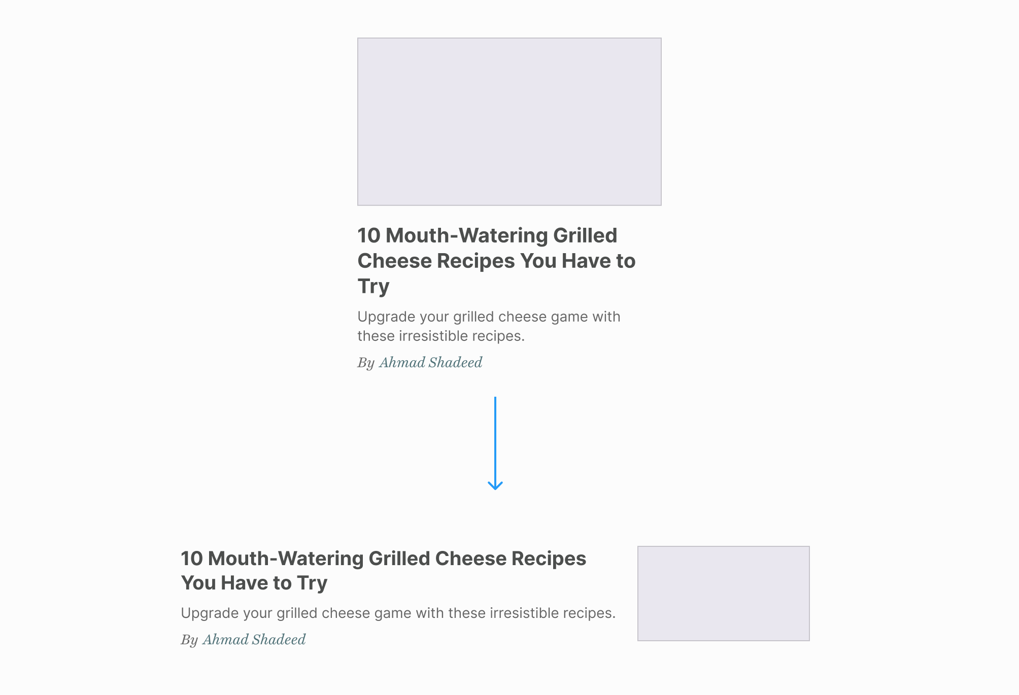
We also have the same variation but with the card thumbnail positioned being flipped. We can do that via the order property.
To query that, we need to add the variable --flipped: true.
<div
  class="c-newspaper__item"
  style="--horizontal: true;
           --flipped: true"
></div>
At first, I tried the following CSS but it didn’t work as expected. It’s not possible to merge two container queries for different containers. In my case, the containers are main and card.
/* That didn't work */
@container main (min-width: 550px) and card style(--flipped: true) {
}
After reading the spec, I noticed the following:
While it is not possible to query multiple containers in a single container query, that can be achieved by nesting multiple queries:
I nested the style query inside another container query. In plain words, that is like saying:
When the container main width is equal to or larger than 550px and the CSS variable —flipped is set on the cards container, apply the following CSS.
.wrapper {
  max-width: 1120px;
  margin: 1rem auto;
  padding-inline: 1rem;
  container-name: main;
  container-type: inline-size;
}

@container main (min-width: 550px) {
  @container card style(--flipped: true) {
    .c-card__thumb {
      order: 2;
    }
  }
}
To learn more about container queries, here are a few write-ups on the topic:
The current way of implementing ting the card thumbnail doesn’t account for when there is an image with a different aspect ratio. We can use the CSS aspect-ratio property to force the card thumb to have the same aspect ratio.
Let’s assume that I added a large image that has a different aspect ratio. We’ll end up with something like this:
To avoid that, we can define an aspect ratio:
.c-card__thumb img {
  aspect-ratio: 5/3;
  object-fit: cover;
}
If you are interested to learn more about aspect ratio, I wrote an article about that.
On vox.com, the horizontal card style was built in a way that feels a bit unnecessary.
/* CSS from vox.com */
.c-entry-box--compact__image-wrapper {
  width: 30%;
}

.c-entry-box--compact__body {
  flex-grow: 1;
  width: 70%;
}
Why is that? I guess that is to avoid having such a UI behavior:
Notice that I mentioned “UI behavior”, not a bug. The above is a default behavior for flexbox. We need to force the image to have a fixed and consistent size.
.c-entry-box--compact__image-wrapper {
  flex: 0 0 30%;
}

.c-entry-box--compact__body {
  flex-grow: 1;
}
We can fix that by simply using the flex property. No need to use the width.
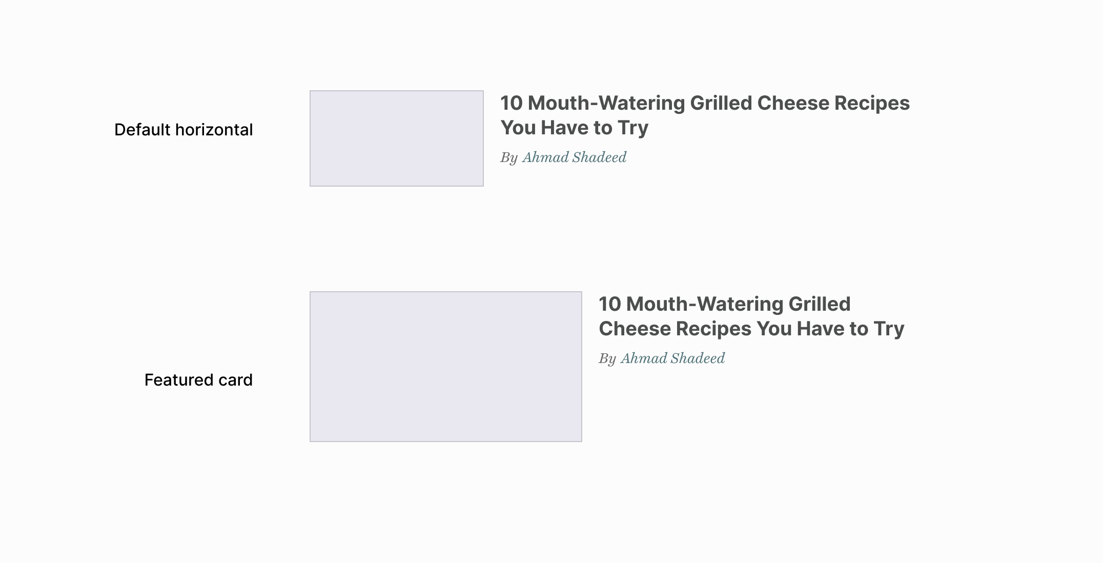
The featured card is displayed horizontally when the container width is small and will change to the stacked styles on larger sizes. In this case, the thumbnail becomes larger and takes 50% of the width.
Here is a comparison between a default horizontal style and the featured one.
When the container width becomes larger, the card style will become stacked.
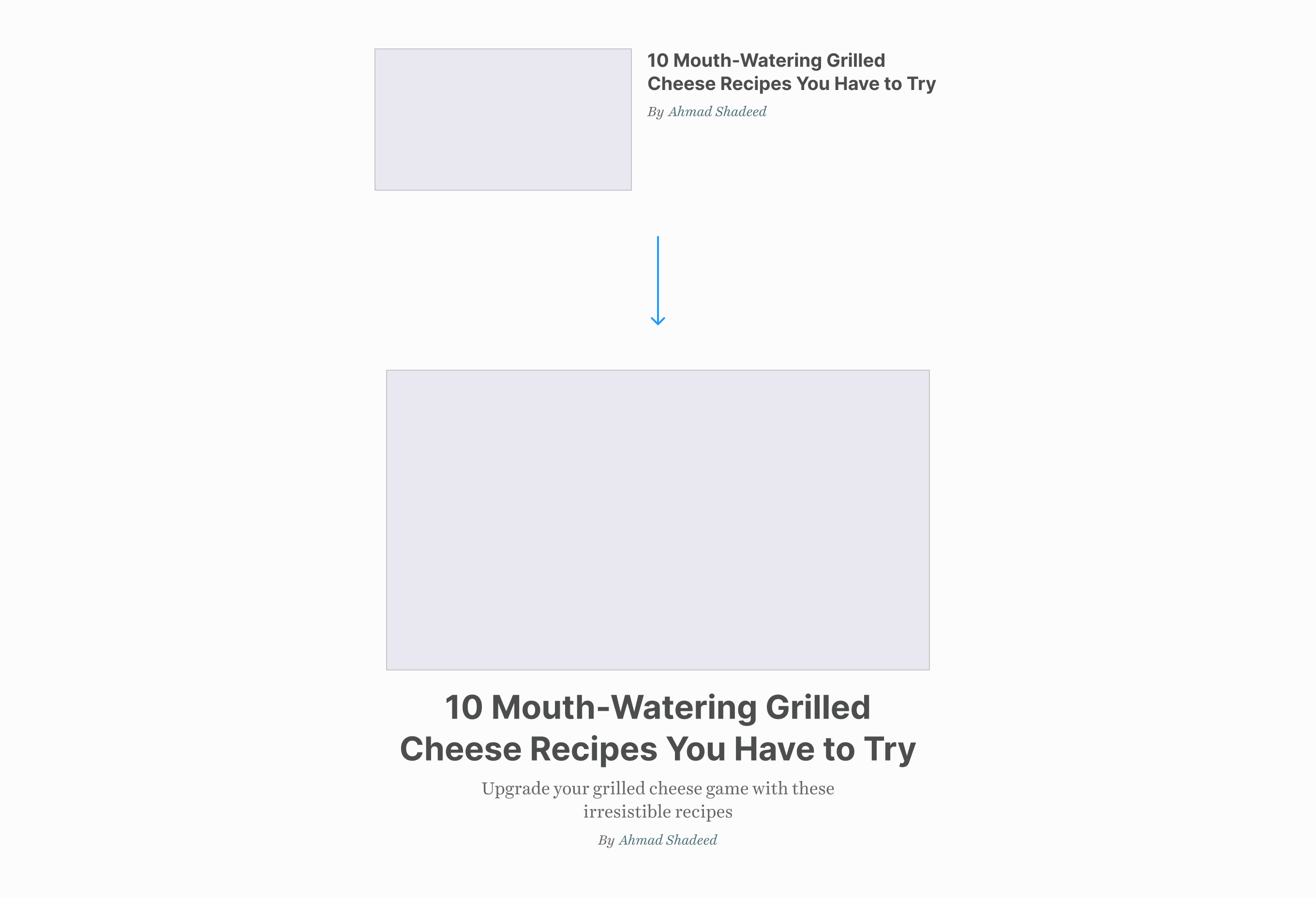
To implement that, I used the --featured variable on the card’s container.
<div class="c-newspaper__item" style="--featured: true;"></div>
Firstly, I added the horizontal style as default.
flex to turn on the horizontal design.50% of the available width.@container style(--featured: true) {
.c-card {
display: flex;
gap: 1rem;
}
.c-card__thumb {
flex: 0 0 50%;
}
.c-card__tease {
font-family: "Playfair Display", serif;
font-size: 19px;
}
}
When the container size gets larger, the browser will apply the stacked styling to the card.
@container main (min-width: 550px) {
  @container card style(--featured: true) {
    .c-card {
      flex-direction: column;
      gap: 0;
    }

    .c-card__title {
      font-size: calc(1rem + 2.5cqw);
    }

    .c-card__content {
      text-align: center;
    }

    .c-card__thumb {
      flex: initial;
    }
  }
}
In this variation, the font size gets smaller. That happens when the image is hidden. At first, I thought about using CSS :has to check if the card thumb is displayed or not.
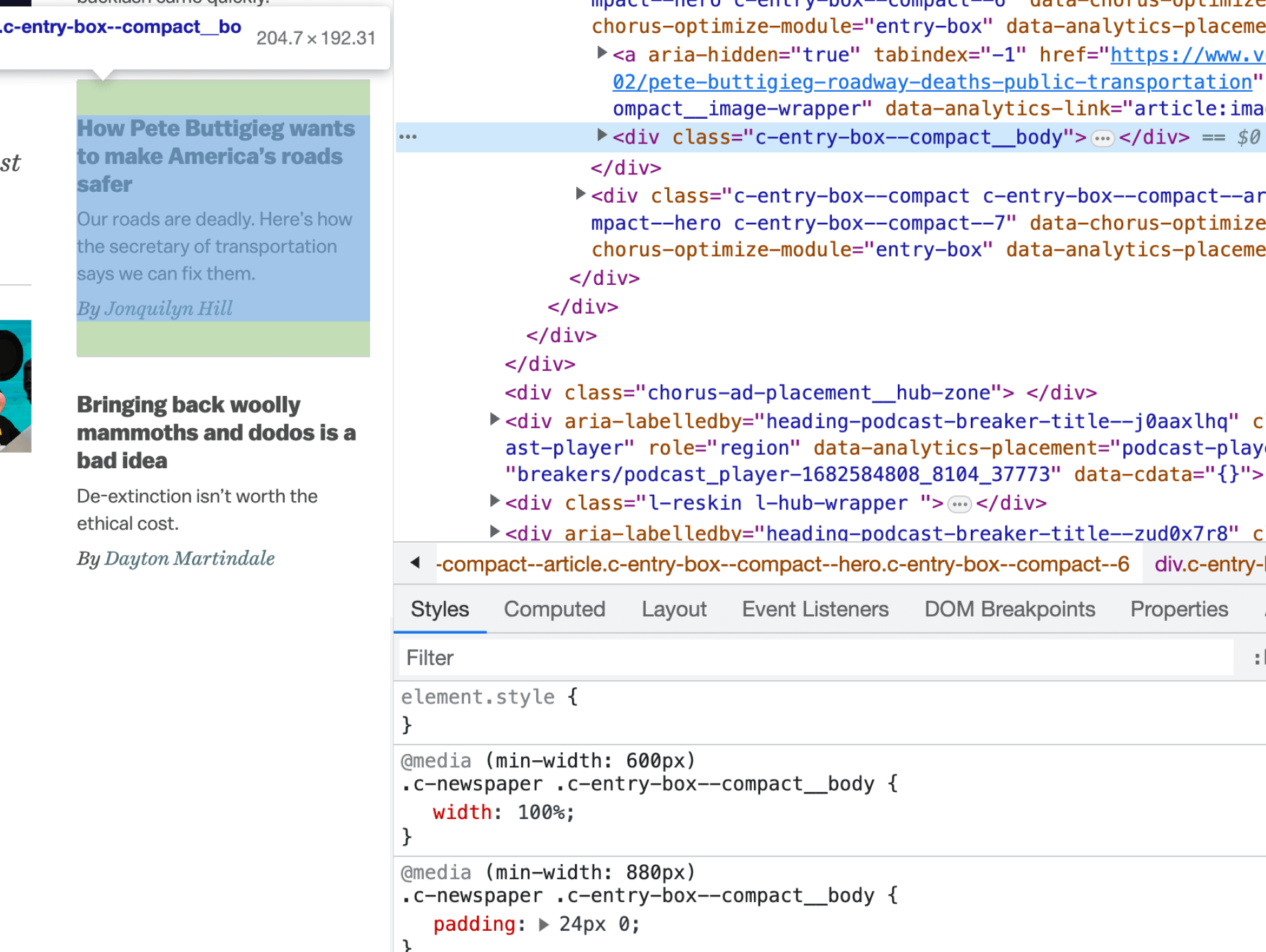
In vox.com, the card thumb is hidden via CSS, so it’s not possible to use :has as it will be valid even if the thumb is hidden.
<article class="c-card">
  <div class="c-card__thumb"></div>
  <div class="c-card__content"></div>
</article>
.c-card__thumb {
  display: none;
}

/* This will always work. */
.c-card:has(.c-card__thumb) .c-card__title {
  font-size: 19px;
}
If the image can be conditionally added via Javascript, then we can use :has. Otherwise, I will default to a style query.
@container main (min-width: 550px) {
  @container card style(--compact: 2) {
    .c-card__title {
      font-size: 19px;
    }
  }
}
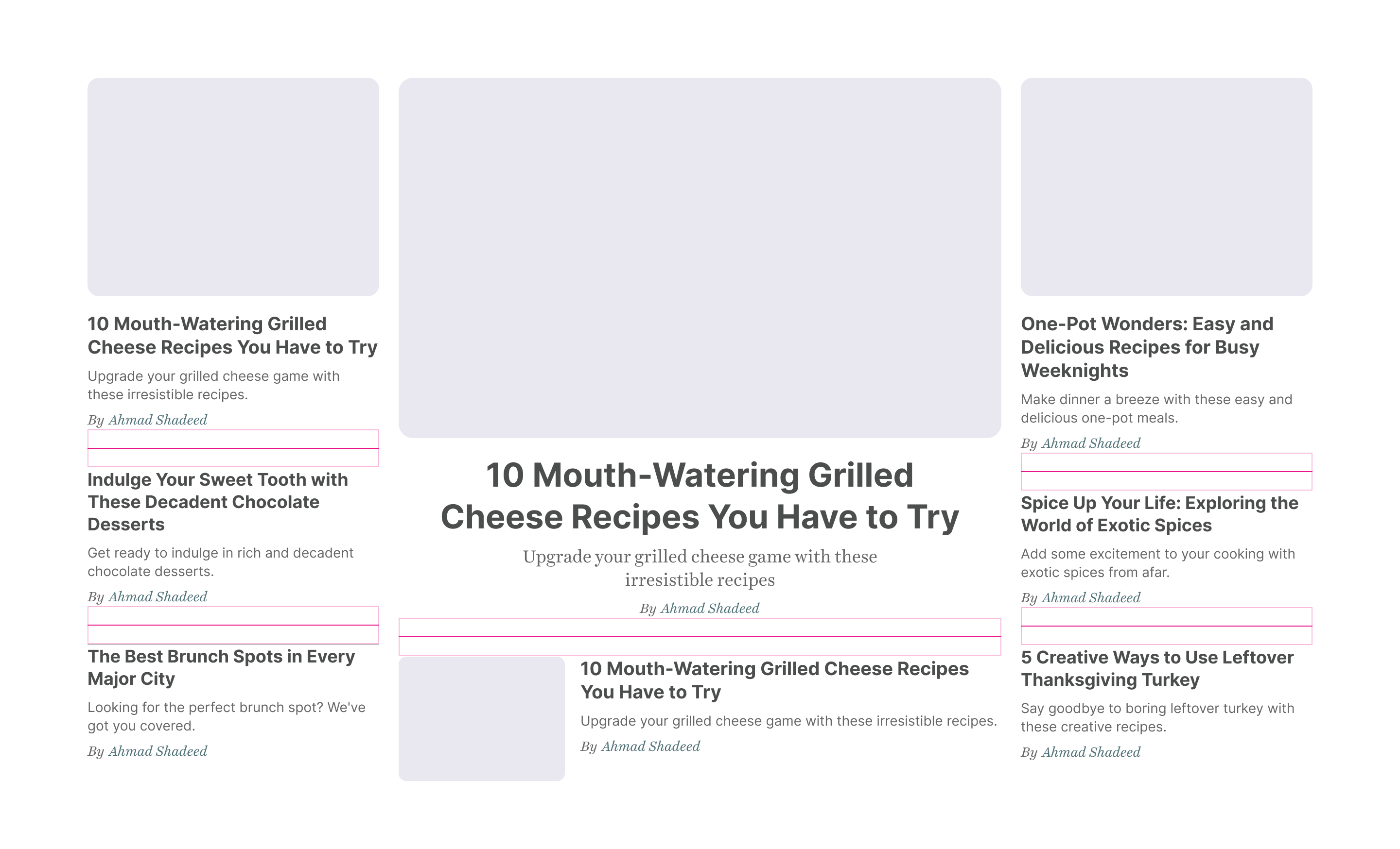
The current way in vox.com to handle the spacing is by adding padding directly to the card. I don’t prefer that. The card styles shouldn’t depend on where it lives. The spacing should be added to the card’s wrapper instead.
To make things easier, I added a CSS variable --gap to each column.
.c-newspaper__col {
  --gap: 20px;
  display: flex;
  flex-direction: column;
}
I added a margin-block to each card wrapper.
The CSS property margin-block is a logical property that means both margin-top and margin-bottom.
@media (min-width: 550px) {
  .c-newspaper__item:not(:last-child):after {
    content: "";
    display: block;
    height: 1px;
    background-color: lightgrey;
    margin-block: var(--gap);
  }

  .c-newspaper__col:last-child {
    border-top: 1px solid lightgrey;
    padding-top: var(--gap);
  }
}

@media (min-width: 880px) {
  .c-newspaper__col:last-child {
    padding-top: 0;
    border-top: 0;
  }

  /* Add separators to the last column */
  .c-newspaper__col:last-child
    .c-newspaper__item:not(:last-child):after {
    content: "";
    display: block;
    height: 1px;
    background-color: lightgrey;
    margin-block: var(--gap);
  }
}
You might be thinking, why not use gap? The reason is that I won’t use modern CSS for the sake of using it. It’s not useful here because:
margin-top with it.column-rule in CSS columns.One thing that I like about container queries is the ability to use container units. They are like viewport units but for a specific container. Isn’t that powerful?
@container main (min-width: 550px) {
  @container card style(--featured: true) {
    .c-card__title {
      font-size: clamp(1rem, 6cqw, 2rem);
    }
  }
}

Learn more about container query units.
Recently, I wrote about the new CSS feature text-wrap: balance, which is still in Chrome Canary only at the time of writing this article.
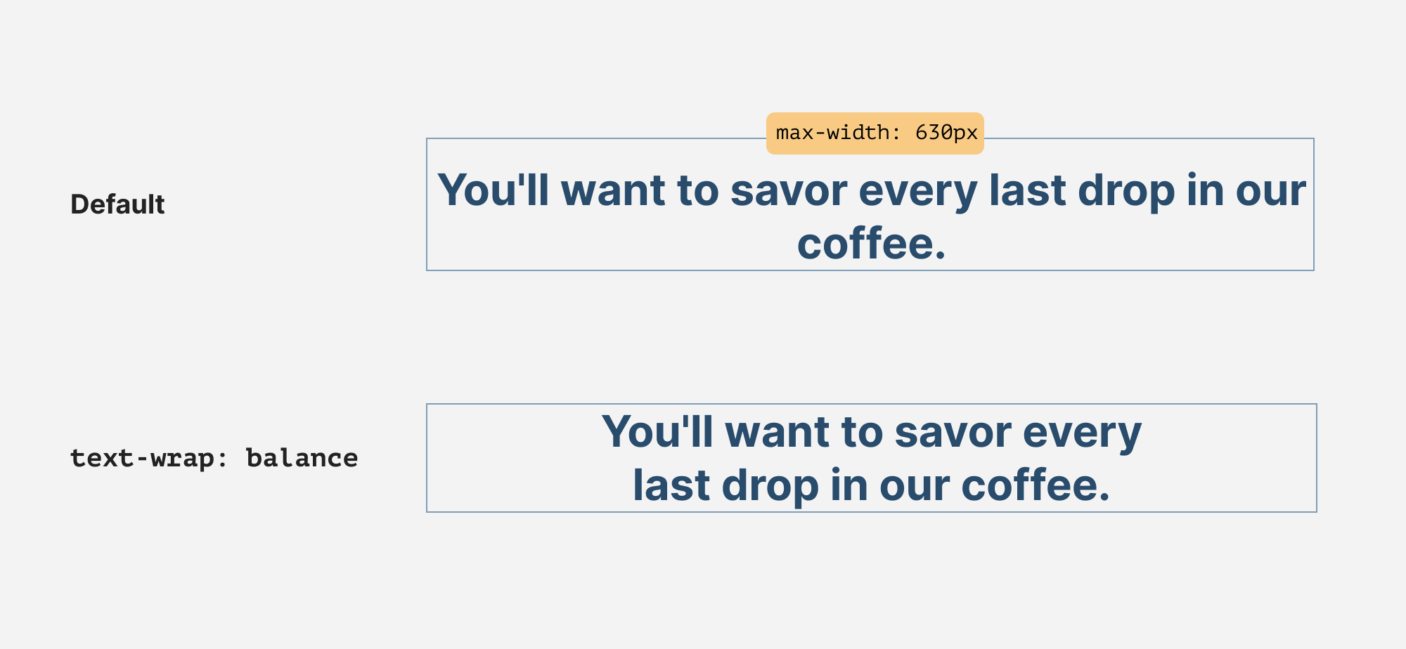
In the layout that I’m building, we can leverage that for all the text content. It can make the layout look more organized.
Learn more about text wrap balancing.
You can play here with the final demo. I recommend checking that on Chrome Canary.
Disclaimer: the design isn’t identical to Vox, this demo focuses more on the layout and components implementation.
One of the things that force me to learn and explore CSS is the curiosity to see how other folks build things. I enjoy that process and learn a lot while doing so. I hope you found the article helpful.
Do you have a question or feedback? Please feel free to ping me on Twitter @shadeed9.
此内容由惯性聚合(RSS阅读器)自动聚合整理,仅供阅读参考。 原文来自 — 版权归原作者所有。