


I spent years teaching CSS layout on this blog. I put everything I know into The Layout Maestro course: 70+ lessons and 150+ interactive examples that teach you how to think CSS layouts, not just memorize syntax.
{% include note.html content = “This is Part 2 of the article: The Process of Implementing A UI Design From Scratch. If you haven’t read it, it’s fine, but I recommend at least to skim it to get a general idea.” %}

The hero has been used in different pages and when building it, I need to be sure that it can work in different contexts.
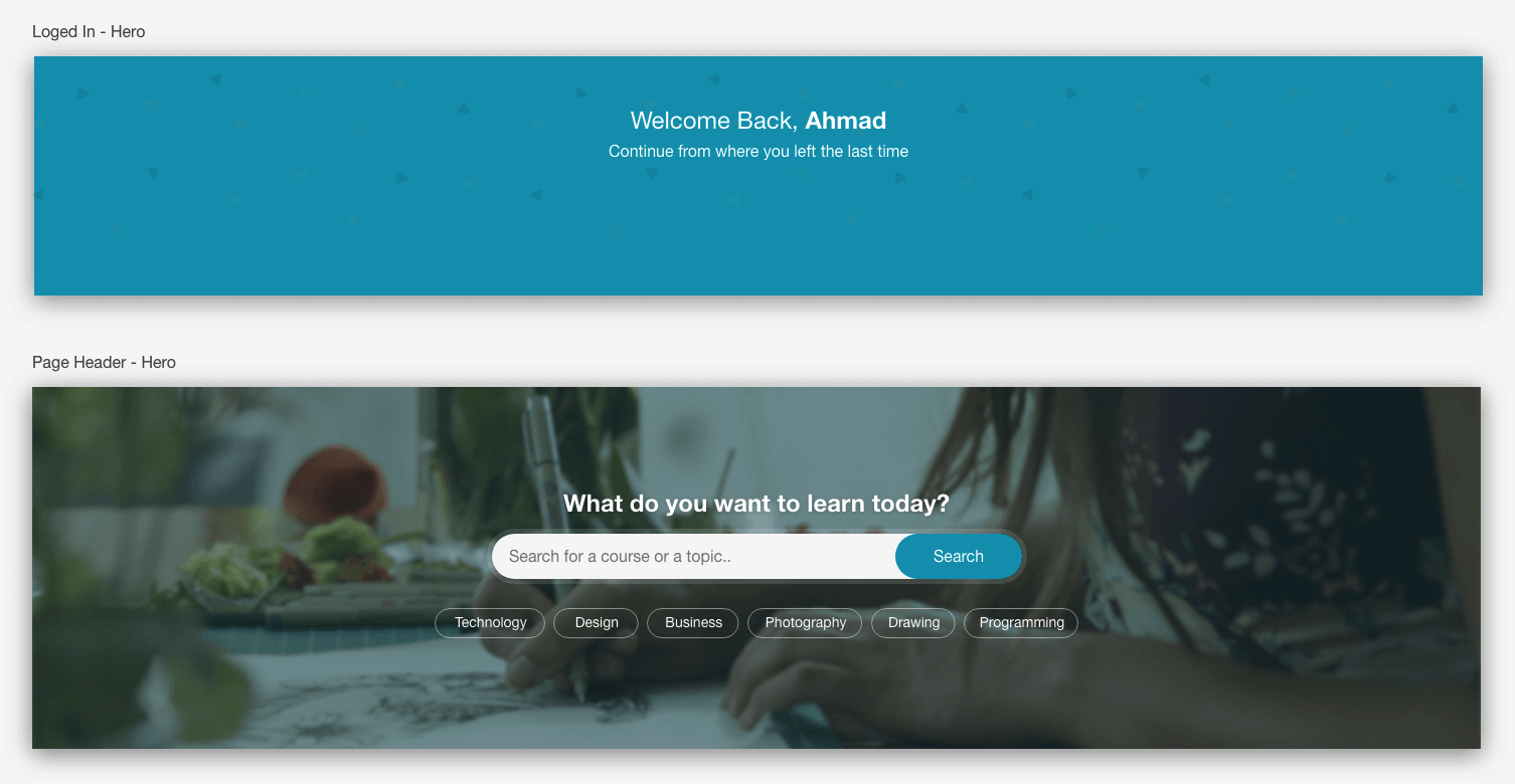
The common between all of them is that the content is centered, and there is an equal vertical space (Top and Bottom).
<section class="hero">
  <h2>What do you want to learn today?</h2>
  <form action="">
    <label for="search" class="visually-hidden"
      >Search for a course or a topic</label
    >
    <input type="text" placeholder="Search for a course or a topic" />
    <button>Search</button>
  </form>
  <ul class="pills-list">
    <li><a href="#" class="pill">Technology</a></li>
    <!-- Rest of tags -->
  </ul>
</section>

Here we go again :D
The first initial step is to add a class of hero and to center the content.
.hero {
  text-align: center;
}
That was quick and easy. After that, I need to display each tag item next to its siblings.
.pills-list li {
  display: inline-block;
  margin-left: 2px;
}
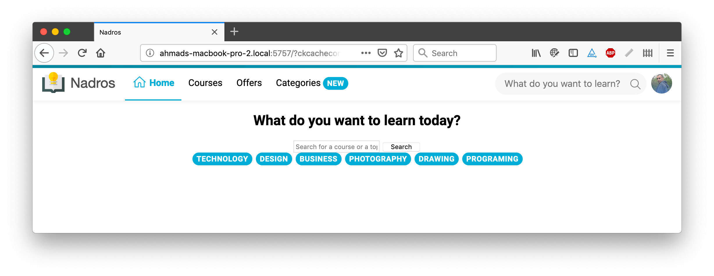
That was the initial CSS that gives us the general look. I’ll dig into more details now!
There are a couple of options for adding a height for the hero section:
heightmin-heightmin-height or height with CSS Viewport UnitsHeightI’m not a big fan of adding a fixed height to a hero section. This is not future-proof and could be easily broken if the content is more than expected.
In the below example, the hero is given height: 300px and the content is more than 300px in height. As a result, the content goes out of its wrapper (The red border).
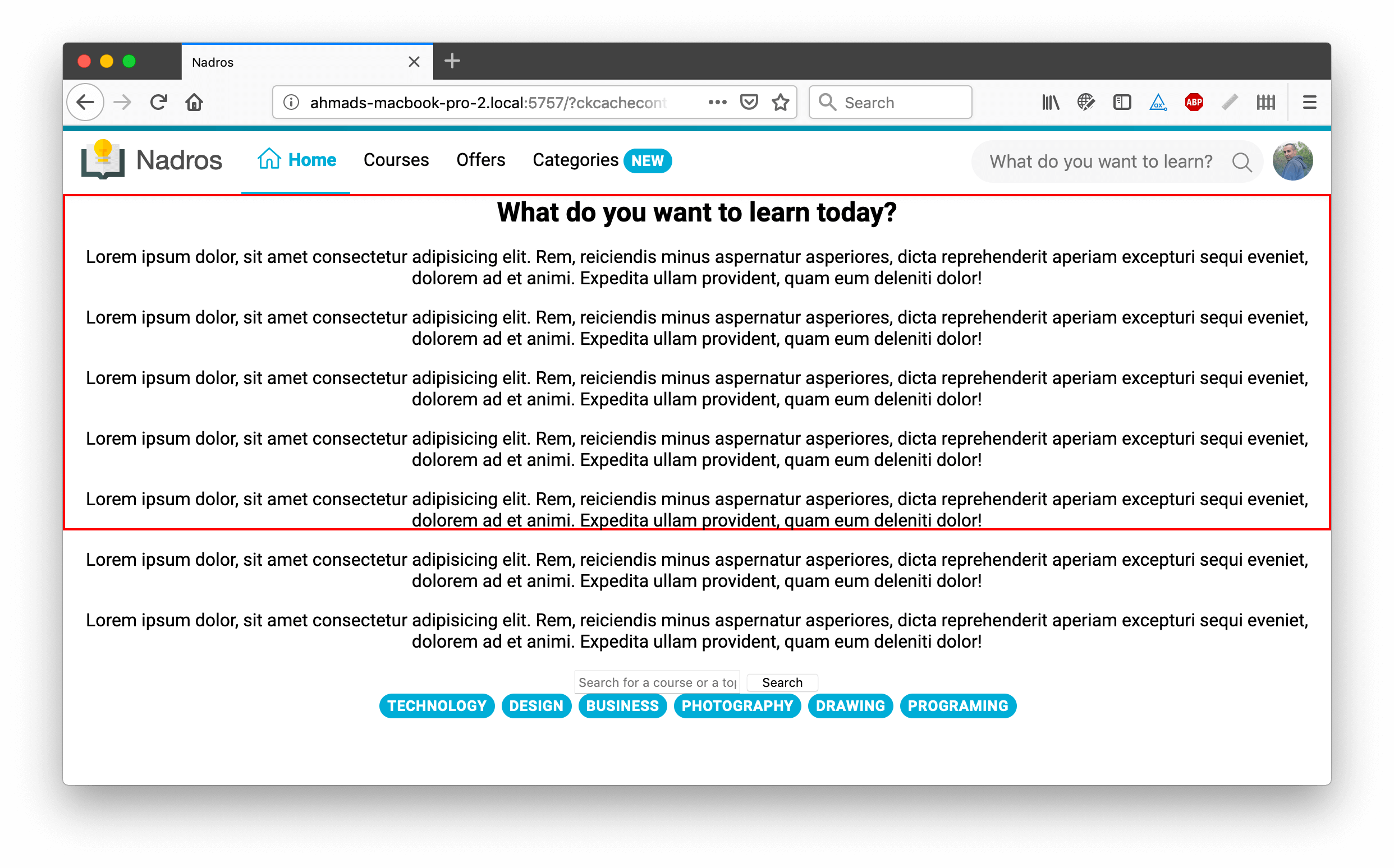
Length content might not be in our case, but we should always plan for the worst. Our designs should be fluid as much as possible. You can’t always guarantee the length of content.
I added padding to the top and bottom sides of the hero wrapper.
.hero {
  padding-top: 6rem;
  padding-bottom: 6rem;
}
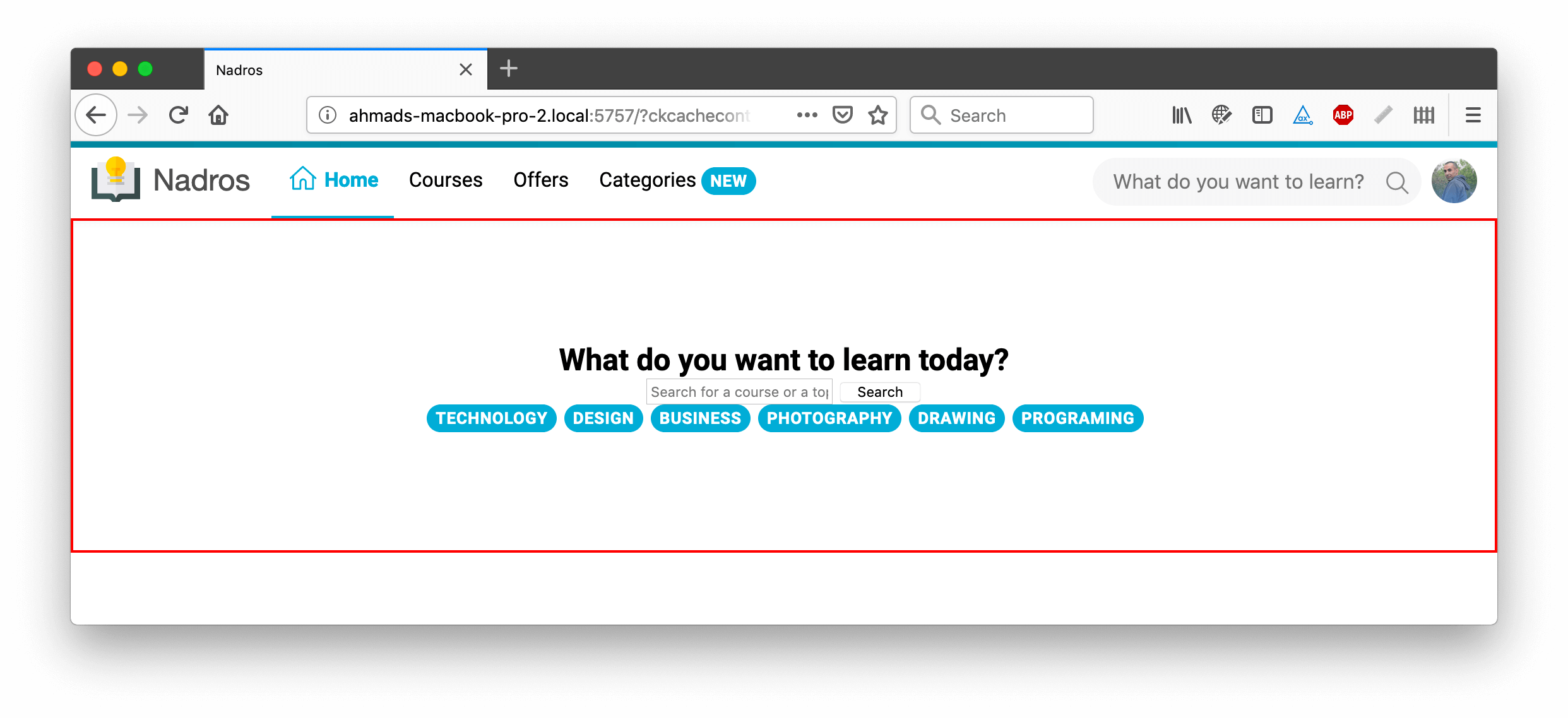
It could work without problems, but I won’t settle on this. Sometimes, I want the height to be the same even if I added another element to the hero. For example, I might add a description paragraph below the title. In that case, the height will increase by ~ 70px which is:
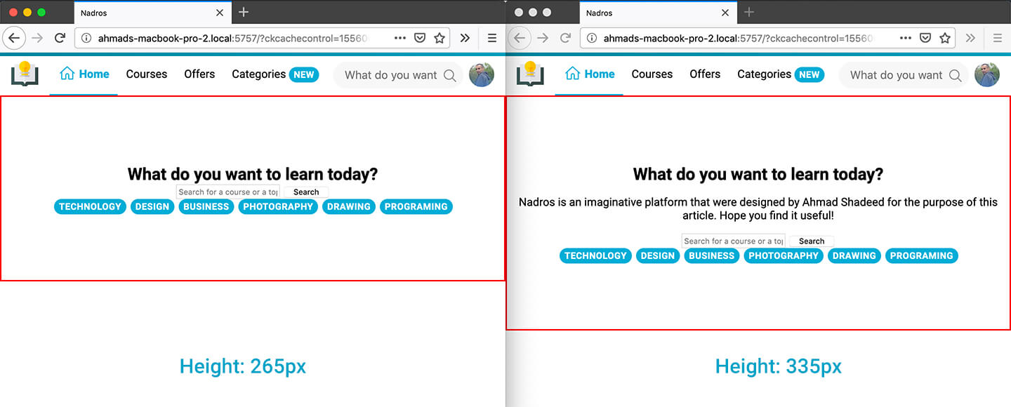
Left: Without the description paragraph. Right: With the description paragraph.
For me, this is a downside when using vertical padding. Here is how it will look in case the height was set with min-height.
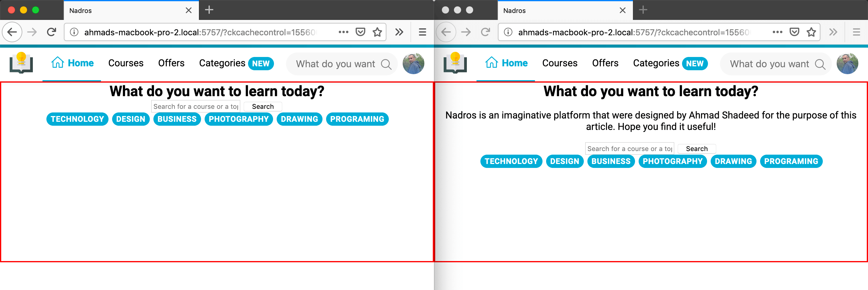
Oops! The content is still not centered. I’m aware of that and will come to this later. Be patient :D
<section class="hero">
  <div class="hero-wrapper">
    <!-- Hero elements -->
  </div>
</section>
.hero-wrapper {
  margin-top: 6rem;
  margin-bottom: 6rem;
}
This approach is very similar to the padding one, except I wrapped the hero elements (Headline, Form, Pills) in an wrapper. I won’t go with it for the exact same reasons as the padding solution.
min-heightWhen combining pixels with viewport units, the result will be a dynamic and fluid hero that acts to the width and height of its viewport.
.hero {
  min-height: calc(200px + 9vmax);
}
This is not just about adding the image, there is also a tint that is placed at the top of the image to ensure that the white text is easy to read and accessible.
I have those options for that:
<img> with a pseudo element for the tint<img> + SVGIt’s possible to add multiple backgrounds, one of them is for the tint, and the other is for the background image itself.
.hero {
  background: linear-gradient(
      rgba(7, 158, 186, 0.15),
      rgba(7, 158, 186, 0.15)
    ), url("../img/hero-cover.jpg");
}

The first background is a gradient for the tint, and the second one is the actual image. This can work great if the image won’t be changed every time in a while. It’s possible to inline the CSS and assign a new background with JavaScript, but this is not straightforward.
I would go with that solution only in case the background is static and won’t be changed.
<img> With A Pseudo ElementThe image will be absolutely positioned to the hero, along with a pseudo element added to the hero wrapper.
.hero {
  position: relative;
}

.hero img {
  position: absolute;
  left: 0;
  top: 0;
  z-index: -1;
  width: 100%;
  height: 100%;
}

.hero:after {
  content: "";
  position: absolute;
  left: 0;
  top: 0;
  z-index: -1;
  width: 100%;
  height: 100%;
  background: rgba(7, 158, 186, 0.15);
}
It’s easier and more future-proof to use than the multiple backgrounds solution.
<img> With SVG FiltersSVG filters are powerful. It’s possible to use filter: url() in CSS to assign the filter to the image, and it will work easily.
However, the only downside here is that changing the color tint is not easy to be done manually. If the tint color should be changed, the author will need to modify the feColorMatrix, which is a bit hard to do without a tool.
.hero img {
  position: absolute;
  left: 0;
  top: 0;
  z-index: -1;
  width: 100%;
  height: 100%;
  filter: url("data:image/svg+xml;utf8,<svg xmlns='http://www.w3.org/2000/svg'><filter id='tint'><feColorMatrix type='matrix' values='0.03 0 0 0 0 0 0.62 0 0 0 0 0 0.73 0 0 0 0 0 .8 0 '/></filter></svg>#tint");
}
I’ve used this tool in the process, which converts a color from rgba to an SVG matrix.
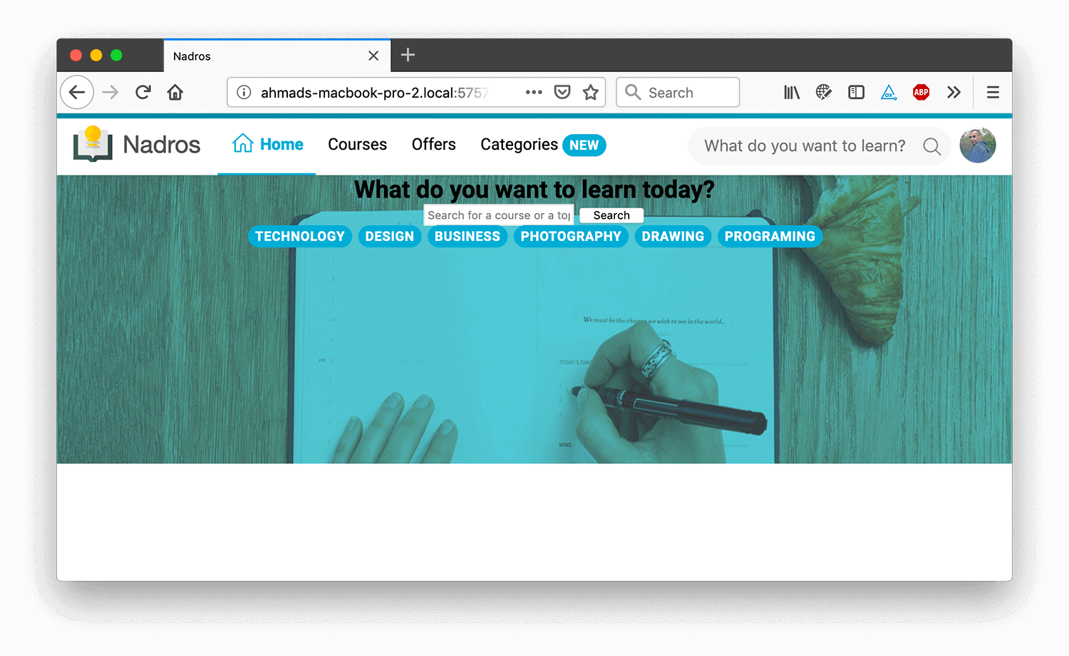
I think that the SVG solution is the best, as I don’t have an additional pseudo element and it’s more straightforward. The only downside is that the color can’t be changed quickly, I tweaked it manually to be similar to the design.
If I used the padding or margin for the height of the hero, I don’t need to center anything since this comes by default. The first thing that I thought about is Flexbox. I added the following:
.hero {
  display: flex;
  flex-direction: column;
  justify-content: center;
}

Since the items in there are not static, and there is a possibility to add or remove items, the best way to add a space between them is to use CSS Adjacent selector.
.hero > * + * {
  margin-top: 16px;
}
I already built the component in part 1, and for the hero, I need to create a variation of it like so.
.pill--outline {
  text-transform: initial;
  background: transparent;
  color: #fff;
  border: 1px solid rgba(#fff, 0.5);
  font-weight: 400;
  padding: 3px 10px;
}

Cool. Next step is the search form!
I added some general styles to the input and button, and centered the form and gave it a width. There is something weird, the space I added from .hero > * + * is no longer working on the form.

Notice that the form is very close to the title. I inspected the code and laughed at myself. This is a mistake that I did. I centered the form using margin: 0 auto and that canceled the spacing from the hero element.
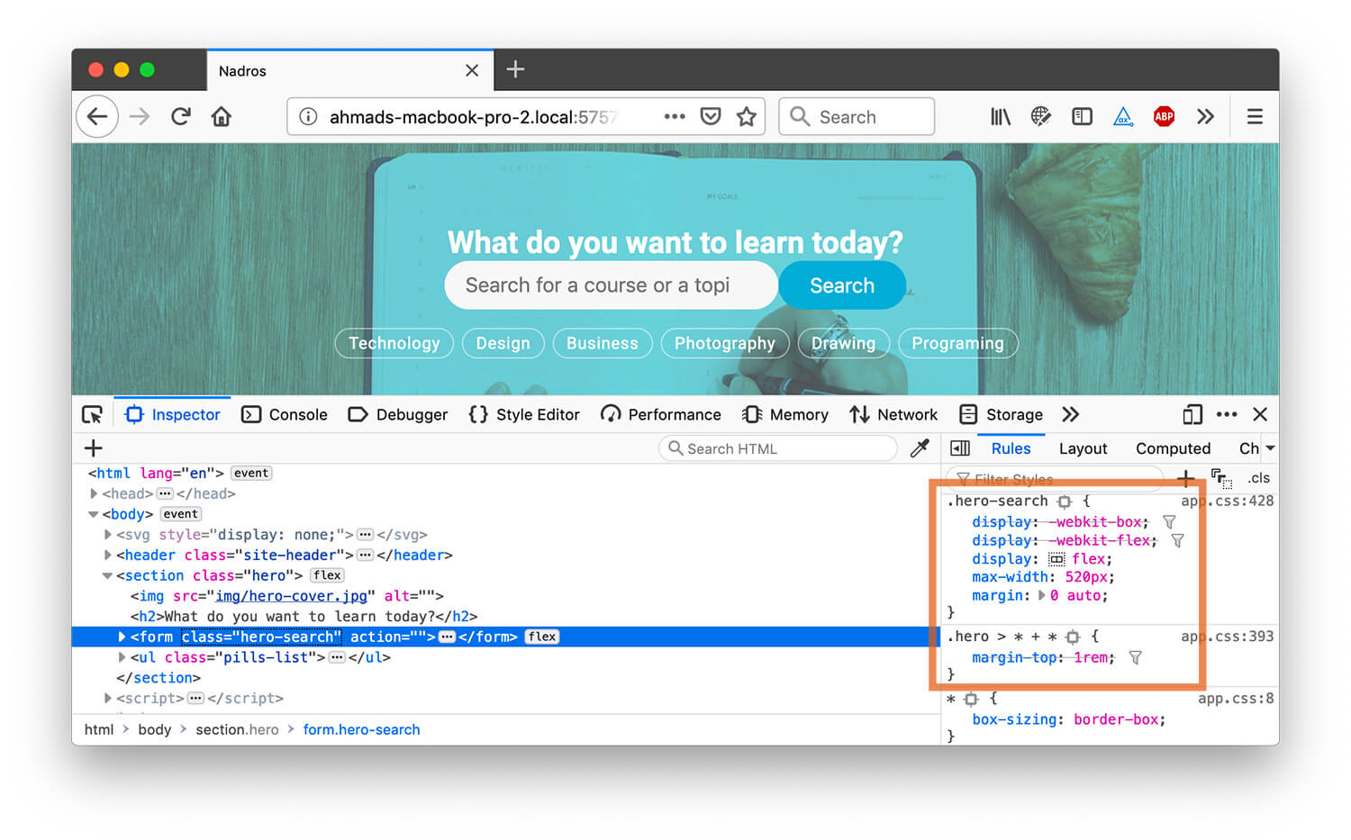
Lesson learned. Don’t use margin: 0 auto and instead add both of margin-left and margin-right in those cases.
Alright, back to the form element. If you notice in the original design, there is a border around the whole form. I will try to add it now.
I added a background for the whole form, and then a border of 5px.
.hero {
  background: #fff;
  border: 5px solid #fff;
}
I got this:

The border is there, but I need it to be:
The border should use rgba() in order for it to be transparent, but this won’t change the result. I need the border to be outside its wrapper.
Since I added a white background, and there is a 5px border. I thought about using CSS background-clip to only apply the background to the content, and to ignore the border area.
.hero {
  background: #fff;
  background-clip: content-box;
  border: 5px solid rgba(255, 255, 255 0.5);
}

What if the image didn’t load? Let’s see how the hero will look without a cover image.
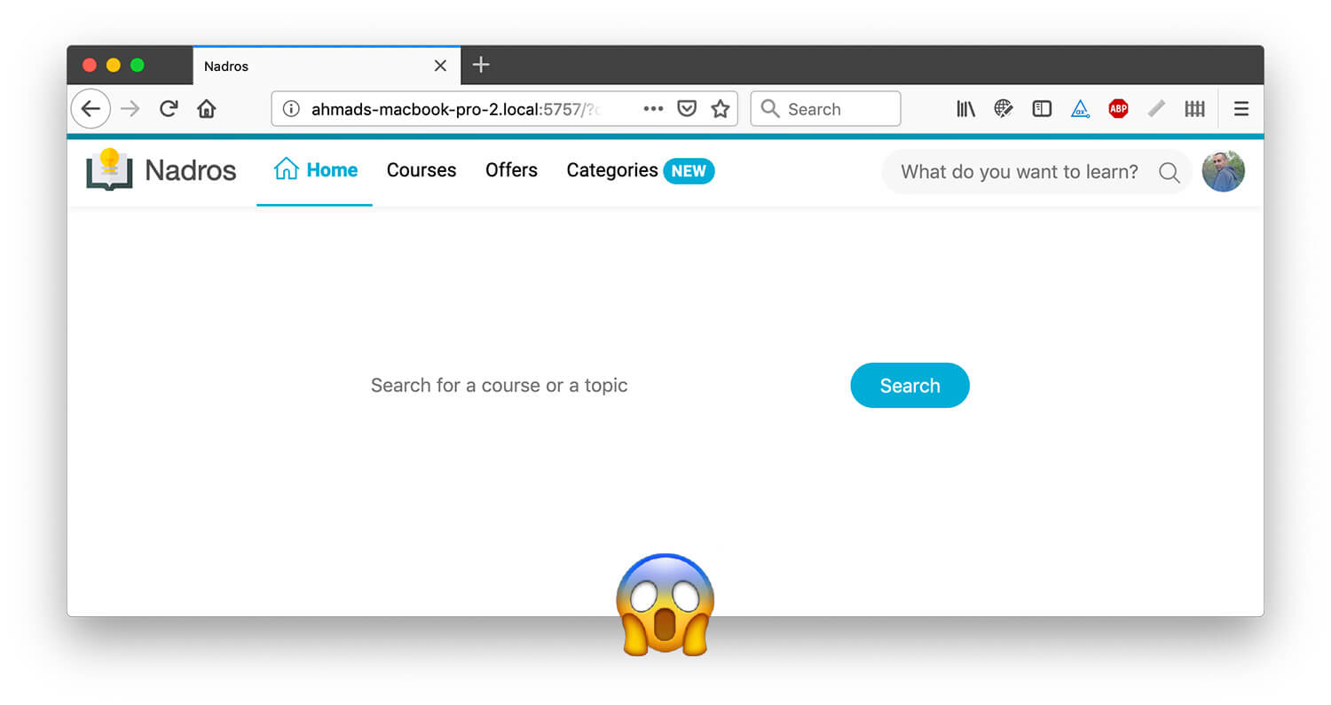
This is unacceptable and will create a bad experience for the user. At first, I thought about adding a pseudo-element for the <img>, yes, this is possible. I learned about it from bitsofcode.
A pseudo-element for an <img> works only if the src attribute failed to load.
.hero img {
  content: "";
  position: absolute;
  left: 0;
  top: 0;
  width: 100%;
  height: 100%;
  background: #000;
  opacity: 0.5;
}
Here is how it looks in Chrome.

Unfortunately, it doesn’t work in Firefox after testing, so I won’t go with that solution.
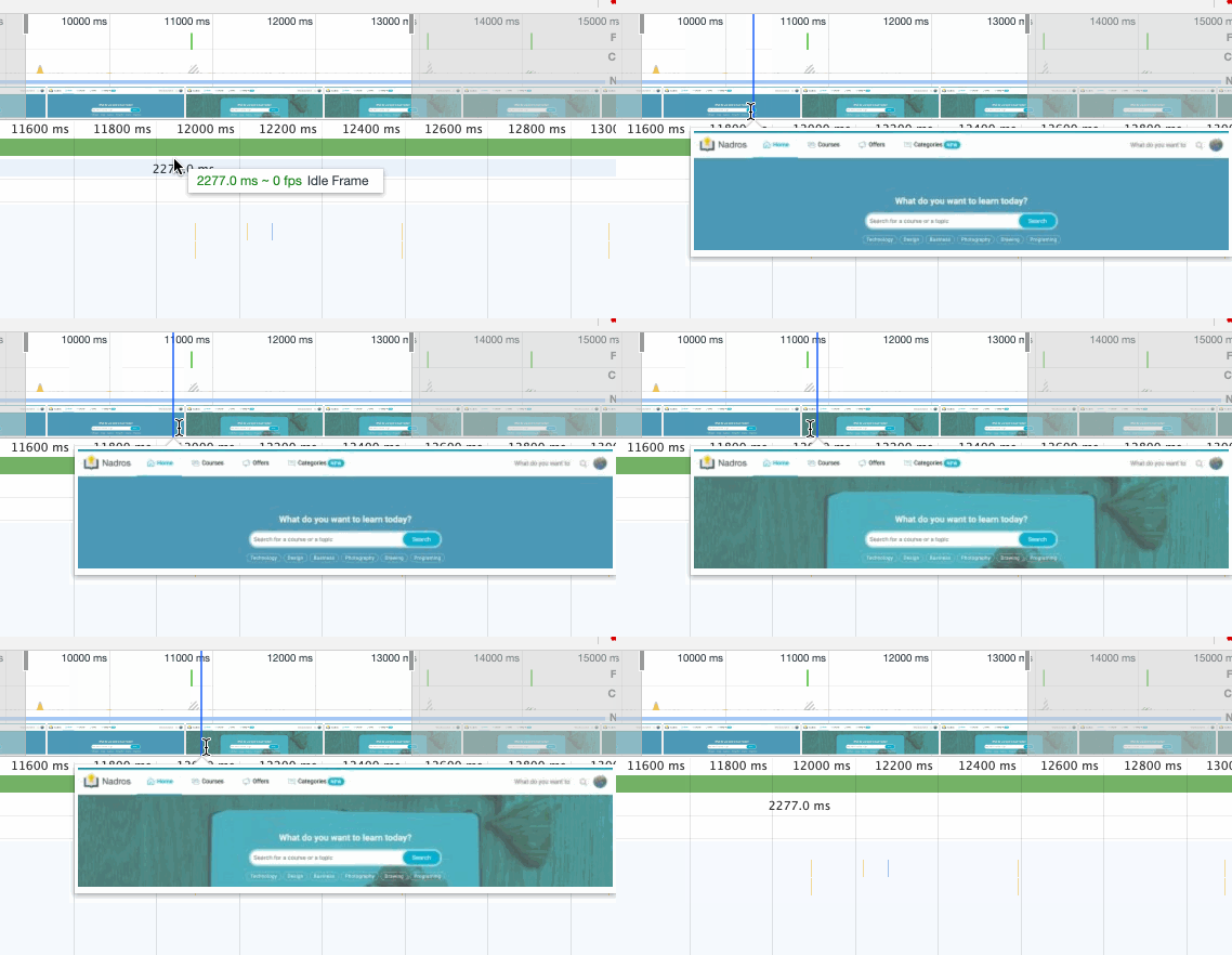
The other solution is to add a background to the <img>, it will only work if the image is not loaded. I added a subtle text shadow to the headline and pill items to make it more readable.
.hero img {
  /*Other styles*/
  background: #06aed5;
}

In addition, to act as a fallback in case the image didn’t load, adding a background to it could act as a loading status. Check below for a screenshot from Chrome performance profile:
For now, I will focus a bit on how to make the hero look better on mobile. Here is how it looks:

There are a couple of issues:
The first thing I did is that I added padding to the left and right sides. Then, I need to fix the form overflow issue.
There is another weird issue in there which is the overflow on the form. Here are the solutions that came to my mind:
.hero-search {
  position: relative;
}

.hero-search button {
  position: absolute;
  right: 0;
  top: 0;
  bottom: 0;
}

.hero-search input {
  padding-right: 85px;
}

It works, but this more of a hack for me.
Since the form element is a flexbox wrapper, the input minimum size can’t be smaller than its content. This is the default behaviour. To override that, I need to set min-width: 0.
.hero-search input {
  /*Other styles*/
  min-width: 0;
}

I’m still not satisfied with how it looks on mobile. What about reducing the size of the headline and form element? Let’s try that.
I did the below tweaks:
object-fit: cover to the <img> to make it look better.

Since the pills list is now scrollable on mobile, it’s better to add a hint to it. I thought about adding a transparent white gradient at the right side to indicate that. Let’s try that!
.pills-list {
  position: relative;
}

.pills-list::after {
  content: "";
  position: absolute;
  right: 0;
  top: 0;
  bottom: 0;
  width: 30px;
  background: linear-gradient(to left, #fff, transparent);
  opacity: 0.5;
}

Since the gradient added is positioned absolutely, it will scroll with the pills list. See below:
As a solution, I need to position the gradient fixed to its parent, in additional to change its color to teal or something similar to the tint so it can look more realistic.

With some testing, it turned out that this solution is not good. Since the transparent gradient is fixed, it appears to the far right of the viewport, and not on the last pill. This happens only on large screens.

I remembered the old days when I used the brush tool in Photoshop to fade a certain object with the hardness value set to zero.
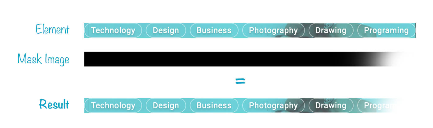
It’s possible to add a transparent gradient to the pills list, which will mimic the effect of brushing it from the right side. See below:
I will do exactly the same using CSS Masks. By adding the below CSS, the pills list will fade at the end to indicate that it’s scrollable.
.pills-list {
  mask-image: linear-gradient(to right, #000 70%, transparent);
}
How does that work? The mask gradient is from black to transparent. Imagine that the pills list is inserted inside that mask.
Final Result
I’m going to build a variation of the hero section. This one is a bit different than the first one I made:
.hero--logged {
  min-height: 200px;
  background: var(--color-brand-primary) url("../img/hero-pattern.svg")
    center/contain;
}

.hero--logged h2,
.hero--logged p {
  color: #fff;
  text-shadow: none;
}

And that’s a wrap. It was a great journey to document every step of building the hero element. Next step is to build the grid element and course card, stay tuned for part 3 of the article.
Hope you enjoyed it and thanks for reading! Do you have any feedback? Please ping me on Twitter @shadeed9
See the Pen Nadros - Hero Component - Final by Ahmad Shadeed (@shadeed) on CodePen.
此内容由惯性聚合(RSS阅读器)自动聚合整理,仅供阅读参考。 原文来自 — 版权归原作者所有。