


I spent years teaching CSS layout on this blog. I put everything I know into The Layout Maestro course: 70+ lessons and 150+ interactive examples that teach you how to think CSS layouts, not just memorize syntax.
Colors play a vital role in making a web page usable or not. In CSS, we can control the foreground and background color of an element with the color and background properties. When I learned CSS back in the years, there wasn’t a straightforward guide or way to learn how to use colors in CSS.
I decided to write about colors and how to use them in CSS. In this article, I will explain color types, specific keywords, and when to use which along with use-cases and examples. Disclaimer: this is not an article about color theory.
According to MDN:
The color CSS property sets the foreground color value of an element’s text and text decorations and sets the
currentcolorvalue.
The property sets the foreground color value of an element. The allowed values for it are: named-color, hex-color, rgb(), hsl, inherit, initial, unset, and currentColor. I will go through each value type in detail.
By default, CSS has named colors that can be used by typing the name of the color. Here are some examples:
.heading {
  color: brown;
  color: green;
  color: black;
}
Check the full list of the colors if you are interested. It’s worth mentioning that some color names are not supported in all browsers.
In general, I’m not a fan of using named colors, as it’s not easy for me to remember what each color means. For example, I sometimes see folks using white or black as a color value. This is not a bad thing, for sure, and I can’t judge it. But generally speaking, I don’t recommend using named colors. The only case I would use a named color is the following:
*,
*:before,
*:after {
  outline: solid 1px red;
}
I used the red color to quickly show an outline for all elements on the page. The red color is popular for such use and I even saw memes and funny things about it.
A hex color consists of six characters, #ffffff represents the white color, for example. There is a tip that I want to make sure that you know, which is the shorthand notation for hex values.
It works in a way that if the pair of color values are identical, then the second one can be removed. Each pair represent a color modal and they are Red, Green, and Blue, respectively. Consider the following:
body { color: #222222; /* Will become #222 */
body { color: #000000; /* Will become #000 */
The #222222 is equal to #222, the hex value can be represented as 22, 22, 22, we took the first value from each one so that resulted in #222.
Let’s see a visual that explains how that works.
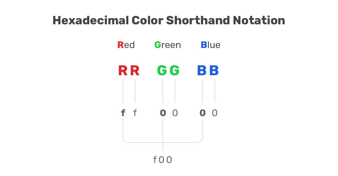
Red Green Blue (RGB) is a color model that represents the three color channels (red, green, blue). Each value of the three can be a number between 0 and 255 or a percentage from 0 to 100%.
If the three values are 0, then the resulting color will be black. However, if all the values are 255, then the color will be white. The same can apply for the percentage values as well.
.element {
  /* White */
  color: rgb(255, 255, 255);
  color: rgb(100%, 100%, 100%);

  /* Black */
  background-color: rgb(0, 0, 0);
  background-color: rgb(0%, 0%, 0%);
}
The good thing about rgb is that there is an alpha channel that controls the transparency of the color. This can be very useful to have a tint of color. There are more useful use-cases that I will go into in this article.
.element {
  /* A black background color with 50% transparency */
  background-color: rgba(0, 0, 0, 0.5);
}
If the value of alpha is zero, then the color or background will be transparent and not visible.
I rarely notice the usage of this color model, but recently it started to gain more attention from designers and developers. HSL stands for: hue, saturation, lightness.
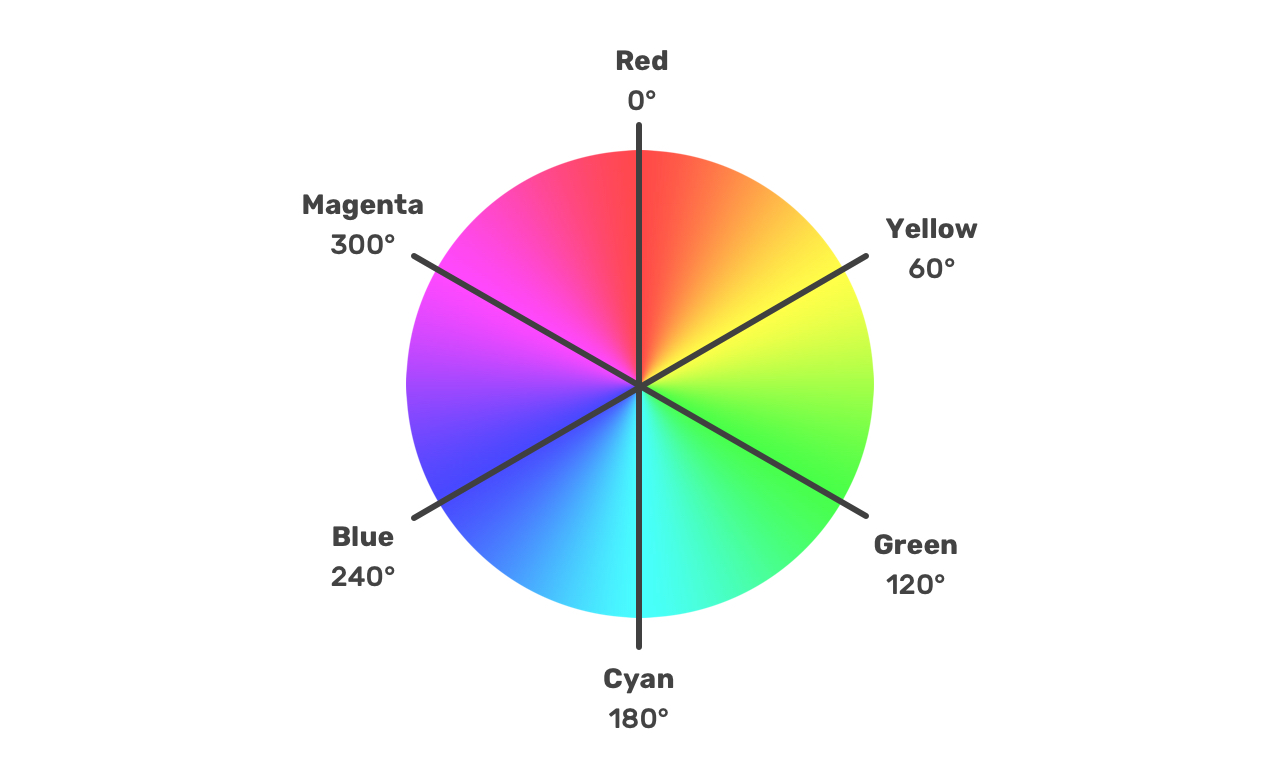
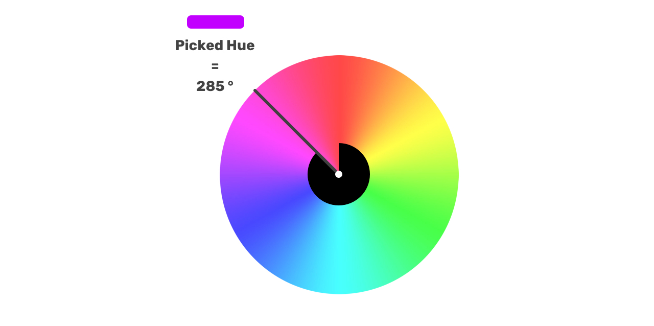
In the color wheel, each color has a certain degree, which is the hue. Then, we still need to set the saturation and lightness.
Let me walk you through the process of computing an HSL color value. Let’s suppose that we picked the below color.
For the saturation and lightness, here is a nice visual way of imagining them that I learned from this article. Once the hue degree is picked, we can imagine the saturation and lightness as the below visual.
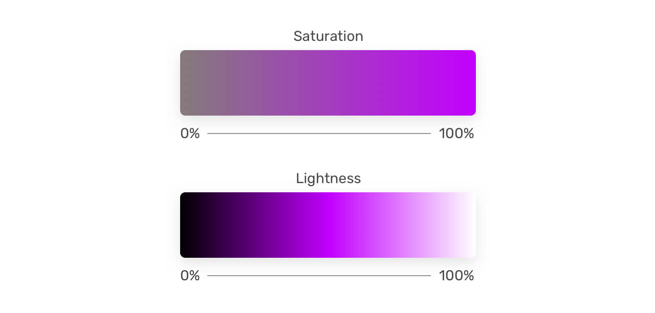
The saturation starts from gray and ends with the hue color. While the lightness starts from black to the hue color, and finally to the white color.
That flexibility is really useful, you can pick a hue color, then tweak the saturation and lightness as per your needs. This can help you in creating a color palette that is dynamic and easy to use.
currentColor KeywordThe currentColor holds the value of an element’s color property. It can be used on elements that don’t inherit color by default. Here are some properties that default to currentColor:
It feels like currentColor is similar to using a CSS variable, but it was there before the CSS variables are supported. Consider the following:
.element {
  color: #222;
  border: 2px solid;
}
Can you guess the border color? It’s the same as the color property. That’s because the border-color has currentColor as the default variable. You can imagine it like this:
.element {
  color: #222;
  border: 2px solid currentColor;
}
An interesting thing to know about the currentColor is that it can be used on the parent element level, or for the child elements.
<h1>
  This is a title
  <span>I'm a child element</span>
</h1>
In the example above, we can use currentColor for the either the <h1> or the <span> element. See below:
h1 {
  color: #222;
  background-color: currentColor;
}
A little trick that is useful when experimenting with colors in CSS, is using the switcher in Chrome DevTools. Choose any element with a hex color value, and inspect it. Then, click on the little square that shows the currently used color.
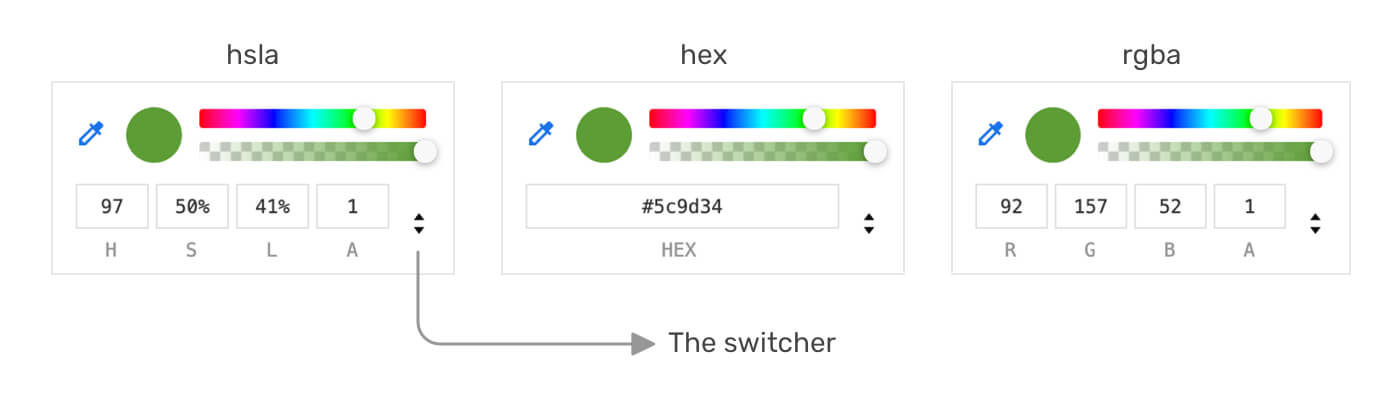
The above works only with hex color, and properties that directly use a CSS variable like below.
.btn {
  background-color: var(--brand-primary);
}
However, the drawback of using HSL colors combined with CSS variables is that the behavior between browsers is still not consistent. For example, the example above won’t show a colored square in Firefox. See the figure below for a comparison:
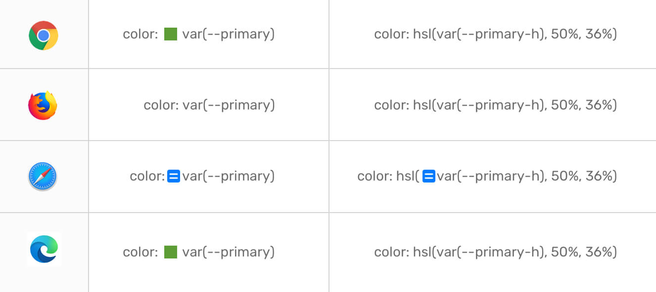
The little blue square in Safari shows the computed value of the used CSS property. Better than nothing.
You might wonder about why it’s necessary to have a square representing the computed color next to the property? Without the square, we can’t open the DevTools color palette, which helps us in checking if color is accessible.
This is not always the case. For instance, a button element has a color: #fff and a background color set with hsl. We can still open the DevTools color palette from the color property and see the contrast ratio. However, for elements that use an hsla value with CSS variables, this is not possible.
The common way of using rgb and hsl is by separating their values with commas. A new way is already has great support in browsers that don’t use commas.
/* Before */
.element {
  background-color: rgb(0, 0, 0);
  background-color: rgba(0, 0, 0, 1);
}

/* After */
div {
  background-color: rgb(0 0 0);
  background-color: rgb(0 0 0 / 0.5);
  background-color: rgb(0 0 0 / 50%);
}
Keep in mind that the slash-separated opacity is optional, and you should only use it if you want to tweak the alpha or color transparency.
The new way is better and recommended as new CSS color functions like lab(), lch(), and color() will only work with the space-separated technique. It’s good to get used to them and you can easily do a fallback for non-supporting browsers.
Disclaimer: although I’ve recommended using the space-separated syntax, but I didn’t use them in the article since they are new, and I don’t want to introduce any unwanted confusion or misunderstanding.
We can use the global values for letting an element inherits the color from its parent, or to reset an element’s color with initial or unset keywords. Let’s take the following example to understand those keywords.
We have a hero section with a title, description, and a link.
<section class="hero">
  <h2>Page title</h2>
  <p>Some description content</p>
  <a href="#">View all</a>
</section>
.hero {
  color: #222;
}
With color: #222 added to the parent element, what do you expect the color of the child elements? The <h2> and <p> will inherit the color, while the <a> won’t inherit by default. Interesting, no?
The default link color is:
:link {
  color: #0000ee;
}
If you need, you can enforce the link to inherit by adding color: inherit to it.
unset KeywordAccording to MDN:
The unset CSS keyword resets a property to its inherited value if the property naturally inherits from its parent, and to its initial value if not.
For the same example explained above, we can let the link inherit the color by using the following:
.hero a {
  color: unset;
}
It will reset the color to the defaulted inherited value from the .hero element, which is what we want.
I think that’s enough for theory and concepts. Let’s jump into some use-cases that we can use in our day to day work.
rgba() ColorA common use-case that I see fit for rgba() in CSS is the following design.

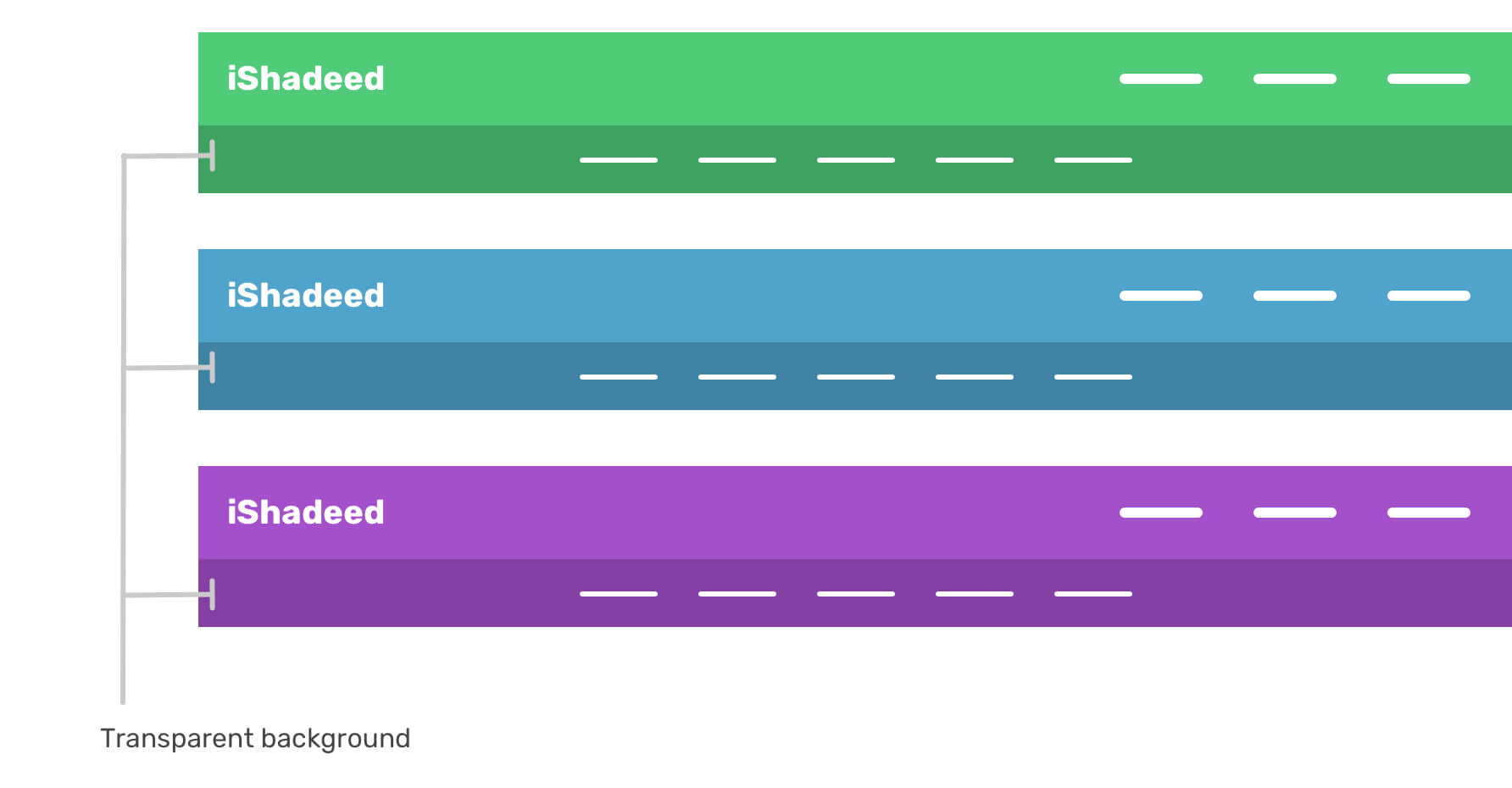
Notice how each circle has a border that is darker than the background of it. How we can do that dynamically? Well, by using a border with a color value of a transparent rgba(), this is possible.
.item {
  border: 10px solid rgba(0, 0, 0, 0.2);
  /* A black border with 20% alpha value */
}
The same concept can be used for an element that has a background, and a child of it has a darker variation of it. Consider the below figure:
hsl ColorsWhat I like about hsla colors is that what we need is to pick a color hue value (degree), and then we can play with the saturation and brightness to either lighten or darken the color.
This can be useful for a couple of use-cases, for example, a button’s hover effect can have lower brightness value to make it a bit darker.

.btn {
  /* Hue: 97, Saturation: 50%, Brightness: 41% */
  background: hsl(97, 50%, 41%);
}

.btn:hover {
  background: hsl(97, 50%, 36%);
}
We can take this further by combining hsl colors and CSS variables to create a color palette that can easily be changed.
:root {
  --primary-h: 97;

  --brand-primary: hsl(var(--primary-h), 50%, 41%);
  --brand-primary-darker: hsl(var(--primary-h), 50%, 36%);

  --brand-grey-1: hsl(0, 0%, 0%);
  --brand-grey-2: hsl(0, 0%, 10%);
  --brand-grey-3: hsl(0, 0%, 20%);
  --brand-grey-4: hsl(0, 0%, 30%);
  --brand-grey-5: hsl(0, 0%, 40%);
  --brand-grey-6: hsl(0, 0%, 50%);
}
By defining the primary hue color, we can now use this to override the lightness or saturation to make an element lighter or darker.
What I particularly like there is the use of gray colors. I always face difficulties in memorizing the correct hex values for gray colors. With hsl, this is much easier and straightforward.
Notice how I generated a pallet from one hue, and by only changing the lightness value.
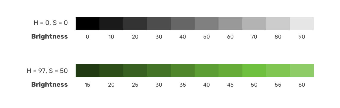
Isn’t it a million times easier to use gray colors now? I really loved it and will consider using it in upcoming client projects.
While working on a large project, I would use the following approach with CSS variables to change the lightness value. See the below:
:root {
  --primary-h: 97;
  --primary-l: 41%;

  --brand-primary: hsl(var(--primary-h), 50%, var(--primary-l));
  --brand-primary-darker: hsl(var(--primary-h), 50%, 36%);
}
I defined --primary-h to represent the hue value, and --primary-l for the base lightness value. The interesting thing now is that I can tweak the color by only changing the --primary-l variable.
.btn {
  --primary-l: 45%;
  background-color: hsl(var(--primary-h), 50%, var(--primary-l));
}

.footer {
  --primary-l: 55%;
  background-color: hsl(var(--primary-h), 50%, var(--primary-l));
}

.section {
  --primary-l: 50%;
  background-color: hsl(var(--primary-h), 50%, var(--primary-l));
}
A lovely use case for currentColor is for SVG icons. Let’s suppose that we have an icon with a text label next to it. The icon and the label should have the same color.

We can use currentColor for the SVG fill and then assign a color on the parent element. Consider the following:
<a href="#" class="link">
  <svg fill="currentColor"></svg>
  <span>Show more</span>
</a>
.link {
  color: #3766dc;
}
That way, the SVG will take the assigned color.
Adding on that, we can use the same technique to have an icon wrapped in a square, and that square has an opacity with a fill value of currentColor. This will make it possible to use the color to:
See the figure below.
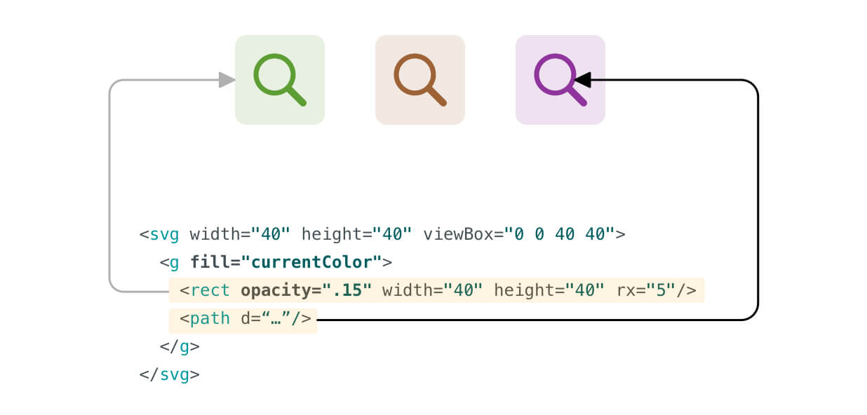
.icon {
  color: hsl(var(--primary-h), 50%, var(--primary-l));
}

.icon-2 {
  --primary-h: 26;
}

.icon-3 {
  --primary-h: 292;
}
Notice that the <rect> has an opacity. All I changed is the hue value for each icon variation. For a design system, this can be extremely useful to have the same color used for an icon and its background without redundancy.
That’s a wrap. Do you have a comment or a suggestion? Please feel free to ping me on @shadeed9.
此内容由惯性聚合(RSS阅读器)自动聚合整理,仅供阅读参考。 原文来自 — 版权归原作者所有。