


I spent years teaching CSS layout on this blog. I put everything I know into The Layout Maestro course: 70+ lessons and 150+ interactive examples that teach you how to think CSS layouts, not just memorize syntax.
Having a consistent ratio between the width and height of images and other responsive elements is important. In CSS, we used the padding hack for many years, but now we have native aspect ratio support in CSS.
In this article, I will discuss what is aspect ratio, how we used to do it, what’s the new way of doing it. Of course, there will be use cases with a proper fallback for them.
Let’s dive in!
According to Wikipedia:
In mathematics, a ratio indicates how many times one number contains another. For example, if there are eight oranges and six lemons in a bowl of fruit, then the ratio of oranges to lemons is eight to six (that is, 8∶6, which is equivalent to the ratio 4∶3).
In web design, the concept of aspect ratio is used to describe that an image’s width & height should be resized proportionally to each other.
Consider the following figure.
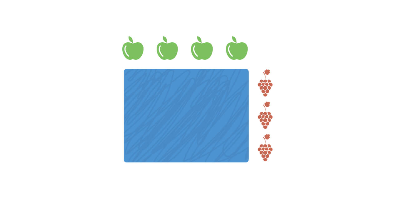
We have a ratio of 4:3. Which shows that the ratio of apple to grape is four to three.
In other words, the smallest box we can create for an aspect ratio of 4:3 is a 4px*3px box. When this box height is resized proportionally to its width, we will have a box that respects its aspect ratio.
Consider the following figure.
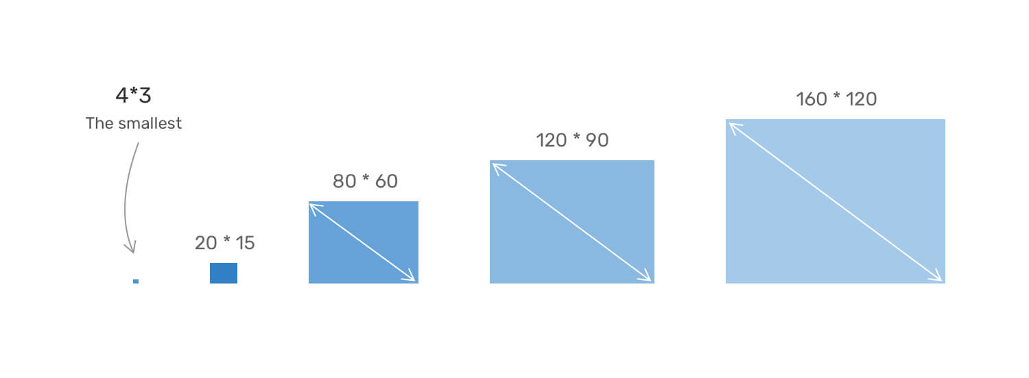
The box is being resized proportionally, and the ratio between its width and height is consistent. Now, let’s imagine that the box contains an important image that we care about all of its details.
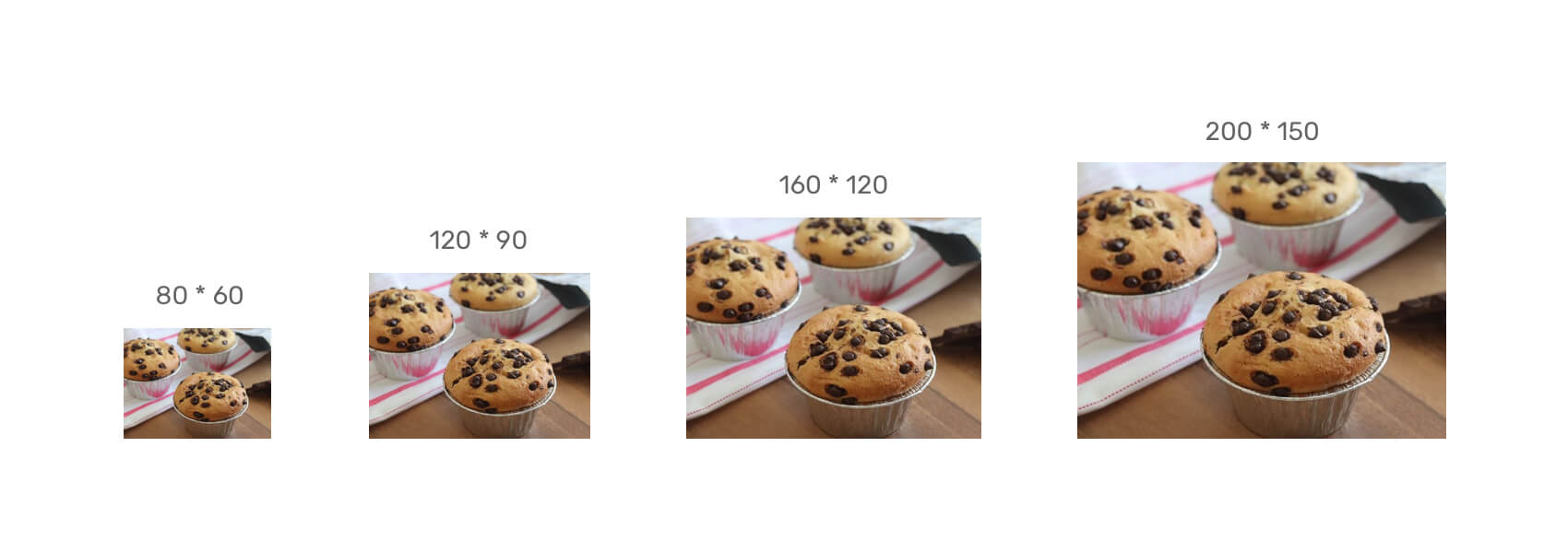
Notice that the image details are preserved, no matter what’s the size. By having a consistent aspect ratio, we can get the following benefits:
To measure the aspect ratio, we need to divide the width by the height as in the following figure.
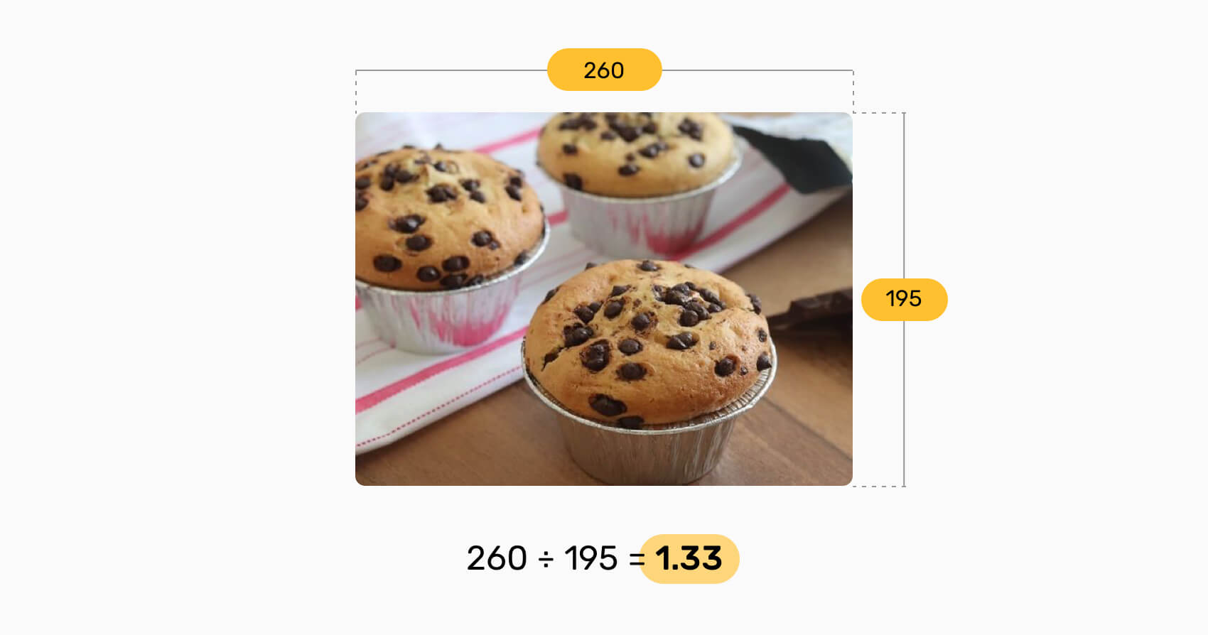
The ratio between the width and height is 1.33. That means this ratio should be respected. Consider the following:
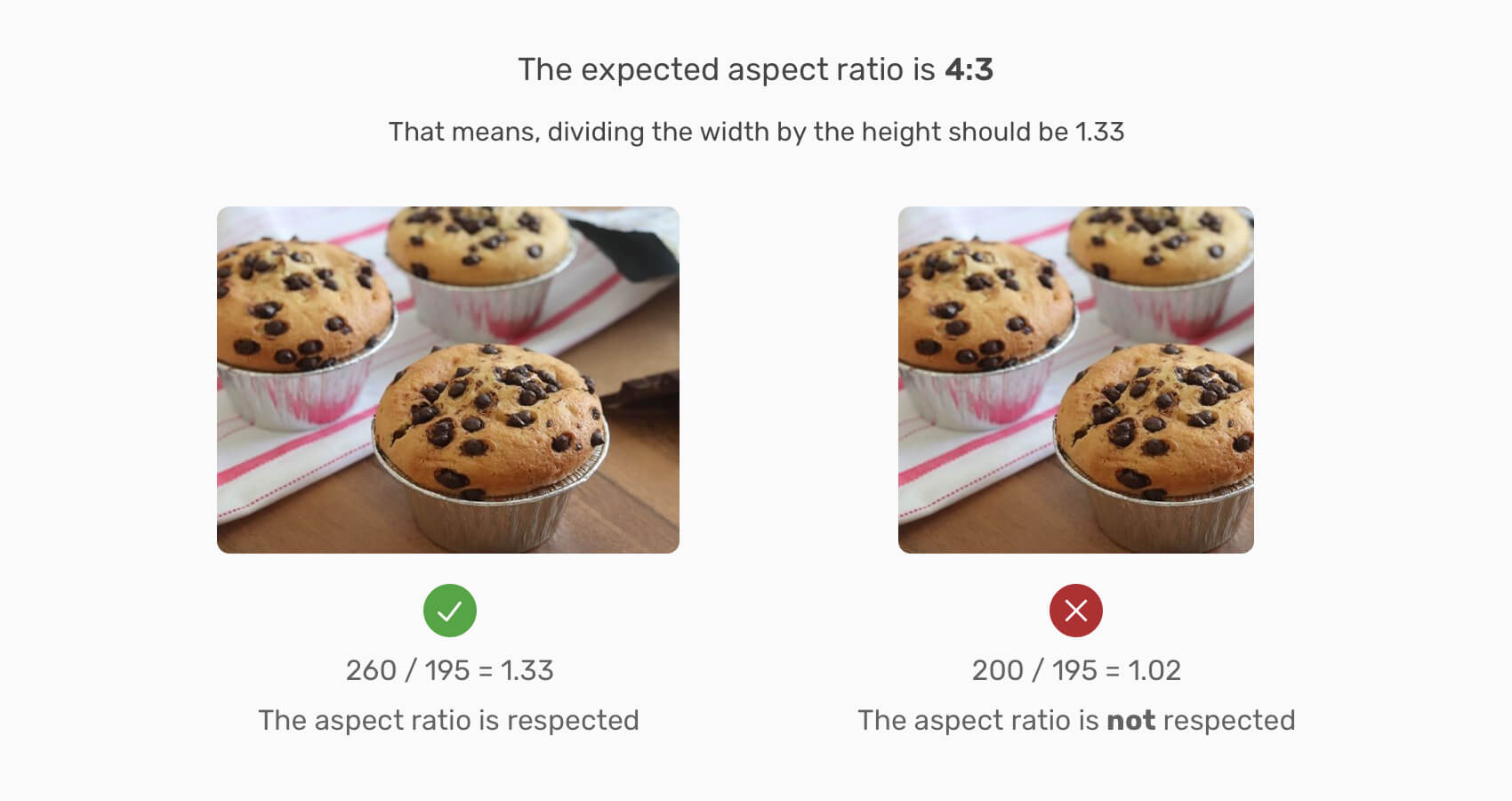
Notice on the image on the right, the value of width ÷ height is 1.02, which is not what the original aspect ratio is (1.33 or 4:3).
You might be thinking, how to come up with the value 4:3? Well, this is called the Nearest Normal Aspect Ratio and there are tools that can help us in finding it. While working on a UI design, it’s highly recommended to know exactly what’s the aspect ratio of the images you are using. Using this calculator can help in that.
With that, I hope that the concept of aspect ratio is clear for you now. If you already know about it, then I hope that you refreshed your knowledge about it.
We used to implement aspect-ratio by using percentage padding in CSS. The good news is that recently, we got native support for aspect-ratio in all major browsers. Before diving into the native way, I will explain the good old way first.
When an element has a vertical percentage padding, it will be based on its parent width. Consider the following figure:
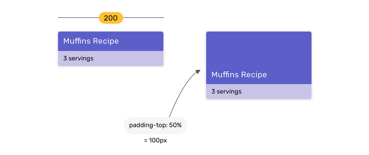
When the headline has padding-top: 50%, the value is computed based on its parent width. Since the width of the parent is 200px, the padding-top will become 100px.
To find out what’s the percentage value to use, we need to divide the image’s height by its width. The resulting number is the percentage you want to use.
Consider that the image width is 260px and the height is 195px.
Percentage padding = height / width
The result of 195/260 is 0.75 (or 75%).
Let’s suppose that there is a grid of cards, and each one of them has a thumbnail. The thumbnails are supposed to be equal in width and height.
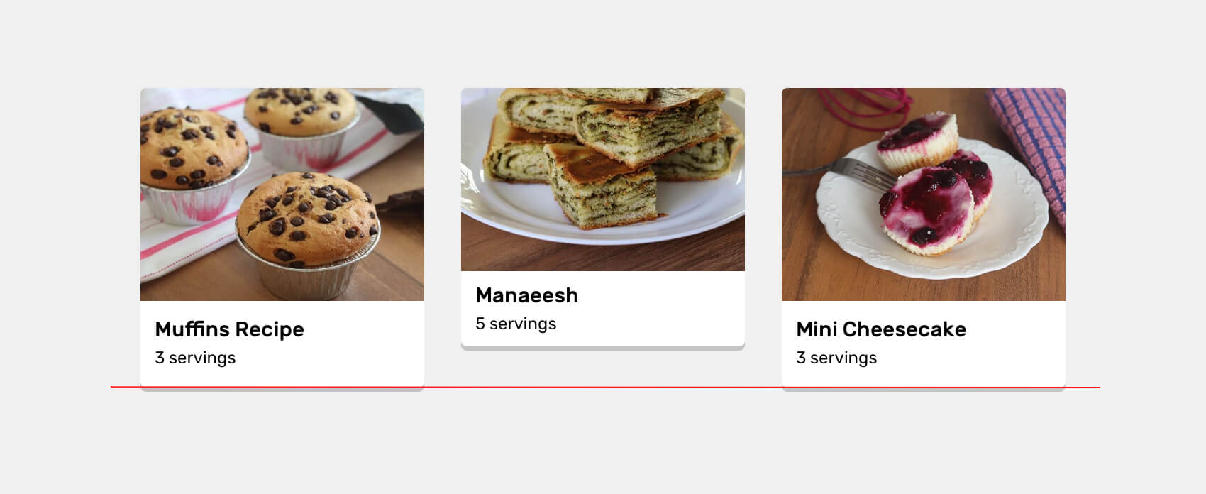
For some reason, the content author uploaded an image that is not consistent in size with the others. Notice how the height of the middle card isn’t as equal to the other ones.
You might be thinking like, well, we can add a fixed height and object-fit: cover. Problem fixed, right? It’s not that simple. This solution won’t look good in multiple viewport sizes.
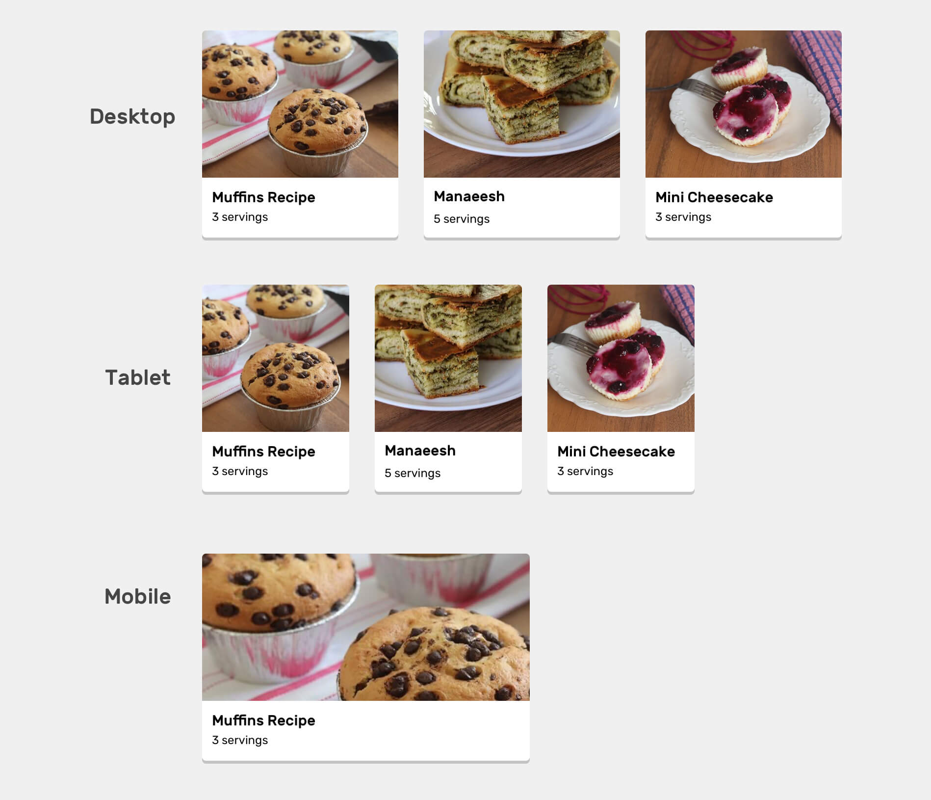
Notice how in medium size, the fixed-height images are too cropped from the left and right, while on mobile, they’re too wide. All that is due to using a fixed height. We can tweak the height manually with different media queries, but this isn’t a practical solution.
What we need is a consistent size for the thumbnails no matter what the viewport size is. To achieve that, we need to implement an aspect ratio using percentage padding.
<article class="card">
  <div class="card__thumb">
    <img src="thumb.jpg" alt="" />
  </div>
  <div class="card__content">
    <h3>Muffins Recipe</h3>
    <p>Servings: 3</p>
  </div>
</article>
.card__thumb {
  position: relative;
  padding-top: 75%;
}

.card__thumb img {
  position: absolute;
  left: 0;
  top: 0;
  width: 100%;
  height: 100%;
  object-fit: cover;
}
With the above, we’ve defined that the height of the card thumbnail wrapper (.card__thumb) depends on its width. Also, the image is absolutely positioned and it has the full width and height of its parent, with object-fit: cover for cases of uploading a different-sized image. See the video below:
Notice how the card size changes and the aspect ratio of the thumbnails didn’t get affected.
aspect-ratio propertyEarlier this year, the aspect-ratio CSS property got supported in Chrome, Safari TP, and Firefox Nightly. Recently, it got supported in the official version of Safari 15.
What’s useful about this property is that we don’t have to add percentage padding at all. We can just define the aspect ratio we need.
If we go back to the previous example, we can rewrite it like this:
/* The current way */
.card__thumb {
  position: relative;
  padding-top: 75%;
}

/* With native aspect-ratio support */
.card__thumb {
  position: relative;
  aspect-ratio: 4/3;
}
See the video below for how the aspect ratio is changing.
You can also play with the interactive demo.
See the Pen Changing Aspect Ratio by Ahmad Shadeed (@shadeed) on CodePen.
With that, let’s explore some use-cases for where the native aspect ratio can be useful, and how to use it in a progressively enhanced approach.
We can use CSS aspect-ratio today by using CSS @supports and CSS variables. I learned about this from this great article by Peter-Paul Koch.
.card {
  --aspect-ratio: 16/9;
  padding-top: calc((1 / (var(--aspect-ratio))) * 100%);
}

@supports (aspect-ratio: 1) {
  .card {
    aspect-ratio: var(--aspect-ratio);
    padding-top: initial;
  }
}
The most common use-case for aspect-ratio is for a card image. Since I already covered this, I won’t go into it again.
In the past year, I published an article about how to properly align different sized logos with CSS object-fit and positioning. Now, it’s even easier with CSS aspect-ratio.
Let’s take a look at the following logos.

Did you notice that their sizes are consistent, and they are aligned? Let’s take a behind-the-scenes look.
<li class="brands__item">
  <a href="#">
    <img src="assets/batch-2/aanaab.png" alt="" />
  </a>
</li>
.brands__item a {
  padding: 1rem;
}

.brands__item img {
  width: 130px;
  object-fit: contain;
  aspect-ratio: 2/1;
}
I added a base width of 130px to have a minimum size, and the aspect-ratio will take care of the height.
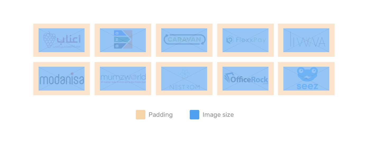
The blue area is the image size, and having object-fit: contain is important to avoid distorting the images.
Yes! Have you ever needed to create a circular element that should be responsive? CSS aspect-ratio is a perfect fit for this use case.

.person {
  width: 180px;
  aspect-ratio: 1;
}
If the two values for aspect ratio are the same, we can write aspect-ratio: 1 instead of aspect-ratio: 1/1. If you’re using CSS grid of flexbox, the width will be optional and it can be added to act as a minimum value.
This is a use case that I came across recently in a client project. I have an external link component. At first, I did it with padding that needs to be changed on mobile vs desktop.
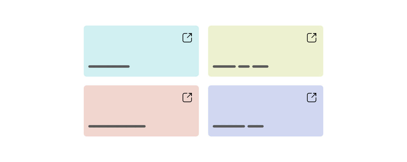
With aspect-ratio, we can make them responsive to their parent width without the need to tweak the padding on mobile (i.e: making it smaller).
Thank you for reading…
此内容由惯性聚合(RSS阅读器)自动聚合整理,仅供阅读参考。 原文来自 — 版权归原作者所有。