


I spent years teaching CSS layout on this blog. I put everything I know into The Layout Maestro course: 70+ lessons and 150+ interactive examples that teach you how to think CSS layouts, not just memorize syntax.
Have you ever tried to click or tap on an element (e.g.: button, link) and you realize that it doesn’t respond until you click on a specific area of it?
This happens because the clickable area is not applied to the whole element. To make it more clear, see the below figure. I made some examples of how the clickable area should and shouldn’t be.
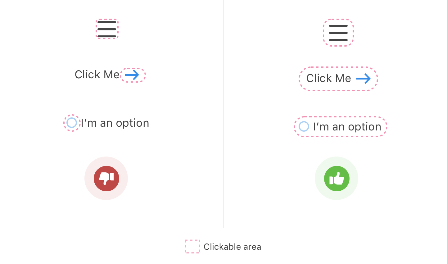
For this article, I will go through different examples that I notice a lot and show how to solve them properly.
As per WCAG 2.1, the minimum target size for touch or mouse should be 44×44 pixel. The size is not fixed and it could change depending on the use case. However, 44×44 pixel is a good starting point.
An important law to be followed in UX design. In simple words, the larger and closer the touch or click target is, the less time it will require the user to interact with it.
In the below figure, I mocked two different cases for a primary button. On the left side, the button is smaller and farther which will require more time for the user to interact with it. On the right side, the button size is larger and closer to its sibling input element, which will make it easier and faster to interact with.
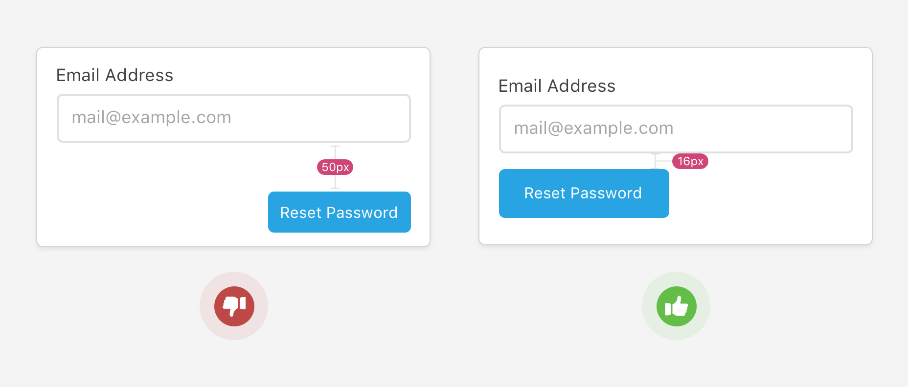
Let’s get to actual examples and keep WCAG 2.5.5 Target Size and Fitts’ law in mind.
It’s very important to use an actual <button> when you need it. The example below is from an online banking system I use:
<div class="navig next" onclick="validateLogin()">Next</div>
Here is a GIF image for the above button’s HTML. I’m hovering on the button and the cursor is still a pointer, which is fine. However, I can also select the text and when hovering, there is a text cursor! This won’t happen if the correct element were used.

When using the HTML <button> element, you will gain the below for free:
Once the correct element is used, you need to add enough padding for two reasons:
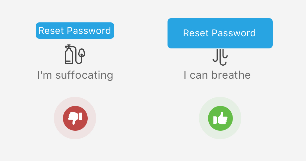
I made this mistake in the past and I see it in the wild. When there is a navigation menu, the padding should be given to the <a> element and not the <li>.
<nav>
  <ul>
    <li class="nav-item"><a href="#">Home</a></li>
    <li class="nav-item"><nav href="#">Products</nav></li>
    <li class="nav-item"><a href="#">Store</a></li>
    <li class="nav-item"><a href="#">Team</a></li>
  </ul>
</nav>
.nav-item {
  padding: 12px 16px;
}
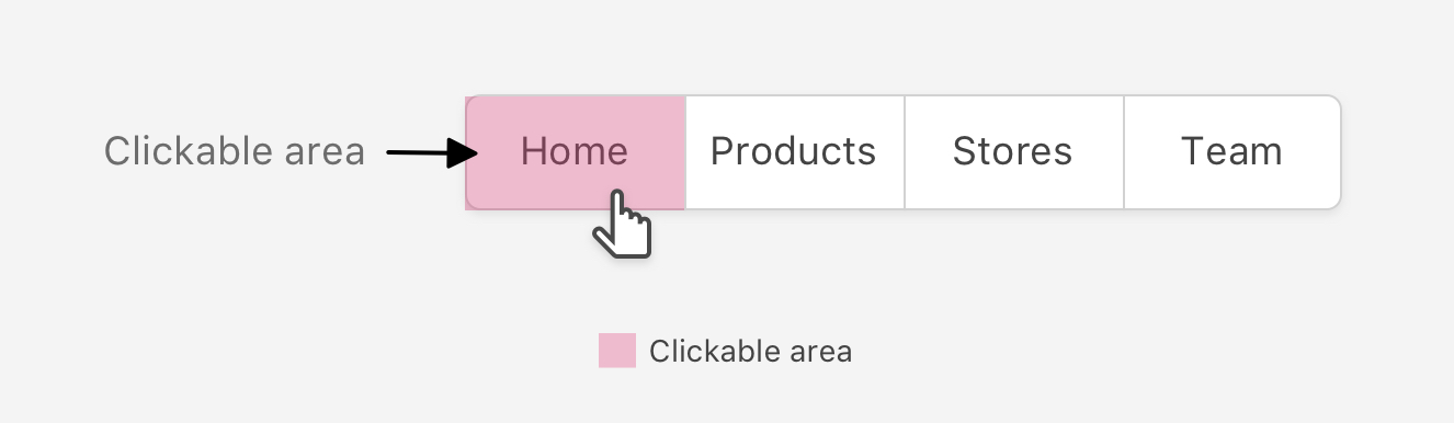
Based on the above HTML and CSS, the clickable area will be the text only. Check the below figure:
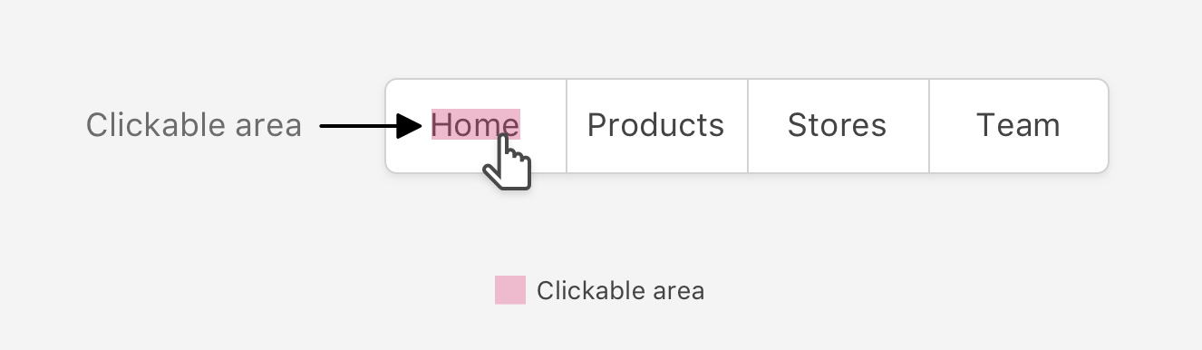
The correct way to do this is to add the padding on the link itself. Notice that the top and bottom padding won’t work by default since it’s an inline element. It can be block or inline-element or flex, whatever works for your case.
.nav-item a {
  display: block;
  padding: 12px 16px;
}
As a result, the whole link is now clickable/tappable. Here is a figure that shows the difference:
Or Kebab? whatever you call it. It’s important to increase the clickable area for them as mostly they will be used on touch devices.
Let’s suppose that the clickable area is as below:
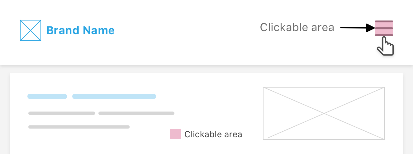
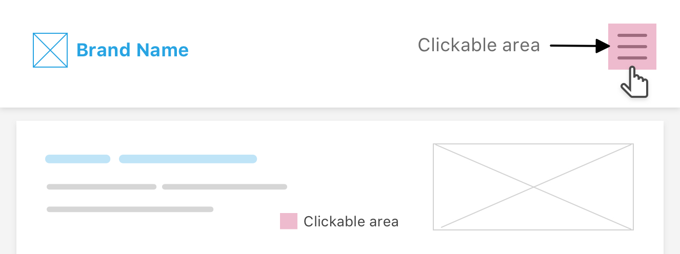
This is not good and will make it hard to point the mouse or finger at such a small target on the screen. While in the below figure, it’s larger and much easier to interact with.
Check out this demo on CodePen.
When there is a checkbox or a radio button element, I expect that I can click on it or the associated label to activate/inactivate it.
In the below figure, the clickable area is tied to the checkbox or radio elements only. In other words, you cannot click on the label to active/inactivate it.
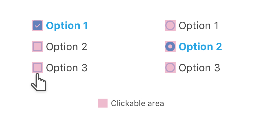
This is inaccessible and bad from a user experience perspective. In HTML, you can tie the label with an input using the for attribute.
<input type="checkbox" id="option1" />
<label for="option1">Option 1</label>
or you can place the input inside the label:
<label for="option1">
  Option 1
  <input type="checkbox" id="option1" />
</label>
Then, you will need to add padding on the <label> element so the clickable area become larger. That way, the issue is solved and the whole checkbox or radio button is clickable such as the below figure:
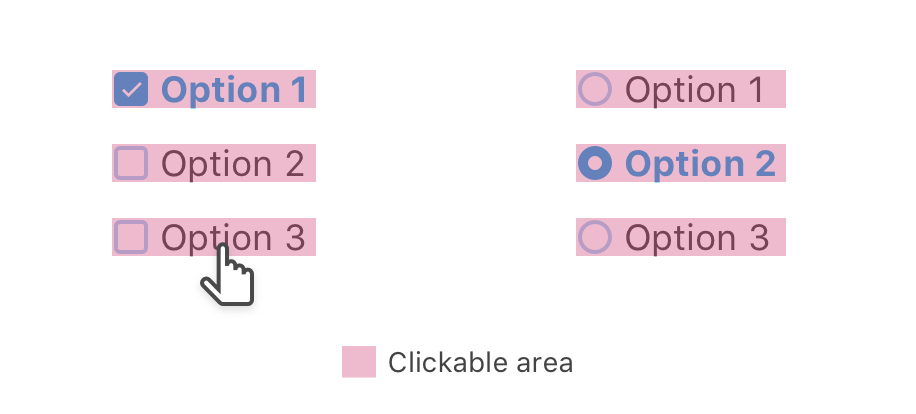
For a page with categories, sometimes I notice that the list links doesn’t expand to the full width of its parent. That means, the clickable area is on the text only.
The below figure shows that:
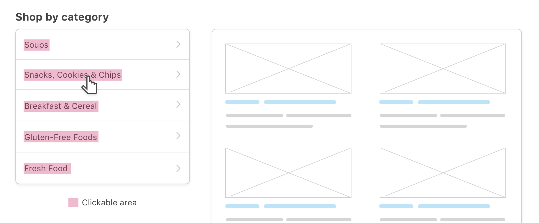
The fix for this is to:
<li> element and instead, move it to the <a> element (Discussed this in the links point).display: block..nav-item a {
/*Other styles*/
padding: 12px 16px;
display: block;
}
Curious to see how it looks after the above little CSS addition?
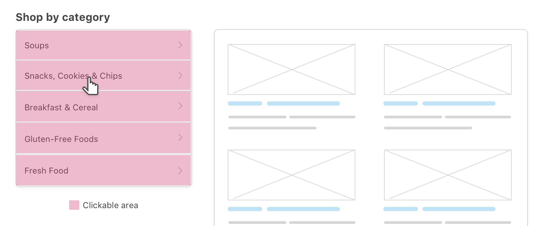
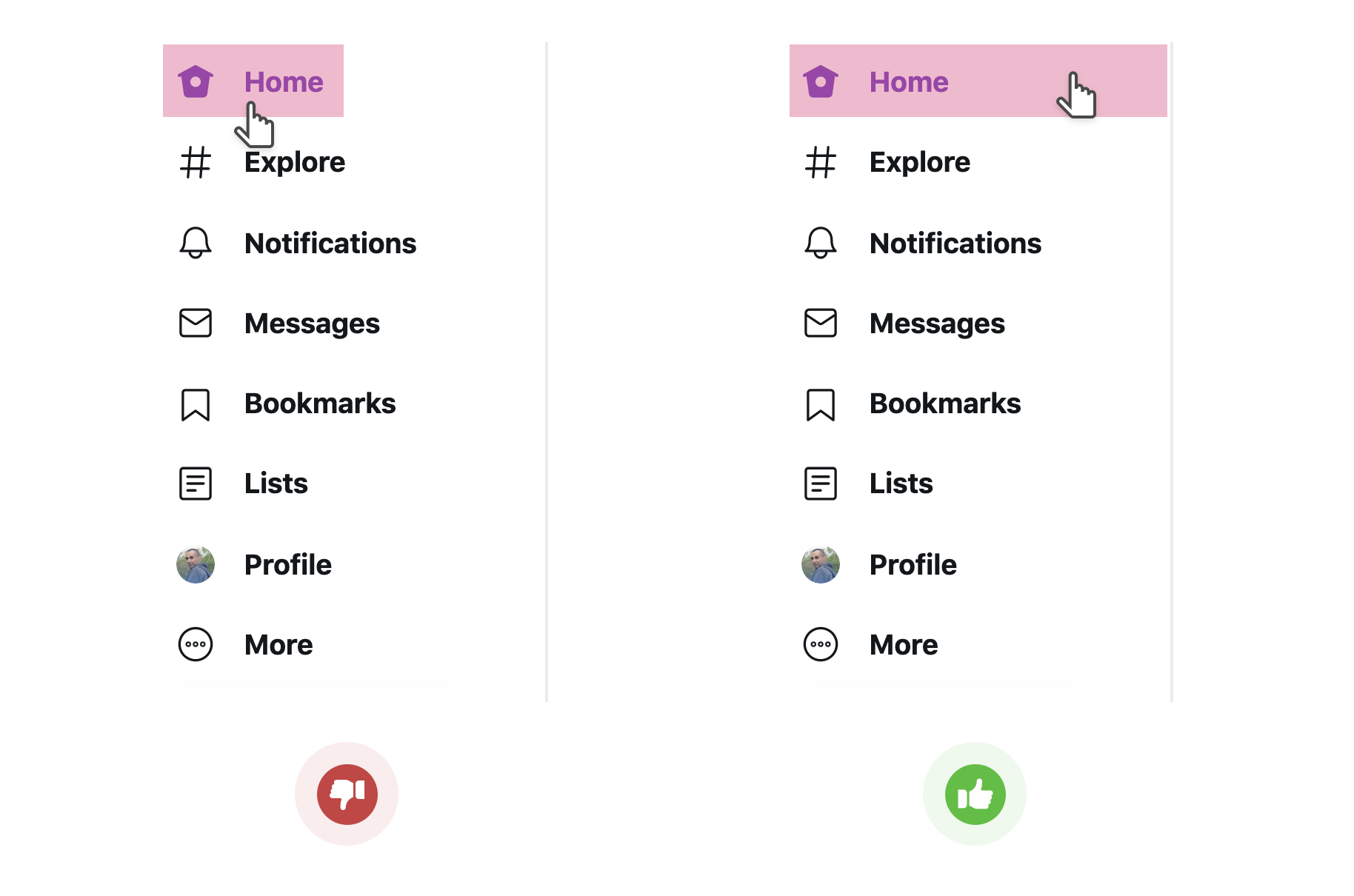
In a recent Twitter update, the navigation design has an issue in the clickable area size. At first, it was tied to the text only, as in the below screenshot, but they got it fixed after receiving feedback.
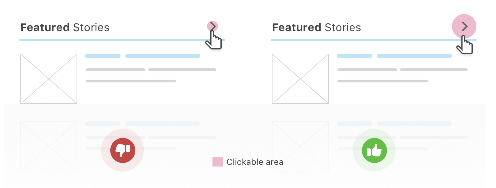
In some cases, there is a need to add a “See more” button or arrow on the far side of a section header. In the below example, I placed the arrow in a fake circle so I can center the arrow correctly.
Typically, the spacing around the arrow can be done in CSS using padding, or a width and height.. Whatever work for your case.
It’s not always possible to make the clickable area larger by just changing the width and height of an element or using padding. Well, pseudo elements to the rescue!
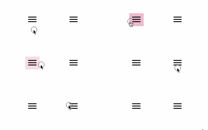
The idea is that a pseudo element belongs to its parent, so when we create one with a specific width and height, it will act as a click/touch/hover area of its parent.
In the below figure, I added an :after pseudo element to the menu button. Here is the CSS used:
.menu-2:after {
  content: "";
  position: absolute;
  left: 55px;
  top: 0;
  width: 50px;
  height: 50px;
  background: #e83474;
  /*Other styles*/
}

Notice that I intentionally positioned the square 55px to the left of its parent for explaining purposes. When that square is positioned in the center of its parent, it will increase the touch target. Goal achieved!!
See the below GIF or check out the demo on Codepen.

On 10 January 2024, I published a complete guide on designing better clickable areas and target sizes. It explains everything you need with lots of examples and interactive demos. See the interactive guide about target sizes
And that’s a wrap. I wrote down most of the examples I know. Do you have a comment or a suggestion? Please feel free to ping me on @shadeed9.
Thank you for reading.
此内容由惯性聚合(RSS阅读器)自动聚合整理,仅供阅读参考。 原文来自 — 版权归原作者所有。