


I spent years teaching CSS layout on this blog. I put everything I know into The Layout Maestro course: 70+ lessons and 150+ interactive examples that teach you how to think CSS layouts, not just memorize syntax.
Have you ever thought about a CSS selector where you check if a specific element exists within a parent? For example, if a card component has a thumbnail, we need to add display: flex to it. This hasn’t been possible in CSS but now we will have a new selector, the CSS :has which will help us to select the parent of a specific element and many other things.
In this article, I will explain the problem that :has solves, how it works, where and how we can use it with some use-cases and examples, and most importantly how we can use it today.
:has selector:has selector is not only about the parent:has
Being able to style a specific parent or element based on the existence of an element isn’t possible. We have to make CSS classes and toggle them based on the variation we need.
Consider the following basic example.
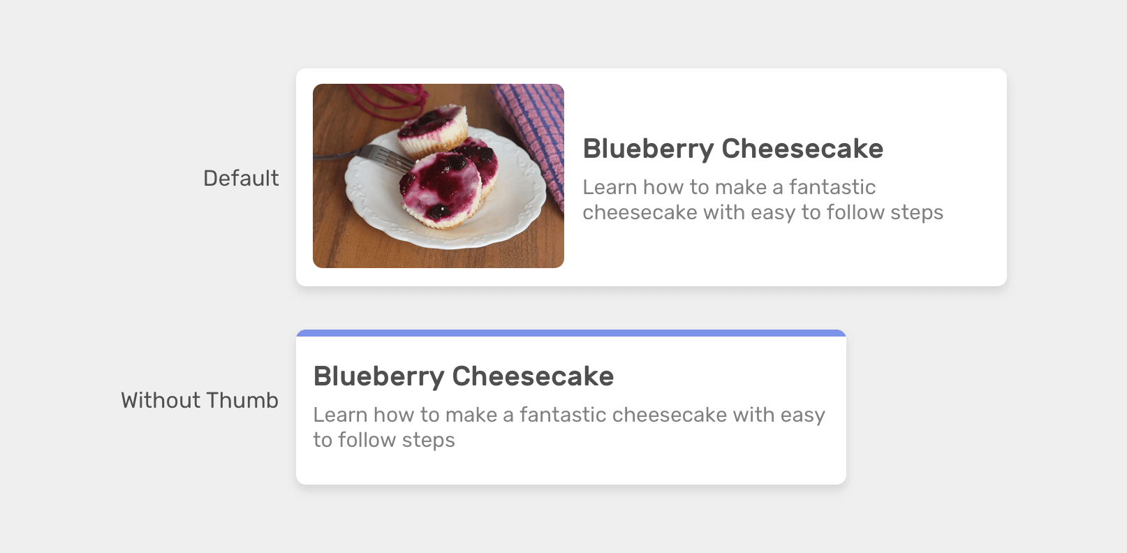
We have a card component in two variations: 1) With an image 2) Without an image. In CSS, we might do something like this:
/* A card with an image */
.card {
  display: flex;
  align-items: center;
  gap: 1rem;
}

/* A card without an image */
.card--plain {
  display: block;
  border-top: 3px solid #7c93e9;
}
<!-- Card with an image -->
<div class="card">
  <div class="card__image">
    <img src="awameh.jpg" alt="" />
  </div>
  <div class="card__content">
    <!-- Card content here -->
  </div>
</div>

<!-- Card without an image -->
<div class="card card--plain">
  <div class="card__content">
    <!-- Card content here -->
  </div>
</div>
As you saw above, we created a variation class specifically for having a card without an image since we don’t need the flex wrapper. The question is, what if we can conditionally do that in CSS, without a variation class?
Well, this is where CSS :has come to the rescue. It can help us in checking if the .card element has a .card__image or not.
For example, we can check if the card :has an image and if yes, we need to apply flexbox.
.card:has(.card__image) {
  display: flex;
  align-items: center;
}
:has selectorAccording to the CSS spec, the :has selector checks if a parent contains at least one element, or one condition like if an input is focused.
Let’s revisit the previous example snippet.
.card:has(.card__image) {
}
We check if the .card parent contains the .card__image child element. Consider the following figure:
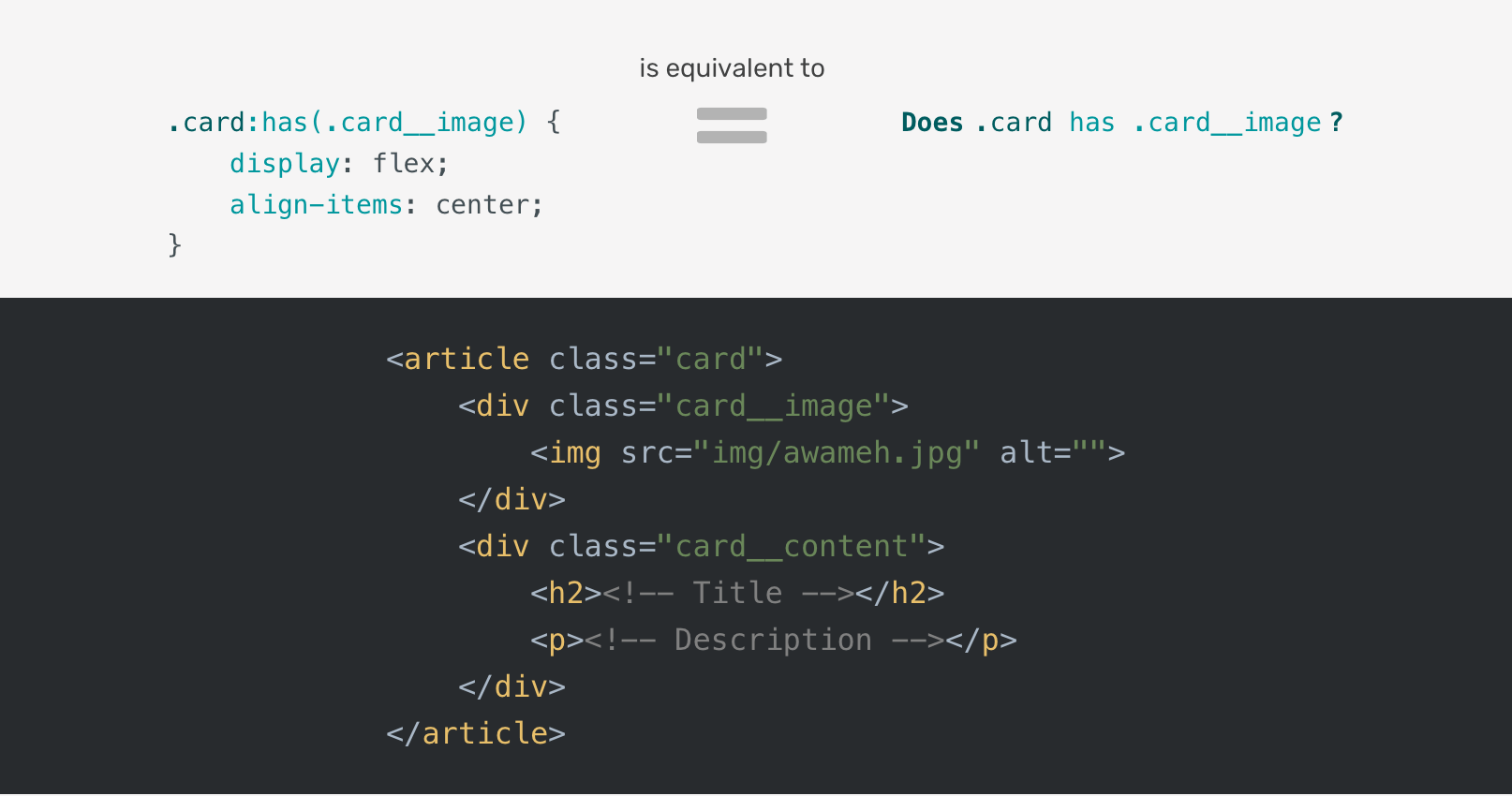
In plain words, the CSS above is equivalent to the following
Does the card has a card__image element?
Isn’t that just amazing? We’re getting some kind of logic in CSS. What a time to write CSS!
:has selector is not only about the parentIt’s not only about checking if a parent contains a child, but we can also check if an element is followed by a <p>, for example. Consider the following:
.card h2:has(+ p) {
}
This checks if the <h2> element is followed directly by a <p> element.
Or we can use it with a form element to check if there is a focused input, for example.
/* If the form has a focused input, apply the following */
form:has(input:focused) {
  background-color: lightgrey;
}
At the time of writing, CSS :has works in Safari 15.4 and in Chrome Canary. Keep an eye on Can I use for the support.
Yes, it’s possible. We can check with CSS @supports rule like the following.
@supports selector(:has(*)) {
  /* do something */
}
Enough theory, let’s get into the use-cases!
:hasWhen I work on a section header, I will mostly have two variations, one with the title only, and one that contains both title and an anchor link.
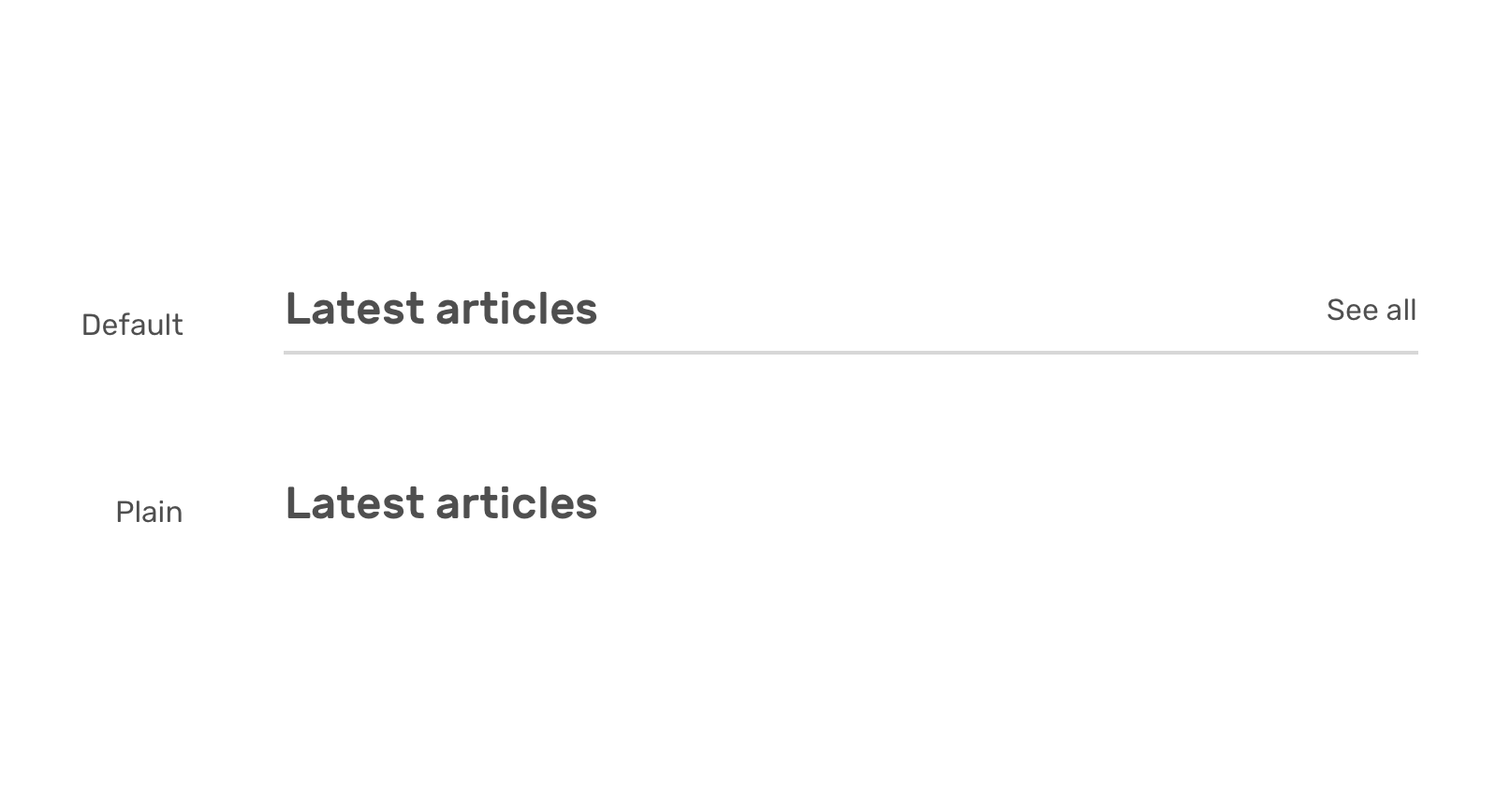
Based on whether there is a link or not, I want to style it differently.
<section>
  <div class="section-header">
    <h2>Latest articles</h2>
    <a href="/articles/">See all</a>
  </div>
</section>
Notice that I used :has(> a) which will only select the direct child link.
.section-header {
  display: flex;
  justify-content: space-between;
}

/* If there is a link, add the following */
.section-header:has(> a) {
  align-items: center;
  border-bottom: 1px solid;
  padding-bottom: 0.5rem;
}
Let’s go back a bit for the initial card example. We have two variations, one with an image and the other without one.
.card:has(.card__image) {
  display: flex;
  align-items: center;
}
We can even check if the .card doesn’t have an image and apply some specific styles. In our case, it’s the border-top.
.card:not(:has(.card__image)) {
  border-top: 3px solid #7c93e9;
}
Without CSS :has, we need to have two CSS classes to handle what :has did.
.card--default {
  display: flex;
  align-items: center;
}

.card--plain {
  border-top: 3px solid #7c93e9;
}
In this card example, we have two variations of card actions: one with a single item (the link) and the other with multiple actions (save, share, and more).
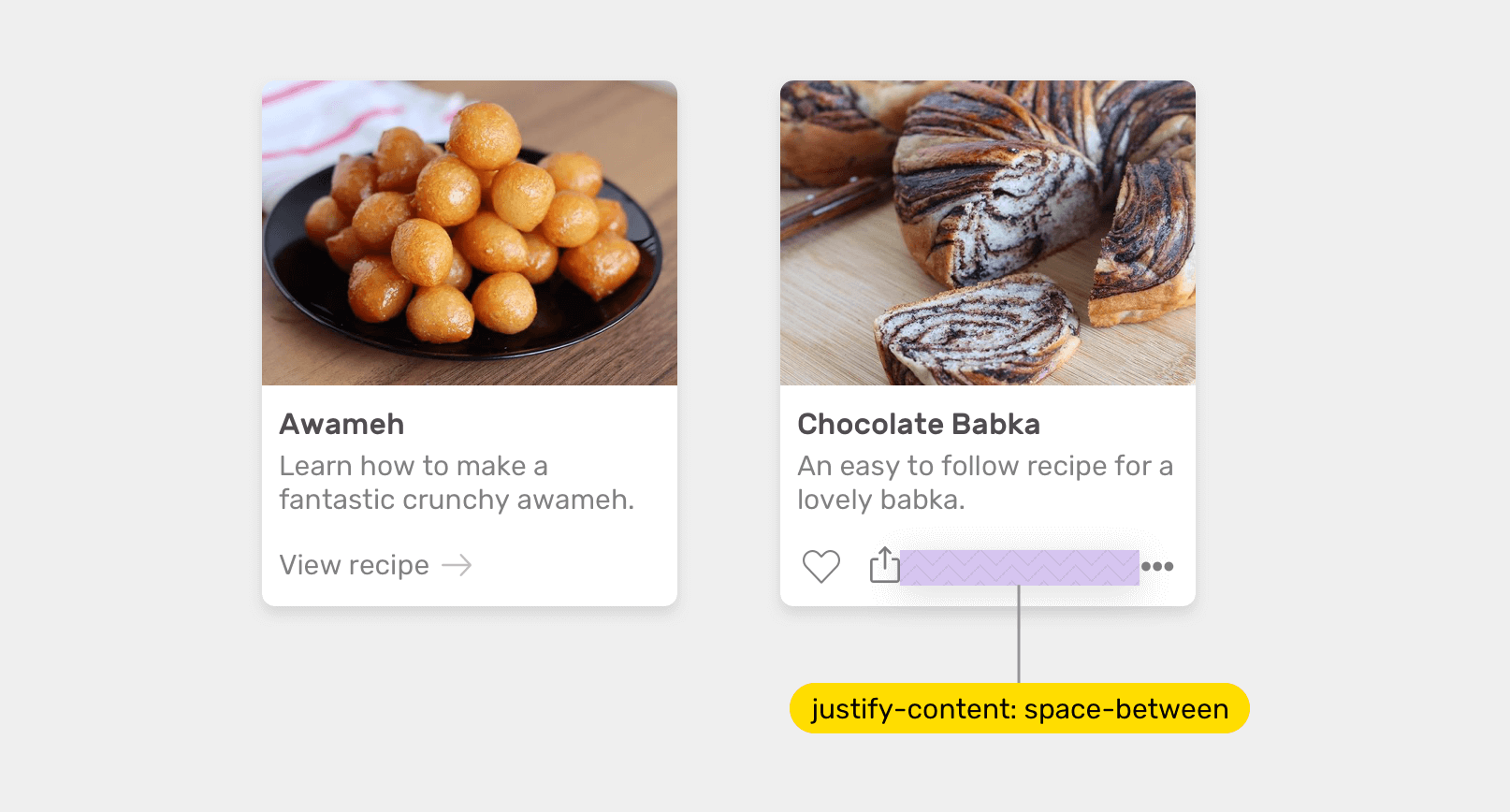
When the card actions have two different wrappers for the actions, we want to activate display: flex like the following (Please don’t mind the below markup, it’s purely for demonstration purposes!).
<div class="card">
    <div class="card__thumb><img src="cool.jpg"/></div>
    <div class="card__content">
        <div class="card__actions">
            <div class="start">
                <a href="#">Like</a>
                <a href="#">Save</a>
            </div>
            <div class="end">
                <a href="#">More</a>
            </div>
        </div>
    </div>
</div>
.card__actions:has(.start, .end) {
  display: flex;
  justify-content: space-between;
}
Here is what we should do without CSS :has.
.card--with-actions .card__actions {
  display: flex;
  justify-content: space-between;
}
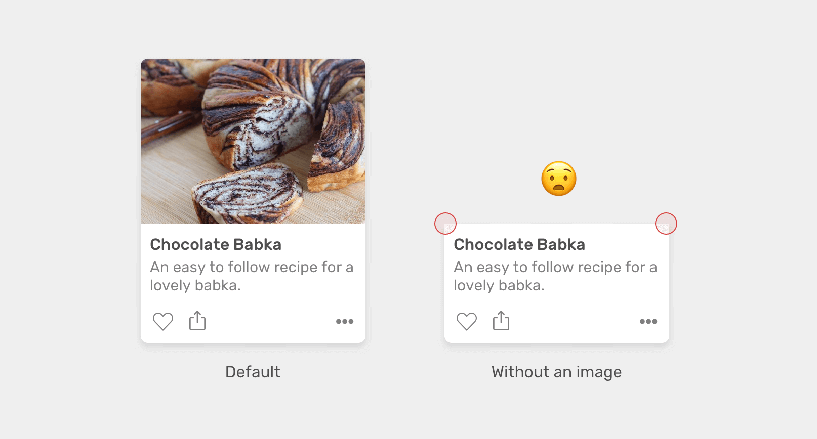
Have you ever needed to reset the border-radius for a card component based on if there is an image or not? This is a perfect usage for CSS :has.
Consider the following figure. When the card image is removed, the border radius of the top left and right corners is zero, which looks odd.
/* If no image, add radius to the top left and right corners. */
.card:not(:has(img)) .card__content {
  border-top-left-radius: 12px;
  border-top-right-radius: 12px;
}

.card img {
  border-top-left-radius: 12px;
  border-top-right-radius: 12px;
}

.card__content {
  border-bottom-left-radius: 12px;
  border-bottom-right-radius: 12px;
}
Much better!
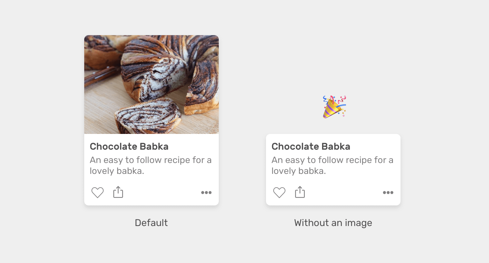
Here is what we should do without :has.
.card--plain .card__content {
  border-top-left-radius: 12px;
  border-top-right-radius: 12px;
}
In this example, we have a component with multiple options. When none of them is checked, there is no reset button. However, when at least one is checked, we need to show the reset button.
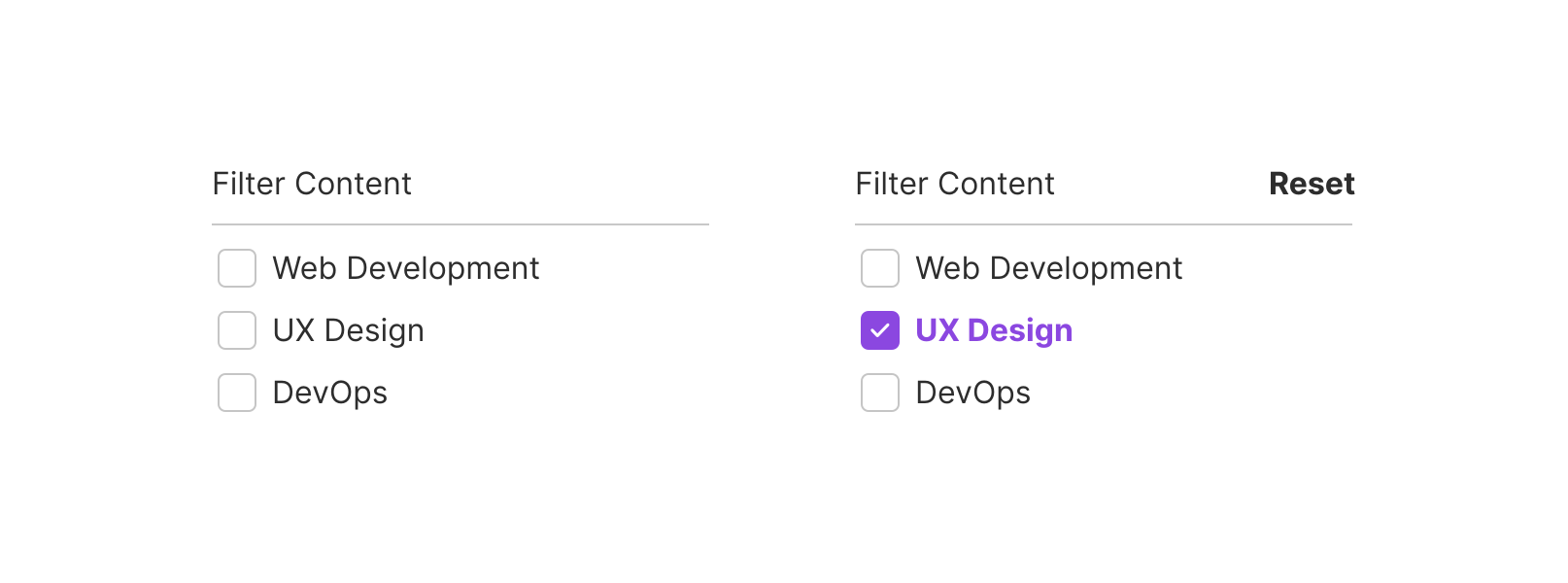
We can do that easily with CSS :has.
.btn-reset {
  display: none;
}

.multiselect:has(input:checked) .btn-reset {
  display: block;
}
Oh, and we can’t do that in CSS at all. This is one of the things that we will ditch Javascript for when :has has support in stable browsers (No, :has has isn’t a typo).
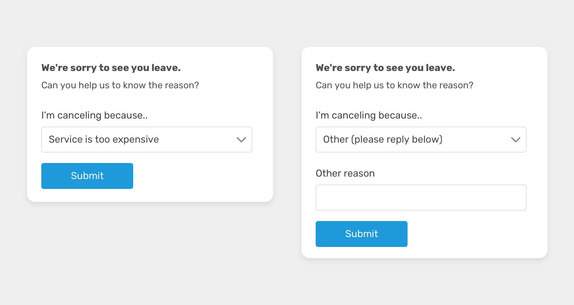
We might need to show a specific form field based on a previous answer or selection. In this example, we need to show the “other” field in case the user selected “other” from the select menu.
With CSS :has, we can check if the select menu has the other option selected and show the “other” field based on that.
.other-field {
  display: block;
}

form:has(option[value="other"]:checked) .other-field {
  display: block;
}
Isn’t that just amazing? We don’t need to worry about the HTML source order as long as the select and form field is within the .box parent element.
See the Pen CSS :has - Other field by Ahmad Shadeed (@shadeed) on CodePen.
In this use-case, we have a navigation item with a sub-menu that appears on hover or focus.
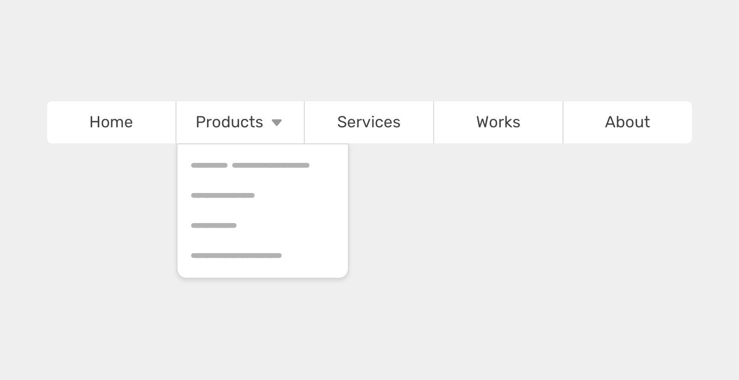
What we want to do is to hide the arrow based on whether there is a menu or not. We can do that easily with CSS :has. The idea is to check if <li> contains a <ul>. If yes, we show the arrow icon.
/* Check if the <li> has a <ul>. Yes? show the arrow. */
li:has(ul) > a:after {
  content: "";
  /* arrow styling */
}
Without CSS :has, we will probably have a class to the <li> with a sub menu. Something like the following:
.nav-item--with-sub > a:after {
  content: "";
  /* arrow styling */
}
While building a header component, we might be sure about whether we want the header to take the full width of the page, or to be contained within a wrapper.
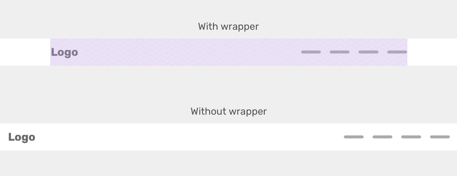
Either way, we need to apply flexbox in order to distribute the header items in a certain way. If the .wrapper is there, we will apply the styles to it. If not, then we will apply them directly to the .site-header element.
<header class="site-header">
  <div class="wrapper">
    <!-- Header content -->
  </div>
</header>
.site-header:not(:has(.wrapper)) {
  display: flex;
  justify-content: space-between;
  align-items: center;
  padding-inline: 1rem;
}

/* If it has a wrapper */
.site-header .wrapper {
  display: flex;
  justify-content: space-between;
  align-items: center;
  max-width: 1000px;
  margin-inline: auto;
  padding-inline: 1rem;
}
In some dashboards, there might be an important alert that the user must be aware of. In that case, having the in-page alert might not be enough. In such a case, we might add a red border and a dimmed red background color to the header element, for example.
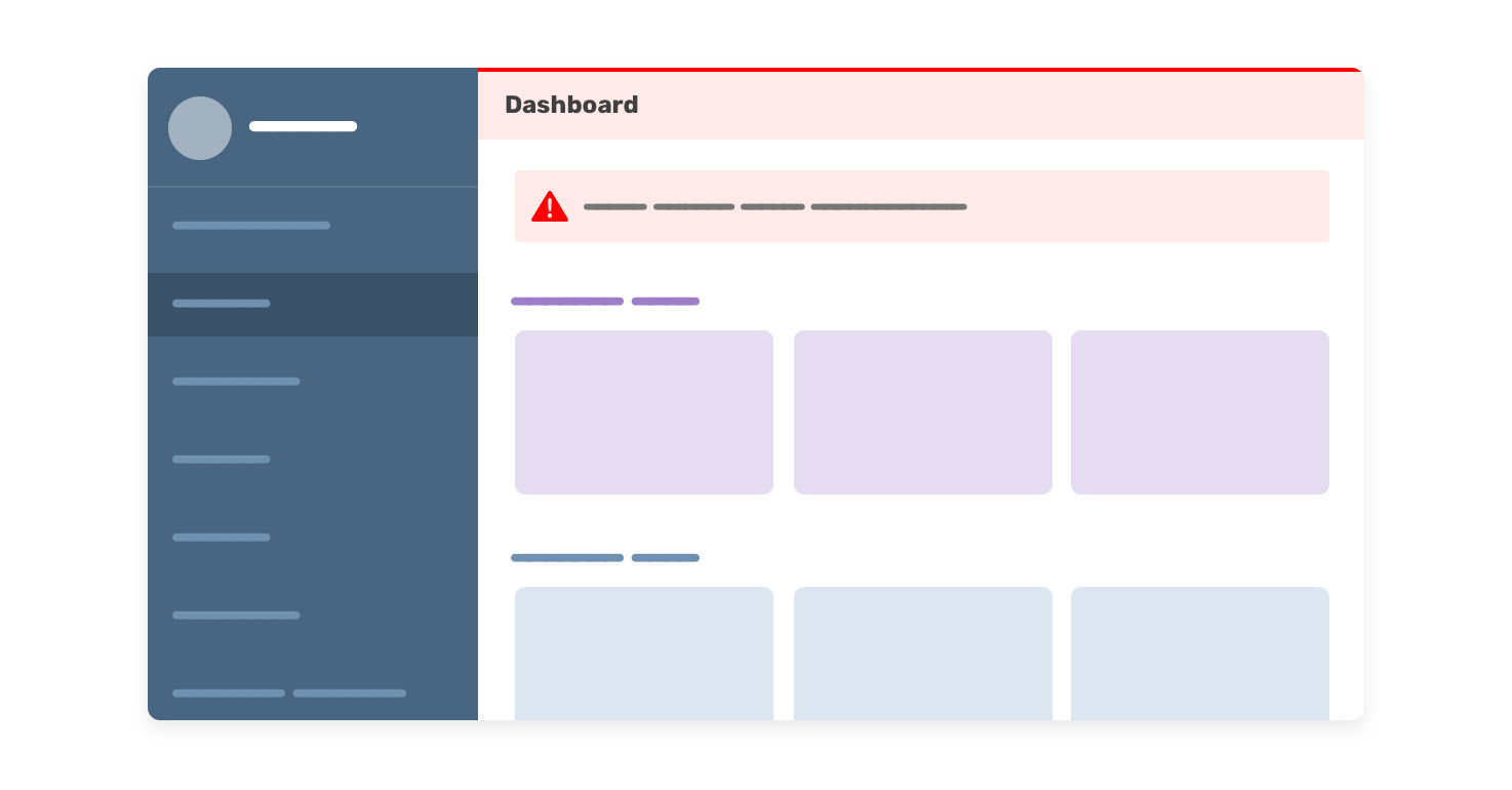
Having this will increase the possibility of the user noticing the alert quickly.
With CSS :has, we can check if the .main element has an alert and if yes, we can add the following styles to the header.
.main:has(.alert) .header {
  border-top: 2px solid red;
  background-color: #fff4f4;
}
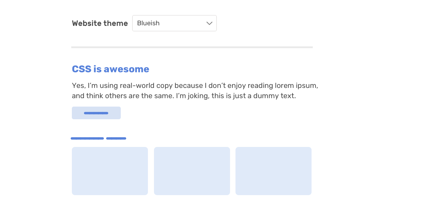
We can use CSS :has to change the color scheme of a website. For example, if we have multiple themes that are built with CSS variables, we can change them via a <select> menu.
html {
  --color-1: #9e7ec8;
  --color-2: #f1dceb;
}
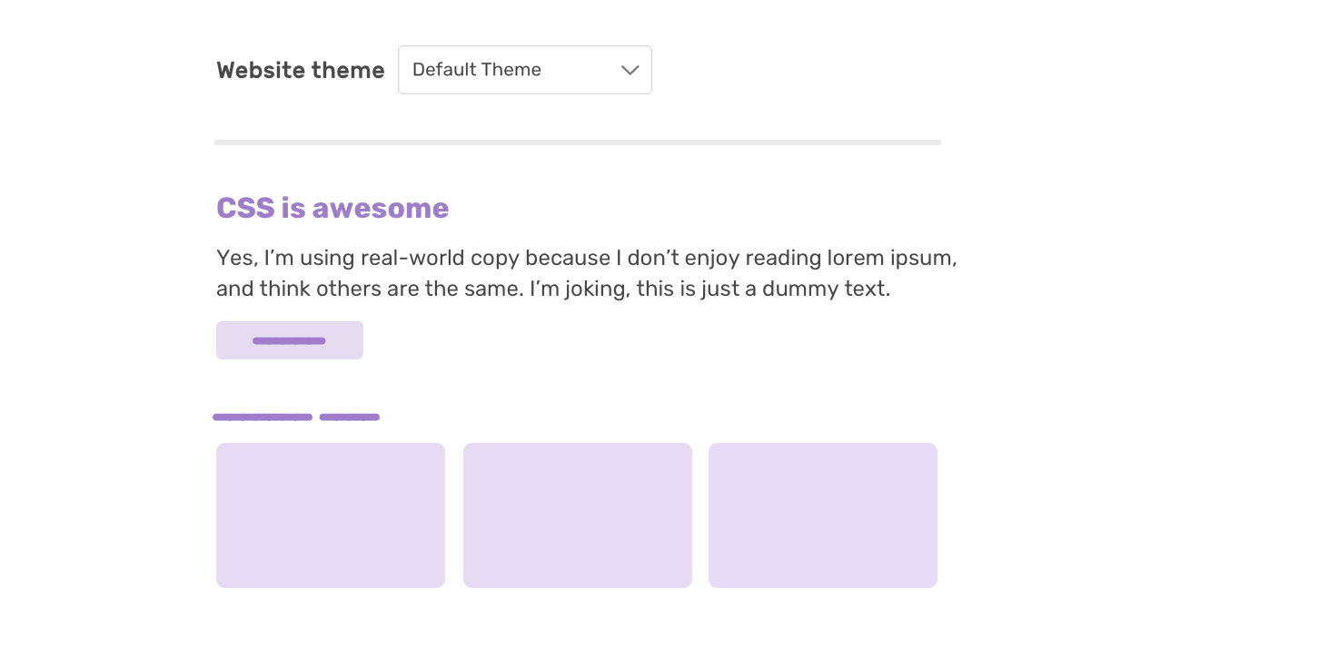
And when we select another option from the list, here is what’s happening in CSS. Based on the selected option, the CSS variables will be changed.
html:has(option[value="blueish"]:checked) {
    --color-1: #9e7ec8;
    --color-2: #f1dceb;
}
And here is the codepen demo:
See the Pen CSS :has - Alert by Ahmad Shadeed (@shadeed) on CodePen.
In some cases, we don’t have any control over the HTML. For example, within an article’s body. The content management system (CMS) might generate elements in an unexpected way, or the author might embed a video or something.
Suppose that we want to select that <h3> that is not followed by a paragraph and increase the spacing below it.
.article-body h3:not(:has(+ p)) {
  margin-bottom: 1.5rem;
}
Or we need to select the <iframe> that is followed by a <h3> and do something. These kinds of situations can’t be handled without CSS :has!
.article-body h3:has(+ p) {
  /* do something */
}
In this example, we have a default button style. When we have an icon, we want to use flexbox to center and align the button’s content.

.button:has(.c-icon) {
  display: inline-flex;
  justify-content: center;
  align-items: center;
}
In a design system, we often need to have a group of action buttons. If we have more than 2 buttons, the last one should be displayed on the far opposite side.
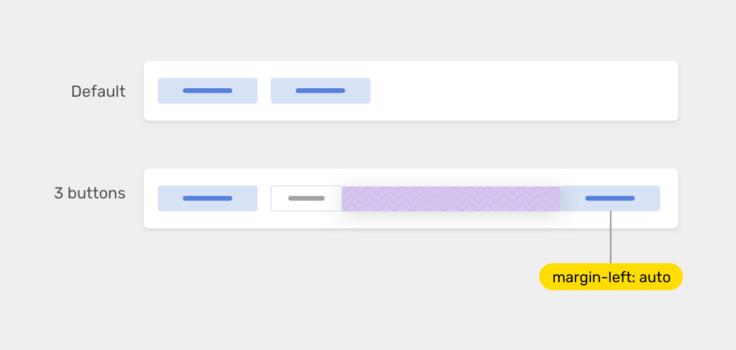
We can use quantity queries to achieve that. The following CSS will check if the number of buttons is 3 or more and if yes, the last flex item will be pushed to the right by using margin-left: auto.
.btn-group {
  display: flex;
  align-items: center;
  gap: 0.5rem;
}

.btn-group:has(.button:nth-last-child(n + 3)) .button:last-child {
  margin-left: auto;
}
I got this example from pinterest design system. When the input has an error, we also want the headline to change and indicate that.
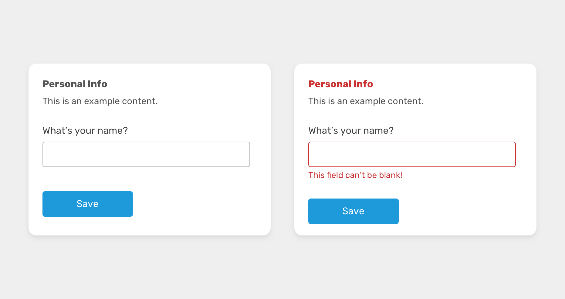
.module:has(.input-error) .headline {
  color: #ca3131;
}
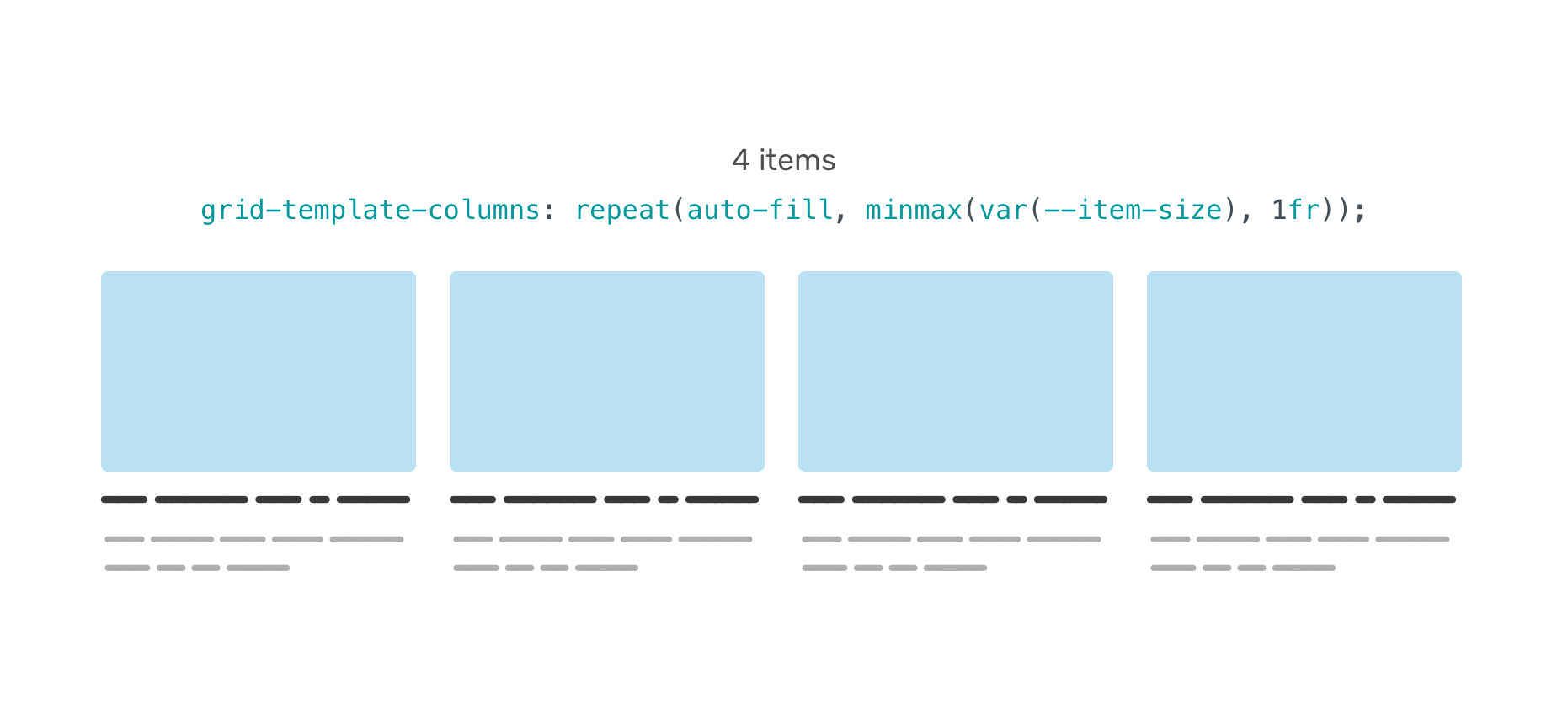
With CSS grid, we can use the minmax() function to create truly responsive and auto-sizing grid items. However, this might not be enough. We also want to change the grid based on the number of items.
Consider the following figure.
.wrapper {
  --item-size: 200px;
  display: grid;
  grid-template-columns: repeat(
    auto-fill,
    minmax(var(--item-size), 1fr)
  );
  gap: 1rem;
}
When we have 5 items, the last one will wrap into a new row.
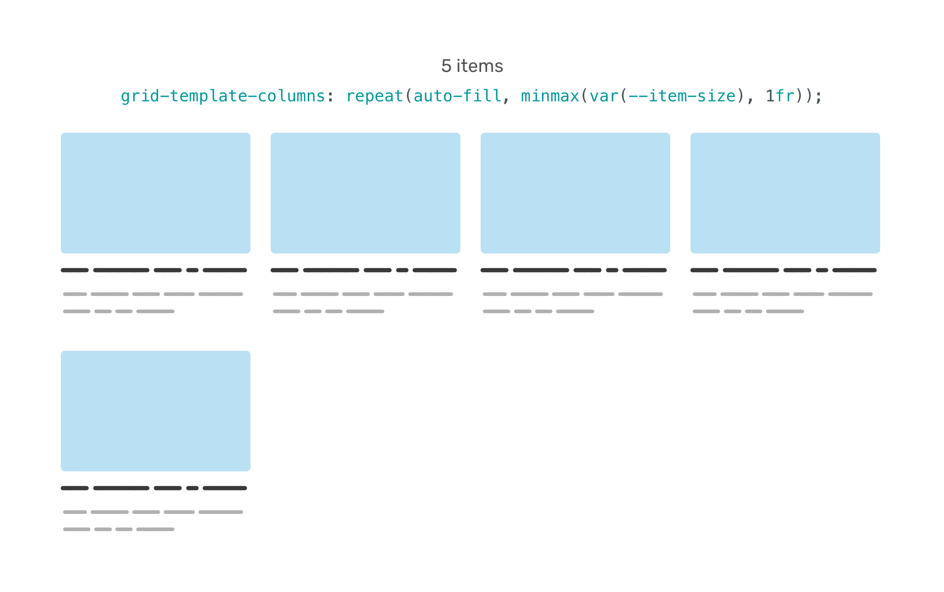
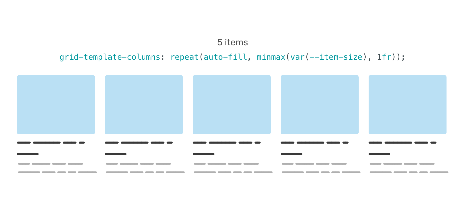
We can overcome that by checking if the .wrapper has 5 items or more. Again, this is using the concept of quantity queries.
.wrapper:has(.item:nth-last-child(n + 5)) {
  --item-size: 120px;
}
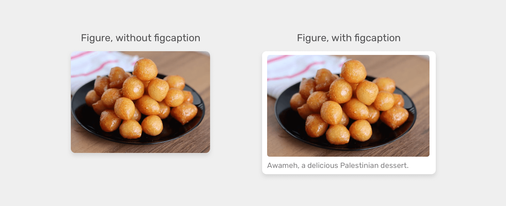
In this example, we have an HTML <figure>. If there is a <figcaption>, the styling should be a bit different by:
border-radiusfigure:has(figcaption) {
padding: 0.5rem;
background-color: #fff;
box-shadow: 0 3px 10px 0 rgba(#000, 0.1);
border-radius: 3px;
}
I can’t wait to see what you will all create with CSS :has. The use-cases in this article are just scratching the surface! I’m sure we will discover plenty of useful uses along the way.
Like they say, there has never been a better time to learn CSS. I’m really, really excited for that’s coming next. Thanks a lot for reading!
此内容由惯性聚合(RSS阅读器)自动聚合整理,仅供阅读参考。 原文来自 — 版权归原作者所有。