


I spent years teaching CSS layout on this blog. I put everything I know into The Layout Maestro course: 70+ lessons and 150+ interactive examples that teach you how to think CSS layouts, not just memorize syntax.
Back in 2007, when I first learned about blending modes in Photoshop, it was a life-changing moment for a 15 years old kid. I wanted to explore them in CSS and share that experience with you.
According to Wikipedia:
Blend modes (or Mixing modes) in digital image editing and computer graphics are used to determine how two layers are blended into each other. The default blend mode in most applications is simply to hide the lower layer by covering it with whatever is present in the top layer.
In CSS, there are two properties responsible for blending. mix-blend-mode is used to blend DOM elements, and background-blend-mode is used to combine multiple CSS Backgrounds.
mix-blend-mode
Let’s take a basic example to see how it works. I have a heading with a circle above it. What I want to do is to blend the text with the circle.
<div class="circle"></div>
<p>Blend Me</p>
.blend-me {
  mix-blend-mode: overlay;
  margin-top: -35px;
}
I added mix-blend-mode: overlay for the text element which resulted in blending it with the circle. CodePen Demo.
I think that this is a widespread use case for blend modes. A text would be on top, with an image below it.
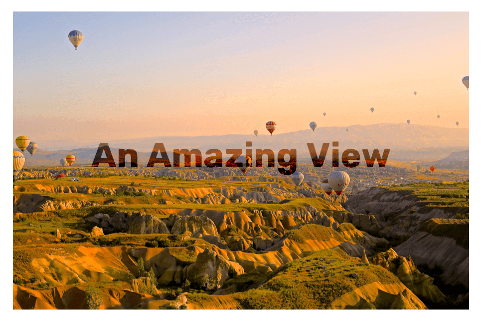
In the above design, I added the following to the title:
.hero-title {
  color: #000;
  mix-blend-mode: overlay;
}
It’s not only about changing the blending mode. We can get more creative by creating animations, for example.
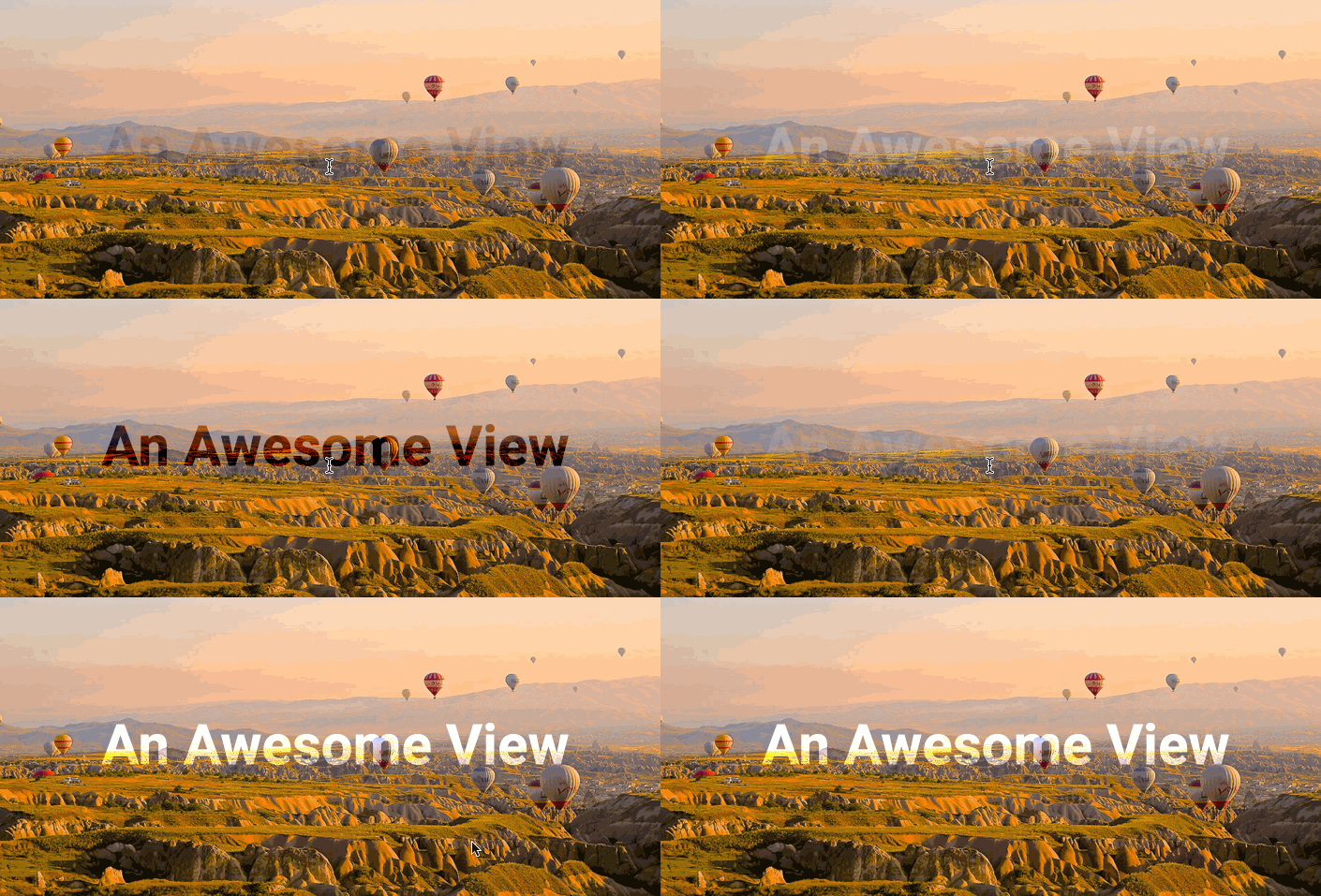
In CSS, I added an animation that changes the color from white to black.
.hero-title:hover {
  animation: heroTitle 1s ease-out infinite alternate;
}
@keyframes heroTitle {
  to {
    color: #000;
  }
}
In this example, I wanted to explore how the text will blend with leaves background. Since the image contains dark and light spots, this will play a useful role in making the text look like it’s moving under each leaf.
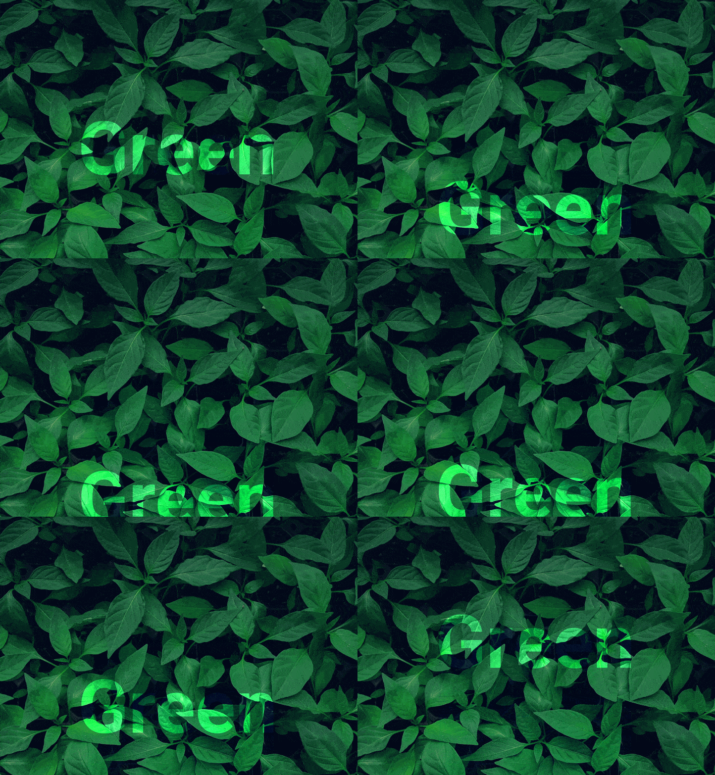
It’s also possible to use text stroke and make the text fill transparent. This will result in stroke blending with the background.
.hero-title {
  color: transparent;
  -webkit-text-stroke: 4px #d3ffd3;
}

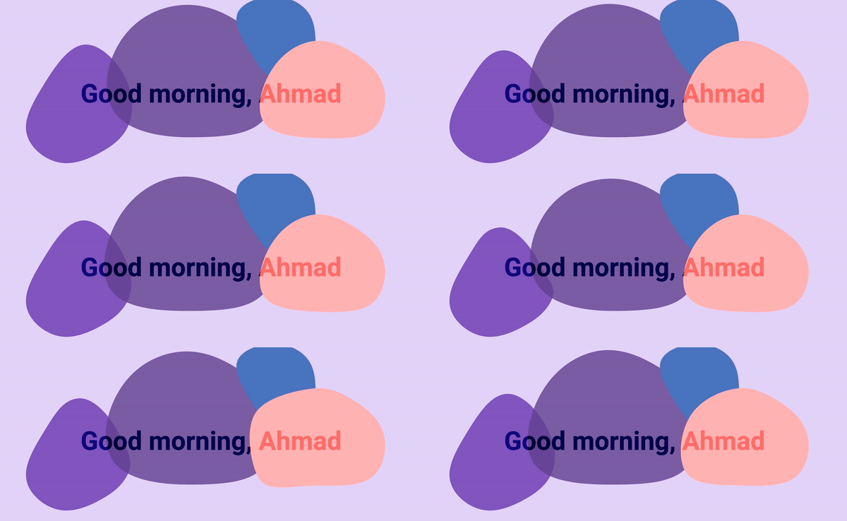
Another interesting effect is to have a title over a background with vector and shapes. It gets more fun when the shape’s colors are different.
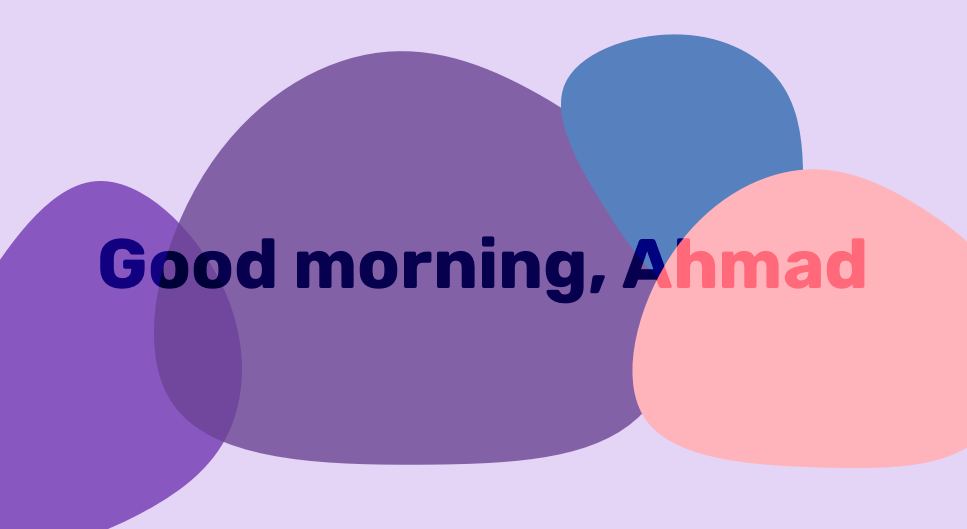
What can we do with those blob shapes? The possibilities are endless, but I’ll explore a few with you. I used MorphSVG plugin to morph the path of each blog shape. This resulted in an interesting effect:
Now that I understood the basic use cases, I wanted to explore a more in-depth example that can benefit the way I work.
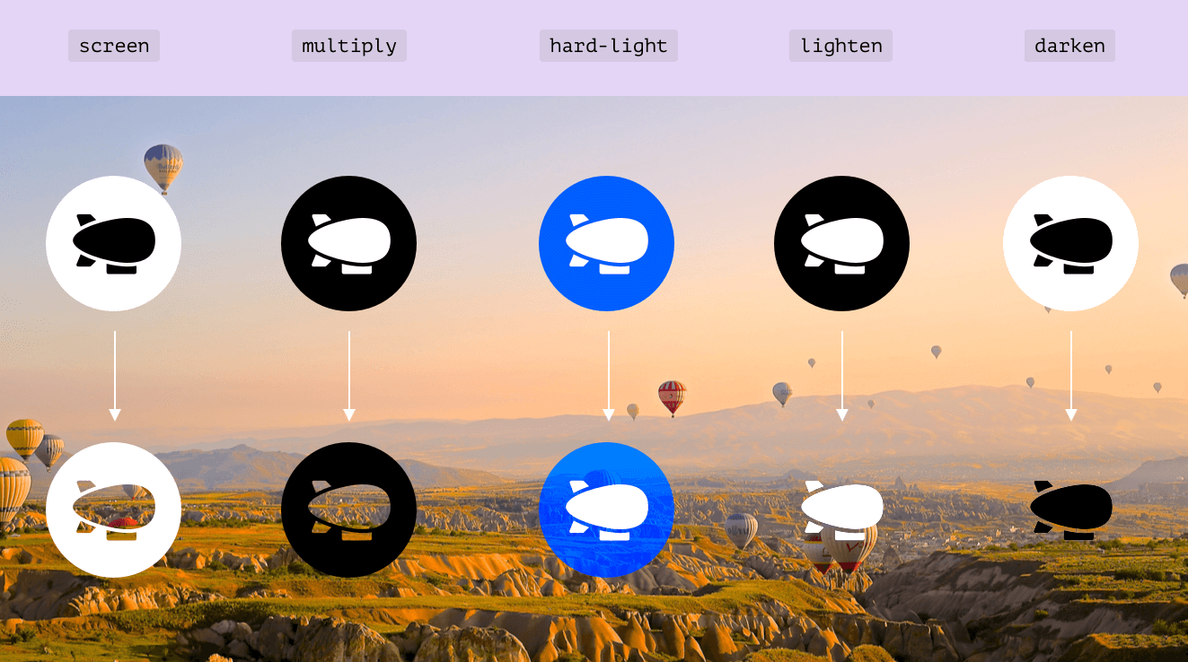
The effect that caught my eye is mix-blend-mode: screen when used with elements that have a white background and a black foreground.
Let’s explore some cool use cases for that.
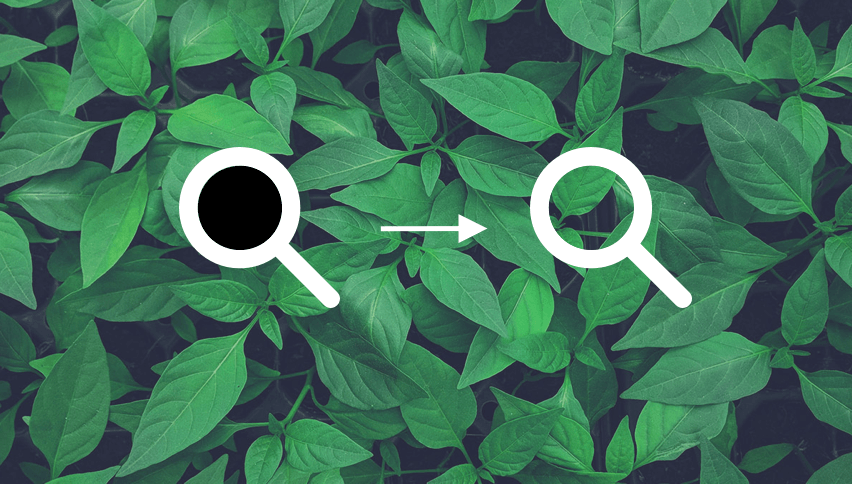
I used an SVG and applied the following to it. Notice how the black area is turned to transparent when using screen. Isn’t that cool?
svg {
  mix-blend-mode: screen;
}
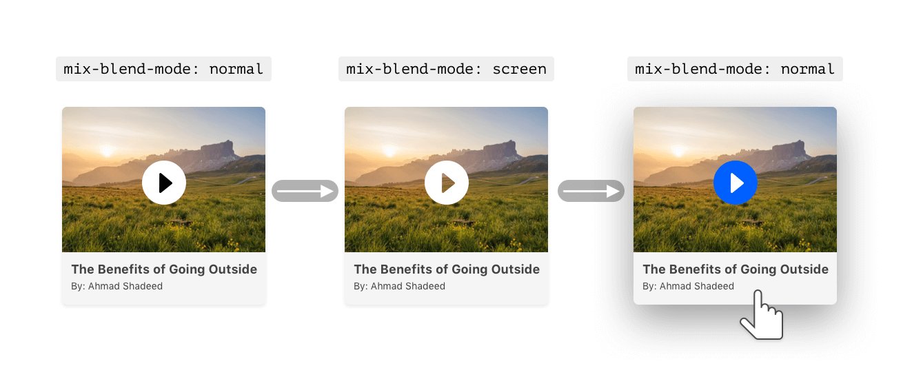
For me, this is a very useful use case. I often need to add a play icon to indicate that an article has a video, so I end up using an SVG that is transparent from the center.
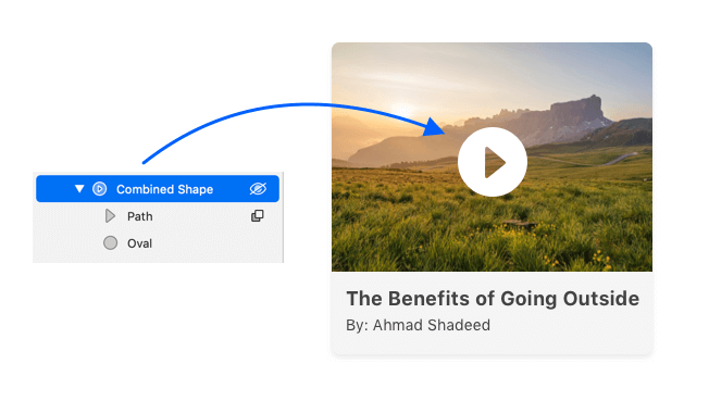
This might sound correct, but it’s limiting. What if I wanted to add a hover effect so that the triangle is filled? It’s not possible since the shape is subtracted in SVG. A workaround for that would be to place a circle behind the SVG and to color it on hover.

For me, this is not enough. I also want to do vice versa. The triangle needs to be in white, and the rest in blue.
Thanks to blending modes, I can use the technique to leverage that for free by controlling the inline SVG on hover.
.article__play {
  mix-blend-mode: screen;
}

.article:hover .article__play {
  mix-blend-mode: normal;
}

.article:hover .article__play {
  .play__base {
    fill: #005fff;
  }

  .play__icon {
    fill: #fff;
  }
}
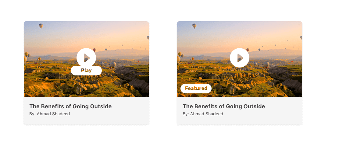
In addition to that, it is possible to apply the same effect to elements that contain text. The desired result is as below:
It could be a label indicating the article is featured, for example. I learned about this from inspecting Forkgasm website by Lea Verou.
<div class="article-label">Featured</div>
.article-label {
  background: #fff;
  color: #000;
  mix-blend-mode: screen;
}
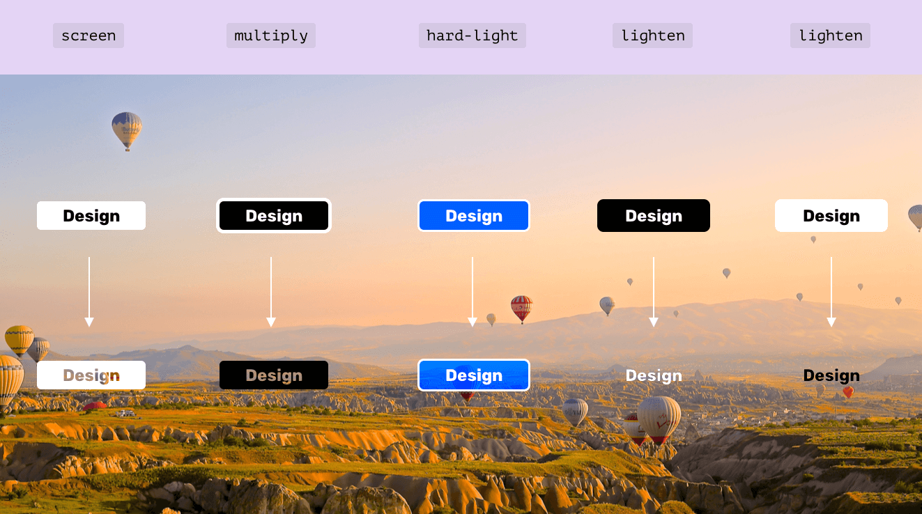
This is not limited to mix-blend-mode: screen only. It can be used with other modes which create interesting effects. Play with the demo below to see for yourself:
See the Pen Mix Blend Mode - Real Elements #3 by Ahmad Shadeed (@shadeed) on CodePen.
Another case is to use cut-out images and blend them with the background beneath them. The result is quite interesting.
img {
  position: absolute;
  right: -15px;
  top: 0;
  width: 110px;
  mix-blend-mode: screen;
}
I used skalgubbar website to get free cut-out images. The idea is to place the image on the right side, with a title and description on the left.

Also, it can be better by adding multiple backgrounds for each card. See below:

I know this trick since my early days in Photoshop. Sometimes, I need a logo for a brand, and it’s tough to get a transparent PNG version of it. With blend modes, this is easy to fix.
I mocked up Facebook and Amazon logos and added a white background under each one.
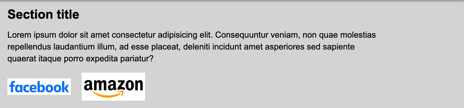
Now comes the solution. I added the following CSS:
img {
  mix-blend-mode: multiply;
  filter: contrast(2);
}
Notice that I added filter: contrast(2) to increase the contrast of the logos. Applying the blending effect made them a bit darker than their original colors.
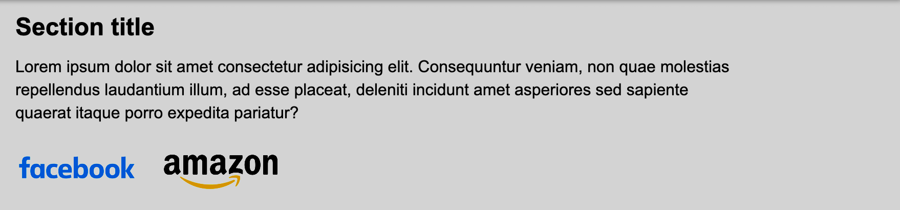
Issue solved! Of course, I don’t recommend to use this. But if I’m forced to, I will use it to save time, and once the original logo arrives, I can replace it and remove the blending effect.
It turns an element into a stacking context, which makes a group and isolates the applied blending mode to the element only. By default, all elements have isolation: auto unless there is an operation that creates a new stacking context. Let’s explore an example.
<div>
  <span>CSS is Awesome</span>
</div>
div {
  isolation: isolate; /* Creates a new stacking context */
}

span {
  mix-blend-mode: difference;
}
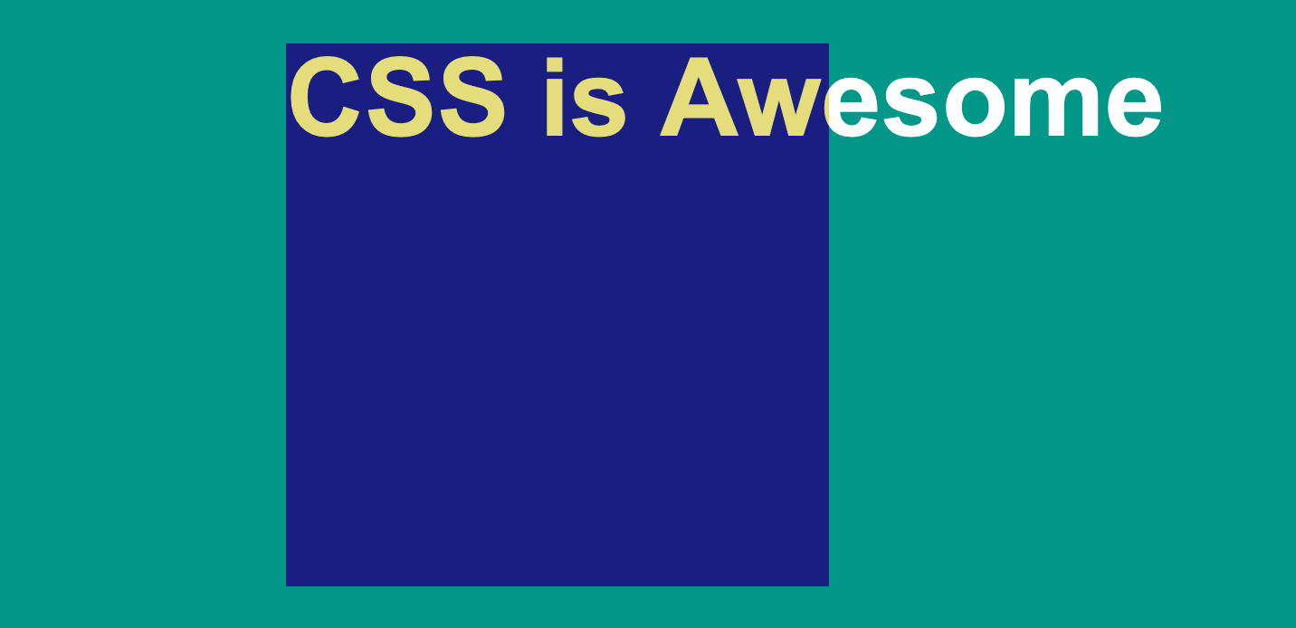
As you see, the text “CSS is Awesome” is blending within the boundaries of its parent only. Anything that goes outside is not blended. In other words, it’s isolated.
The isolation can happen by using properties that create a new stacking context. For example, if the parent element has an opacity property, this will affect the result.
<div>
  <img src="cake.jpg" alt="" />
</div>
div {
  opacity: 0.99; /* Creates a new stacking context, which result to an isolated group */
}

img {
  mix-blend-mode: difference;
}
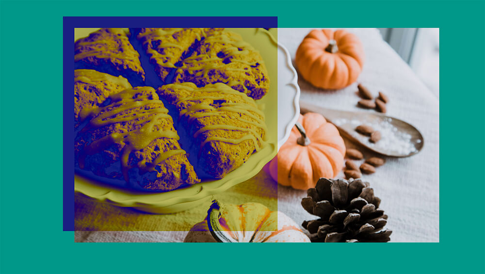
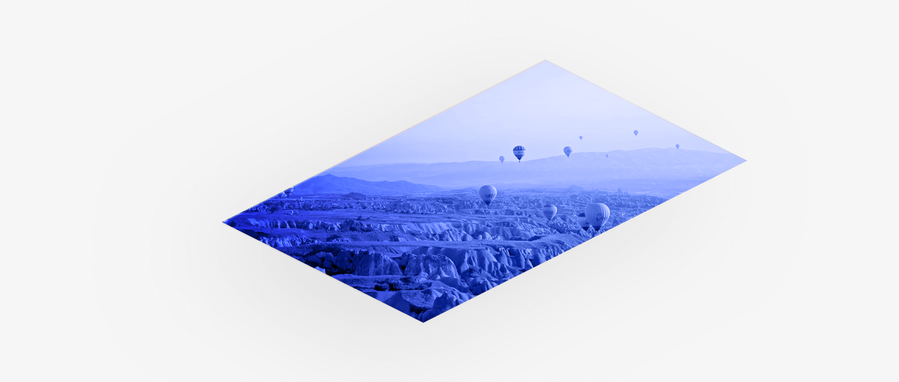
background-blend-modeIt works similarly to mix-blend-mode, but with multiple background images. Each background can have its own blending mode. Let’s take an example.
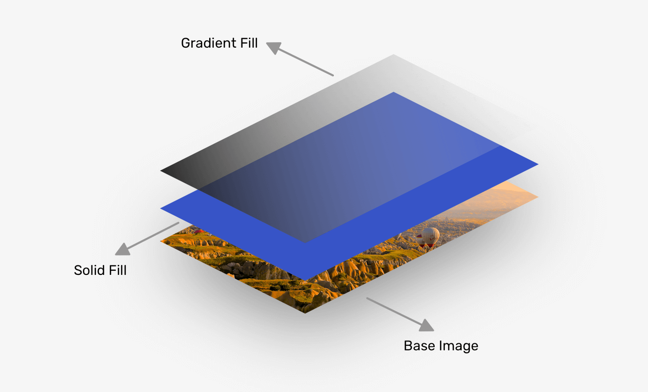
In the example, there are three layers that will blend together: Base image, Solid Fill, and Gradient Fill.
.elem {
  background: linear-gradient(45deg, #000 10%, transparent),
    linear-gradient(#3754c7, #3754c7), url(nature.jpg);
  background-size: cover;
  background-blend-mode: overlay, color;
}
In CSS, each background should be ordered in the correct way. The stacking order is from top to bottom, just like the illustrated figure above.
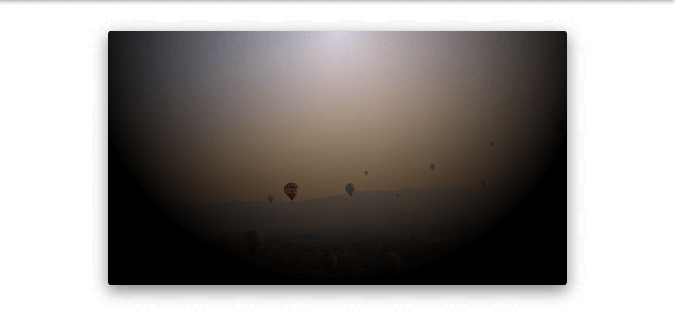
By using a radial gradient, there are some interesting results than be useful. The idea is to add a tint color to the image and make it blend with it.
:root {
  --color: #000;
  --size: 250px; /* Gradient Size */
}

.elem-1 {
  background: radial-gradient(
      circle var(--size) at center,
      transparent,
      var(--color)
    ), url(nature.jpg);
}
By applying background-blend-mode: color to the element, the result will be a desaturated version of the image.
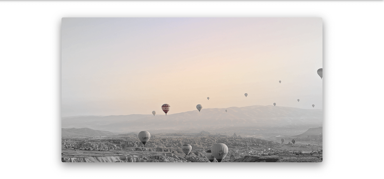
..and changing the color will result in a tint applied to the whole image. Try the demo to see that in action.
See the Pen Blend Modes - 3 by Ahmad Shadeed (@shadeed) on CodePen.
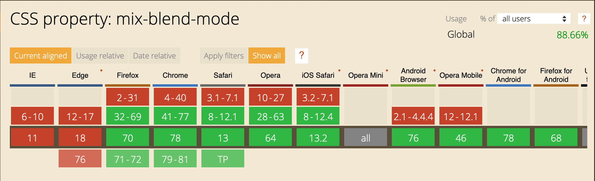
At the time of writing, the support for mix-blend-mode and background-blend-mode is great except that it’s not supported in Microsoft Edge. Make sure to provide a proper fallback when using them.
And that’s a wrap. Do you have a comment or a suggestion? Please feel free to ping me on @shadeed9.
此内容由惯性聚合(RSS阅读器)自动聚合整理,仅供阅读参考。 原文来自 — 版权归原作者所有。