


I spent years teaching CSS layout on this blog. I put everything I know into The Layout Maestro course: 70+ lessons and 150+ interactive examples that teach you how to think CSS layouts, not just memorize syntax.
When I first started using CSS variables, I wasn’t fully aware of the potential. When used in the right way, we can shorten the time and effort to do specific things in CSS.
If you don’t know about CSS variables, I recommend you to read this article to learn about them. Once you’re good with it, it will be easier for you to follow along. The goal of this article is to focus heavily on useful use-cases for CSS variables that are not only about design tokens like colors.
Are you ready? Let’s dive in!
If you’re using CSS variables just like CSS pre-proccerssors (Sass, for example), then you aren’t taking the full benefit of them. Consider the following:
:root {
  --brand-primary: #7777e9;
  --brand-secondary: #c96fde;
}

.title {
  color: var(--brand-primary);
}
…is no difference than writing the following in Sass:
$brand-primary: #7777e9;
$brand-secondary: #c96fde;

.title {
  color: $brand-primary;
}
Using CSS variables only for color variables isn’t wrong at all, but it’s like getting an Apple M1 MacBook to browse the internet, even though your old 2012 is still working fine. What’s the point of getting a cutting-edge computer to do the same job while you have a chance to use its full potential? That’s exactly what I feel about using CSS variables, you know, just for storing colors.
The goal of this article is to walk you through use-cases where CSS variables shine. Let’s dive in!
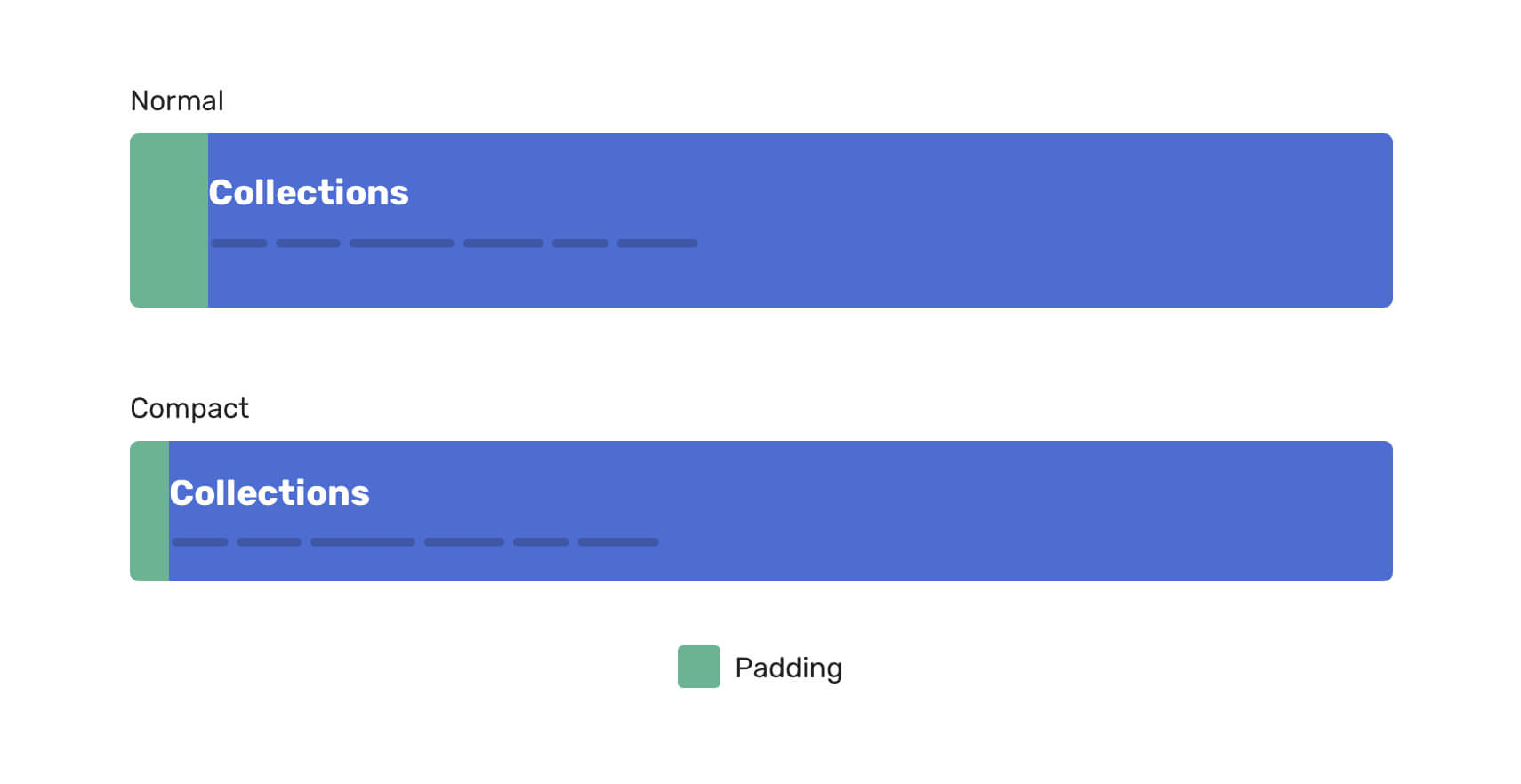
In some scenarios, you might need to tweak the longhand version of a property. For example, a padding property can differ from a component variation to another. Instead of rewriting the longhand again, we can use a CSS variable for the thing that will change, and it will be overridden via the variation CSS class.
<!-- Base component -->
<header class="page-header">
  <h2>...</h2>
  <p>...</p>
</header>

<!-- Component variation -->
<header class="page-header page-header--compact">
  <h2>...</h2>
  <p>...</p>
</header>
.page-header {
  --padding-start: 2.5rem;
  --padding-block: 2rem;
  padding: var(--padding-block) 1rem var(--padding-block) var(--padding-start);
}

.page-header--compact {
  --padding-start: 1.5rem;
  --padding-block: 1rem;
}
Notice that we only need to change the CSS variable value to alter the padding. Without CSS variables, we will need to type the full longhand of the padding property only to override one value of it.
.page-header {
  padding: 2rem 1rem 2rem 1.5rem;
}

.page-header--compact {
  padding: 1rem 1rem 1rem 2.5rem;
}
The above can also apply to using margin.
When it comes to CSS backgrounds, CSS variables can help us in reducing the CSS code we write. Even better, it can make the CSS look simpler to read.
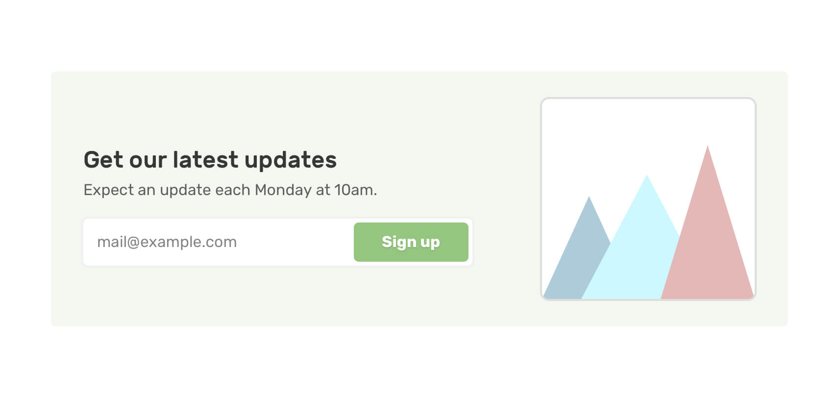
In a user interface, you might need to include an image for decorative purposes only. In such a case, using a <div> with a background-image is a good idea. When the interface needs to be dynamic, the value of the image needs to be injected with JavaScript.
Without CSS variables, the HTML will look like this:
<section
  class="newsletter"
  style="background-image: url('/assets/ui/decoraitve/newsletter-lg-aj1891101.svg')"
></section>
Instead of directly altering the background-image property, we can do the following.
<section
  class="newsletter"
  style="--thumb:url('/assets/ui/decoraitve/newsletter-lg-aj1891101.svg')"
></section>
.newsletter {
  background-image: var(--thumb);
  background-size: cover;
  background-position: 100% 50%;
}
Notice that we need to include the url() without the CSS variable
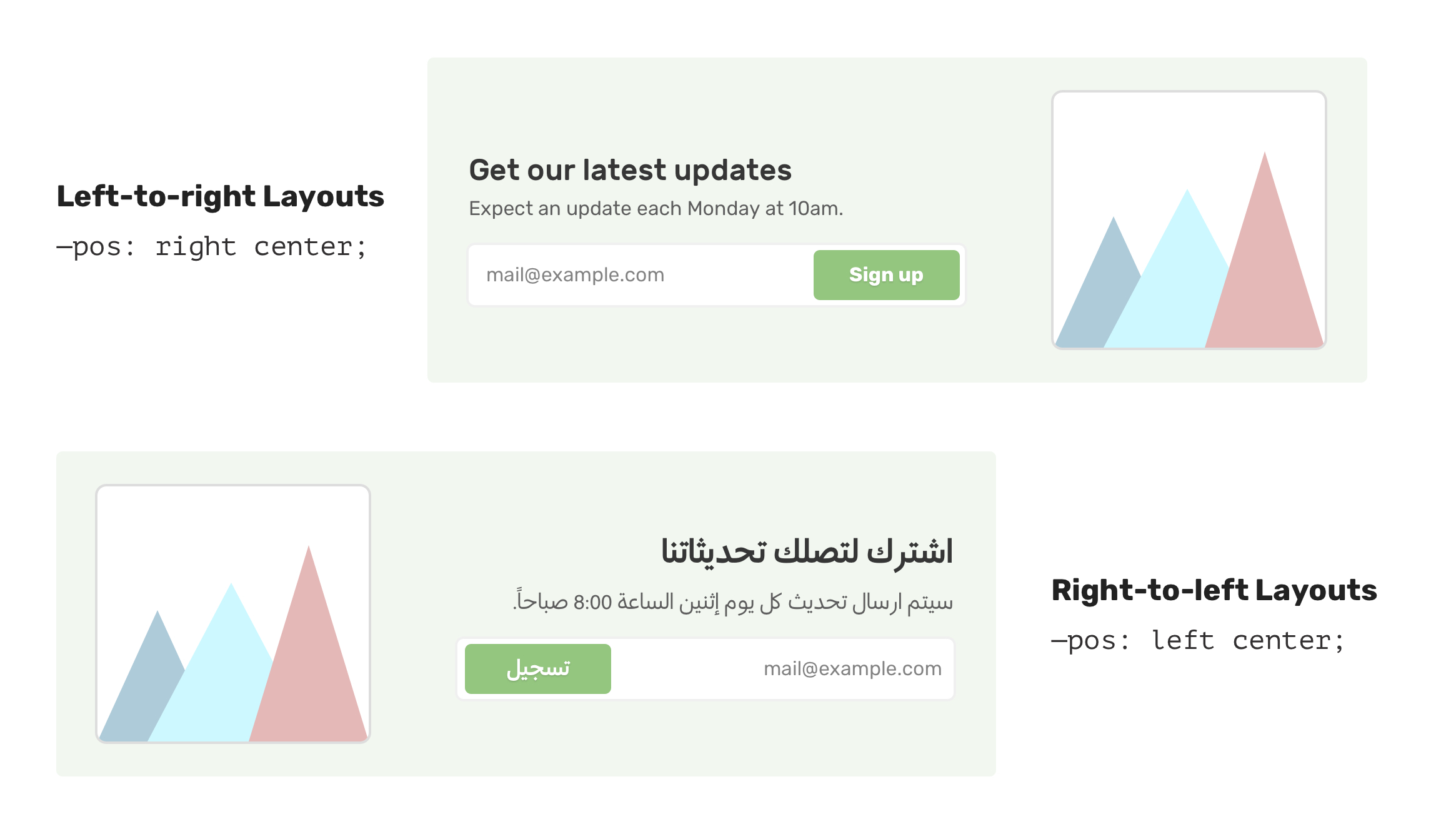
In the previous example, the background image is placed on the right side. For a right-to-left layout (RTL), the background position should be flipped.
.newsletter {
    --pos: 100% 50%;
    background-image: var(--thumb);
    background-size: cover;
    background-position: 100% 50%;
}

html[dir="rtl] .newsletter {
    background-position: 0% 50%;
}
We can get help from CSS variables to make this easier.
.newsletter {
    /* other styles */
    background-position: var(--pos);
}

html[dir="rtl] .newsletter {
    --pos: 0% 50%;
}
This can also be related to building multilingual layouts. A gradient angle can be 45deg by default, and it needs to be -45deg for RTL layouts.
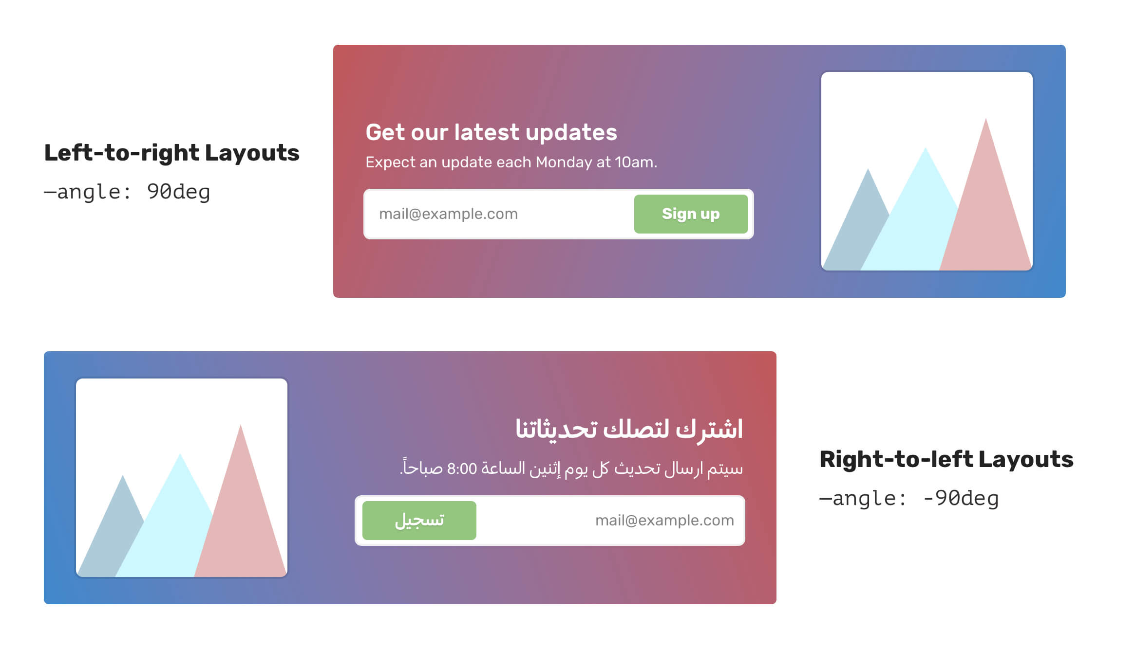
.element {
    --angle: 90deg;
    background: linear-gradient(var(--angle), #4088vb, #C05858);
}

html[dir="rtl] .element {
    --angle: -90deg;
}
In regards to the gradient angle, using CSS variables with radial gradient is very handy to tweak the position. In the following example, the gradient’s position has been changed by only altering the --pos variable.
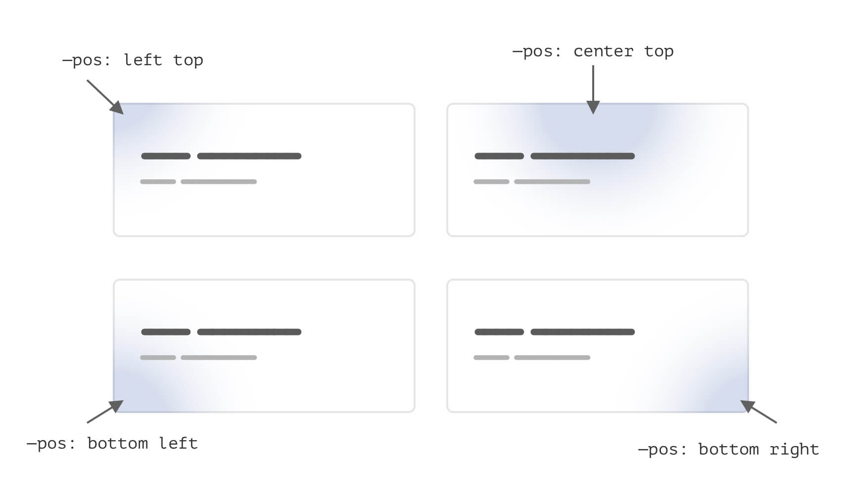
Here is how we can do this without CSS variables.
.card {
  background: radial-gradient(
    circle 200px at center top,
    rgba(64, 136, 203, 0.5),
    #f7f7f7
  );
}
Let’s suppose that we have a variation of the card .card-2 and it should have a different position. We need to write the following:
.card-2 {
  background: radial-gradient(
    circle 200px at center top,
    rgba(64, 136, 203, 0.5),
    #f7f7f7
  );
}
The whole gradient declaration is being overridden. Can we do better? Sure thing. Notice how the variation only has the adjusted value for the --pos variable.
.card {
  --pos: center top;
  background: radial-gradient(
    circle 200px at var(--pos),
    rgba(64, 136, 203, 0.5),
    #f7f7f7
  );
}

.card-2 {
  --pos: left top;
}
A useful use-case for CSS variables is to alter the clip-path: polygon() values on mobile versus desktop.
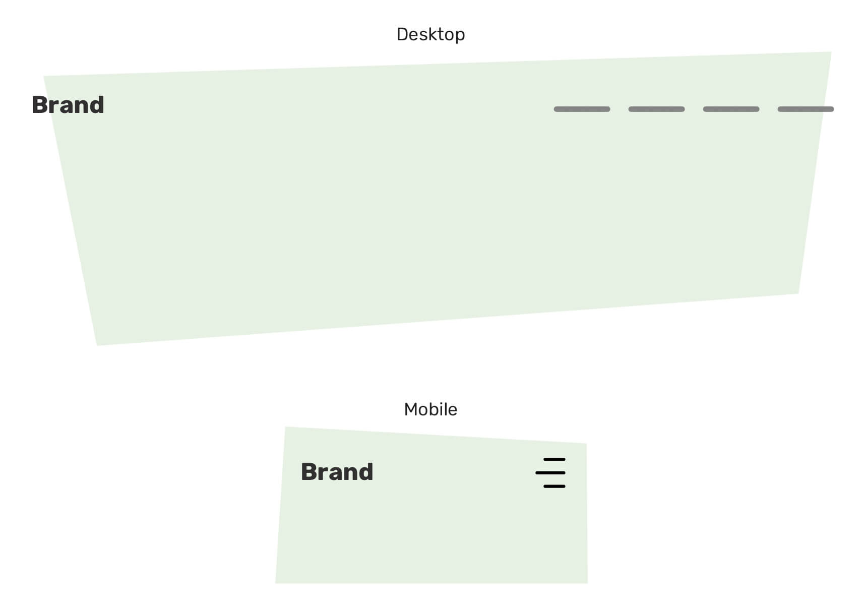
In the figure above, the polygon points need to be changed, and using CSS variables can help in making that process easier.
.hero {
  --first: 4% 7%;
  --second: 80% 0;
  --thrid: 100% 95%;
  --fourth: 10% 100%;
  clip-path: polygon(
    var(--first),
    var(--second),
    var(--thrid),
    var(--fourth)
  );
}

@media (min-width: 40rem) {
  .hero {
    --second: 96% 0;
    --thrid: 92% 82%;
  }
}
If you want to learn more about CSS clip-path, here is an article by yours truly.
A perfect use case for CSS variables is to combine them with hsla() colors. That way, we can create dynamic components that we can them by only changing one or a few CSS variables.
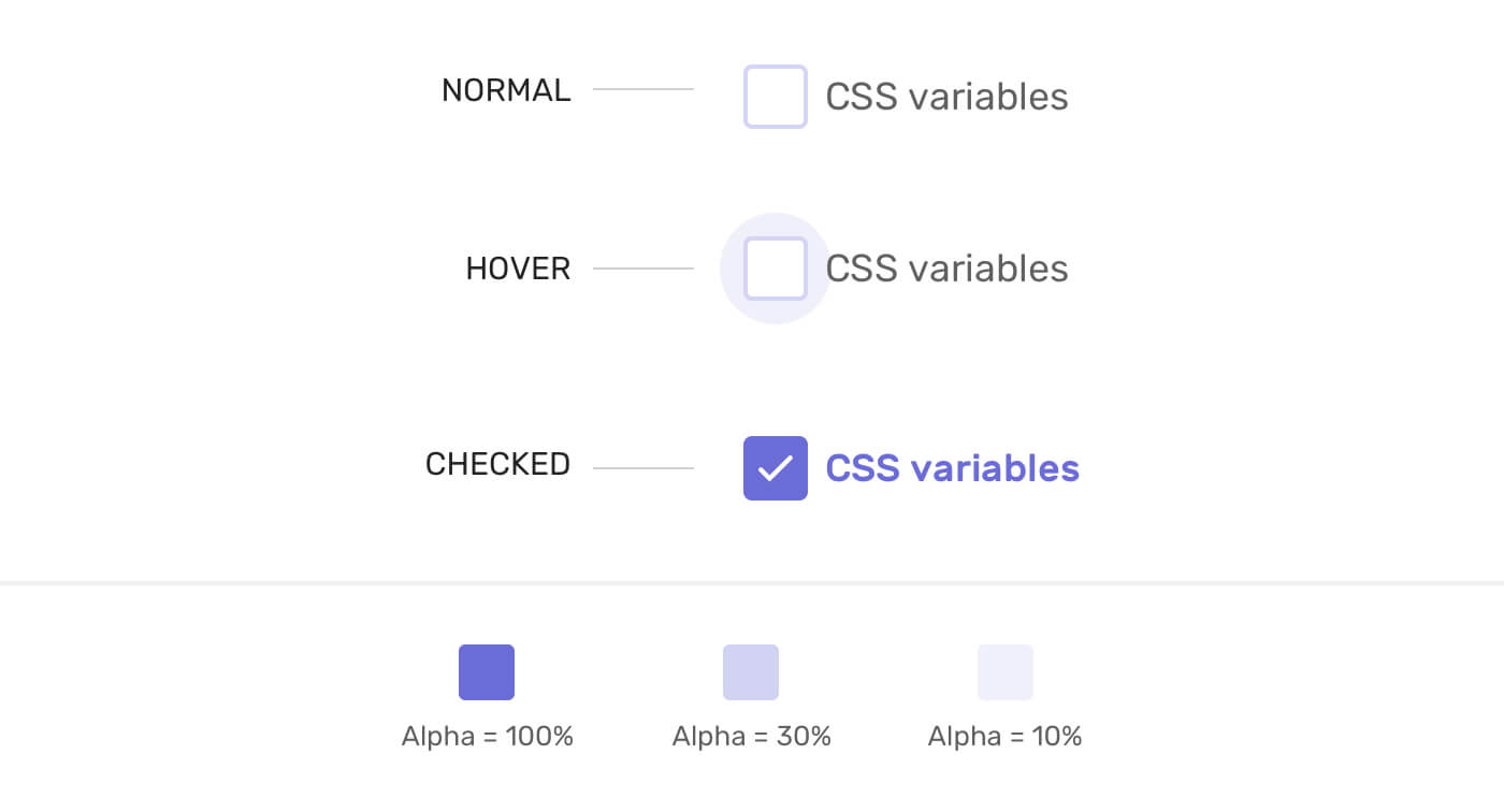
The first thing I did is to define the hsla() values to the root element of the component.
.form-item {
  --primary-h: 240;
  --primary-s: 56%;
  --primary-l: 63%;
  --primary-alpha: 100%;
}
With that, I can use these properties in the hsla() color function.
/* The circle that appears on hover */
.form-item__label:after {
  --primary-alpha: 0;
  background-color: hsla(
    var(--primary-h),
    var(--primary-s),
    var(--primary-l),
    var(--primary-alpha)
  );
}

.form-item__label:hover:after {
  --primary-alpha: 15%;
}
See the Pen Practical CSS Vars: Checkbox by Ahmad Shadeed (@shadeed) on CodePen.

I was working on a UI for a client project, and I stumbled upon this bit. We have a section with two tapes (one at the top, and the other at the end). As a requirement, I need to change the tape color, rotation, and size without writing custom CSS for each one.
CSS variables to the rescue!
First, I prepared the SVG in Adobe Illustrator. I divided the tap into three layers:
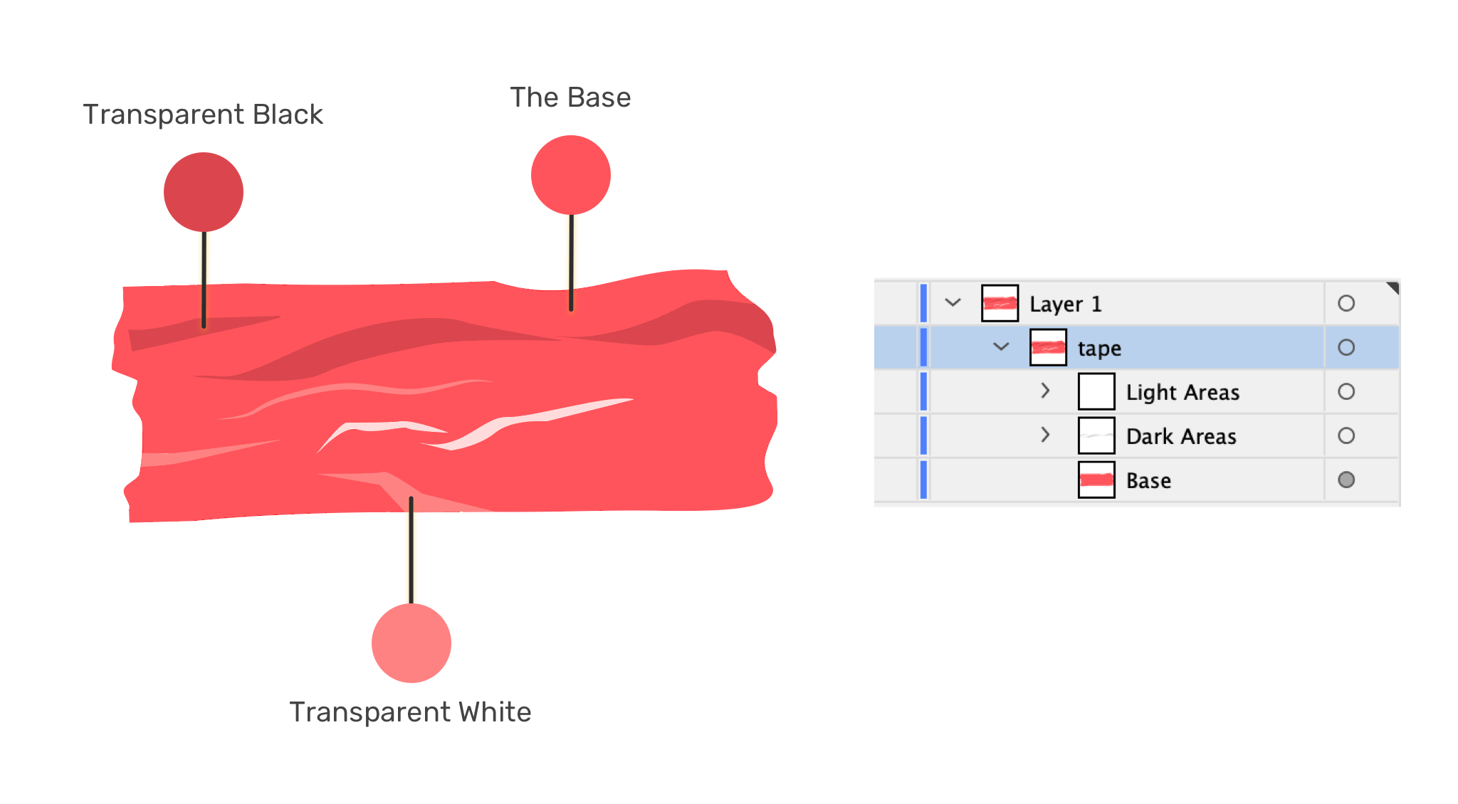
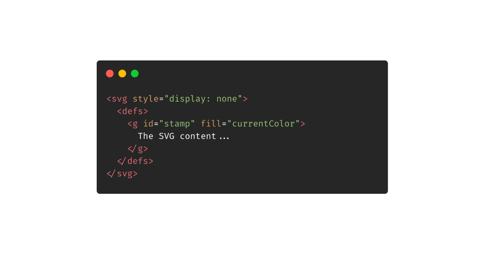
Then, I exported the SVG and placed the content of it inside <defs> so it can be easy to reuse it. Notice that I added currentColor! This is the magic value that will make it work.
Finally, we need to define the size and rotation in CSS.
.tape {
  width: var(--size);
  transform: rotate(var(--angle));
}
<svg
  class="tape"
  style="--angle: 10deg; color: red; --size: 120px;"
  aria-hidden="true"
  focusable="false"
  viewBox="0 0 123 47"
>
  <use href="#tape"></use>
</svg>
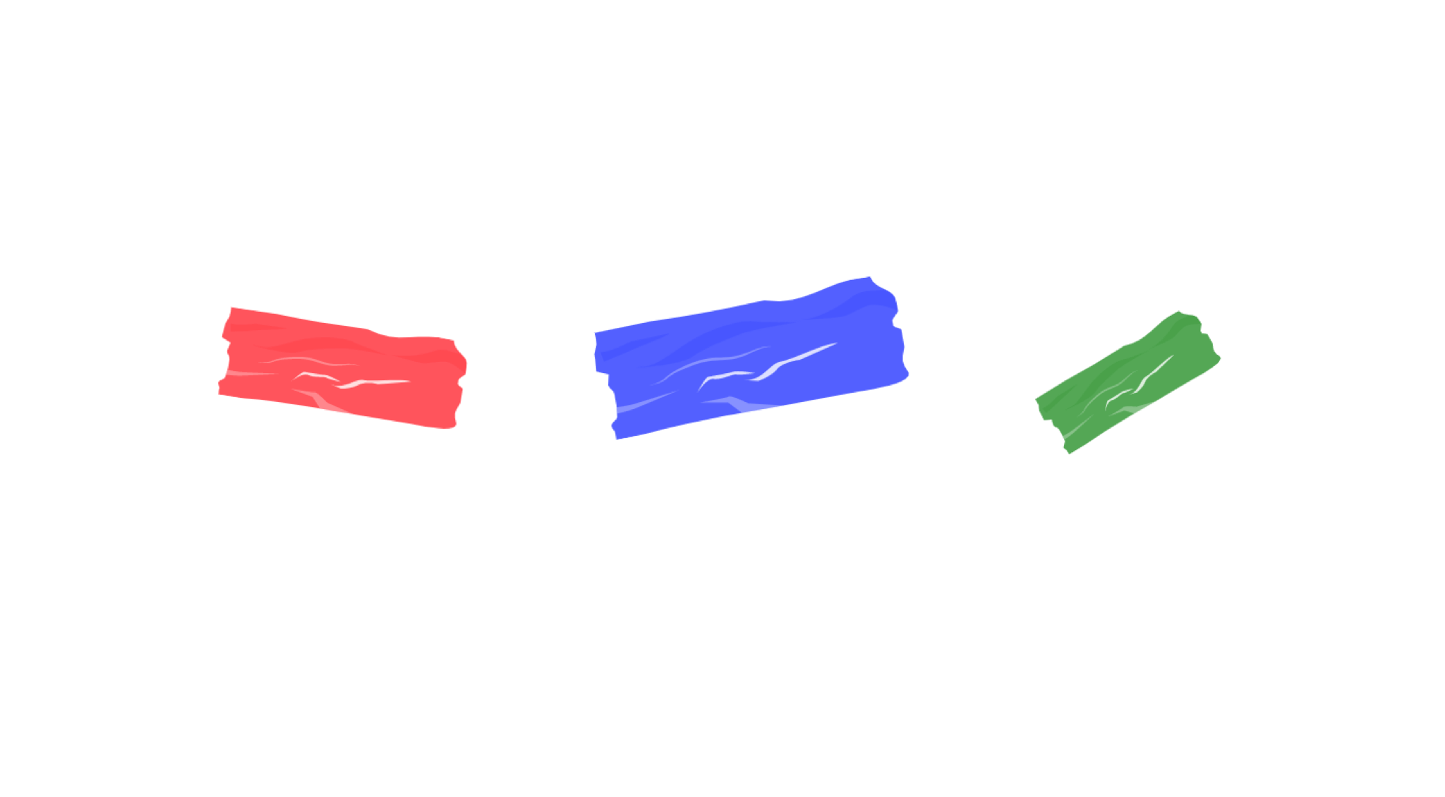
That’s it. We created a custom SVG that can be customized as needed. Isn’t that powerful?
See the Pen SVG Tape by Ahmad Shadeed (@shadeed) on CodePen.
I learned about this interesting concept from a must-watch talk by Lea Verou. The idea is that we set initial CSS variables for a specific property, and then we can override the variables when needed.
Here is an example of where we can use this concept. In many cases, I need to have a wrapper centered, which can be solved by adding margin: 0 auto to the wrapper element. In cases where there is a custom element that needs to be centered, we can do something like the following:
<div class="featured-section u-center"></div>
.u-center {
  --mx: initial;
  --my: initial;

  margin: var(--my) var(--mx);
}

.featured-section {
  --mx: auto;
  --my: 2rem;
}
First, I created a utility class .u-center with default horizontal and vertical margin values. I can add that class to the element and then override the CSS variables. This can be handy if an element needs some margins on the top and bottom sides, for example.
The calc() function can be very handy with CSS variables. We can create a base size for a component, and then change only one variable to make it smaller or bigger.
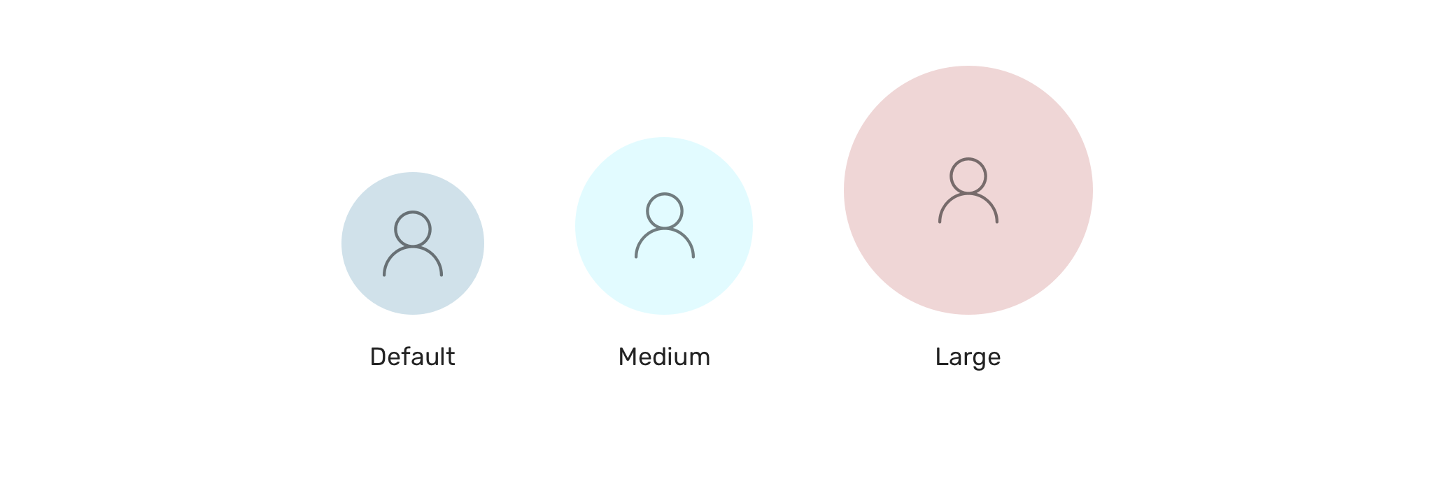
This can be useful for different use-cases. Let’s suppose that we need to have variations of a user avatar.
.c-avatar {
  width: calc(var(--size, 32) * 1px);
  height: calc(var(--size, 32) * 1px);
}
Notice that I used var(--size, 32). If the --size variable is not defined, then the 32 will be used as a fallback. The 1px is important to append px to the final number.
With that, we can create variation classes by just adding the --size CSS variable.
.c-avatar--medium {
  --size: 64;
}

.c-avatar--large {
  --size: 128;
}
With CSS variables, it’s possible to change a pseudo-element property since it’s inherited from its parent. Consider the following example:
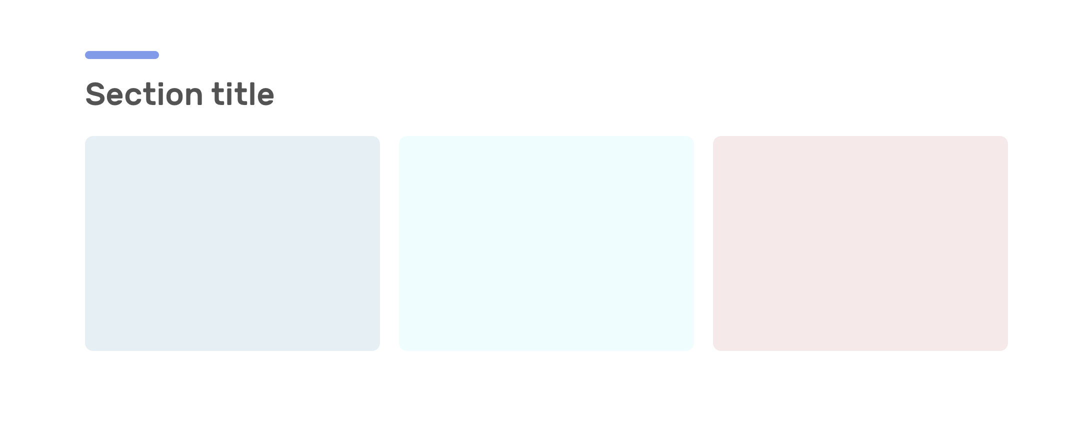
The section title has a decorative purple line which is as a pseudo-element. We can pass a CSS variable to the title, and the pseudo-element will inherit it.
.section-title {
  --dot-color: #829be9;
}

.section-title:before {
  content: "";
  background-color: var(--dot-color);
}
Not only that, but we can also mimic changing pseudo-element color via Javascript.
Another useful usage for CSS variables is using them as inline styles. This can open a lot of possibilities for customizing a component by just changing one or multiple variables.
Consider the following example.
.o-grid {
    display: grid;
    grid-template-columns: repeat(auto-fit, minmax(var(--item-width, 200px), 1fr);
    grid-gap: var(--gap);
}
We have a custom grid, and the grid item default width is 200px. In the HTML, we can override that by resetting the CSS variable to something else.
<!-- Example 1 -->
<div class="o-grid" style="--item-width: 250px;">
  <div></div>
  <div></div>
  <div></div>
</div>

<!-- Example 2 -->
<div class="o-grid" style="--item-width: 350px;">
  <div></div>
  <div></div>
  <div></div>
</div>
Isn’t that useful? If you’re interested more in CSS variables with inline styles, I wrote about it in detail.
As you might’ve seen, there are many use-cases for CSS variables other than using them for colors. I’m sure that I didn’t even scratch the surface with what’s possible with them. If you have a unique use case, I would love to hear from you!
Thank you for reading.
此内容由惯性聚合(RSS阅读器)自动聚合整理,仅供阅读参考。 原文来自 — 版权归原作者所有。