


I spent years teaching CSS layout on this blog. I put everything I know into The Layout Maestro course: 70+ lessons and 150+ interactive examples that teach you how to think CSS layouts, not just memorize syntax.
When I redesigned my website, I needed a way to have the feature image play nicely regardless of where it’s placed or the viewport/container size.
This is the design I aim to implement:
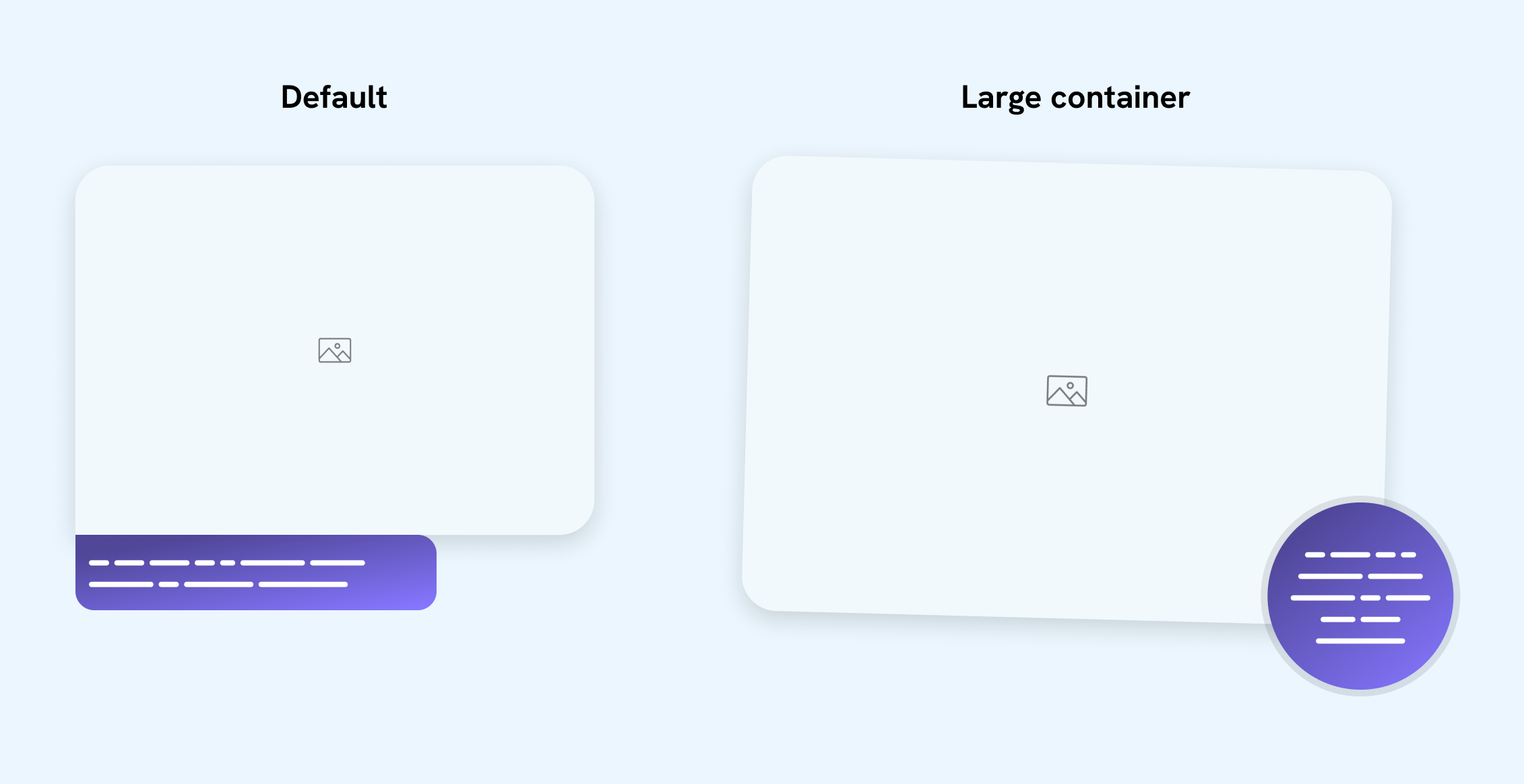
I have an image and a caption. On small sizes, the caption is displayed in a classic style. If the container is large enough, I want to rotate the image and show the caption in a circular style, positioned at the bottom-right corner.
How we can build that in CSS?
Before container queries, we could have built it like this:
.figure {
  figcaption {
    /* Classic style. */
  }

  @media (min-width: 600px) {
    figcaption {
      position: absolute;
      right: 0;
      bottom: 0;
      /* CSS needed to make the caption in a circular style. */
    }
  }
}
Here is a demo:
When the content wraps to a new line, there is enough space for the figure, but the figure stays with the classic look. Can we do better?
Here is the same demo but with container queries instead. I highlighted four different viewport sizes so you can understand the value of using CSS container queries.
Click on the next button and see what the component looks like on different viewport sizes.
Small view, classic style.
Container width > 250px
The component layout is alternating between the stacked and the circular design. This wouldn’t happen so smoothly without container queries.
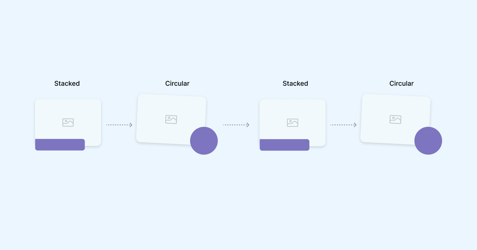
If we use media queries for this, the CSS will look something like this:
figure {
  /* Stacked style */

  @media (min-width: 400px) {
    /* Circular style */
  }

  @media (min-width: 900px) {
    /* Stacked style */
  }

  @media (min-width: 1100px) {
    /* Circular style */
  }
}
Not to mention that this can easily fail if we change the design or content.
Let’s explore how to build that.
For containment to work, it’s important to wrap the component in a container, and then query the component according to that container. Otherwise, it will not work and it will cause an infinite loop (It will keep querying itself).
<div class="figure-wrapper">
  <figure>
    <img src="images/thumb.jpg" alt="" />
    <figcaption></figcaption>
  </figure>
</div>
Then, we need to define the figure-wrapper as a container.
.figure-wrapper {
  container-type: inline-size;
  container-name: thumbWrapper;
}
Let’s test the above out to ensure it’s working as expected. If the container is greater than 240px, add an outline to the <figure> element.
@container thumbWrapper (min-width: 240px) {
  figure {
    outline: dashed 2px deeppink;
    outline-offset: 2px;
  }
}
Try to resize the browser in the demo below and see how the outline appears if the width is 240px or more.
By default, the design is in the stacked version. If the container width is large enough, we’ll switch to the circular style.
We need to check if the figure has a <figcaption>. If yes, we need to: rotate the image.
To build that, we can use CSS :has() selector to check if there is a <figcaption> or not. I wrote an interactive guide about CSS :has in case you are interested.
figure {
  @container thumbWrapper (min-width: 250px) {
    &:has(figcaption) {
      /* Rotate the image */
      img {
        transform: rotate(1.25deg);
      }
    }
  }
}
Now that the basic CSS is here, let’s move to the layout.
Even though it’s a simple design, there are a couple of ways to build it, and they’re worth considering.
In this option, the concept is to position both the image and the caption out of the document flow.
figure {
  @container thumbWrapper (min-width:240px) {
    position: relative;

    img {
      position: absolute;
      left: 0;
      top: 0;
      width: 90%;
    }
  }
}
While the styles are applied to the image, the container height is (almost) zero due to not having any element in the normal flow.
See what the outline looks like below:
Welcome to my blog.
This is a caption of the image.
To fix that, we need to define a size for the <figure> itself, and then pass that to the image.
figure {
  @container thumbWrapper (min-width:240px) {
    position: relative;
    aspect-ratio: 4/3;
    width: 100%;

    img {
      position: absolute;
      left: 0;
      top: 0;
      /* Limit the width of the image to 85% of the container. */
      width: 85%;
    }

    .caption.caption {
      right: 0;
      bottom: 0;
    }
  }
}
It works, but for me, it’s not optimal, or not the solution that I can be happy about:
position: absolute. I try to minimize its usage wherever possible.Welcome to my blog.
This is a caption of the image.
In this solution, I need to use CSS grid to overlap both the image and caption. Let’s explore it.
In CSS grid, we can overlap items by placing them on the same column and row.
figure {
  display: grid;

  > * {
    grid-area: 1 / -1;
  }
}
Here is the result:
Welcome to my blog.
This is a caption of the image.
Next, we need to make the image size as per the design needed. To do that, we can subtract half of the caption size.
figure {
  img {
    max-width: calc(100% - var(--caption-size) / 3);
    max-height: calc(100% - var(--caption-size) / 3);
  }
}
Here is the result:
Welcome to my blog.
This is a caption of the image.
I like this solution and don’t see any issues in using it. You can read my interactive guide on CSS grid area to learn more.
In this solution, only the caption will have position: absolute, and we’ll add padding on the right and bottom sides to push the image a bit.
Welcome to my blog.
This is a caption of the image.
To mimic the effect of the image intersecting with the caption, I added padding on the bottom and right sides of the figure container.
figure {
  @container thumbWrapper (min-width:240px) {
    position: relative;
    padding-inline-end: calc(var(--caption-size) / 3);
    padding-bottom: calc(var(--caption-size) / 3);

    figcaption {
      position: absolute;
      right: 0;
      bottom: 0;
    }
  }
}
In my blog, I used this solution as I liked it the most. However, that doesn’t mean that the grid overlapping isn’t good. Both are fine to me.
To make it even better, we can use fluid CSS to make the component work on any container or screen size. We can define fluid CSS on the following:
Thanks to container query units, we can achieve fluid sizing based on the container width.
In our case, I will use the unit cqw which stands for “container query width”.
figure {
  /* The size of figcaption */
  --caption-size: clamp(6rem, 4.167rem + 13.33cqw, 10rem);

  img {
    border-radius: clamp(0.625rem, -0.625rem + 10cqw, 1.875rem);
  }

  @container thumbWrapper (min-width:240px) {
    padding-inline-end: calc(var(--caption-size) / 4 + 8cqw);
    padding-bottom: calc(var(--caption-size) / 4 + 8cqw);

    figcaption {
      width: var(--caption-size);
      height: var(--caption-size);
      font-size: clamp(0.813rem, 0.727rem + 0.63cqw, 1rem);
    }
  }
}
In the following demo, try to resize and notice how the border radius, font size, padding, and caption size are fluid.
In this interactive example, my goal is to put the component to use within different contexts and scenarios to make sure it’s working well.
I explored the following scenarios:
Change the options below to see it in action.
Container width > 250px
Default
Full width
Grid 1
Grid 2
Mobile
As you have seen, this might seem like a fairly simple component. When considering it in multiple contexts, additional challenges arise. I enjoyed building it and using modern CSS to build it out. I hope you learned something new!

I wrote a book that will help you improve your debugging CSS skills and reduce the time you spend on bugs by showing proven methods and techniques.
This year, I have reduced the book price to just $19.99. Get your copy and enhance your debugging CSS skills now.
此内容由惯性聚合(RSS阅读器)自动聚合整理,仅供阅读参考。 原文来自 — 版权归原作者所有。