


I spent years teaching CSS layout on this blog. I put everything I know into The Layout Maestro course: 70+ lessons and 150+ interactive examples that teach you how to think CSS layouts, not just memorize syntax.
If you are a front-end developer who worked with a CSS pre-pre-processor, then you’ve probably come across or used the nesting feature. It has been a popular feature and for me, it’s been one of the features that kept me using a CSS preprocessor..
This year, native CSS nesting got supported in all major browsers: Chrome, Firefox, and Safari. This is a major CSS feature that will make it easier to write CSS. In this article, I will document what I learned so far about CSS nesting and share my findings with you, along with use cases and examples.
There is no prerequisite to follow along except for your excitement and focus.
Nesting in CSS has been one of the long-awaited features for many developers. We used to rely on CSS pre-processors like Sass or Less. Let me give you a quick review:
Consider the following example. We have an icon that is nested within the selector .nav__item.
.nav__item {
  .icon {
    display: flex;
    padding: 1rem;
  }
}
The above is a valid Sass code. When compiled, it will look like the following to the browser:
.nav__item .icon {
  display: flex;
  padding: 1rem;
}
With native CSS nesting, the same CSS will work as is. Here is a figure that shows a comparison between native CSS nesting and the browser DevTools.
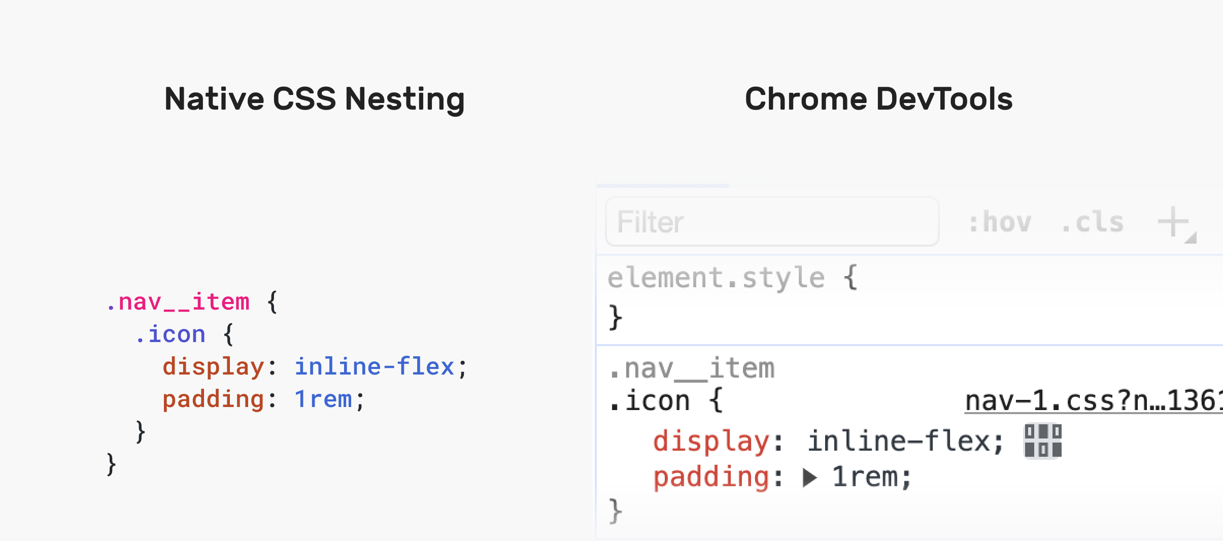
Notice how the browser is showing the CSS similar (almost) to how it’s displayed in the CSS.
If this CSS was compiled in Sass, the browser will show it like this:
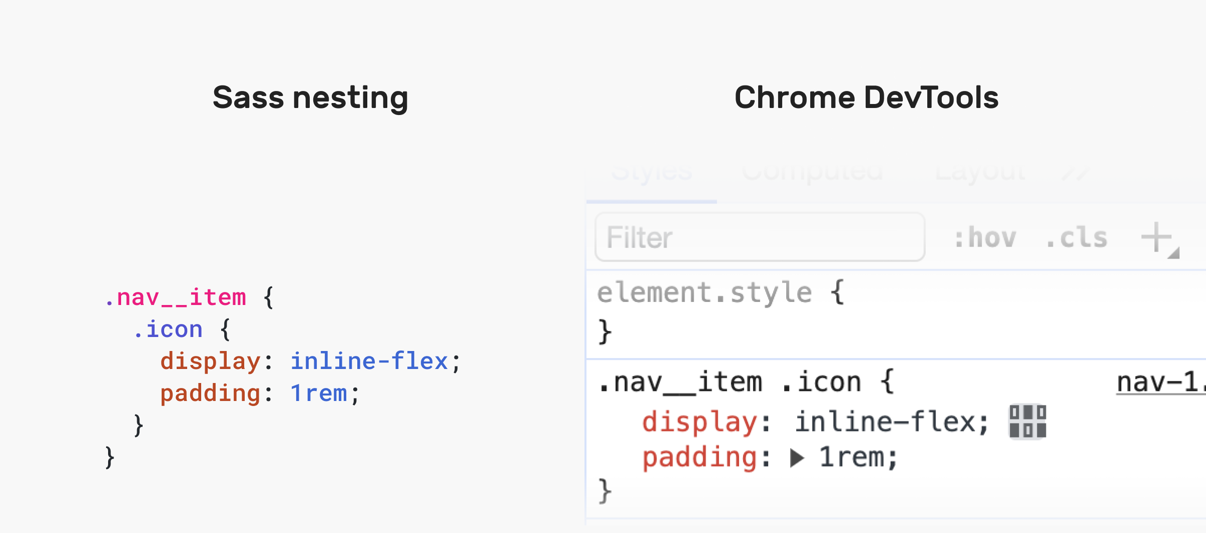
There are some valid reasons in my opinion which makes nesting CSS useful:
To educate you about CSS nesting, I will try to provide visual examples of different CSS problems and how nesting can help solve them.
First of all, you need to learn about the ampersand symbol &. There are multiple conditions where this symbol is necessary.
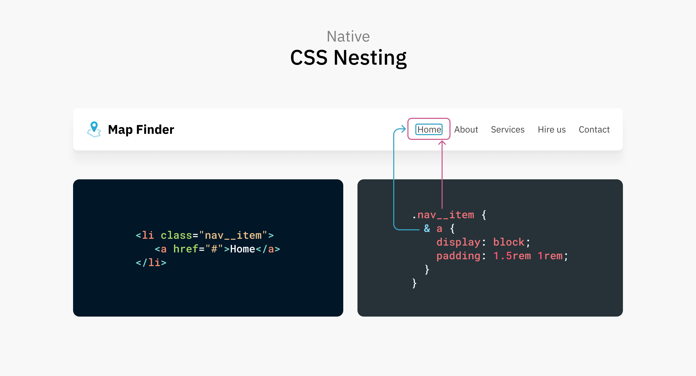
In this example, the <a> element is styled via the .nav__item. Using the ampersand symbol is optional for the CSS to be valid.
.nav__item {
  & a {
    display: block;
    padding: 1.5rem 1rem;
  }
}

/* Same as: */
.nav__item a {
}
You can also opt out of the ampersand:
.nav__item {
  a {
    display: block;
    padding: 1.5rem 1rem;
  }
}

/* Same as: */
.nav__item a {
}
Note that this is a recent update and is called Relaxed CSS nesting. It works in the latest Chrome Canary and Safari Technology Preview. Check out this post on relaxed nesting by Adam Argyle.
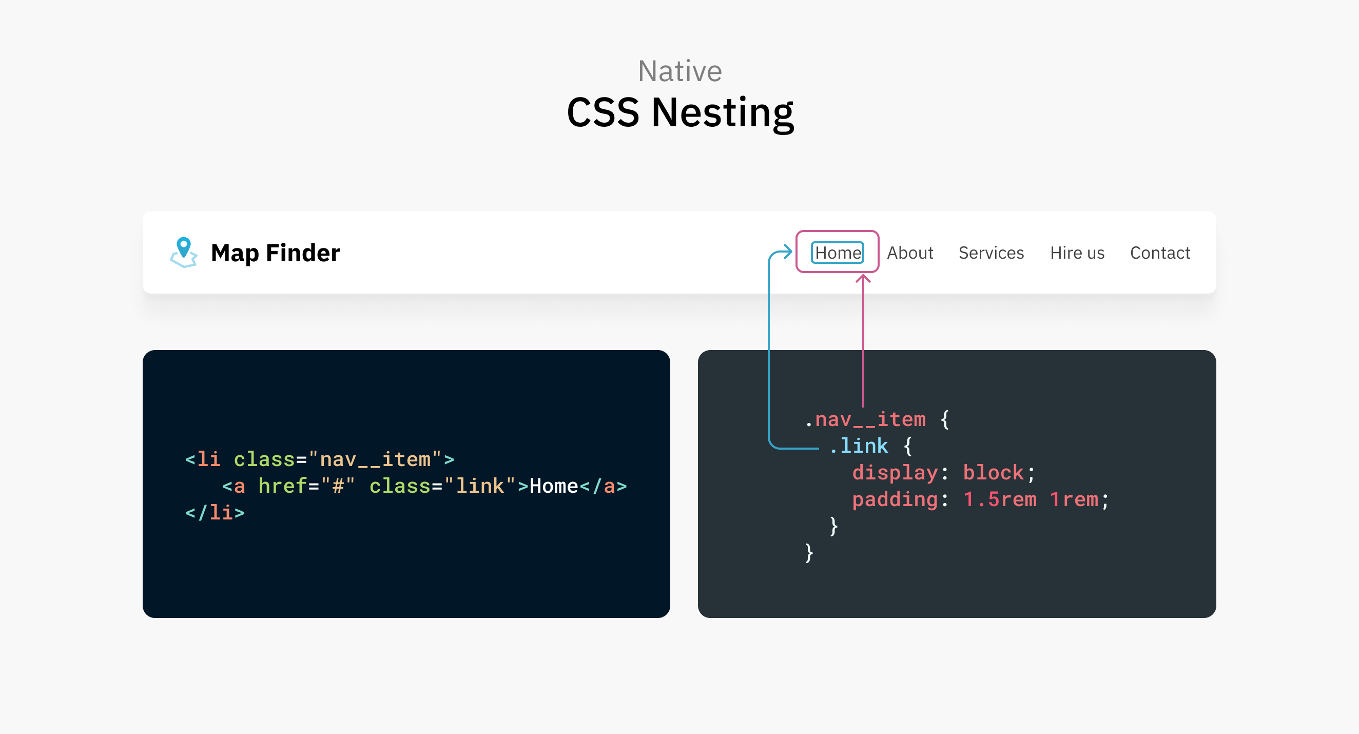
Take the same previous example, but assume that the <a> element has an HTML class.
.nav__item {
  .link {
    display: block;
    padding: 1.5rem 1rem;
  }
}

/* Same as: */
.nav__item .link {
}
No need to use the ampersand here. The class name will work fine.
One of the benefits of CSS native nesting is using combinators. Let’s take a few examples.
In the following example, I want to select every element with the class .nav__item that is preceded by another element with the same class. For that purpose, I used the adjacent sibling selector.
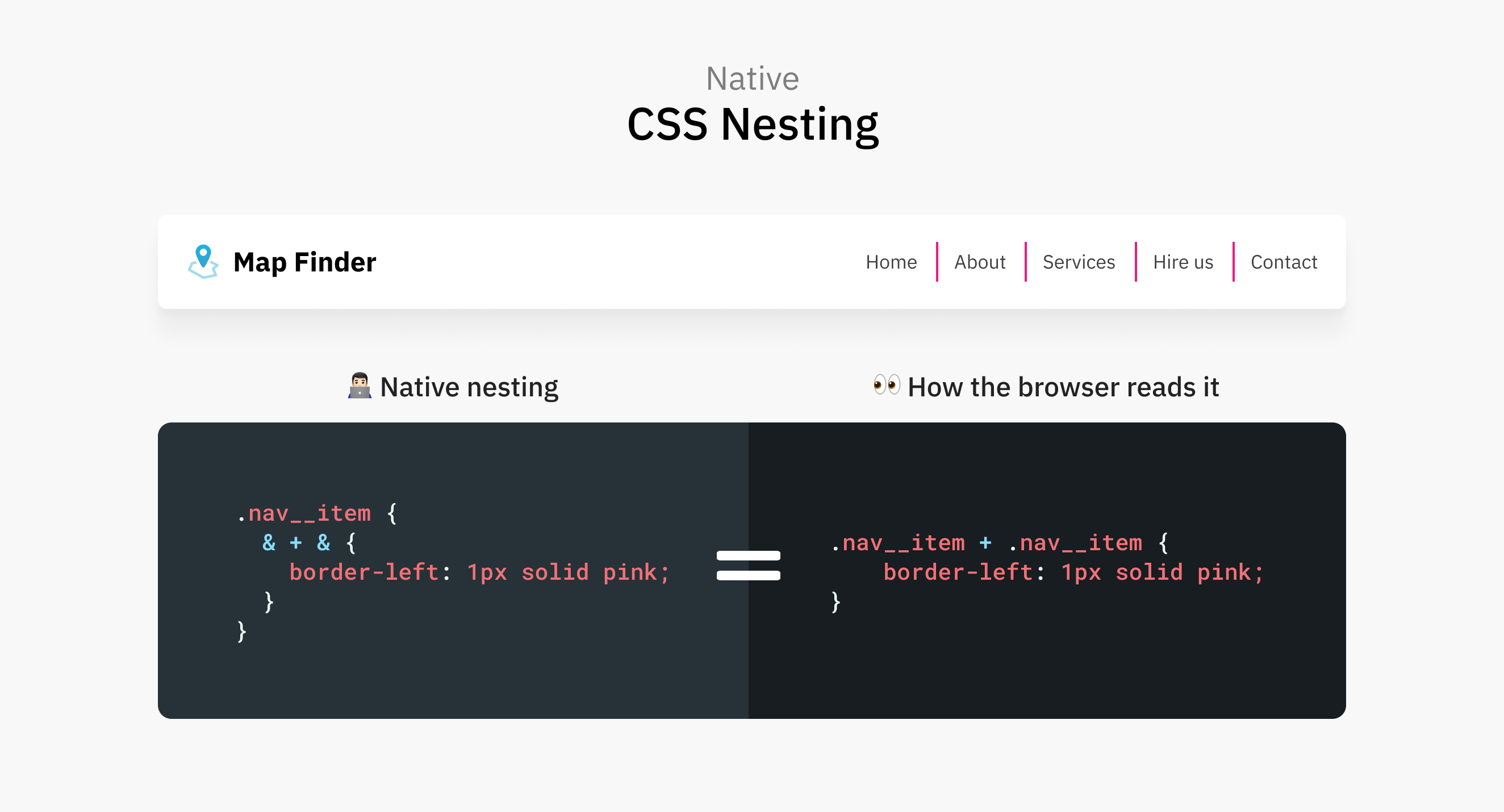
In native CSS nesting, we can use the ampersand symbol to mimic that. Notice that I repeated it twice.
.nav__item {
  & + & {
    border-left: 2px solid;
  }
}
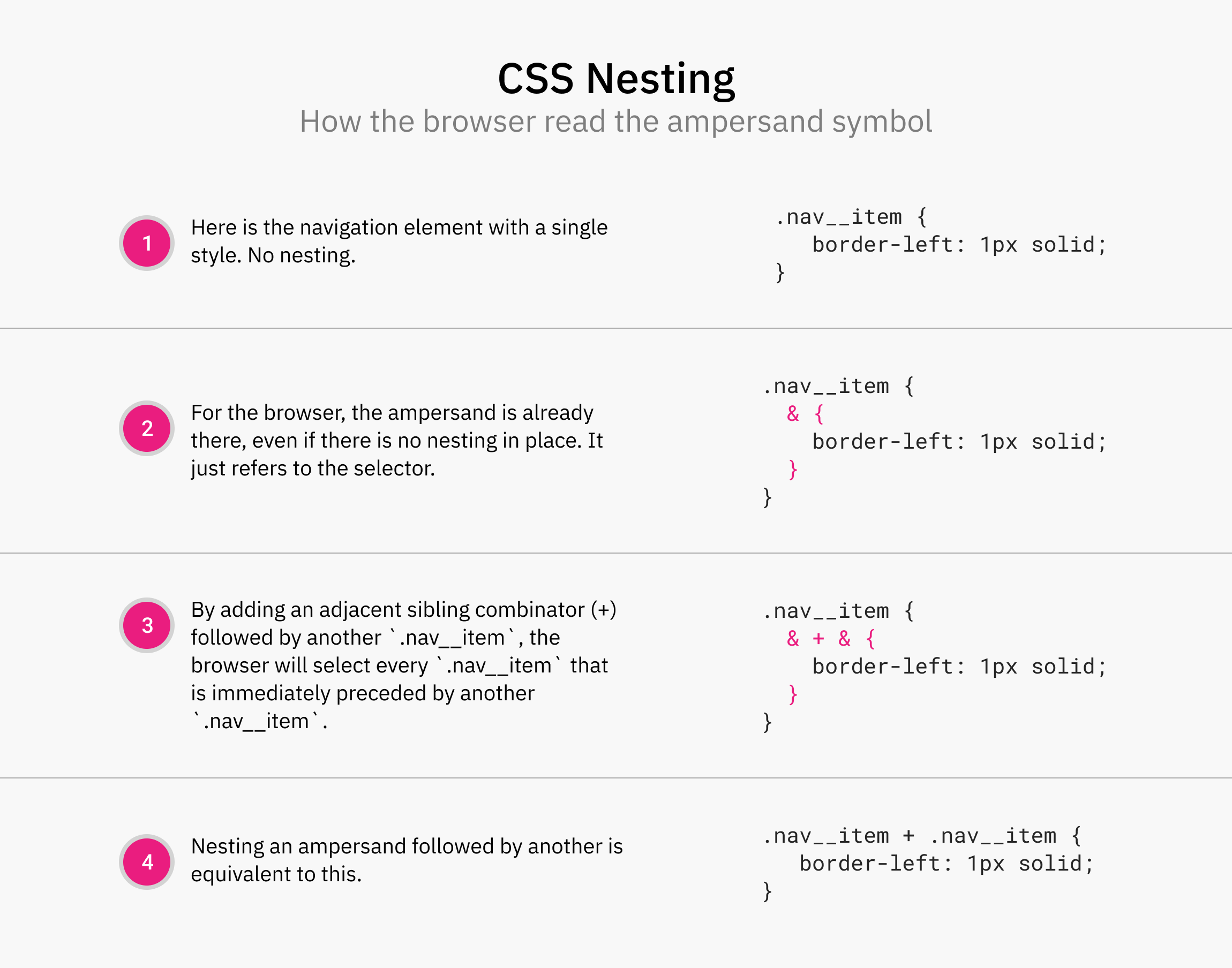
The magic happens in the 2nd repetition of the ampersand. Here, the browser will understand that I want to use the adjacent sibling selector. Let me show you a figure that illustrates this:
Another example is nesting the child combinator. It can select the direct child of an element.
.nav__item {
  > a {
    padding: 1rem;
  }
}
.nav__item {
  & a {
    color: blue;
  }
}
This was required in the initial CSS nesting spec. In Safari TP 179+ and Chrome Canary 120, the ampersand symbol is no longer required for nesting elements.
As a result, the following works:
.nav__item {
  a {
    color: blue;
  }
}
The only problem is that you have to fallback on the previous version of the spec, which must include the ampersand & symbol.
The :active, :focus, and :hover is CSS pseudo-classed that are activated via user action.
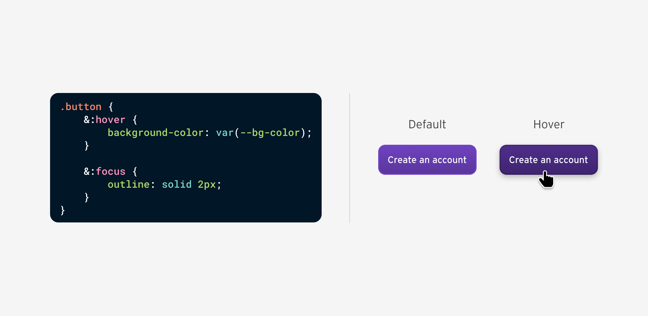
With CSS nesting, it’s possible to nest them all at once to avoid code duplication. Let’s take :hover as an example:
button {
  &:hover {
    background-color: var(--bg-color);
  }

  &:focus {
    outline: solid 2px;
  }
}
The difference when using a pre-processer for nesting is that the browser will render it like this:
button:hover {
  background-color: var(--bg-color);
}

button:focus {
  outline: solid 2px;
}
Let’s take a look at how the native CSS nesting is rendered in Chrome, Safari, and Firefox.
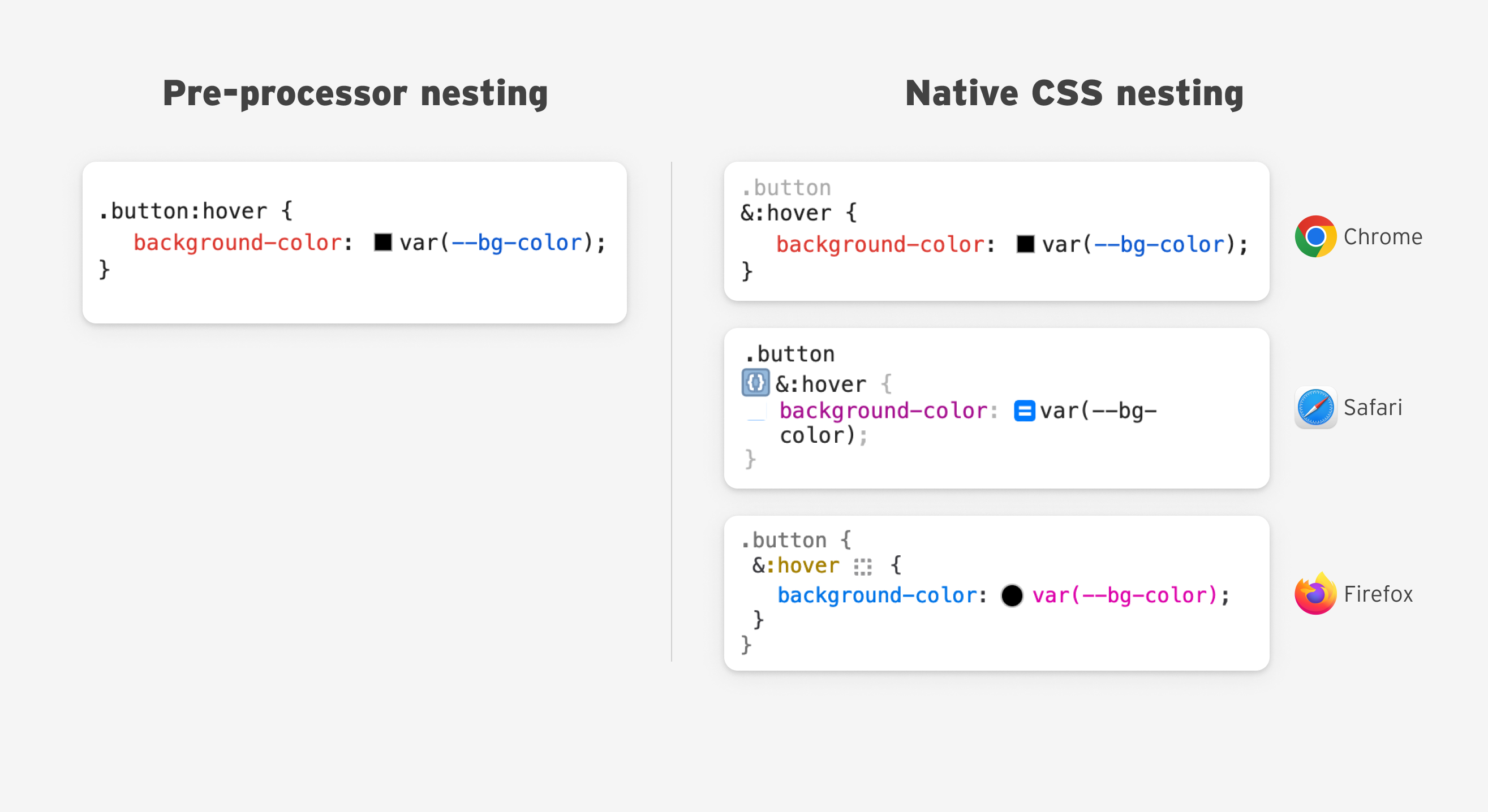
I have a few thoughts about the DevTools UX for CSS nesting and will discuss them later in the article.
One of the first examples to experiment with CSS nesting is styling a post’s body content. Imagine an article with body headlines, text, images, quotes, and more.
We tend to style headings like the following:
.post-content h1,
.post-content h2,
.post-content h3,
.post-content h4 {
  /* styles here */
}
With CSS nesting, it’s more straightforward:
.post-content {
  h1,
  h2,
  h3,
  h4 {
    color: var(--heading-color);
    font-weight: var(--heading-font-bold);
    margin-bottom: var(--size-2);
  }
}
We can also do the same by using the :is() selector.
.post-content {
  :is(h1, h2, h3, h4) {
    color: var(--heading-color);
    font-weight: var(--heading-font-bold);
    margin-bottom: var(--size-2);
  }
}
A common case is to style a link that is inside a paragraph. In such a case, CSS nesting works great.
.post-content {
  & p {
    color: var(--color-black);

    & a {
      font-weight: bold;
      text-decoration: underline;
    }
  }
}
The link might need a hover or a focus effect, too.
.post-content {
  & p {
    color: var(--color-black);

    & a {
      font-weight: bold;
      text-decoration: underline;

      &:hover {
        /* hover styles */
      }
    }
  }
}
We can also nest media queries.
.post-content {
  & p {
    /* base styles */

    @media (min-width: 400px) {
      /* do something */
    }
  }
}
In some cases, a CMS might wrap a <p> element within another element, and for styling purposes, you need to only style the direct <p> elements.
.post-content {
  /* Select the direct <p> elements */
  > p {
    /* base styles */
  }
}
In this example, the quote gets its custom styling, and the <p> element within the quote is selected to reset the bottom margin to zero.
.post-content {
  & blockquote {
    /* custom quote styling */

    & p {
      margin-bottom: 0;
    }
  }
}
The post figure contains an image and an optional <figcaption> to show a description of the image.
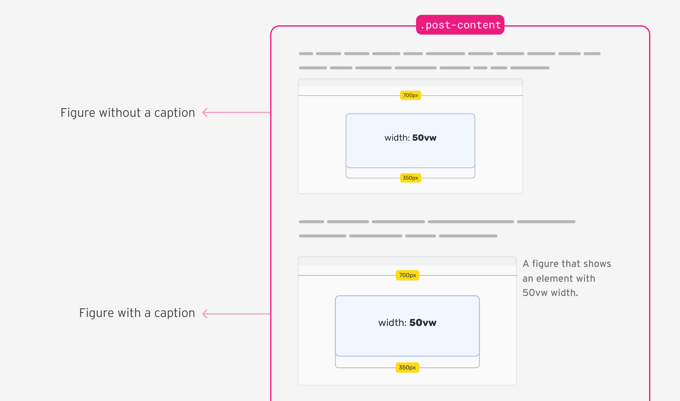
In my example, I need to style the <figure> differently if it has a caption. By nesting CSS :has(), this is possible.
.post-content {
  & figure {
    & img {
      /* the figure's image styles */
    }

    /* changes to the <figure> container, if it has a figcaption element */
    &:has(figcaption) {
      display: flex;
      align-items: start;
    }

    & figcaption {
      /* caption styling */
    }
  }
}
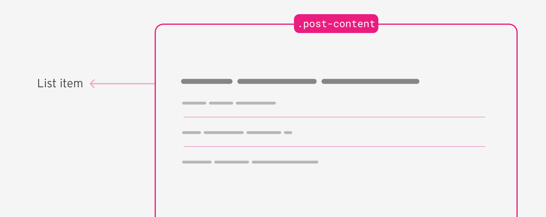
I need to add a border to all list items except the last one. For that purpose, I used the :not() selector.
.post-content {
  li {
    &:not(:last-child) {
      border-bottom: 1px solid;
    }
  }
}
To use :not(), we need to append an ampersand before it.
I need to reduce the spacing below <h3> and <h4> if one of them is followed by a code snippet.
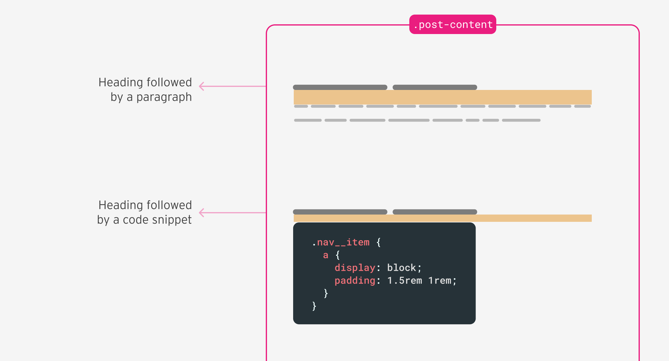
.post-content {
  & h3 + [class*="language-"],
  & h4 + [class*="language-"] {
    margin-top: 0.5rem;
  }
}
As you’ve seen in this practical example, the use of CSS nesting is straightforward, especially if you’re coming from a CSS preprocessor experience.
I will demonstrate a simple card component that uses CSS nesting to achieve the desired styles.
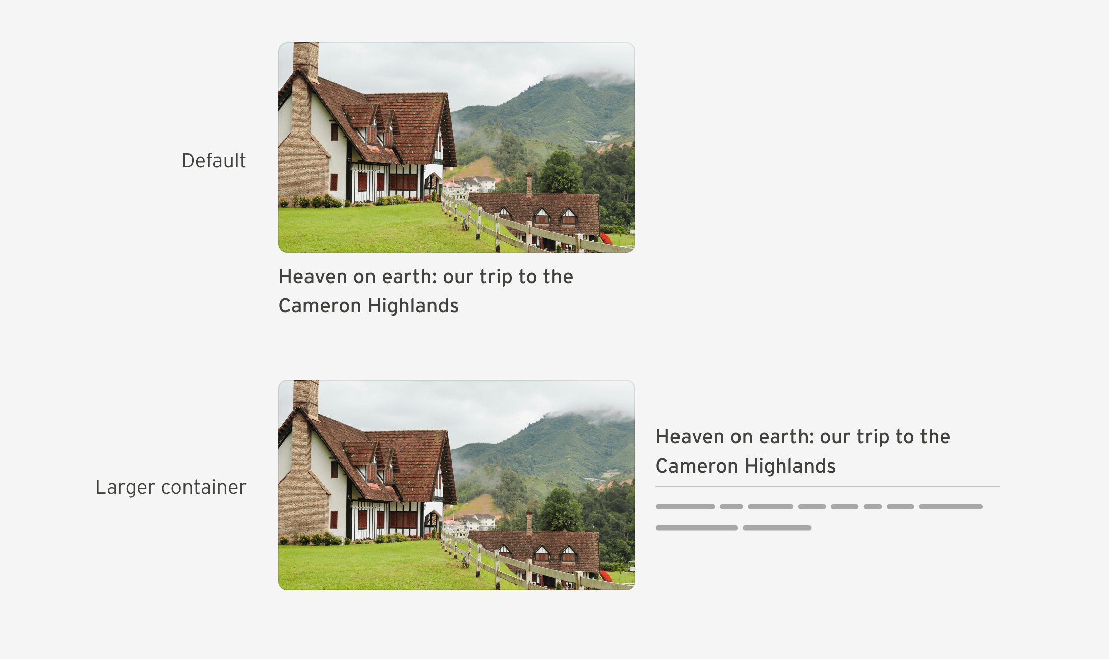
Assuming that there is a .card element with default or basic styles, I will move on to showcase the use of CSS nesting.
.card {
  /* default card styles */
}
If the container width is bigger than 400px, I want the card to become a flex container.
.card {
  /* default card styles */

  /* if the container width is 400px or bigger */
  @container card (min-width: 400px) {
    display: flex;
  }
}
I want to style the paragraph element via the <h3>. That way, I can add margins and paddings to the <p> element. If it’s not there, the UI won’t have extra spacing.
.card__content {
  & h3 + p {
    border-top: 1px solid #000;
    padding-top: 0.5rem;
    margin-top: 0.5rem;
  }
}
When the container width is 400px or larger, the .card__content element should become a flex container, too.
.card__content {
  & h3 + p {
    border-top: 1px solid #000;
    padding-top: 0.5rem;
    margin-top: 0.5rem;
  }

  @container card (min-width: 400px) {
    display: flex;
    flex-direction: column;
    justify-content: center;
  }
}
A common case is to style the placeholder of an input. The problem is that each browser vendor has its prefix (oh, it’s 2023).
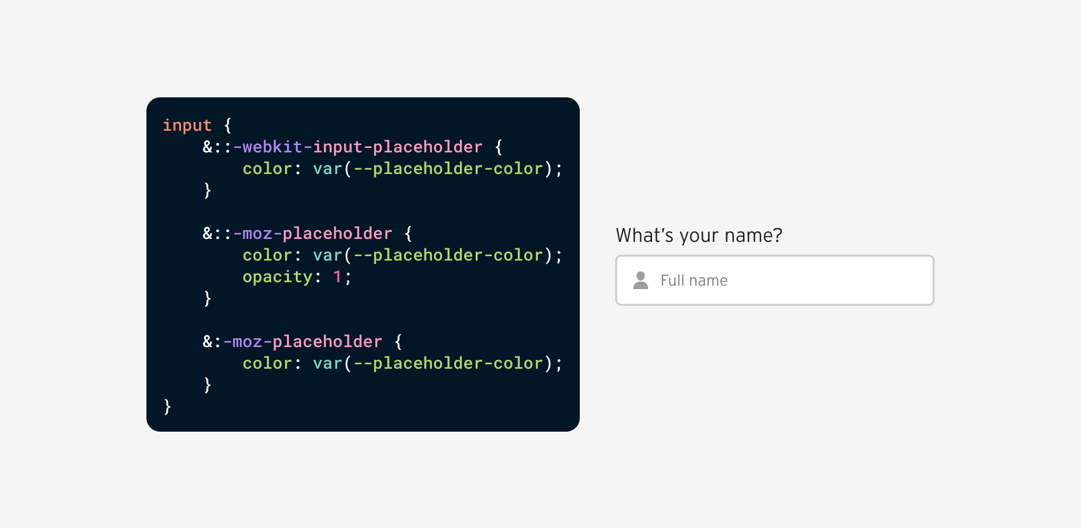
Since the prefix styles need a double colon, we need to use the ampersand &, otherwise the styles will break.
input {
  --placeholder-color: #969696;
  /* other styles */

  &::-webkit-input-placeholder {
    color: var(--placeholder-color);
  }

  &::-moz-placeholder {
    color: var(--placeholder-color);
    opacity: 1;
  }

  &:-moz-placeholder {
    color: var(--placeholder-color);
  }
}
You might be wondering, what’s the difference between using CSS nesting, or directly writing the prefix style without it.
/********** Option 1: native nesting **********/
input {
  &::-webkit-input-placeholder {
    color: var(--placeholder-color);
  }
}

/********** Option 2: without nesting **********/
input::-webkit-input-placeholder {
  color: var(--placeholder-color);
}
There is no difference between the two. Both have the same specificity (0, 1, 1).
We can use native CSS nesting to change a child’s styles based on where it lives. For example, if the .button element lives within a .box parent, it should take the full width.
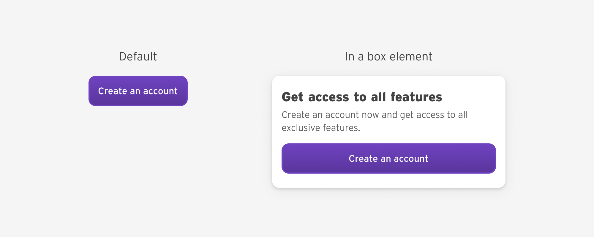
<div class="box">
    <h2>Get access to all features</h2>
    <p>Create an account now and get access to all exclusive features.</p>
    <a href="/offer" class="button">Create an account</a>
</div>
.button {
  .box & {
    width: 100%;
  }
}

/* equivalent to */
.box .button {
}
Say that we have a card and we want to select all the elements within it. With CSS native nesting, this should work:
.card {
  * {
    /* styles here */
  }
}
I found out that this doesn’t work in Chrome stable, but works fine in Chrome Canary 121, Safari 17.1, and Firefox 119.
The fix is to append an ampersand.
.card {
  & * {
    /* styles here */
  }
}
In this issue, selecting a data attribute without the ampersand won’t render the expected result.
.card {
  [data-type="featured"] {
    /* styles here */
  }
}
I found out that this doesn’t work in Chrome stable, but works fine in Chrome Canary 121, Safari 17.1, and Firefox 119.
To fix that, we need to append an ampersand:
.card {
  &[data-type="featured"] {
    /* styles here */
  }
}
Both of those bugs were fixed in the release for the relaxed CSS nesting in Chrome Canary.
It’s possible to use @supports to check for CSS nesting support. In our case, we want to check if the browser identifies the ampersand or not.
@supports selector(&) {
  .post-content {
    & h2 {
      /* styles here. */
    }
  }
}
You can explore other options to detect support in this Codepen by Bramus.
For me, I will use the PostCSS nesting plugin today, which compiles native CSS nesting to normal CSS. Once it’s safe to use, I will drop off the plugin.
I’m not a big fan of the current UX for CSS nesting in the browser DevTools.
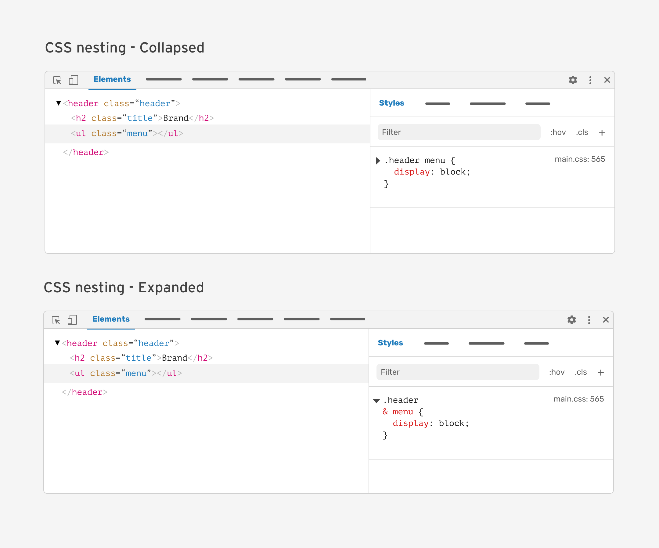
I worked on a separate article where I explored a few proposals for how I would like CSS nesting to be in the DevTools.
CSS nesting is a major feature that will enhance how we write CSS. For the time being, using nesting is possible but you need to be careful about the audience, as the support is still new.
I hope that you’ve learned something useful. Thank you for reading!
此内容由惯性聚合(RSS阅读器)自动聚合整理,仅供阅读参考。 原文来自 — 版权归原作者所有。