


I spent years teaching CSS layout on this blog. I put everything I know into The Layout Maestro course: 70+ lessons and 150+ interactive examples that teach you how to think CSS layouts, not just memorize syntax.
Hello there! If you haven’t read the first article from that series, I highly recommend giving it a read if you are into hero sections. If not, totally fine.
This is the 2nd article of my series of digging into the mind of a frontend developer. I will try to think aloud about how I should build an article layout by using CSS techniques like grid, flexbox, comparison functions, and more.
All articles:
Are you ready? Let’s deep dive into the mind of a frontend developer.
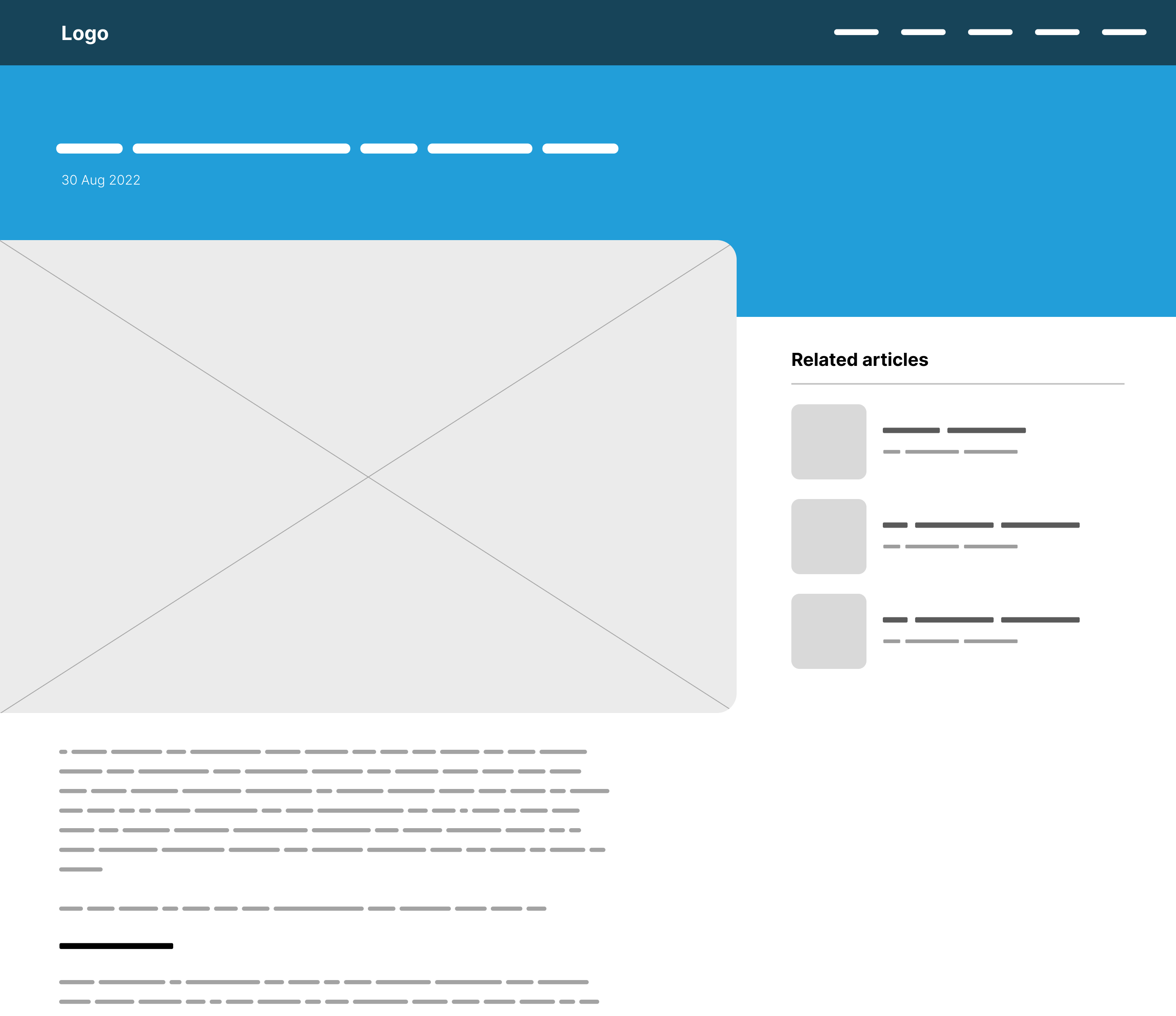
From a quick look at the layout, I see that we have the following main elements:
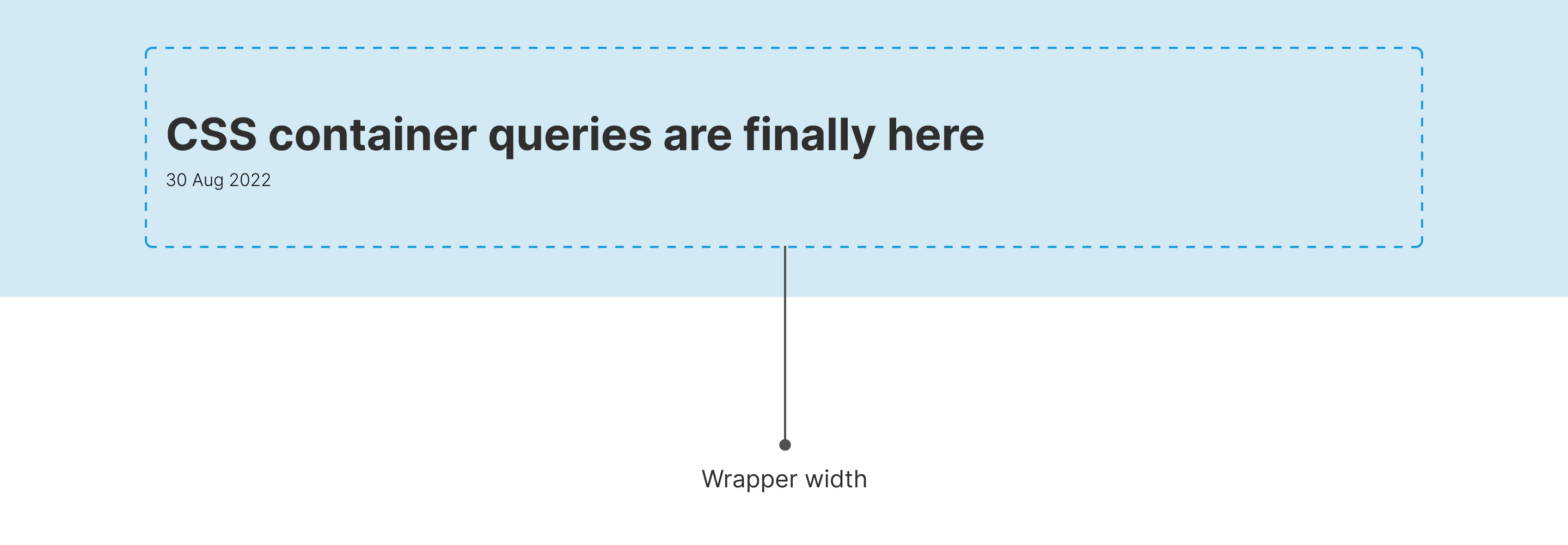
The first thing that I can do to build this layout is to think about the containing wrapper.
Within the main article header, there is definitely going to be a wrapper in here. As per the design, the width is 1170px which equals 73.125rem.
<section class="page-header">
  <div class="wrapper">
    <h1>....</h1>
    <p>....</p>
  </div>
</section>
.wrapper {
  max-width: 73.125rem;
  margin-inline: auto;
  padding-inline: 1rem;
}
I’m using CSS logical properties above to save myself writing margins and padding for each direction.
Nice! The next step is to build the layout for the main and aside.
When I have an article page, I mostly focus on the main layout first, then I start working on the tiny little details. The reason? because that’s what actually matters here. It’s simple to style the article body (headlines, paragraphs, links.. etc) but what’s challenging is the layout itself, and how it should behave on different viewport sizes.
Consider the following figure.
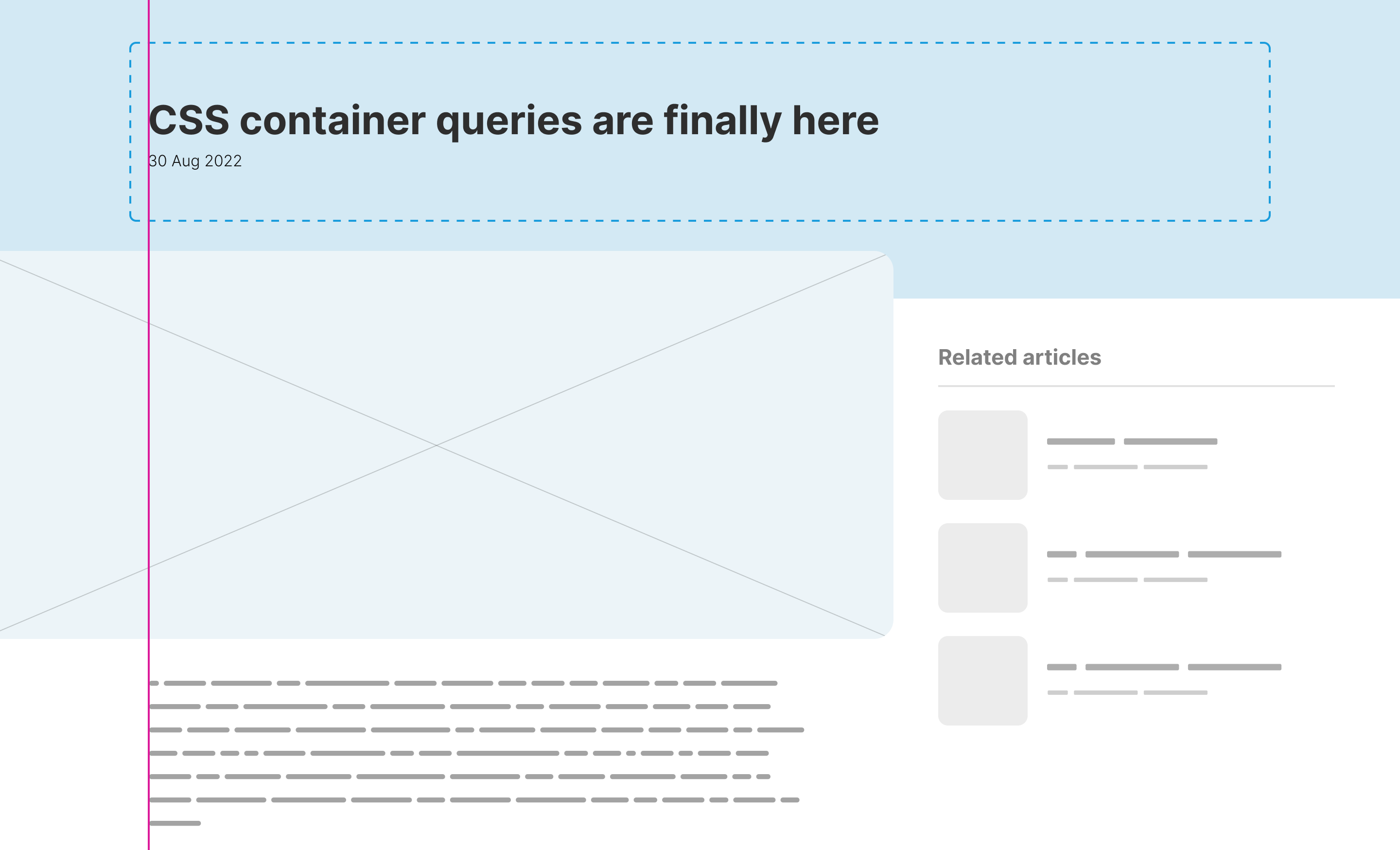
The thing that I’m trying to wrap my head around is: how to align the main element’s content with the dotted wrapper boundaries given that each one of them lives in a different container?
Let’s keep that on the side for now. To begin, I want to establish a grid for the main and aside.
<div class="layout">
  <main>...</main>
  <aside>...</aside>
</div>
.layout {
  display: grid;
  grid-template-columns: 1fr 400px;
}
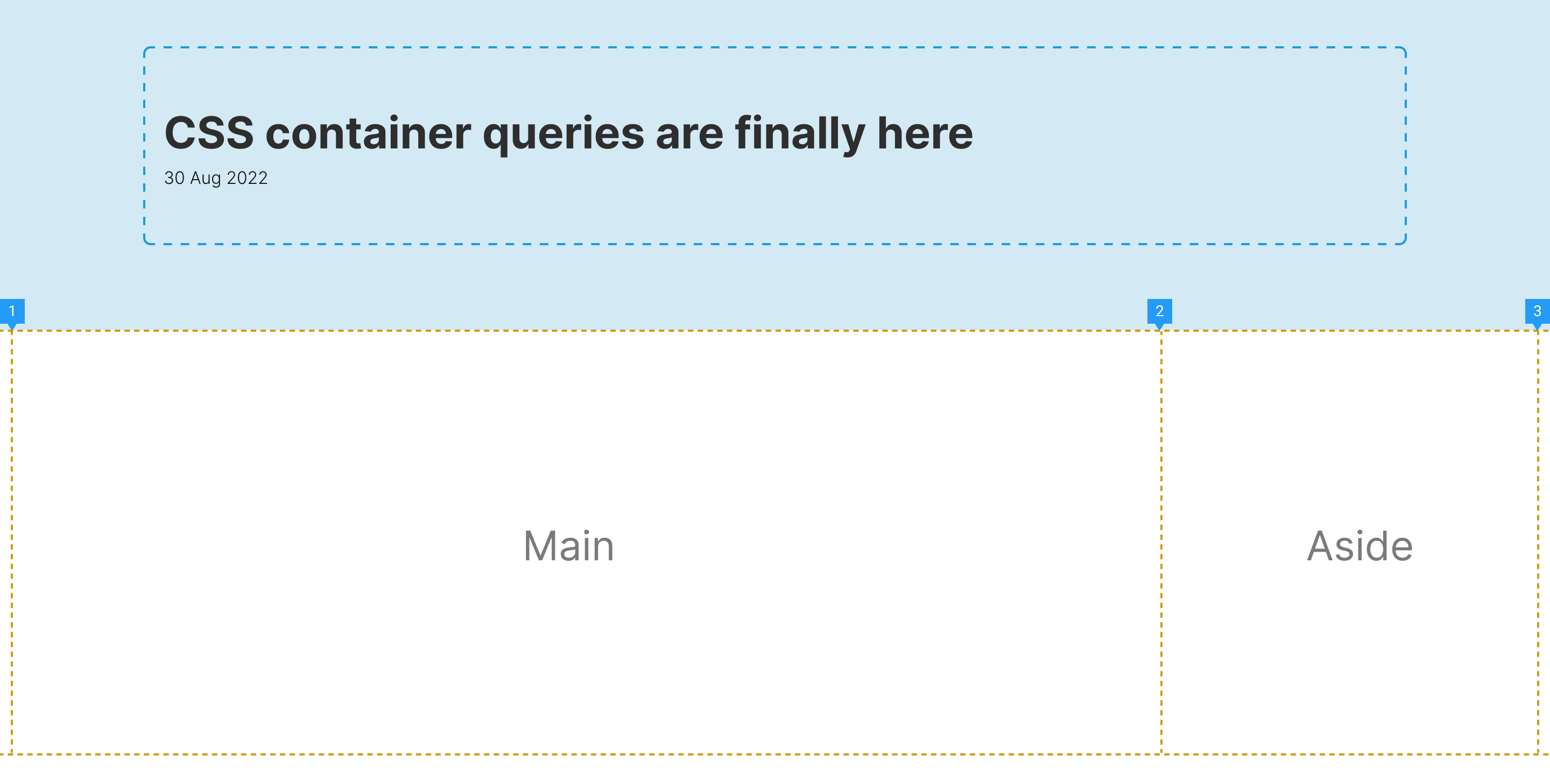
Looks good as a start. Next, I need to add the content within the main section. Usually, I like to wrap it with an element so that I can style the inner content items easily.
<div class="layout">
  <main>
    <div class="prose">
      <h2>....</h2>
      <p>....</p>
    </div>
  </main>
  <aside>...</aside>
</div>
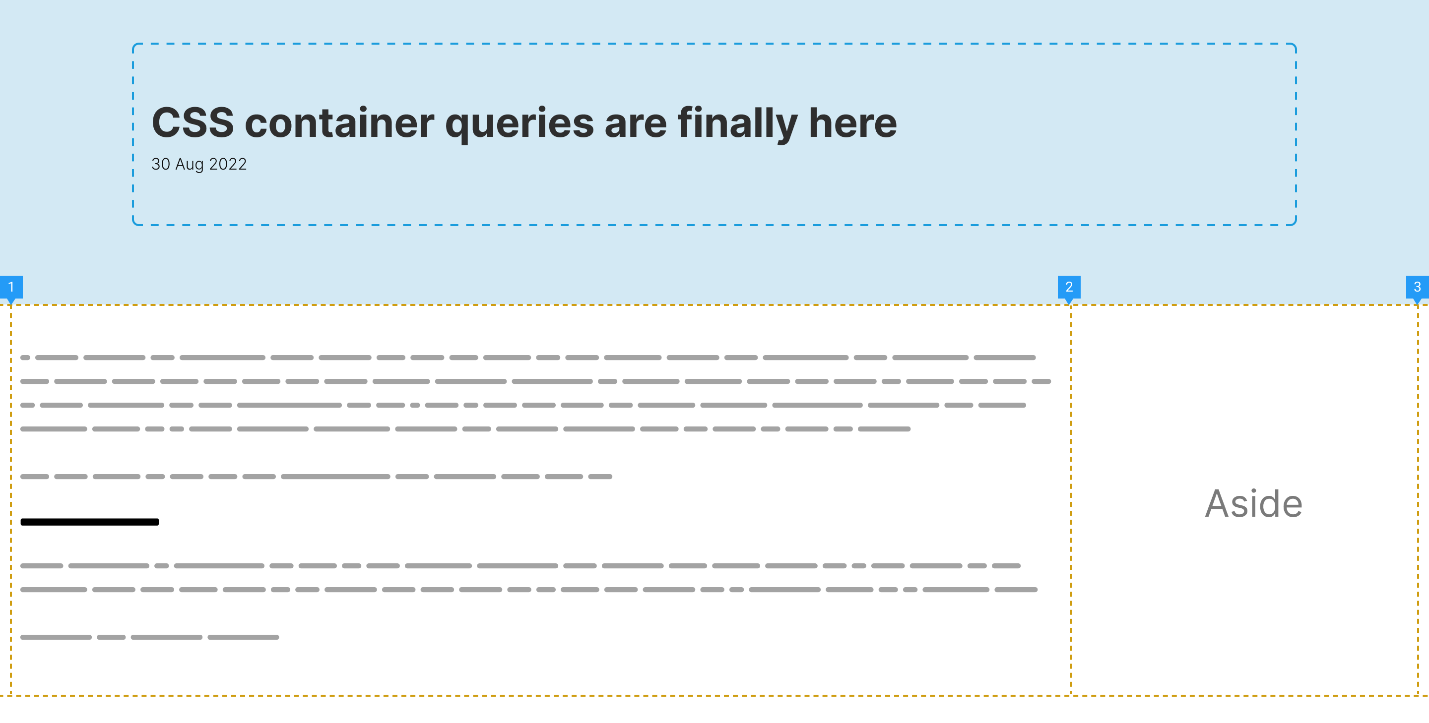
It’s expected that the content with the .prose element will span to fill all the main section width. I like to constrain that by using the CSS character unit (ch).
.prose {
  max-width: 70ch;
}
With that, we have the following result. Notice how the content isn’t aligned with the article header content. I used a pink guideline to make it clearer.
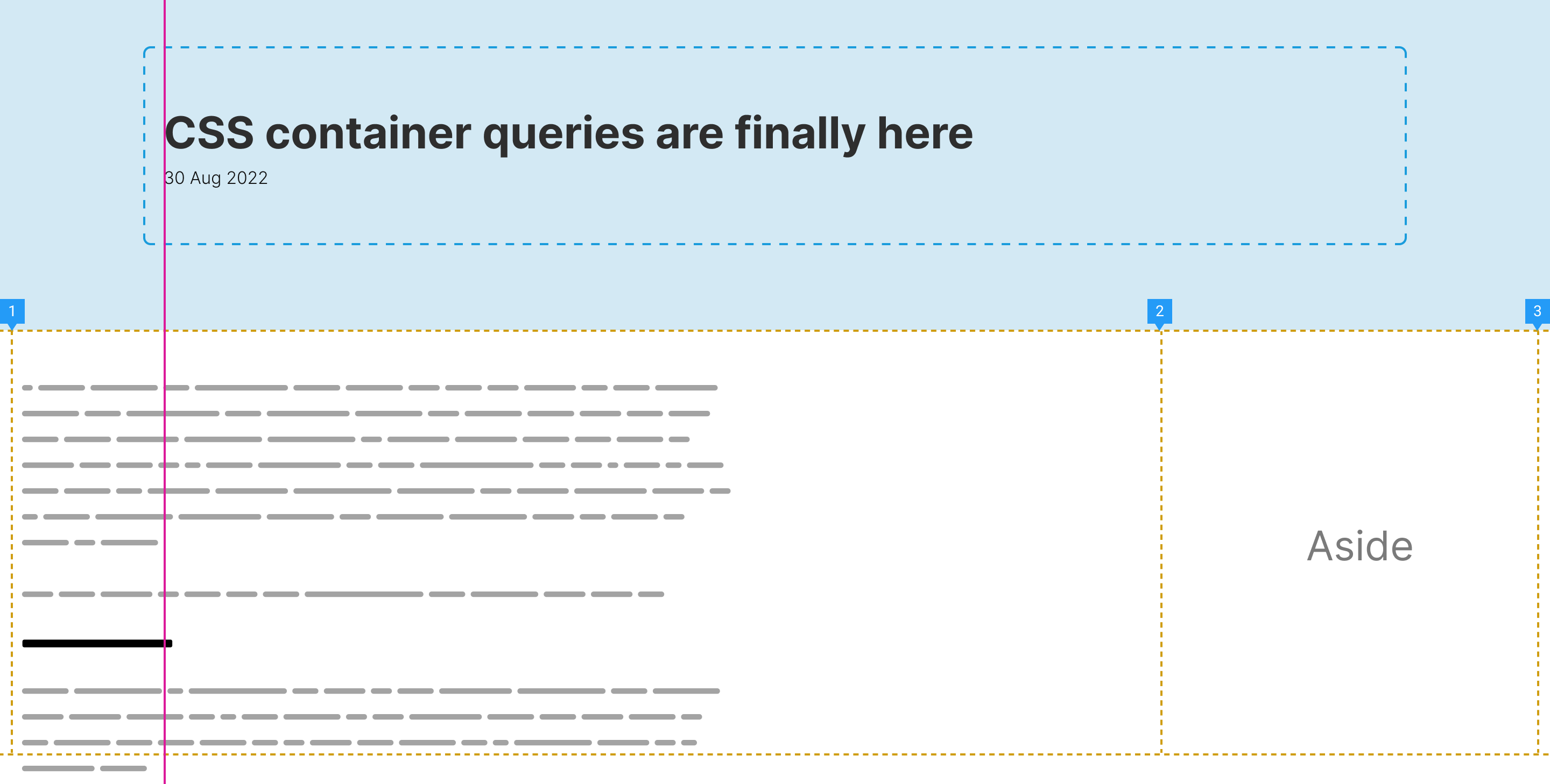
While thinking aloud, I asked myself the following question:
In the middle of such a task, we tend to opt for the easiest solution possible. My mind started tricking me into using .wrapper, but then I stopped. The main element is a part of a grid that is taking the full-screen width, so that will be useless.
I got the idea of measuring the space on both sides of the .wrapper. That is the space that I need to align the inner content with. If I can retrieve that space, then it will be easy to apply a padding-left on the content.
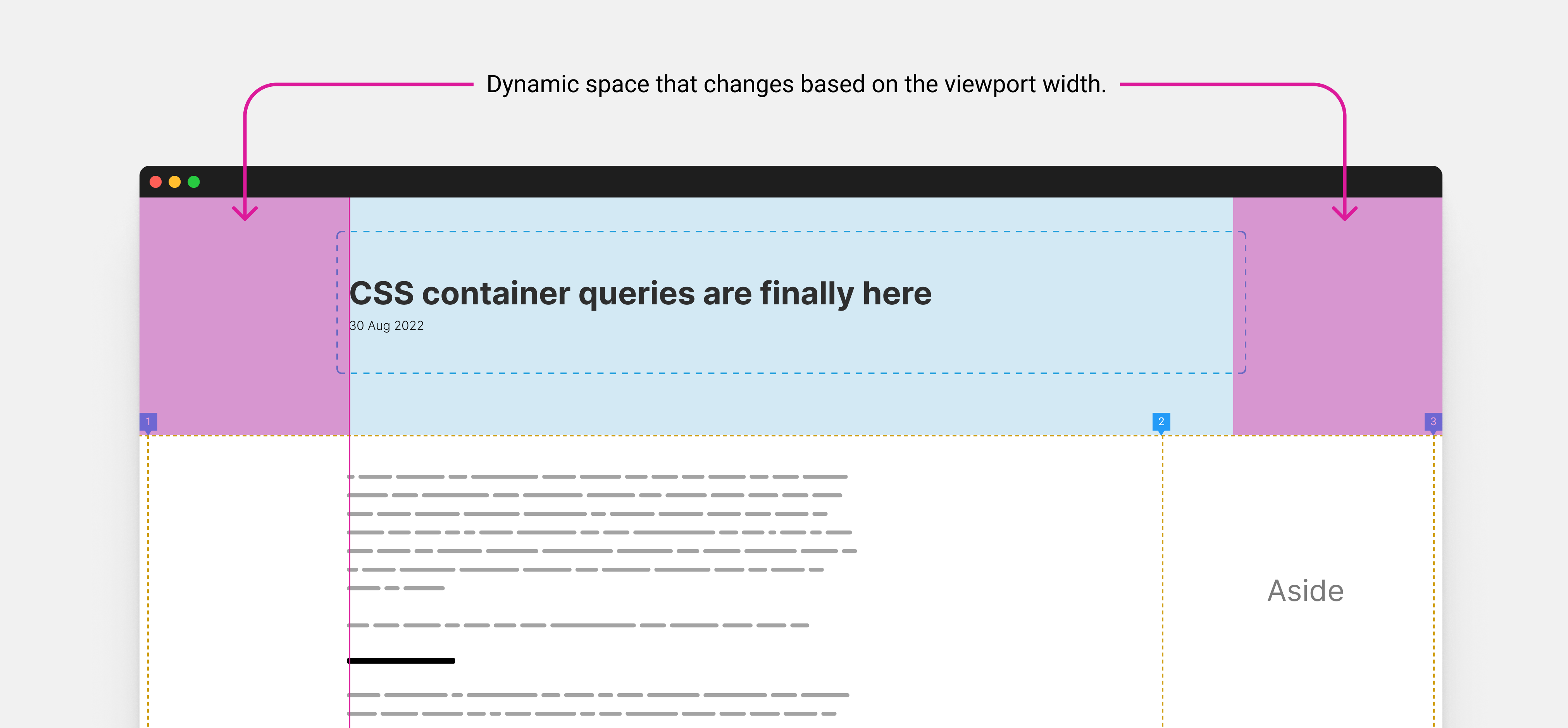
The interesting bit is that the space grows or shrinks based on the viewport width. I started thinking about a way to get it since I already know the .wrapper width.
Dynamic space = (100% of the viewport width - wrapper width) / 2
In CSS, it equals to something like this:
:root {
  --wrapper-width: 73.125rem;
  --dynamic-space: calc((100vw - var(--wrapper-width)) / 2);
}
The above will get us the width of the space from the left of the viewport to the start of the .wrapper element boundaries.
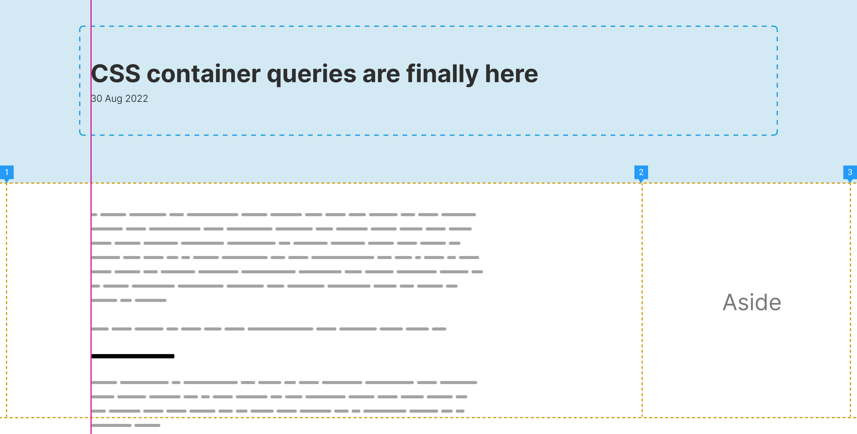
Nice! It’s aligned perfectly now. It works great on desktop sizes (AKA large viewport sizes). My gut tells me that there is something off on smaller sizes (This is a good thing that we, frontend developers, gain over time). I resized the viewport and BOOM! The padding-left becomes zero on mobile.
That is logical, I think. When we ask the browser to deduct the .wrapper width from the full viewport width, it will equal zero when the viewport width is equal to or less than the .wrapper.
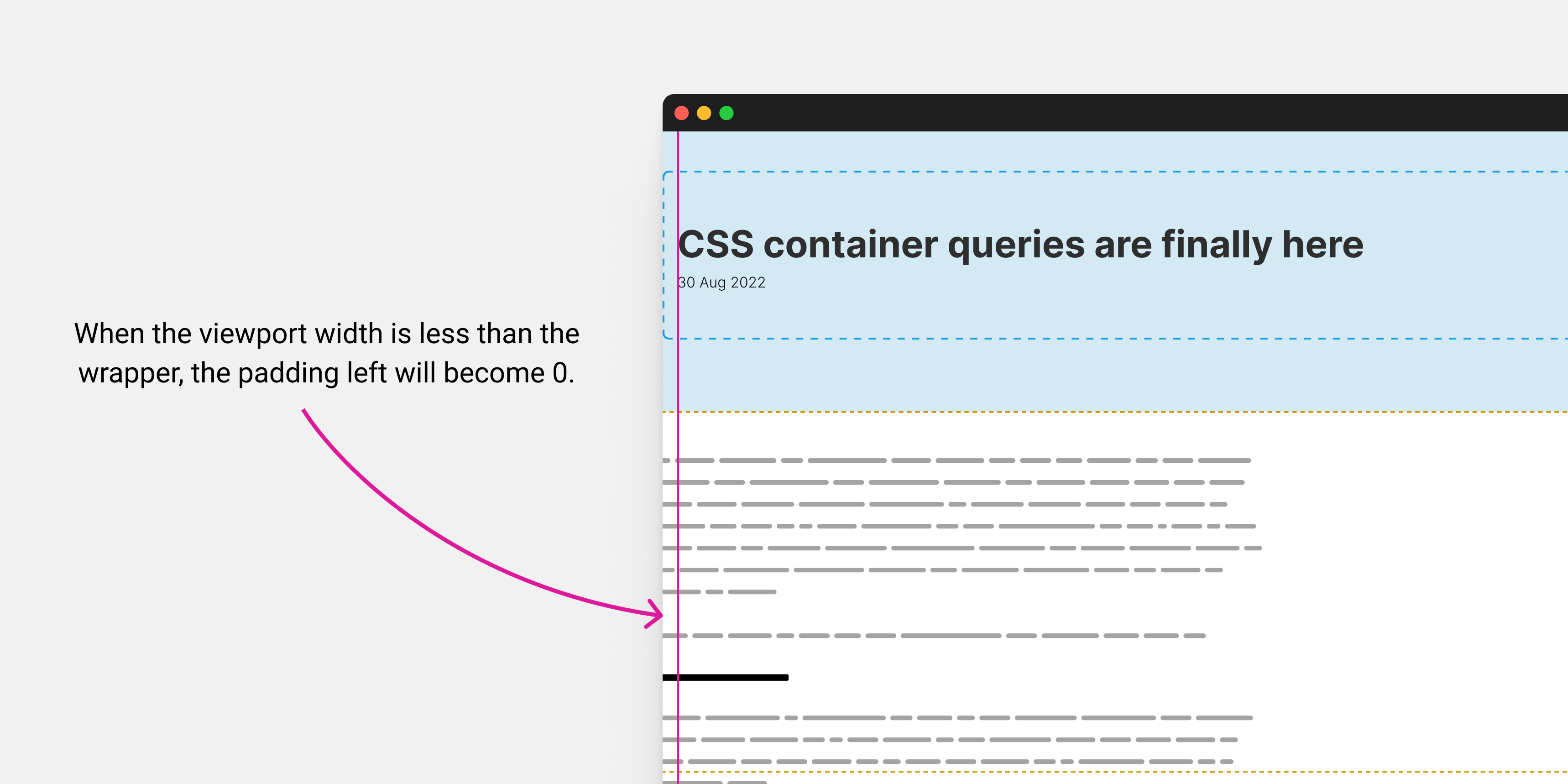
My mind defaulted to using a media query for that. What we should do is check if the viewport width is larger or equal to the wrapper width + the left padding.
.prose {
  padding-left: 1rem;
  padding-right: 1rem;
  max-width: 65ch;
}

@media (min-width: 1186px) {
  .prose {
    padding-left: calc((100vw - var(--wrapper-width)) / 2);
  }
}
While that worked, I’m still not happy with it. I asked myself, isn’t that a perfect use-case for CSS comparison functions? Come on, Ahmad! That’s 100% right, we need the padding to be at least 1rem, and if the viewport size is larger than 1170px, then it will use dynamic padding.
I got the idea of using CSS max() comparison function. We can tell the browser to use 1rem for the padding-left property and then switch to using the dynamic value when the viewport size is larger enough.
.prose {
  padding-left: max(1rem, calc((100vw - var(--wrapper-width)) / 2));
}
And it’s done! No need to use a media query or anything. The max() function did the job for us.
One little detail, there is no need to use the calc() function since any mathematical computation within a comparison function will be calculated without the need for calc().
.prose {
  padding-left: max(1rem, (100vw - var(--wrapper-width)) / 2);
}
While thinking about the article layout, I asked myself the question: why not build it using a CSS subgrid? It should be a perfect use-case (Still not sure), but I imagine having a grid for both the article header and main/aside, then I need to pass it out to the main and aside sections.
Even though CSS subgrid is supported only in Safari and Firefox, I decided to give it a chance anyway, because why not?
Consider having the below markup.
<div class"page-layout">
	<section class="page-header"></section>
	<div class="layout">
		<main>
			<div class="prose"></div>
		</main>
		<aside></aside>
	</div>
</div>
I added a 3-column grid. I will explain later on.
.page-layout {
  display: grid;
  grid-template-columns: 1fr 5fr 320px;
}
The goal I want to achieve is that I want to have the same grid for the page header, and main/aside section. That is possible with CSS subgrid.
When subgrid is there, the grid columns will look like the following. Basically, we can align the inner content of the page header and the main section just as it was a direct child of the .page-layout element.
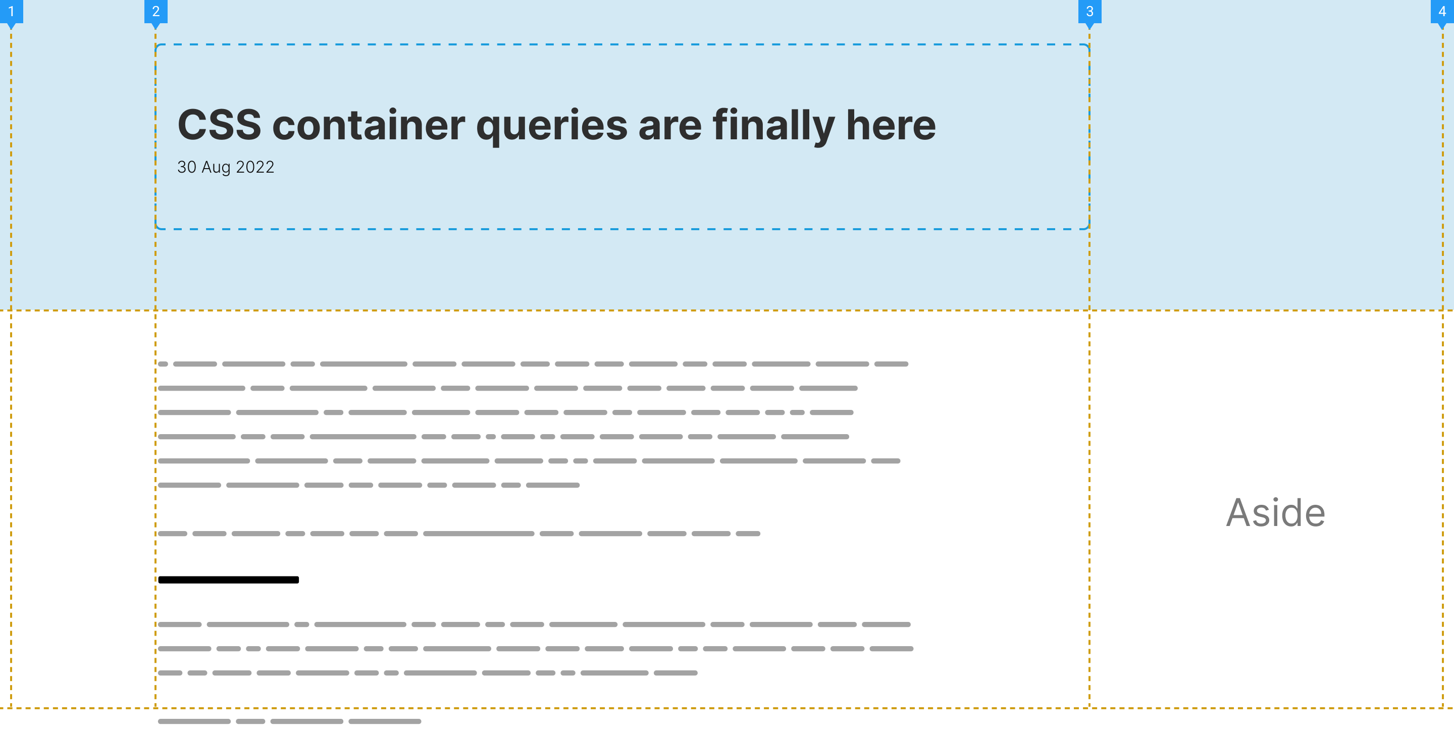
First, I added subgrid as a value for grid-template-columns in the .page-header element.
.page-header {
  /* Making the page header span the whole grid */
  grid-column: 1 / -1;
  display: grid;
  grid-template-columns: subgrid;
}

.page-header .wrapper {
  grid-column: 2 / 3;
  max-width: 80ch;
}
That helped me to place the .wrapper element right in the center of the grid.
Next, I need to add subgrid again to the .layout and the main elements.
.layout {
  grid-column: 1/-1;
  display: grid;
  grid-template-columns: subgrid;
}

.layout main {
  grid-column: 1/3;
  display: grid;
  grid-template-columns: subgrid;
}
That might like too much grid nesting (AKA subgrid), but it’s just me exploring the possibility of the solution.
With that, I can control the placement of the article thumbnail and the .prose element.
.main-thumb {
  grid-column: 1 / 3;
}

.prose {
  grid-column: 2 / 3;
}
It works perfectly, but for me, I found that too much to use, so I will default to the padding solution.
Interested in learning more about CSS subgrid? I wrote a detailed article explaining it in detail.
Thanks to Defensive CSS, I now have the habit of stress testing any UI that I will implement, and this one is no exception.
I added a very long word to break the layout, and it did. In CSS grid, the minimum width for an item equals the width of its content.
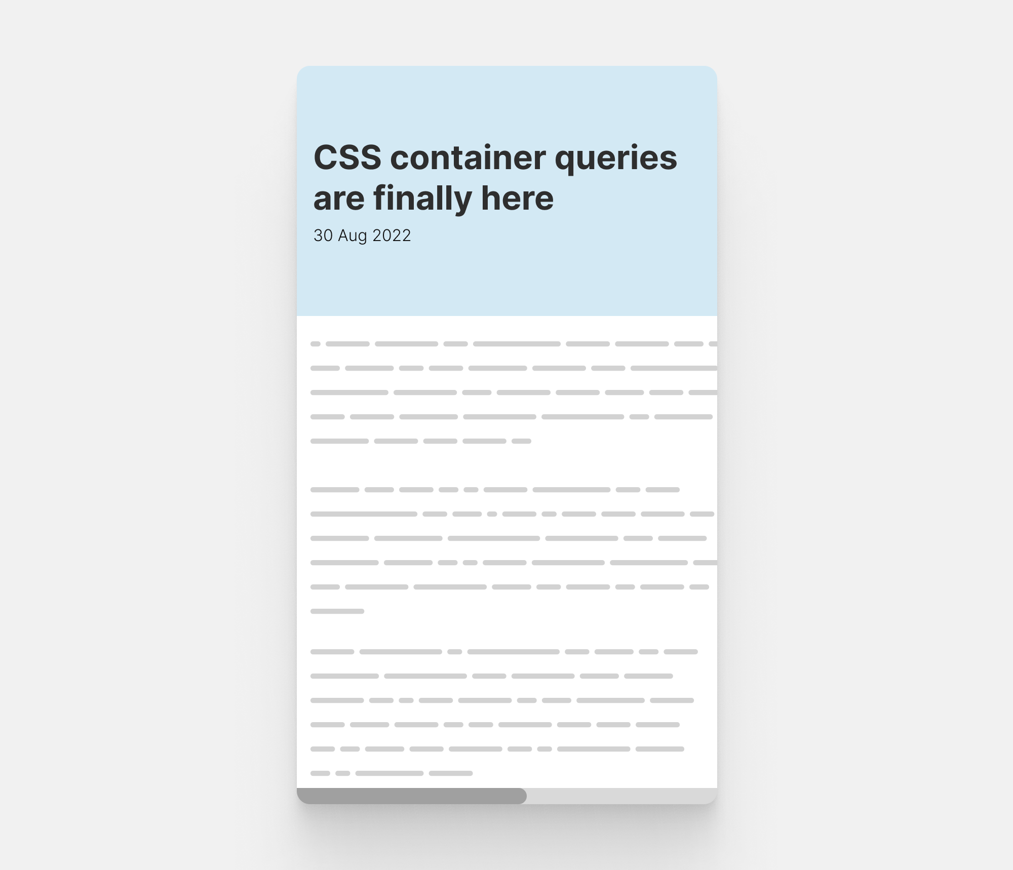
To fix that, we first need to reset the default behavior of CSS grid. Since the closest grid item to the content is the <main> element, that’s the one to handle.
main {
  min-width: 0;
}
Then, we can add overflow-wrap to all text elements.
.prose h2,
.prose h3,
.prose h4,
.prose p,
.prose a {
  overflow-wrap: break-word;
}
A friendly reminder is to always force all images to have a maximum width of 100%. It’s an important defensive CSS mechanism to have.
img {
  max-width: 100%;
}
It’s interesting how a tiny design change can influence a lot on how to write the CSS for a certain layout or interface. In this article, we’ve seen how the alignment needed seems simple in words, or in design, but when we try to think about it in CSS, lots of challenges arise.
This is what I like about CSS. Each time I try to implement a new design, it forces me to get out of my comfort zone and think about new possible ways to implement the design at hand.
That’s it, I hope you’ve enjoyed this article, and stay tuned for the next one.
此内容由惯性聚合(RSS阅读器)自动聚合整理,仅供阅读参考。 原文来自 — 版权归原作者所有。