
惯性聚合 高效追踪和阅读你感兴趣的博客、新闻、科技资讯
阅读原文 在惯性聚合中打开

推荐订阅源

量子位
奇客Solidot–传递最新科技情报
奇客Solidot–传递最新科技情报
博客园_首页
AWS News Blog
AWS News Blog
阮一峰的网络日志
阮一峰的网络日志
Vercel News
Vercel News
C
Cybersecurity and Infrastructure Security Agency CISA
P
Proofpoint News Feed
Exploit-DB.com RSS Feed
T
Tailwind CSS Blog
PCI Perspectives
PCI Perspectives
Application and Cybersecurity Blog
博客园 - 叶小钗
IT之家
IT之家
V2EX - 技术
V2EX - 技术
Cloudbric
Cloudbric
cs.CV updates on arXiv.org
宝玉的分享
宝玉的分享
Know Your Adversary
Know Your Adversary
爱范儿
爱范儿
OSCHINA 社区最新新闻
OSCHINA 社区最新新闻
cs.CL updates on arXiv.org
S
Schneier on Security
博客园 - 【当耐特】
G
Google Developers Blog
S
Security @ Cisco Blogs
N
Netflix TechBlog - Medium
T
Tenable Blog
C
Check Point Blog
The Cloudflare Blog
J
Java Code Geeks
The Register - Security
Google Online Security Blog
Security Latest
Security Latest
T
Tor Project blog
T
The Blog of Author Tim Ferriss
S
Security Affairs
S
Securelist
P
Privacy & Cybersecurity Law Blog
Security Archives - TechRepublic
P
Privacy International News Feed
博客园 - 三生石上(FineUI控件)
D
DataBreaches.Net
N
News and Events Feed by Topic
Hacker News - Newest:
Hacker News - Newest: "LLM"
让小产品的独立变现更简单 - ezindie.com
A
About on SuperTechFans
G
GRAHAM CLULEY
Jina AI
Jina AI
Spread Privacy
Spread Privacy

Ahmad Shadeed

Better fluid sizing with round() Use Cases for Field Sizing The Basics of Anchor Positioning Item Flow CSS Relative Colors Balancing Text In CSS Should masonry be part of CSS grid? CSS display contents CSS Grid Areas CSS Cap Unit An Interactive Guide to CSS Container Queries CSS :has() Interactive Guide CSS Nesting UX in DevTools CSS Nesting Future CSS: State Container Queries Rebuilding a comment component with modern CSS Conditional CSS with :has and :nth-last-child CSS Masking Do we need CSS flex-wrap detection? My CSS Wishlist Conditional CSS CSS Style Queries Inside the mind of a frontend developer: Article layout Inside the mind of a frontend developer: Hero section CSS container queries are finally here The CSS behind Figma First Look At The CSS object-view-box Property Learn CSS Subgrid CSS :has Parent Selector Aligning Content In Different Wrappers Flexbox Dynamic Line Separator Hello, CSS Cascade Layers Building UI Components With SVG and CSS A Deep CSS Dive Into Radial And Conic Gradients Defensive CSS Building Real-life Components: Facebook Messenger Conditional Border Radius In CSS CSS Container Query Units Less Absolute Positioning With Modern CSS Aligning a Button Label Vertically Comparing Design Mockups To Code Result Using HSL Colors In CSS Custom Scrollbars In CSS Let CSS Container Queries For Designers The State of CSS Cross-Browser Development Overflow Issues In CSS Inspect Element As A Way To Increase Your Curiosity Handling Text Over Images in CSS Digging Into CSS Logical Properties Clipping Scrollable Areas On The inline-start Side Understanding Clip Path in CSS The Art of Building Real-life Components Handling Short And Long Content In CSS CSS Scroll Snap A Deep Dive Into CSS Grid minmax() CSS Variables 101 Finding The Root Cause of a CSS Bug Learn CSS centering How to detect browser support for Flexbox Gap CSS Mistakes While On Autopilot Digging Into the Flex Property Understanding CSS Multiple Backgrounds Aligning Logo Images in CSS Grid for layout, Flexbox for components Colors in CSS Thinking About The In-between Design Cases min(), max(), and clamp() CSS Functions Image Techniques On The Web Everything About Auto in CSS Learn Box Alignment Let Learn CSS Positioning Intrinsic Sizing In CSS CSS Grid Template Areas In Action Hiding Elements On The Web Creating a Variable Color Font From Scratch Building a Football Ticket With CSS and SVG Blending Modes in CSS CSS Variables With Inline Styles Implementing Dark Mode For My Website Rebuilding Apple Music Header in HTML & CSS Accessible Checkbox Layout Flickering On Browser Resize Enhancing The Clickable Area Size Custom Underlines with SVG Part 3: The Process of Implementing A UI Design From Scratch Part 2: The Process of Implementing A UI Design From Scratch Building An Old Nav Design CSS Flexbox: 5 Real World Use Cases I Used CSS Inline Flex For The First Time The Process of Implementing A UI Design From Scratch Common CSS Issues For Front-End Projects Handling Long and Unexpected Content in CSS How to Build Web Form Layouts With CSS Grid Grid Layout Ah-ha Moment Enhancing Our Components with CSS :empty Building Resizeable Components with Relative CSS Units CSS Writing Mode The Journey of Learning Front End Web Development on a Daily Basis
CSS Text balancing with text-wrap:balance
Ahmad Shadeed · 2023-04-09 · via Ahmad Shadeed

The Layout Maestro

I spent years teaching CSS layout on this blog. I put everything I know into The Layout Maestro course: 70+ lessons and 150+ interactive examples that teach you how to think CSS layouts, not just memorize syntax.

Get the course

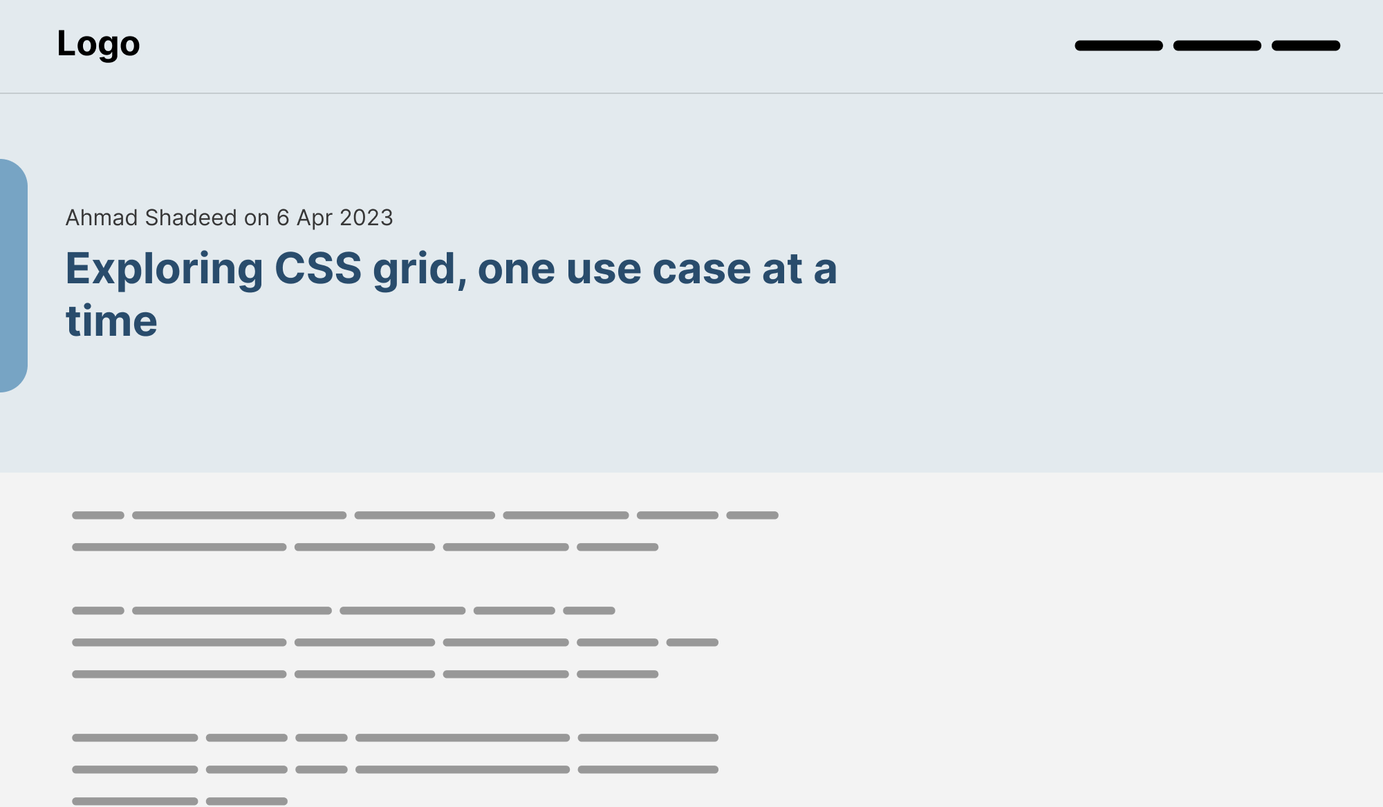
Have you ever wished there is a native way in CSS to make two lines headlines consistent in the number of words per line? As a designer, I spot that a lot when dealing with varying content lengths while designing a website or a UI.

Such a thing can make the UI you’re working on feels unbalanced, or missing something. Here is what I mean:
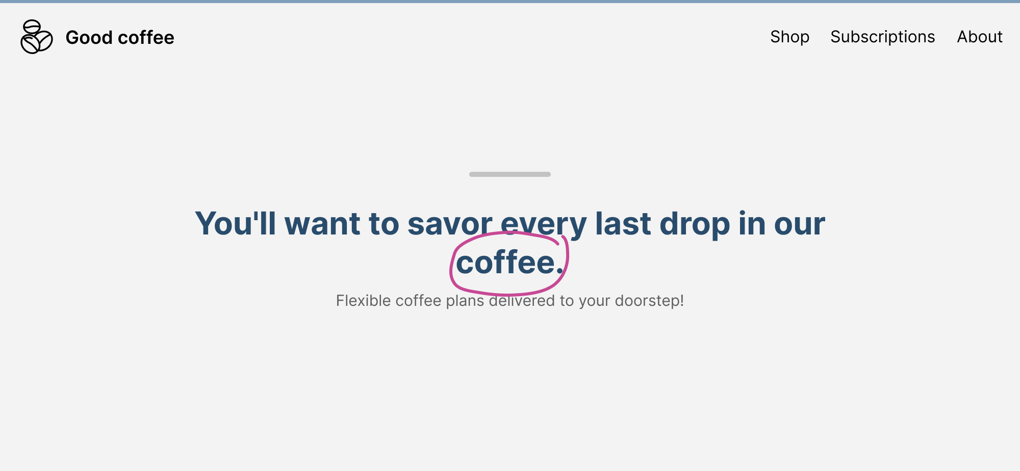
The highlighted word is a single word that lives on its line. From a visual perspective, this looks odd. It’s breaking the visual

While I design in a tool like Figma, I intentionally move that last word to the previous line, just to avoid that inconsistency.
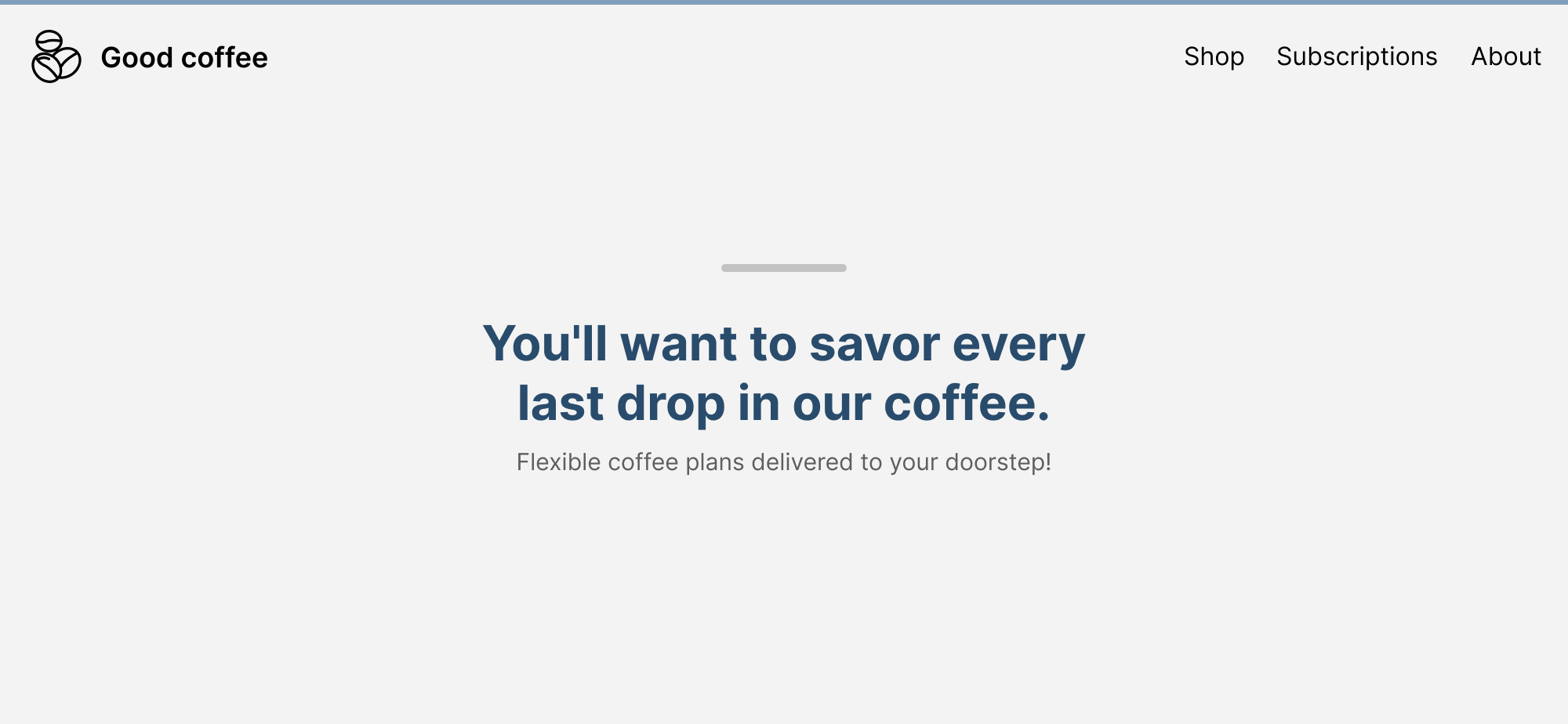
That looks better, right?

In code, if balancing is important, we can do that manually by using a <br>, or dividing the other part of the content with a <span>. There are ways to give hints to the browser on when to break a word by using the <wbr> element, but not a sentence.

There is a React component called React Wrap Balancer that make the text balanced dynamically on resize.

Luckily, we now have experimental support for text-wrap: balance in Chrome Canary. The browser will automatically calculate the number of words and divide them equally between two lines.

All we need is to apply the text-wrap: property.

.c-hero__title {
  max-width: 36rem;
  text-wrap: balance;
}

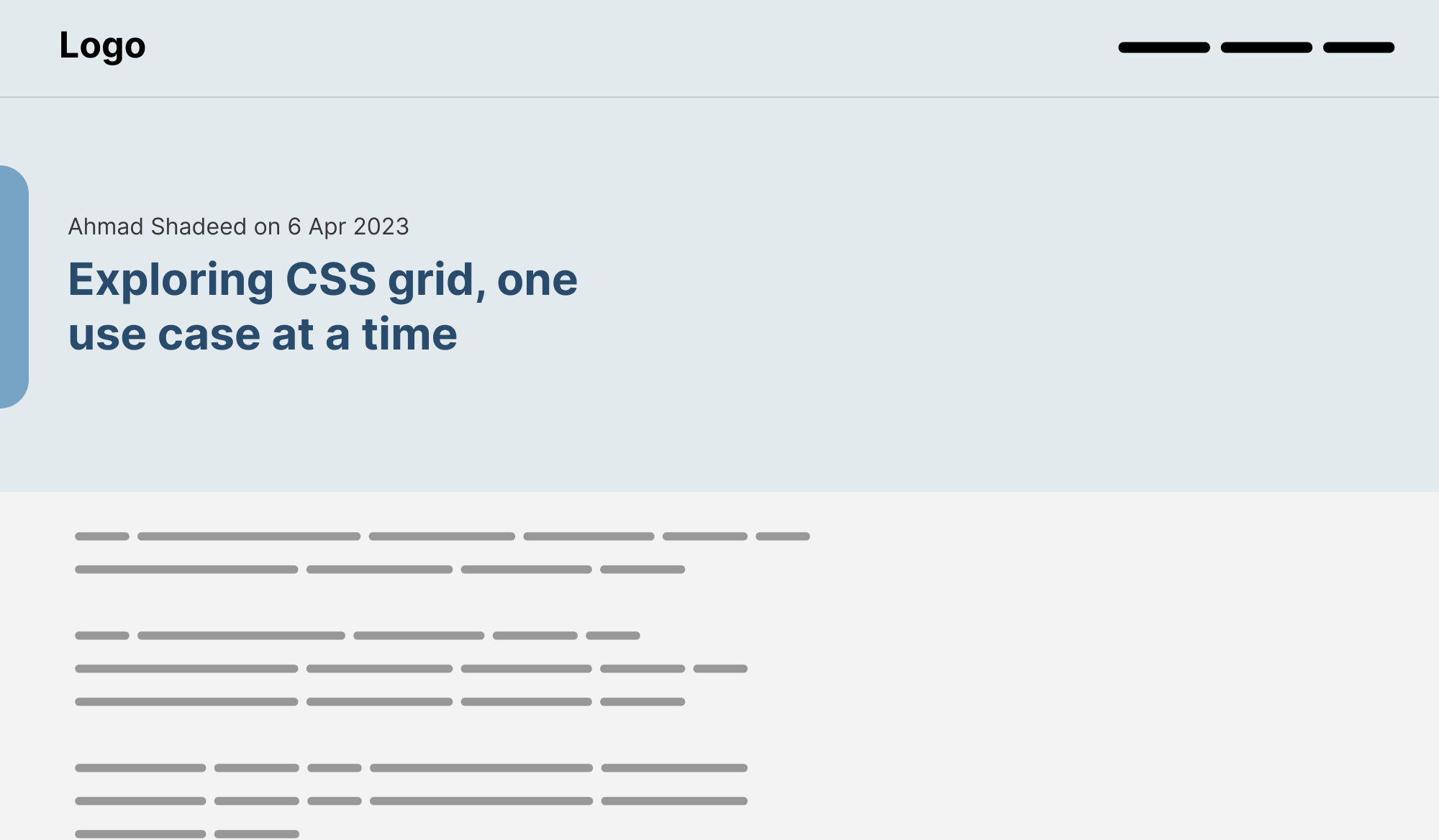
With that, the title content will be balanced and we won’t have a single word in its line.

Demo

Let’s explore this in more detail.

Text balancing with max-width set on the element

It’s important to keep in mind that using text balancing won’t affect the width of the element.

Consider the following figure.
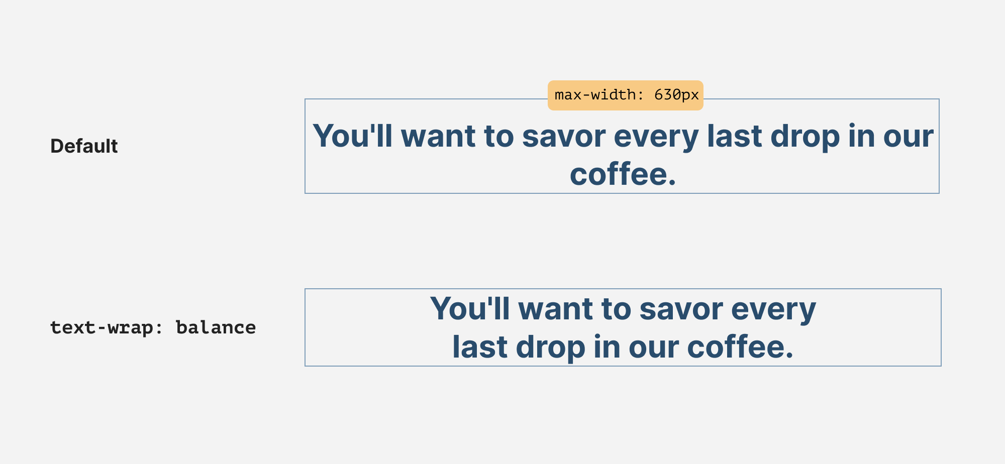
The maximum width of the headline is 630px. When text-wrap: balance is there, it will align the number of words per line, and the max-width won’t be affected.

The same thing also happens when the container is small, like a card title. It will just affect the words within their container.
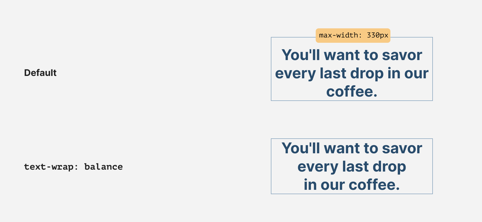
Use cases & examples

Let’s explore where text-wrap: balance can be useful.

Page title

A page title is the first thing that might catch the user’s eye. Here is an example without balancing:
Balanced text:
Card title

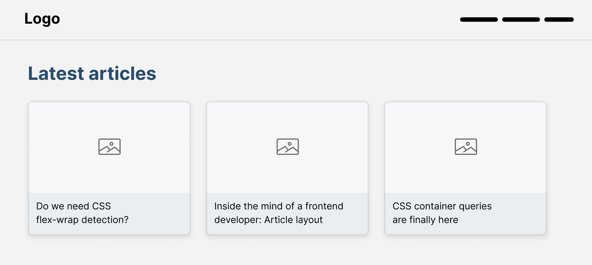
This is a common pattern where you might spot a list of articles with different titles.

With text balancing in CSS, that can be solved easily:

.card__title {
  text-wrap: balance;
}
Tooltip

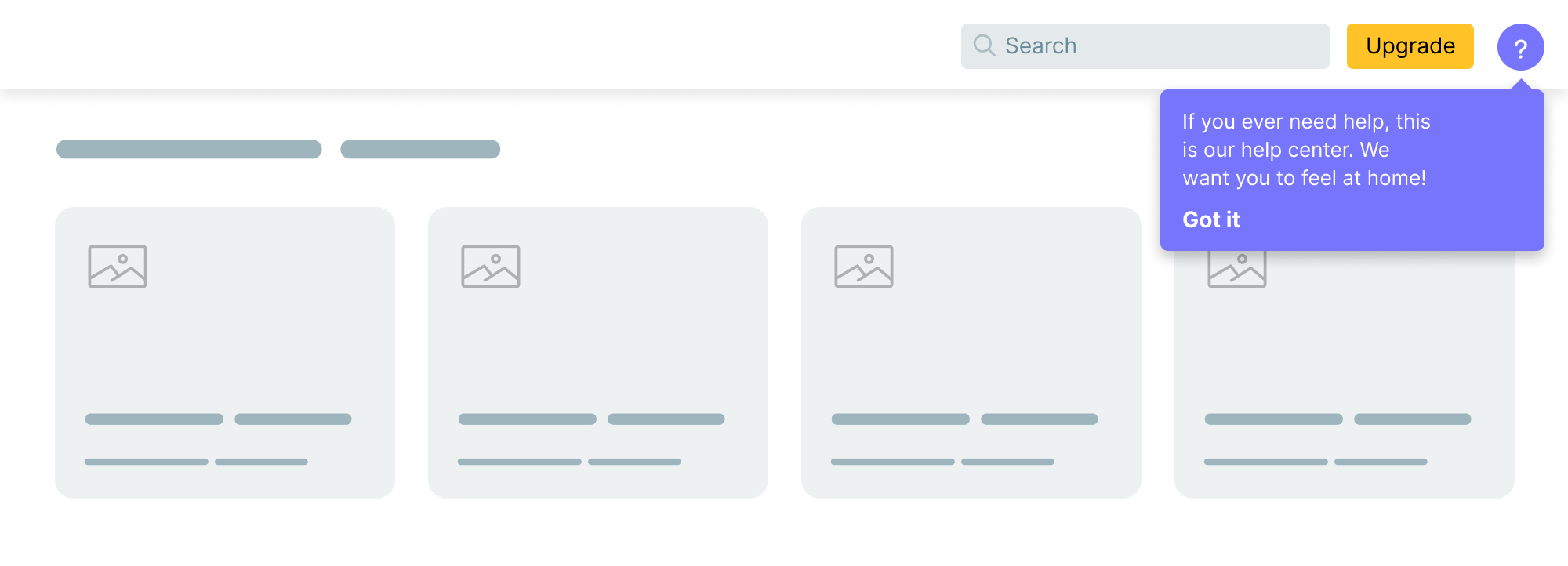
We often use a tooltip to show important information to the user. It might be a few words or multiple lines.

Here is a tooltip where a single word lives on its line.
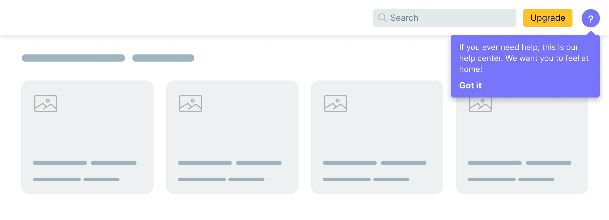
The fixed version with text-wrap: balance.

.tooltip p {
  text-wrap: balance;
}
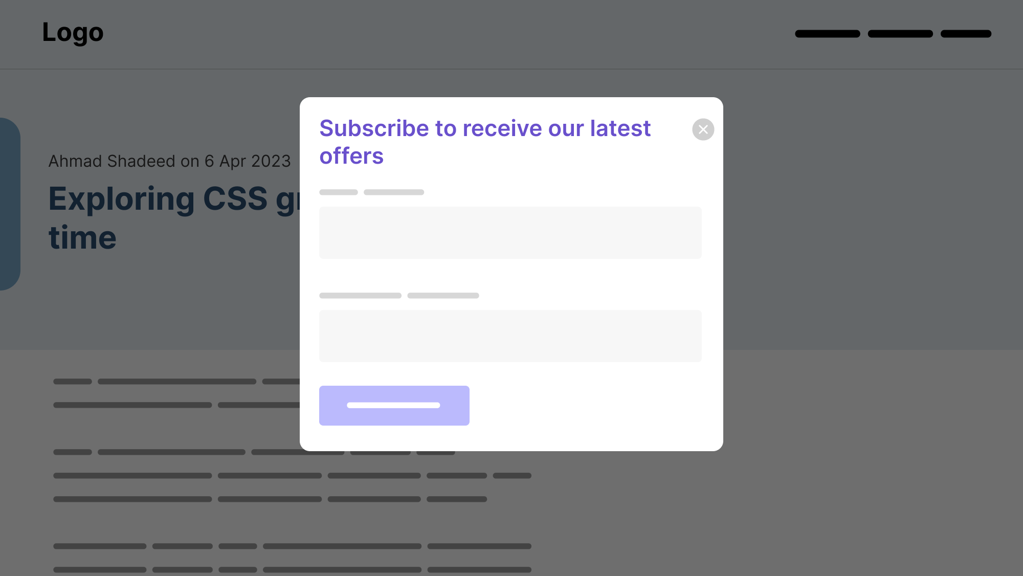
Oftentimes, we might have a modal title that is spanning into multiple lines. It can be visually annoying to see a single word on its line.
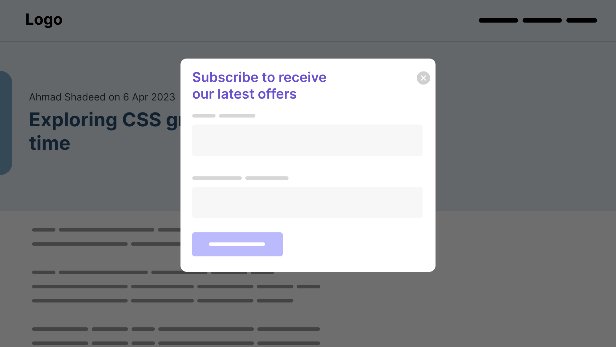
With text balancing, it will look better:

.modal__title {
  text-wrap: balance;
}
FAQ

Another example where I see a good potential for text-wrap: balance is in a FAQ list.
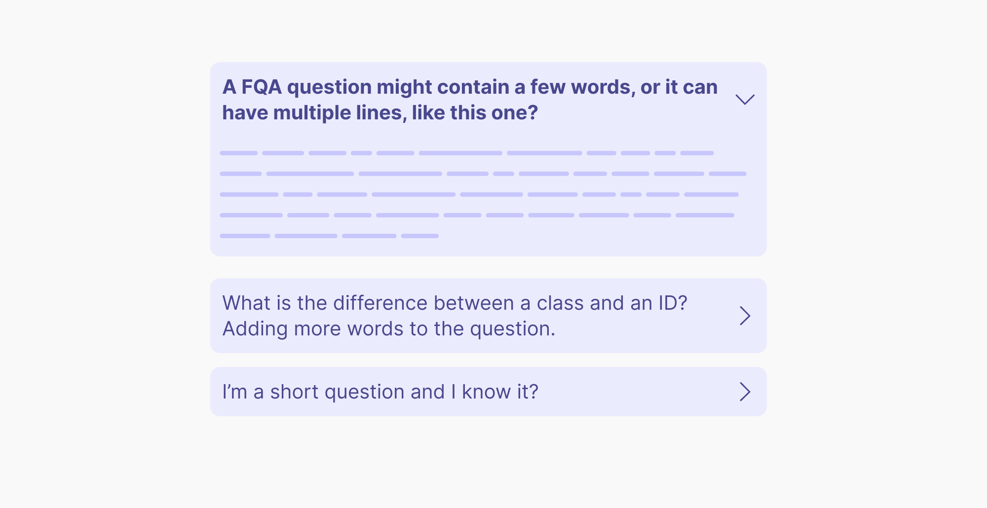
After text balancing:
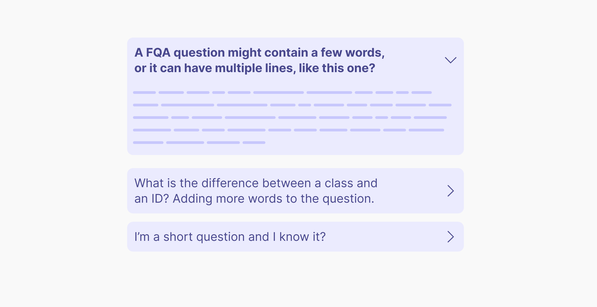
Text balancing won’t affect the element’s width

I’m not sure about using text-wrap: balance when it can’t control the element width. In certain designs, it can leave a big space that makes the design even worse in my opinion.

Consider the following figure:

.blockquote {
  max-width: 20rem;
}

.blockquote p {
  text-wrap: balance;
}
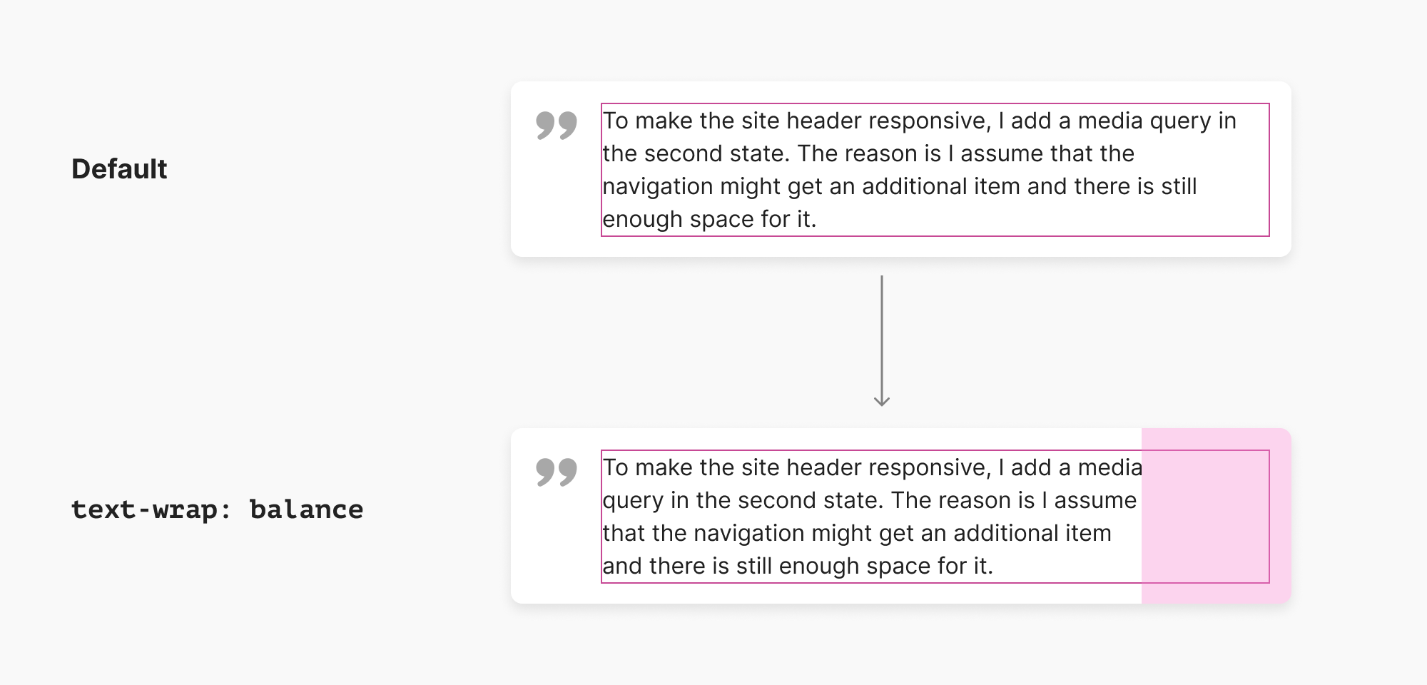
Notice how the width of the text in the pink outline. When text balancing is applied, the width will stay as is and only the text will be reordered.

Here is a similar problem from the tooltip example that I showed:
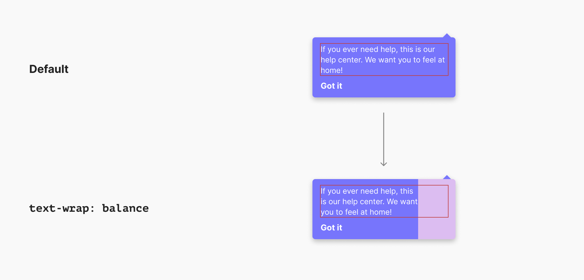
I can tell you from past experiences that this won’t please designers. This is a big white space that makes the design feel unbalanced.

What if, for example, we can turn on an option to let text-wrap: balance affect the element’s width?

.element {
  text-wrap: balance;
  width: fit-content;
}

The keyword fit-content will force the element width to match the new balanced text, but this is just an idea. I’m sure that this idea might be replaced with something better, but you got it.

Performance limits

Currently, the feature is limited to 4 lines only. That means, it can mainly be used for headlines or paragraphs with a few lines.

Further resources: