


I spent years teaching CSS layout on this blog. I put everything I know into The Layout Maestro course: 70+ lessons and 150+ interactive examples that teach you how to think CSS layouts, not just memorize syntax.
A website content should be wrapped or contained in a width that makes the content easy to read. To achieve that, we can use what has been called a wrapper, or a container. Using a wrapper in CSS can be possible in different ways which might introduce some challenges along with it.
In this article, I will explain about layout wrappers in CSS, how they work, how to use them, and when not to use them. Notice that throughout this article, I might mention the terms wrapper and container, and both of them means the same.
Are you ready? Let’s dive in!
When you hear the word wrapper or container, it’s actually means that a group of elements is wrapped or contained inside another element. Without using additional elements, we can add a wrapper to the <body> element as below:
body {
  max-width: 1170px;
  margin-left: auto;
  margin-right: auto;
  padding-left: 16px;
  padding-right: 16px;
}
However, adding the wrapper to the <body> element might not practical for today’s work. The wrapper element can prevent child items from going outside its boundaries. Consider the following figure:
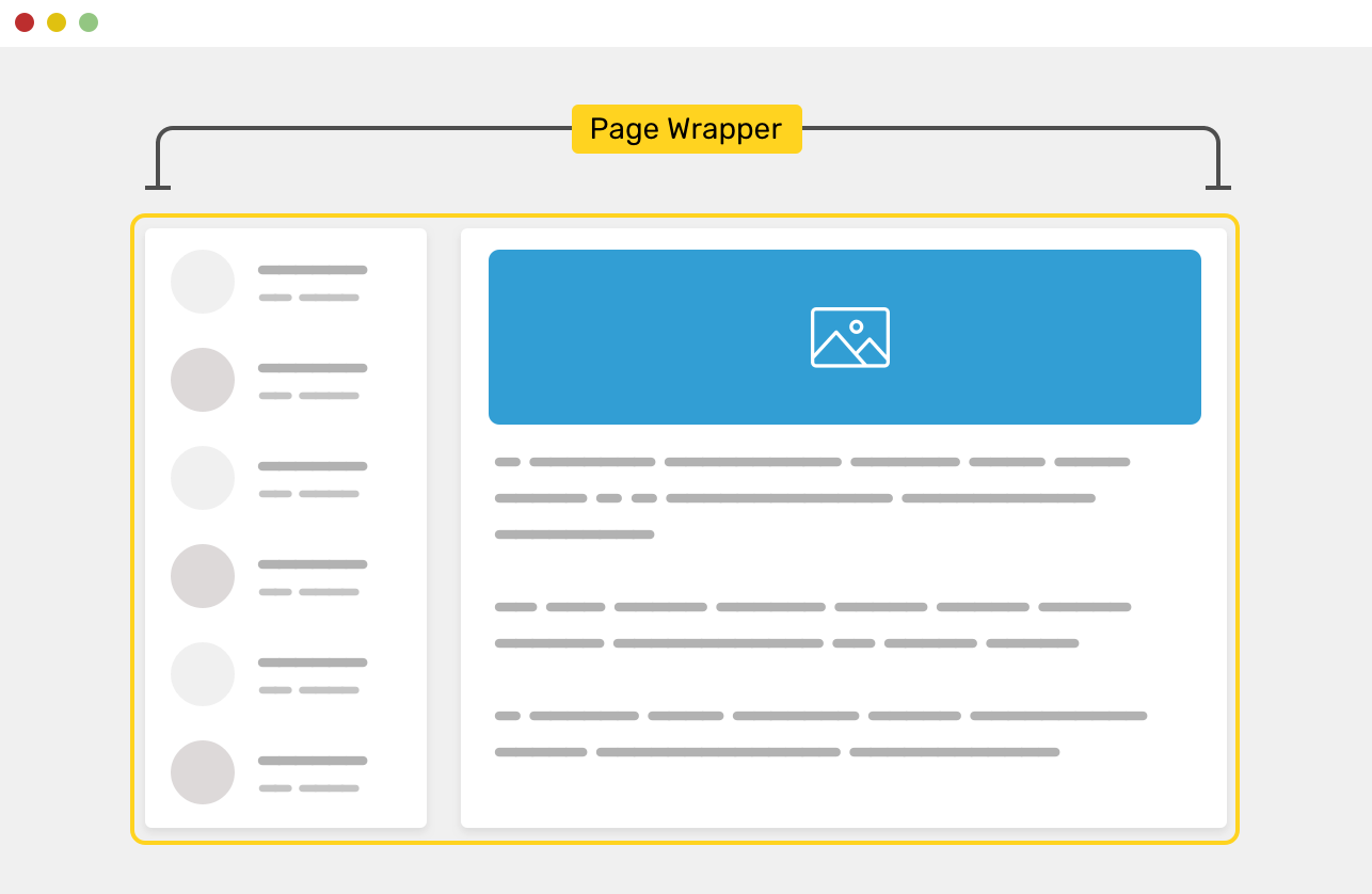
We have aside and main elements, and they live inside another element that wraps them. The .wrapper element has a width, of course.
<div class="wrapper">
  <aside>...</aside>
  <main>...</main>
</div>
Without a wrapper, the child elements will stick to the edges of the screen. This can be very annoying to the user, especially on a large screen.

The figure above shows how the elements will stretch when there is no element wrapping them. This behavior isn’t something that a user should experience. Let me explain the reason behind that.
Using a page wrapper can have many benefits that you should be aware of them as a designer or a developer. Here are some of the benefits:
Now that you understand the basics and the benefits of a wrapper, let’s explore how to build one in CSS.
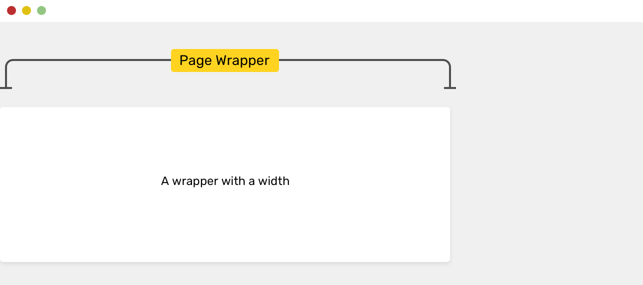
The first thing to decide about when implementing a wrapper is the width of it. How do you want the wrapper width to be? That depends on your design. Generally speaking, having a wrapper width that ranges between 1000px - 1300px is the most commonly used. The popular framework Bootstrap, for example, uses a width of 1170px.
.wrapper {
  width: 1170px;
}
However, it’s not recommended to use the width property as it will cause horizontal scrolling when the screen size is less than 1170px. You can solve it by adding max-width, though.
.wrapper {
  width: 1170px;
  max-width: 100%;
}
While this works, you can get rid of width and use the max-width only as the following.
.wrapper {
  max-width: 1170px;
}
Now that we added the width for the wrapper. Let’s move on to centering it.
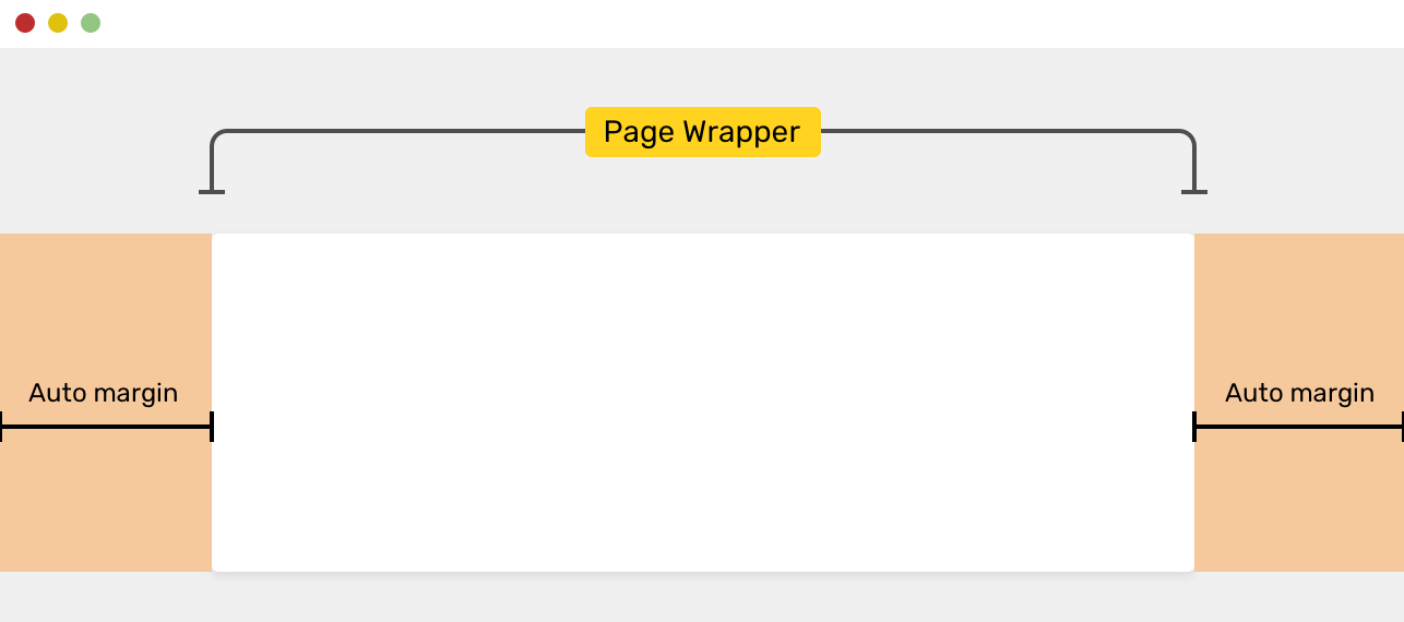
To center the wrapper, you should add an auto margin from the left and right sides. See the following:
.wrapper {
  max-width: 1170px;
  margin: 0 auto;
}
According to the CSS spec, here is how auto margins work:
If both ‘margin-left’ and ‘margin-right’ are ‘auto’, their used values are equal. This horizontally centers the element with respect to the edges of the containing block.
If you are interested to dig in the auto keyword, I wrote a detailed article about it.
I used margin: 0 auto, this basically reset the margin for the top and bottom to zero and make it auto for the left and right sides. There are some consequences of using this, but I will come to them later in this article. For now, it’s recommended to use the longhand version of the margins.
.wrapper {
  max-width: 1170px;
  margin-left: auto;
  margin-right: auto;
}
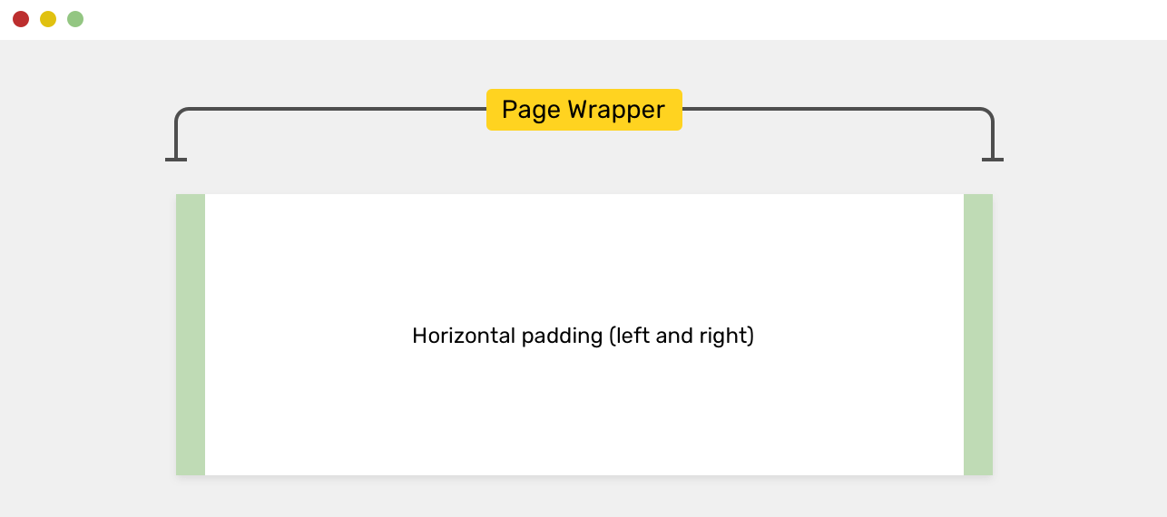
An important thing to consider is to add padding for the left and right sides. When the viewport size is less than the maximum width of the wrapper, this will cause the wrapper edges to stick to the viewport.
.wrapper {
  max-width: 1170px;
  margin-left: auto;
  margin-right: auto;
  padding-left: 16px;
  padding-right: 16px;
}
By adding the padding, we can make sure that we will have a 16px offset from the left and right sides, even if the viewport size is less than the maximum width. The padding acts as a protective strategy that avoids making the wrapper sticking to the viewport edges when space is not enough.
I got a reply about using a percentage width like max-width: 90% for the wrapper instead of using padding-left and padding-right.
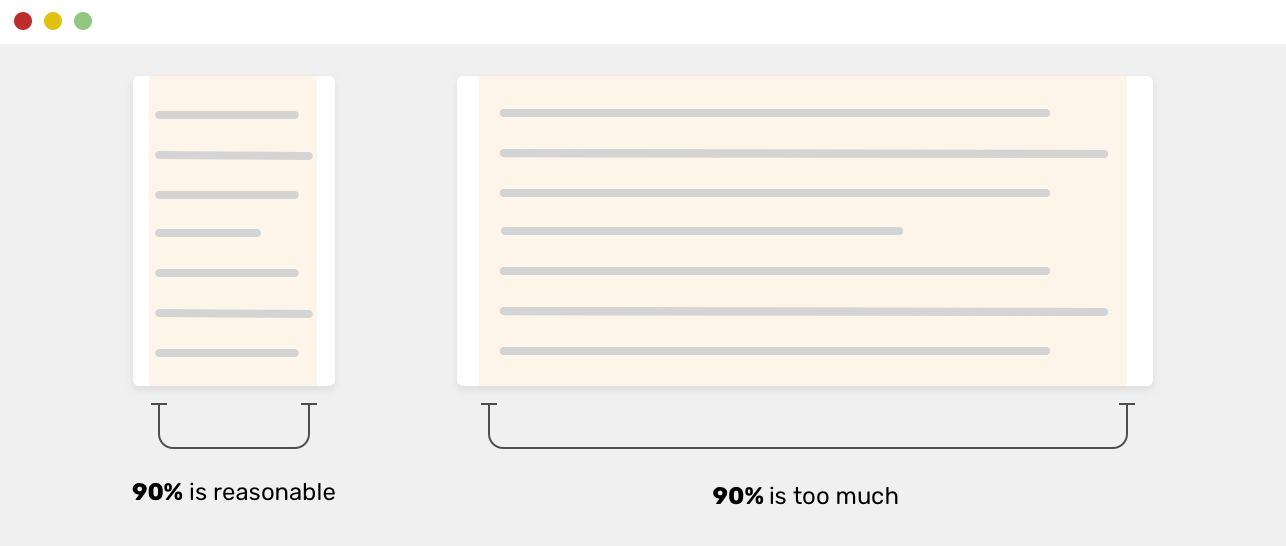
While this works, the 90% of the viewport width will be too much on large screens, which you can override with a media query.
.wrapper {
  max-width: 90%;
  margin-left: auto;
  margin-right: auto;
}

/* A media query for a large screen */
@media (min-width: 1170px) {
  .wrapper {
    max-width: 1170px;
  }
}
By using a percentage width, we added an extra step. We can avoid this step easily by using a fixed width value. Another solution suggested in this tweet says that we can combine width: 90% with a max-width: 1170px property.
.wrapper {
  width: 90%;
  max-width: 1170px;
  margin-left: auto;
  margin-right: auto;
}
That’s an interesting approach, but I would prefer to add the padding myself instead of depending on the percentage width.
display type of a wrapperSince the wrapper is a <div>, it’s a block-level element by default. The question is, what should we do if we want to change the display type to grid, when the content inside the wrapper should be placed in a grid?
Well, I don’t recommend doing that as it stands against the concept of separation of concerns. A wrapper is for wrapping other contents, that’s all. If you need a grid wrapper, then adding another <div> inside the wrapper with display: grid is easier, clear, and more maintainable in the future.
<div class="wrapper">
  <!-- Content -->
</div>
This is not recommended, the wrapper element could be used on another page and this might break the layout unintentionally.
.wrapper {
  display: grid;
  grid-template-columns: 2fr 1fr;
  grid-gap: 16px;
}
A better solution would be as the following:
<div class="wrapper">
  <div class="featured-news">
    <!-- Elements that needs to be placed in a grid -->
  </div>
</div>
.featured-news {
  display: grid;
  grid-template-columns: 2fr 1fr;
  grid-gap: 16px;
}
Notice how I added a separated <div> element to wrap the content. Please don’t mind the class and naming conventions for this example. We can have an even better solution by using a class naming that can be reused across different pages on the website. However, CSS naming conventions are out the scope of this article.
Do you remember when I didn’t recommend using the shorthand version to center the wrapper element? I mean this:
.wrapper {
  margin: 0 auto;
}
While it works, it can get confusing when you have multiple wrappers on the page and you need to add spacing between them. If for some reason you added another variation class to the .wrapper, adding the margin might not work for specificity reasons.
.wrapper-variation {
  margin-top: 50px;
}

.wrapper {
  max-width: 1170px;
  margin-left: auto;
  margin-right: auto;
  padding-left: 16px;
  padding-right: 16px;
}
The margin for the .wrapper-variation element won’t work because it’s overridden by margin: 0 auto. A shorthand property overrides a longhand one. To avoid such confusion, it’s recommended to use longhand for such cases.
Now let’s get to adding the margin. In each project, I prepare a set of utility classes for margin and padding, and I use them when necessary. Consider the following figure.
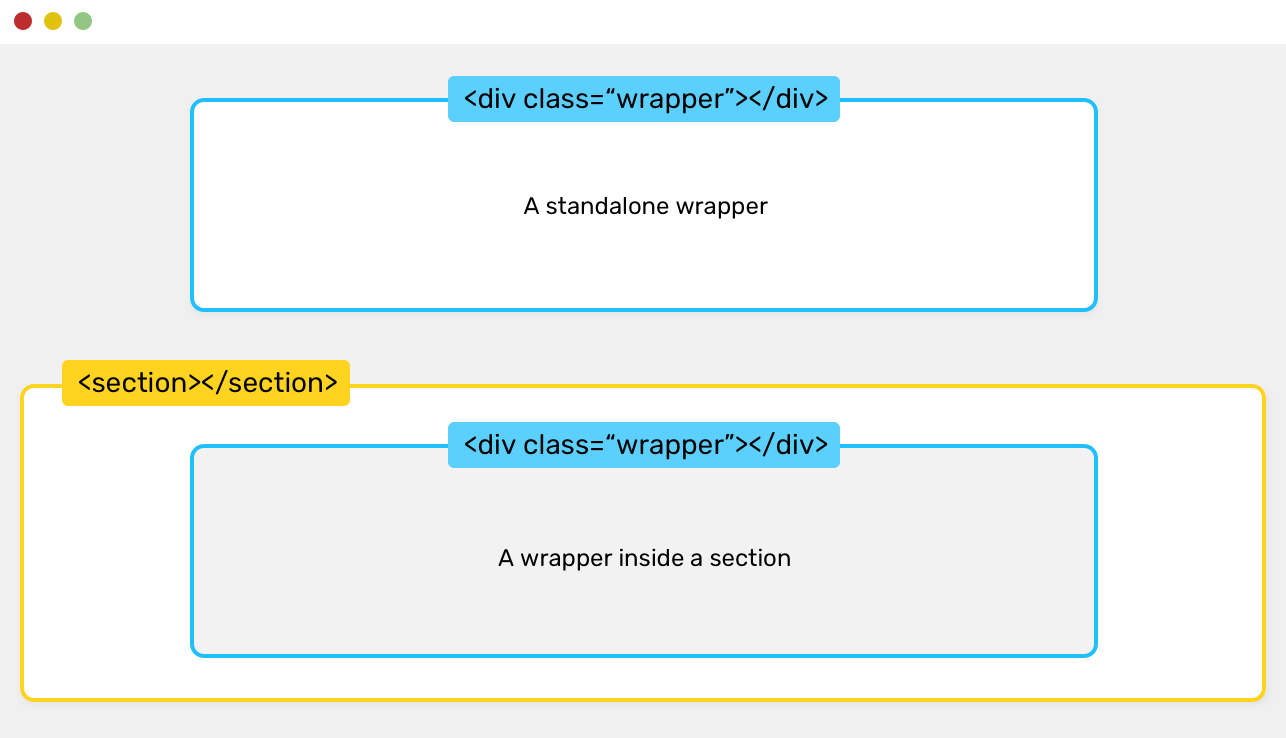
<div class="wrapper mb-5"></div>
<section>
  <div class="wrapper"></div>
</section>
<div class="wrapper"></div>
.mb-5 {
  margin-bottom: 3rem !important;
}
That way, the wrapper CSS stays as it is, and the spacing is added with an additional CSS utility class. Now, you might ask, why do I need to add multiple wrappers to a page, when I can add one? In the HTML above, there is a <section> element between two wrappers.
Using !important here is good, as the point of utility classes is to force a property, and by adding !important, we can ensure that.
There might be cases when you have a section with a background that has 100% viewport width, and within it, there is a wrapper. It’s similar to what is introduced in the previous example.
A page HTML structure can be like that:
<section>
  <div class="wrapper"></div>
</section>
<section>
  <div class="wrapper"></div>
</section>
The <section> has 100% width of the viewport. You can add a background color or image to it. Inside it, the wrapper prevents the content from becoming taking the full width of the viewport.
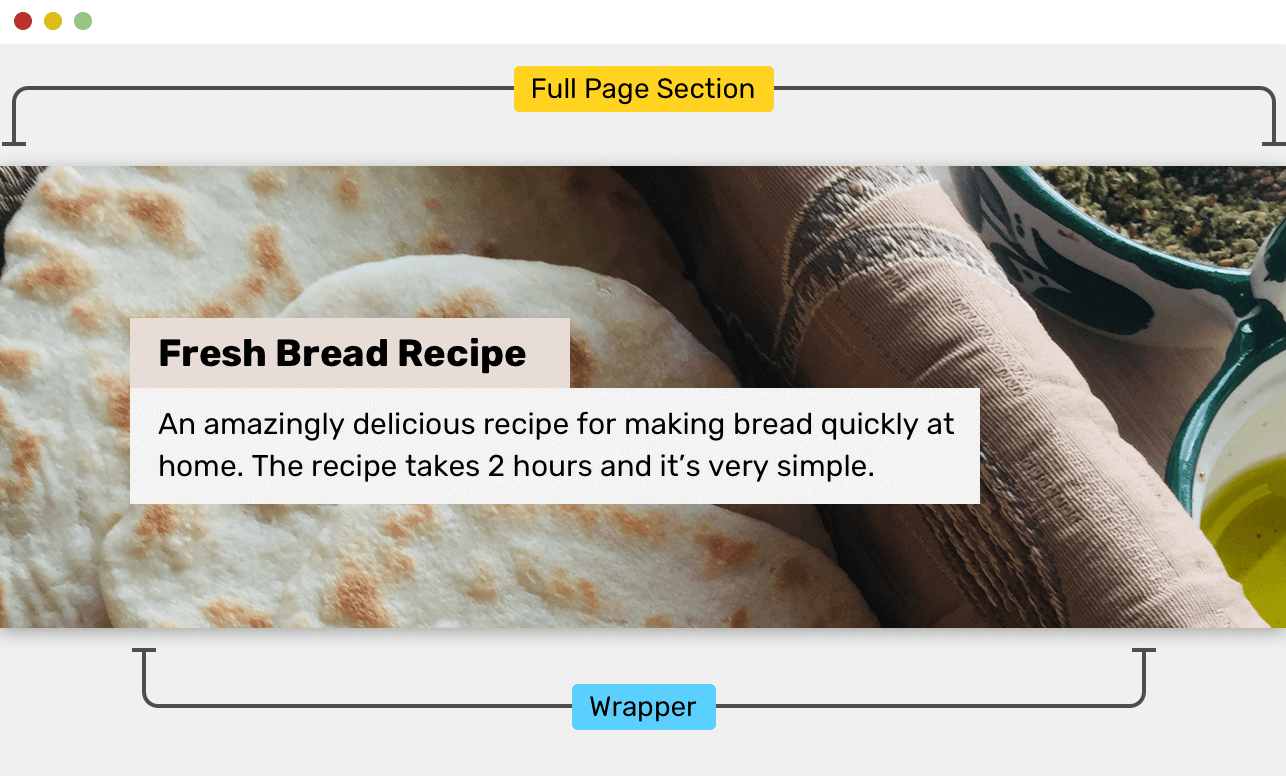
In the figure above, the section has a background image and it’s taking the full width of the viewport. The content inside is restricted by the wrapper’s width.
Well, it depends. Let’s explore the two most commonly used hero section designs.
The first one has its content centered and is constrained by a specific width.
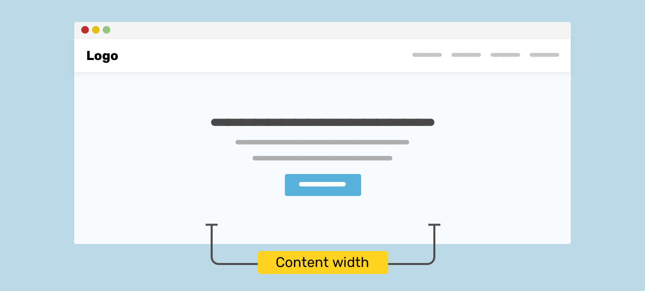
The second one has its content spread to the main wrapper width.
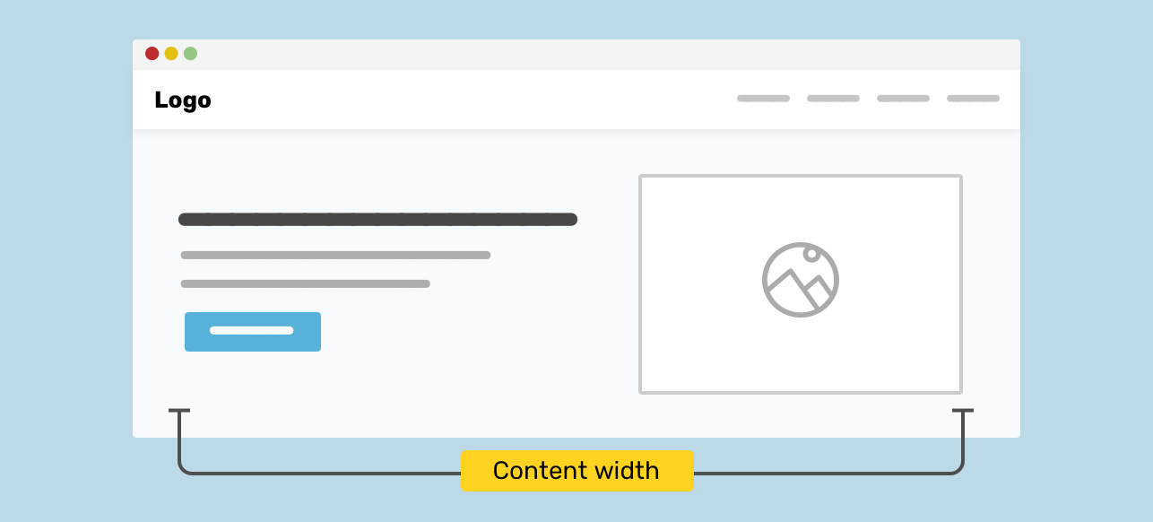
To understand the two patterns better, let’s explore how to build each one of them.
You might be tempted to place the hero content and then center everything without considering the wrapper.
<section class="hero">
  <h2>How to make bread at home</h2>
  <p>....</p>
  <p><a href="/sign-up">Sign up</a></p>
</section>
With the HTML above, you could center the content with text-align:
.hero {
  text-align: center;
}
This will look good until you resize the browser window. Here are the issues you might notice.
Since there is no padding on the left and right sides, the content will stick to the edges without proper spacing. This is bad for the user as it will make it harder to observe and read the content.
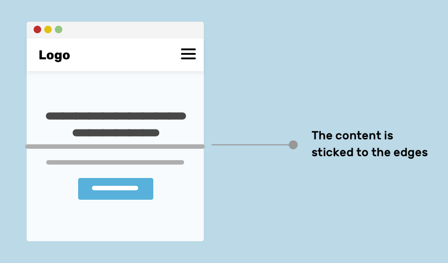
On large screens, the paragraph text can be very hard to read since the line length is too long. As per The Elements of Typographic Style Applied to the Web, the recommended number of characters for a line is 45 to 75. Anything far from that range will make the reading harder.
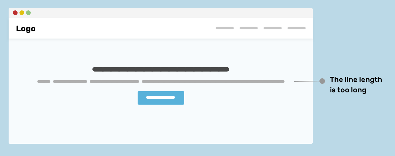
To avoid the above issues, a wrapper can be used to prevent the text length from becoming too long and to add spacing in mobile.
<section class="hero">
  <div class="hero__wrapper">
    <h2>How to make bread at home</h2>
    <p>...</p>
    <p><a href="/sign-up">Sign up</a></p>
  </div>
</section>
I used the class hero__wrapper since this wrapper might be custom only for the hero section, so it can have a certain width which is smaller than the usual wrapper element.
.hero__wrapper {
  max-width: 720px;
  margin-left: auto;
  margin-right: auto;
  padding-left: 16px;
  padding-right: 16px;
}
For centering the content, it can be done using the technique of your choice, depending on the use-case. For this example, using text-align: center is enough to center the content.
I don’t know if there is a black or white for this question, but I’ve seen websites that center the wrapper on laptop screens, and it’s left-aligned on desktop sizes.
The Techcrunch website is an example of this. Notice how the website is left-aligned on large screens.
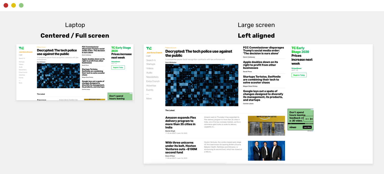
For me, I love reading a website that is centered and has symmetrical spacing on the left and right sides. But it could be a reason that I don’t know about it. If you have an idea, please let me know on Twitter!
It’s rare that you only need a wrapper with one size. A wrapper width could be small or big, depending on the content and use-case. By leveraging CSS variables, we can create a modern take on a wrapper, and you will have great flexibility. Consider the below:
<div class="wrapper"></div>
.wrapper {
  max-width: var(--wrapper-width, 1170px);
  margin-left: auto;
  margin-right: auto;
  padding-left: 16px;
  padding-right: 16px;
}
If you notice, the var has two values, the first one if the variable --wrapper-width, and the second one is 1170px. The second variable is a fallback, which means that if the variable --wrapper-width is not set, the second one will be used.
What does that mean? It means that you can create a variation of the wrapper, by overriding the --wrapper-width as below:
<div class="wrapper" style="--wrapper-width: 720px"></div>
That way, I created a custom wrapper without:
If you don’t like the solution of adding an inline style for overriding the CSS variable, you can add a new class instead. See below:
<div class="wrapper wrapper--small"></div>
.wrapper--small {
  --wrapper-width: 720px;
  /* this will override the default wrapper width. */
}
display: contentsFirst, let me brief you about this value. Each element in CSS is a box, and that box contains content, padding, margin, and border. By using display: contents, that box will be removed from the flow. I can imagine it as removing the surrounding opening and closing tags.
<header class="site-header">
  <div class="wrapper site-header__wrapper">
    <!-- Header content -->
  </div>
</header>
.site-header__wrapper {
  display: flex;
  flex-wrap: wrap;
  justify-content: space-between;
}

In the example above, you might need to let the header expand to the full width of the page, instead of being restricted by the wrapper width.
.site-header__wrapper {
  display: contents;
}

.site-header {
  display: flex;
  flex-wrap: wrap;
  justify-content: space-between;
}
By doing that, the .wrapper element will be hidden (kind of). Now, when display: flex is applied to the .site-header element, the descendants items of the .wrapper will be the child items of .site-header.

In her CSS Secrets book, Lea Verou introduced an interesting technique that can be used for sections that have a fluid background (taking the full viewport width) with a wrapper inside it. Let’s review the common way of doing it.
<section>
  <div class="wrapper"></div>
</section>
section {
  background-color: #ccc;
}

.wrapper {
  max-width: 1170px;
  margin-left: auto;
  margin-right: auto;
  padding-left: 16px;
  padding-right: 16px;
}
The margin-left: auto and margin-right: auto works in a way that computes half the viewport width, minus the content width. That same thing can be done using padding.
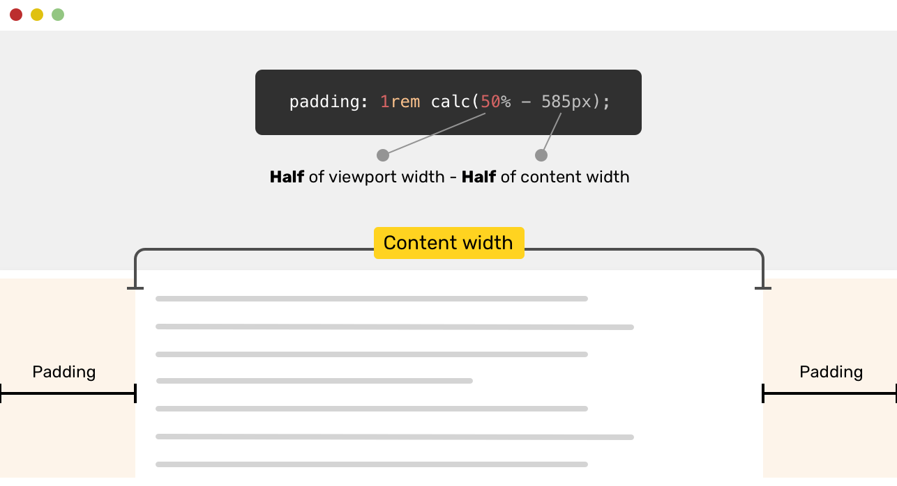
section {
  padding: 1rem calc(50% - 585px);
}
We are not done yet. The content will be sticked to the edges on mobile. A solution for that would be the following.
section {
  padding: 1rem;
}

@media (min-width: 1170px) {
  section {
    padding: 1rem calc(50% - 585px);
  }
}
An alternative solution would be to use the new CSS max() function. Simply, we set a minimum padding of 1rem, and the 50% - 585px calculation can be used as the other value.
section {
  padding: 1rem max(1rem, (50% - 585px));
}
If you want to learn more about min(), max(), and clamp(), I wrote a detailed article about them.
That’s a wrap. Do you have a comment or a suggestion? Please feel free to ping me on @shadeed9.
Thank you for reading.
此内容由惯性聚合(RSS阅读器)自动聚合整理,仅供阅读参考。 原文来自 — 版权归原作者所有。