


I spent years teaching CSS layout on this blog. I put everything I know into The Layout Maestro course: 70+ lessons and 150+ interactive examples that teach you how to think CSS layouts, not just memorize syntax.
In CSS, we have the value auto which could be used for properties like margin, positioning, height, width, and a lot more. I felt that I need a place to document everything I know about them so that it can be a reference for anyone interested to dig into the auto thing.
For this article, I will explain the technical details of how auto works in the first place, and how we can leverage it to the maximum. Of course, there will be some use-cases and examples.
The use of auto keyword varies from a property to another. For this article, I will explain the value in the context of each property.
autoThe initial width of block-level elements like <div> or <p> is auto, which makes them take the full horizontal space of their containing block.
According to the CSS spec:
‘margin-left’ + ‘border-left-width’ + ‘padding-left’ + ‘width’ + ‘padding-right’ + ‘border-right-width’ + ‘margin-right’ = width of containing block
When an element has auto as a value for width, it can have margin, padding, and border without becoming bigger than its parent element. The width of its content box will be the content itself with the subtraction of margin, padding, and border.
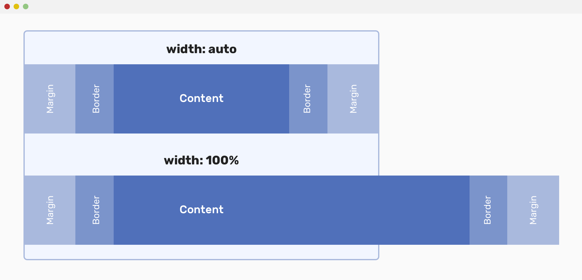
Let’s see the above mockup as an example in action.
<div class="wrapper">
  <div class="item"></div>
</div>
* {
  box-sizing: border-box;
}

.wrapper {
  max-width: 600px;
  margin: 2rem auto 0;
  padding: 1rem;
}

.item {
  padding: 1rem;
  margin: 0 50px;
  border: 15px solid #1f2e17;
}
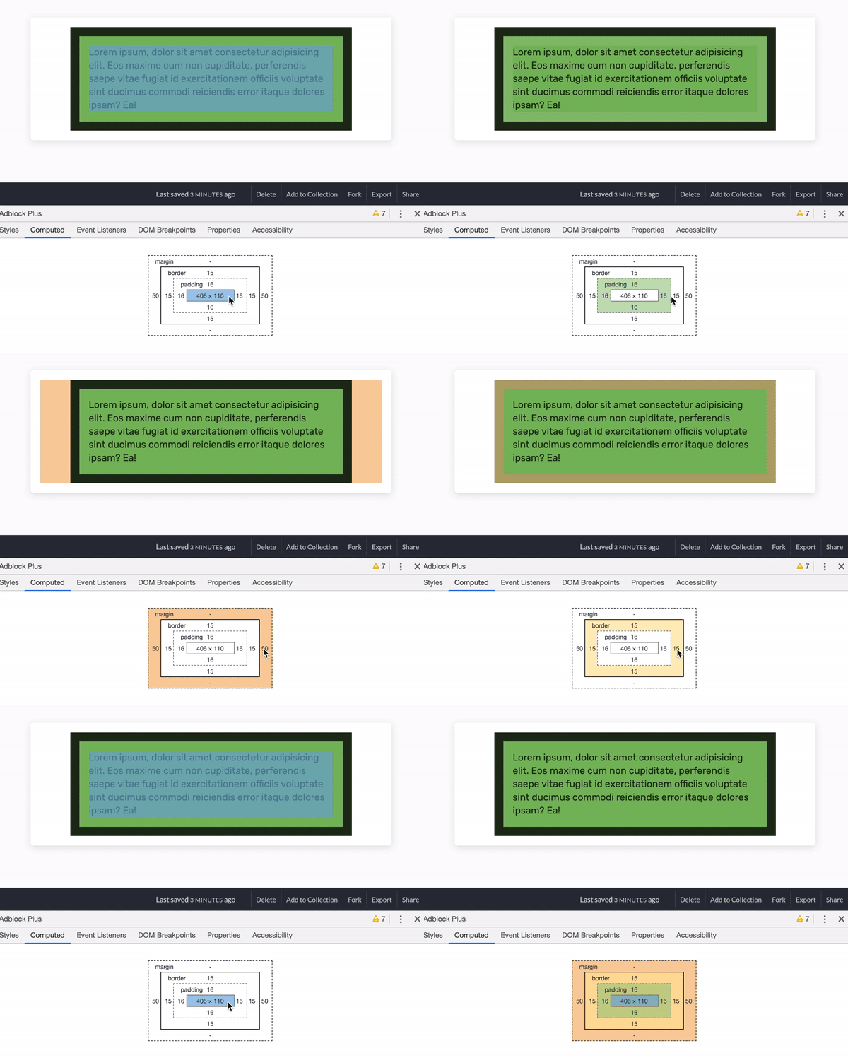
Everything is ok. The item is constrained within its parent.
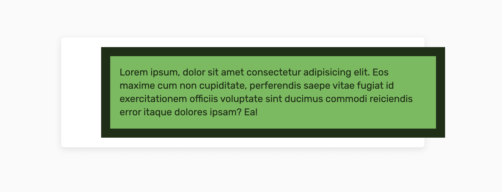
However, what will happen if we change the item’s width to 100% instead of auto? The item will take 100% of its parent, plus the margins on the left and the right sides.
.item {
  width: 100%;
  padding: 1rem;
  margin: 0 50px;
  border: 15px solid #1f2e17;
}
The width of the item is 568px, which is the sum of the following:
‘border-left-width’ + ‘padding-left’ + ‘width’ + ‘padding-right’ + ‘border-right-width’ = width of the item 15 + 16 + 506 + 16 + 15 = 506px
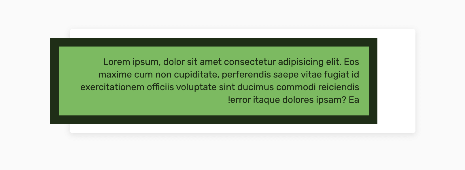
If the direction is ltr, the margin-right will be completely ignored. In our case, that happens. However, if the layout is rtl, then the margin-left will be ignored.
width: autoExplaining the basics is not enough for us to grasp the concept, so I researched to highlight some practical use-cases for width: auto.
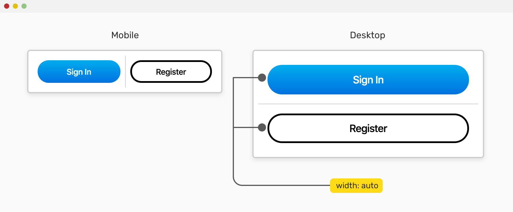
We have a group of buttons. On mobile, we want them to be next to each other (each button wrapper takes 50% of its parent), while on desktop, each one should take the full width of their parent. How to do it?
<div class="group">
  <div class="group__item">
    <button class="c-button">Sign In</button>
  </div>
  <div class="group__item">
    <button class="c-button c-button--ghost">Register</button>
  </div>
</div>
I used flexbox to make the buttons appear next to each other.
.group {
  display: flex;
}

.group__item {
  width: 50%;
}
And on desktop, I need each one to take the full width. In that case, you might be tempted to use width: 100%, right? There is a better solution.
@media (min-width: 800px) {
  /* Revert the wrapper to a block element instead of flex */
  .group {
    display: block;
  }

  .group__item {
    width: auto;
  }
}
Since the .group__item is a block element, using width: auto makes it fill the available space of its parent nicely.
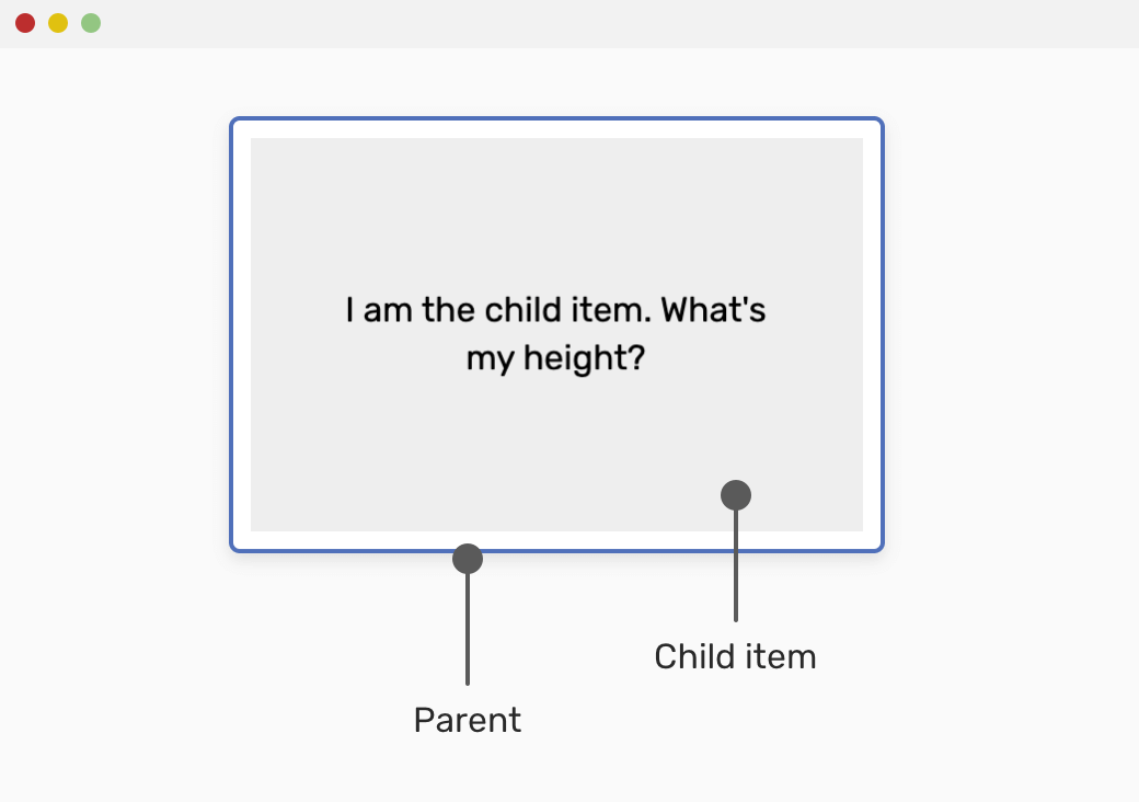
autoWhen it comes to height, things are different. The height of an element is equal to its content where the default value is auto.
Consider the following example.
<div class="wrapper">
  <div class="item">What's my height?</div>
</div>
To make the .item take the full height of its container, we can use one of the following:
.wrapper a fixed height, and then add height: 100% for the .item element..wrapper and it will stretch the child item .item by default..wrapper {
height: 200px;
}
.item {
height: 100%;
}
auto keywordFor margins, the most common use case to center elements with know widths horizontally.
Consider the following example:
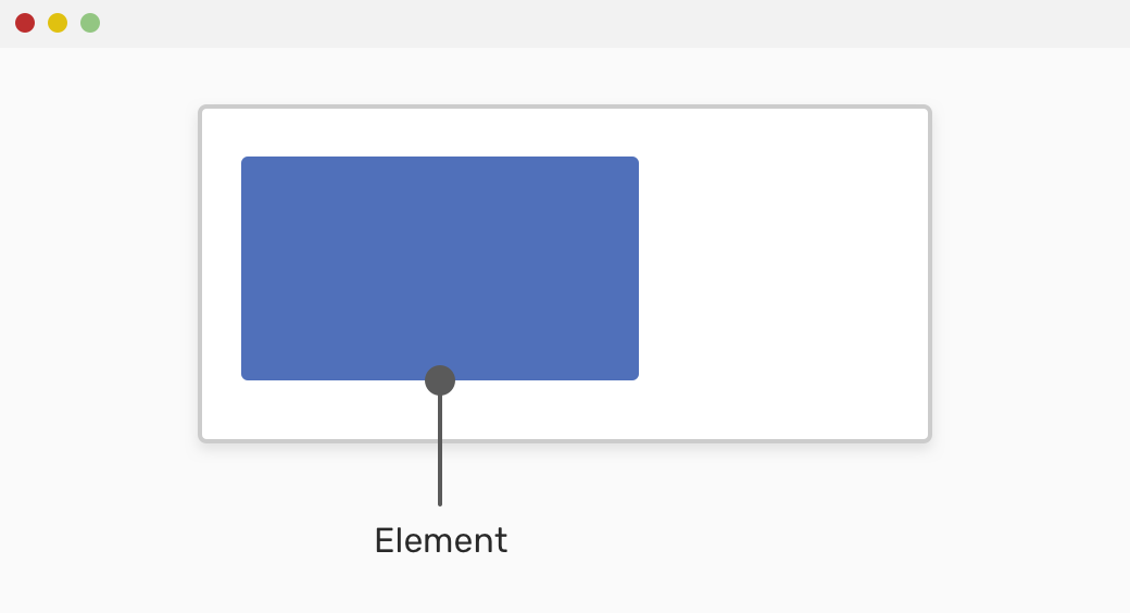
The blue rectangle should be centered horizontally. For that purpose, the following should be used:
.element {
  margin-left: auto;
  margin-right: auto;
}
According to the CSS spec:
If both ‘margin-left’ and ‘margin-right’ are ‘auto’, their used values are equal. This horizontally centers the element with respect to the edges of the containing block.

auto With Absolutely Positioned Elements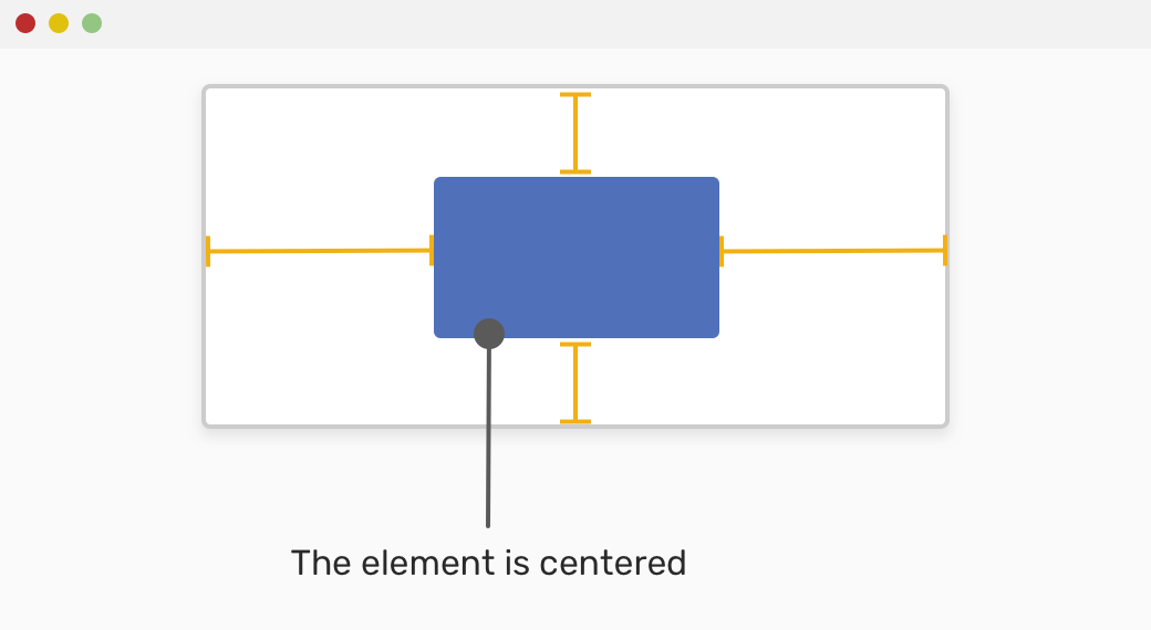
Another less common use-case to center an absolutely positioned element is margin: auto. When we have an element that should be centered horizontally and vertically inside its parent, we might be tempted to use translateX or translateY.
For the above technique to work, we need the following:
position: absolute<div class="wrapper">
<div class="item">I am centered.</div>
</div>
.wrapper {
  position: relative;
}

.item {
  width: 200px;
  height: 100px;
  position: absolute;
  left: 0;
  top: 0;
  right: 0;
  bottom: 0;
  margin: auto;
}
Using auto margins with flexbox can be very useful in some use cases. When a child item has an auto margin, it will be pushed to the far to the opposite side. For example, if a flex item has margin-left: auto, it will be pushed to the far right.
Consider the following mockup. We have two boxes, taking into consideration that the parent is a flex container.
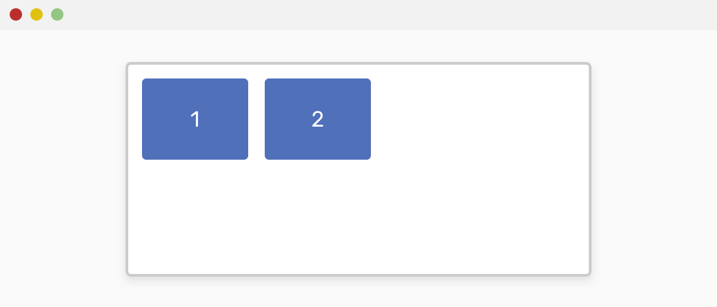
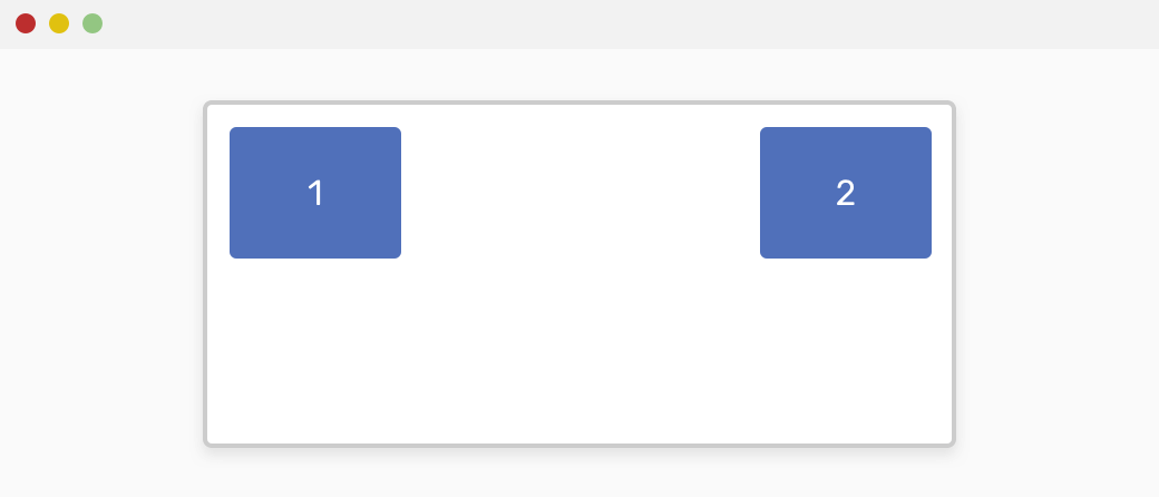
We want item #2 to be pushed to the far right. Auto margins are perfect for that!
.wrapper {
  display: flex;
}

.item-2 {
  margin-left: auto;
}
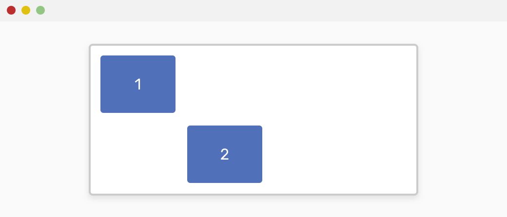
Not only that, but it can also work in the either horizontal or vertical direction. See the following example:
.item-2 {
  margin-top: auto;
}
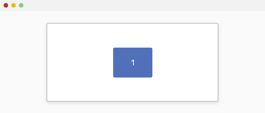
Also, if we have only one child element, we can use margin: auto to center it horizontally and vertically.
.item-1 {
  margin: auto;
}
auto KeywordIn flexbox, we can use flex: auto for a child item. What does that mean? Well, let me explain that. When a child item has flex: auto, that is equivalent to flex: 1 1 auto which means the following:
.item {
  flex-grow: 1;
  flex-shrink: 1;
  flex-basis: auto;
}
According to Mozilla Developer Network (MDN):
The item is sized according to its width and height properties, but grows to absorb any extra free space in the flex container, and shrinks to its minimum size to fit the container. This is equivalent to setting “flex: 1 1 auto”.
An item with flex: auto will be sized based on its width and height, but it can grow or shrink depending on the extra space available. I didn’t know about that before researching for this article!
<div class="wrapper">
  <div class="item item-1">Item</div>
  <div class="item">Item</div>
  <div class="item">Item</div>
</div>
.wrapper {
  display: flex;
  flex-wrap: wrap;
}

.item {
  width: 120px;
  height: 500px;
}

.item-1 {
  flex: auto;
}
autoauto Column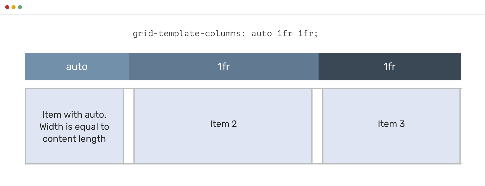
In CSS Grid, we can set a column to auto, which means its width will be based on its content length. See the below to know what I mean:
.wrapper {
  display: grid;
  grid-template-columns: auto 1fr 1fr;
}
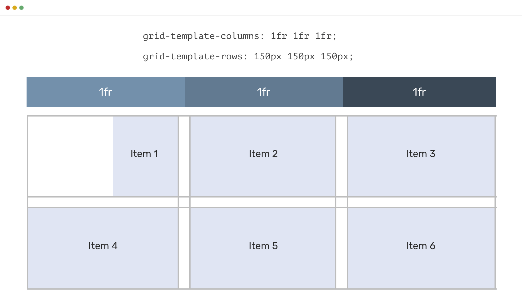
auto MarginsWhen CSS grid is used, auto margins can be used to achieve results that are similar to flexbox. When we have a grid, and of the grid items has margin-left: auto for example, it will be pushed to the right and its width will be based on its content length.
Consider the following example.
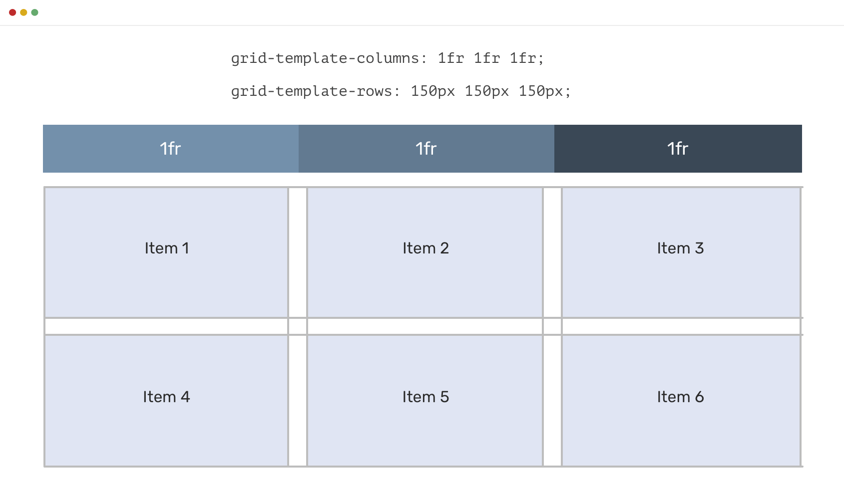
We want item #1 width to be based on its content, not on the grid area. By using margin-left: auto, we can achieve the following:
.item-1 {
  margin-left: auto;
}
It worth mentioning that using margin-left: auto or margin-right: auto might work great for the left to right layouts, like English. However, beware to flip those values when working on a multilingual website.
Even better, I would recommend using flexbox or grid properties in case the job can be done with them. If not, then make using auto margins your last resort and instead, use CSS logical properties.
When we have an element, we should think about the minimum and maximum content it should take. If the content exceeded the maximum, then we need to show a scrollbar.
You might be tempted to use the following:
.element {
  overflow-y: scroll;
}
However, this might show a scrollbar even if the content height is short. See the example below:
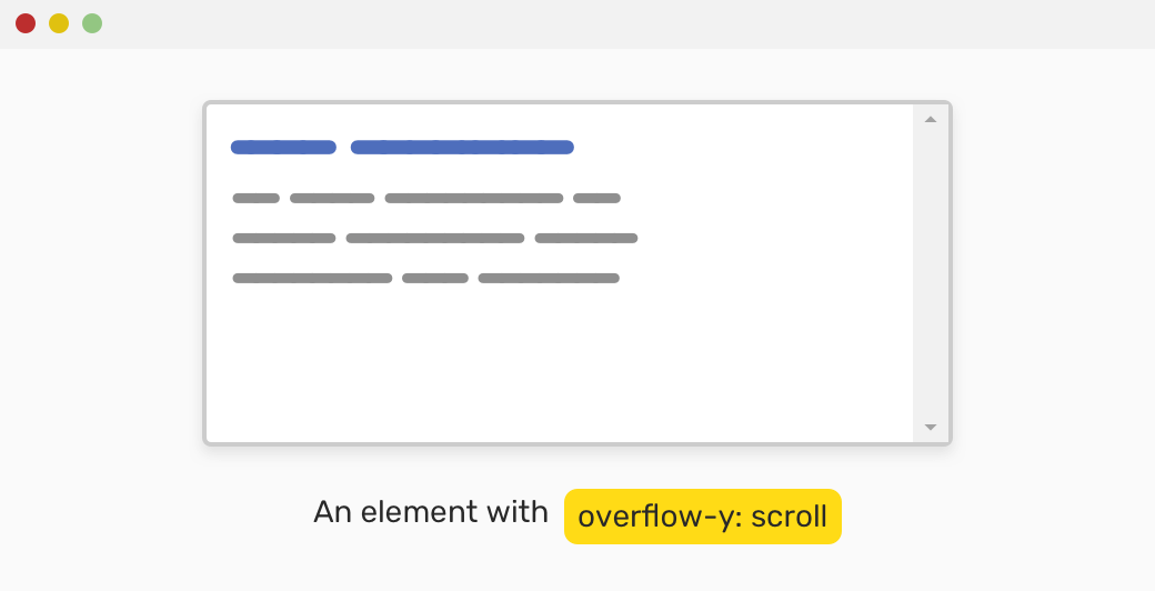
In Chrome Windows, the scrollbar is always shown. This is incorrect and confusing behavior.
By using auto keyword instead, we can assure that the scrollbar won’t be shown unless the content height is bigger than its container.
According to MDN:
Depends on the user agent. If content fits inside the padding box, it looks the same as visible, but still establishes a new block formatting context. Desktop browsers provide scrollbars if content overflows.
.element {
  overflow-y: auto;
}
For the CSS positioning properties top, right, bottom, and left, we can use the auto keyword as a value for them.
The next thing I’m gonna explain is new for me and I learned it while researching for this article.
Consider the following mockup:
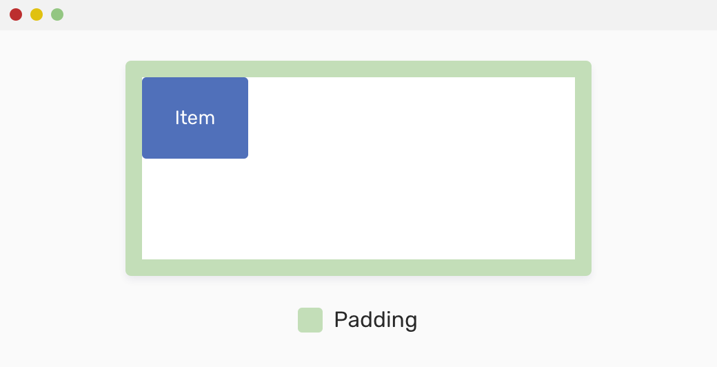
We have a wrapper that has padding, and there is a child item. The child item is absolutely positioned and still didn’t have any positioning property with it.
.wrapper {
  position: relative;
  padding: 16px;
}

.item {
  position: absolute;
  width: 100px;
  height: 100px;
}
In CSS, there is an initial/default value for each property. If I inspected the child item and went to the computed styles, what do you guess the value of the left property?
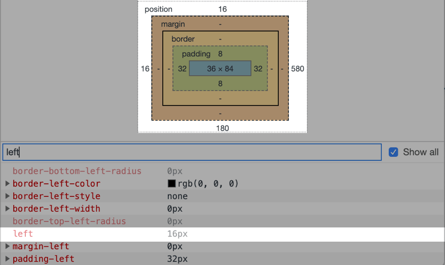
The default value for left is 16px! Why did that happen even I didn’t set it? Well, the reason is that an absolutely positioned element is relative to its closest parent with position: relative. That parent has padding: 16px, so the child item is positioned 16px from the top and left sides. Interesting, no?
Now, you might ask, what’s the benefit of that? Well, let me move on.
Let’s suppose that the child item has to be positioned 100px from the left on small viewport sizes, and for desktop, it should revert back to the default position.
.wrapper {
  position: relative;
}

.item {
  position: absolute;
  left: 100px;
  width: 100px;
  height: 100px;
}
How to reset the left on larger viewports? We can’t use left: 0 as this will stick the child to the edge, which is not what we want. See the below mockup for what I mean.
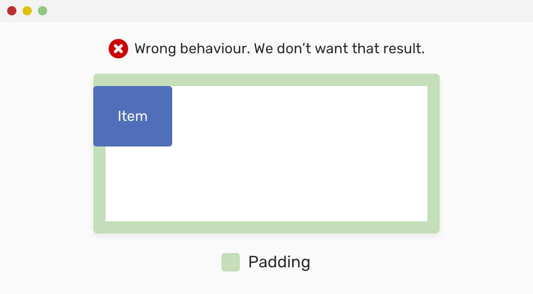
To reset the child item in the correct way, we should use left: auto. According to MDN:
The element is positioned where it should horizontally be positioned if it were a static element.
That means, it will respect the padding and it won’t stick the child item to the edge of its parent.
.item {
  position: absolute;
  left: 100px;
  width: 100px;
  height: 100px;
}

@media (min-width: 800px) {
  .item {
    /* This is equivalent to left: 16px */
    left: auto;
  }
}
The same applies to the top property. For the right and bottom properties, their default computed value is equal to the element width and height, respectively.
It’s worth mentioning that the use-cases below might not be enough, but I tried to add some and hope they will be useful for you.
For a tooltip, we need a pointing arrow to make it more clear for the user. In case we’re working on a design system, we should account for multiple states. For example, a tooltip with an arrow pointing to the left, and another one to the right.
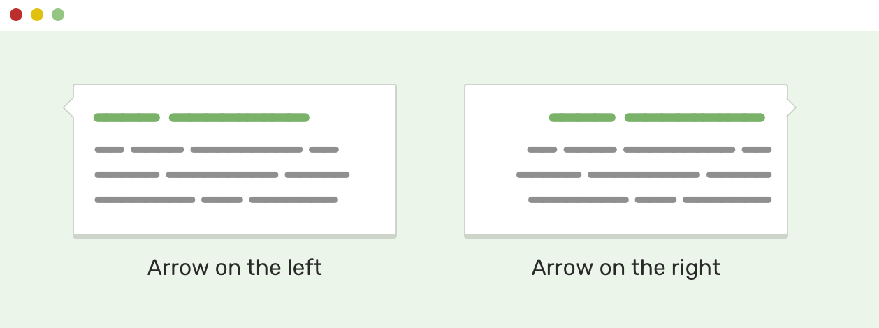
.tooltip:before {
  /* Arrow code */
  position: absolute;
  left: -15px;
}

/* This is a version where the arrow is pointing to the right */
.tooltip.to-right:before {
  /* Arrow code */
  position: absolute;
  left: auto;
  right: -15px;
}
Notice that I used left: auto to override the left: -15px in the initial implementation. For your information, this is used a lot and I would recommend going with the following instead:
.tooltip:before {
  position: absolute;
  right: 100%;
}

.tooltip.to-right:before {
  /* Arrow code */
  position: absolute;
  right: auto;
  left: 100%;
}
By using 100%, we avoided using a hardcoded value (the arrow width) which can fail if we change the arrow size. This is a more future-proof solution.
You might have a card component, with an action at the top-left of it, it might be for decoration purposes only, or it might be a useful action. No matter what is, you should account for having it in both directions.
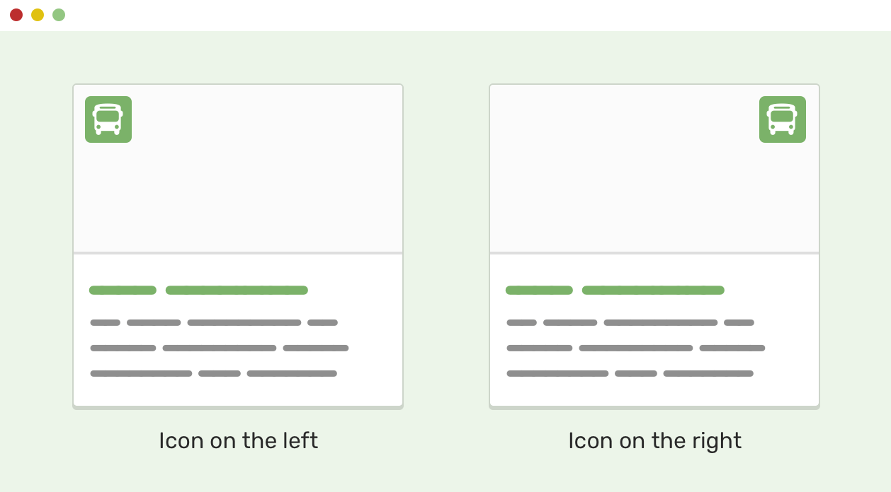
By using left: auto, we can reset the base implementation of it easily.
.card .icon {
  position: absolute;
  left: 15px;
  top: 15px;
}

.card.is-right .icon {
  left: auto;
  right: 15px;
}
When it comes to flexbox, the possibilities are endless. By combining it with auto margins, we can build powerful layouts.
Consider the following example.

We have a row that contains a title, description, and an action button on the right side. We want the action button to stick to the right side.
<div class="item">
  <div class="item-group">
    <!-- Title and description -->
  </div>
  <button class="item__action">Confirm</button>
</div>
.item {
  display: flex;
  flex-wrap: wrap;
  justify-content: space-between;
}

.item__action {
  margin-left: auto;
}
And that’s it! By using margin-left: auto, the action is pushed to the far right corner. Even better, we can use CSS logical properties if you’re building a multilingual website. The CSS will be like the following:
.item__action {
  margin-inline-start: auto;
}
If you want to learn more about Right-to-left styling, I wrote an extensive guide about that.
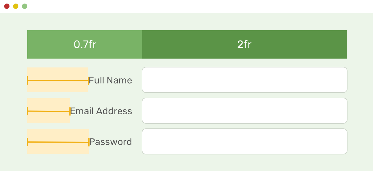
When adding margins to grid items, it could be a fixed, percentage, or an auto value. I’m more interested in auto for this article. Consider the following:

<p class="input-group">
  <label for="">Full Name</label>
  <input type="email" name="" id="" />
</p>
.input-group {
  display: grid;
  grid-template-columns: 1fr;
  grid-gap: 1rem;

  @media (min-width: 700px) {
    grid-template-columns: 0.7fr 2fr;
  }
}
I want to align the label to the left edge of the input. To do that, I need to apply the following:
.input-group label {
    margin-left: auto;
}
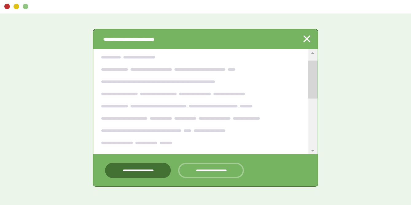
When working on a modal design, it’s important to account for what would happen if the content height is big. For this case, we can use the below:
.modal-body {
  overflow-y: auto;
}
By having that, it will only show scrollbars if the content height is big enough.
That’s a wrap. Do you have a comment or a suggestion? Please feel free to ping me on @shadeed9.
此内容由惯性聚合(RSS阅读器)自动聚合整理,仅供阅读参考。 原文来自 — 版权归原作者所有。