


I spent years teaching CSS layout on this blog. I put everything I know into The Layout Maestro course: 70+ lessons and 150+ interactive examples that teach you how to think CSS layouts, not just memorize syntax.
Even though CSS grid is one of the greatest additions to CSS, it was lacking one important thing, which is to make an element inherit the columns or rows from its parent. CSS subgrid can help us in doing that. It has been requested for years and now that both Firefox and Safari Technology Preview support it, I thought about giving it a chance.
In this article, I will try to highlight the problem that subgrid is expected to solve, how it works, and a few potential use-cases for it.
Before diving into anything, I want to highlight that subgrid is supported in Firefox v71+ and Safari Technology Preview. We can use it as an enhancement with CSS @supports or to provide a fallback.
Let’s suppose that we have the following design. There is a title, description, and image. When both the title and description text are equal in length, both images will line up correctly.

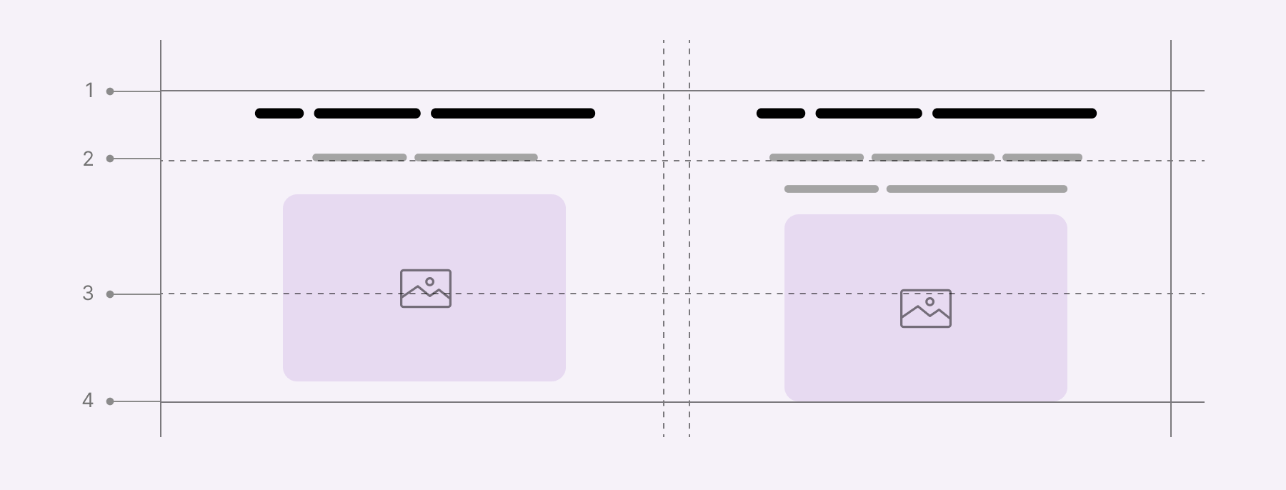
However, when the description gets longer, it will push the image down and as a result, the images are no longer aligned.

This is where CSS subgrid comes in handy! Let’s explore the solution.
We want to divide the content into three rows and make sure they’re aligned with each other. Let’s suppose that we have the following markup.
<div class="wrapper">
  <div class="item">
    <!-- Title, description, and image -->
  </div>
  <div class="item">
    <!-- Title, description, and image -->
  </div>
</div>
In CSS, we will divide the section into two columns and three rows, like this:
.wrapper {
  display: grid;
  grid-template-columns: 1fr 1fr;
  grid-gap: 1rem;
}

.item {
  grid-row: 1 / 4;
}
Here is a visual explanation of what the above looks like.
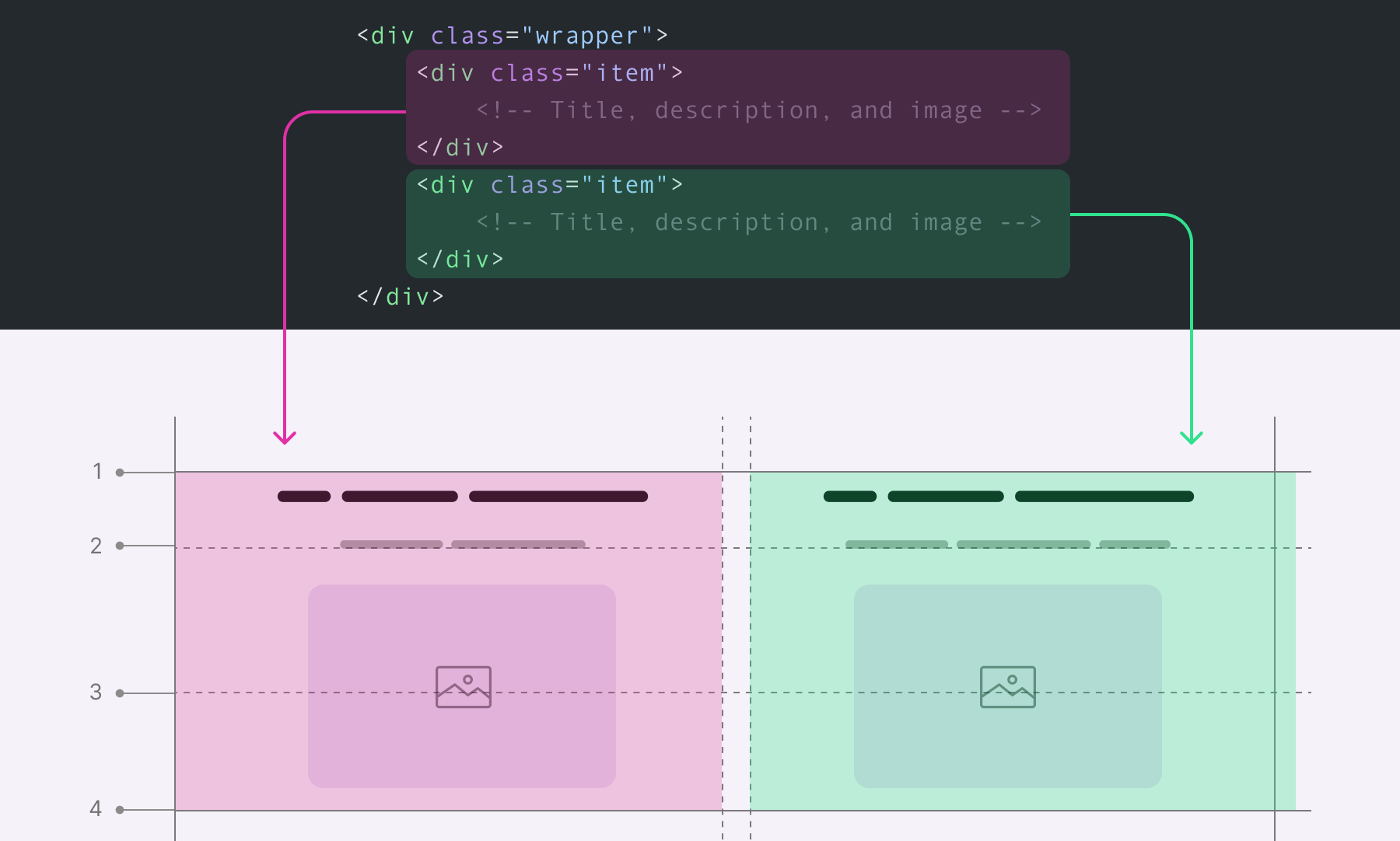
You might think that the grid lines are for the inner items (title, description, and image). However, those grid row lines are for the main wrapper, and only the .item element can access them. That means the title, description, and image are not accounted for with these rows.
Still not convinced? Here, I added two lines for the description text, and the alignment got broken.
We need to pass the grid rows to the inner items, and this is where CSS subgrid shines. To apply it, we need to add the following to the .item element.
.item {
  /* Make sure that each .item spans from row 1 to 4 */
  grid-row: 1 / 4;

  /* Creates a grid container */
  display: grid;

  /* Applying subgrid, kinda like telling .item to inherit
     * the grid from .wrapper
     */
  grid-template-rows: subgrid;
}
When using subgrid, it’s a kind of letting the .item inherit the grid-template-columns value from its parent (The .wrapper). With that, the grid will look like this.
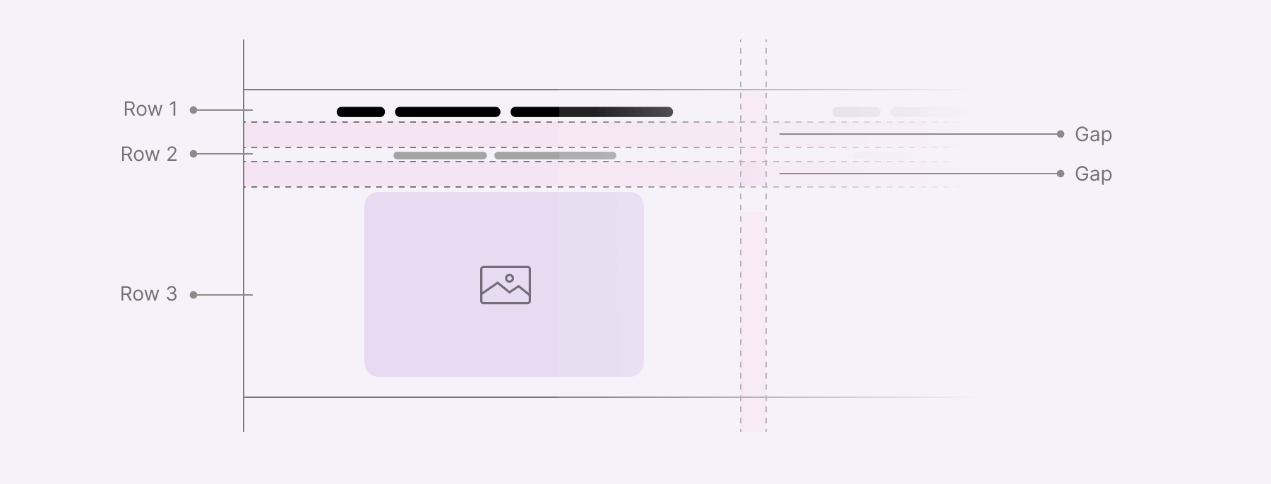
Now, each inner item is placed within a row. That means, if the content of any inner item gets longer, its row will expand to fit the content. That row is responsible for both the direct child items of the .wrapper element.
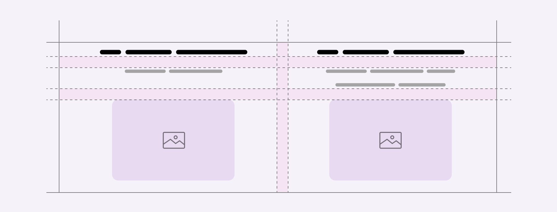
This is very useful and will provide us with even more ways to achieve what hasn’t been possible before with CSS grid.
That’s enough theory. Let’s get into a few use-cases!
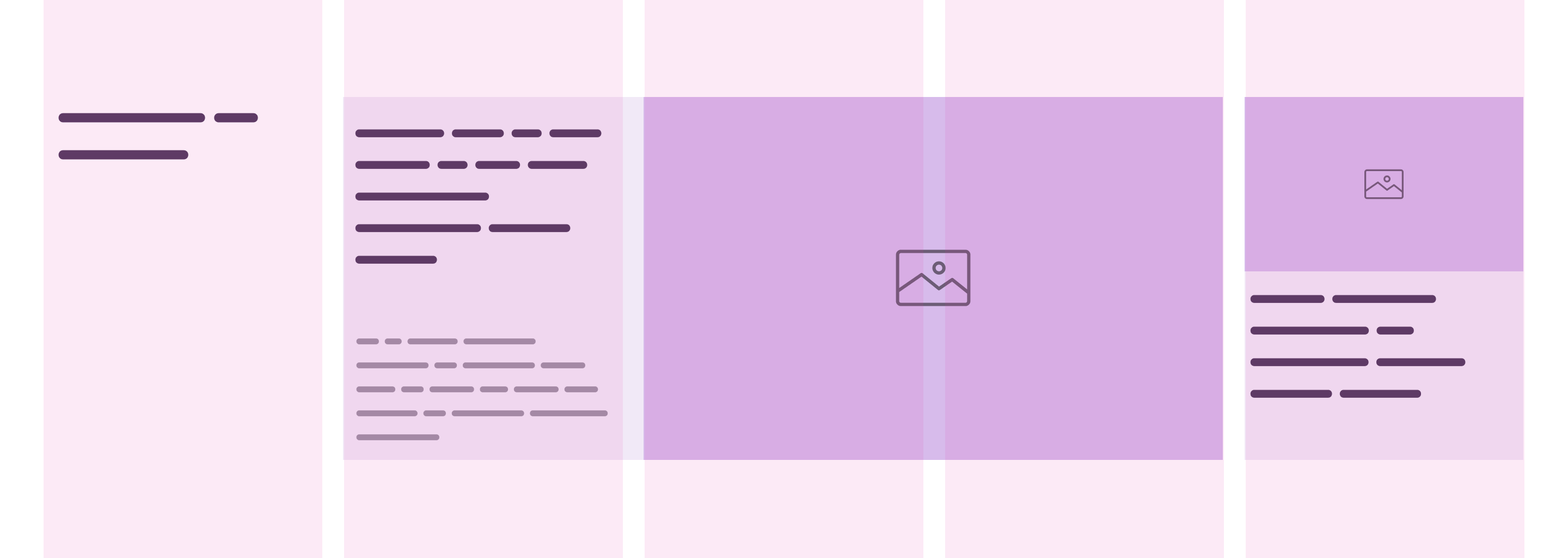
In this example, we have a 3-columns layout that contains the following:

Here is the basic markup.
<section class="section">
  <h2>Headlines</h2>
  <div class="card card--featured"></div>
  <div class="card"></div>
</section>
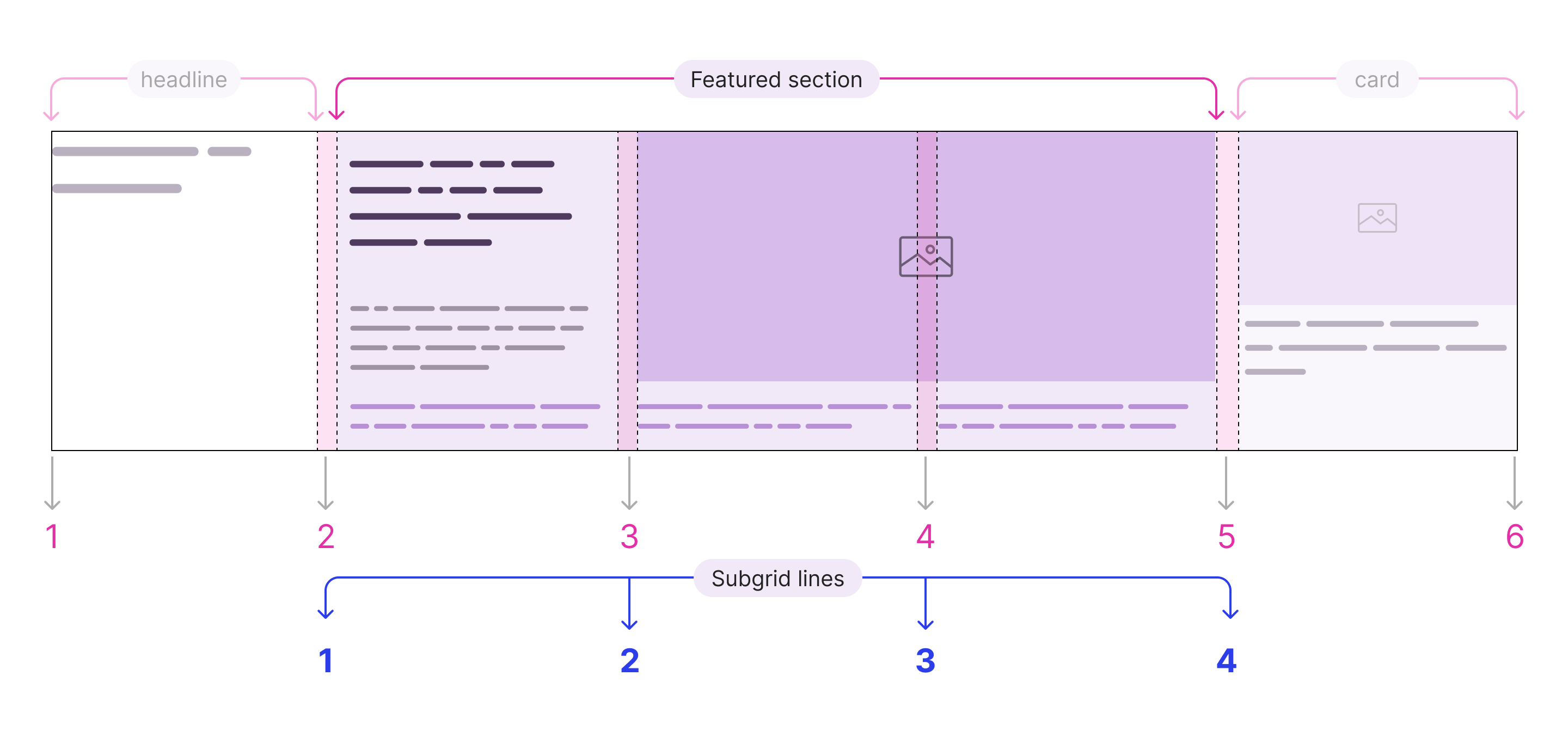
As per the following figure, the design was made to take 5 columns in mind. All main elements take one column except for the middle one which is taking 3 columns.
.section {
  display: grid;
  grid-template-columns: repeat(5, 1fr);
  grid-gap: 20px;
}

.card--featured {
  grid-column: 2 / 5;
  display: grid;
  grid-template-columns: 1fr 2fr;
}
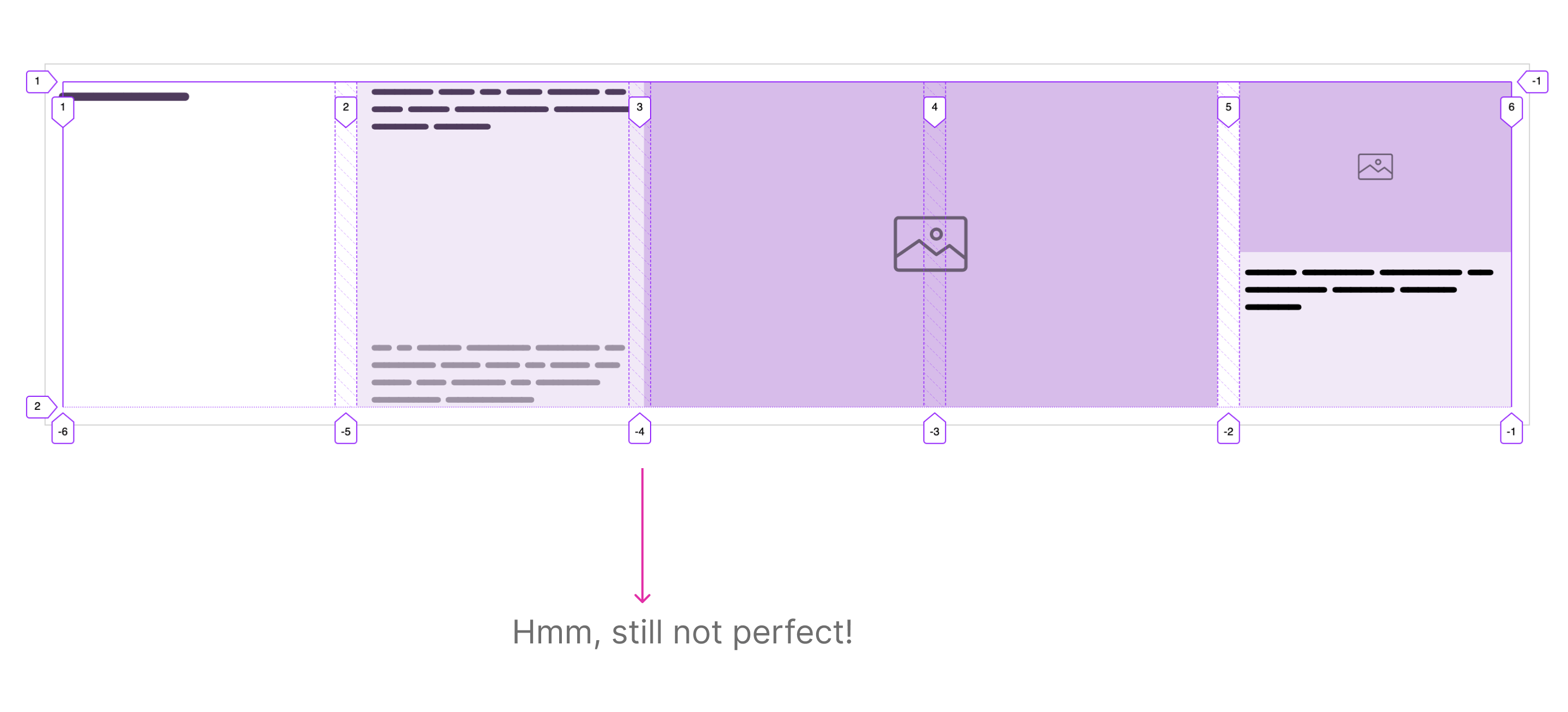
Here is the result so far. It’s still not perfect. The featured card’s thumbnail isn’t aligned with the start of the third column.
This is where subgrid comes in. Here is the featured card markup:
<div class="card--featured">
  <div class="card--featured__content"></div>
  <div class="card--featured__thumb"></div>
</div>
In order to gain much control over the card--featured element, we need to pass the grid columns to the content and thumb elements.
First, we need to make sure that the featured card spans from columns 2 to 5. Then, we add display: grid and subgrid as the value for grid-template-columns.
.card--featured {
  grid-column: 2 / 5;
  display: grid;
  grid-template-columns: subgrid;
}
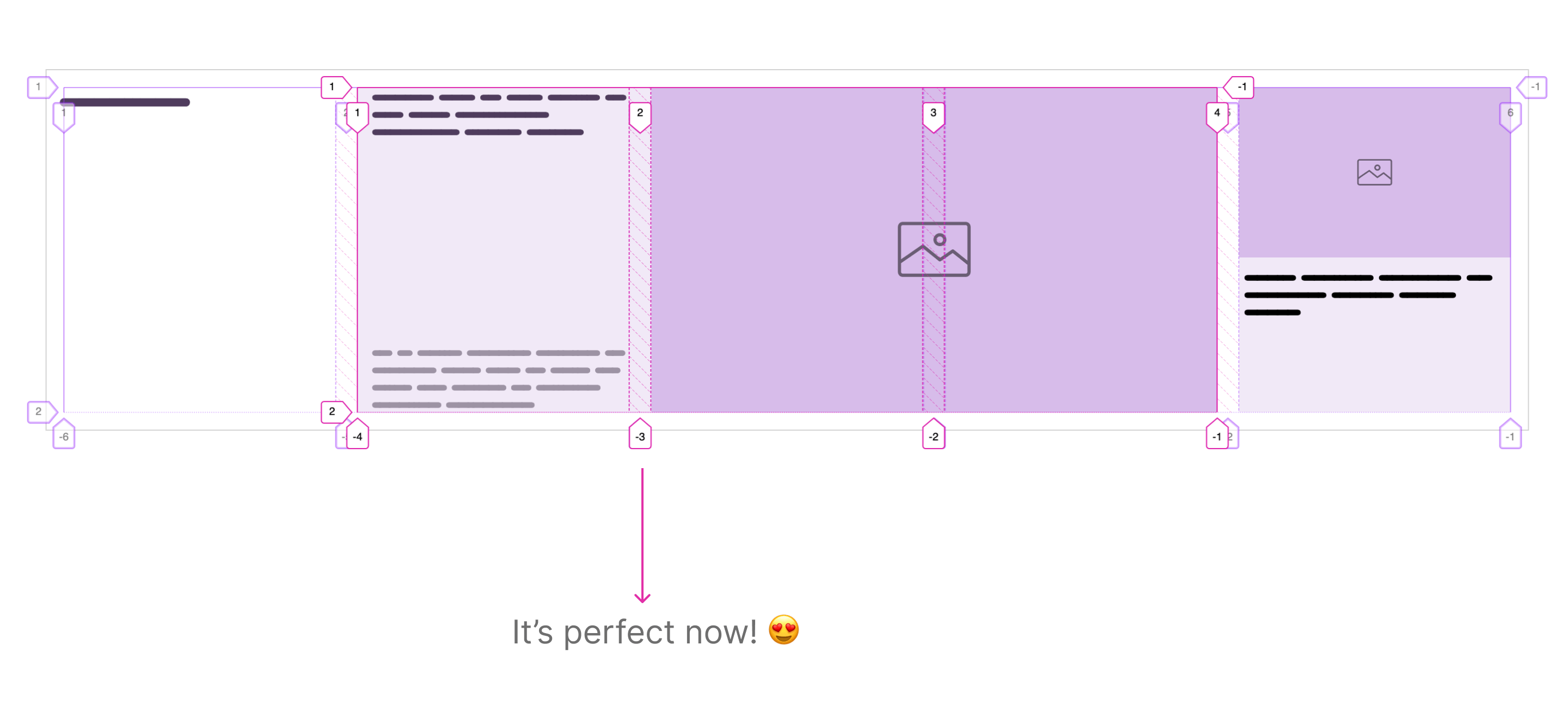
Voila! Now the .card--featured element inherited 3 columns from the main wrapper. With that, we can lay out the thumbnail and content based on these columns.
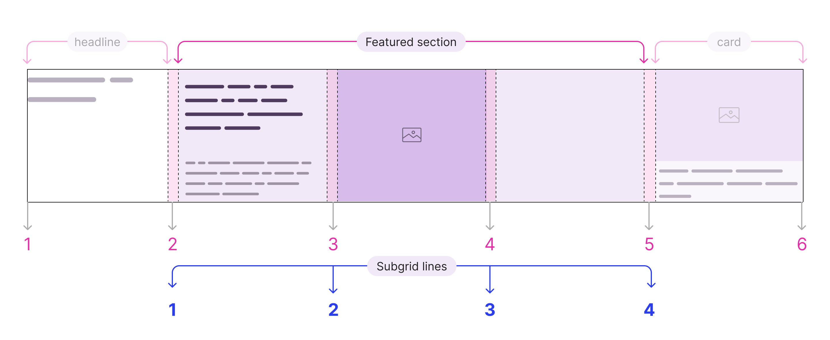
Given that, we can now position the featured card’s thumbnail based on the subgrid columns.
.card--featured {
  grid-column: 2 / 5;
  display: grid;
  grid-template-columns: subgrid;
}

.card--featured__thumb {
  grid-column: 2 / 4;
}
Now the thumbnail is aligned perfectly with the main’s wrapper columns, thanks to subgrid!
This is the same as the previous example, but with an additional section. In the centered block, I added a list of three mini-articles. I called them “mini” since they only have a title.
Consider the following figure.

As you see, there is a list of three articles which is positioned directly under the featured card. Each list item lives in a column.

Working on this update will require some markup changes. Let’s review it below.
<div class="featured-section">
  <div class="card--featured">
    <div class="card--featured__content"></div>
    <div class="card--featured__thumb"></div>
  </div>
  <ul class="list"></ul>
</div>
.featured-section {
  grid-column: 2 / 5;
  display: grid;
  grid-template-columns: subgrid;
}

.card--featured {
  display: grid;
  grid-template-columns: subgrid;
  grid-column: 1 / 4;
}

.card--featured__thumb {
  grid-column: 2 / 4;
}

.list {
  grid-column: 1 / 4;
}
To recap:
grid-column: 2 / 5 to the .featured-section since it’s the direct child of the main grid.grid-column: 1 / 4 to the .list element to make it take the full space of its parent (The subgrid).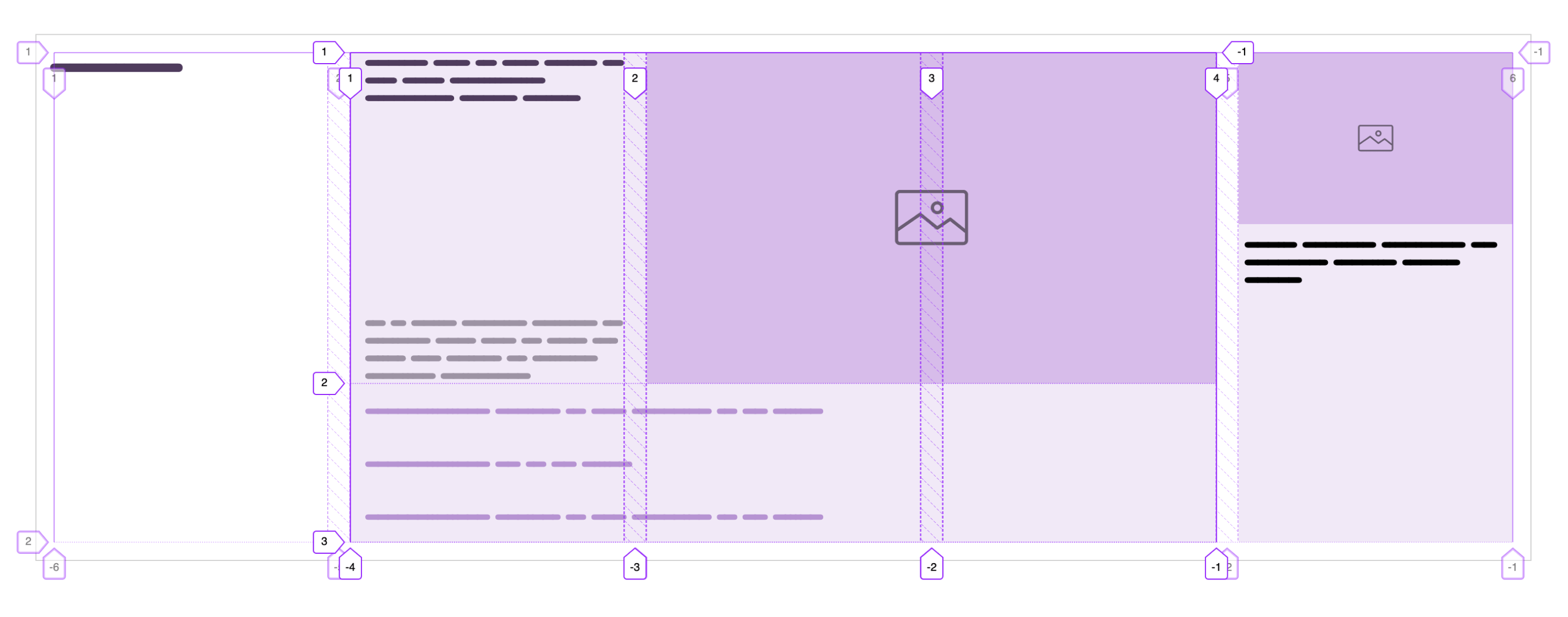
Next step, we need to apply a subgrid on the inner items of .list, so we can position them perfectly with the featured card thumbnail.
.list {
  grid-column: 1 / 4;
  display: grid;
  grid-template-columns: subgrid;
}
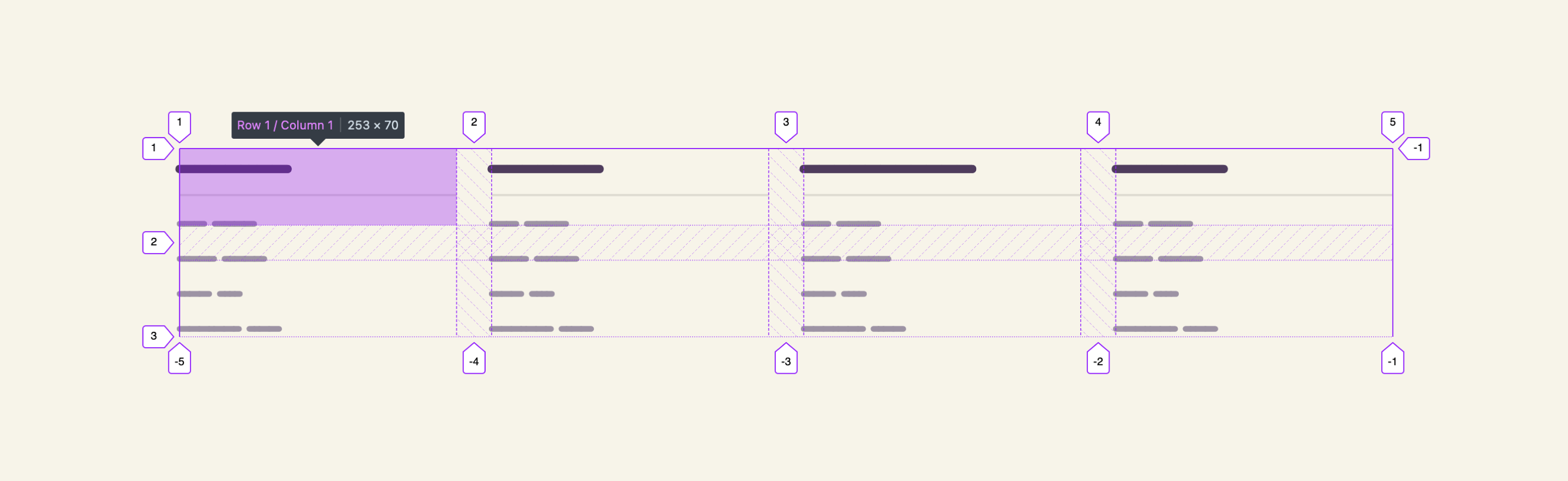
While exploring the potential use-cases for subgrid, I came across an interesting one for a website footer. Here is the markup:
<footer class="site-footer">
  <div class="wrapper">
    <div class="site-footer__item">
      <h2><!-- Title --></h2>
      <ul>
        <!-- Nav items -->
      </ul>
    </div>
    <div class="site-footer__item"></div>
    <div class="site-footer__item"></div>
    <div class="site-footer__item"></div>
  </div>
</footer>

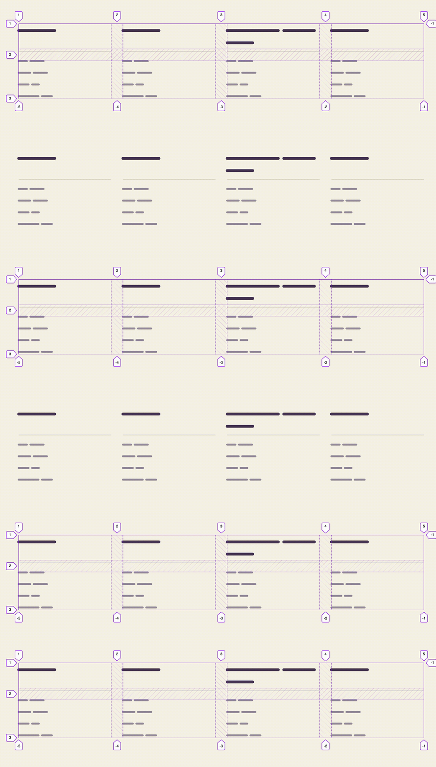
In the figure above, I want the section titles to be aligned. If a title gets too long, then all grow in height to match their sibling that got longer. Without a subgrid, we will end up with something like this:

By default, CSS grid will create an implicit rows that we can take benefit of. In our case, we have two rows. Let’s have a look at the basic CSS:
.site-footer .wrapper {
  display: grid;
  grid-template-columns: repeat(auto-fit, minmax(250px, 1fr));
  grid-gap: 2rem;
}

.site-footer__item {
  grid-row: span 2;
}
To apply subgrid, all we need is the following:
.site-footer__item {
  grid-row: span 2;
  display: grid;
  grid-template-rows: subgrid;
  grid-gap: 1rem;
}
Notice that grid-gap is inherited from .site-footer .wrapper but I need to override it to have a smaller space.
Another interesting use-case for subgrid is a photo gallery. In this example, I have a grid of six columns, and a wrapper that contains two main sections (The content and photos).

Design requirements:
Consider the following markup.
<div class="section">
  <div class="wrapper">
    <div class="start"></div>
    <div class="end">
      <img src="thumb.jpg" alt="" />
      <img src="thumb.jpg" alt="" />
      <img src="thumb.jpg" alt="" />
      <img src="thumb.jpg" alt="" />
      <img src="thumb.jpg" alt="" />
    </div>
  </div>
</div>
With the above, we need to do the following in CSS:
.start {
  grid-column: span 3;
}

.end {
  grid-column: span 3;
  display: grid;
  grid-template-columns: subgrid;
  grid-gap: 1rem;
}

img:nth-child(3) {
  grid-column: 3 / 4;
  grid-row: 1 / 3;
}

img:nth-child(4) {
  grid-column: 1 / 3;
}
Note that the subgrid child items are now positioned according to a new grid line (From 1 to 4).
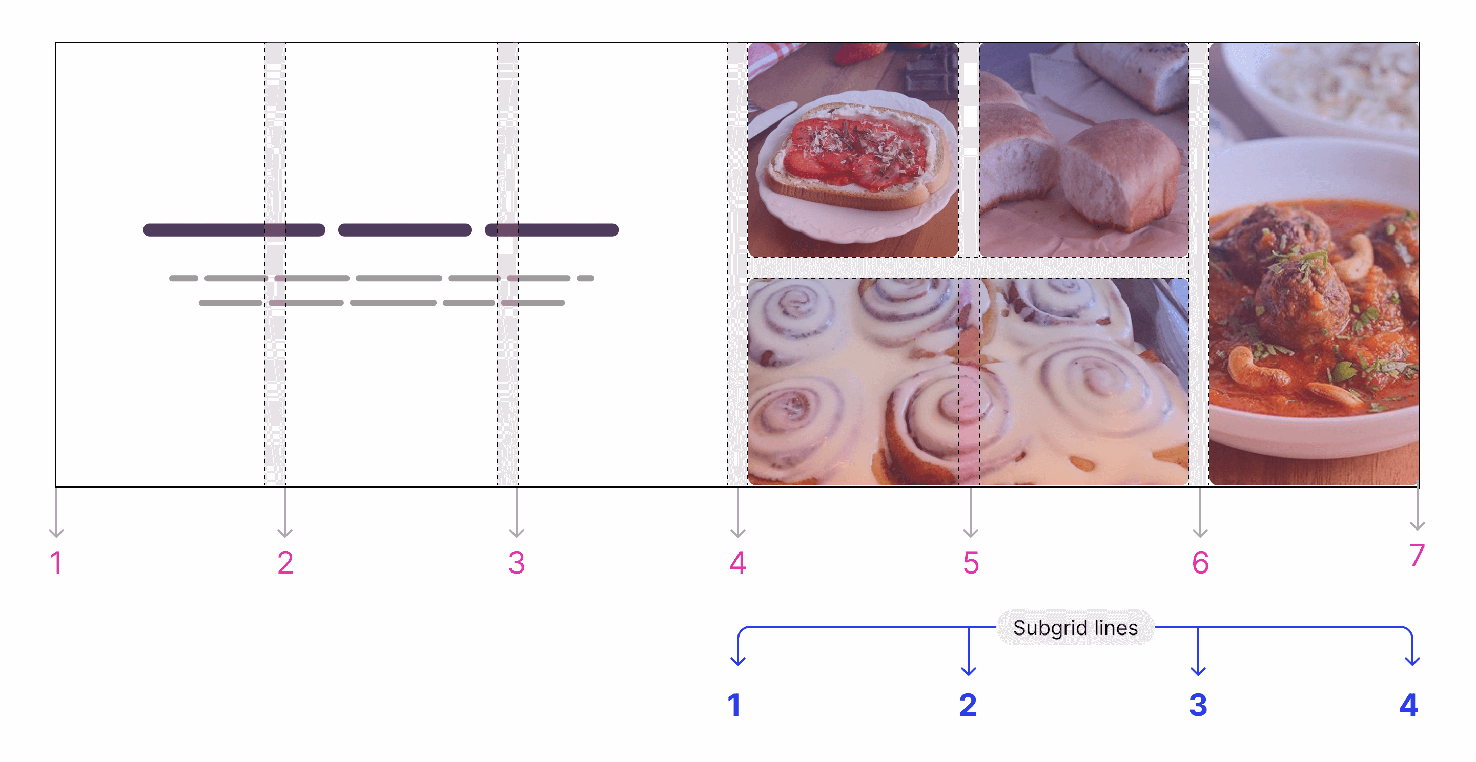
If you don’t already know, we can show the grid lines of a container by using the browser DevTools. I prefer to use Firefox for such things.
The interesting part is that we can create a fake container with empty elements, and place it behind our grid. You might be wondering why? Well, we can do different things with it like visual effects, toggling the grid for debugging purposes, and many more.
Consider the following figure:

Do you see those small squares? Those represent the grid we have, and I created them on purpose.
Before exploring how I made them, let’s have a look at the HTML and CSS:
<section class="section">
  <div class="content content-1"></div>
  <div class="content content-2"></div>
  <div class="fake-grid">
    <!-- Lots of <span>s -->
  </div>
</section>
.section {
  display: grid;
  grid-template-columns: repeat(6, 1fr);
  grid-template-rows: repeat(2, 1fr);
  grid-gap: 3px;
}

.content-1 {
  grid-column: 1 / 3;
  grid-row: 1;
}

.content-2 {
  grid-column: 5 / 7;
  grid-row: 1 / 3;
}
First, I needed a way to position the fake grid under the content. Thankfully, with CSS grid, we don’t need absolute positioning for that. By using 1 / -1 for both columns and rows, we’re telling the browser to make the fake grid take the full width and height of the parent.
.fake-grid {
  --debug-mode: 1;
  display: grid;

  /* Applying subgrid on the fake grid */
  grid-template-columns: subgrid;
  grid-template-rows: subgrid;

  /* To make the fake grid take the full width and height */
  grid-column: 1 / -1;
  grid-row: 1 / -1;

  /* optional: use a variable to toggle the grid visiblity */
  opacity: var(--debug-mode);
}
Finally, we need to add z-index: 1 for the content to make sure it will always be above the fake grid.
This is an example of how a subgrid is useful in mimicking a grid and positioning it under the content either for visual or debugging reasons. With Javascript, we can toggle the value --debug-mode to show or hide that grid!
Even better, we can do the same in CSS :has!
:root {
  --debug-mode: 1;
}

html:has(option[value="on"]:checked) {
  --debug-mode: 1;
}
You can learn more about CSS :has in this article.
That’s not the end. CSS subgrid will open up a lot of possibilities that weren’t possible before. I can’t wait to try it with container queries. It’s like a dream coming true. And as I’ve said before, there is no time now to learn CSS.
Thank you for reading.
此内容由惯性聚合(RSS阅读器)自动聚合整理,仅供阅读参考。 原文来自 — 版权归原作者所有。