


I spent years teaching CSS layout on this blog. I put everything I know into The Layout Maestro course: 70+ lessons and 150+ interactive examples that teach you how to think CSS layouts, not just memorize syntax.
For websites and platforms that provide users with content or reviews, it’s important to include a star rating. Recently, I needed to implement a star rating component for a project and the requirements needed were as below:
I thought about giving SVG a try, and I wasn’t disappointed. In this article, I will go through the solution and how it works for different scenarios.
Dear reader, if you’re looking for solutions other than SVG, I recommend reading this article on CSS Tricks by Alfred Genkin.
Before we dive in, I want to put you in context and show you the requirements that I’m looking for, and all the cases that we need to account for.
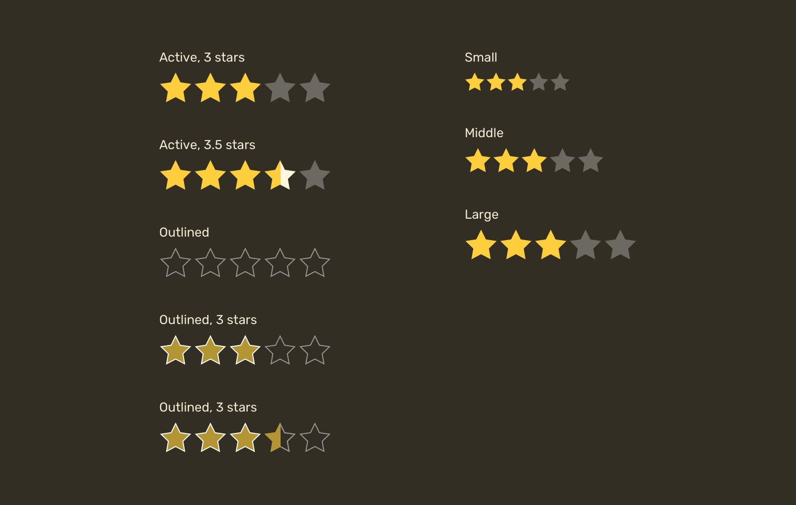
Our focus will be on making a star that can be customized by changing its fill or stroke, sizing it, and the ability to show a half star.
Let’s dive in.
First, you need to pick a star shape and save it as an SVG so we can use it in the browser.
<svg
  width="32"
  height="32"
  xmlns="http://www.w3.org/2000/svg"
  viewBox="0 0 32 32"
>
  <path d="..." />
</svg>
In the browser, this will render a black star with a size of 32px for width and height. Sounds good.
Keep in mind that you need to include a written rating with an aria-label attribute so users with screen readers can access this information.
<p aria-label="Rating is 4.5 out of 5">
  <svg
    width="32"
    height="32"
    xmlns="http://www.w3.org/2000/svg"
    viewBox="0 0 32 32"
  >
    <path d="..." />
  </svg>
</p>
We can either copy the SVG markup above five times, or extract the path data and save it somewhere, and then reusing it without code duplication. Let’s do that!
First, we need to create an SVG with zero width and height, so it won’t reserve a space.
<svg
  width="0"
  height="0"
  xmlns="http://www.w3.org/2000/svg"
  xmlns:xlink="http://www.w3.org/1999/xlink"
>
  <!-- Content -->
</svg>
Within that SVG, we need to include the path data within a <symbol> element. According to MDN:
The symbol element is used to define graphical template objects which can be instantiated by a
<use>element.
What’s goes inside the <symbol> is the same content for the icon. Also, it’s important to add an id so we can reference that symbol later.
<svg width="0" height="0" xmlns="http://www.w3.org/2000/svg">
  <symbol
    xmlns="http://www.w3.org/2000/svg"
    viewBox="0 0 32 32"
    id="star"
  >
    <path d="..." />
  </symbol>
</svg>
With that setup, we can now reuse the star symbol with the <use> element. The idea is that you need to use the id as a value of href attribute.
<p class="c-rate">
  <svg class="c-icon" width="32" height="32">
    <use href="#star"></use>
  </svg>
  <svg class="c-icon" width="32" height="32">
    <use href="#star"></use>
  </svg>
  <svg class="c-icon" width="32" height="32">
    <use href="#star"></use>
  </svg>
  <svg class="c-icon" width="32" height="32">
    <use href="#star"></use>
  </svg>
  <svg class="c-icon" width="32" height="32">
    <use href="#star"></use>
  </svg>
</p>
Now that we have a list of stars, let’s get into the CSS part. I defined the yellow and grey colors for the star.
<p class="c-rate">
  <svg class="c-icon active" width="32" height="32">
    <use href="#star"></use>
  </svg>
  <svg class="c-icon active" width="32" height="32">
    <use href="#star"></use>
  </svg>
  <svg class="c-icon active" width="32" height="32">
    <use href="#star"></use>
  </svg>
  <svg class="c-icon active" width="32" height="32">
    <use href="#star"></use>
  </svg>
  <svg class="c-icon" width="32" height="32">
    <use href="#star"></use>
  </svg>
</p>
.c-icon {
  --star-active: #fece3c;
  --star-inactive: #6c6962;
  fill: var(--star-inactive);
}

.c-icon.active {
  fill: var(--star-active);
}
Considering the above markup and styles, the result will be something like the following.

Thankfully, we have two great solutions when it comes to SVG. The first one is using <masks> and the second one is with SVG gradients.
The goal of using masks is to emulate the effect of erasing a part of the star and painting the other part with a translucent color. To do that, we need the help of SVG masks.

In the figure above, we have a square and a star. What we want is the intersection of them, which will result in half a star.
Here is how to do that with SVG:
<mask> element with a rectangle positioned at x=50%.<!-- The reusable SVG template -->
<svg viewBox="0 0 32 32" id="star">
<defs>
<mask id="half">
<rect x="50%" y="0" width="32" height="32" fill="white" />
</mask>
<symbol viewBox="0 0 32 32" id="star">
<path d="..." />
</symbol>
</defs>
</svg>
<!-- Example of a usage -->
<svg class="c-icon" width="32" height="32" viewBox="0 0 32 32">
<use href="#star" mask="url(#half)" fill="green"></use>
</svg>
The result will be half a star, just like in the previous figure.
The question is, how we can show a translucent star when it’s being masked? Well, thanks to SVG, we can include multiple elements in the <mask>.
With another element, the SVG <mask> will look like this:
<mask id="half">
  <rect x="0" y="0" width="32" height="32" fill="white" />
  <rect x="50%" y="0" width="32" height="32" fill="black" />
</mask>
In masks, a white element represents what we want to show, and a black element represents what we want to hide. When combined, we can create a cut-out effect.
Consider the following figure that explains each element of the mask in a visual way.
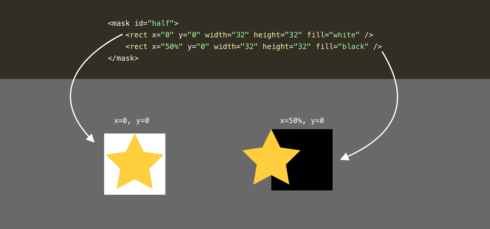
Notice that the white rectangle is positioned at the 0,0 point, while the black one is positioned at 50%,0. Here is how it look visually:
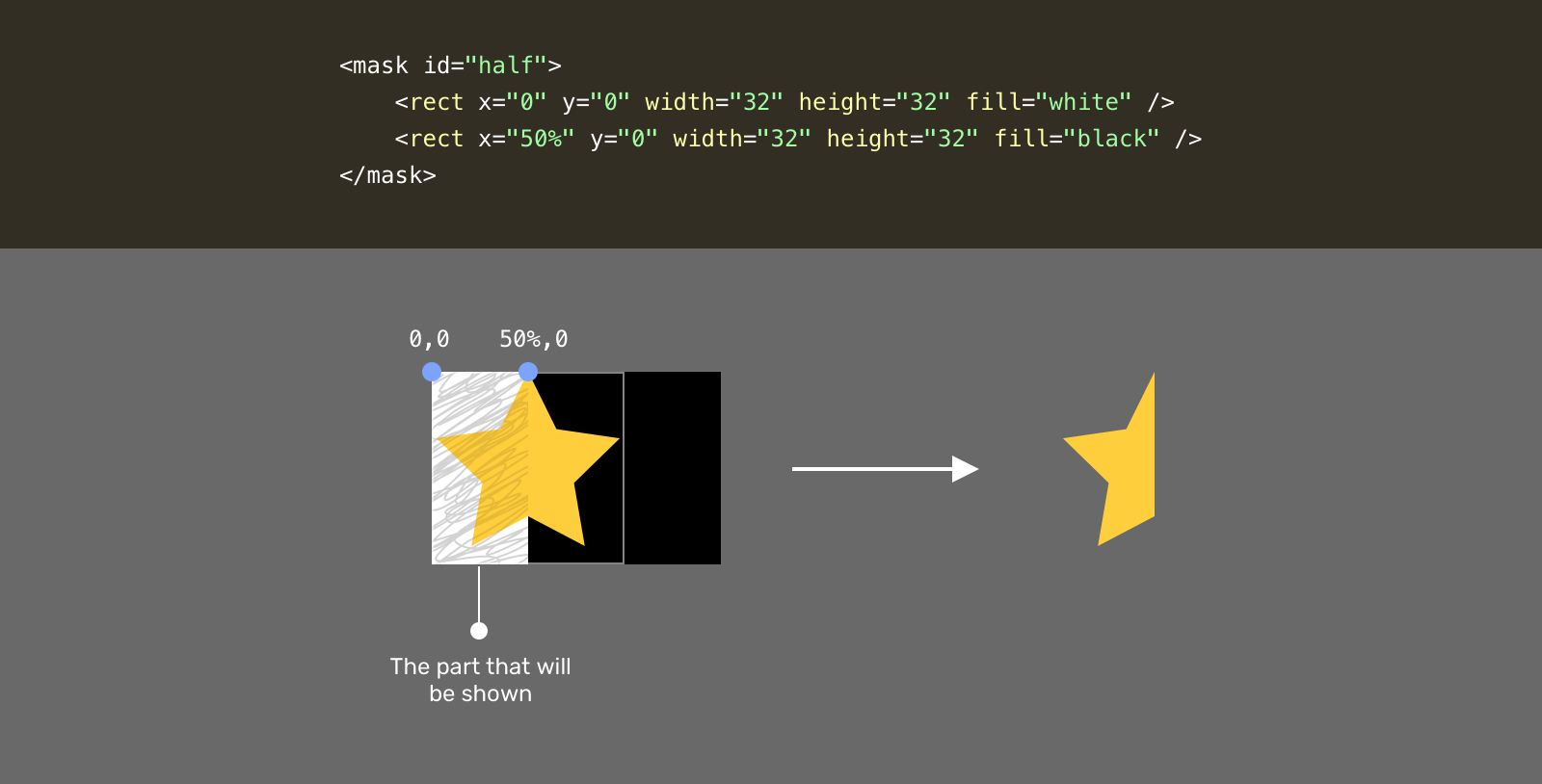
Do you see what happened? The part that is scribbled represents the final result, which is half a star. Now, you might be thinking about, how we can add another translucent star to make it more clear?
Well, by using a lighter color than pure black, we will get a translucent effect. That means the area that is currently hidden will have a light shade of the star color.
<mask id="half">
  <rect x="0" y="0" width="32" height="32" fill="white" />
  <rect x="50%" y="0" width="32" height="32" fill="grey" />
</mask>
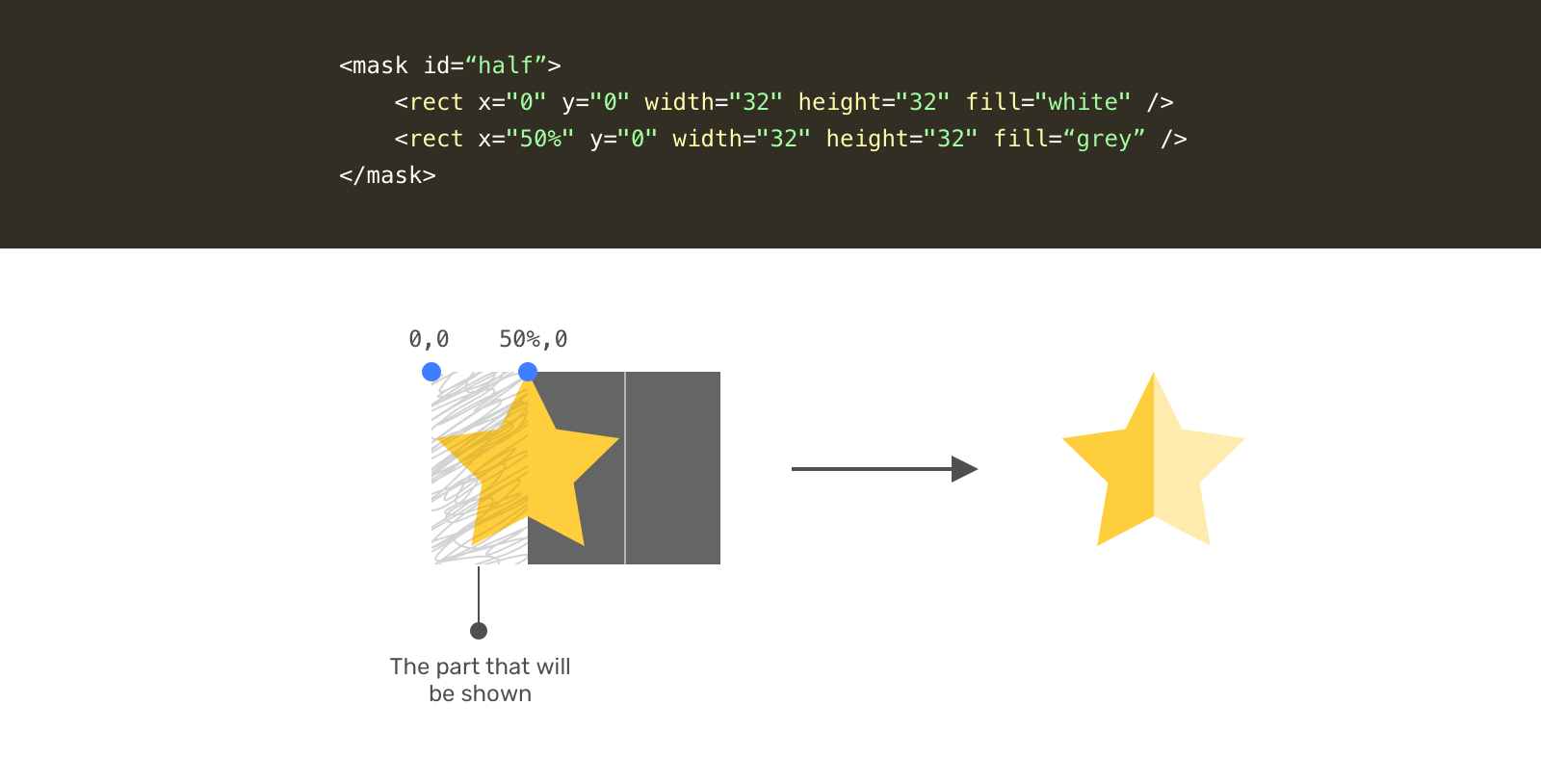
Let’s recap with the full SVG markup.
<svg style="width: 0; height: 0;" viewBox="0 0 32 32">
  <defs>
    <mask id="half">
      <rect x="0" y="0" width="32" height="32" fill="white" />
      <rect x="50%" y="0" width="32" height="32" fill="grey" />
    </mask>

    <symbol viewBox="0 0 32 32" id="star">
      <path d="..." />
    </symbol>
  </defs>
</svg>

<p class="c-rate">
  <svg class="c-icon" width="32" height="32" viewBox="0 0 32 32">
    <use href="#star" mask="url(#half)" fill="green"></use>
  </svg>
  <!-- 4 more stars -->
</p>
With that, we have a star with a partial fill. What’s awesome with that solution is that we don’t need to provide two shades of color. The mask will do the work.
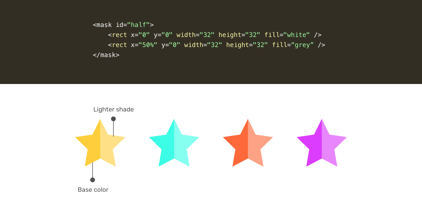
Let’s get into the second solution for a partial star. While searching, I got inspired by this answer on Stackoverflow.
Similar to the mask, we need to define a gradient in the <defs> element.
<svg style="width: 0; height: 0;" viewBox="0 0 32 32">
  <defs>
    <linearGradient id="half" x1="0" x2="100%" y1="0" y2="0">
      <stop offset="50%" stop-color="#f7efc5"></stop>
      <stop offset="50%" stop-color="#fed94b"></stop>
    </linearGradient>
  </defs>
</svg>
Notice that we have two color stops, the first represents the first half, and the second one represents the light shade. In this solution, we need to manually provide two colors.
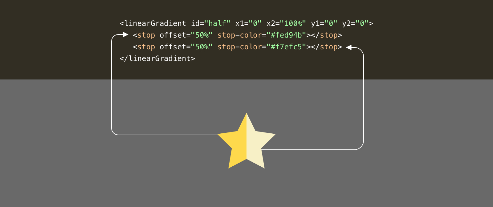
Here is how we can use the gradient.
<p class="c-rate">
  <svg class="c-icon" width="32" height="32" viewBox="0 0 32 32">
    <use href="#star" fill="url(#half)"></use>
  </svg>
</p>
We want a variation that can be customized to include outlined stars. From a first glance, it seems simple. Let’s dig into the details.

To add a stroke, all we need is to add stroke to the SVG element. This will work fine for full stars. However, for partial ones, it will be cut-off because of the mask.

To work around that, we need to have another star shape just for the outline. We can do that by duplicating the <use> element and removing the mask from it.
<p class="c-rate">
  <svg class="c-icon" width="32" height="32" viewBox="0 0 32 32">
    <use href="#star" mask="url(#half)" fill="green"></use>
    <use href="#star" fill="none" stroke="grey"></use>
  </svg>
</p>
Notice that we have two <use> elements. The one with the mask, and the one with a stroke only. That’s how an outline style can be done with SVG masks.
For the gradient solution, we don’t need to duplicate the icon since there is no mask at all. What we need to do is to add a stroke and it’s done.
<svg style="width: 0; height: 0;" viewBox="0 0 32 32">
  <defs>
    <linearGradient id="half" x1="0" x2="100%" y1="0" y2="0">
      <stop offset="50%" stop-color="#f7efc5"></stop>
      <stop offset="50%" stop-color="#fed94b"></stop>
    </linearGradient>
  </defs>
</svg>

<p class="c-rate">
  <svg class="c-icon" width="32" height="32" viewBox="0 0 32 32">
    <use href="#star" fill="url(#half)" stroke="grey"></use>
  </svg>
</p>
By using CSS variables and making sure that the SVG has the right viewBox attribute, we can easily size them.
.c-icon {
    width: var(--size, 24px)
    height: var(--size, 24px);
}

.c-icon--md {
    --size: 40px;
}

.c-icon--lg {
    --size: 64px;
}
I hope you enjoyed the article. Thanks for reading!
此内容由惯性聚合(RSS阅读器)自动聚合整理,仅供阅读参考。 原文来自 — 版权归原作者所有。