


I spent years teaching CSS layout on this blog. I put everything I know into The Layout Maestro course: 70+ lessons and 150+ interactive examples that teach you how to think CSS layouts, not just memorize syntax.
It’s almost the end of 2016, our needs for a robust and powerful way of laying out elements on the web is increasing everyday. We need to build a unique and art-directed layouts in the easiest way in CSS. Grid layout is here to provide us with a way to divide content into rows and columns, with the ability to move and shift them without affecting the source order.
I’m very excited about CSS Grid Layout, it will land in browsers by Q1 2017 and from then we should start using it as enhancement with CSS @supports. In this article, I will share all of what I learned about Grid in the past two weeks, with real-world examples. Let’s start.
Update: It’s now enabled by default in Chromium as per Manuel Rego on Twitter. Also, Firefox 52 will enable it by default and is expected to be released in Jan/Feb 2017.
A new CSS layout module that provide us with the ability to control our content in two dimensions, as rows and columns. We can control and place each child item in the grid by defining the number of columns and rows.
The first step is to add display: grid to the parent element. Now, every item inside this wrapper will be a grid item. The child items won’t be affected by that, at least we need to define the number of columns we want.
{% highlight css %} .wrapper { display: grid; grid-template-columns: 200px 200px 200px; }
.item { height: 100px; } {% endhighlight %}
By using grid-template-columns, we can define how many columns we want, each value is representing a column.
We have 3 columns and each one of them has a width of 200px. If we have 4 items inside our wrapper for a markup like the below, can you expect the result?
{% highlight html %}
{% endhighlight %}
Result:
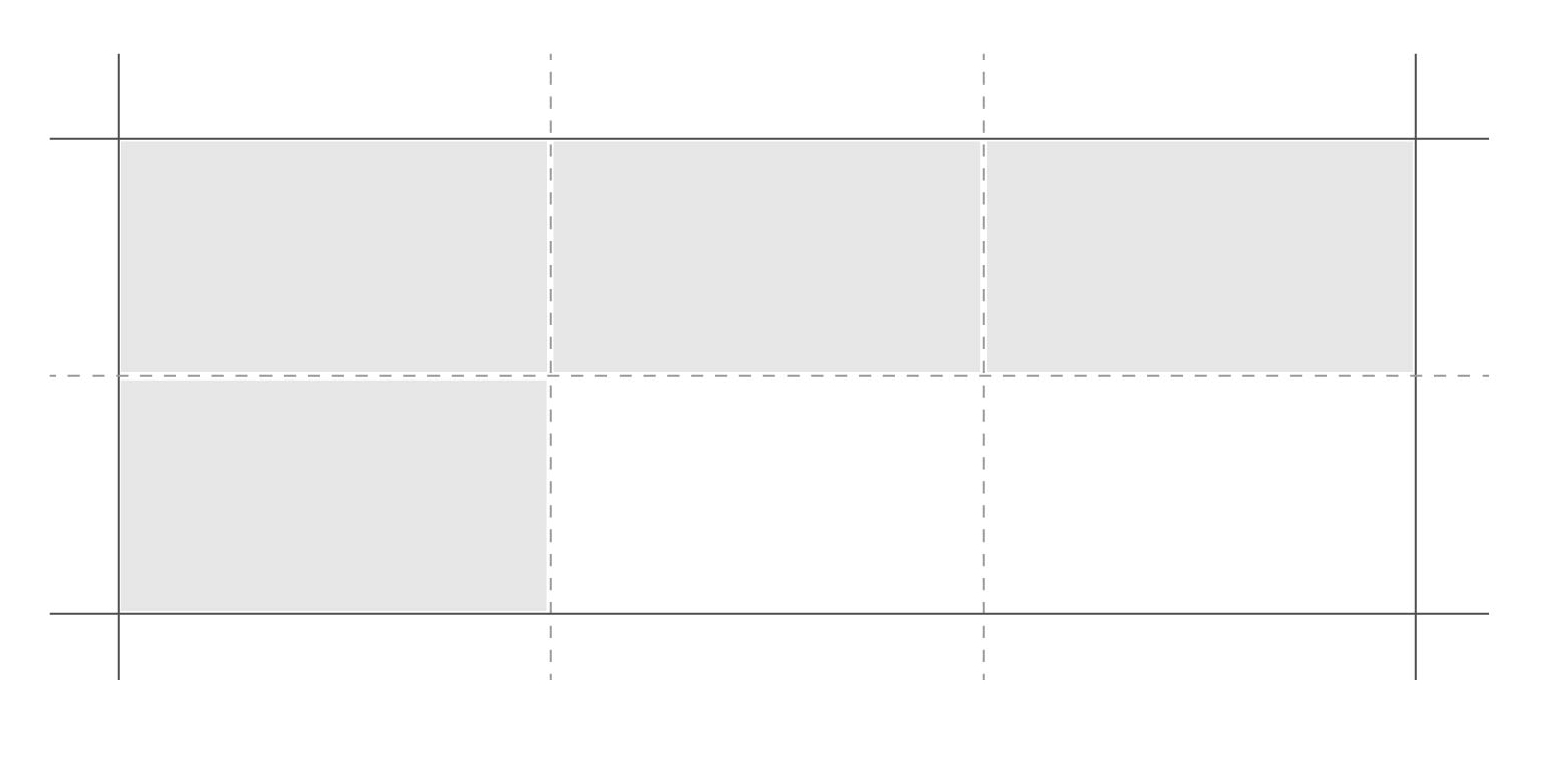
As you see, we have 3 columns and so the last item is wrapped to the next row. Note that there is no space between them, the dashed line is added only for clarity.
To add a space between the items, we can use grid-column-gap and grid-row-gap to achieve that.
{% highlight css %} .wrapper { display: grid; grid-template-columns: 200px 200px 200px; grid-column-gap: 10px; grid-row-gap: 10px; } {% endhighlight %}
Or you can use the shorthand grid-gap: 10px 10px. The values are 10px 10px for row and column respectively.
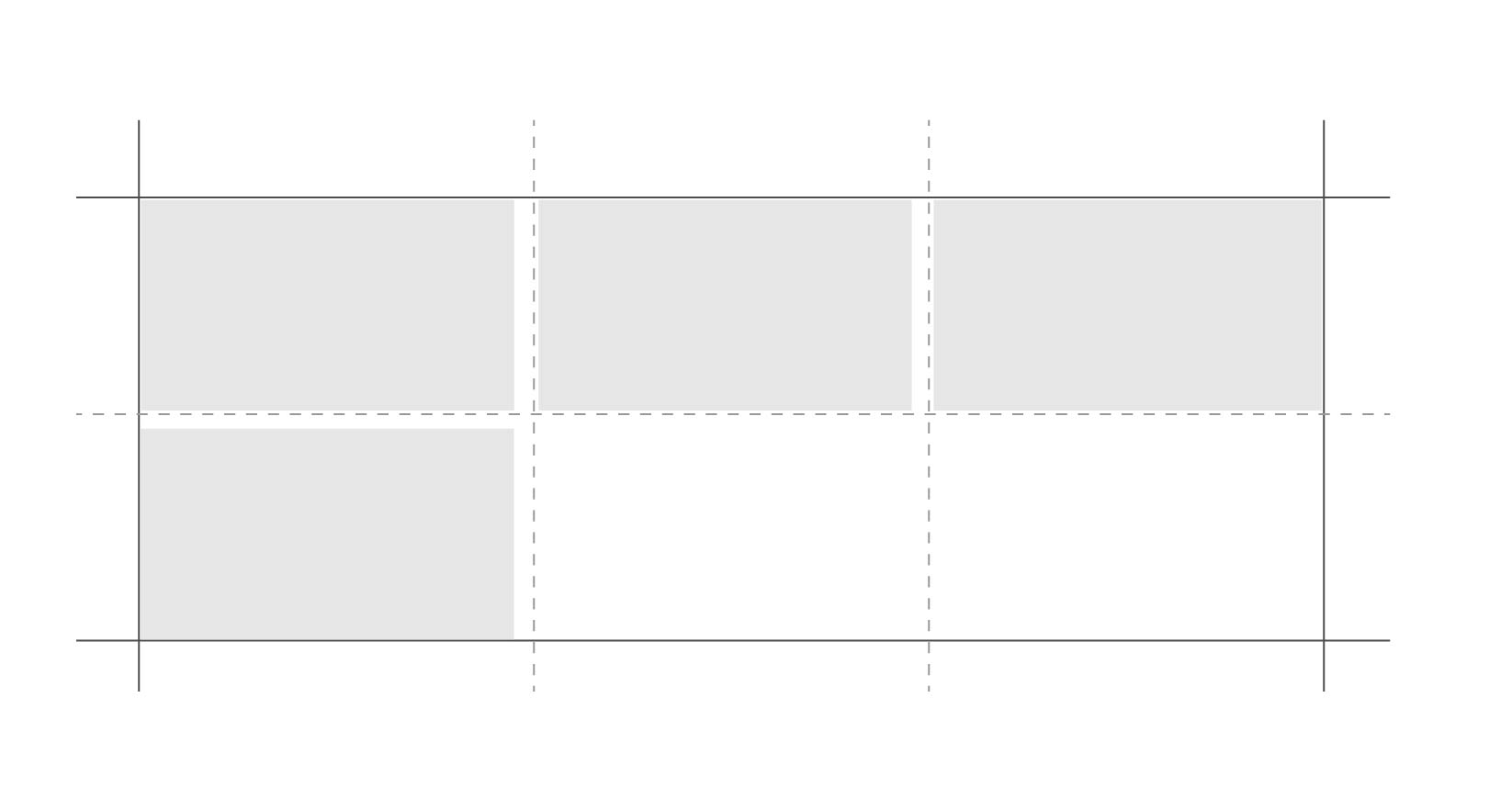
If you noticed, we only defined the columns number and width. The nice thing is that the browser will implicitly define the rows for us, since the height of each item is 100px, then we will have 2 rows. To proof that, I will inspect element and show you the computed value of grid-template-rows property.
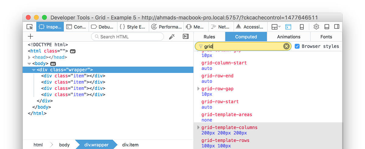
If you noticed, we have these properties on .wrapper element:
{% highlight css %} .wrapper { grid-template-columns: 200px 200px 200px; grid-template-rows: 100px 100px; /_ implicitly added by the browser _/ } {% endhighlight %}
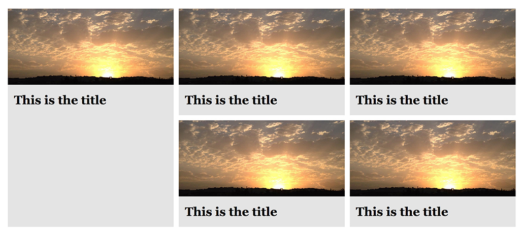
We have 5 news items, the first one is featured and thus its height should be as twice as the other items.
{% highlight html %}
{% endhighlight %}
{% highlight css %} .wrapper { display: grid; grid-template-columns: 1fr 1fr 1fr; grid-gap: 10px; } {% endhighlight %}
We divided the columns using fr unit. Its stand for Fraction, by using it we are using something similar to percentages in CSS. We have 3 columns, each one them has a width of 1fr.
1 / 3 = 0.33 = 33%
So each one will take 33% width from the wrapper.
We need a way to tell the first item: “Hey, Please take the first two rows of the grid!”. Remember how the browser implicitly added the rows for us? We will get benefit of that in this example.
When I first saw things like grid-row: 1 / 2 or grid-column: 1 / 3, I was a bit confused and got the idea that grid-row: 1 / 2 will give us the space of 2 rows. The same with grid-columns: 1 / 3, it was like taking 3 columns. I took some time to understand the idea of Grid lines, where the Ah-ha momment happened.
The grid is an intersecting set of horizontal and vertical grid lines that divides the grid container’s space into grid areas, into which grid items (representing the grid container’s content) can be placed. CSS Grid Spec
In Grid, there is the concept of Grid Lines for both columns and rows. The following image illustrates that:
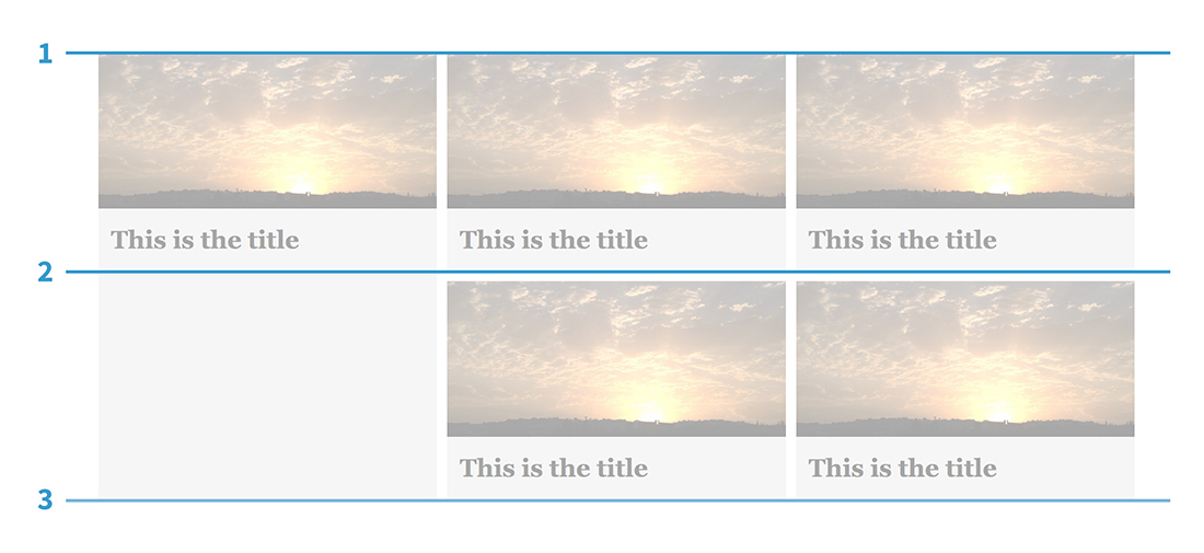
Notice that we have 3 lines, starting from the top, middle and at the bottom. The featured item should take space from line 1 to line 3.
In CSS, we will use the following:
{% highlight css %} .item:first-child { grid-row-start: 1; grid-row-end: 3; } {% endhighlight %}
Or as a shorthand:
{% highlight css %} .item:first-child { grid-row: 1 / 3; } {% endhighlight %}
Also, we could make this responsive by accounting for mobile from the beginning, so each news item will take 1 column, and then 2 columns until we reach 3 per column on large screens.
{% highlight css %} .wrapper { display: grid; grid-template-columns: 1fr; /_ 1 column _/ grid-gap: 10px; }
/_ make them as 2 columns per row on viewports > 500px / @media(min-width: 500px) { .wrapper { grid-template-columns: 1fr 1fr; / 2 columns _/ } }
/_ make them as 2 columns per row on viewports > 900px / @media(min-width: 900px) { .wrapper { grid-template-columns: 1fr 1fr 1fr; / 3 columns _/ }
.item:first-child { grid-row: 1 / 3; } } {% endhighlight %}
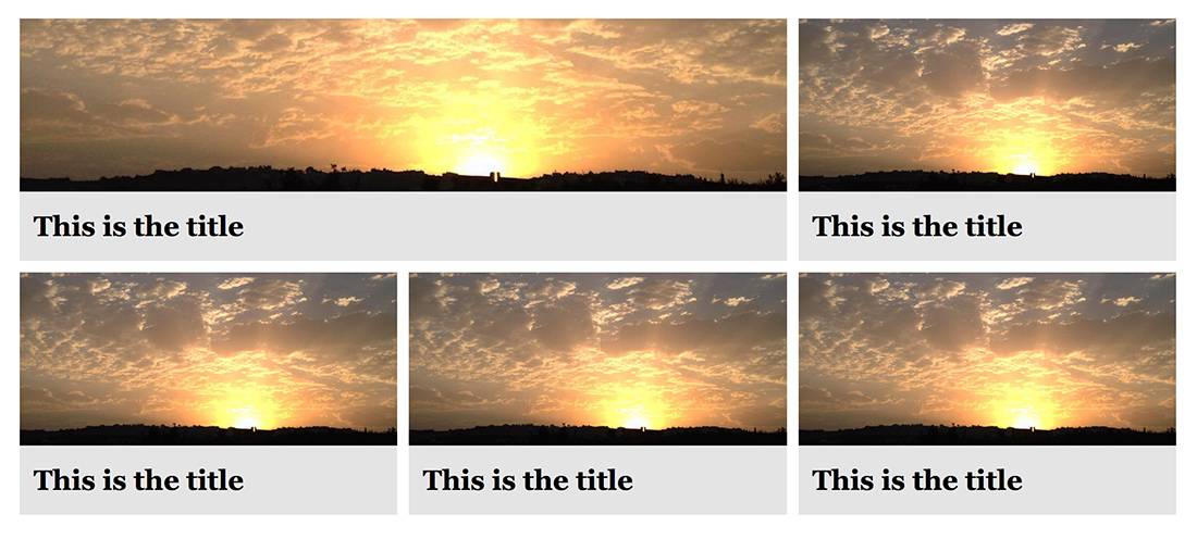
What if we want to span the featured item in term of columns? Grid layout provide us with the ability to do that. See the below:
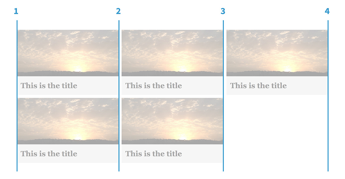
We want the featured item to take space from line 1 to 3. In CSS, we can write the following:
{% highlight css %} .item:first-child { grid-column-start: 1; grid-column-end: 3; } {% endhighlight %}
Or as a shorthand:
{% highlight css %} .item:first-child { grid-column: 1 / 3; } {% endhighlight %}
See the Pen Grid Layout - Featured Item by Ahmad Shadeed (@shadeed) on CodePen.
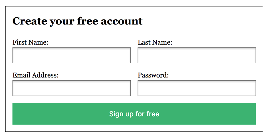
We could get benefit of CSS Grid by using it to lay out the form fields, we can create endless options with it. In our example, the end result is like the design above.
Requirments:
{% highlight html %}
{% endhighlight %} Each form item is wrapped in a `
` element, we will use this to control some elements. At the beginning, we need to define a grid:
{% highlight css %} form { display: grid; grid-template-columns: 1fr 1fr; grid-gap: 16px; }
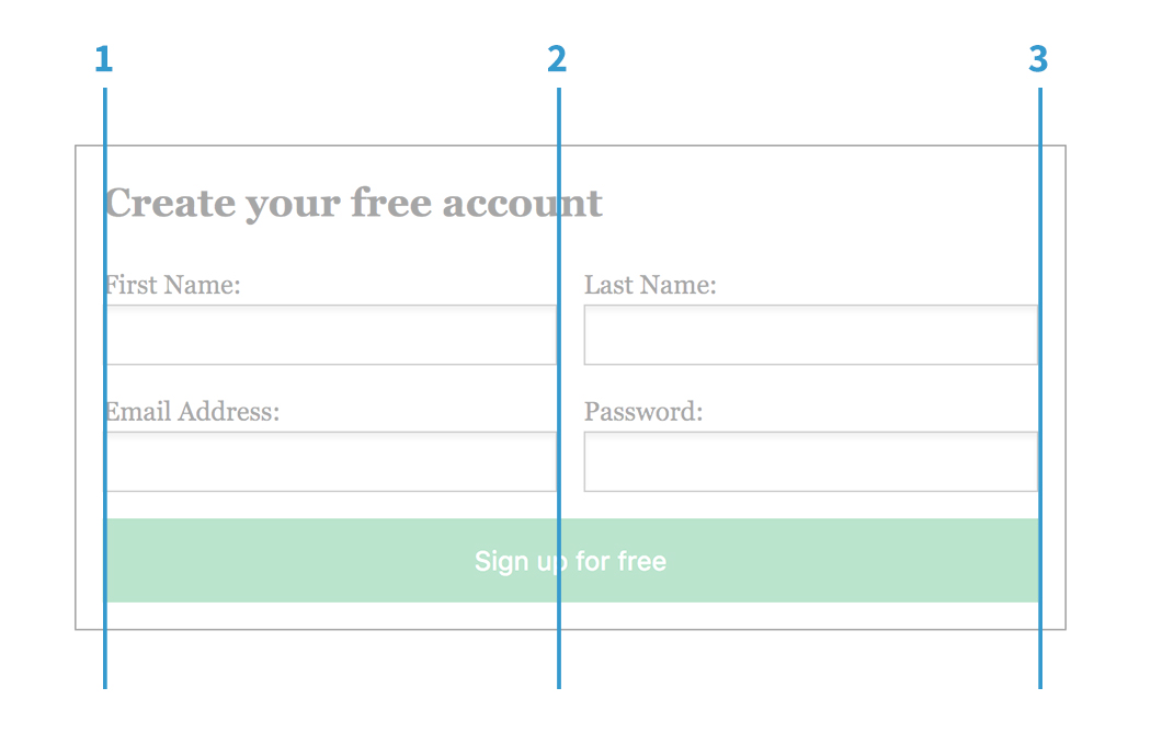
/_ make the button wrapper take space from line 1 to line 3 _/ form p:last-child { grid-column: 1 / 3; } {% endhighlight %}
To make the last <p> element (the button wrapper) take the full width, it should take space from line 1 to line 3. See the below image:
See the Pen Grid Layout - Form Example by Ahmad Shadeed (@shadeed) on CodePen.
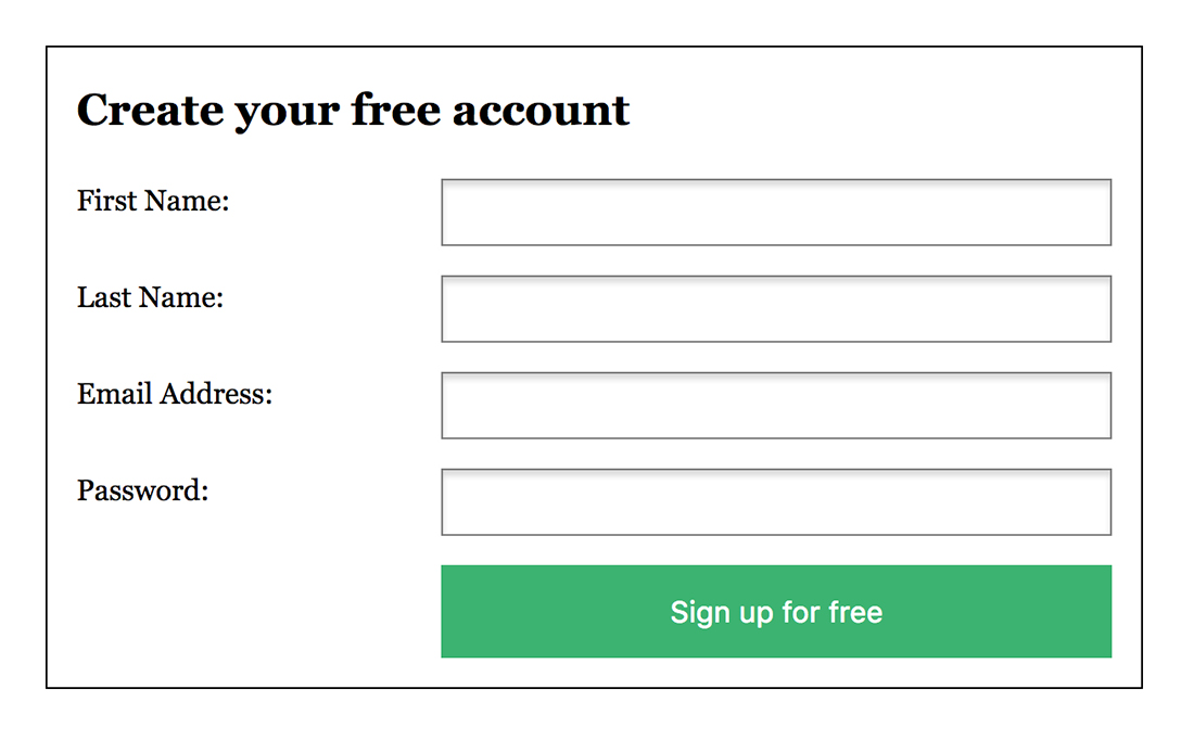
In the design above, we have the following requirments:
For that case, we don’t need to wrap labels and fields in a <p> element. Grid layout can align them easily for us.
{% highlight html %}
{% endhighlight %}
{% highlight css %} form { display: grid; grid-template-columns: 1fr 2fr; grid-gap: 16px; }
button { grid-column: 2 / 3; } {% endhighlight %}
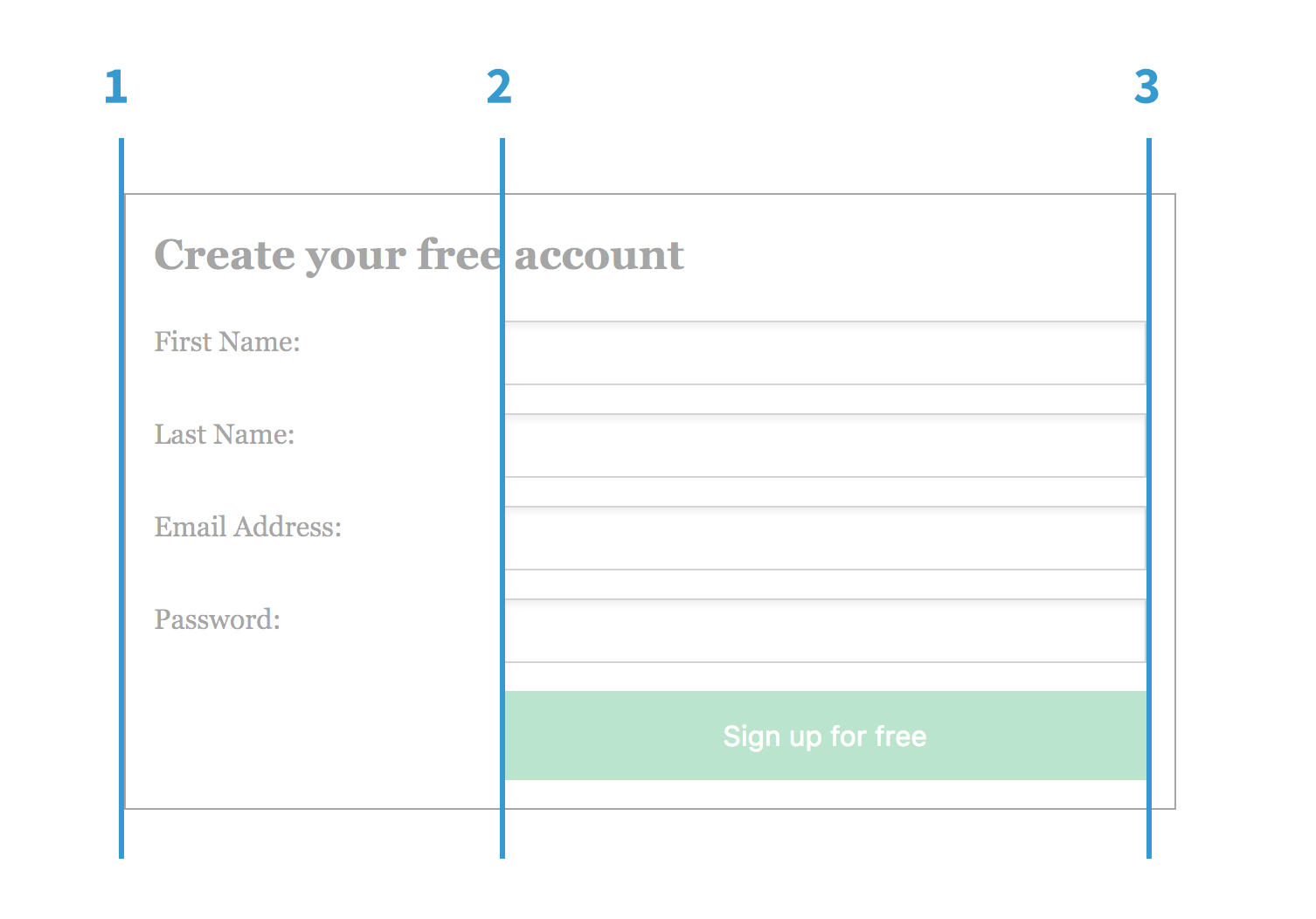
1fr 2fr means that the fields width will be twice as the label. In order to align the button with the inputs, we need to let it start from line 2 to 3.
See the Pen Grid Layout - Form 2 by Ahmad Shadeed (@shadeed) on CodePen.
I like to imagine grid areas as table cells, each cell is surrounded by four lines from each side (left, right, top, left). Grid areas are exactly the same.
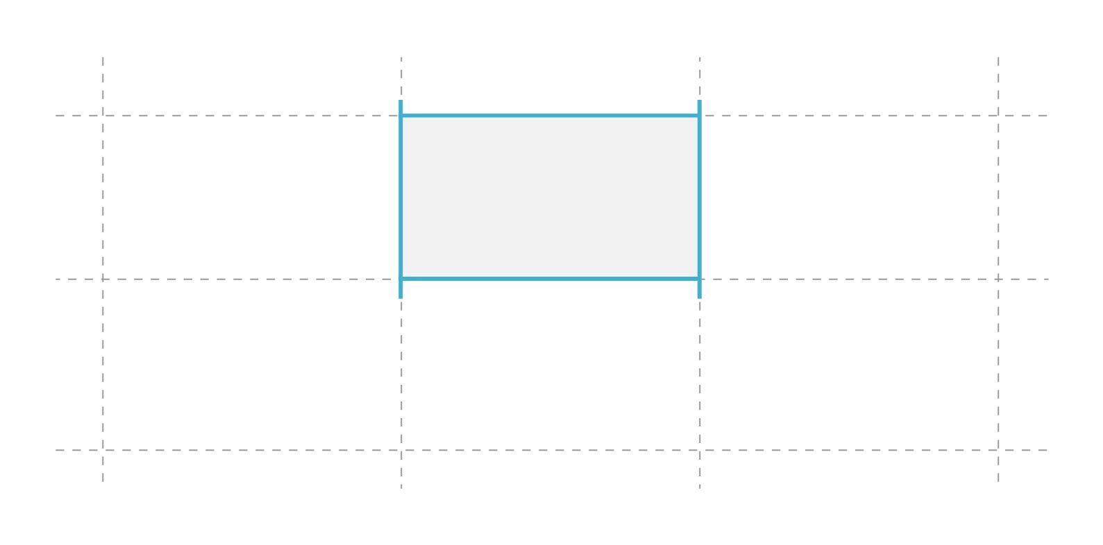
The nice thing is that we can name our areas and use the names to layout different elements. By using grid-template-areas property, this is possible. We will work on layout like the below:
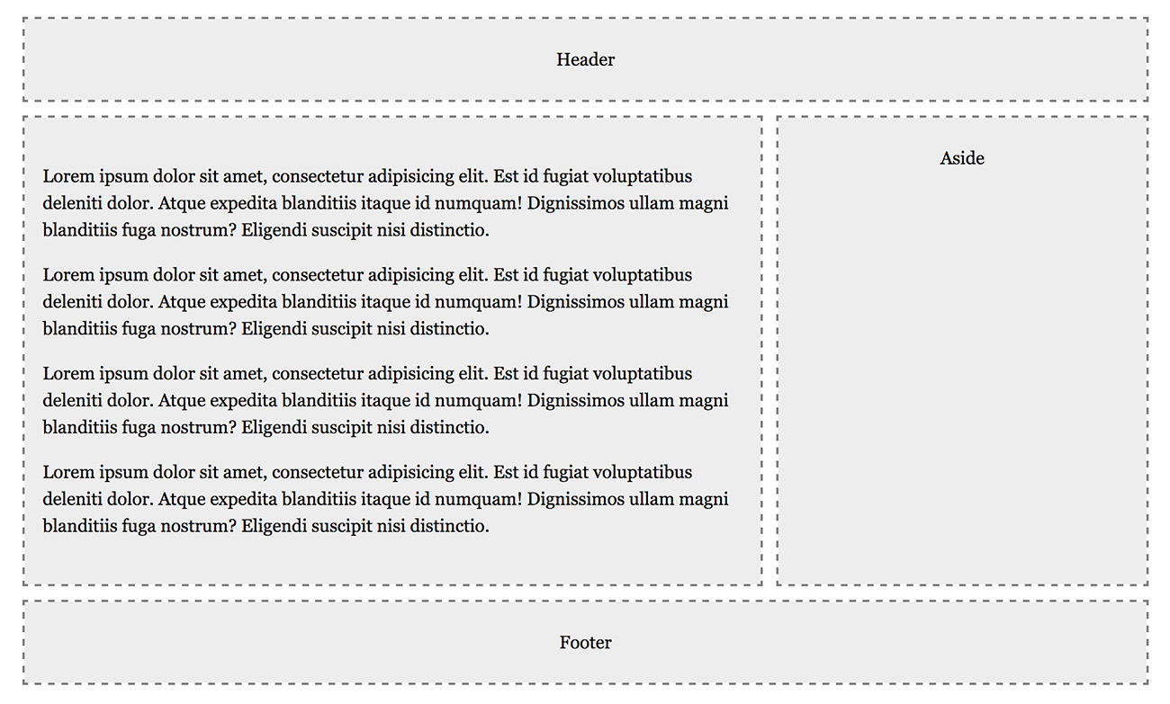
The first step is to define the grid and number of columns.
{% highlight html %}
<main> .... </main>

<aside>Aside</aside>

<footer>Footer</footer>
{% endhighlight %}
{% highlight css %} .wrapper { display: grid; grid-template-columns: 8fr 4fr; /_ main element will take 8 and 4 cols, respectively. _/ } {% endhighlight %}
To use grid areas, we should assign a name of our choice for each element in the page (header, main, aside and footer).
{% highlight css %} header { grid-area: header; }
footer { grid-area: footer; }
main { grid-area: main; }
aside { grid-area: aside; } {% endhighlight %}
Once we have a name for each element, we will get back to .wrapper and use them there.
{% highlight css %} .wrapper { display: grid; grid-template-columns: 8fr 4fr; grid-template-areas: “header header” “main aside” “footer footer”; } {% endhighlight %}
As you noticed, we added an array of different values, the first one header header, we are setting the header to take the space of the 2 columns we have. The main element will only take the first column (with 8fr width) and the aside will take 4fr. Lastly, the footer will take the space of the 2 columns.
See the Pen Grid Layout - Areas by Ahmad Shadeed (@shadeed) on CodePen.
When we have a certain columns number to repeat, we can use a handy expression that make it easier for us. See the below example:
{% highlight css %} .wrapper { display: grid; grid-template-columns: 100px 100px 100px 100px 100px; } {% endhighlight %}
Notice that we repeated 100px 5 times. At some point, if we decided to change that value, then it might be a bit boring to change them all. By using repeat, this issue will be solved.
{% highlight css %} .wrapper { display: grid; grid-template-columns: repeat(5, 100px); } {% endhighlight %}
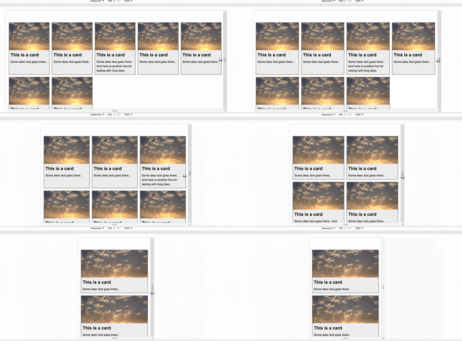
Our goal is to create a responsive cards layout by using repeat expression. Without media queries, we can use minmax() to help us in that.
{% highlight css %} .wrapper { display: grid; grid-template-columns: repeat(auto-fill, minmax(250px, 1fr)); } {% endhighlight %}
auto-fill, the number of times we want to repeat columns. By adding auto-fill, the value will be calculated automatically by the browser.See the Pen Grid Layout - Cards by Ahmad Shadeed (@shadeed) on CodePen.
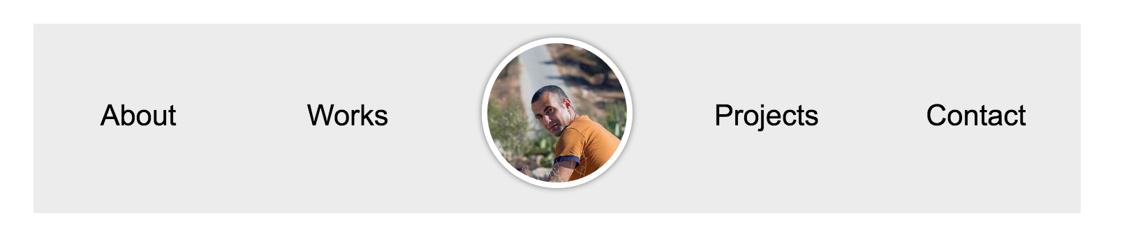
In this example, we will change the visual order of the image and center it.
{% highlight html %}

{% endhighlight %}
In order to move the avatar to the center, we need to determine the start and end of the column lines.
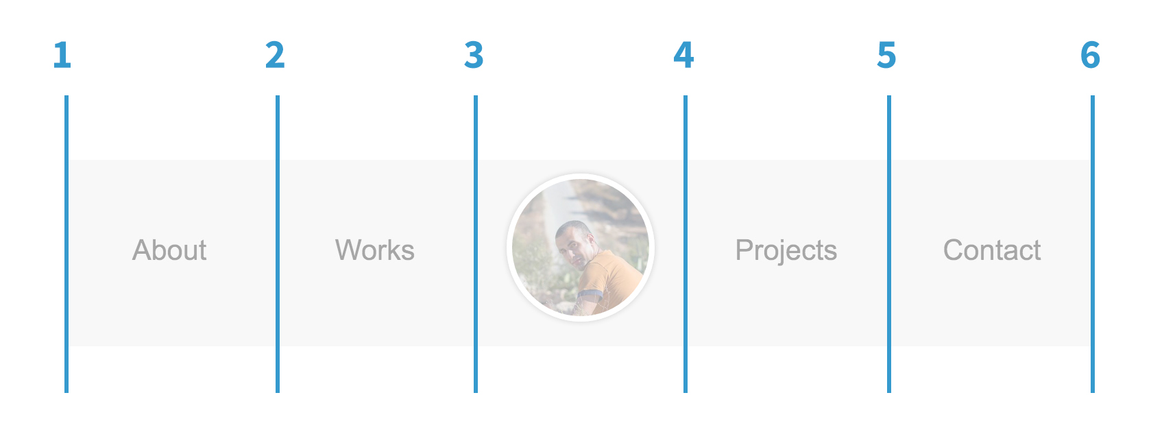
{% highlight css %} ul { display: grid; grid-template-columns: repeat(5, 1fr); /_ 1fr 1fr 1fr 1fr 1fr _/ }
li { align-self: center; /_ center the links vertically _/ }
li:first-child { grid-column: 3 / 4; } {% endhighlight %}
See the Pen Grid Layout - Header by Ahmad Shadeed (@shadeed) on CodePen.
Once the support is there, we can use it as an enhancement to our layouts. By using @supports in CSS, this will become possible and in case no support, it’s fine, we are using it as an enhancement. ;)
{% highlight css %} @supports (display: grid) { .wrapper { display: grid; grid-template-columns: 1fr 1fr 1fr; }
.featured-item { grid-column: 1 / 3; } } {% endhighlight %}
With grid, we can reorder our layouts in many ways. When those changes have focusable elements like controls and links, it might provide a bad experience for people using the keyboard. When the visual order is different than the source one, it might work for element that the user don’t need to click or interact with. But for interactive elements, please think twice before re-ordering content with grid.
此内容由惯性聚合(RSS阅读器)自动聚合整理,仅供阅读参考。 原文来自 — 版权归原作者所有。