


I spent years teaching CSS layout on this blog. I put everything I know into The Layout Maestro course: 70+ lessons and 150+ interactive examples that teach you how to think CSS layouts, not just memorize syntax.
We have been using CSS viewport units since 2012. They are useful to help us in sizing elements based on the viewport width or height.
However, using the vh unit on mobile is buggy. The reason is that the viewport size won’t include the browser’s address bar UI.
To solve that, we now have new viewport units. Let’s find out about them in this article.
For example, when we need to size an element against the viewport size. The viewport units are vw, vh, vmin, and vmax.
Consider the following figure:

The value 50vw means: to give the element a width equal to 50% of the viewport width.
If you want to learn more, I wrote a detailed article on viewport units.
When using 100vh to size an element to take the full height of the viewport on mobile, it will be larger than the space between the top and bottom bars. This will happen in browsers that shrink their UI on scrolling, such as Safari or Chrome on Android.
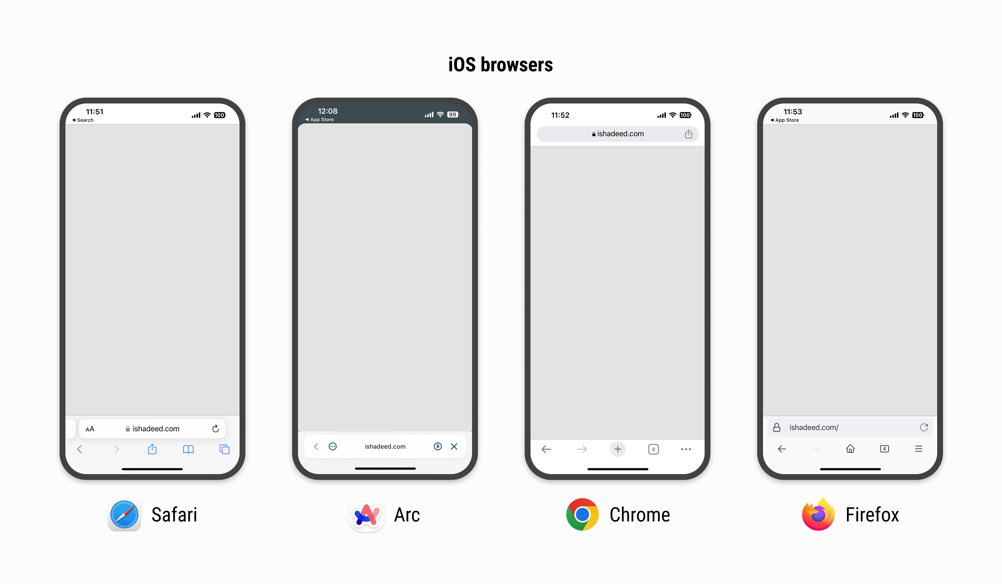
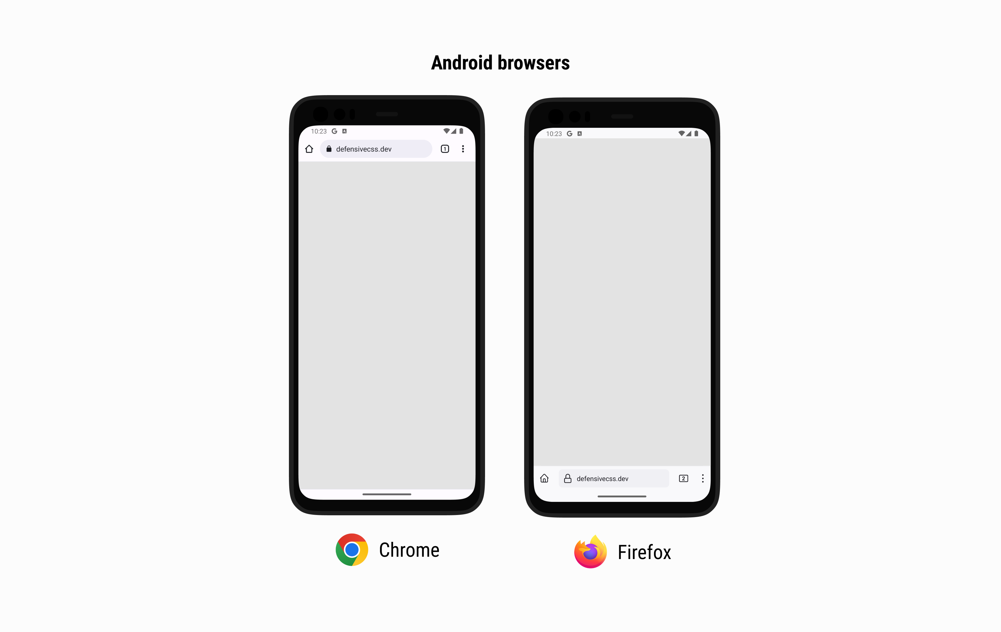
Here is a figure that shows how each mobile browser has a different UI for the top and bottom UI.
Suppose that we have a loading view that fills the whole screen.
/* I know that we can use bottom: 0 instead of height: 100vh, but this is to intentionally highlight the issue. */
.loading-wrapper {
  position: fixed;
  left: 0;
  right: 0;
  top: 0;
  height: 100vh;
  display: grid;
  place-items: center;
}
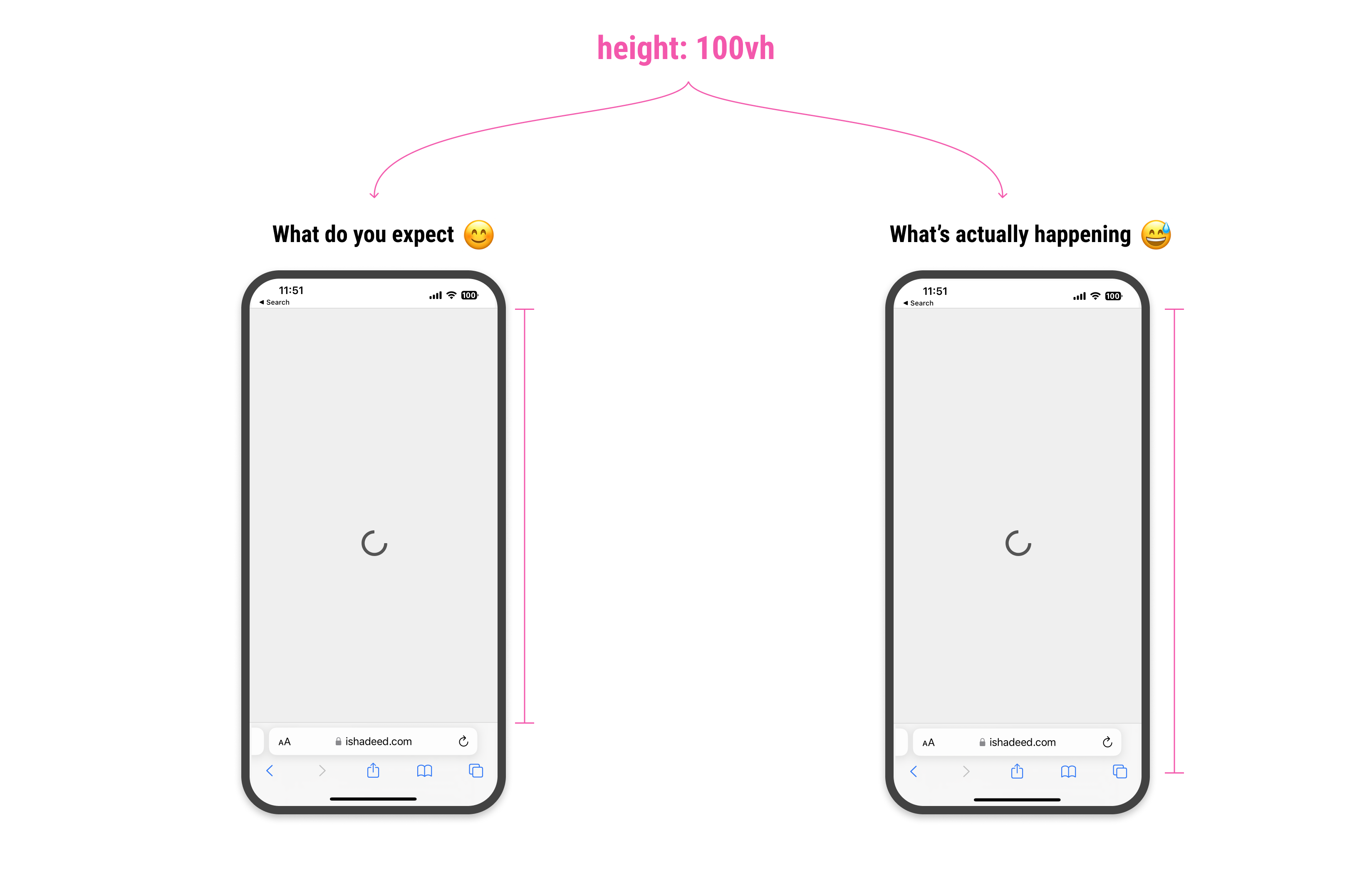
Consider the following figure:
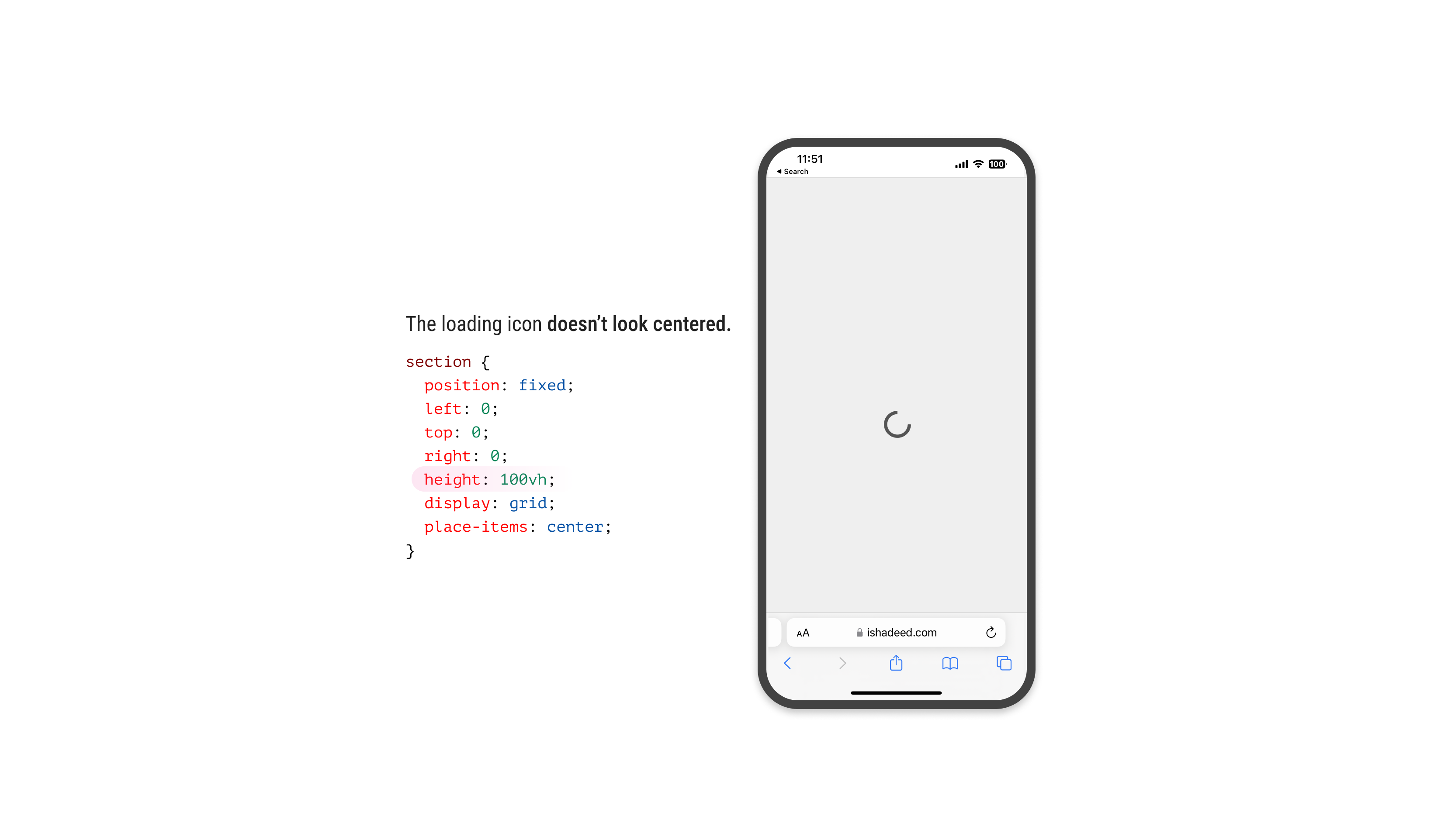
The loading icon is centered in CSS, but visually, it looks like it’s positioned slightly to the bottom. Why is that happening?
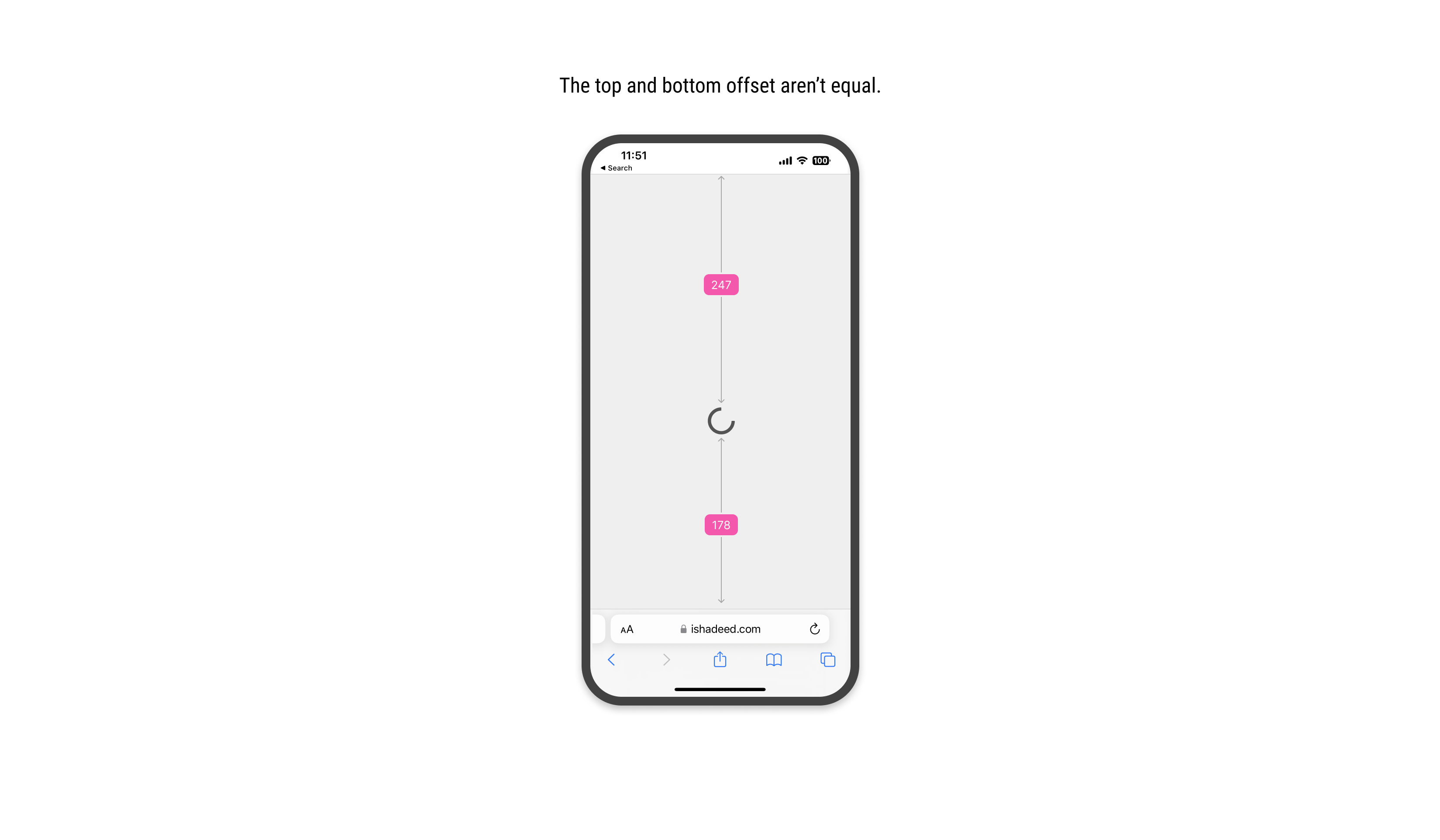
For the browser, height: 100vh means that the element will fill the viewport height, but it won’t calculate the computed value dynamically. That means the bottom address and toolbar won’t be calculated.
Because of that, we have an expectation that 100vh will be equal from the top of the viewport to the start of the address bar UI.
When we scroll down, the address bar UI will shrink its size. This is good, as it gives the user more vertical space to browse the page. At the same time, it’s breaking the UI somehow.
In the following figure, the center of the vertical space is off when the address bar is visible. When scrolling, it looks fine.
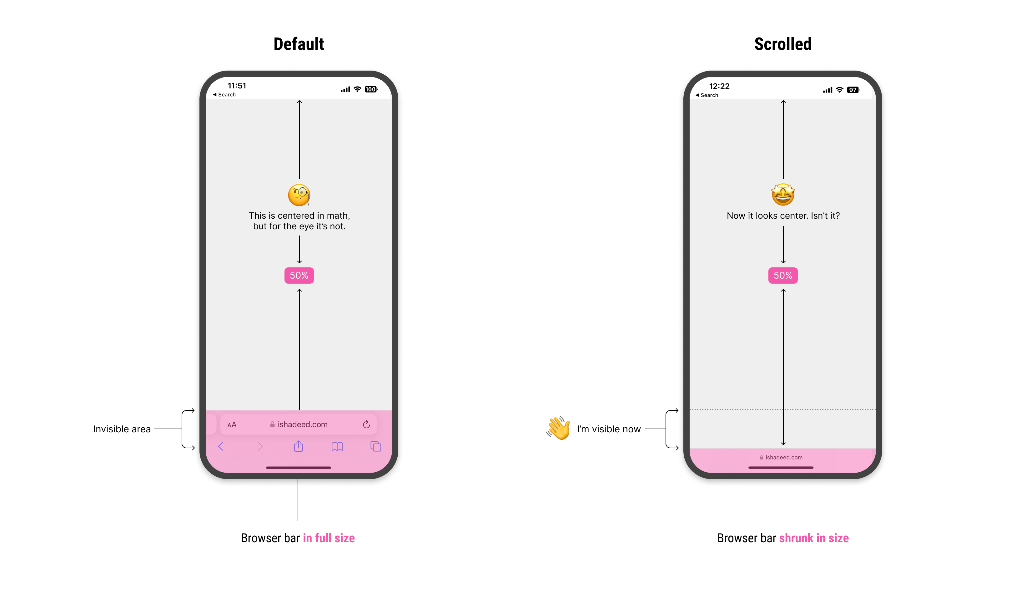
Notice how I highlighted the invisible area. When scrolled down, it become visible. How to deal with that in CSS?
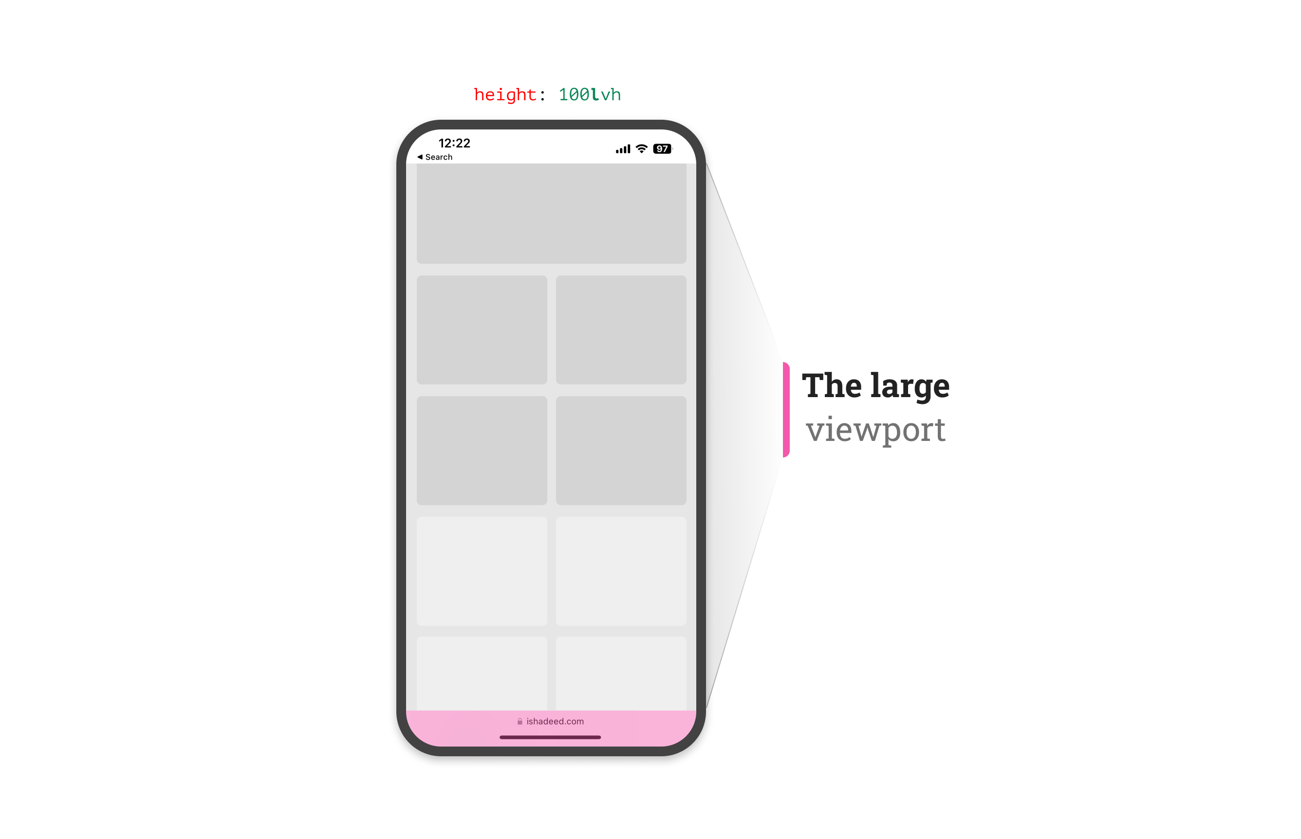
To solve that, the CSS working group agreed on having a new set of units: svh, lvh, and dvh. They stand for the small, large, and dynamic viewport, respectively.
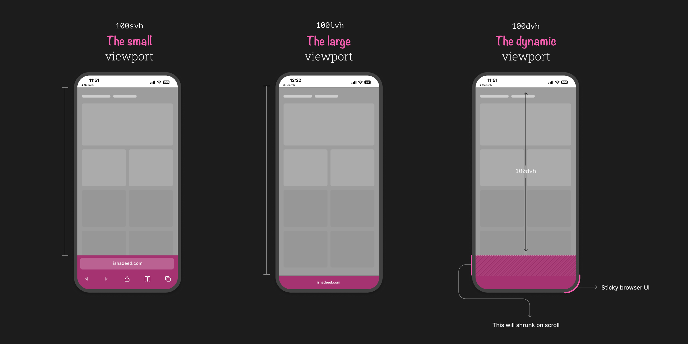
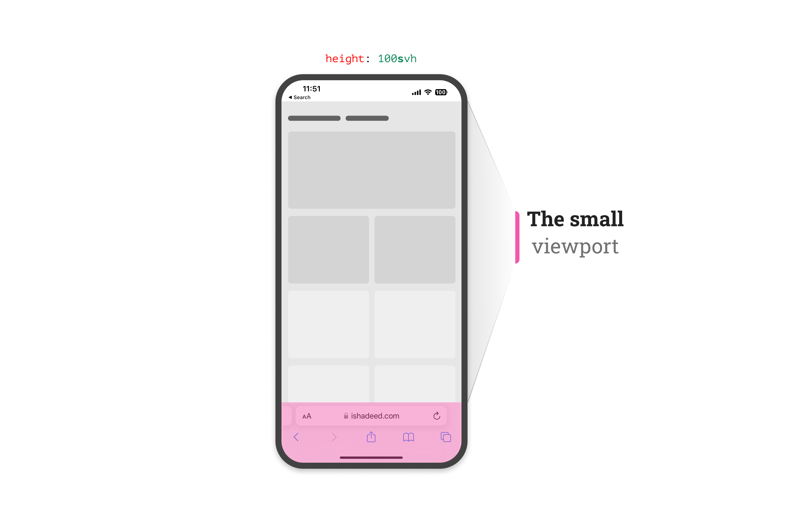
The svh represents the viewport height when the address bar UI hasn’t shrunk its size yet.
The lvh represents the viewport height after the address bar UI shrunk its size.
From its name, this unit is dynamic. That means it will use any of the small, in-between, and large units based on whether the address bar UI is shrunk or not.
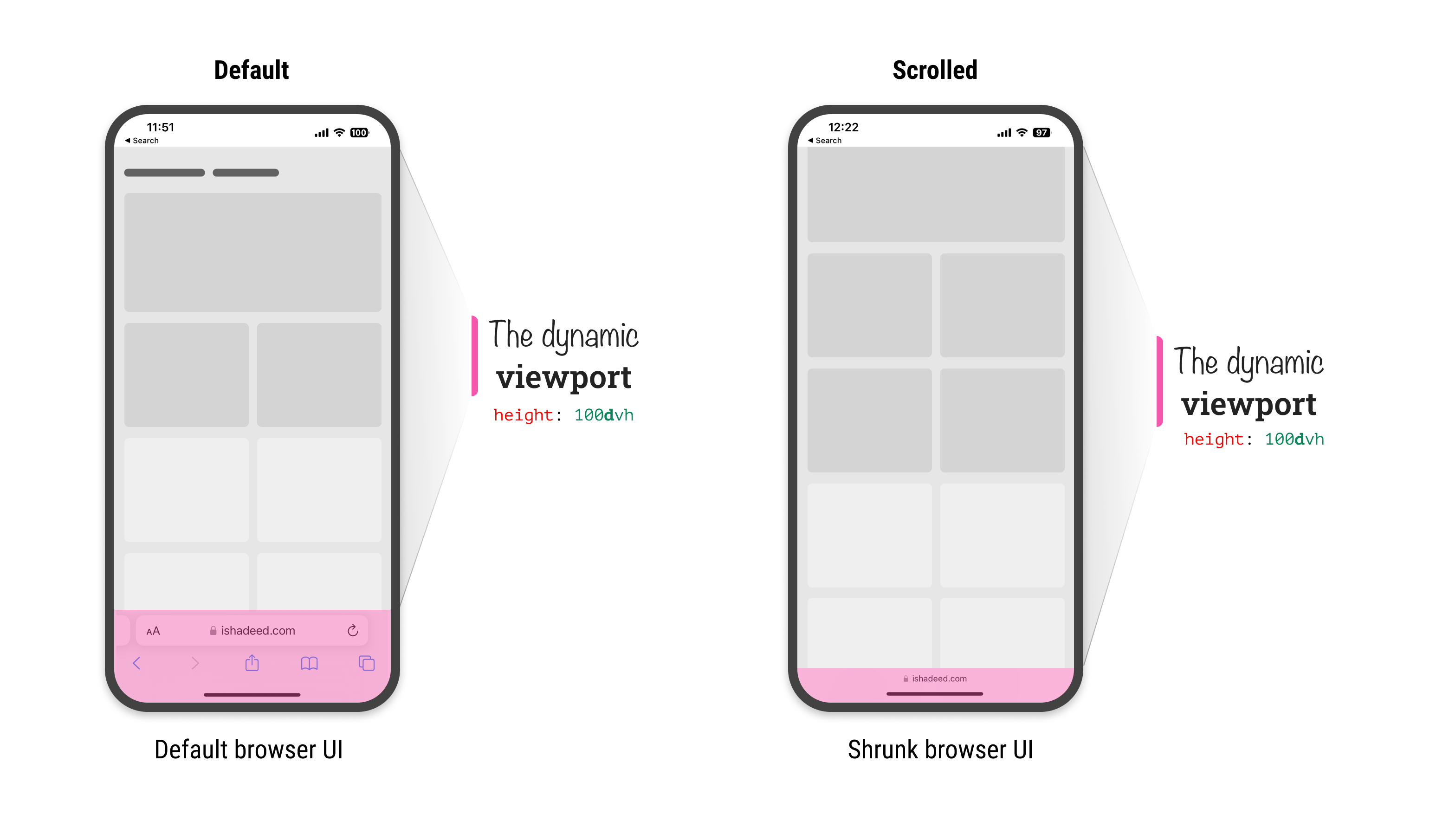
During the initial scroll, the dynamic viewport unit will change as the browser UI will shrunk. Here is a video that shows how the dynamic viewport changes:

In this example, we have a modal with a sticky header and footer. The middle part should scroll if the content is long enough. This example is inspired by a figure by Max Schmitt while researching the topic.
Consider the following CSS:
.modal {
  position: fixed;
  top: 0;
  left: 0;
  right: 0;
  height: 100vh;
}
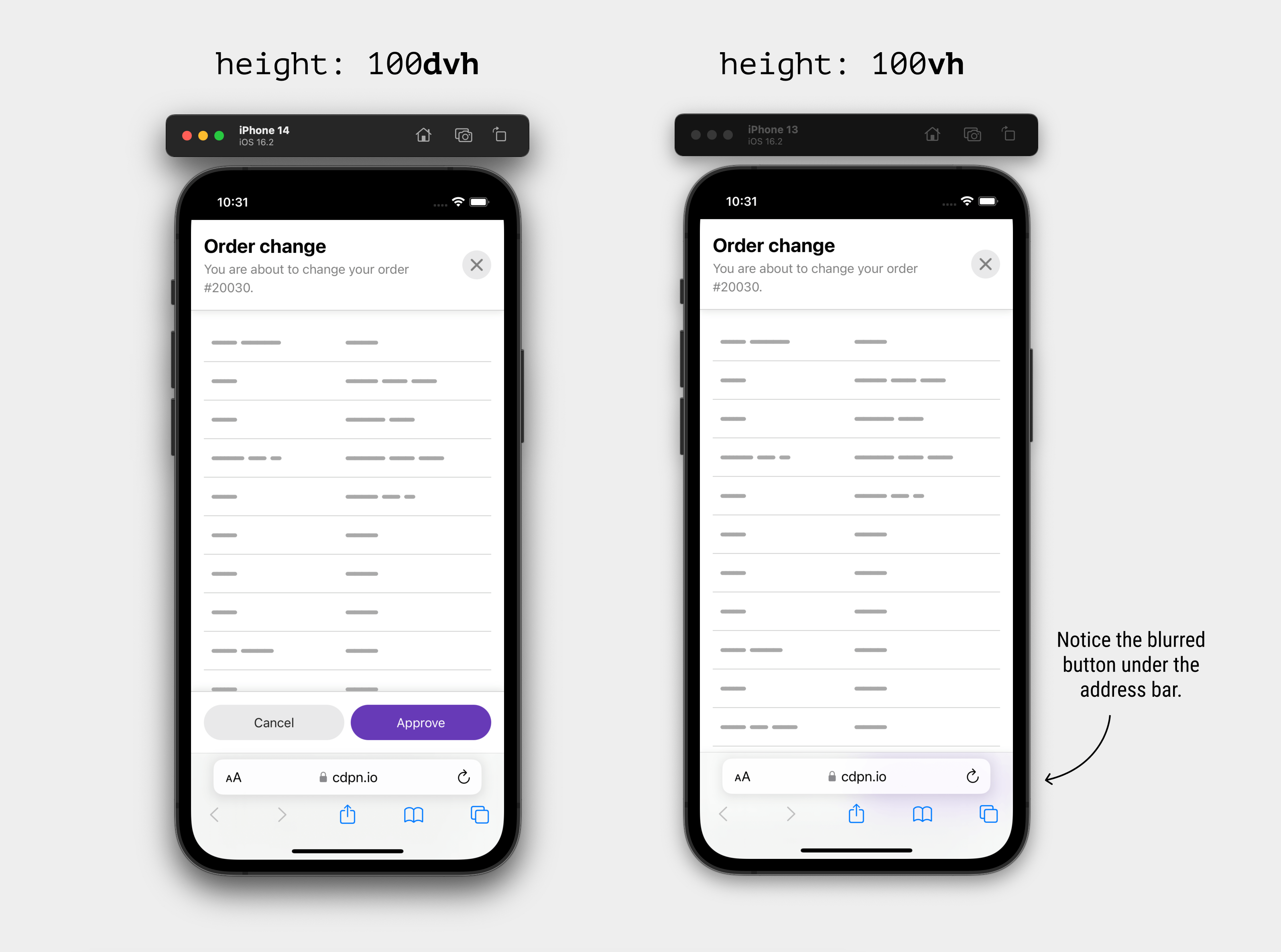
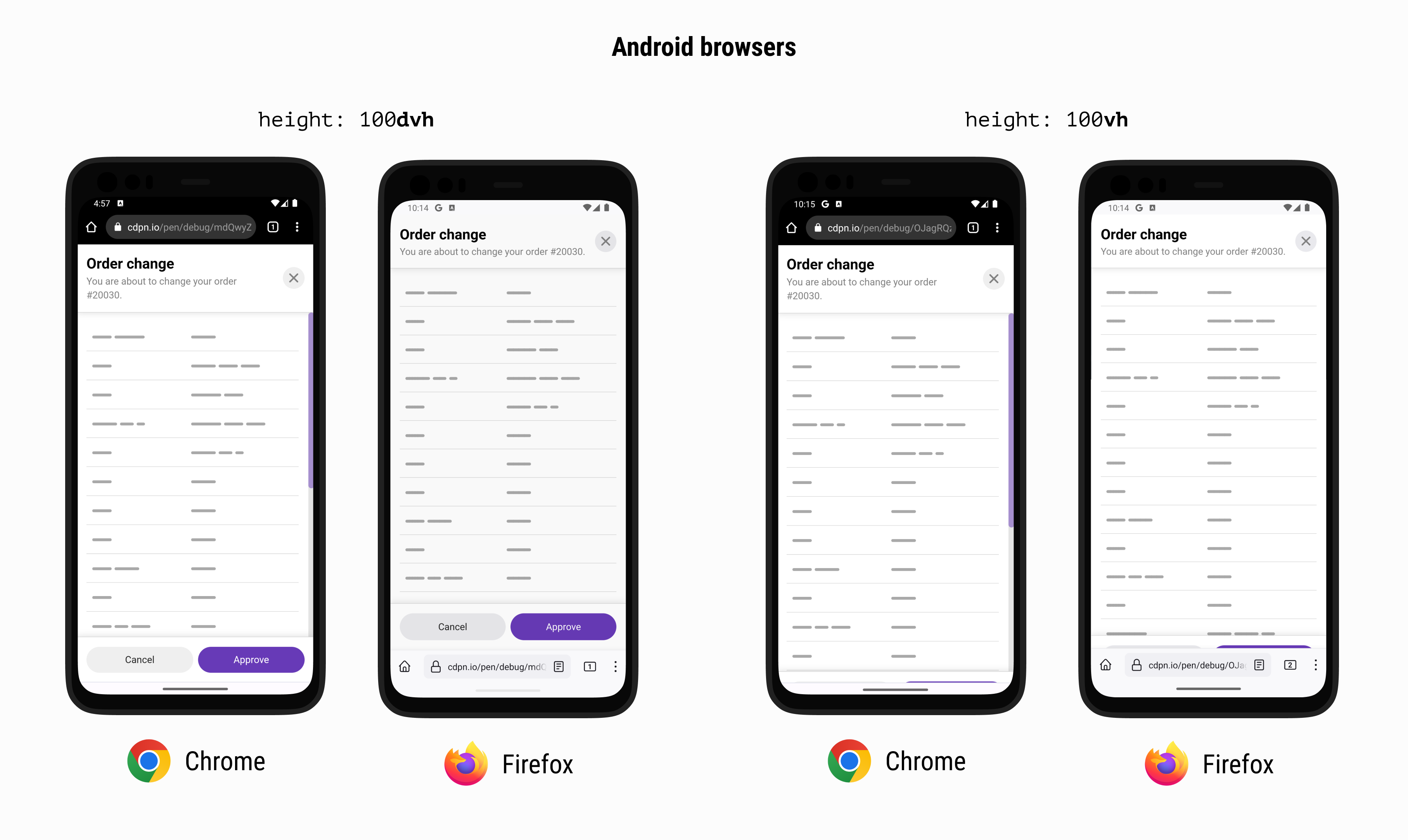
Using 100vh will make the bottom part of the modal invisible. In the example, that means the footer won’t be visible and this will break the UX.
Here is how it looks with traditional and new viewport units on iOS:
..plus Chrome and Firefox on Android:
To solve that, we can either use svh or the dvh units.
Here is a video that shows the differences between dvh and vh.
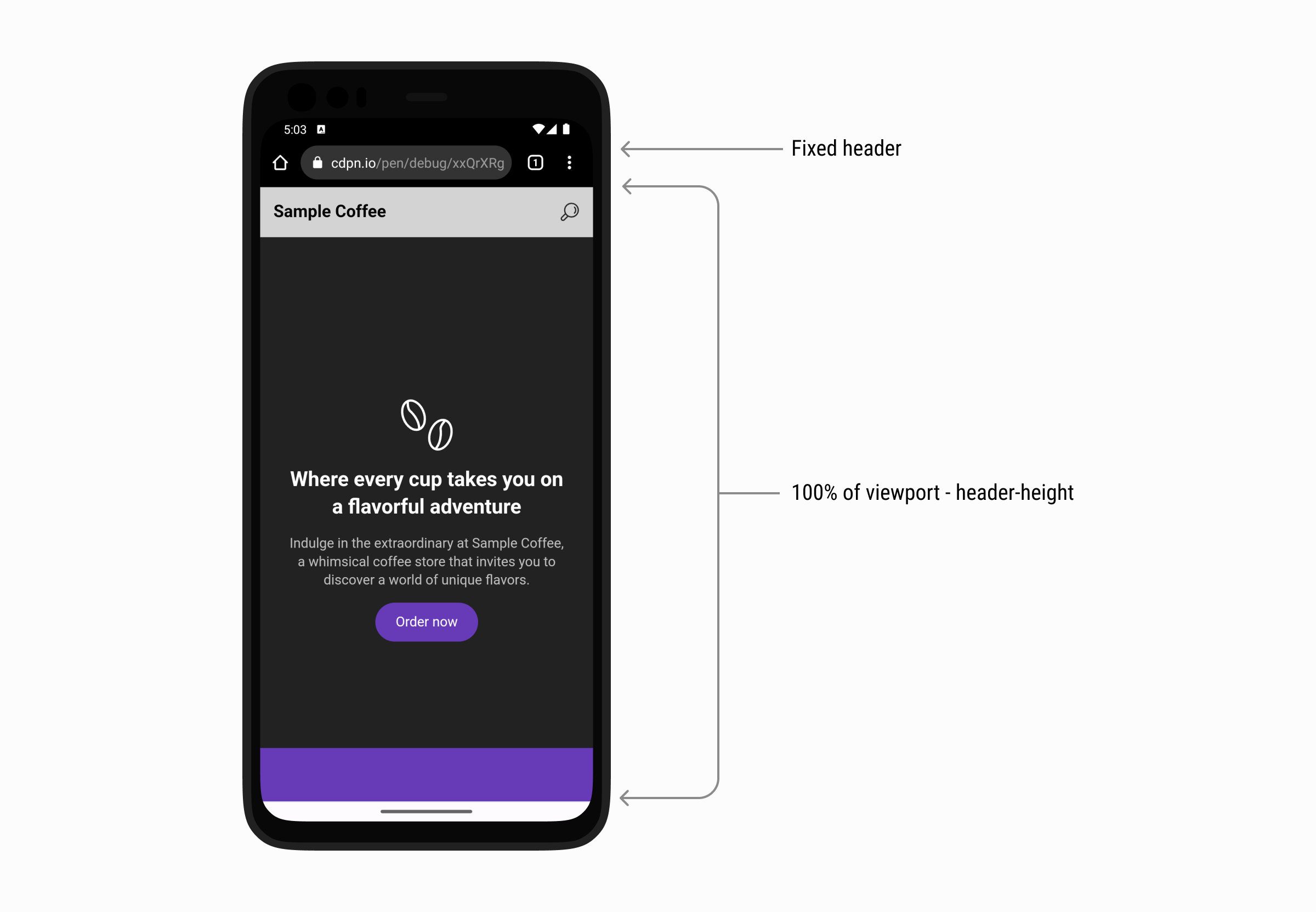
It’s a common case that we need to make the hero section height equal to the full viewport height minus the header height. Using the traditional vh for that case will fail in a browser that shrinks its UI on scrolls like iOS Safari and Firefox and Chrome for Android.
First, we need to make sure that the header height is fixed. I used min-height for that.
:root {
  --header-height: 60px;
}

.site-header {
  position: sticky;
  top: 0;
  min-height: var(--header-height, initial);
}
After that, I added min-height to the hero section and used calc().
.hero {
  min-height: calc(100svh - var(--header-height));
}
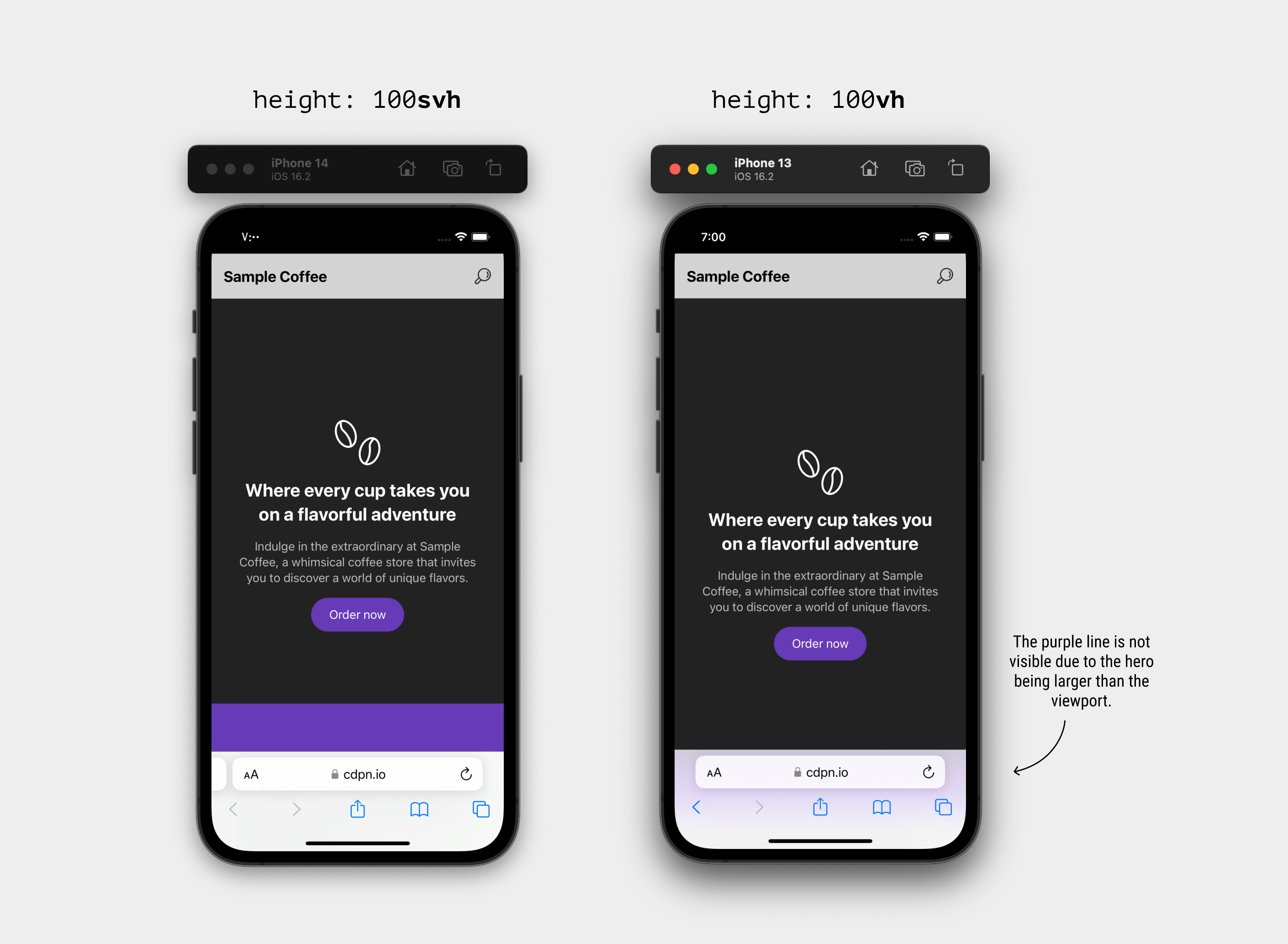
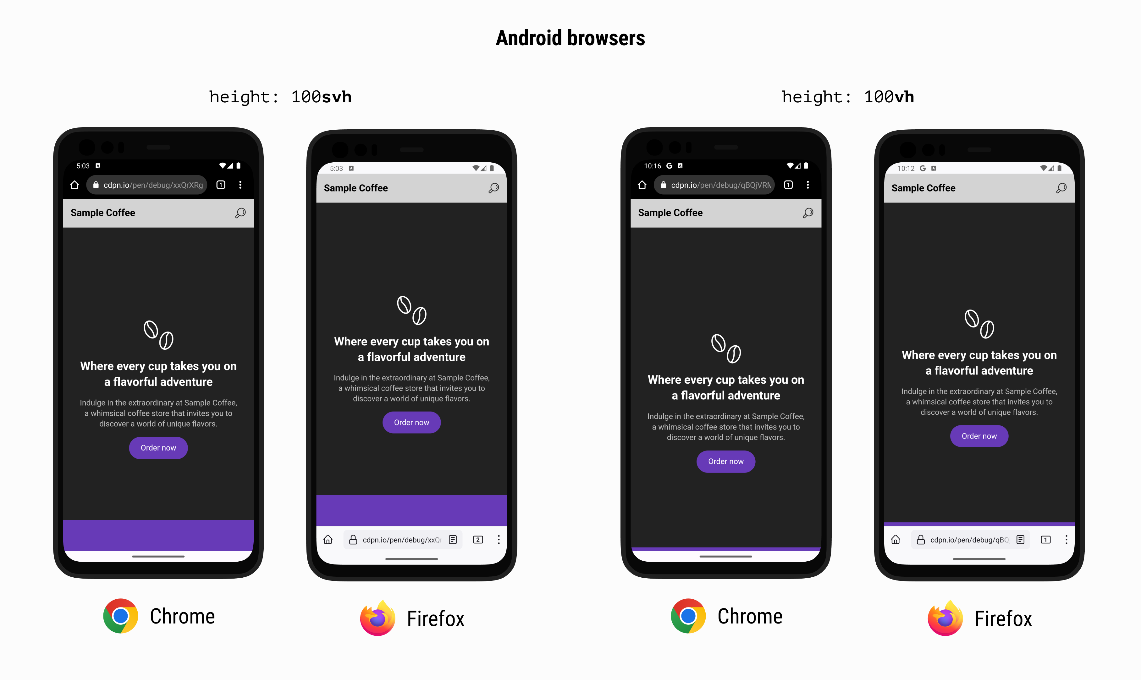
When using vh, the decorative element (in purple) isn’t visible at all. In fact, if you look closer, it’s blurred underneath the address bar UI in iOS Safari and cropped in Android browsers.
Here is a comparison between svh and vh on Safari iOS.
..plus Chrome and Firefox on Android:
See the following video and spot the difference between using svh and vh.
In such a case, using svh will solve the problem.
dvh the default unit?At first, the answer was “Yes, why not?”. Then I thought to myself, the dvh value will change as you scroll, so it might create a confusing experience when used for stuff like font-size.
h1 {
  font-size: calc(1rem + 5dvh);
}
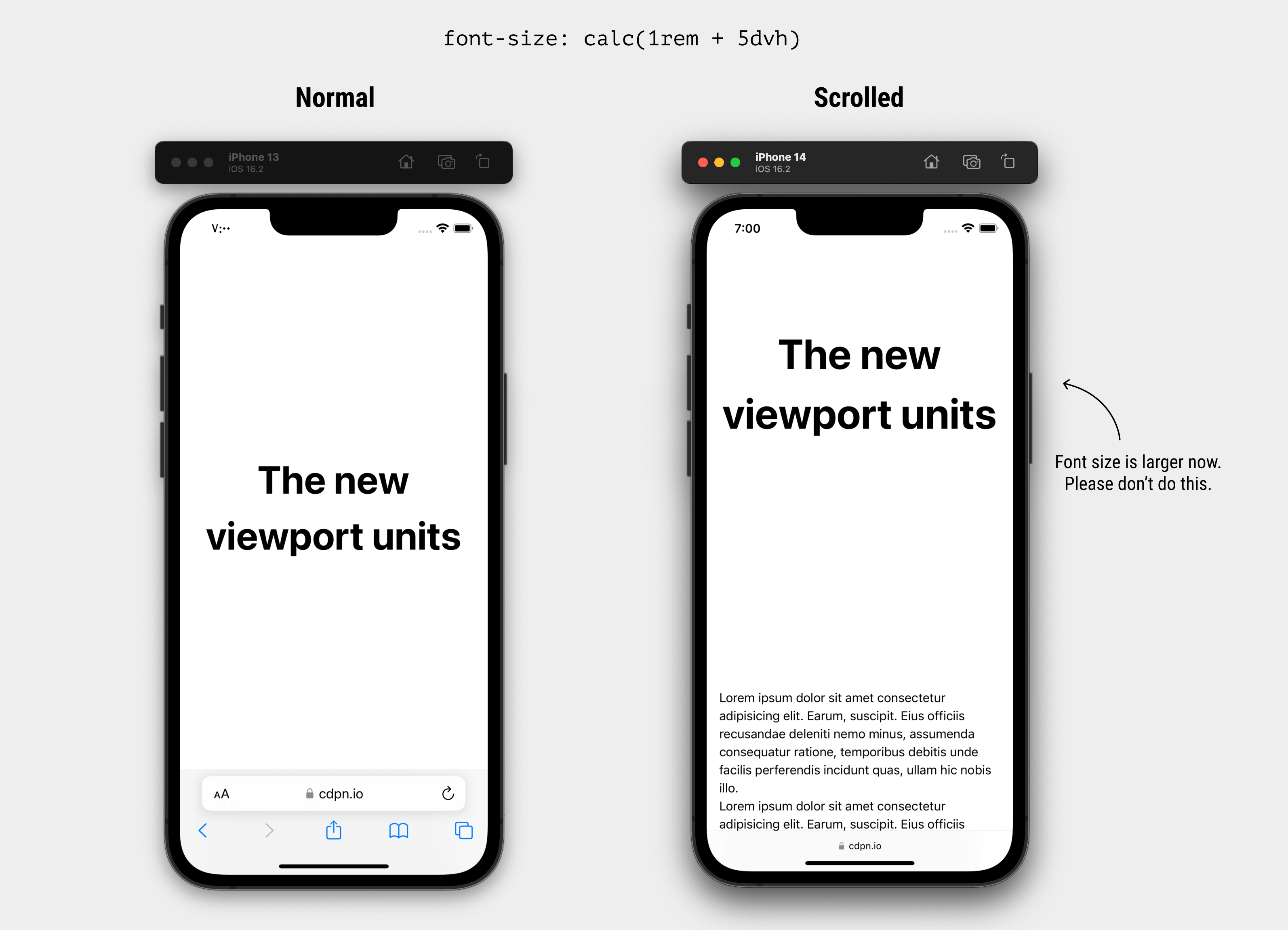
Check out the following video and notice how the font-size change after the address bar UI is shrunk:
dvh viewport unitThe dynamic viewport unit might impact the performance of the page, as it will be a lot of work for the browser to recalculate the styles which the user is scrolling up or down.
I didn’t get the chance to do intensive performance testing, but I would be careful when using it. I hope that I will get the time to update on that here.
Those new viewport units might not be only about mobile browsers. In fact, you can browse the web on a TV today. Who knows what browser will come for a TV that has a UI that changes on scrolling and thus resize the viewport?
For example, here is the hero section example viewed on an Android TV:

It works perfectly and will keep working even if we have a dynamic UI.
此内容由惯性聚合(RSS阅读器)自动聚合整理,仅供阅读参考。 原文来自 — 版权归原作者所有。