


I spent years teaching CSS layout on this blog. I put everything I know into The Layout Maestro course: 70+ lessons and 150+ interactive examples that teach you how to think CSS layouts, not just memorize syntax.
Who doesn’t like getting new CSS features supported in browsers? Nobody, I think. Recently, lots of folks are excited for the support of gap property for flexbox in Chromium browsers (Chrome, Edge). The gap property is an attempt to have the same property for CSS grid and flexbox. It will be responsible for the spacing (gutters) between columns and rows.
Before digging into the details, I want to explain briefly how grid-gap or gap works. Simply, it adds spacing between columns and rows. See the video below:
Initially, the gap was done using grid-gap.
.wrapper {
  display: grid;
  grid-template-columns: 1fr 1fr 1fr;
  grid-gap: 1rem;
}
However, it’s being replaced by gap property instead. And it works like the below:
.wrapper {
  /* CSS grid styles */
  gap: 1rem;
}
No need to use the prefix grid-.
I created a very abstract demo of two wrappers, grid and flex, respectively. I used gap to define the spacing between the child items.
<div class="grid-wrapper">
  <div class="item"></div>
  <!-- 5 more items -->
</div>

<div class="flex-wrapper">
  <div class="item"></div>
  <!-- 5 more items -->
</div>
/********* CSS Grid *********/
.grid-wrapper {
  display: grid;
  grid-template-columns: 1fr 1fr 1fr;
  gap: 1rem;
}

/********* CSS Flexbox *********/
.flex-wrapper {
  display: flex;
  flex-wrap: wrap;
  gap: 1rem;
}

.flex-wrapper .item {
  flex: 0 0 calc(33% - 1rem);
}
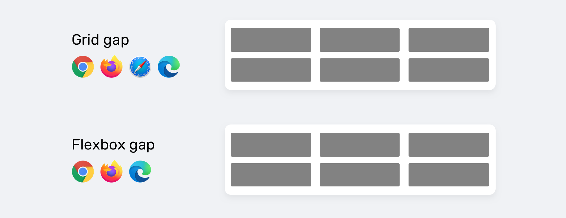
As you see, the gap works perfectly for both CSS grid and flex - on the browsers that support them. However, for the non-supporting browsers like old versions of Chrome and Safari, the result will look like the figure below.
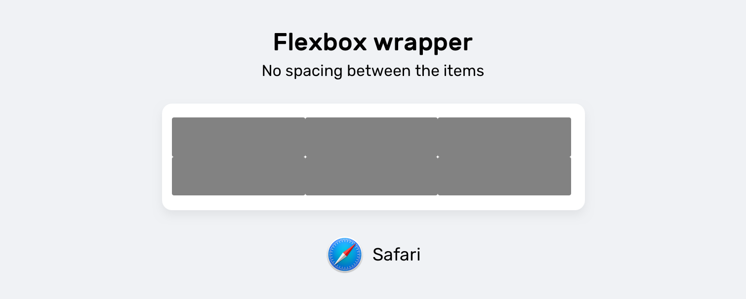
Even though the property is the same, but the support for it differs in grid vs flexbox. This is confusing. Consider the below support tables.
gap support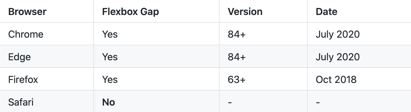
gap support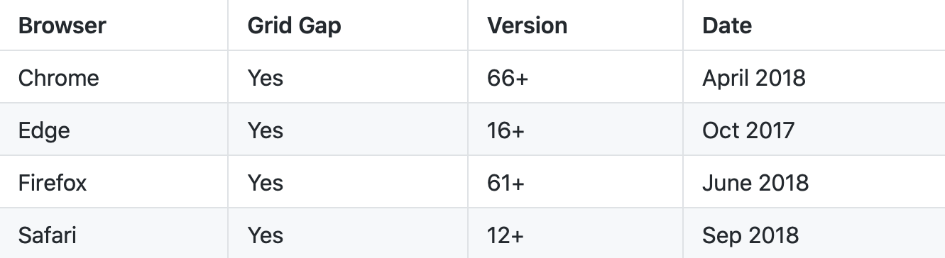
For more information on the support, please check flexbox gap and grid gap on CanIUse.
The flexbox gap is fairly new, so how we can use it in real-life projects? Taking into consideration that we should detect the support for it first.
gapFor CSS flexbox, the gap property was first supported in Firefox, and then Chromium announced that the property is now supported. Great news, but I have an important question.
How can we detect if the gap for flexbox is supported or not?
You might be thinking about using CSS @supports? I’m sorry to let you know that it’s not possible to detect gap with CSS @supports rule. As per the discussion in this CSSWG thread, it seems that there is no way to detect that.
/* This won't work.. */
@supports (gap: 10px) {
  .element {
    display: flex;
    gap: 10px;
  }
}
The above won’t work.
While reading the thread, I noticed some interesting and possible suggestions for that problem.
withA suggestion by @Dan503 is to combine two conditions.
@supports (gap: 10px) with (
  display: flex
) {
  div {
    display: flex;
    gap: 10px;
  }
}
andA suggestion by Bramus.
@supports (display: flex; gap: 1em) {
  .warning {
    display: none;
  }
}
In the meantime, it’s not possible to detect if the gap for flexbox is supported or not.
For now, we have no option but to use Javascript to detect if flexbox gap is supported. I got the idea of creating a wrapper and two child items, and then to apply flex and gap on them. Thankfully, I found that this is already done by someone smarter than me in Modernizr. Thanks to Chris Smith.
function checkFlexGap() {
  // create flex container with row-gap set
  var flex = document.createElement("div")
  flex.style.display = "flex"
  flex.style.flexDirection = "column"
  flex.style.rowGap = "1px"

  // create two, elements inside it
  flex.appendChild(document.createElement("div"))
  flex.appendChild(document.createElement("div"))

  // append to the DOM (needed to obtain scrollHeight)
  document.body.appendChild(flex)
  var isSupported = flex.scrollHeight === 1 // flex container should be 1px high from the row-gap
  flex.parentNode.removeChild(flex)

  return isSupported
}
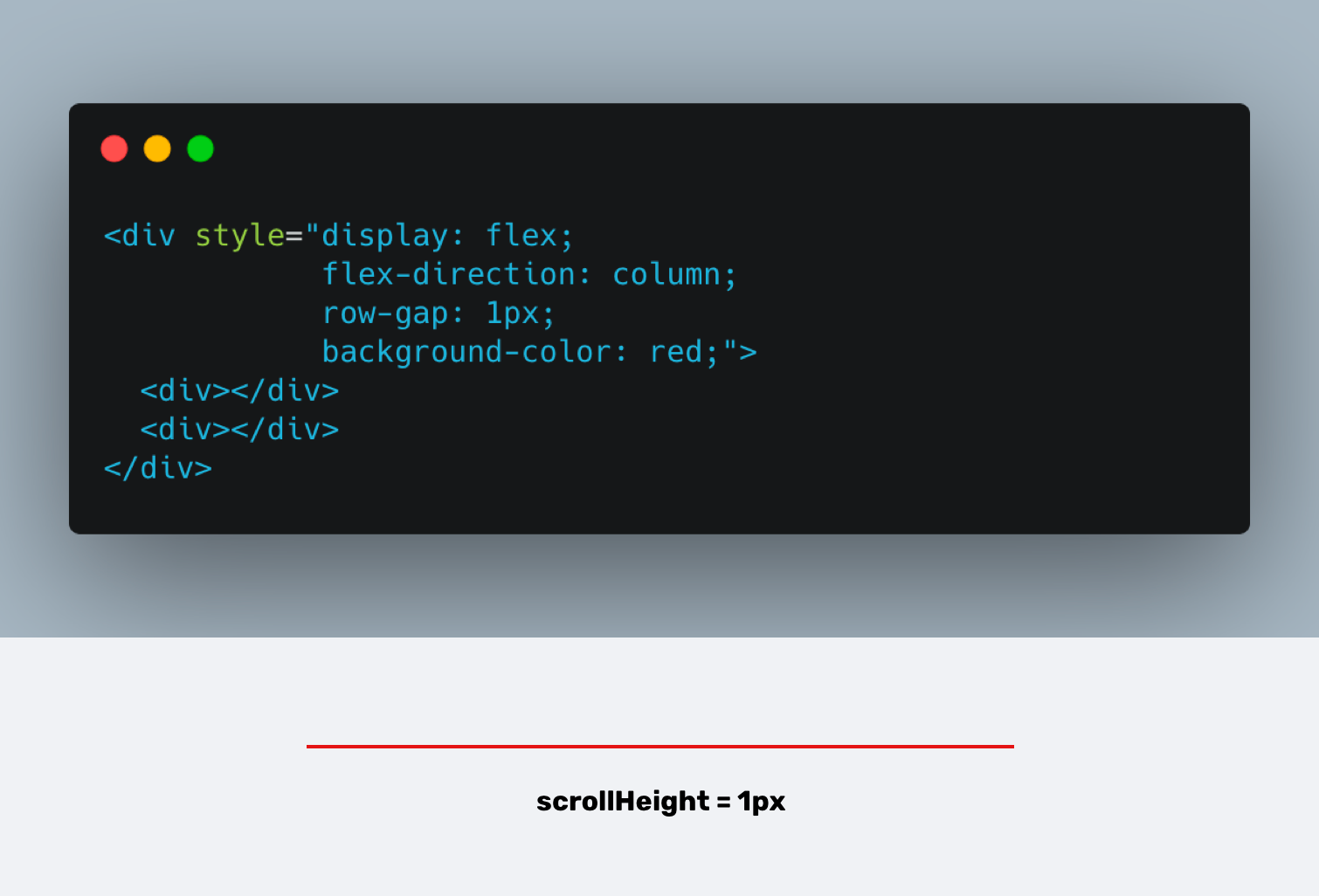
The script works in a way that it creates a flexbox wrapper with flex-direction: column, and row-gap: 1px. If the height of the content is equal to 1px, this means that flexbox gap is supported.
See the visual explanation below.
As per MDN:
The Element.scrollHeight read-only property is a measurement of the height of an element’s content, including content not visible on the screen due to overflow.
By getting the scrollHeight value of the parent element, we can check if the flexbox gap is supported or not.
gap fallbackI tried to check if the support detection for flexbox gap is added in Modernizer or not, but it looks like something is off in the latest build.
Usually, Modernizr adds a class to the <html> to indicate that a property is supported or not. Given that we already have the function, we can check if it’s true or false, and add a class to the <html> element based on that.
if (checkFlexGap()) {
  document.documentElement.classList.add("flexbox-gap")
} else {
  document.documentElement.classList.add("no-flexbox-gap")
}
Now, we can use the class .flexbox-gap to enhance an experience and use the gap property. Here is a simple example:
.flex-wrapper {
  display: flex;
  flex-wrap: wrap;
}

.flex-wrapper .item {
  flex: 0 0 calc(33.33% - 1rem);
  margin-left: 1rem;
  margin-bottom: 1rem;
}

/* If flexbox gap is supported, do the following */
.flexbox-gap .flex-wrapper {
  gap: 1rem;
}

.flexbox-gap .flex-item {
  margin-left: 0;
  margin-bottom: 0;
}
You can check all the code above in this demo
I’m excited to let you know that I’m writing an ebook about Debugging CSS.

If you’re interested, head over to debuggingcss.com and subscribe for updates about the book.
此内容由惯性聚合(RSS阅读器)自动聚合整理,仅供阅读参考。 原文来自 — 版权归原作者所有。