


I spent years teaching CSS layout on this blog. I put everything I know into The Layout Maestro course: 70+ lessons and 150+ interactive examples that teach you how to think CSS layouts, not just memorize syntax.
While I was working on a recent article on the gap property, I needed to place a box between two words and keep it aligned. I thought about a way to size the box to be equal to the capital letter height. After some research, I found the cap unit and it worked as expected. In this article, I will demonstrate the problem and how I solved it.
In the following figure, I have a box between the words. I need to make its height equal to the uppercase letters (H and W).
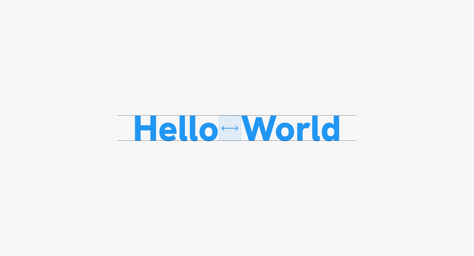
The first thing I thought about was to divide each word into an element and use Flexbox to handle the layout.
<p class="title">
  <span>Hello</span>
  <span class="spacer"></span>
  <span>World</span>
</p>
.title {
  display: flex;
  gap: 0.5rem;
}
HelloWorld
Cool. The next step is to add the spacer styling. As a start, I did this:
.spacer {
  --size: 2rem;
  width: var(--size);
  height: var(--size);
  background-color: var(--brand-1);
}
Here is the result.
HelloWorld
At first glance, it looks like we solved it. Let’s try to change the font size a bit and see what happens.
This isn’t good. I need to make the square height equal to the uppercase letter.
In this iteration, I tried using the ex CSS unit which is equal to the lowercase letter height.
.spacer {
  --size: 1.55ex;
  width: var(--size);
  height: var(--size);
  background-color: var(--brand-1);
}
Try to resize the text below.
It works! Yay. At this stage, I wasn’t sure if this was the best solution. The only downside is that you need to play with the ex value to a point where it’s equal to the uppercase letter height.
At this point, even though it was solved, I thought about researching for a CSS unit that is equal to the uppercase height. I remember seeing an announcement on Twitter but couldn’t recall it.
A quick Google search revealed the cap and rcap units that were first released in Firefox (Feb 2022), Chrome (Sep 2023) and Safari (Dec 2023).
.spacer {
  --size: 1cap;
  width: var(--size);
  height: var(--size);
  background-color: var(--brand-1);
}
One word to describe this. Perfection. With that, I used the cap unit for a real-life use case that I’m happy with.
Now that I found the perfect solution, is it possible to make it even better?
The last issue I noticed is that when I add an outline to the title, there is a space at the top and bottom.
What if I added height: 1cap to the title?
.title {
  height: 1cap;
  outline: solid 1px;
}
Better, right?
Another way to use the CSS cap could be to keep an icon aligned with the adjacent text.
.button {
  /* Other styles */
  padding-block: 1cap;
  display: flex;
  align-items: center;
  justify-content: center;
  gap: 0.5cap;

  svg {
    --size: 1.65cap;
    flex: 0 0 var(--size);
    width: var(--size);
    height: var(--size);
  }
}
In the demo below, play with the slider to change the font size.
That’s it for this article. Do you have other use cases for the CSS cap unit? If yes, I would love to hear from you on Twitter (X), Mastodon or Threads.
Enjoyed the read? If you'd like to support my work, consider buying me a coffee. This interactive guide took 6 weeks, which translates to 54 coffee cups. Thanks a latte!

此内容由惯性聚合(RSS阅读器)自动聚合整理,仅供阅读参考。 原文来自 — 版权归原作者所有。