


I spent years teaching CSS layout on this blog. I put everything I know into The Layout Maestro course: 70+ lessons and 150+ interactive examples that teach you how to think CSS layouts, not just memorize syntax.
Flexbox is one of the best additions to CSS. I found it very useful to code elements and making them adapt easily to different screen sizes.
I made a design to show how many components could be built with Flexbox. This article assumes that you have a basic understanding of Flexbox. If you would like to learn more about it, then I recommend reading this guide on CSS Tricks.
Here is the design:
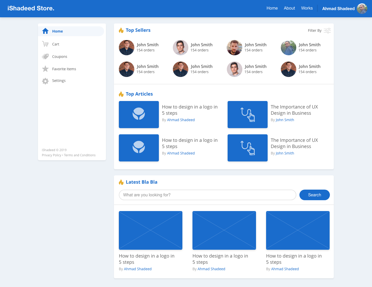

It looks like a normal header, right? It has two sections: Logo, Navigation and User.
The navigation is pushed to the far right. Let’s see how to make it like so.
<header class="c-header">
  <h1 class="c-logo"><a href="#">iShadeed Store</a></h1>
  <div class="c-header__nav">
    <nav>
      <ul>
        <!-- Nav Items -->
      </ul>
    </nav>
    <a href="#" class="c-user">
      <span>Ahmad Shadeed</span>
      <img class="c-avatar" src="shadeed.jpg" alt="" />
    </a>
  </div>
</header>
.c-header {
  display: flex;
  align-items: center;
  flex-wrap: wrap;
}

.c-header__nav {
  margin-left: auto; /* Where the magic happens */
}
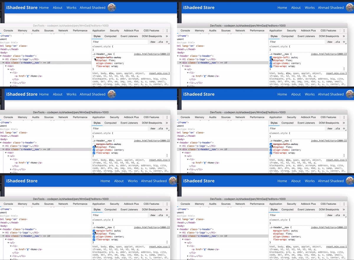
In Flexbox, when using an auto margin on the child element, it will make that element occupy the available space in its parent. In our case, the nav and user were pushed to the far right.
See the Pen Practical Flexbox: Header by Ahmad Shadeed (@shadeed) on CodePen.
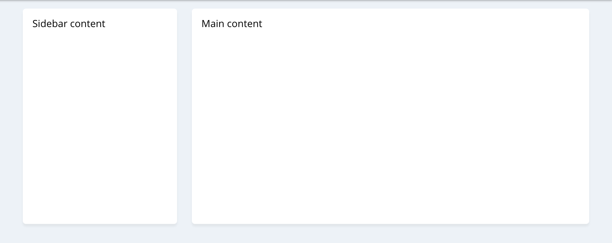
Generally, the sidebar has a fixed width, and the main element next to it has fluid width. Flexbox can help in achieving that easily.
<div class="wrapper">
  <aside>...</aside>
  <main>...</main>
</div>
.wrapper {
  display: flex;
  flex-wrap: wrap;
}

aside {
  flex-basis: 250px;
}

main {
  flex-grow: 1;
}
For this use case, CSS Grid is more suitable than Flexbox. However, it’s fine to use Flexbox as a base and then enhance with Grid when it’s supported.
@supports (display: grid) {
  .wrapper {
    display: grid;
    grid-template-columns: 250px 1fr;
    grid-gap: 24px;
  }
}
See the Pen Practical Flexbox: Sidebar and Main by Ahmad Shadeed (@shadeed) on CodePen.
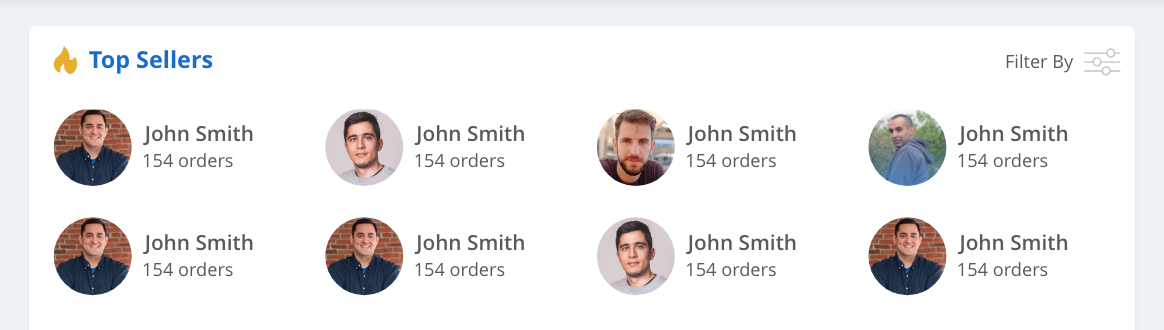
For this part of the design, there are two uses for Flexbox:
<ul class="top-sellers">
  <li>
    <div class="c-seller">
      <img src="shadeed.jpg" alt="" class="c-avatar" />
      <div>
        <h3>John Smith</h3>
        <p>150 orders</p>
      </div>
    </div>
  </li>
  <li>...</li>
  <li>...</li>
  <li>...</li>
  <li>...</li>
</ul>
.top-sellers {
  display: flex;
  flex-wrap: wrap;
}

.top-sellers > * {
  flex: 0 0 25%;
}
A couple of things that I want to focus on:
<ul> element for the grid wrapper<li> element. The component .c-seller is living on its own..top-sellers > *: Select all the direct child elements of .top-sellers. In our case, this will select all <li> elements and give each a width of 25%.It’s important to apply the above when there is enough space. Here is the complete CSS.
@media (min-width: 400px) {
  .top-sellers {
    display: flex;
    flex-wrap: wrap;
    margin-bottom: -1rem;
  }

  .top-sellers > * {
    flex: 0 0 50%;
  }
}

@media (min-width: 600px) {
  .top-sellers > * {
    flex: 0 0 33%;
  }
}

@media (min-width: 900px) {
  .top-sellers > * {
    flex: 0 0 25%;
  }
}
In addition to that, it’s better to use CSS Grid. So just like the sidebar and main example, I will use CSS @supports to enhance when Grid is supported.
I also used Flexbox to align the seller name and orders total vertically with the user avatar.
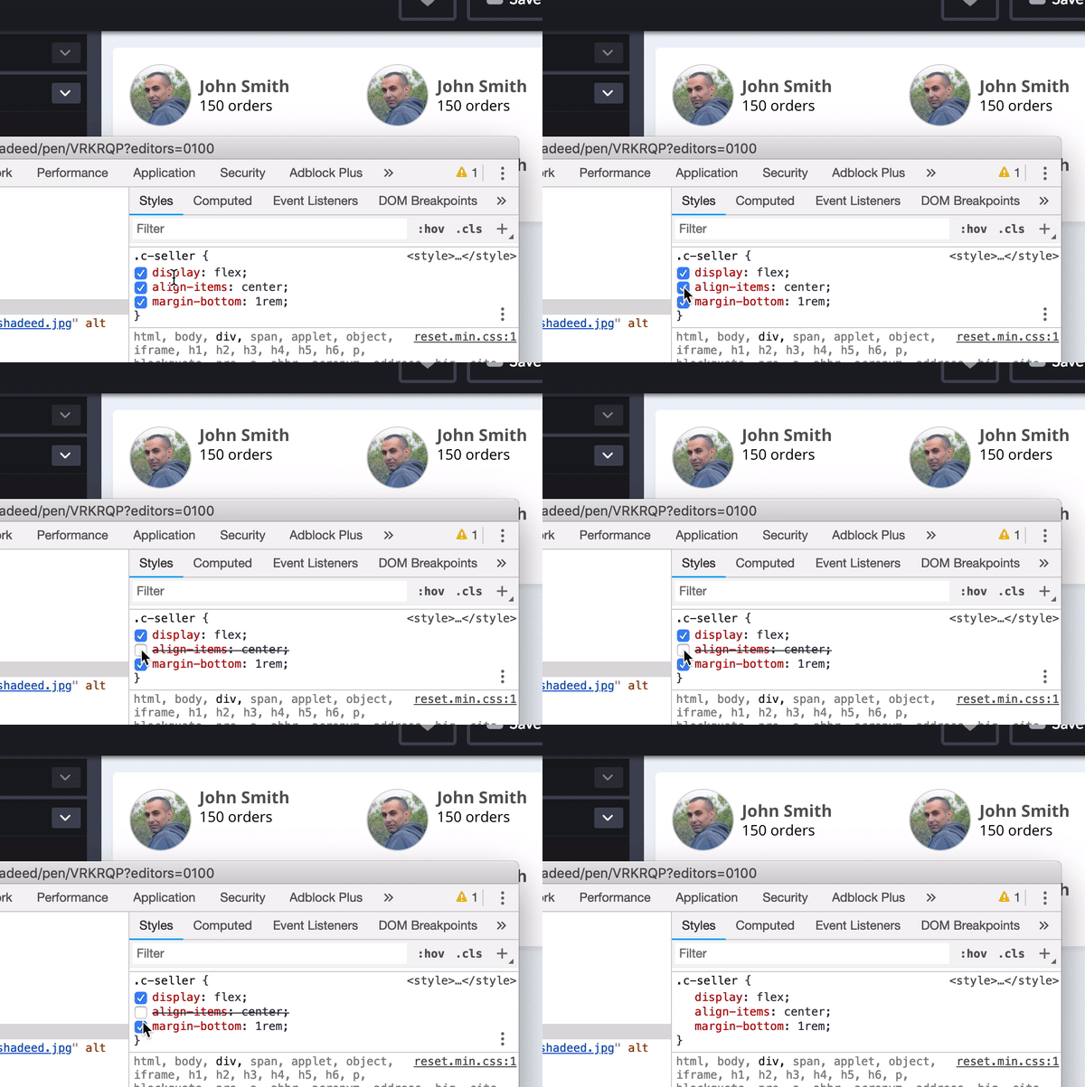
See the Pen Practical Flexbox: Top Sellers Grid by Ahmad Shadeed (@shadeed) on CodePen.
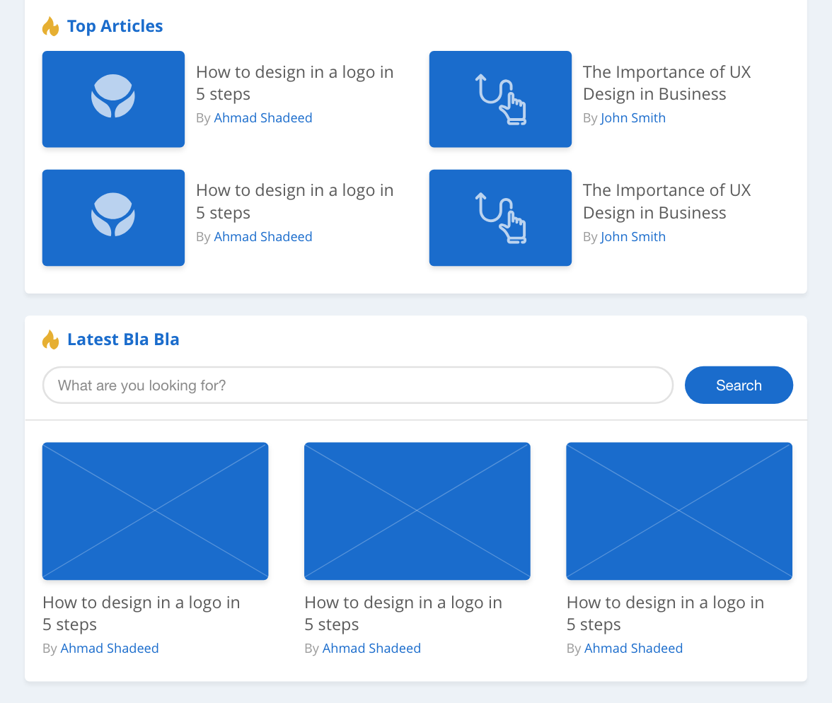
The two card components in the design are almost similar, but one is horizontal, and the other is vertical (Elements are stacked).
It’s handy to use Flexbox to accomplish both cases without duplicating the code. Let’s see how.
<ul class="articles-wrapper">
  <li>
    <article class="c-article">
      <a href="#">
        <img src="image.jpg" alt="" />
        <div>
          <h3>How to design in a logo in 5 steps</h3>
          <p>By Ahmad Shadeed</p>
        </div>
      </a>
    </article>
  </li>
  <li>...</li>
  <li>...</li>
  <li>...</li>
</ul>
.articles-wrapper {
  display: flex;
  flex-wrap: wrap;
}

.articles-wrapper > * {
  flex: 0 0 50%;
}

Note that each child item has a width of 50%. How to add spacing between the grid items? It’s possible to use margins, but this will make it harder. See the example below:
.articles-wrapper > * {
  flex: 0 0 calc(50% - 16px);
  margin-right: 16px;
}
A better approach is to add padding-right to each child item, and then we will add the same amount as a negative margin to the wrapper.
.articles-wrapper {
  display: flex;
  flex-wrap: wrap;
  margin-right: -16px;
}

.articles-wrapper > * {
  flex: 0 0 50%;
  padding-right: 16px;
}
<ul class="articles-wrapper">
  <li>
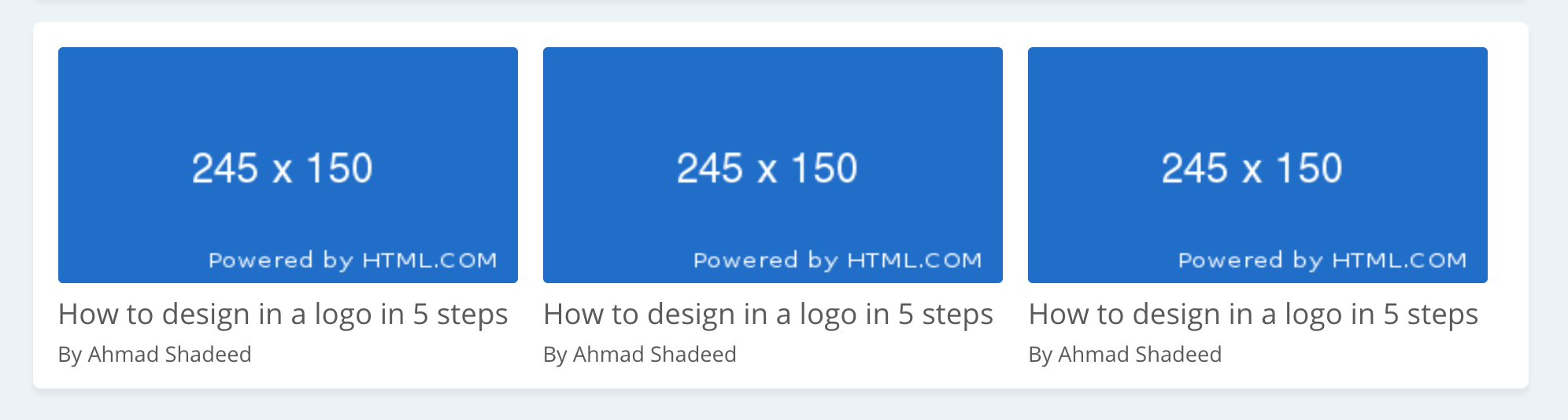
    <article class="c-article stacked">....</article>
  </li>
  ...
</ul>
.c-article.stacked a {
  flex-direction: column;
  align-items: flex-start;
}

.c-article.stacked img {
  width: 100%;
  height: 150px;
  margin-bottom: 0.5rem;
  margin-right: 0; /* Resetting the margin to zero since the normal card has a margin-right */
}
See the Pen Practical Flexbox: Articles Cards by Ahmad Shadeed (@shadeed) on CodePen.

Flexbox is the perfect solution for this design. The input needs to occupy the remaining space, while the button should have a fixed width.
<form action="">
  <input
    type="text"
    name=""
    id=""
    placeholder="What are you looking for?"
  />
  <button>Search</button>
</form>
form {
  display: flex;
  flex-wrap: wrap;
}

input {
  flex-grow: 1;
}
Note that the input and button are equal in height. By default, a Flex container will stretch the child items and make them equal in height.
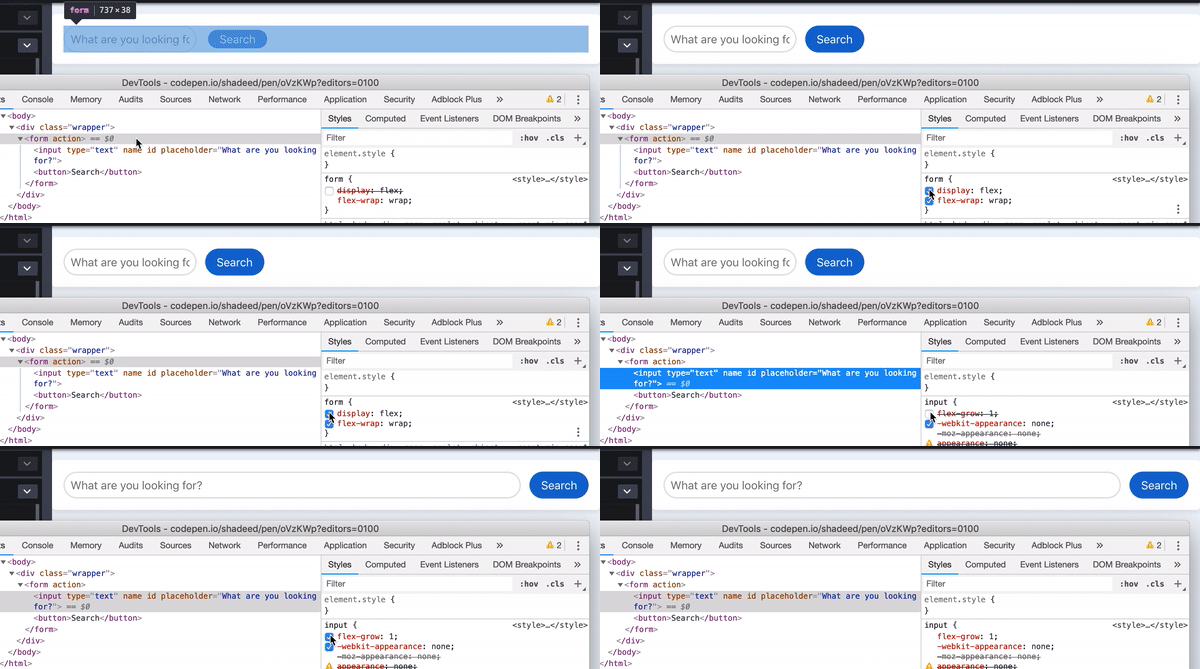
See the Pen Practical Flexbox: Search Form by Ahmad Shadeed (@shadeed) on CodePen.
Thank you for reading.
{% include share.html text = “Practical Use Cases For Flexbox” link = “https://ishadeed.com/article/flexbox-real-world-use-cases/” %}
此内容由惯性聚合(RSS阅读器)自动聚合整理,仅供阅读参考。 原文来自 — 版权归原作者所有。