


I spent years teaching CSS layout on this blog. I put everything I know into The Layout Maestro course: 70+ lessons and 150+ interactive examples that teach you how to think CSS layouts, not just memorize syntax.
Working on a web design involves handling the design for different screen sizes. Based on those designs, the developer will use CSS media queries to detect the viewport width or height, and then alter the design based on that. This is how we used to design web layouts for the past 10 years, and it’s about to get even better. I have some good news for you.
CSS Container queries, a long-requested feature by web developers is coming soon to CSS and now available as an experimental feature in Chrome Canary. In this article, I will go through what is it, how it will change your workflow as a designer, and more. I don’t care if you a designer who codes or not, as the main point of this article is to introduce this concept so you can be prepared for the next. If you spot any CSS bits that you don’t fully understand, you can totally ignore them and move on.
Enough talking, Let’s dig in!
Nowadays, it’s still okay to work on multiple versions of the same web layout to show how the inner parts will change based on the viewport width. We design different sizes like mobile, tablet, and desktop.
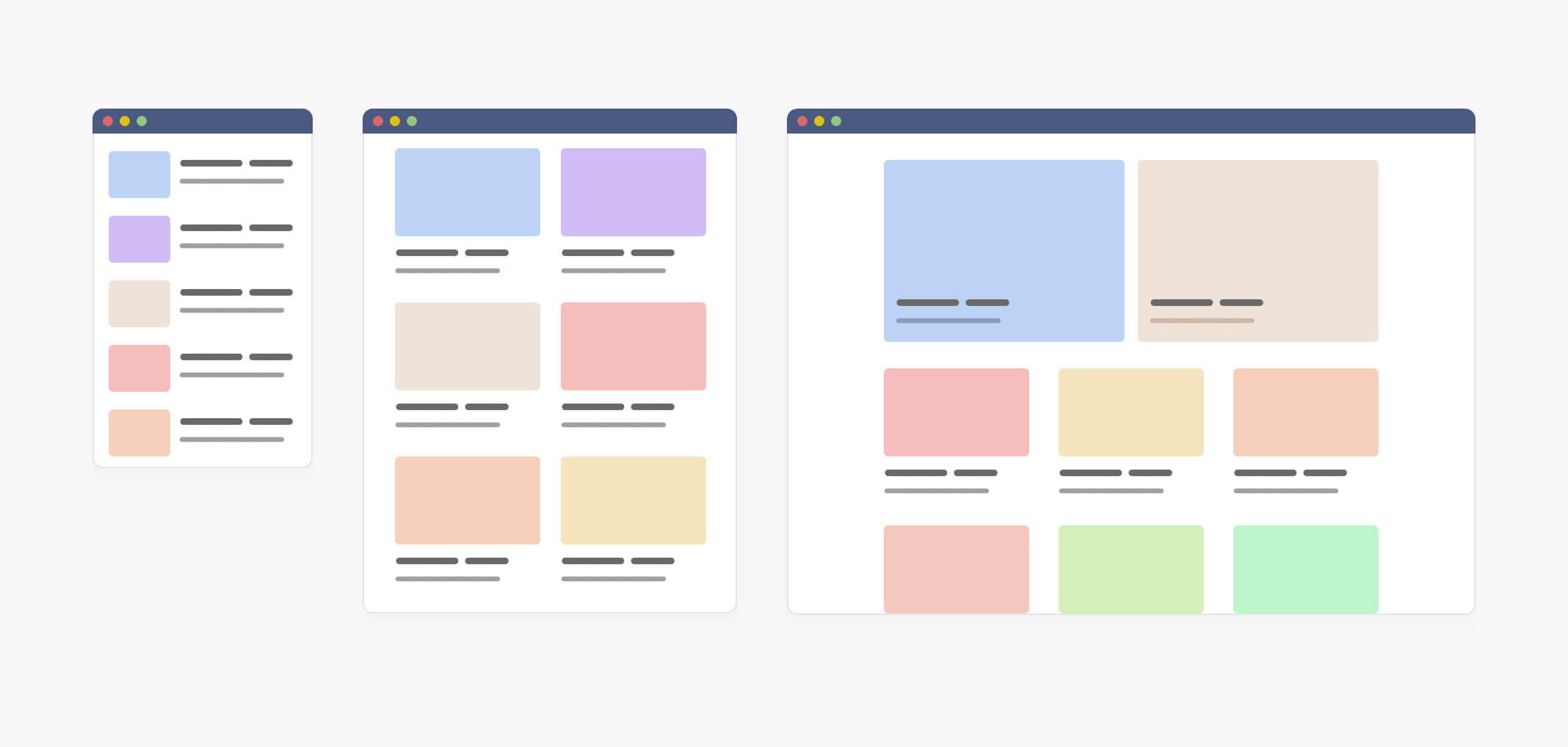
In the figure above, the designer has created three variations of the same design, so the developer can get an idea of how things will work. All is good till now.
Now, I will show you a more detailed look for the design and its variations so I can shed light on the problem that CSS container queries will fix for us.
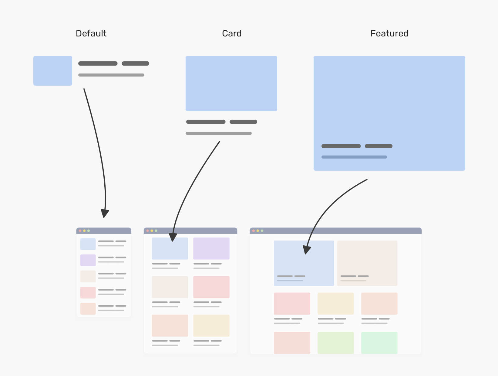
Notice that this is the same component, and it has three variations which are the default, card, and the featured. As a designer, you have used multiple versions of the layout to showcase this. It’s like saying: “This is how the article component will look on mobile, and this is how it will look on tablets”.
In CSS, the developer needs to create three variations of this component, and each one of them is unique. Consider the following basic styles:
.c-media {
  /* the default styles */
  display: flex;
  flex-wrap: wrap;
  gap: 1rem;
}

@media (min-with: 400px) {
  .c-media--card {
    display: block;
  }

  .c-media--card img {
    margin-bottom: 1rem;
  }
}

@media (min-with: 1300px) {
  .c-media--featured {
    position: relative;
    /* other styles */
  }

  .c-media--featured .c-media__content {
    position: absolute;
    left: 0;
    top: 0;
    width: 100%;
    height: 100%;
  }
}
The variations above depend on media queries or the viewport width. That means, we can’t control them based on their parent width. Now you might be thinking, what’s the problem here? Well, that’s a good question.
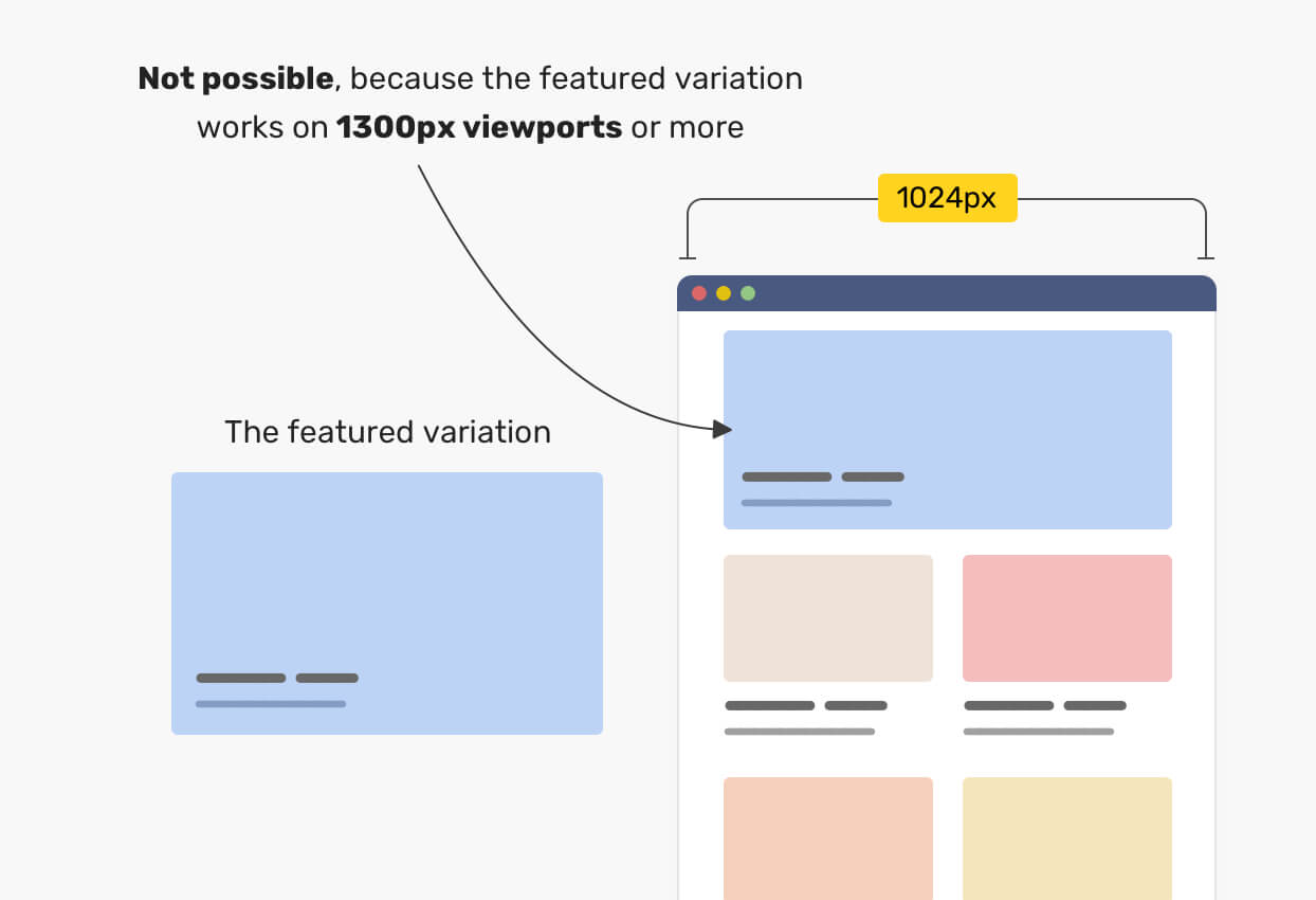
The problem is that the developer is tied with using a variation of a component only when the viewport width is greater than a specific value. For example, if I want to use the “featured” variation in the tablet size, it won’t work, why? Because the media query for it kicks in at 1300px viewport width or more.
Not only that, but we can also face an issue when the content is less than expected. Sometimes, a content author will add only one article, where the design was made to include three of them. In such a case, either we will have an empty space, or the article will expand to fill the available space. Consider the following figure:
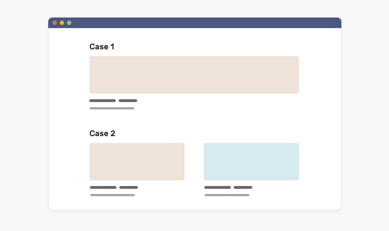
In case one, the article is too wide, thus it breaks the imagery being used. In the second case, it’s the same but with more grid items that are expanding to fill the available space. This isn’t good.
If container queries were used, we could have solved those problems by querying the parent to decide on how to display a specific component. Consider the following figure that shows how we could fix the issue using container queries.
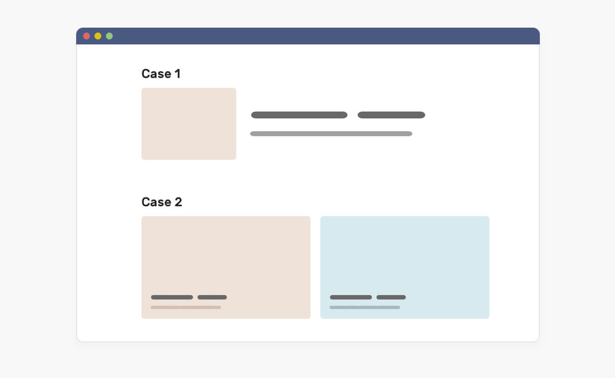
With that, what if we shift our thinking to the parent of the component instead? In other words, what if we query the parent, and decide how the component should look based on its parent width or height? Let’s learn about the concept of container queries.
First, let me define the container. It’s an element that contains another element(s), and is sometimes called a wrapper. If you are interested to learn more about containers, I have a full article on that.
The prototype of container queries is now available behind a flag in Chrome Canary. Thanks to efforts from smart people like Miriam Suzanne and other folks.
When a component is placed within an item, it’s contained within that item. That means, we can query the width of its parent and modify it based on that. Consider the following figure:
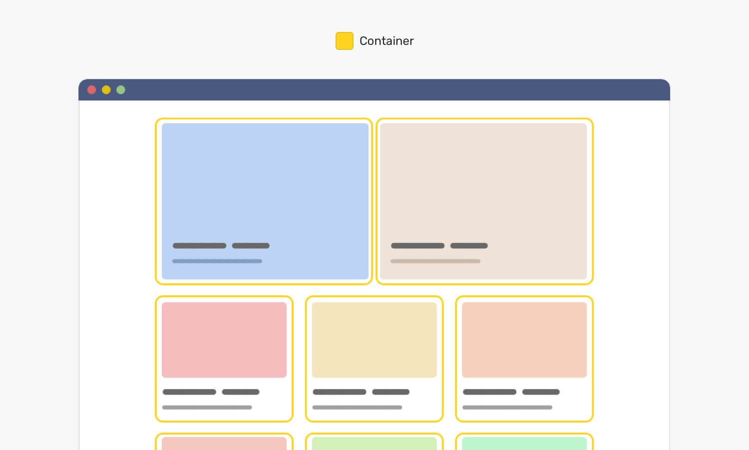
Notice that each card has a yellow outline which represents the parent for each component. With CSS container queries, we can modify the component based on its parent width. To make it more clear, here is the HTML markup for the above:
<div class="o-grid">
  <div class="o-grid__item">
    <article class="c-media"></article>
  </div>
  <!-- + more items -->
</div>
The component is the item with the class .c-media, and its parent is .o-grid__item element. In CSS, we can do the following:
.o-grid__item {
  container-type: inline-size;
}

.c-media {
  /* Default style */
}

@container (min-width: 320px) {
  .c-media {
    /* The styles */
  }
}

@container (min-width: 450px) {
  .c-media {
    /* The styles */
  }
}
First, we told the browser that each element with the class .o-grid__item is a container. Then, we told the browser that if the parent width is equal to or more than 320px, it should look in a different way. The same for the 450px query. That’s how CSS container queries work.
Also, we can define them anywhere we want, which means that we can query on the top-level container if needed. Now that you understand the basic idea of CSS container queries, I want to show you the following figure.
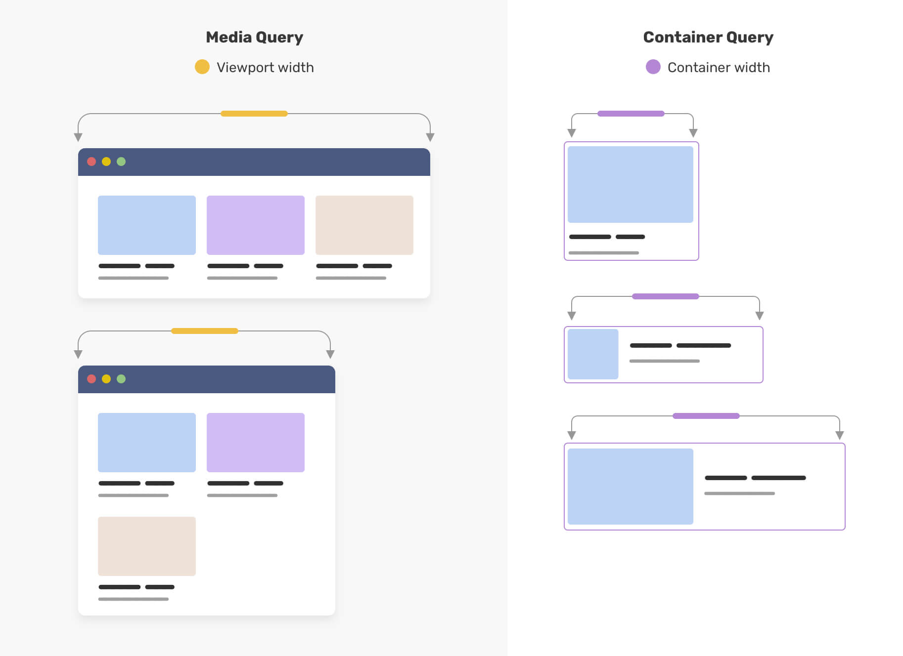
On the left, that’s a viewport that is being resized. On the right, a component that changes based on its parent width. That’s how powerful and useful container queries are.
If you want to dig more into the CSS details of container queries, I wrote a detailed article about them.
As a designer, you need to adapt to this revolutionary CSS feature as it will improve how we design and write CSS for the web. We won’t only design for screen sizes, but also account for how components should adapt when their container width changes.
Right now, design systems are getting more popular. A design team will construct a set of rules and components, so other members can build pages based on them. With CSS container queries coming, we will also design how a component should adapt based on its parent width.
Consider the following design:
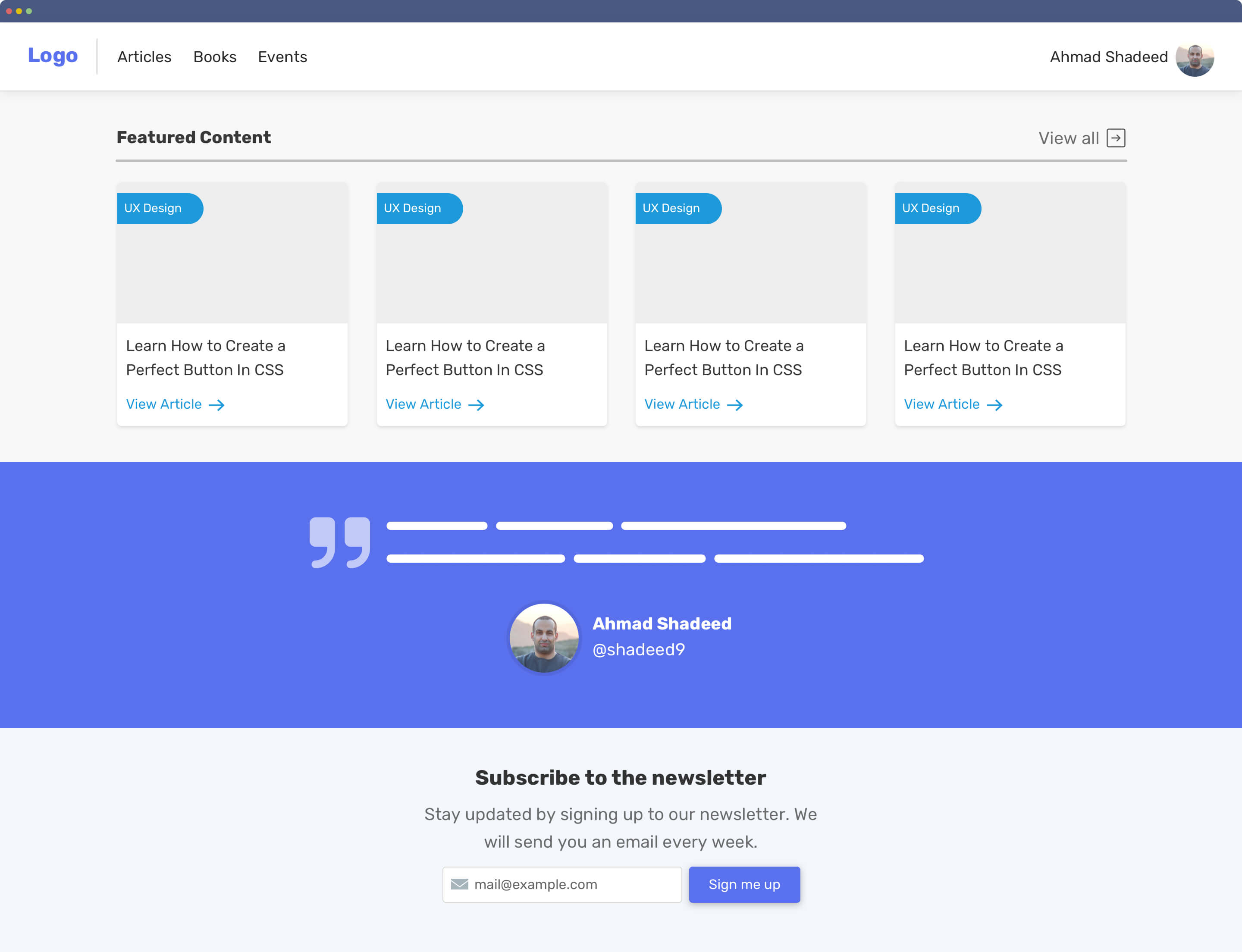
Notice that we have the header, articles section, quotation, and newsletter. Each one of them should adapt to either the viewport width of the parent width.
I can imagine dividing the components into the following:
For the example UI, here is how we can divide the components.
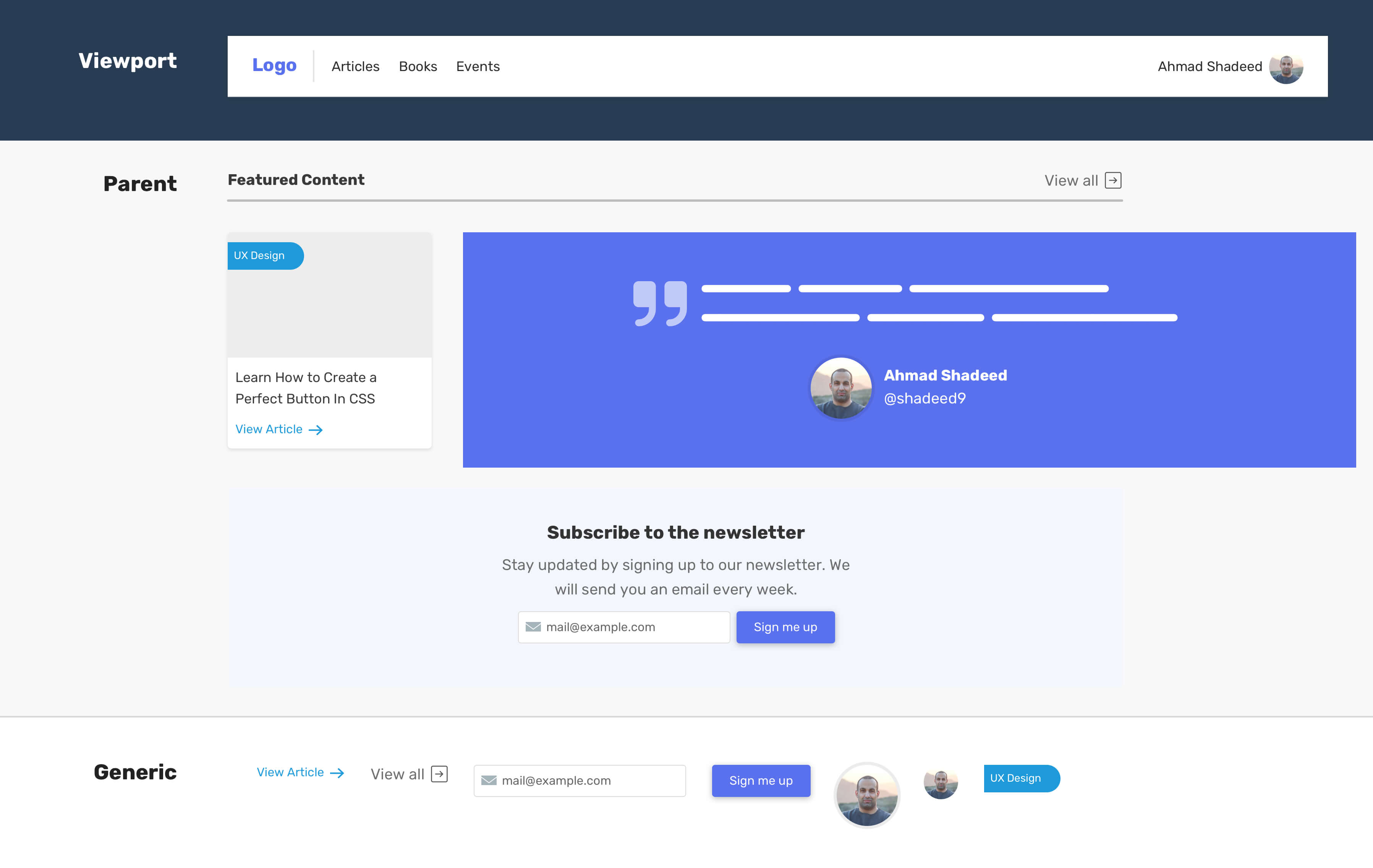
When we think in this mindset while designing a UI, we can start thinking of different variations for the components that depend on their parent width. Let’s explore them.
In the following figure, notice how each variation of the article components kicks in at a specific width.
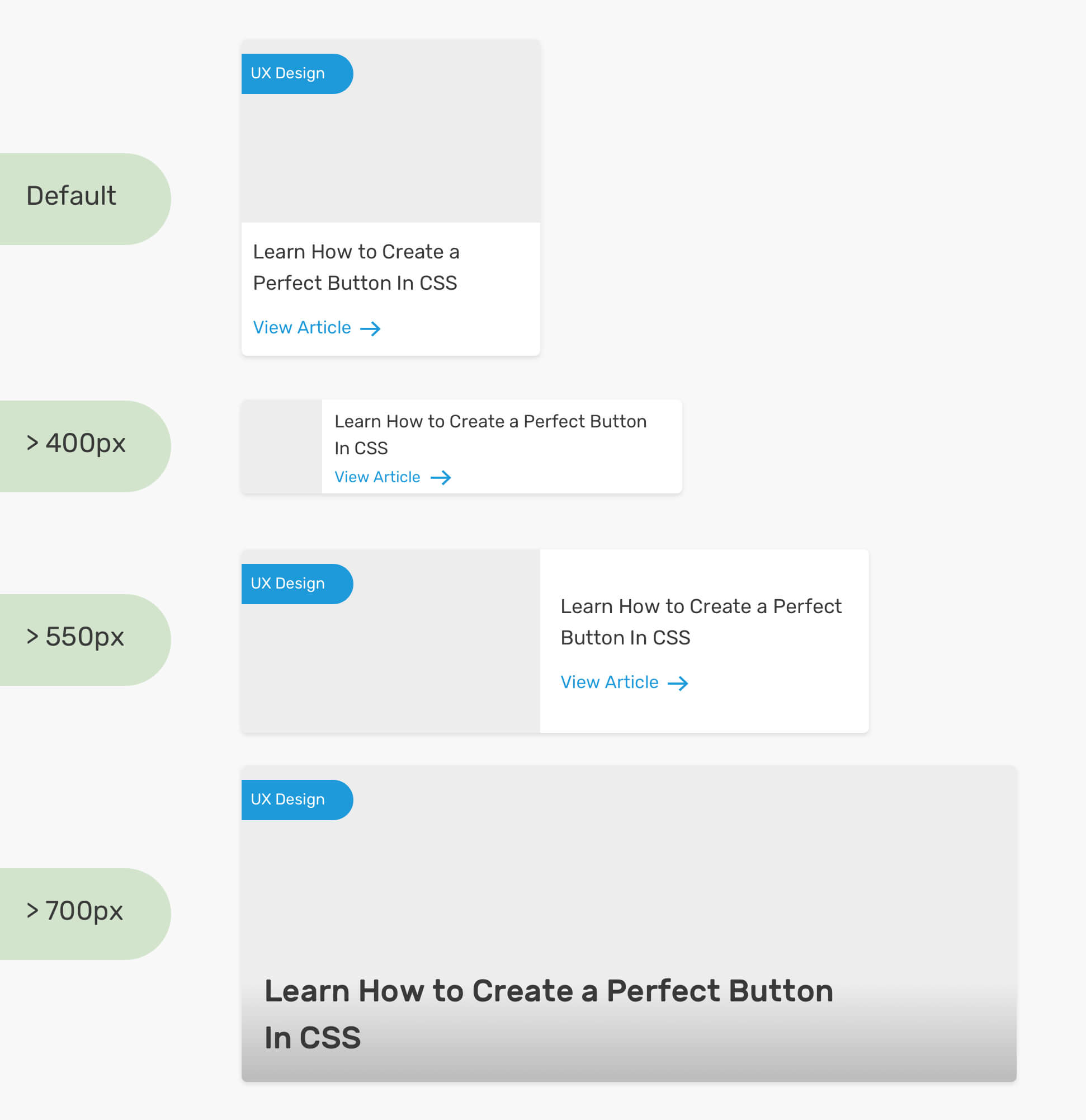
As a designer, thinking in terms of the parent width might be a bit odd at first, but that’s how the future will be. We provide the front-end developers with the details and variation of each component, and they can use them.
Not only that, but we might have a variation of a component that should only be shown in a specific context. For example, the events listing page. In such a case, it’s important to be clear on where to use this variation.
The question is, how to tell designers where they should use these components?
Good communication is an important factor for the project to succeed. As a designer, it’s expected that you will provide guidance on where the variation of the component should be used. It can be a full-page design, or a simple figure showing how each component can be used.
Let’s apply that to the article component that we discussed previously.
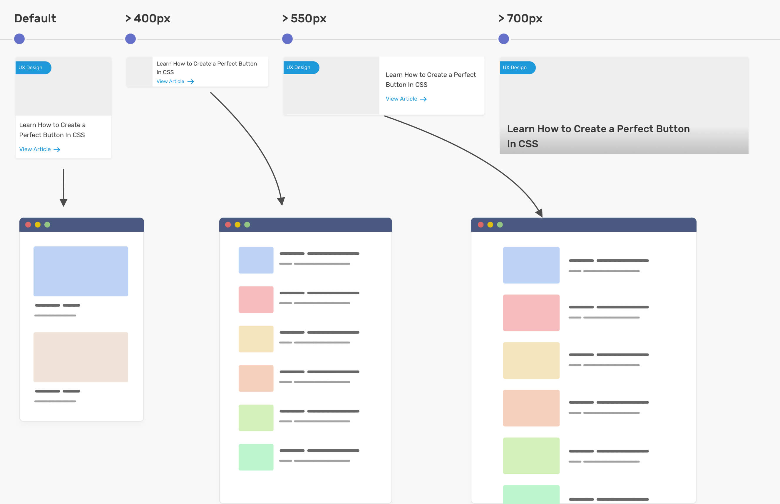
Notice how I mapped each variation to a specific context, not a viewport. To prove that even more, I want to show you how the component will act differently when used with CSS grid.
In CSS grid, we can tell the browser that we want columns to expand if their number is less than expected by using the auto-fit keyword (You can read more about it here). That feature is powerful as it can help us to show different variations in the same context. Consider the following figure:
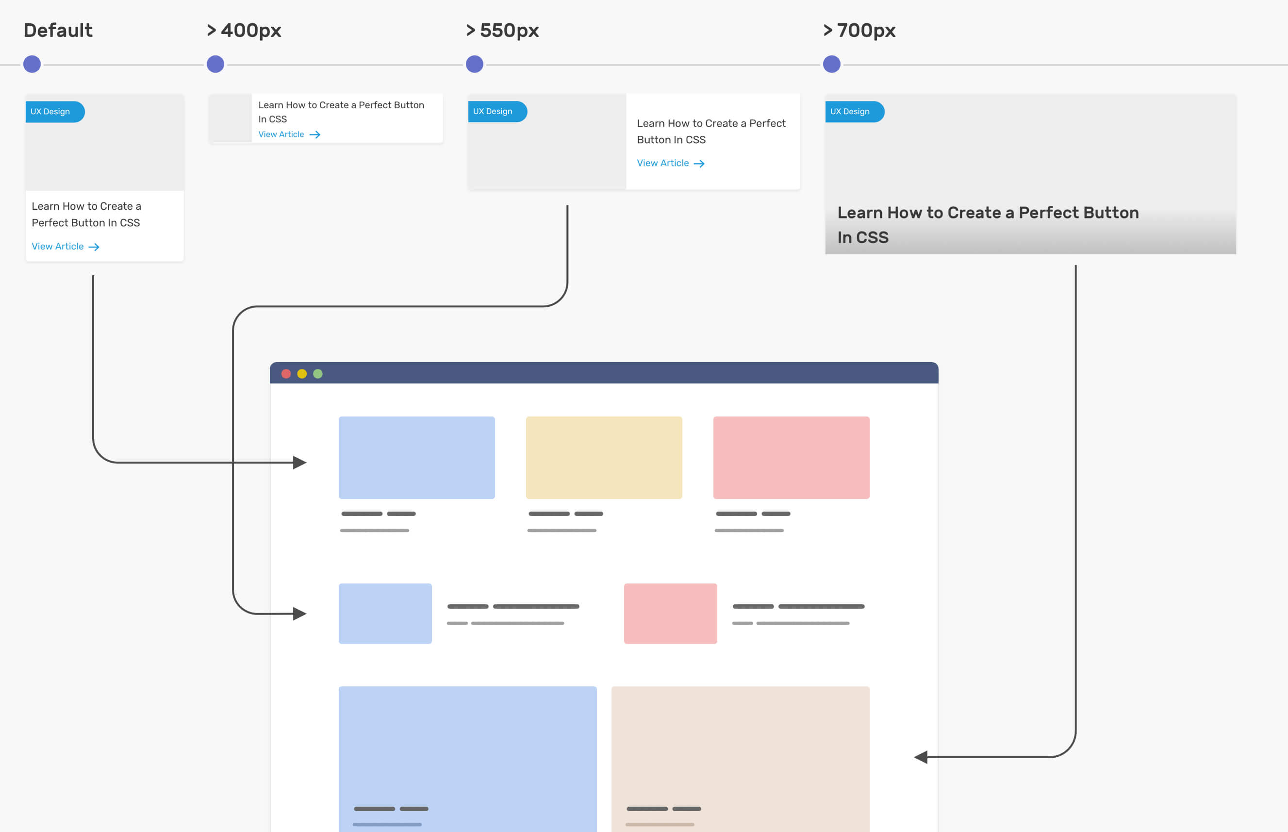
Having a component that reacts to its parent width is very useful. As you just saw, we’re viewing a page on desktop size, and having different sections with a varying number of columns of each one of them.
It’s important to keep in mind that the inner parts of a component are like a lego game. You can order them based on the current variation, but everything has a limit. Sometimes, it would be better for the front-end developer to work on a completely new component rather than creating the variation with container queries.
Consider the following.
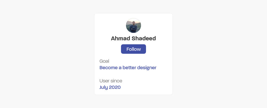
It has the following:
If the inner parts will stay the same, or at least won’t include new ones, we can alter the component and have multiple variations like the following.
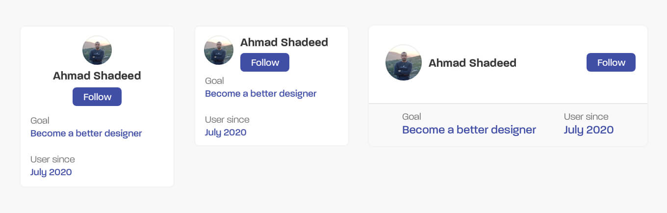
Let’s explore some use cases that can be implemented using CSS container queries.
I saw this pattern in Facebook messenger. The chat list changes based on the viewport width. We can implement that using CSS container queries.
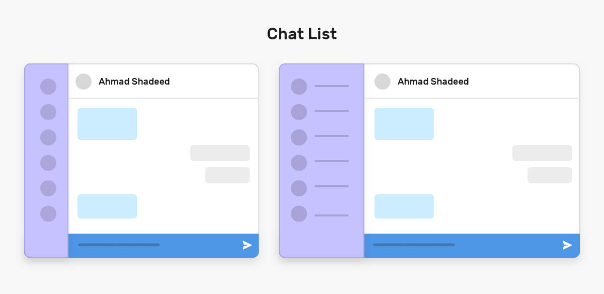
When there is enough space, the listing will expand and it will show each user’s name. The parent of the chat list can be an element that is being sized dynamically (e.g: by using CSS viewport units, or CSS comparison functions).
Here is how we can implement that in CSS.
<div class="content">
  <aside>
    <ul>
      <li>
        <img src="shadeed.jpg" alt="Ahmad Shadeed" />
        <span class="name">Ahmad Shadeed</span>
      </li>
    </ul>
  </aside>
  <main>
    <h2>Main content</h2>
  </main>
</div>
.content {
  display: grid;
  grid-template-columns: 0.4fr 1fr;
}

aside {
  container-type: inline-size;
}

@container (min-width: 180px) {
  .name {
    display: block;
  }
}
Notice that the width of the aside is 0.4f, so it’s a dynamic width. On the aside, I added the contain property. Then, if the container width is larger than 180px, the user name will be shown.
Another similar use case to this is side navigation. We can switch the position of the navigation item label from being in a new line or next to the icon.
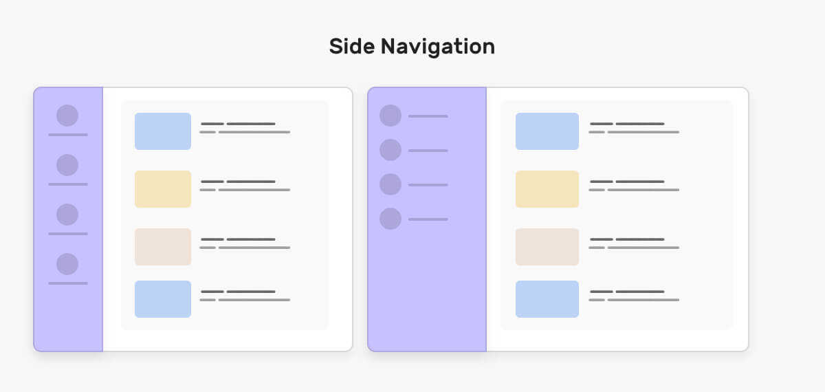
Notice how the navigation item label is being switched from a new line when the container (aside) is small, and next to the navigation icon when there is enough space.
An accordion pattern can be used for things like FAQs. In some cases, we might need to add an FQAs list within a sidebar or a small area in the UI rather. Container queries can help!
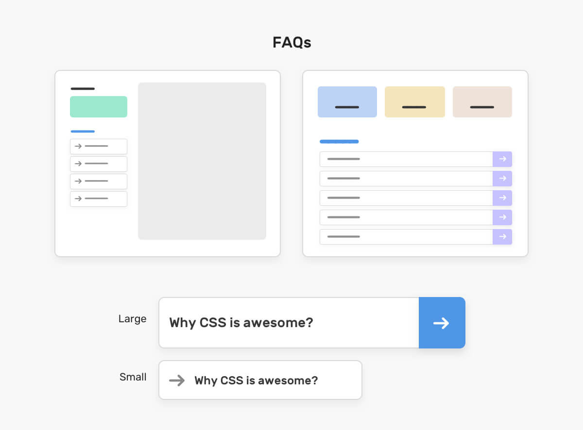
Here is how we can implement the above with CSS container queries.
@container (min-width: 180px) {
  .faq-title {
    display: flex;
    justify-content: space-between;
    font-size: 1.25rem;
  }

  .faq__icon {
    width: 60px;
    height: 60px;
    background-color: #4f96e7;
  }
}
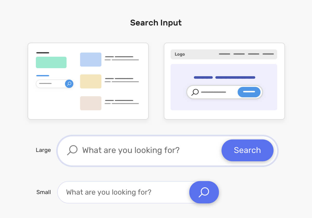
This can be very useful when we have universal search input that is being used in multiple places. For example, it can be used within a hero section (On the right), or it can be used in a smaller context like a sidebar (On the left).
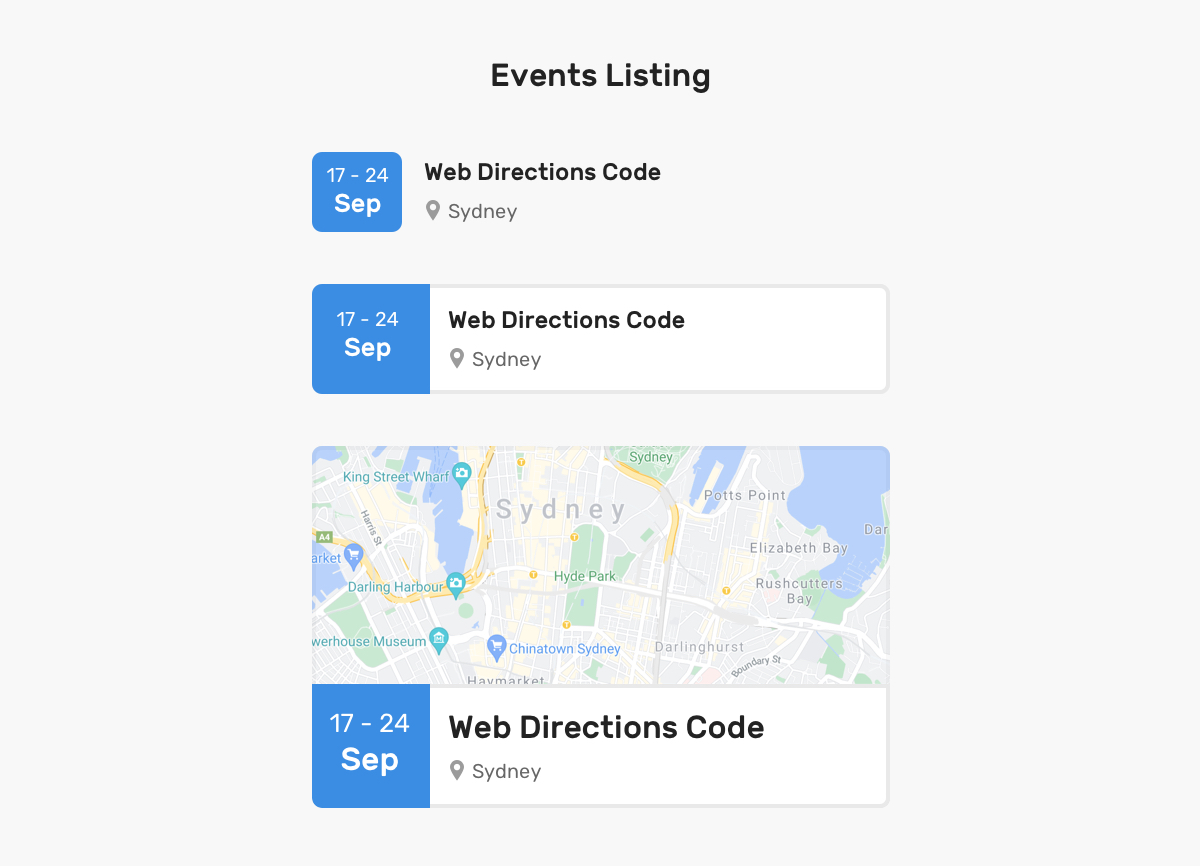
I personally like this use-case for container queries. We can have the same component in multiple contexts. In the figure above, we have simple, medium, and large ones. Here is an example of how they can be used.
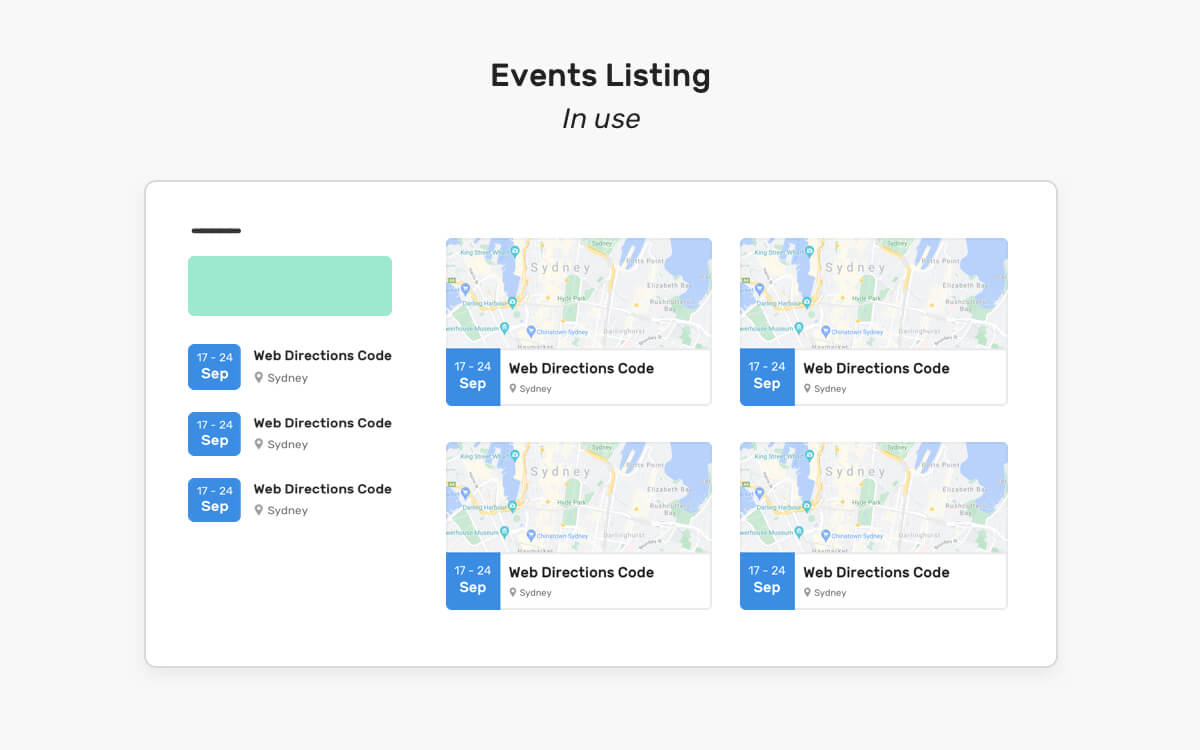
Again, this is the same component that adapts to its parent width. Isn’t that awesome? For me, it is.
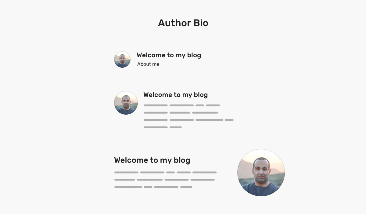
An author bio is a common component in blogs. It can be used in multiple contexts, and thus it should adapt. The above figure shows that.
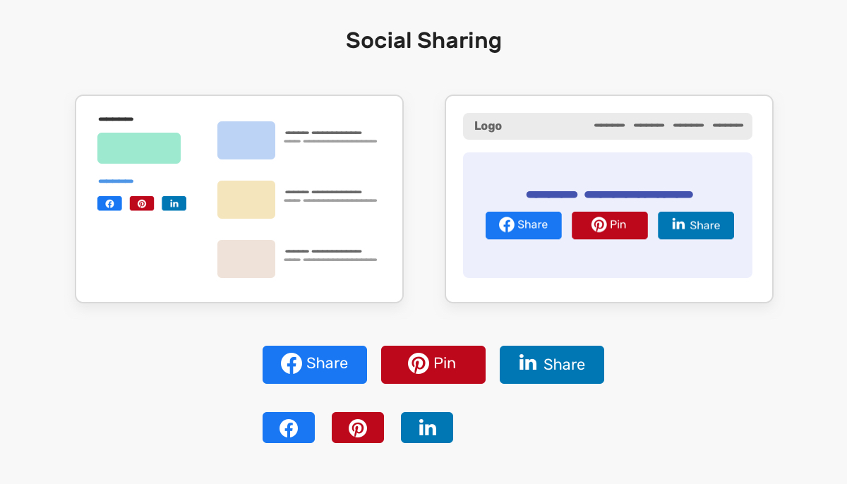
Most of the time I implemented a social sharing component, I needed to create a version that works when the viewport is large but the parent is small (E.g: sidebar). With container queries, this can be easily solved by making it adapt to its parent width.
When the component is being used within a sidebar (On the left), the small version will be used. When the parent is larger (e.g: main section), the full version will be used.
Thank you for reading :)
此内容由惯性聚合(RSS阅读器)自动聚合整理,仅供阅读参考。 原文来自 — 版权归原作者所有。