


I spent years teaching CSS layout on this blog. I put everything I know into The Layout Maestro course: 70+ lessons and 150+ interactive examples that teach you how to think CSS layouts, not just memorize syntax.
Have you come across an issue where there is a fixed element on mobile, and when the keyboard is activated, that element will be hidden underneath the keyboard?
This has been a default behavior on the web for years. In this article, we’ll explore the problem, why it happens, and how we can solve it today with the virtual keyboard API.
Let’s dive in.
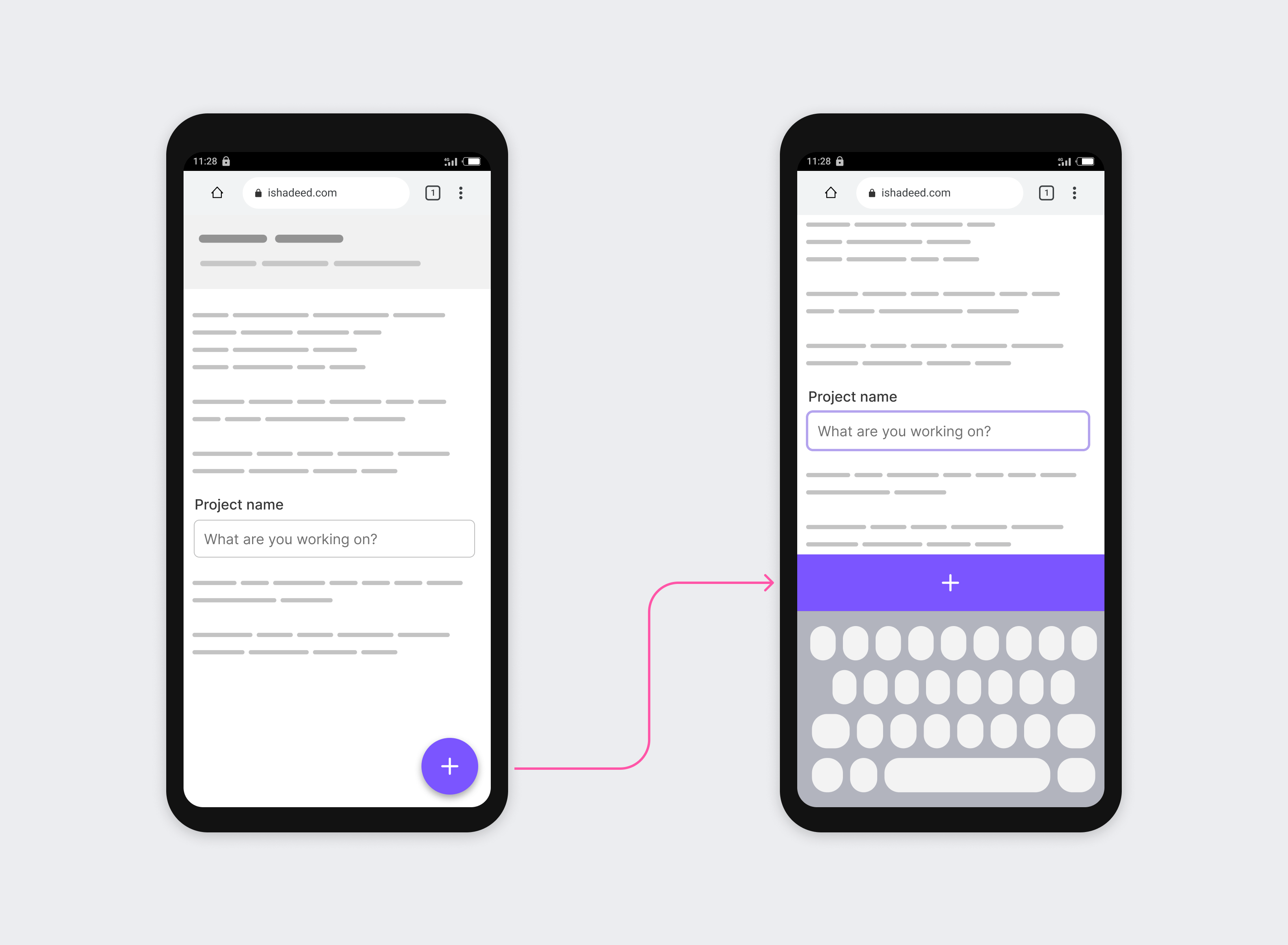
Before diving into the fine details, let us walk through an example. This is a UI that has the following:
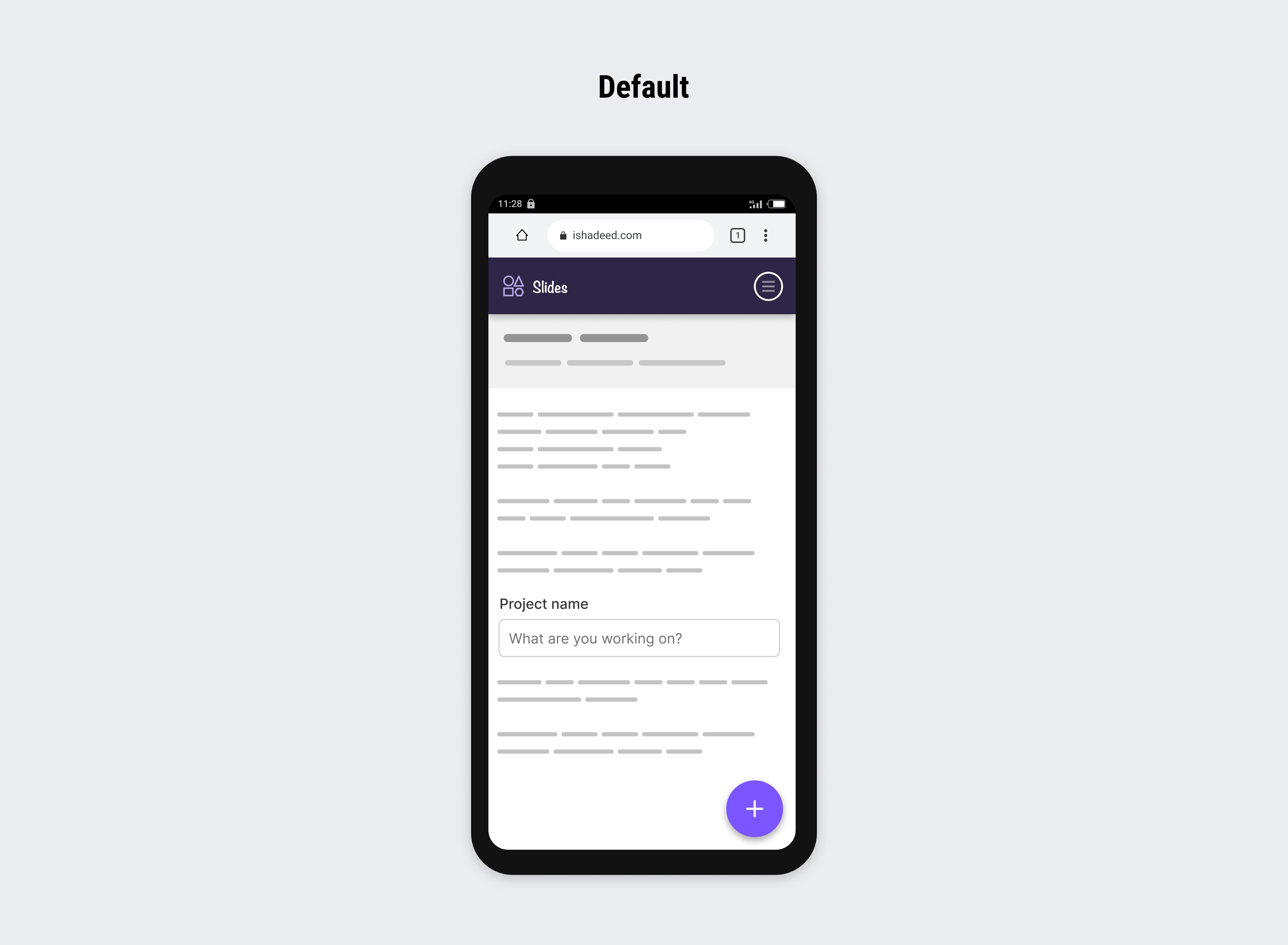
When the user focuses on the input, the virtual keyboard will show. Can you expect what will happen?
The browser will scroll upwards to make the input above the keyboard, and thus the sticky header and floating button will disappear.
It looks similar to the following:
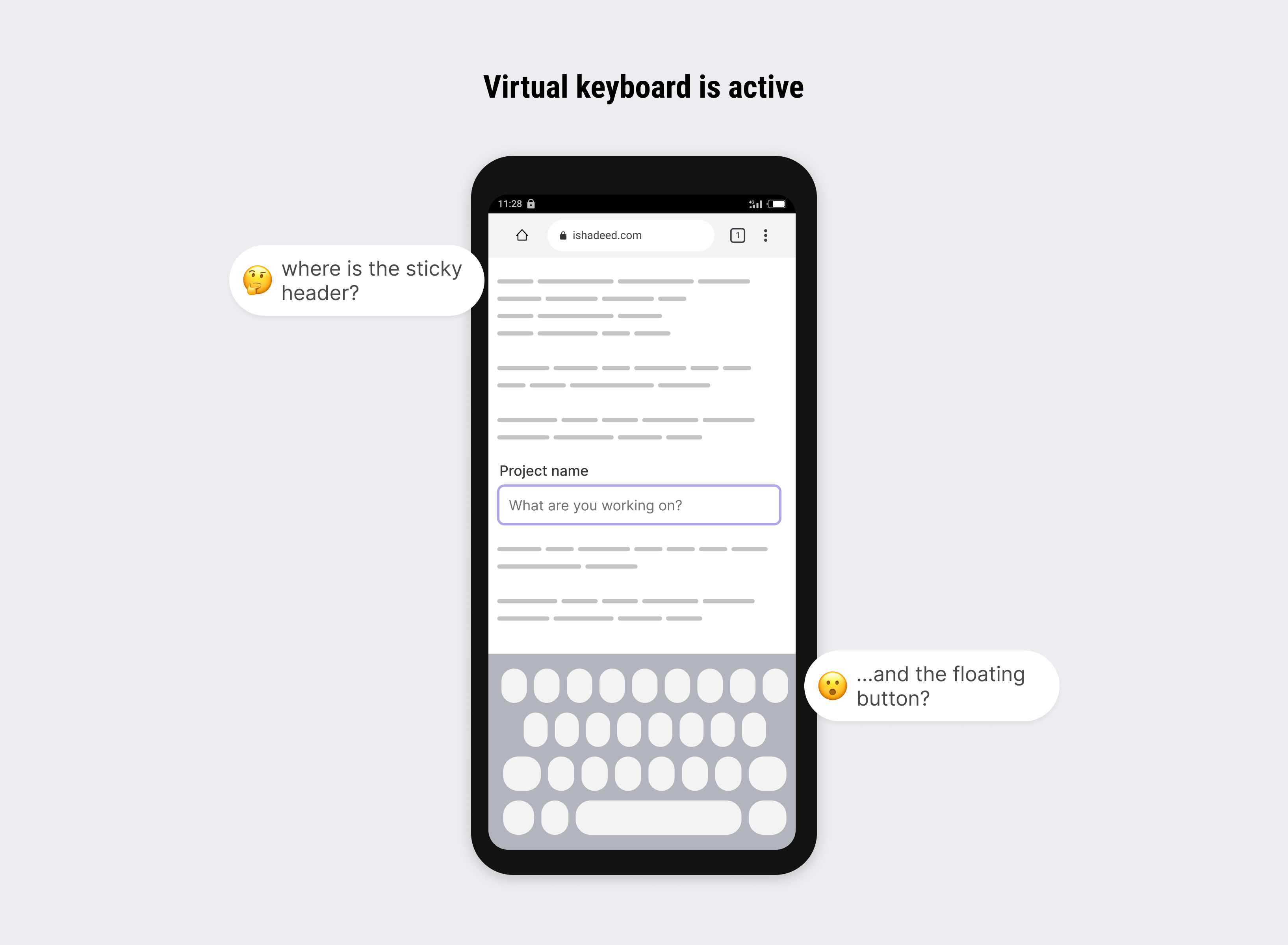
This is a default behavior in mobile browsers in general. From a UX point of view, it might be annoying to hide parts of the UI, especially those parts that are related to the current action I’m doing while the keyboard is active.
Behind the scenes, what happens is something similar to the following figure.
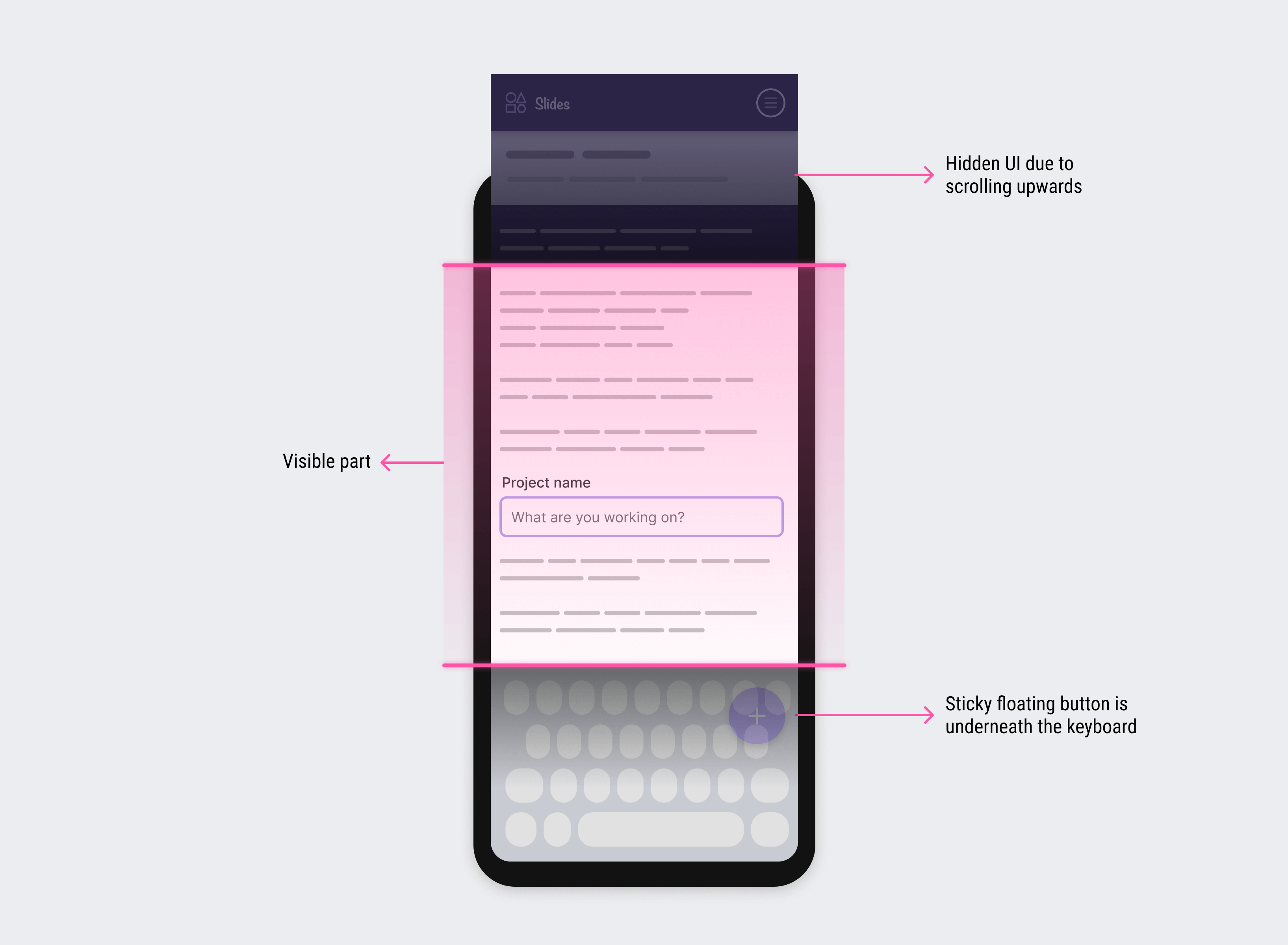
In technical terms, the visible part is called the visual viewport, and the hidden parts along with what’s currently visible is the layout viewport.
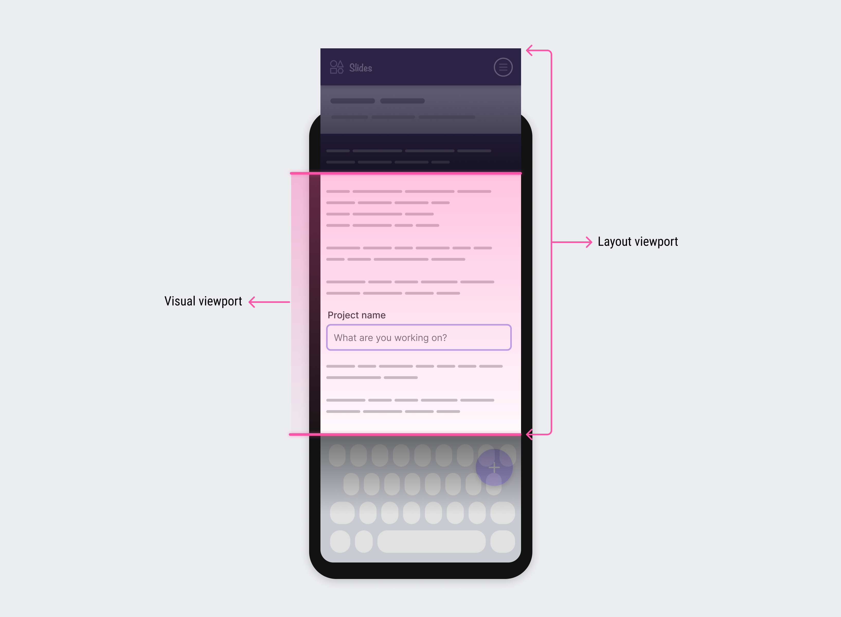
The main problem is that the visual viewport shrinks in size when the virtual keyboard is active.
Thanks to the virtual keyboard API, we can define that both the visual and layout viewports are equal. With that, we can detect the keyboard position and dimensions with the following CSS environment variables:
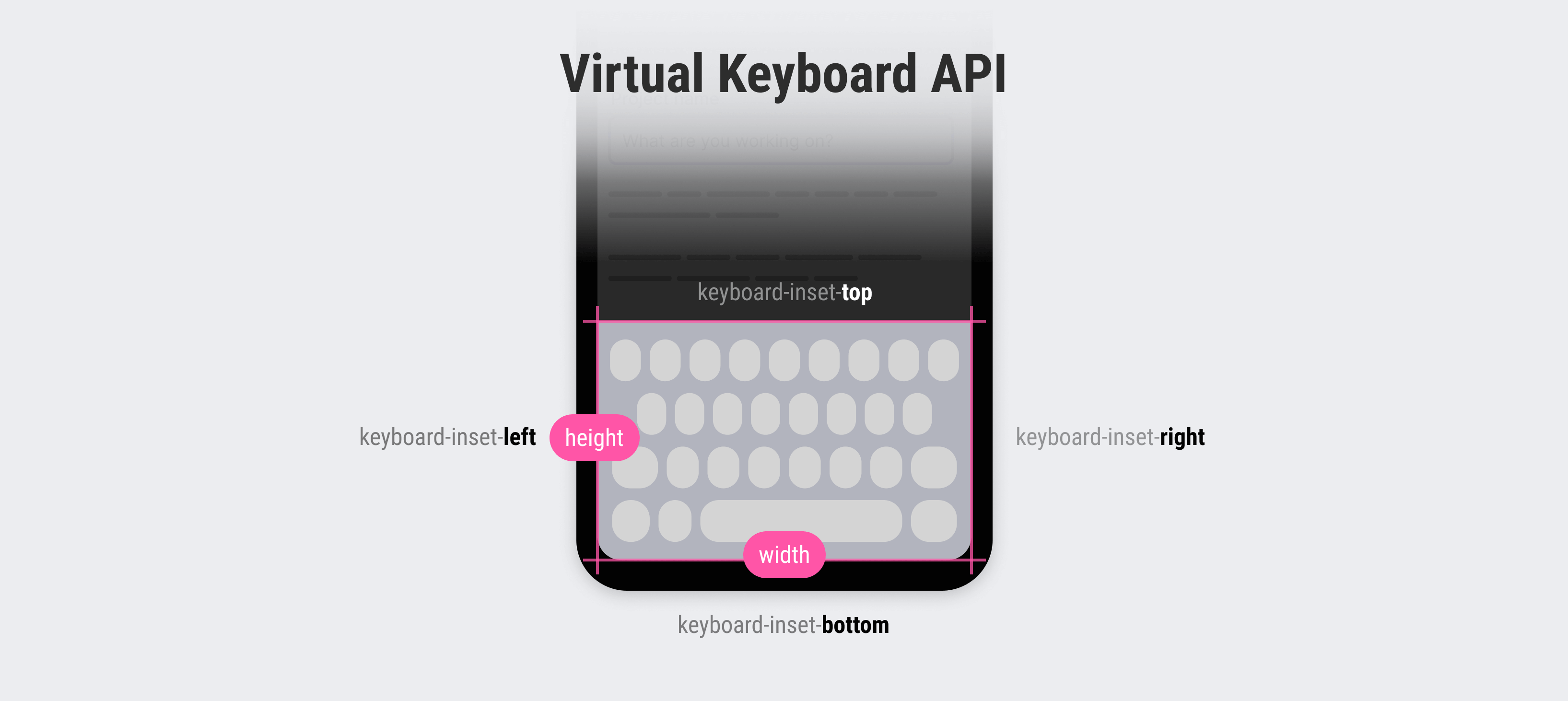
By using the above variables, we can alter a layout when the virtual keyboard is active.
At the time of writing this article, the VirtualKeyboard API is supported only in Chrome for Android.
In the next section, I will explore a few examples and use-cases where it can be helpful.
This API isn’t available by default. We need to use Javascript to enable it.
See the following:
if ("virtualKeyboard" in navigator) {
  navigator.virtualKeyboard.overlaysContent = true
}
I found this a bit weird; using Javascript to enable such behavior. I agree with Bramus in his article about the topic. He suggested using a meta tag like this:
<!-- Proposal -->
<meta
  name="viewport"
  content="width=device-width, initial-scale=1.0, virtual-keyboard=overlays-content"
/>
Or CSS property:
html {
  virtual-keyboard: overlays-content;
}
Bramus kindly noted that there is a new interactive-widget in the viewport meta tag which helps in changing the resizing behavior.
See MDN for details.
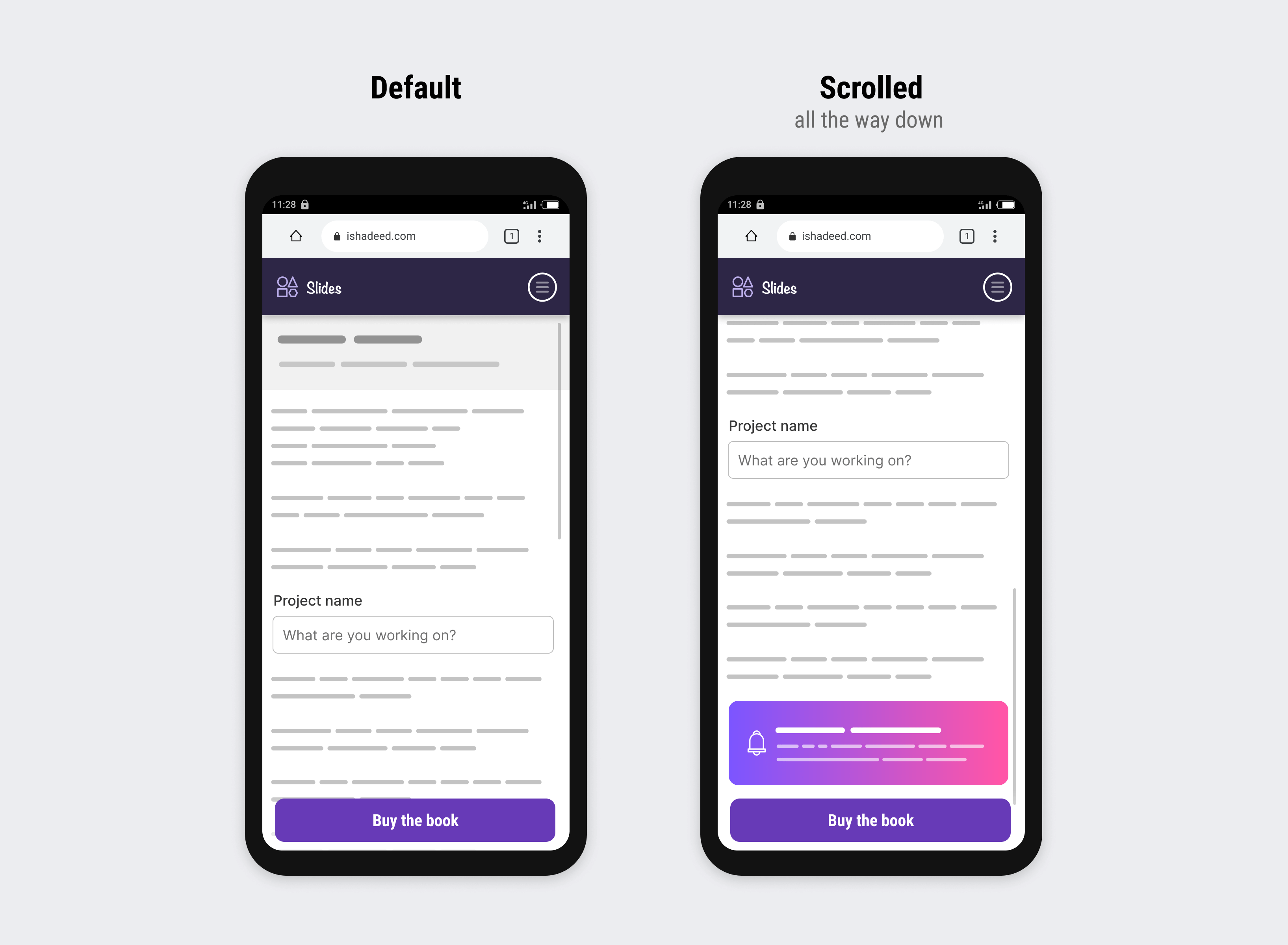
On a smaller viewport, you might need to have a call to action button or footer that is fixed to the bottom of the UI.
Consider the following figure where we have a CTA button that is fixed to the bottom. In the middle of the screen, there is an input field.
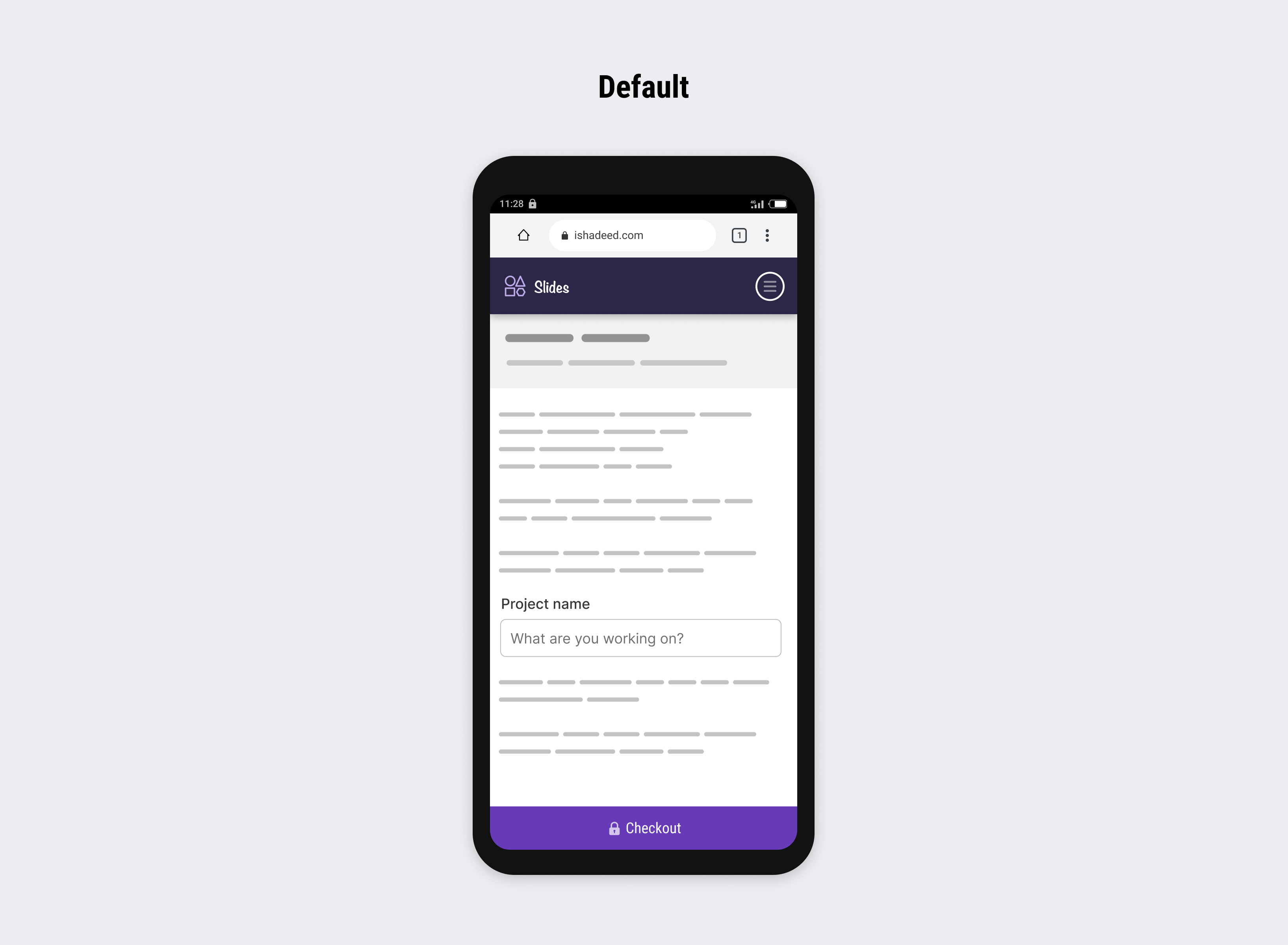
When the input field is active, the checkout button will be under the virtual keyboard, thus it’s hidden.
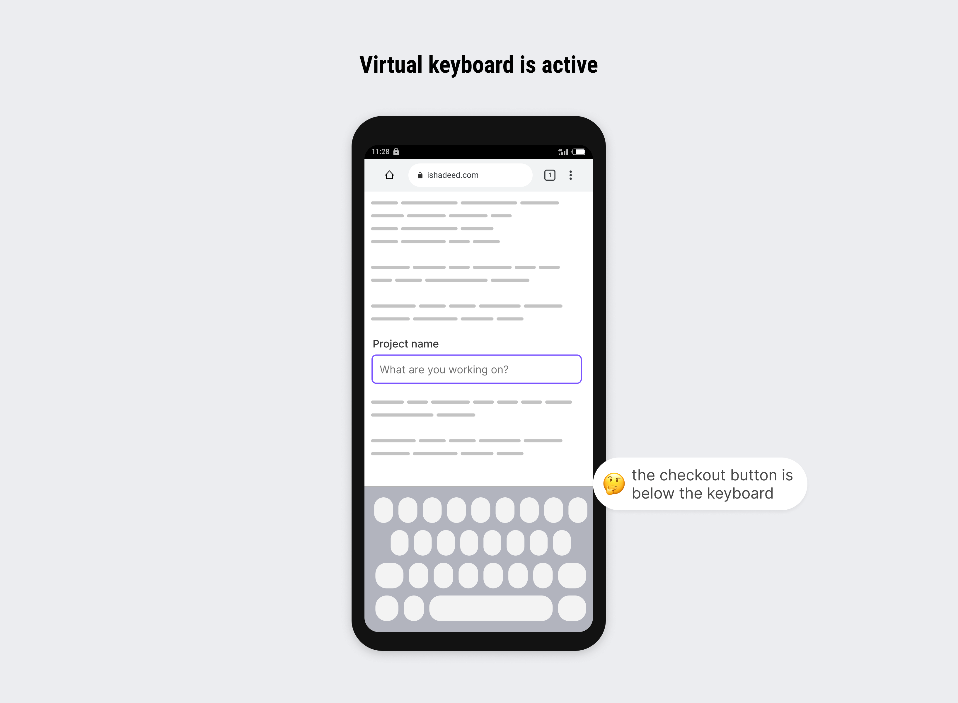
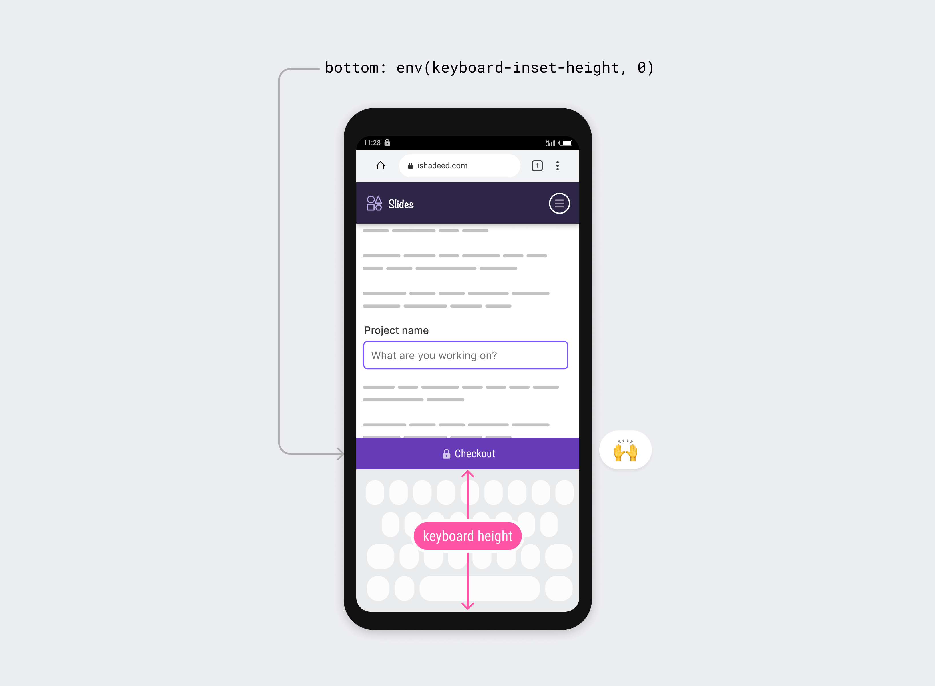
We can fix that easily with the virtual keyboard API.
input {
  font-size: 16px;
}
.cta {
  bottom: env(keyboard-inset-height, 0);
}
On mobile, the value of bottom will be equal to the keyboard height, thus offsetting the CTA button with that value. If the browser doesn’t support the API, it will default to zero.
You might be wondering about the reduced space due to the presence of the header and fixed bottom. We can use vertical media queries to show the header if the vertical space is enough.
When there is an item with position: fixed at the very bottom of the layout viewport, we usually add a padding-bottom to offset the page and allow the user to scroll to the very end.
body {
  --cta-height: 60px;
  padding-bottom: var(--cta-height);
}

.cta {
  bottom: env(keyboard-inset-height, 0);
}
The padding-bottom should be a value that is equal to or greater than the fixed element height.
Cool, right? What happens when we involve a virtual keyboard? Let’s take a look.
Consider the following figure:
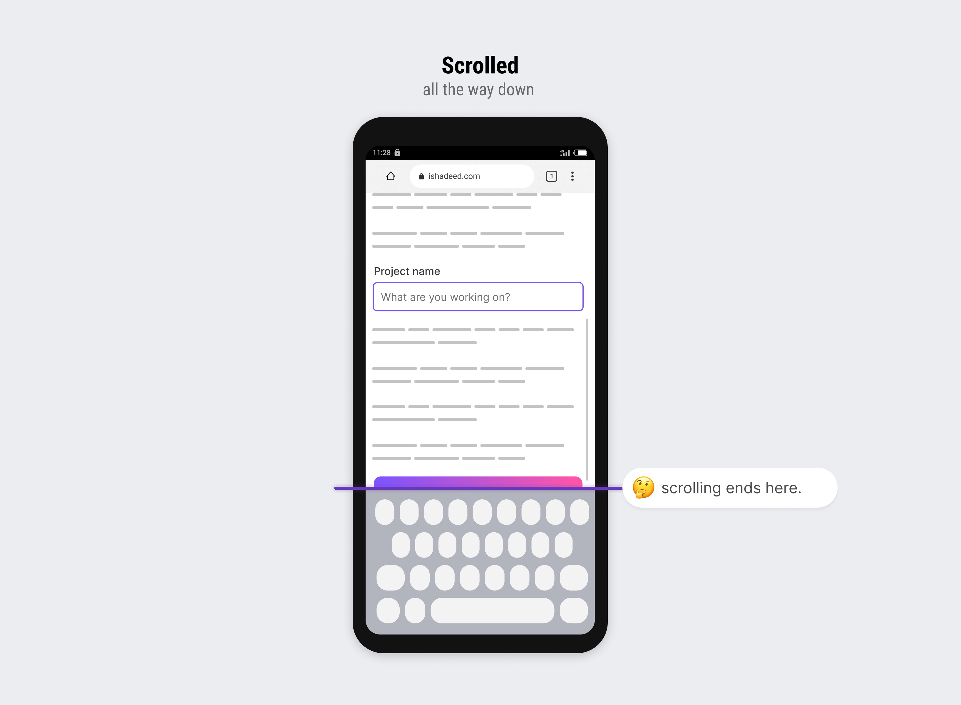
When the virtual keyboard is active, the padding-bottom value with the height of the fixed element isn’t enough. We need to add a keyboard to it.
To visualize the issue better, here is a video:
To fix that, we need to detect when the input is focused and change the padding-bottom based on that.
body:has(input:focus) {
  padding-bottom: calc(
    var(--cta-height) + env(keyboard-inset-height, 0)
  );
}
You might wonder, what will happen on desktop? Good question. The env() will fall back to 0 and the total will result in the value of var(--cta-height).
In this example, we have a floating action button that is positioned at the bottom right corner of the page.
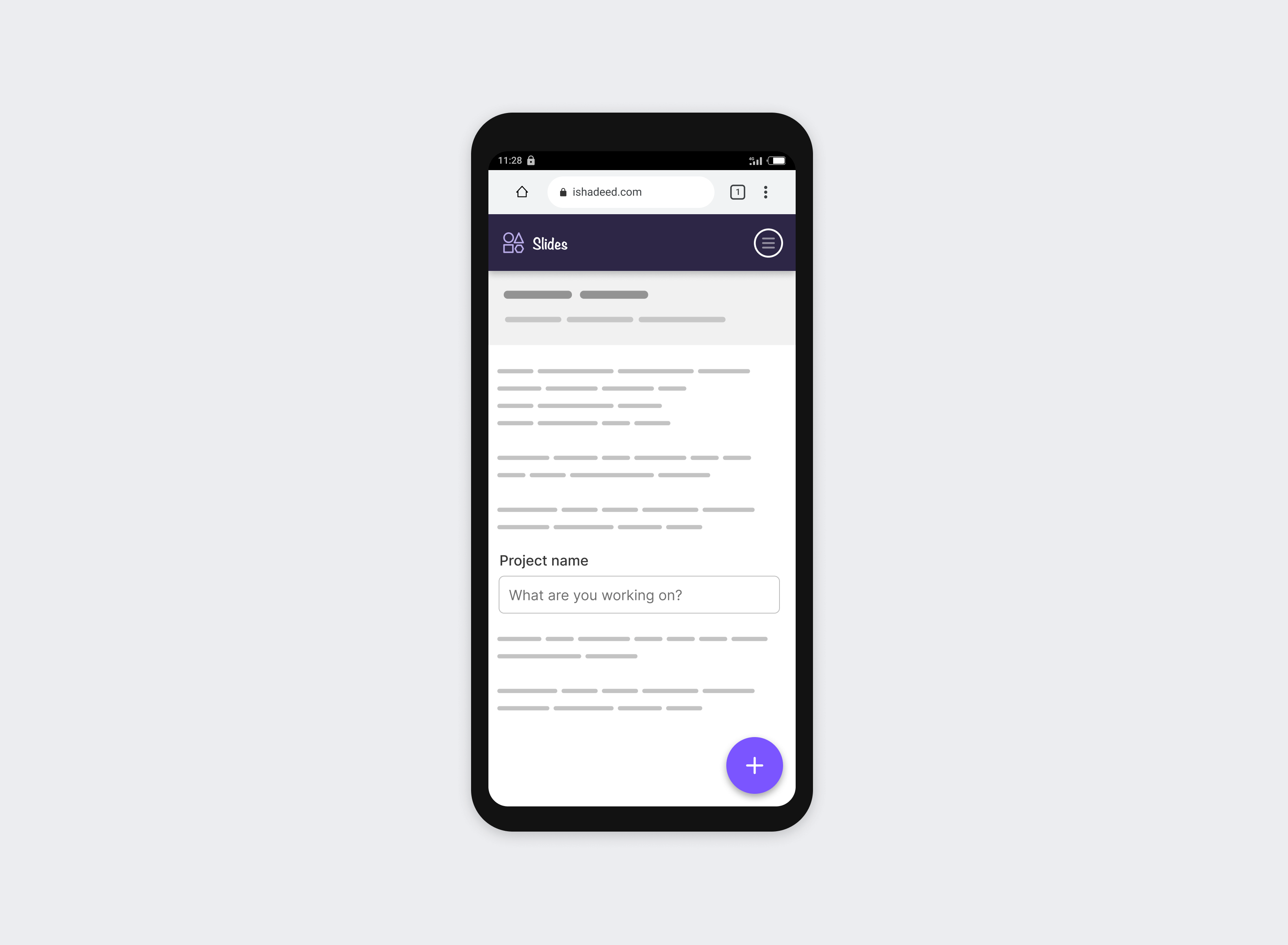
When the keyboard is active, the floating button should move above it. As in the very first example, the floating button will be under the keyboard.
To fix that, we can use the env(keyboard-inset-height) value.
Let’s walk through the solution:
.fab {
  /* other styles */
  bottom: calc(1rem + env(keyboard-inset-height, 0rem));
}
I used 1rem plus the keyboard height, to avoid having the floating button directly at the top edge of the keyboard.
With CSS comparison functions, it’s important to note that using a unitless number for the fallback value within the env() will break the whole thing in Safari. We must add the unit rem.
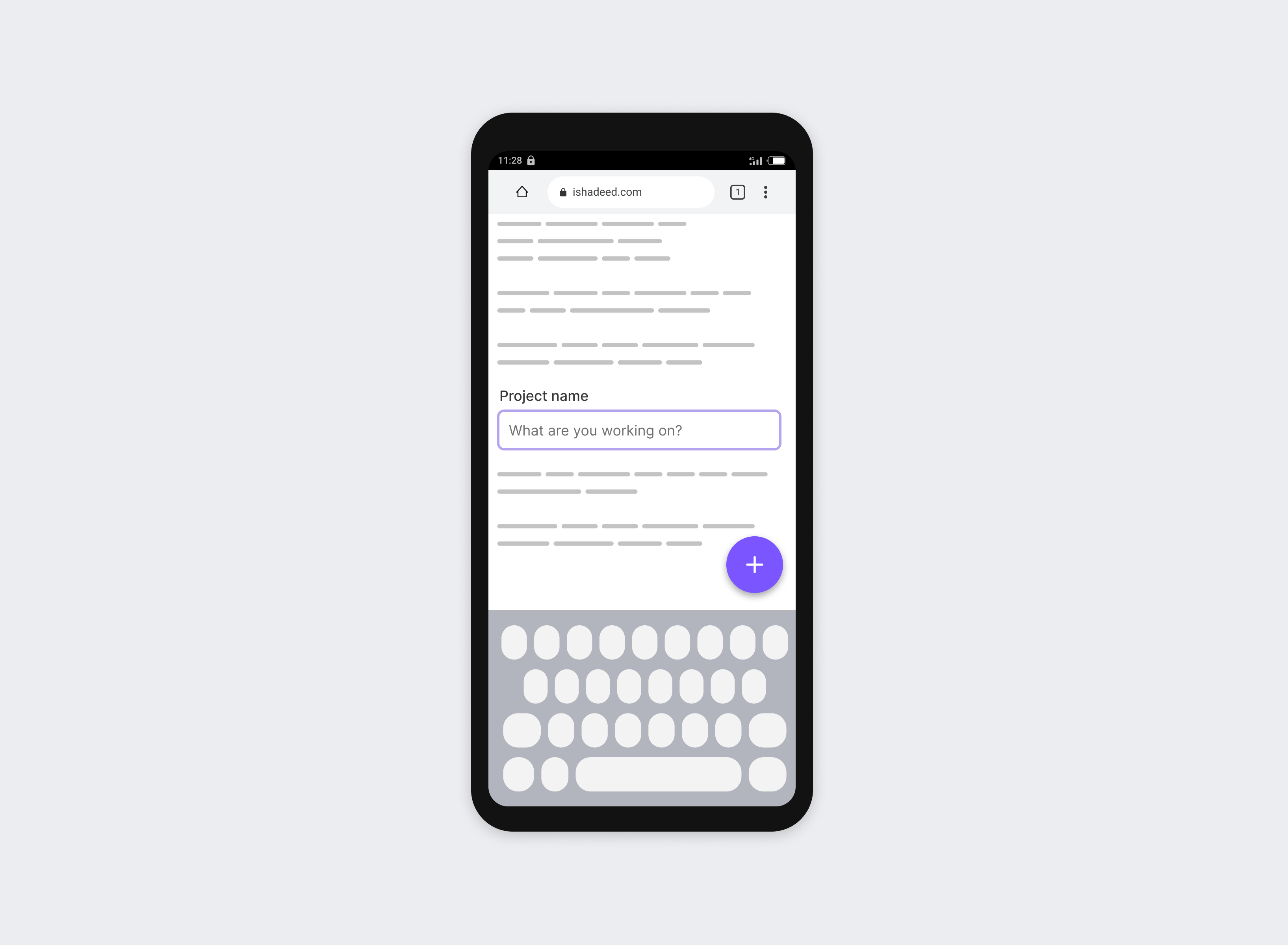
Suppose that we want to offset the floating button a bit more on desktop browsers, how we can do that? Well, I thought about using the max() comparison function, and it worked.
.fab {
  /* other styles */
  bottom: max(2rem, 1rem + env(keyboard-inset-height, 0rem));
}
Here is how it works:
env(keyboard-inset-height) evaluates to zero on desktop, the maximum value is 2rem.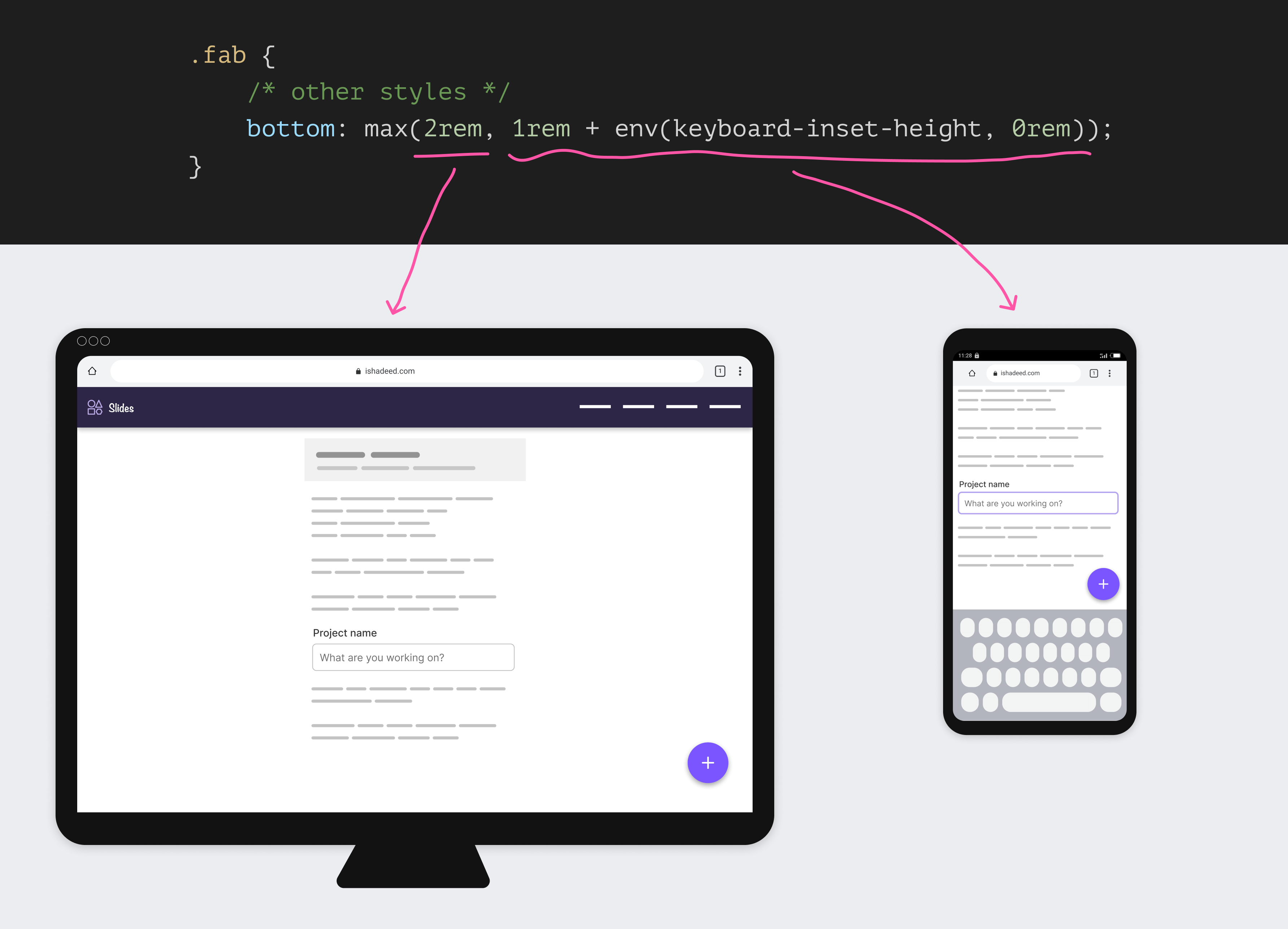
To learn more about CSS comparison functions, you can read this article.
I got inspired by the example in this article by Thomas Steiner and wanted to show you how it works.
Consider the following figure:
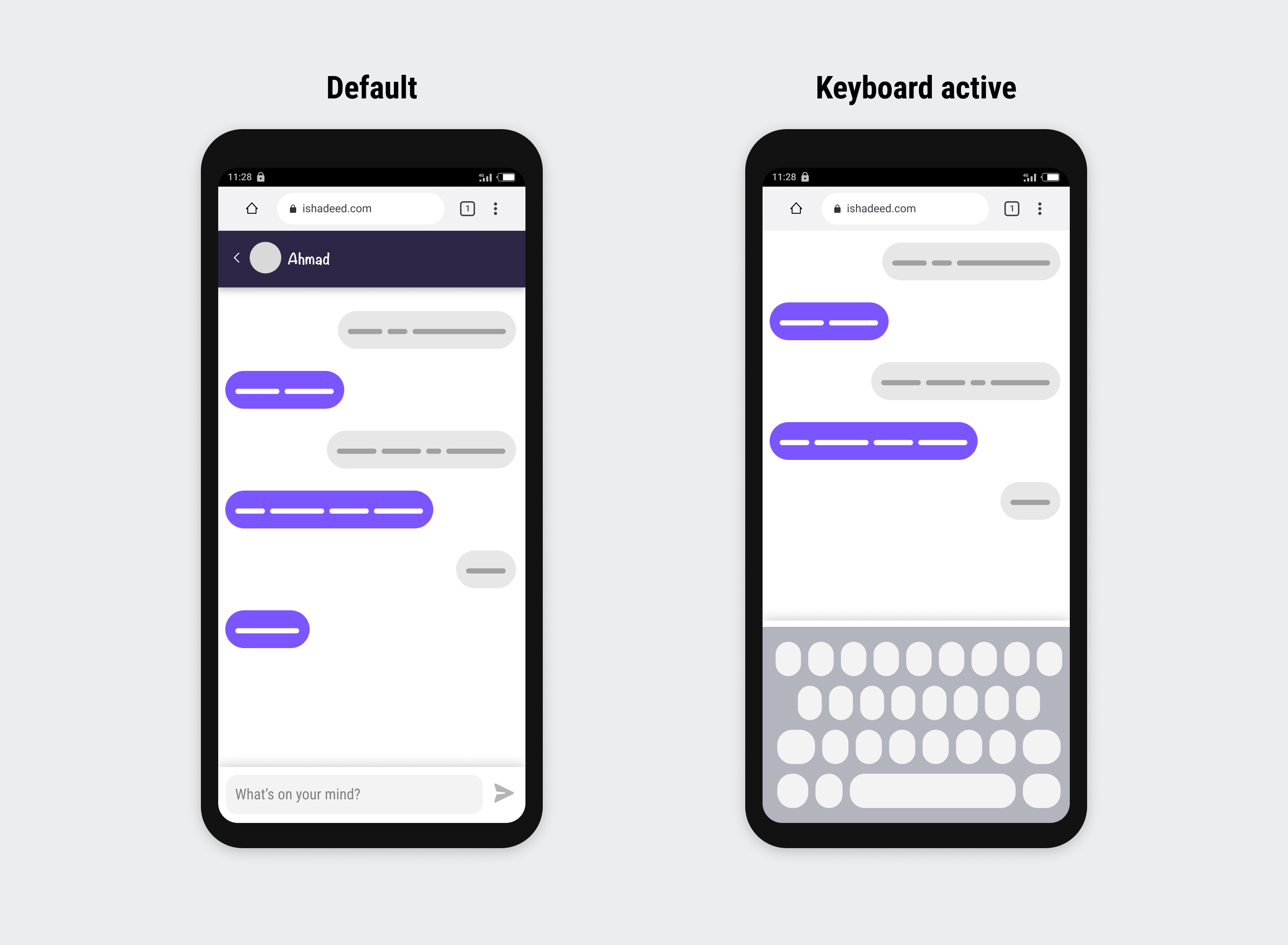
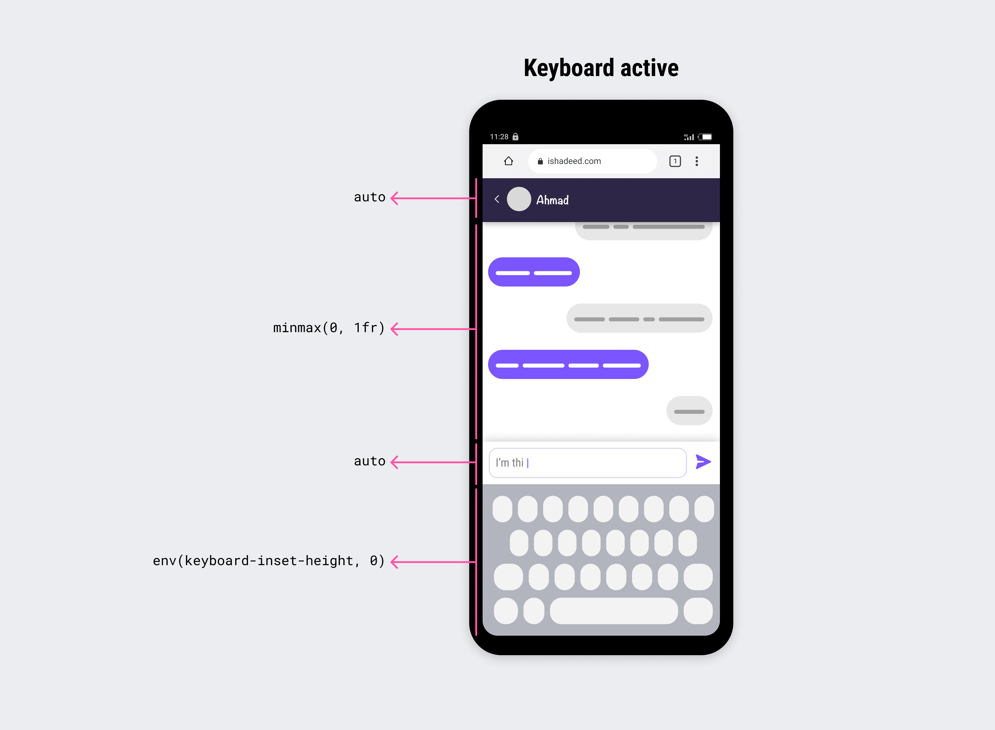
When the keyboard is active, both the header and the message field are hidden. We can use the env(keyboard-inset-height) as a value for the grid-row property.
.layout {
  display: grid;
  grid-template-rows: auto minmax(0, 1fr) auto env(keyboard-inset-height, 0);
  height: 100dvh;
}
Here is how it looks with the fix above:
The virtual keyboard should be used only when needed. Using it in each context might cause problems. Yes, you read that right.
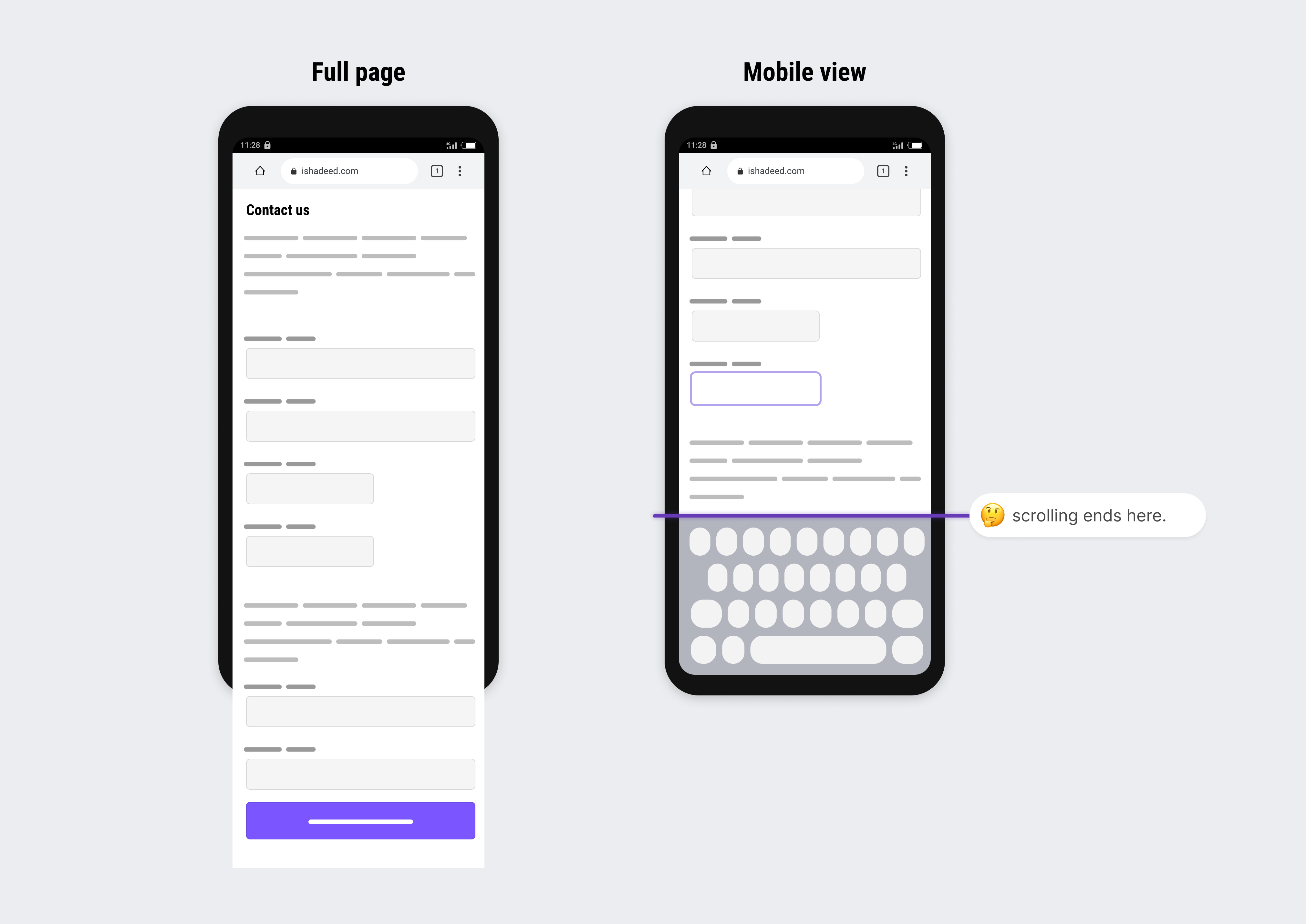
Let’s take a simple example. We have a contact page with long content and form inputs. If we opt-in for making the virtual keyboard overlaying the page’s content, it won’t be possible to scroll to the very end of the form.
In this case, I don’t recommend having the keyboard overlay the content. Use it wisely.
See the following video to get a feeling of the problem:
This might be a useless use case or an example, but it’s interesting to see what happens when a feature is used to its full potential.
I thought to myself, why not mix CSS comparison functions and the virtual keyboard env values? I did that, and it worked.
See the video below:
How does that work? Here you go:
.fab {
  --size: 4rem;
  position: fixed;
  /* [1] */
  right: min(1rem, 100vw - env(keyboard-inset-width, 0rem));
  /* [2] */
  bottom: max(1rem, env(keyboard-inset-height, 0rem));
  /* [3] */
  width: max(var(--size), env(keyboard-inset-width, 0rem));
  height: var(--size);
  /* [4] */
  border-radius: max(
    0px,
    min(50px, 100% - env(keyboard-inset-width))
  );
  /* other styles */
}
This works on both desktop and mobile. Here is what’s happening:
right value will be either 1rem or zero. The first is for desktop, and the latter is for mobile (when the keyboard is active). 100vw is equal to the keyboard width in that case, thus the outcome is zero. min(1rem, 0).1rem or the keyboard’s height.--size variable, and on mobile, it will take the full width, thus why env(keyboard-inset-width, 0) is used.border-radius can be either 50px or 0.Neat, right? I’ve never expected to come up with such a demo. Do you think it could be useful? I’m excited to see what you will build.
An example that I saw good potential for applying the virtual keyboard API is how the post form & navigation are shown for a Linkedin post.
Consider the following figure:
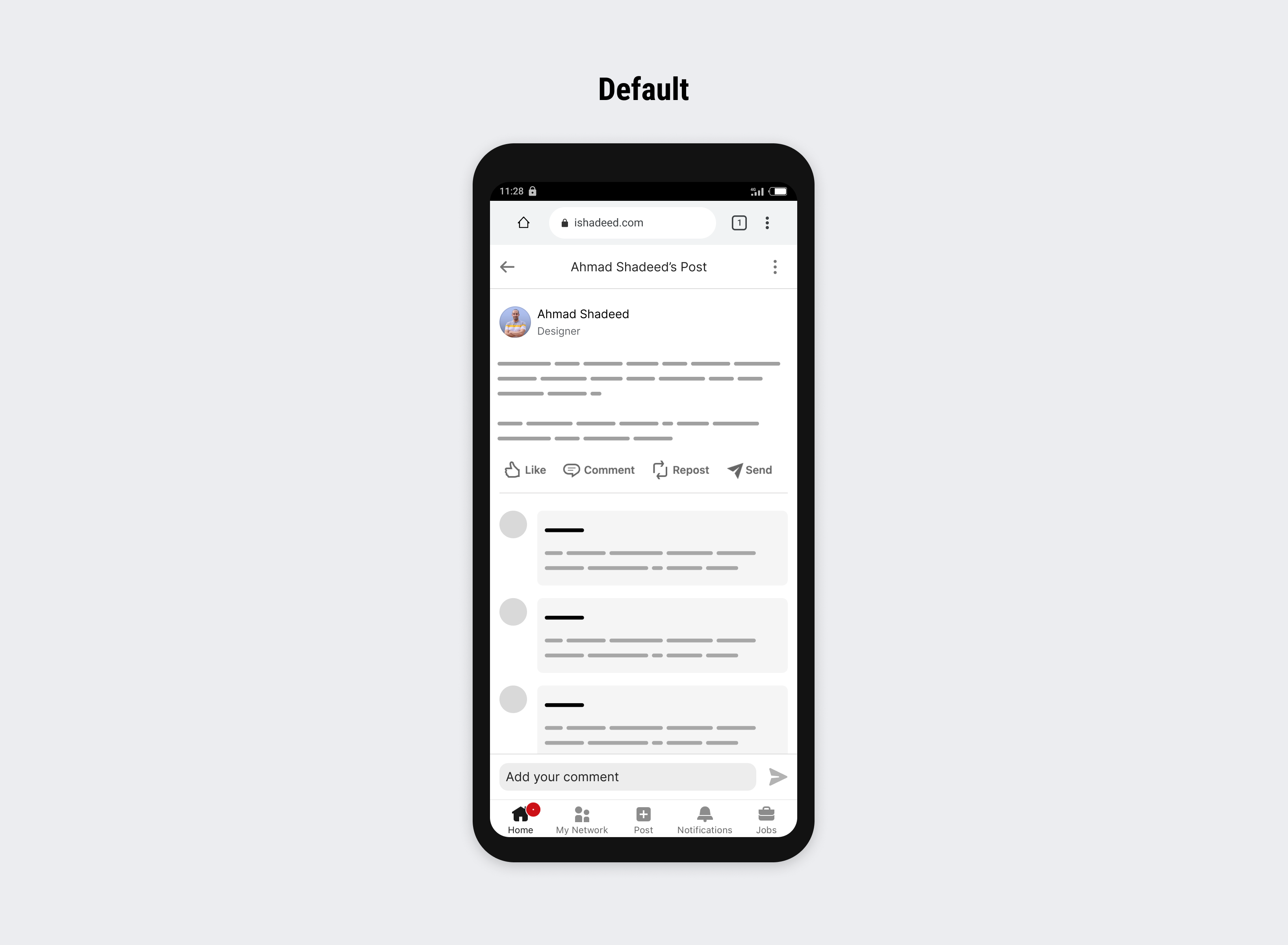
The post form and navigation are fixed to the bottom. When the user activates the input field, it looks like this:
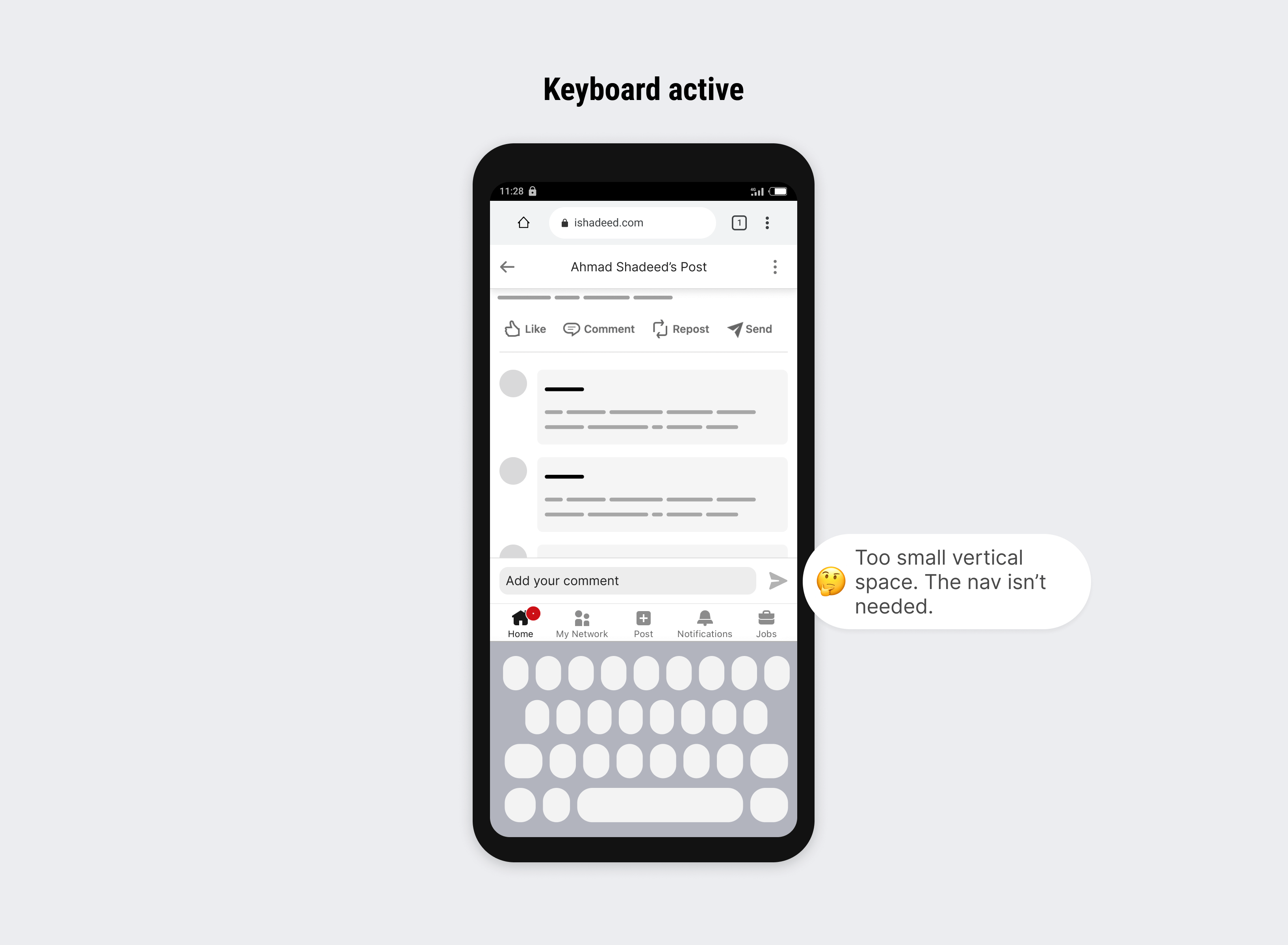
Notice how the vertical real estate is too small. What do to do? By mixing comparison functions and the virtual keyboard API, we can hide the navigation when the keyboard is shown.
Here is the CSS that does that.
.post-form,
.nav {
  position: fixed;
  left: 0;
  right: 0;
}

.post-form {
  bottom: max(48px, env(keyboard-inset-height, 0px));
}

.nav {
  bottom: max(0px, env(keyboard-inset-height, 0) - 100px);
}
Don’t worry, I will explain it bit by bit.
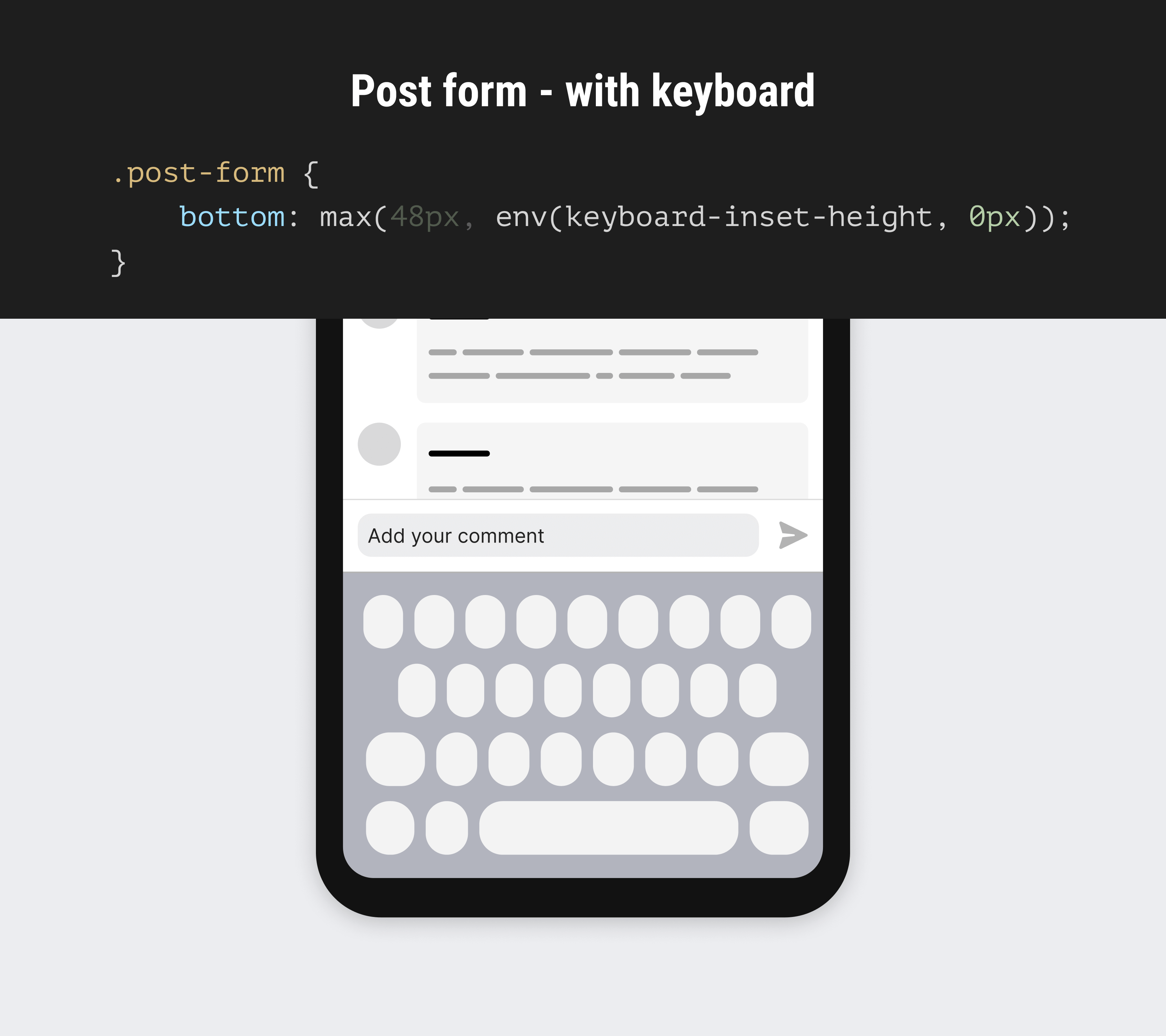
In the default state, the form is offset by 48px from the bottom. In this state, the second part of the max() function is inactive.
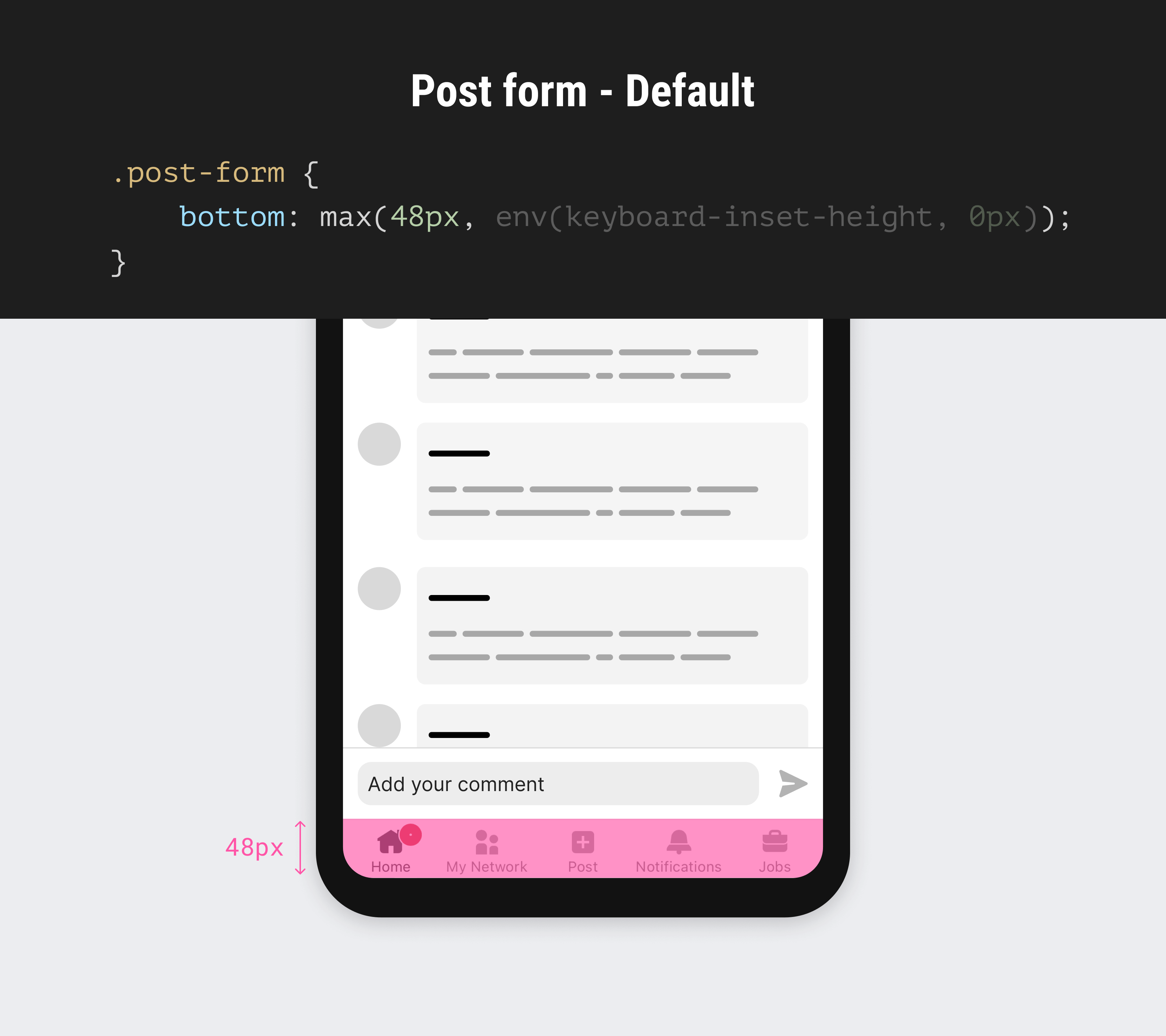
When the keyboard is active, the second part of the max() will work and the bottom value will become the height of the keyboard.
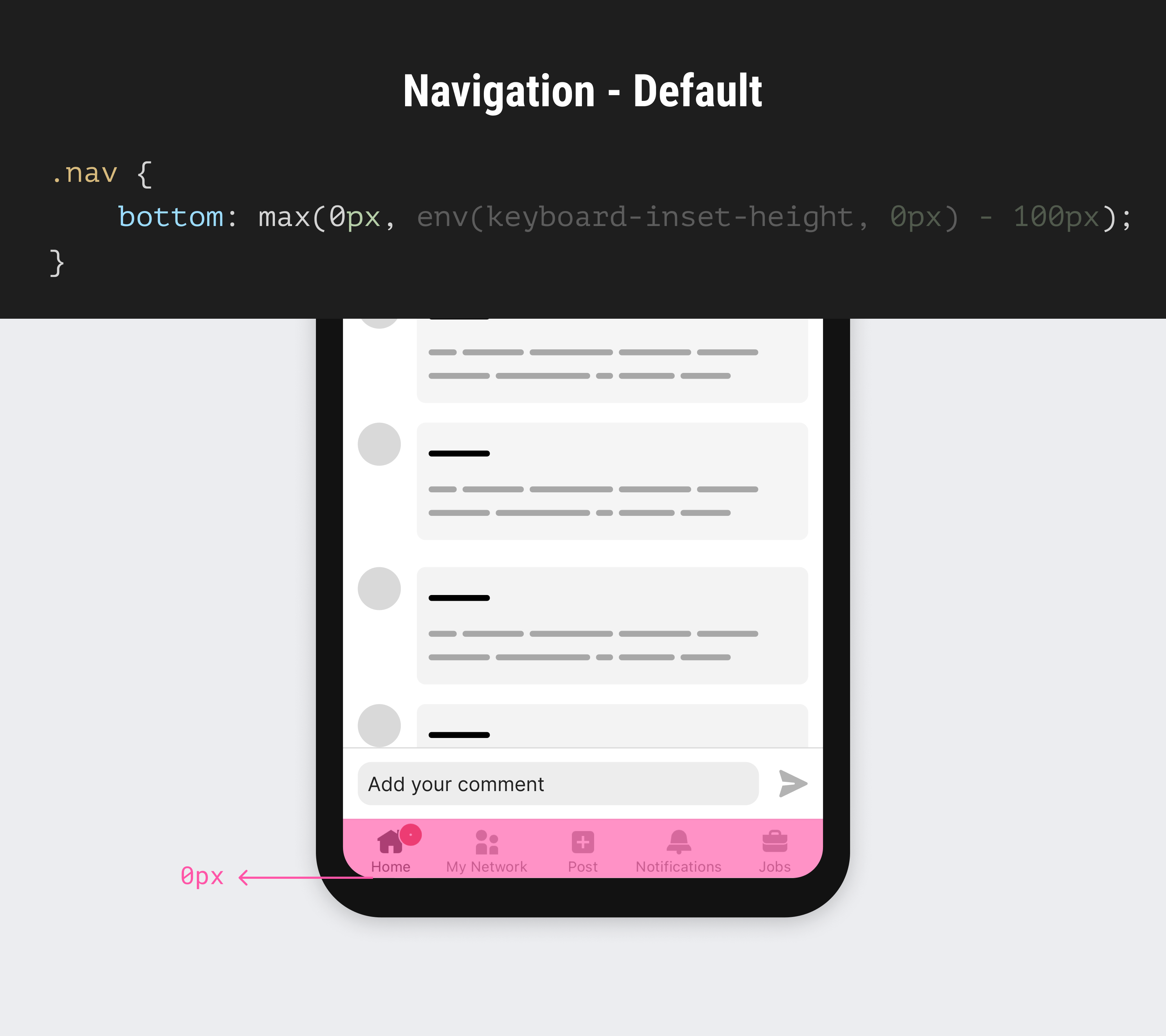
The navigation is positioned at bottom: 0. The first part of the max() function is what’s active now.
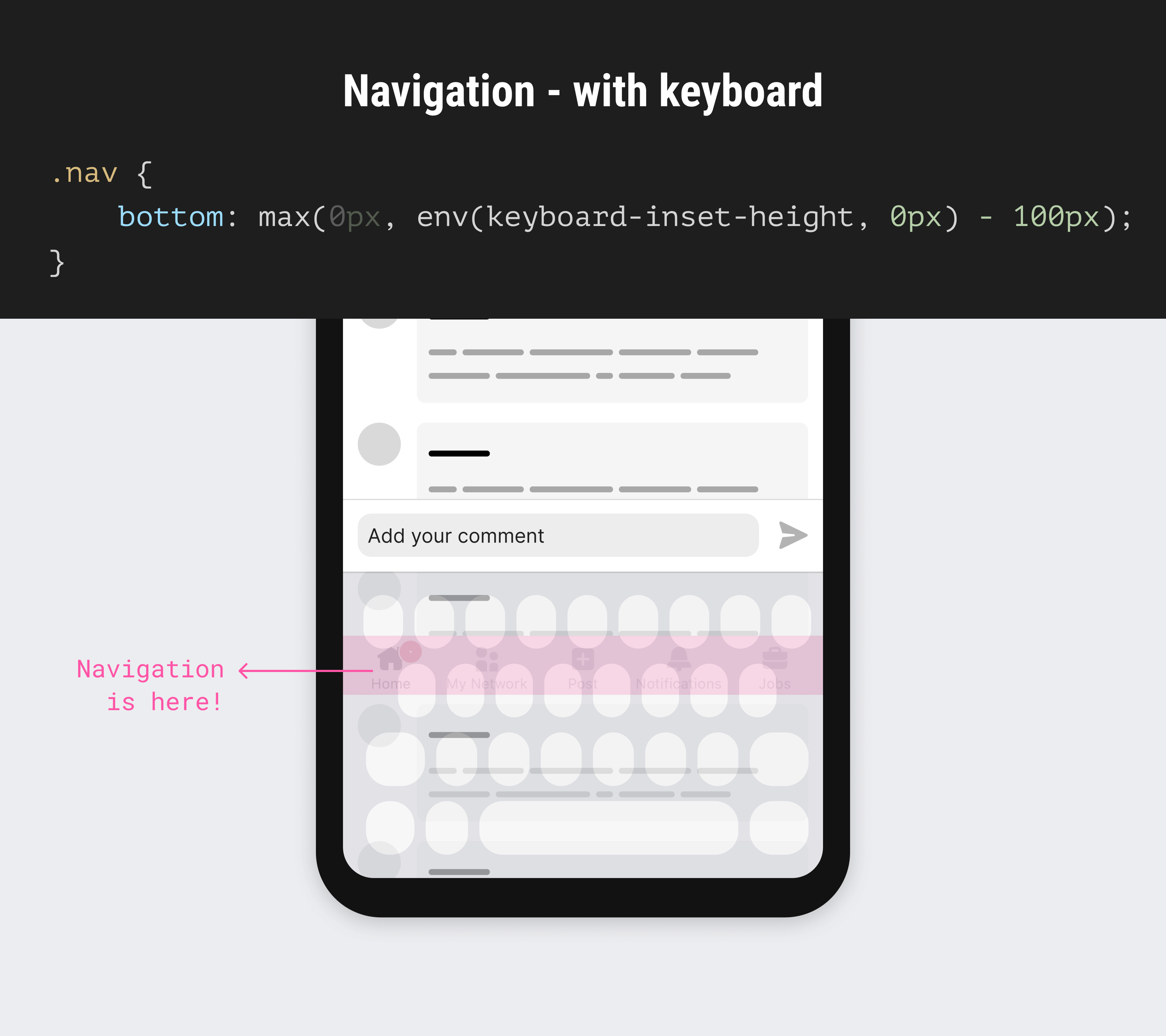
When the keyboard is active, we’ll move the nav under the keyboard. The 100px here is a random number, the point is to add something that is larger than the navigation’s height.
Here is a video of how it works:
Demo on Codepen. You can also view all demos in the Codepen collections.
That’s it for this article. I learned a lot about the virtual keyboard API and can’t wait to apply it in my next project. The last thing I expected is to write 1600 words on such a topic. If that means anything, it means to never trust your inner feelings about something you don’t know. Just start and the good things will follow.
Do you have any thoughts or questions? Please feel free to ping me on Twitter (sorry, X) @shadeed9 or Mastodon or Threads.
The following resources helped me a lot in my initial research about the topic.
Thank you for reading.
此内容由惯性聚合(RSS阅读器)自动聚合整理,仅供阅读参考。 原文来自 — 版权归原作者所有。