


I spent years teaching CSS layout on this blog. I put everything I know into The Layout Maestro course: 70+ lessons and 150+ interactive examples that teach you how to think CSS layouts, not just memorize syntax.
Have you ever wondered about how the CSS flex property works? It’s a shorthand for flex-grow, flex-shrink, and flex-basis. The most common use-case I notice on the web is flex: 1, which lets a flex item to expand and fill the available space.
In this article, I will go through the shorthand and the longhand properties in detail, and explain when and why to use them with practical and visual examples.
The flex-grow sets the grow factor which allows a flex item to grow and fill the available space. The value of flex-grow only accepts an integer number. Consider the following.
<div class="wrapper">
  <div class="item item-1"></div>
  <div class="item item-2"></div>
  <div class="item item-3"></div>
</div>
.wrapper {
  display: flex;
  flex-wrap: wrap;
}

.item {
  flex-grow: 1;
}
Note: the
flex-growcan affect the width or the height, depending on theflex-directionproperty. For the following examples, please assume that theflex-directionis set torow(the default value) unless I clarify something else.
Notice that without using flex-grow, the flex items width will default to their initial width. However, with flex-grow: 1 being used, the available space was distributed between them.
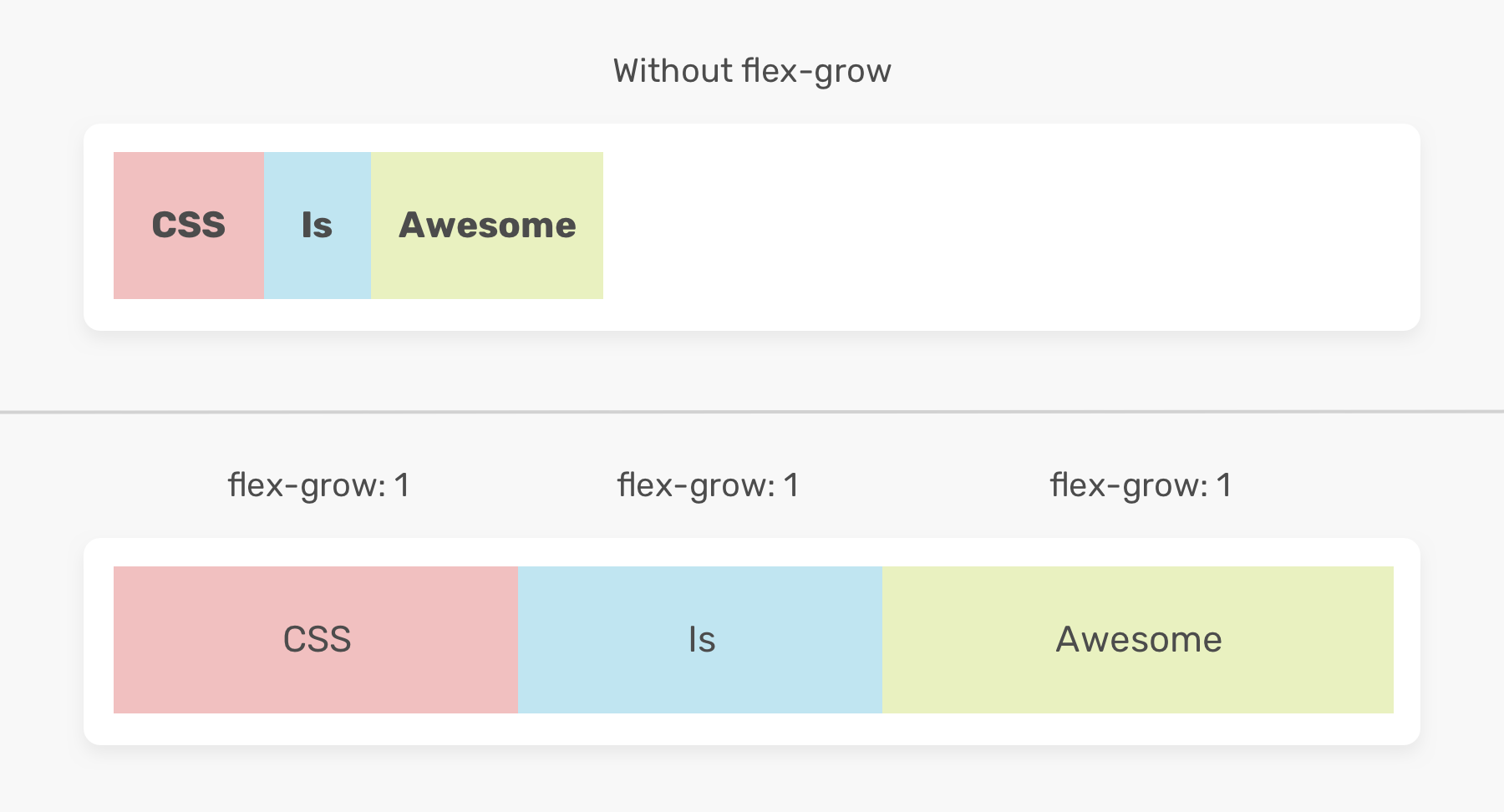
You might be wondering, how space is distributed between the flex items? Well, that’s a good question, and I will answer it shortly.
In the figure below, that’s how the items look without flex-grow. In other words, that’s their natural size.
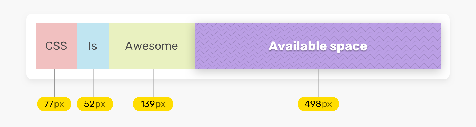
To understand how the flex item width is calculated, see the equation below. I learned about the equation from this post by Samantha Ming (Thank you!).
Let’s calculate the size of the item which contains the text “CSS”.
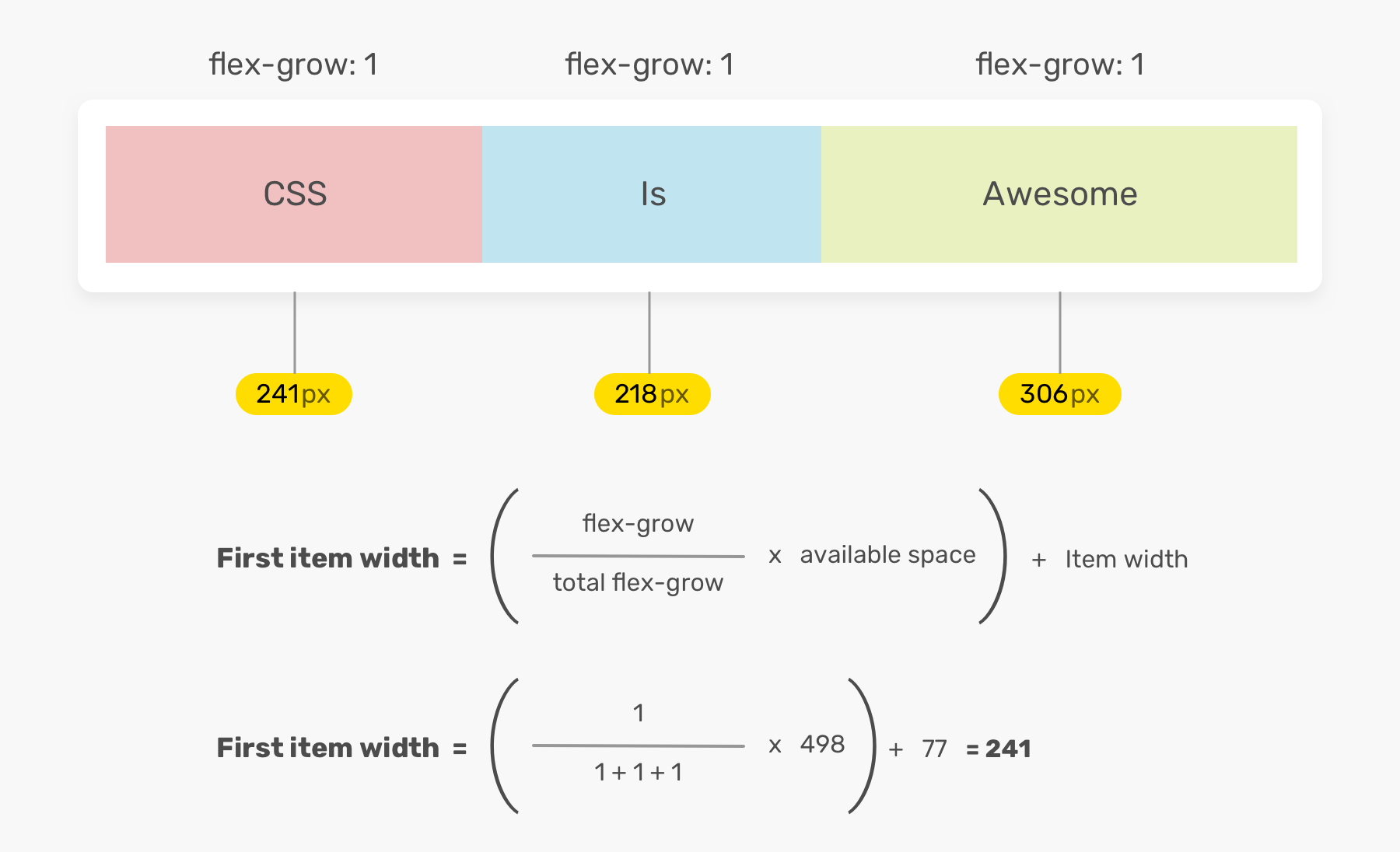
Item width = ( (flex-grow / total flex-grow) * available space) + initial item width
Flex-grow: the flex grow factor for the item
Total flex-grow: the summation of flex-grow value for all flex items
Available space: before applying flex-grow
Item width: the initial width of the item
---> Item width = ( (1 / 3) * 498) + 77 = 241
flex-grow factorsIn the previous example, the flex-grow value is the same for all flex items. Let’s try to add flex-grow: 2 for the first item. How it will be calculated? Keep in mind that the available space for our example is 498px.
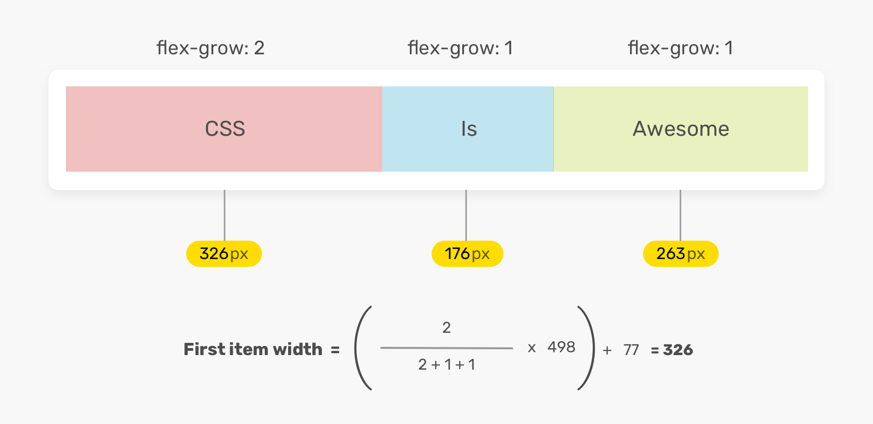
I hope it’s clearer now.
flex-grow?Of course! Since the flex-grow property accepts integer values, it’s possible to use 0 as a way to prevent a flex item from taking the available space.
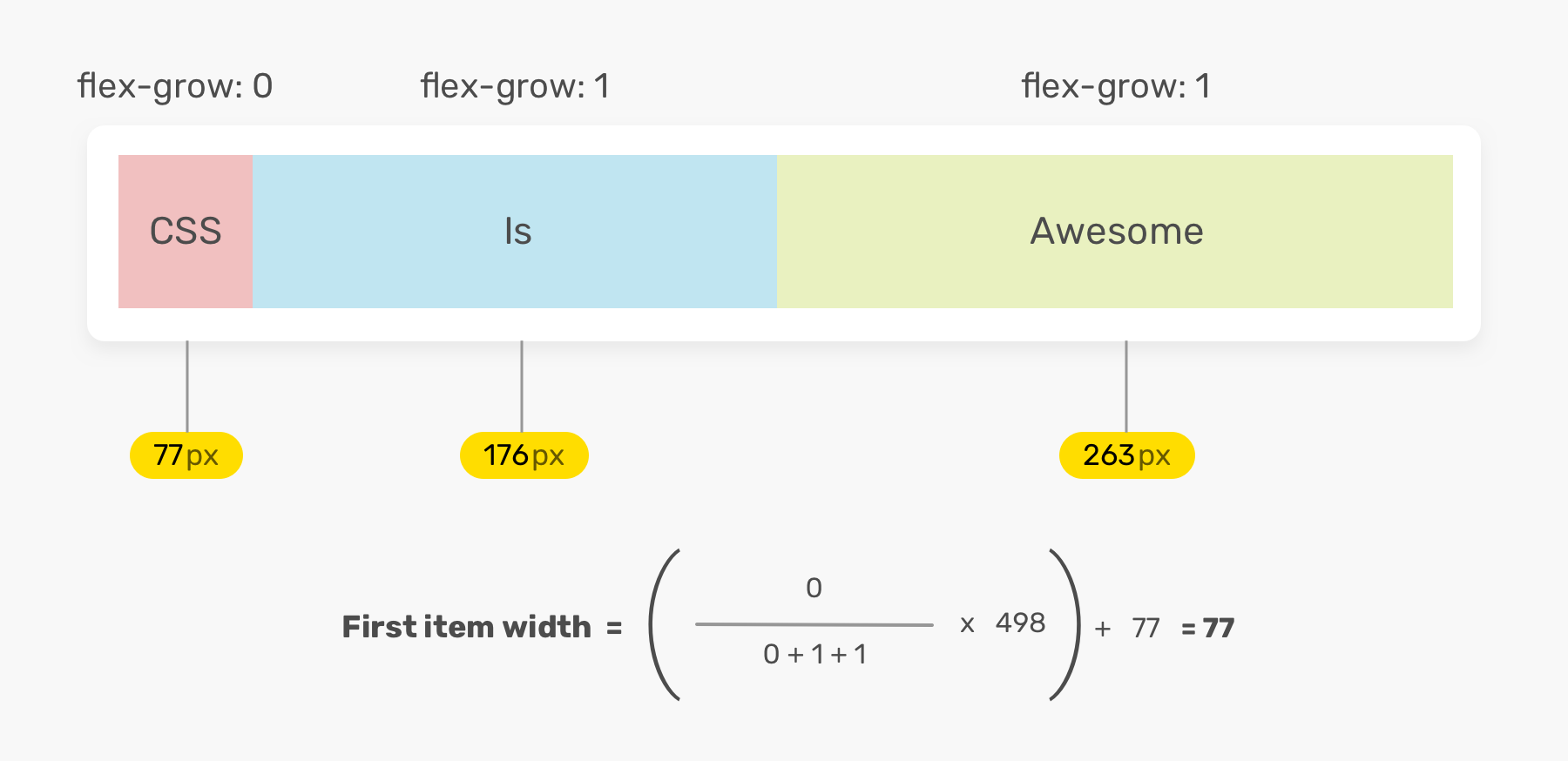
This can be useful in edge cases where we want to force a flex item to stay with its initial width.
There is a common misconception that using flex-grow will make the items equal in width. This is incorrect. The idea of using flex-grow is to distribute the available space. As you saw in the equation, the width of each flex item is calculated based on its initial width (The width before applying flex-grow).
If you want to make the flex items equal in width, it’s possible by using flex-basis. I will explain that in the coming sections.
flex-shrink propertyThe flex-shrink sets the shrink factor of a flex item. If the size of all flex items is larger than the wrapper, items will shrink according to the flex-shrink factor.
Consider the following example. The middle item has a width of 300px, and with flex-shrink: 1 is set. This will allow the item to shrink in width if there is no space available to fit all flex items.
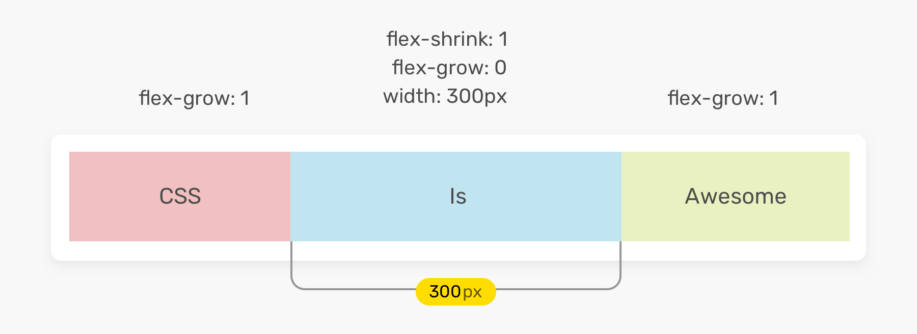
.item-2 {
  width: 300px;
  flex-shrink: 1;
}
The browser will keep the item width as equal to 300px under the following conditions:
Here is how the item behaves with different viewport sizes.
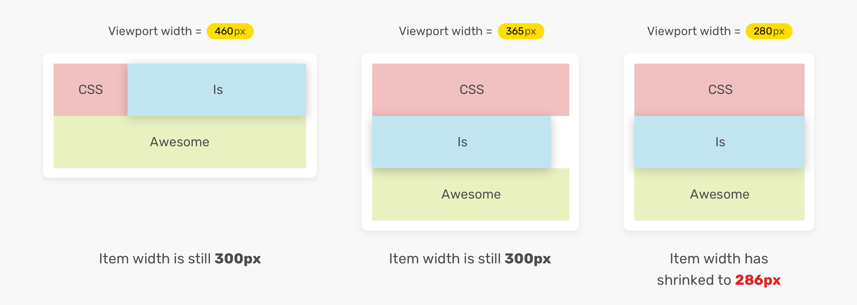
As you see in the figure, the width is 300px until the viewport width is less than 300px.
flex-basis propertyIt sets the initial size of the flex item before distributing the free space according to the flex factors. The size can be referred to width by default, and height (in case of flex-direction: column).
The flex-basis property can accept the same values as the width or height properties. The default value is auto, which resolves to content. The content value is an automatic size based on the flex item content size.
.item-1 {
  flex-grow: 0;
  flex-shrink: 0;
  flex-basis: 50%;
}
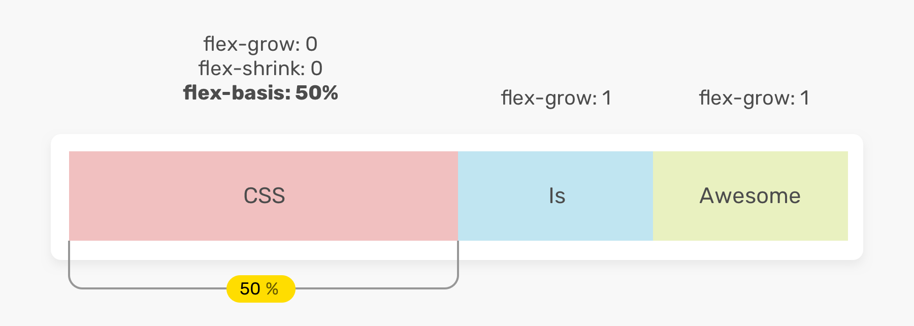
In the example above, the first item has a width of 50%. It’s important to reset the flex-grow to 0 to prevent the item from becoming larger than 50%.
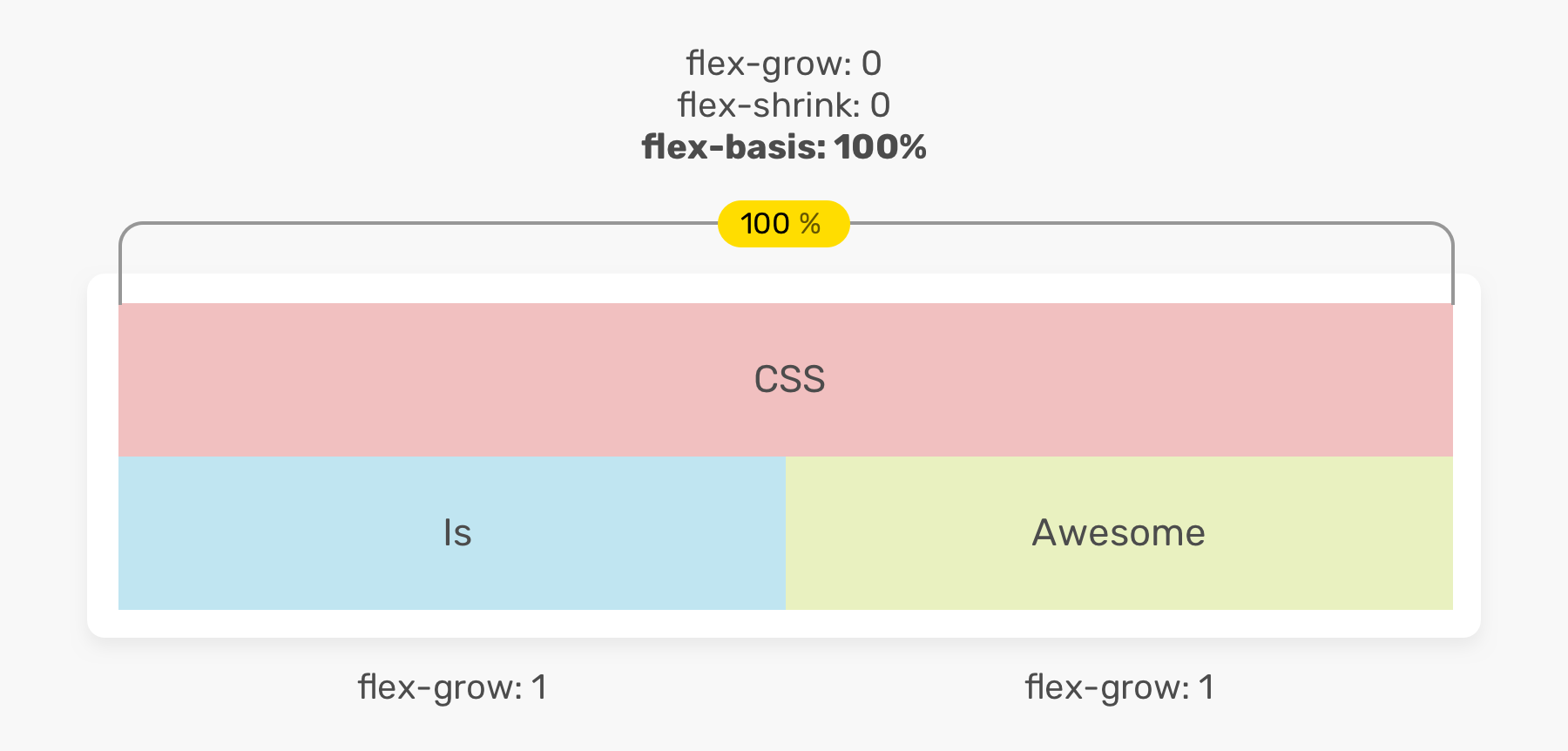
What will happen if we use 100% instead? The item will take 100% width of its parent, and the other items will wrap into a new line.
.item-1 {
  flex-grow: 0;
  flex-shrink: 0;
  flex-basis: 100%;
}
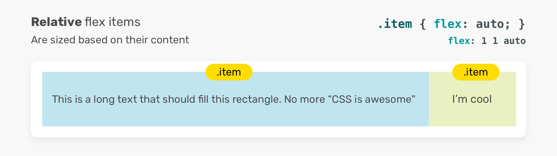
flex shorthand propertyIt’s a shorthand for flex-grow, flex-shrink, and flex-basis. The default value for flex is 0 1 auto. What that means is that it allow flex items to grow based on their content size.
In that context, there is something important that I wanted to highlight, which is absolute and relative flex-items. No, this is not about CSS positioning, it’s about something related to flexbox.
.item {
  /* Equivalent to flex: 1 1 auto */
  flex: auto;
}
The size of flex items is based on the content. As a result, flex items with more content will be larger.
On the contrary, when the flex-basis property is set to 0, all flex items will grow to the same size.
.item {
  /* Equivalent to flex: 1 1 0% */
  flex: 1;
}

flex propertyFrom its name, this property is flexible in the values it can take. Take the following examples.
.item {
  flex: 1;
}
If it has only one unitless value, it will be considered as flex-grow, and the longhand values will be 1 1 0.
.item {
  flex: 1 1;
}
The values are flex-grow and flex-shrink, respectively. The flex-basis will default to 0.
This will be used for flex-basis. The flex-grow and flex-shrink will default to 1.
.item {
  flex: 100px;
  /* flex: 1 1 100px */
}
0In cases where you need to set the flex-basis to zero by using the flex shorthand.
.item {
  flex: 0;
}
This is not recommended as it will confuse both of the developer and the browser. How can you decide if that 0 is for the flex factors (grow or shrink) or for the flex-basis? It’s confusing. According to the CSS spec:
A unitless zero that is not already preceded by two flex factors must be interpreted as a flex factor. To avoid misinterpretation or invalid declarations, authors must specify a zero <‘flex-basis’> component with a unit or precede it by two flex factors.
Instead, you should append a unit like px or %.
.item {
  flex: 0%;
  /* flex: 1 1 0% */
}
flex shorthandWhen you need to set the grow, shrink, and basis, it’s better to use the flex property for that purpose.
According to the CSS spec:
Authors are encouraged to control flexibility using the flex shorthand rather than with its longhand properties directly, as the shorthand correctly resets any unspecified components to accommodate common uses.

A common use-case for flexbox is for a user component. The avatar and the text content should be on the same line.
<div class="user">
  <img class="user__avatar" src="shadeed.jpg" alt="" />
  <div>
    <h3>Ahmad Shadeed</h3>
    <p>Author of Debugging CSS</p>
  </div>
</div>
.user {
  display: flex;
  flex-wrap: wrap;
  align-items: center;
}

.user__avatar {
  flex: 0 0 70px;
  width: 70px;
  height: 70px;
}
Notice that I added flex: 0 0 70px for the avatar. It’s important to use it as some old browser might look the image look compressed, if flex is not set. Adding on that, flex has a higher priority than the width property (in case of flex-direction: row) or height (in case of flex-direction: column).
If we change the avatar size by only tweaking the flex property, the width will be ignored by the browser.
.user__avatar {
  /* The width is 100px, not 70px */
  flex: 0 0 100px;
  width: 70px;
  height: 70px;
}
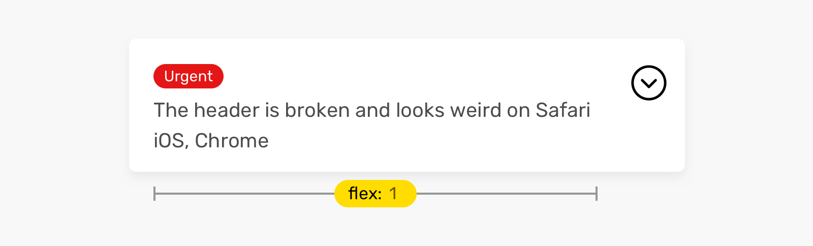
You have a title for a section header, and it should fill all the available space. Using flex: 1 is perfect for that case.
.page-header {
  display: flex;
  flex-wrap: wrap;
}

.page-header__title {
  flex: 1;
}
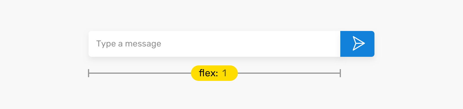
This is very common in messaging apps, like Facebook messenger or Twitter. The input should fill the available space, with a fixed width for the send button.
form {
  display: flex;
  flex-wrap: wrap;
}

input {
  flex: 1;
  /* Other styles */
}
The above examples are useful use-cases for flex-grow. However, some cases are ignored or not mentioned at all in some of the flex articles out there. Let’s explore them!
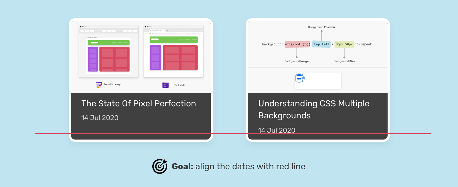
Let’s suppose that CSS grid is being having a two-column layout. The issue is that the dates are not aligned. They should be at the same line (The red one).
We can do that with flexbox.
<div class="card">
  <img src="thumb.jpg" alt="" />
  <h3 class="card__title">Title short</h3>
  <time class="card__date"></time>
</div>
By setting the flex-direction: column, we can use flex-grow on the title to make it fill the available space, and thus keeping the date at the end, even if the title is short.
.card {
  display: flex;
  flex-direction: column;
}

/* First solution */
.card__title {
  flex-grow: 1;
}
Also, this possible without using flex-grow. Thanks to auto margins and flexbox! I wrote a detailed article about auto in CSS, if you want to dig into more details.
/* Second solution */
.card__date {
  margin-top: auto;
}
flex factorWhat I mean here is using flex-grow or flex-shrink, but with a value other than 1. In this section, I will explore some ideas where we can incorporate that.
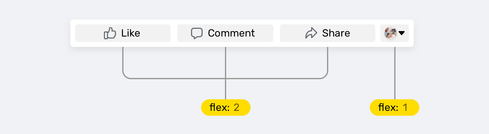
Inspired by Facebook (I stealed the icons, too), this actions footer has four items, and the last one has a smaller width. What we can do is the following:
.actions {
  display: flex;
  flex-wrap: wrap;
}

.actions__item {
  flex: 2;
}

.actions__item.user {
  flex: 1;
}
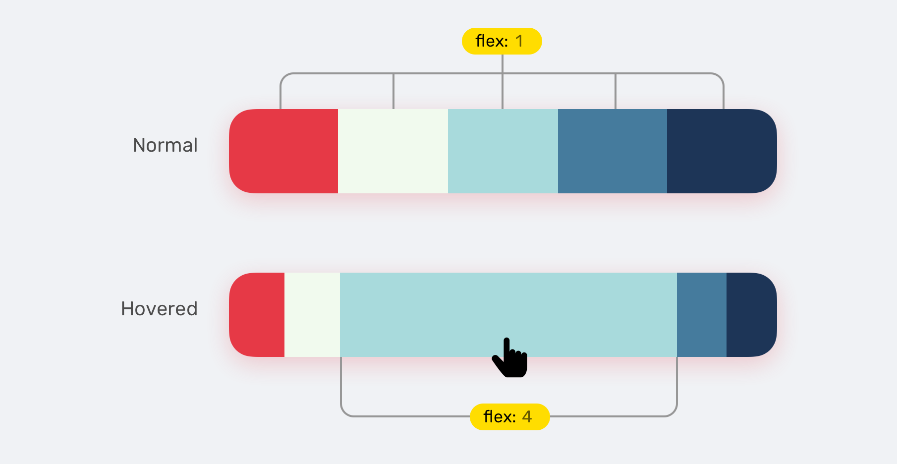
An interesting thing we can do is to animate a flex item on hover. This can be extremely useful. Here is a simple example of what’s possible:
.palette {
  display: flex;
  flex-wrap: wrap;
}

.palette__item {
  flex: 1;
  transition: flex 0.3s ease-out;
}

.palette__item:hover {
  flex: 4;
}
I love this demo on Codepen. Once a card is activated, it expands by changing flex-grow to 4.
See the Pen 🔘 Flexbox Toggles 🔘 by Shaw (@shshaw) on CodePen.
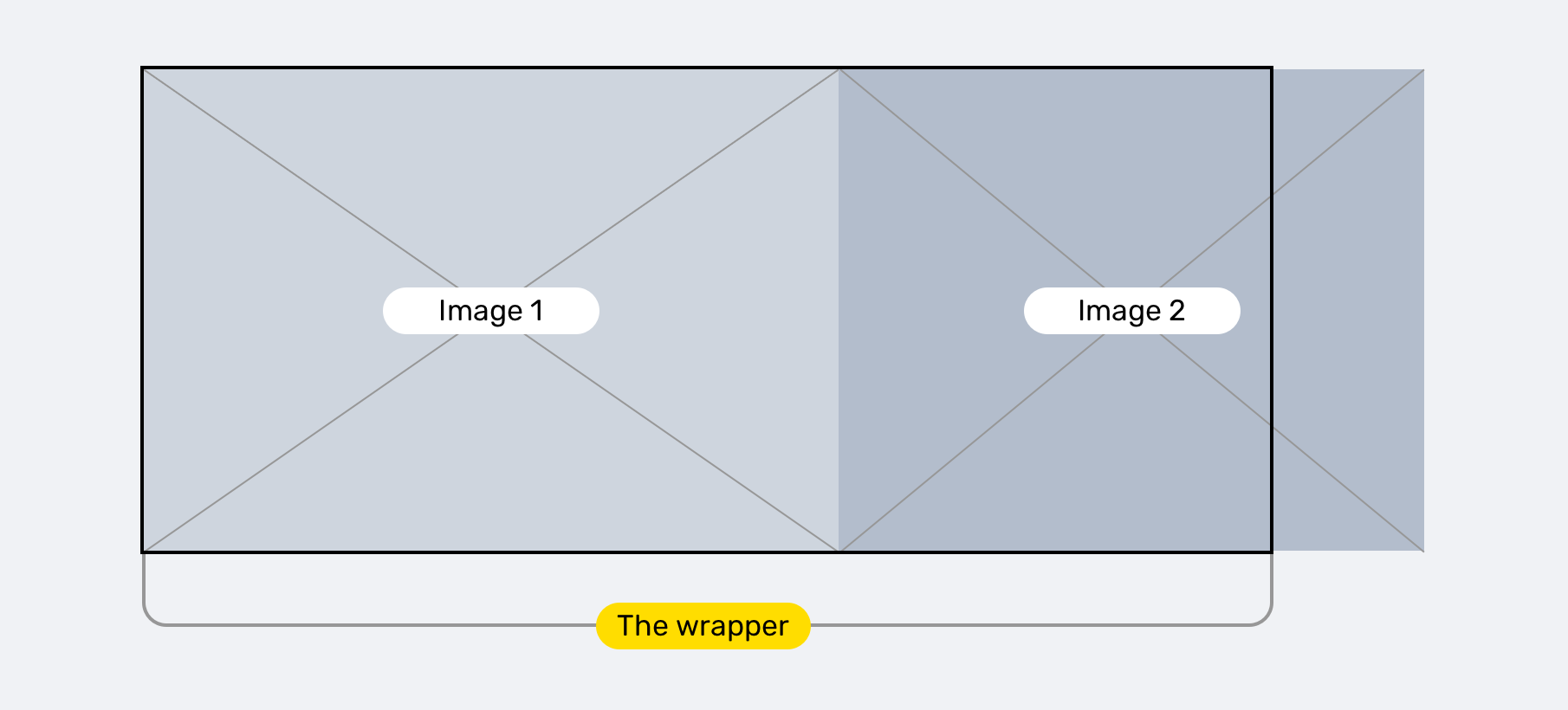
A while ago, I got an email from a reader asking about an issue he is facing. As in the figure, we have two images that should stay within the boundaries of their wrapper.
.wrapper {
  display: flex;
}

.wrapper img {
  flex: 1;
}
However, even with flex: 1, the images are still overflowing the wrapper. According to the CSS spec:
By default, flex items won’t shrink below their minimum content size (the length of the longest word or fixed-size element). To change this, set the min-width or min-height property.
In our case, the images are too large, and flexbox won’t shrink them to fit the wrapper. To change this behaviour, we need to set the following:
.wrapper img {
  flex: 1;
  min-width: 0;
}
I explained about this issue in my article about min and max width/height in CSS.
That’s all. I explained the basics of flex longhand properties, and how to use them. I hope you learned something new from this article. Do you have a comment or a suggestion? Please feel free to ping me on @shadeed9.
Thank you for reading.
I’m excited to let you know that I’m writing an ebook about Debugging CSS.

If you’re interested, head over to debuggingcss.com and subscribe for updates about the book.
{% include share.html text = “Digging Into the Flex Property” link = “https://ishadeed.com/article/css-flex-property/” %}
flex-grow is weird. Or is it?此内容由惯性聚合(RSS阅读器)自动聚合整理,仅供阅读参考。 原文来自 — 版权归原作者所有。