


I spent years teaching CSS layout on this blog. I put everything I know into The Layout Maestro course: 70+ lessons and 150+ interactive examples that teach you how to think CSS layouts, not just memorize syntax.
Through our work as web developers, we need to hide elements for many reasons. For example, a button that should be visible in a mobile viewport, and hidden in a desktop viewport. Or, a navigation element that is hidden on mobile and shown on the desktop. There are three different states when hiding an element:
In this article, we will learn about hiding elements in HTML&CSS and covering the aspects of accessibility, animation and use cases for hiding. Let’s dive in!
It’s a boolean HTML attribute that hides the element attached to it. When the browser loads a web page, it won’t render the elements with hidden attribute unless that is overridden manually from CSS. It’s similar to the effect of applying display: none for an element.
Consider the following example.
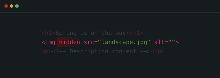
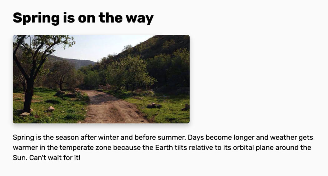
We have a title, a figure, and a description. The figure should be only shown if the viewport width is larger than 400px. I added the hidden attribute to the <img> element.
In CSS, I used the hidden attribute to show the element only in the desired viewport size.
img[hidden] {
  display: none;
}

@media (min-width: 400px) {
  img[hidden] {
    display: block;
  }
}
Well, you might be wondering, why not use display: none? Good question. When the image selector is called via its hidden attribute, we can be sure that even if CSS didn’t load for some reason, the element will be hidden.
hiddenFrom an accessibility perspective, hidden hides the element completely from a web page, so it won’t be accessible to screen readers. Be sure to avoid using it to hide elements for presentational purposes only.
Each element has a default display value like inline-block, block, table..etc. To hide an element with the display property, we should use display: none. When an element is hidden with display: none, all of its descendants will be removed along with it.
Consider that we have the same example as above, and we want to hide the image.
img {
  display: none;
}

@media (min-width: 400px) {
  img {
    display: block;
  }
}
This will hide the image completely from the document flow, and from screen readers. Maybe you’re wondering what’s the document flow? See the below illustration:
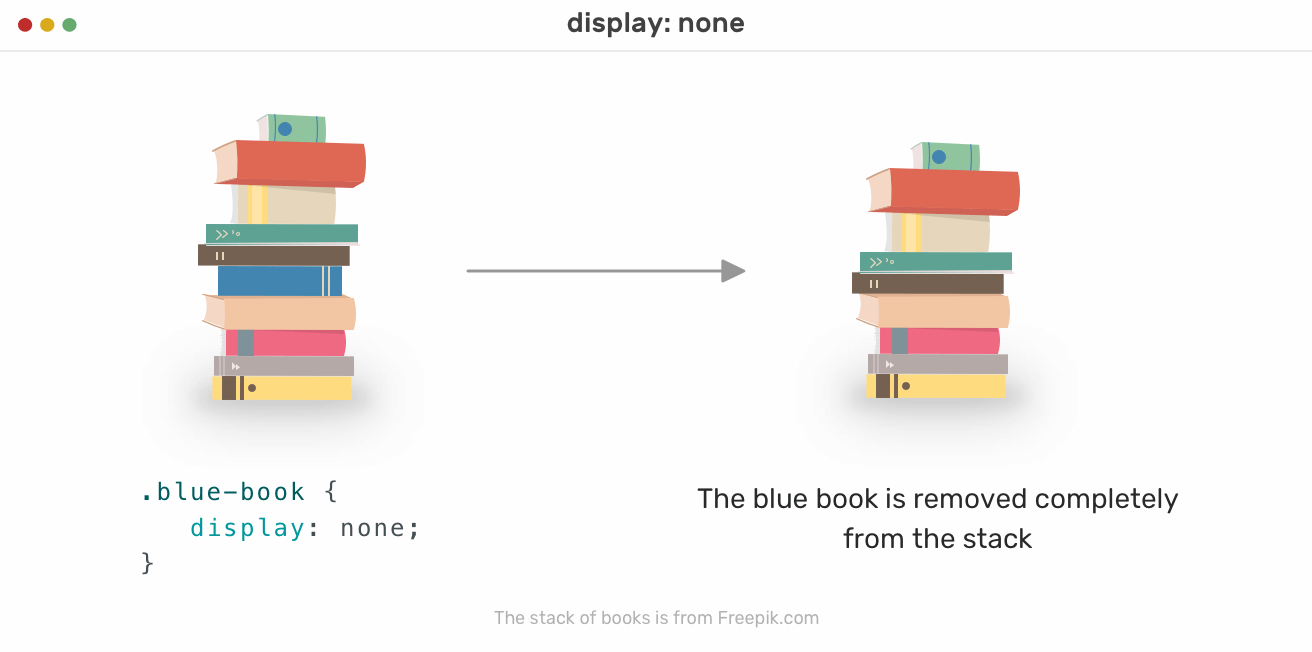
Notice when the blue book is hidden, it has been removed completely from the stack. The space that was preserved for it is gone. The same concept applies when hiding elements in the HTML. The reserved space for the element is gone, and it changes the document flow, or in our example, the stack of books flow.
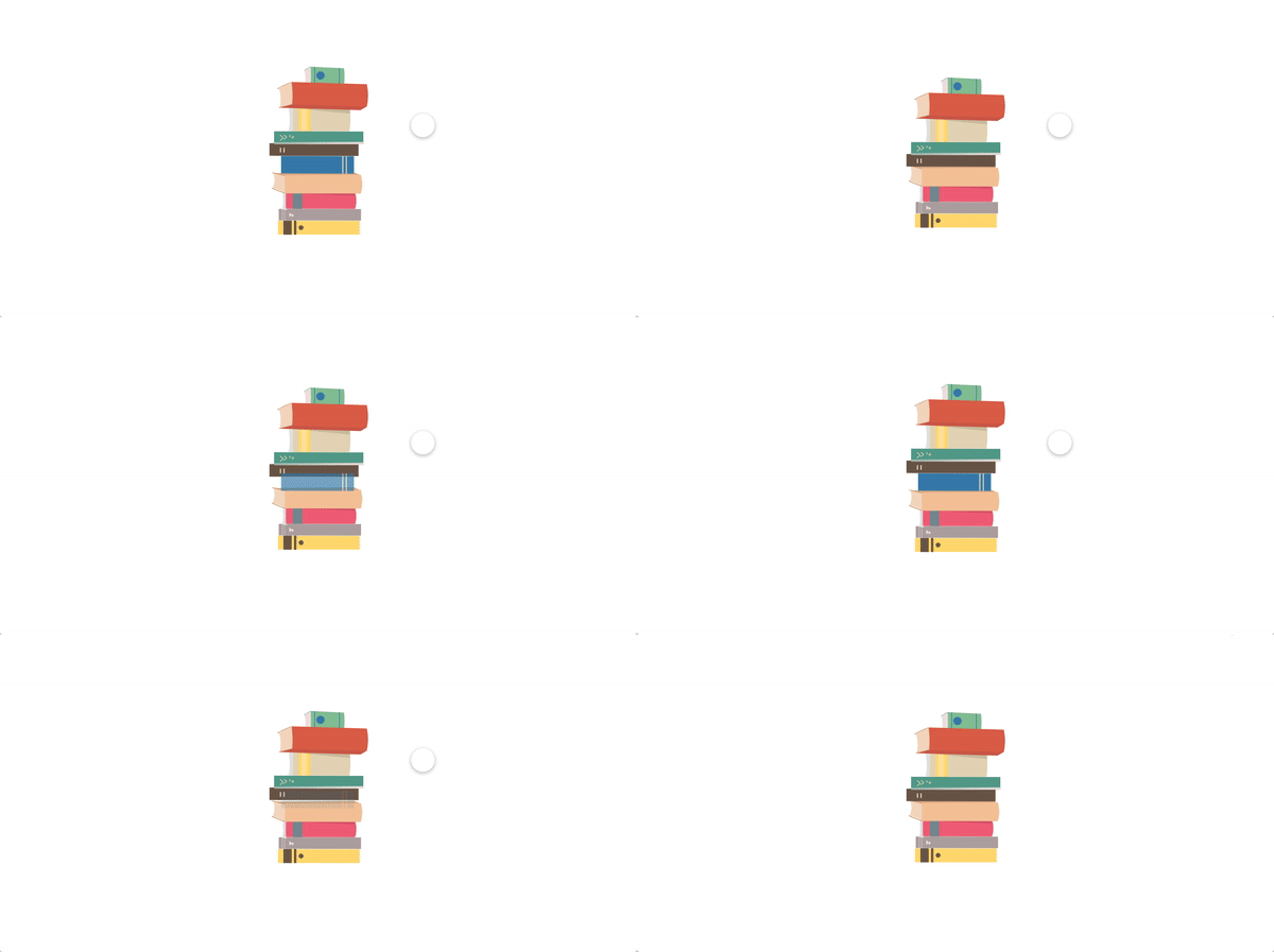
Here is an animation showing what happen when a book is removed:
Yes, this is the short answer. For example, if an <img> is hidden with CSS, and we show it at a certain breakpoint, it will be loaded already. The image will cause an HTTP request even if it’s hidden with CSS.
In this demo, I added an image only and hide it with CSS. Then, I opened DevTools and checked the networks tab which shows that the image is loaded.
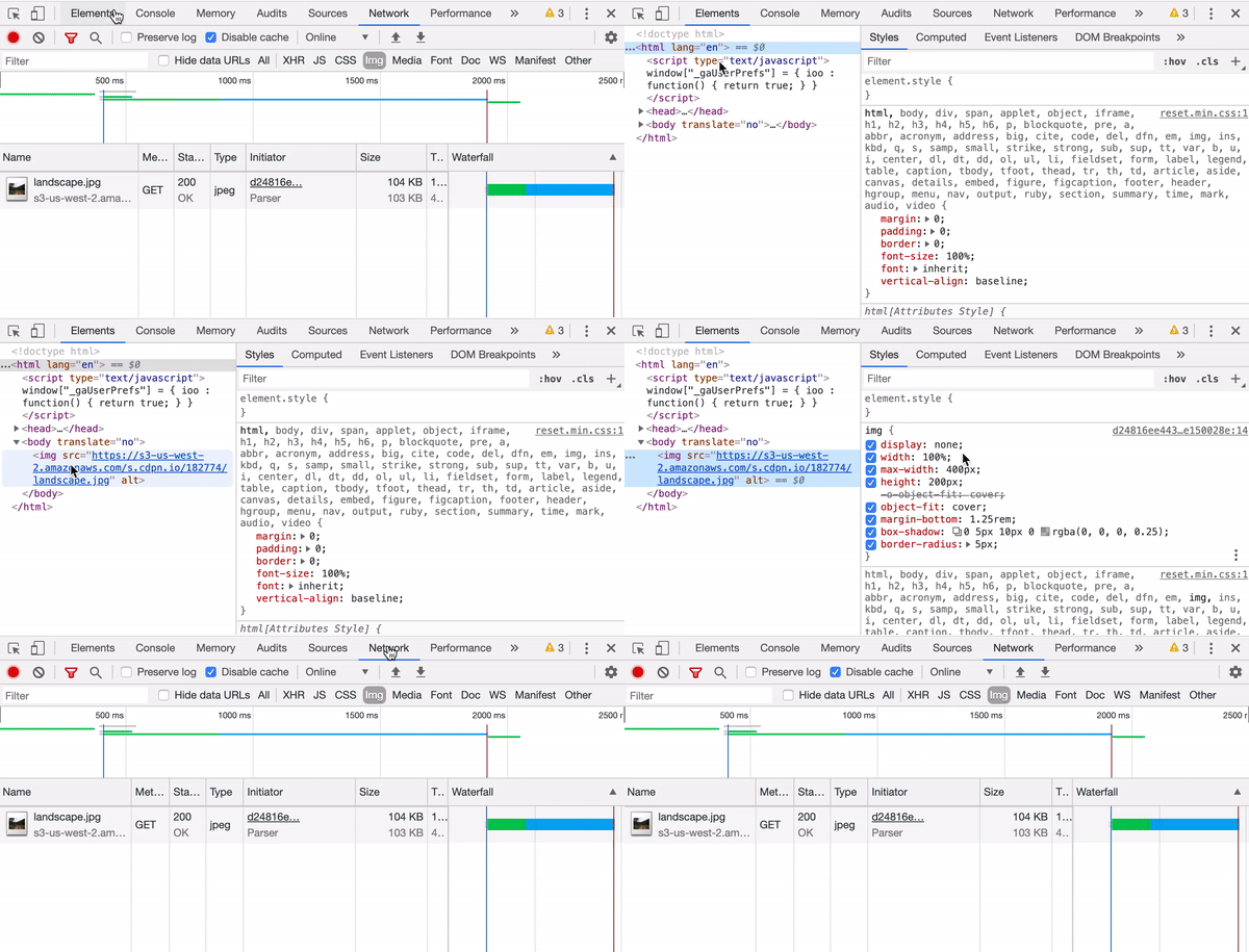
We will come back to this later to explain how to reduce HTTP requests when they’re not needed in a specific breakpoint or viewport size.
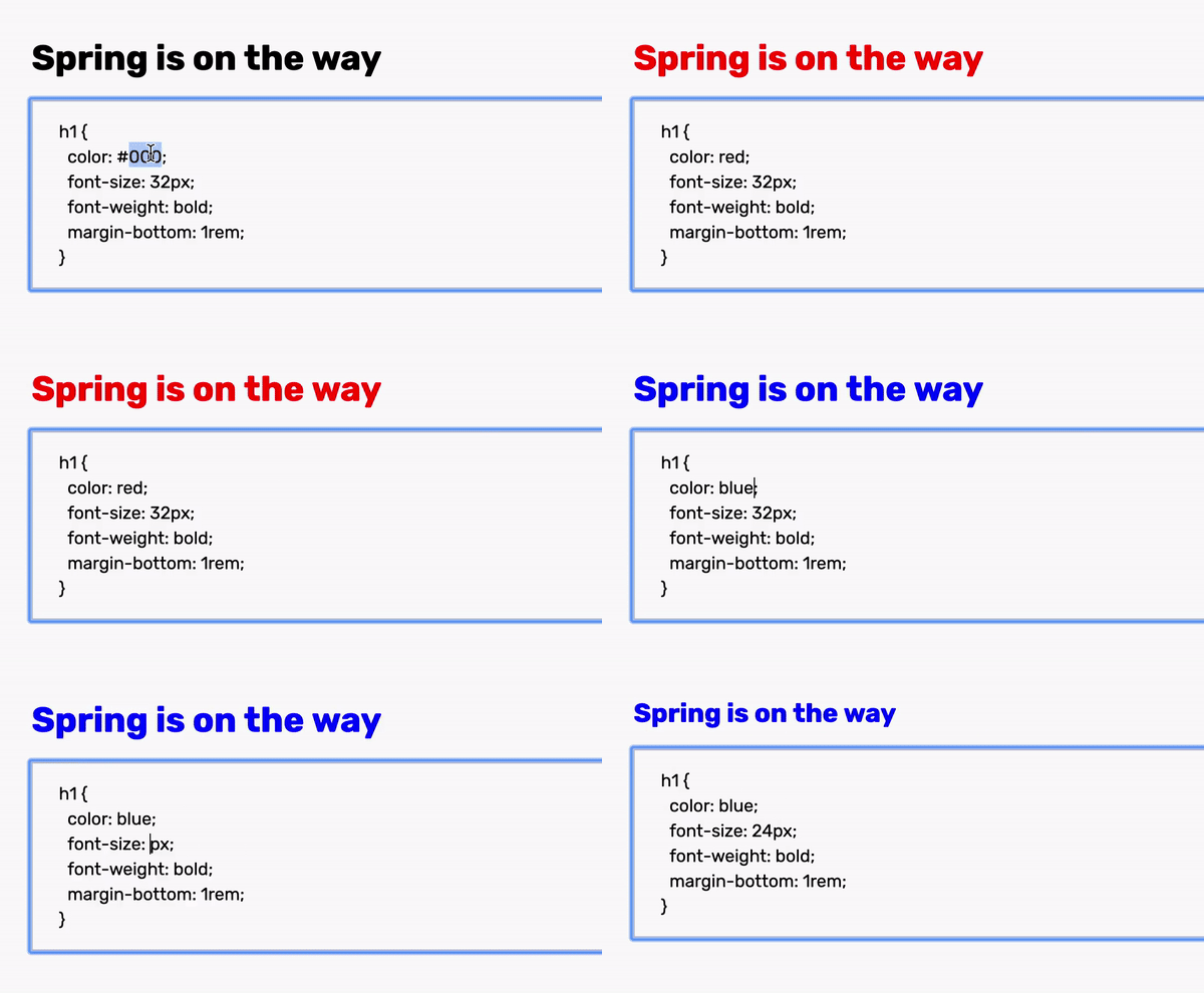
It’s worth mentioning that there are elements with display: none as their default value. The <style> element can be added inside an HTML page, and we can change its display property to block so it can be visible.
<body>
  <style>
    .title {
      color: #000;
    }
  </style>
</body>
style {
  display: block;
}
This is useful in case you want to have the style block always visible and editable. It can be editable by adding the attribute contenteditable=true to the style tag.
display: noneWhen using display: none, it hides the element completely from screen readers.
By setting the opacity to 0, the element and all of its descendants will be hidden, and it’s not inherited. However, it hides them only from a visual perspective. Adding on that, an element with opacity value other than 1 will create a new stacking context.
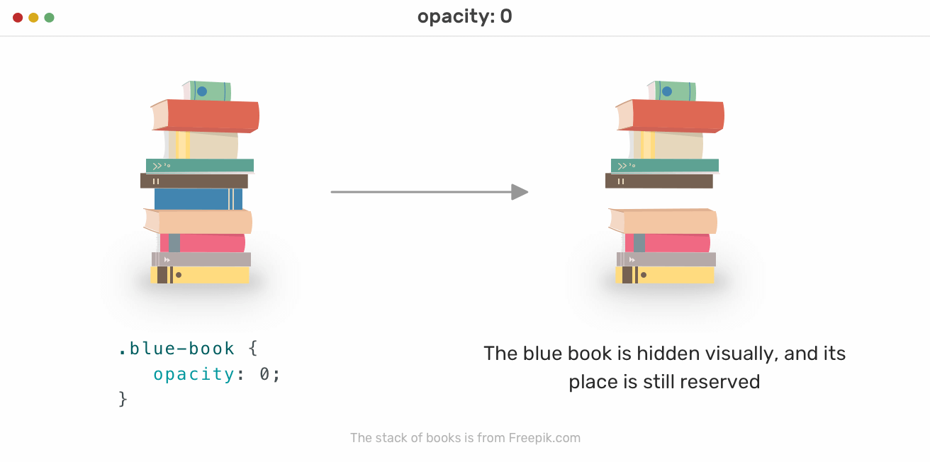
In the figure above, the blue book is hidden visually only. Its space is still reserved for it, and the stack order didn’t change, compared to what happened when we used display: none.
img {
  opacity: 0;
}
Based on our initial example, if we want to hide the image with opacity, the result will look like this:
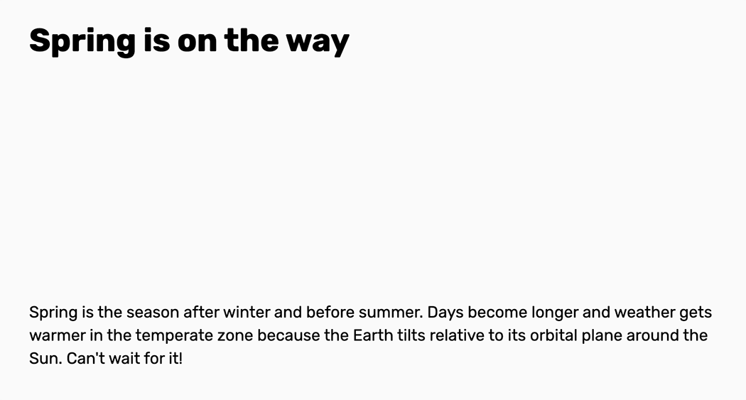
The image is still there and its space is reserved. It’s hidden only from a visual perspective.
Dusan Milovanovic pointed out that pointer-events: none | auto can be used to disable mouse events on elements hidden with opacity: 0. This is important as it might be confusing to the user to click, hover, or select the text of a hidden element.
opacity: 0An element is hidden with opacity: 0 will still be accessible to screen readers, and focusable with the keyboard.
By using visibility: hidden, we can show or hide elements similar to using opacity: 0, without affecting the visual flow of the document.
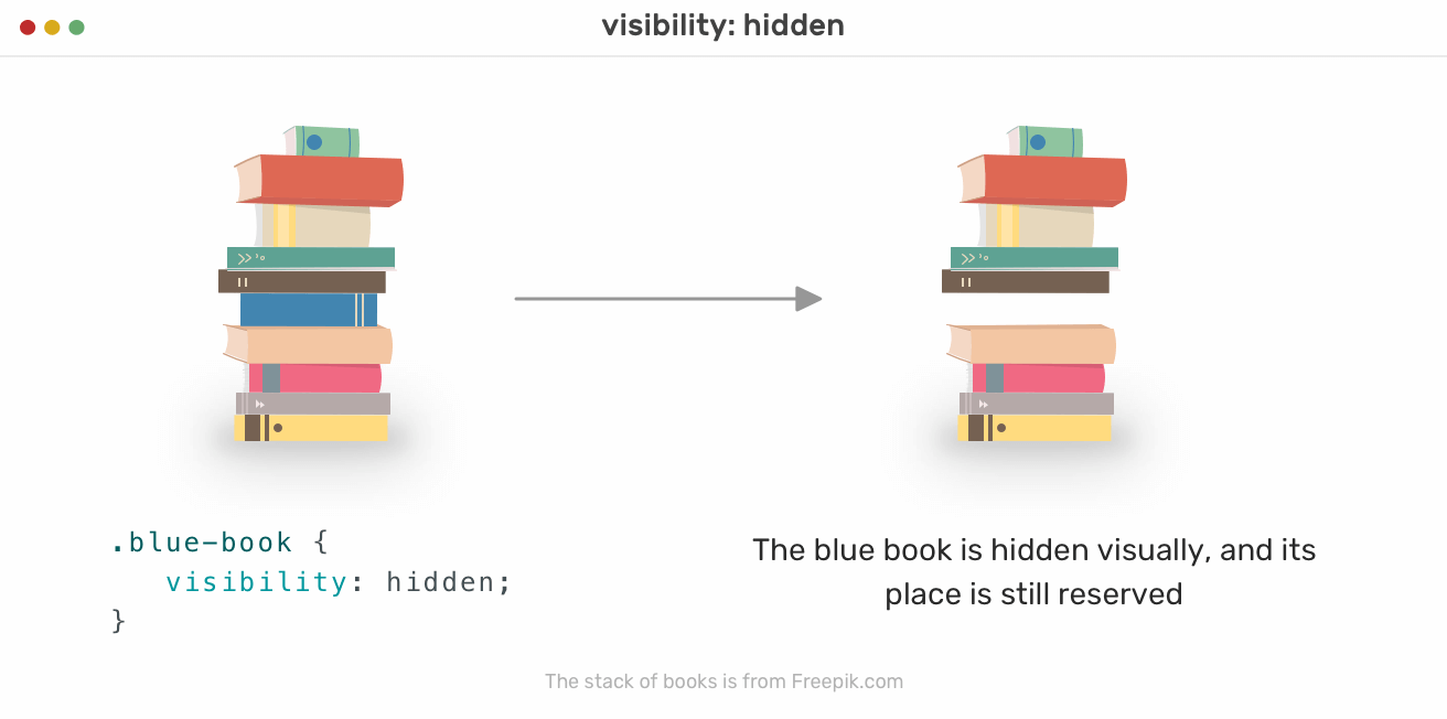
Notice how the blue book is hidden from the visual flow, but it didn’t affect the order of the book stack.
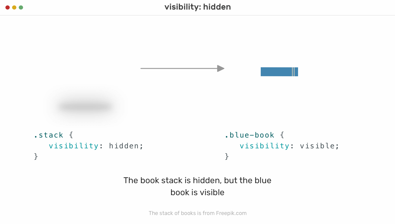
However, when visibility: hidden is used on the parent element, everything is hidden, but when a child element of this parent has visibility: visible applied to it, that child will be shown.
<article>
  <h1>Spring is on the way</h1>
  <img src="landscape.jpg" alt="" />
  <p><!-- Desc --></p>
</article>
article {
  visibility: hidden;
}

img {
  visibility: visible;
}
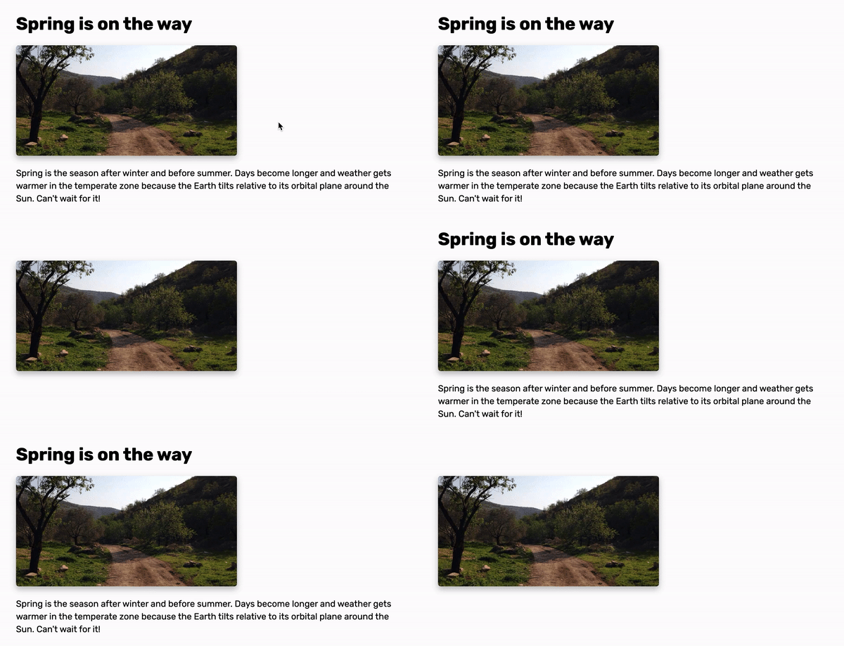
In the example above, the <article> element has visibility: hidden with it. However, adding visibility: visible to the image made it visible. Again, that’s because visibility applies to element’s descendants, but it can be overridden from a child element with that element.
visibility: hiddenThe element is hidden and its descendants will be removed from the accessibility tree, and it won’t be announced by screen readers.
To hide an element with the position property, we should move it off-screen, and set its size to zero (width and height). An example of that is a skip navigation link. Consider the following figure:
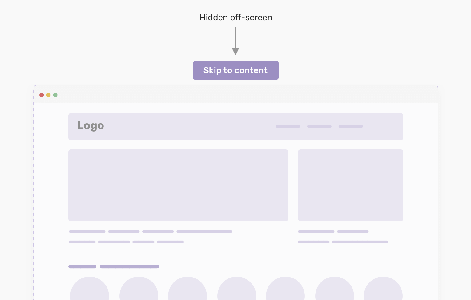
To position the link off-screen, we should add the following:
.skip-link {
  position: absolute;
  top: -100%;
}
The value -100% will push the element 100% of the viewport height. As a result, it will be hidden completely. Once it’s focused on the keyboard, it can be shown like this:
.skip-link:focus {
  position: absolute;
  top: 0;
}
position: absolute | fixedThe element is accessible to screen readers, and keyboard focusable. It’s only hidden visually from the viewport.
When clip-path is used on an element, it creates a clipping region that defines what the parts should be shown and hidden.
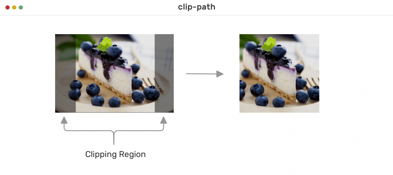
In the above example, the transparent black region has clip-path. When the clip-path is applied to the element, anything under the transparent black area won’t be shown.
To demonstrate the above in a more visual way, I will use clippy tool for that. In the GIF below, I have the following clip-path:
img {
  clip-path: polygon(0 0, 0 0, 0 0, 0 0);
}
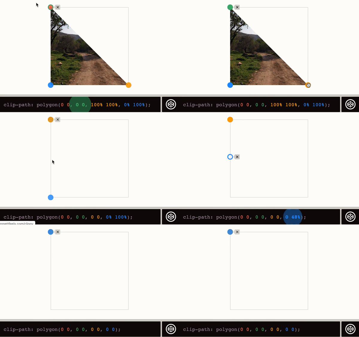
Setting the polygon values to 0 0 for each direction will resize the clipping region to zero. As a result, the image won’t be shown. Also, this can be done using a circle instead of a polygon:
img {
  clip-path: circle(0 at 50% 50%);
}
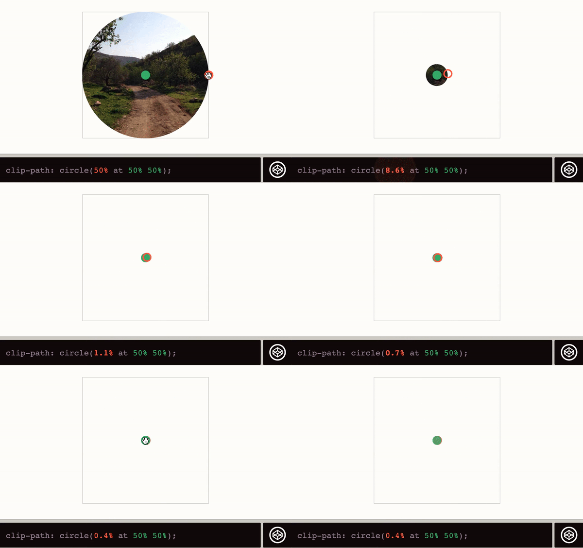
clip-pathAn element is only hidden visually. It’s still accessible to screen readers and keyboard focus.
While those two techniques are not common as the previous one we discussed, they might be useful for some use cases.
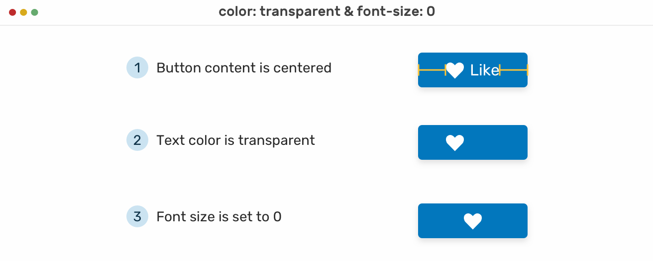
By making the color transparent for a text, it will be hidden visually. This can be useful for an icon-only button.
Also, it can be useful to set the font size to zero as this will hide the text visually.
Consider the following example where we have a button with the below structure:
<button>
  <svg
    width="24"
    height="24"
    viewBox="0 0 24 24"
    aria-hidden="false"
    focusable="false"
  >
    <!-- Path data -->
  </svg>
  <span>Like</span>
</button>
Our goal is to hide the text in an accessible way. To do that, I added the following CSS:
.button span {
  color: transparent;
  font-size: 0;
}
And with that, the text is hidden. It can even work without changing the color, but I added it for explanation purposes.
When adding aria-hidden attribute to an element, it removes that element from the accessibility tree, which can enhance the experience for screen reader users. Note that it doesn’t hide the element visually, it’s only for screen reader users.
<button>
  Menu
  <svg aria-hidden="true"><!-- --></svg>
</button>
In the example above, we have a menu button with a label and an icon. To hide the icon from screen readers, aria-hidden is added for that purpose.
According to Mozilla Developer Network (MDN), the below are uses cases for the attribute:
aria-hidden="true"It’s designed for screen readers as it hides content from screen readers only. However, the content is still visible for sighted users and keyboard focusable.
Before we start with the examples, I want to highlight the properties mentioned previously to compare them and pick the appropriate method based on our needs. The cheatsheet is inspired by this great article on CSS-Tricks.
See the Pen Hiding On The Web by Ahmad Shadeed (@shadeed) on CodePen.
When we want to animate an element that is hidden, for example, show hidden mobile navigation, it needs to be done in an accessible way. In order to make an accessible experience, we will explore some good examples to learn from, and bad examples, to avoid making mistakes that could lead to a bad experience for screen reader users.
We have a menu that needs to have a sliding or off-canvas animation when it’s expanded. The easiest thing to do is to add the following to the menu:
ul {
  opacity: 0;
  transform: translateX(100%);
  transition: 0.3s ease-out;
}

ul.active {
  opacity: 1;
  transform: translateX(0);
}
With the above, the menu will expand and collapse based on the class .active that will be added via JavaScript as below.
menuToggle.addEventListener("click", function (e) {
  e.preventDefault()
  navMenu.classList.toggle("active")
})
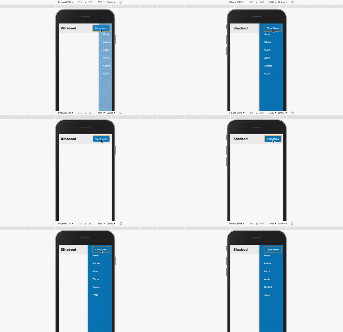
The result might seem good, but it has a big mistake. Using opacity: 0 won’t hide the navigation from the accessibility tree. Even if the navigation is hidden visually, it’s still focusable via keyboard, and accessible for screen readers. It must be hidden to avoid confusing the user.
Here is a screenshot of the accessibility tree from Chrome’s DevTools:
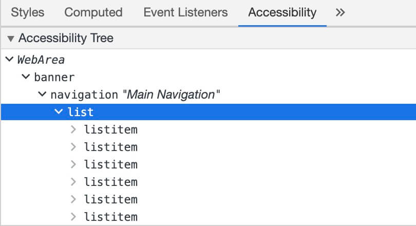
In short, the accessibility tree is a list of everything a screen reader user can access. In our case, the navigation list is there while it’s visually hidden. There are two issues we need to solve:
The screenshot below shows how the VoiceOver rotor on Mac OS sees the page. The navigation list there while it’s hidden visually!
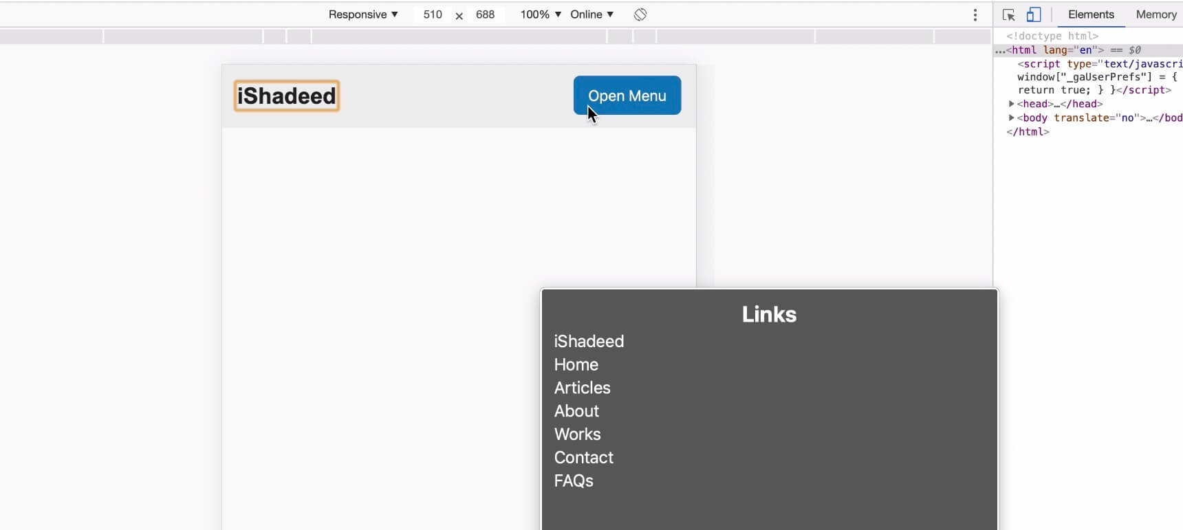
To fix that mistake, we need to use visibility: hidden for the navigation menu. This will ensure that the menu is hidden visually and for screen readers.
ul {
  visibility: hidden;
  opacity: 0;
  transform: translateX(100%);
  transition: 0.3s ease-out;
}

ul.active {
  visibility: visible;
  opacity: 1;
  transform: translateX(0);
}
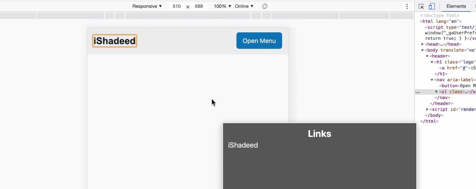
Once that is added, now the menu is hidden from screen readers. Let’s test again and see what VoiceOver will show:

The default checkbox design is hard to customize, and as a result, we need to create a custom design for a checkbox. Let’s see the basic HTML:
<p class="c-checkbox">
  <input class="sr-only" type="checkbox" name="" id="c1" />
  <label class="c-checkbox__label" for="c1">Custom checkbox</label>
</p>
To customize the checkbox, we need to hide the input in an accessible way. To do so, position along with other properties should be used. There is a common CSS class called sr-only or visually-hidden, that hides an element only visually, and keep it accessible for keyboard and screen reader users.
.sr-only {
  border: 0;
  clip: rect(0 0 0 0);
  -webkit-clip-path: polygon(0px 0px, 0px 0px, 0px 0px);
  clip-path: polygon(0px 0px, 0px 0px, 0px 0px);
  height: 1px;
  margin: -1px;
  overflow: hidden;
  padding: 0;
  position: absolute;
  width: 1px;
  white-space: nowrap;
}
With that, the custom checkbox is accessible. If you want to learn more, I wrote an article about that topic.

In the cheatsheet title, I added an Emoji after the heading element. If this is not hidden properly, here is how a screen reader will read it:
Hiding On The Web grinning face with open mouth
Since each Emoji has a specific description attached to it, the screen reader will try to announce that. Now, imagine that you are browsing the web and suddenly, you hear that title! It’s very confusing.
To avoid such confusion for the user, aria-hidden should be used. I will wrap the Emoji in a <span> element, and then hide it for screen readers only.
<h1>Hiding On The Web <span aria-hidden="true">😃</span></h1>
Small change, big win!
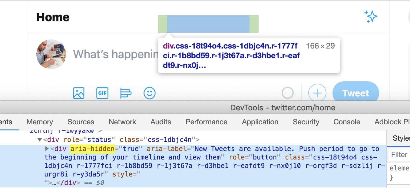
On Twitter, there is a button labeled “See New Tweets” that is hidden for screen readers with aria-hidden, and is shown only visually when new tweets are available.

The dot between the user handle and the date is decorative. As a result, it has aria-hidden="true" to avoid announcing “dot” for screen readers.
display: none;, but don’t
And that’s a wrap. Do you have a comment or a suggestion? Please feel free to ping me on @shadeed9.
此内容由惯性聚合(RSS阅读器)自动聚合整理,仅供阅读参考。 原文来自 — 版权归原作者所有。