


I spent years teaching CSS layout on this blog. I put everything I know into The Layout Maestro course: 70+ lessons and 150+ interactive examples that teach you how to think CSS layouts, not just memorize syntax.
I haven’t been more excited for a CSS feature like I’m now in the past six years I spent as a front-end developer. The prototype of container queries is now available behind a flag in Chrome Canary. Thanks to efforts from smart people like Miriam Suzanne and other folks.
I remember seeing a lot of jokes about the support for CSS container queries, but they are finally there. In this article, I will walk you through why we need container queries, how they will make your life easier, and most importantly, you will achieve more powerful components and layouts.
If you’re excited as I am, let’s dig in. Are you ready?
A web page consists of different sections and components, and we make them responsive by using CSS media queries. There is nothing wrong with that, but it has limitations. For example, we can use a media query to show the minimal version of a component on mobile versus desktop.
Oftentimes, responsive web design is not about the viewport or the screen size. It’s about the container size. Consider the following example:
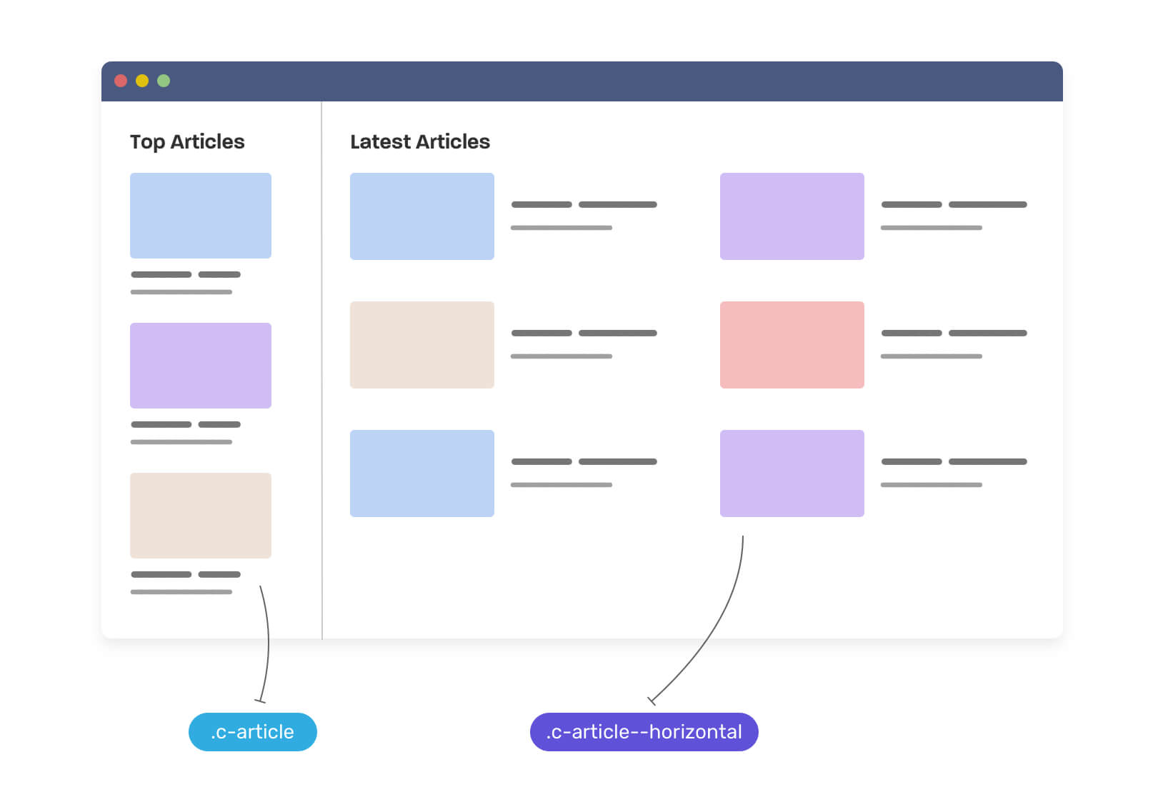
We have a very typical layout with a card component. It has two variations:
There are multiple ways for implementing that in CSS, but the most common one is like the following. We need to create a base component, and then make variations of it.
.c-article {
  /* The default, stacked version */
}

.c-article > * + * {
  margin-top: 1rem;
}

/* The horizontal version */
@media (min-width: 46rem) {
  .c-article--horizontal {
    display: flex;
    flex-wrap: wrap;
  }

  .c-article > * + * {
    margin-top: 0;
  }

  .c-article__thumb {
    margin-right: 1rem;
  }
}
Notice that we created the class .c-article--horizontal to handle the horizontal version of the component. If the viewport width is greater than 46rem, then the component should switch to the horizontal variation.
This isn’t bad, but somehow it makes me feels a bit limited. I want the component to respond to its parent width, not the browser viewport or screen size.
Consider that we want to use the default .c-card in the main section. What will happen? Well, the card will expand to the width of its parent and thus it will be too large. See the following figure:
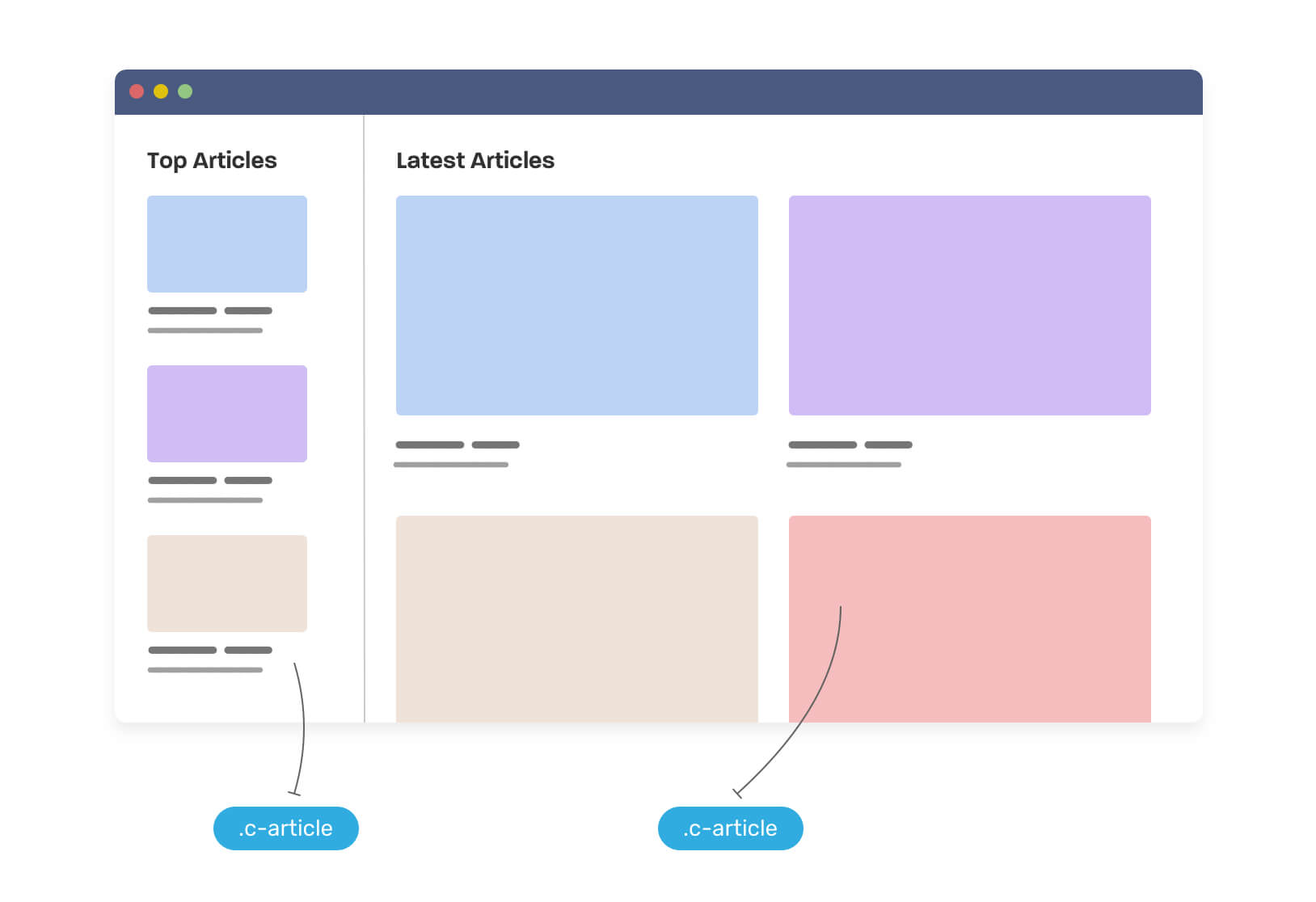
This is a problem, and we can solve it with CSS container queries (Yay, finally). Before diving into them, let me give you a glimpse of the result we want.
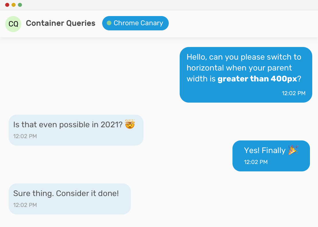
We need to tell the component that if its direct parent width is greater than 400px, then it needs to switch to the horizontal style. Here is how the CSS will look like:
<div class="o-grid">
  <div class="o-grid__item">
    <article class="c-article">
      <!-- content -->
    </article>
  </div>
  <div class="o-grid__item">
    <article class="c-article">
      <!-- content -->
    </article>
  </div>
</div>
.o-grid__item {
  container-type: inline-size;
}

.c-article {
  /* The default style */
}

@container (min-width: 400px) {
  .c-article {
    /* The styles that will make the article horizontal**
        ** instead of a card style.. */
  }
}
Warning: the CSS container queries are only supported in Chrome Canary under an experiment flag for now.
With CSS container queries, we can solve the above problem and make a fluid component. That means, we can throw the component in a narrow parent and it will turn into the stacked version, or to throw it in a wide one and it will turn into the horizontal version. Again, All of them that is independent of the viewport width.
Here is how I imagine it.
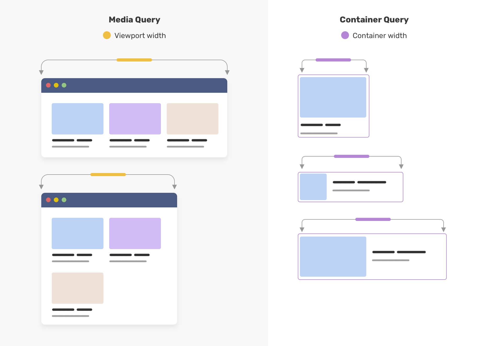
The purple outline represents the parent width. Notice how when it gets bigger, the component adapts to that. Isn’t that awesome? This is the power of CSS container queries.
We can now experiment with container queries Chrome canary. To enable it, go to chrome://flags and search for “container queries”, then enable it.
The first step is to add the container-type property. Since a component will adapt based on its parent width, we need to tell the browser to only repaint the affected area, not the whole page. With the container-type property, we can let the browser know about that ahead of time.
The value inline-size means to respond to the parent’s width changes only.
<div class="o-grid">
  <div class="o-grid__item">
    <article class="c-article">
      <!-- content -->
    </article>
  </div>
  <div class="o-grid__item">
    <article class="c-article">
      <!-- content -->
    </article>
  </div>
  <!-- other articles.. -->
</div>
.o-grid__item {
  container-type: inline-size;
}
This is the first step. We defined the element .o-grid__item as a containment parent for the .c-article within it.
The next step is to add the styles we want to make container queries work.
.o-grid__item {
  container-type: inline-size;
}

@container (min-width: 400px) {
  .c-article {
    display: flex;
    flex-wrap: wrap;
  }

  /* other CSS.. */
}
The @container is the .o-grid__item element, and the min-width: 400px is the width of it. We can even take it further and add more styles. Here is a video of what can be achieved for the card component:
The styles we have in there are:
Let’s dig into use cases for CSS container queries.
auto-fitFor some cases, using auto-fit in CSS grid can lead to unexpected results. For example, a component will be too wide and its content is hard to read.
To give you a bit of context, here is a visual that shows the difference between auto-fit and auto-fill in CSS grid.
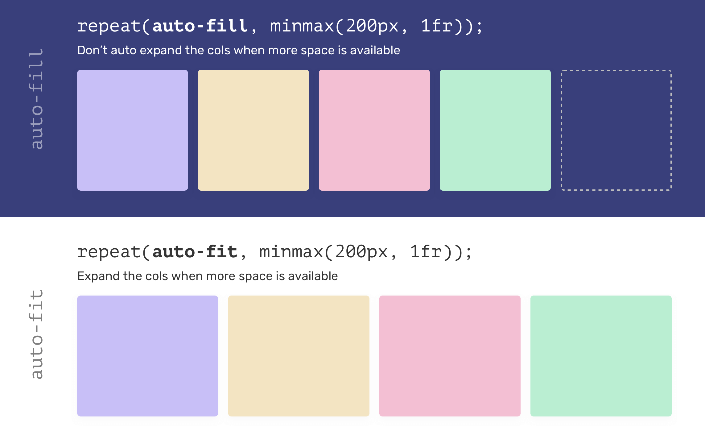
Notice that when auto-fit is used, the items expanded to fill the available space. However, in case of auto-fill, the grid items won’t grow and we will have a free space instead (The dotted item on the far right).
You might be thinking now, what this has to do with CSS container queries? Well, each grid item is a container, and when it’s expanded (AKA we’re using auto-fit), we need the component to change based on that.
<div class="o-grid">
  <div class="o-grid__item">
    <article class="c-article"></article>
  </div>
  <div class="o-grid__item">
    <article class="c-article"></article>
  </div>
  <div class="o-grid__item">
    <article class="c-article"></article>
  </div>
  <div class="o-grid__item">
    <article class="c-article"></article>
  </div>
</div>
.o-grid {
  display: grid;
  grid-template-columns: repeat(auto-fit, minmax(200px, 1fr));
  grid-gap: 1rem;
}
When we have four elements, the result should look something like this.
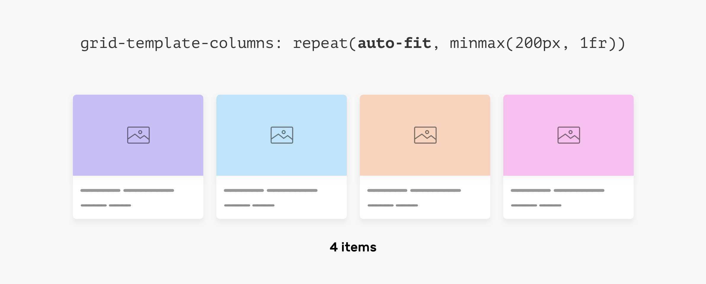
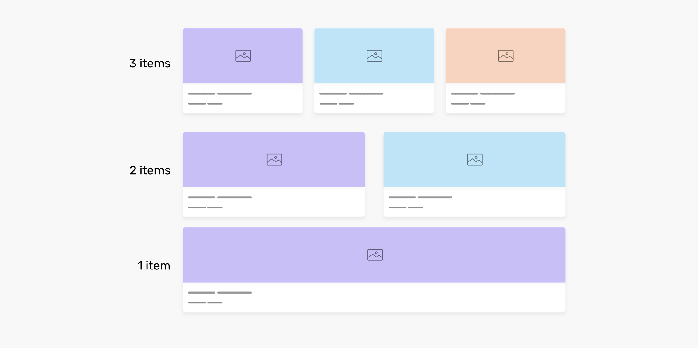
That will change when the number of articles is less, here is what will happen. The less item we have, the wider they will become. The reason is that auto-fit is used. The first one looks good, but the last two (2 per row, 1 per row) doesn’t look good as they’re too wide.
What if each article component changes based on its parent width? That way, we can get the benefit of auto-fit very well. Here is what we need to do:
If the grid item width is greater than 400px, then the article should switch to the horizontal style.
Here is how we can do this:
.o-grid__item {
  container-type: inline-size;
}

@container (min-width: 400px) {
  .c-article {
    display: flex;
    flex-wrap: wrap;
  }
}
Also, we want to display the article with a hero section if it’s the only item in the grid.
.o-grid__item {
  container-type: inline-size;
}

@container (min-width: 700px) {
  .c-article {
    display: flex;
    justify-content: center;
    align-items: center;
    min-height: 350px;
  }

  .card__thumb {
    position: absolute;
    left: 0;
    top: 0;
    width: 100%;
    height: 100%;
    object-fit: cover;
  }
}
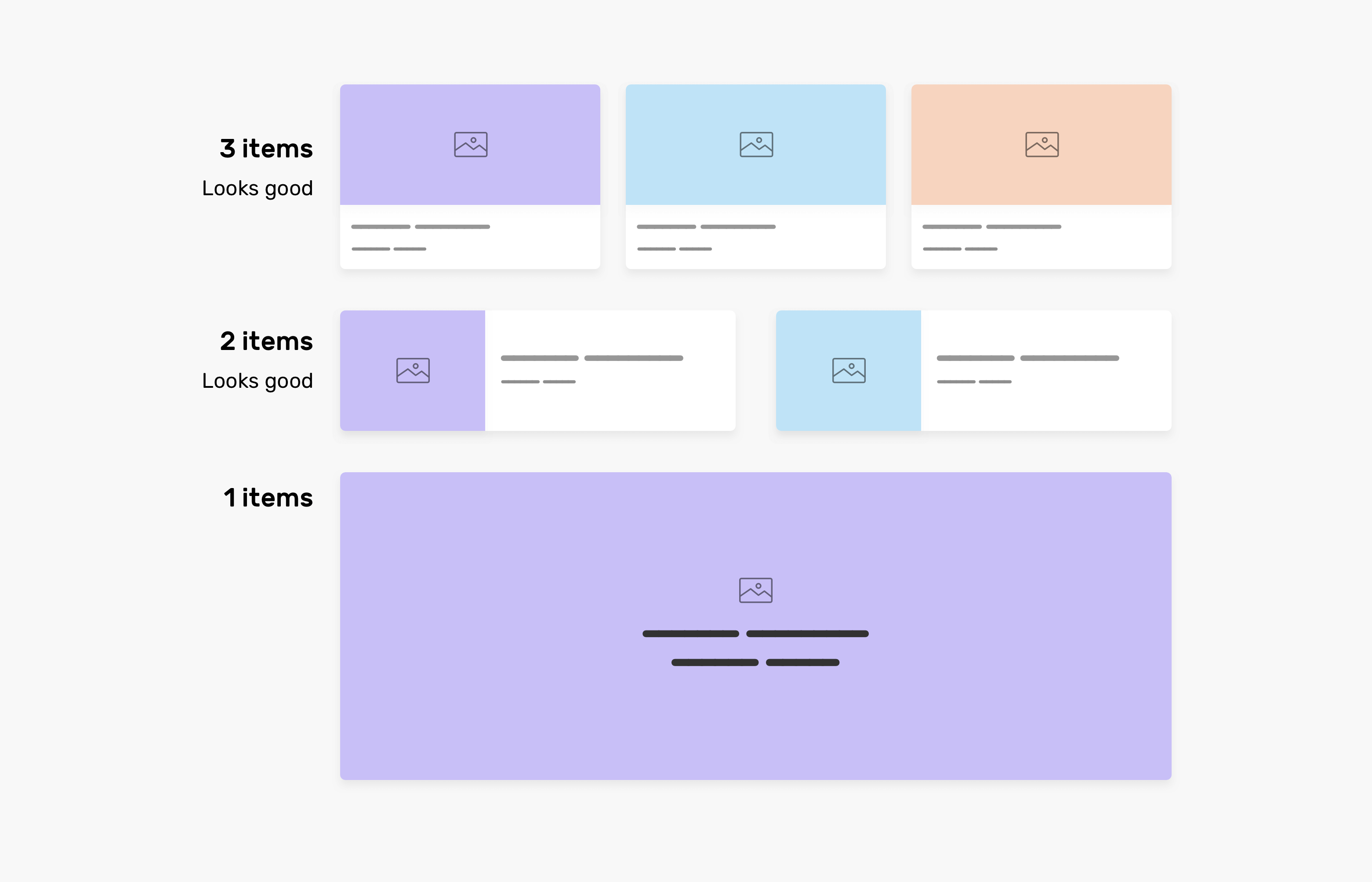
That’s it. We have a component that responds to its parent width, and it can work under any context. Isn’t that awesome?
Check out the demo on CodePen.
Oftentimes, we need to tweak a component to make it work in small width containers like an <aside>.
A perfect fit for this is a newsletter section. When the width is small, we need its items to stack, and when there is enough space, we need them to spread horizontally.
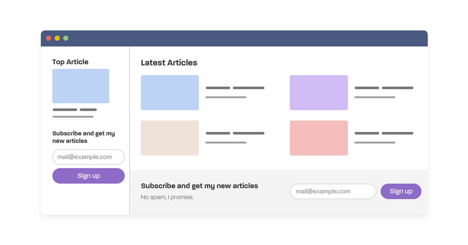
As you see in the figure, we have a newsletter that lives in two different contexts:
Without container queries, this isn’t possible until we have a variation class in CSS, for example, .newsletter--stacked or something.
I’m aware that we can force the items to wrap in case there is no enough space with flexbox, but that’s not enough. I need much more control to do things like:
.newsletter-wrapper {
  container-type: inline-size;
}

/* The default, stacked version */
.newsletter {
  /* CSS styles */
}

.newsletter__title {
  font-size: 1rem;
}

.newsletter__desc {
  display: none;
}

/* The horizontal version */
@container (min-width: 600px) {
  .newsletter {
    display: flex;
    justify-content: space-between;
    align-items: center;
  }

  .newsletter__title {
    font-size: 1.5rem;
  }

  .newsletter__desc {
    display: block;
  }
}
Here is a video of the result.
Check out the Demo on CodePen.
I found pagination to be a good fit for using container queries. Initially, we can have “Previous” and “Next” buttons, then we can hide them and show the full pagination if there is enough space.
Consider the following figure.
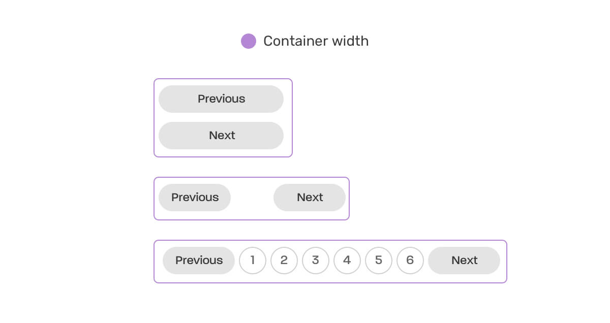
To handle the states above, we need to work on the default style first (the stacked buttons), and then work on the other two states.
.wrapper {
  container-type: inline-size;
}

@container (min-width: 250px) {
  .pagination {
    display: flex;
    flex-wrap: wrap;
    gap: 0.5rem;
  }

  .pagination li:not(:last-child) {
    margin-bottom: 0;
  }
}

@container (min-width: 500px) {
  .pagination {
    justify-content: center;
  }

  .pagination__item:not(.btn) {
    display: block;
  }

  .pagination__item.btn {
    display: none;
  }
}
Check out the Demo on CodePen.
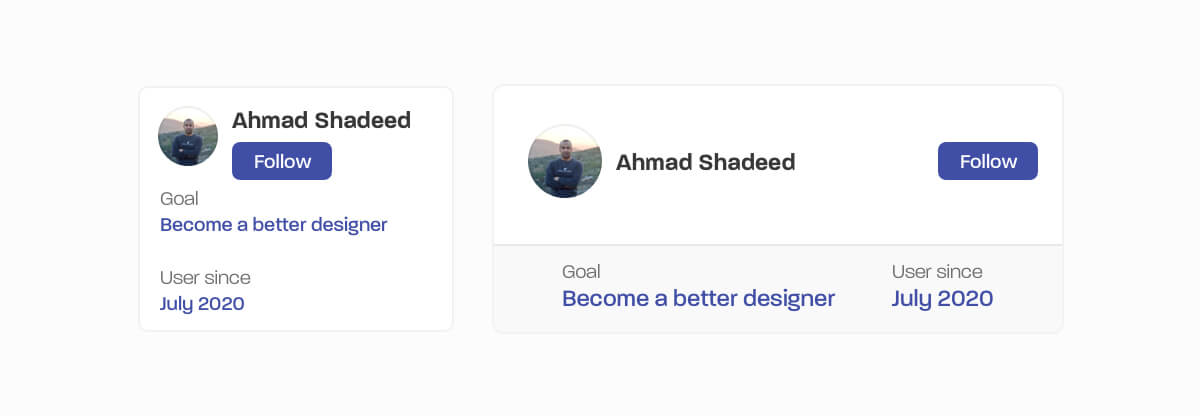
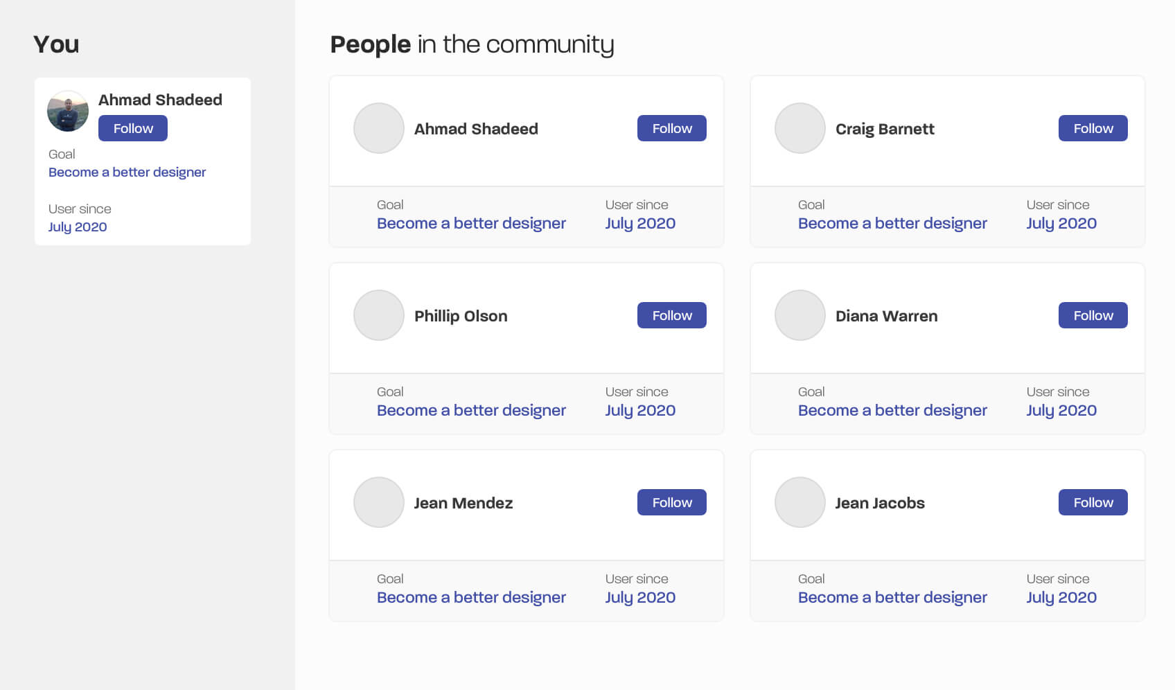
Here is another use case that is ideal for being used in multiple contexts. The small state works for small viewport sizes, and contexts like a sidebar. The larger can works for much bigger contexts like placing it within a 2-col grid.
.p-card-wrapper {
  container-type: inline-size;
}

.p-card {
  /* Default styles */
}

@container (min-width: 450px) {
  .meta {
    display: flex;
    justify-content: center;
    gap: 2rem;
    border-top: 1px solid #e8e8e8;
    background-color: #f9f9f9;
    padding: 1.5rem 1rem;
    margin: 1rem -1rem -1rem;
  }

  /* and other styles */
}
With that, we can see how the component words in different contexts without using a single media query.
Check out the Demo on CodePen.
I didn’t go deep into use-cases for forms yet, but the one that I got in mind is switching from labels from being horizontal to being stacked.
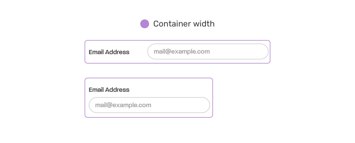
.form-item {
  container-type: inline-size;
}

.input-group {
  @container (min-width: 350px) {
    display: flex;
    align-items: center;
    gap: 1.5rem;

    input {
      flex: 1;
    }
  }
}
Try it yourself in the demo below. Check out the demo on CodePen.
Now that we’ve explored a couple of use-cases where CSS container queries can be useful, how can we test a component? Thankfully, we can do that with the CSS resize property on the parent of the component.
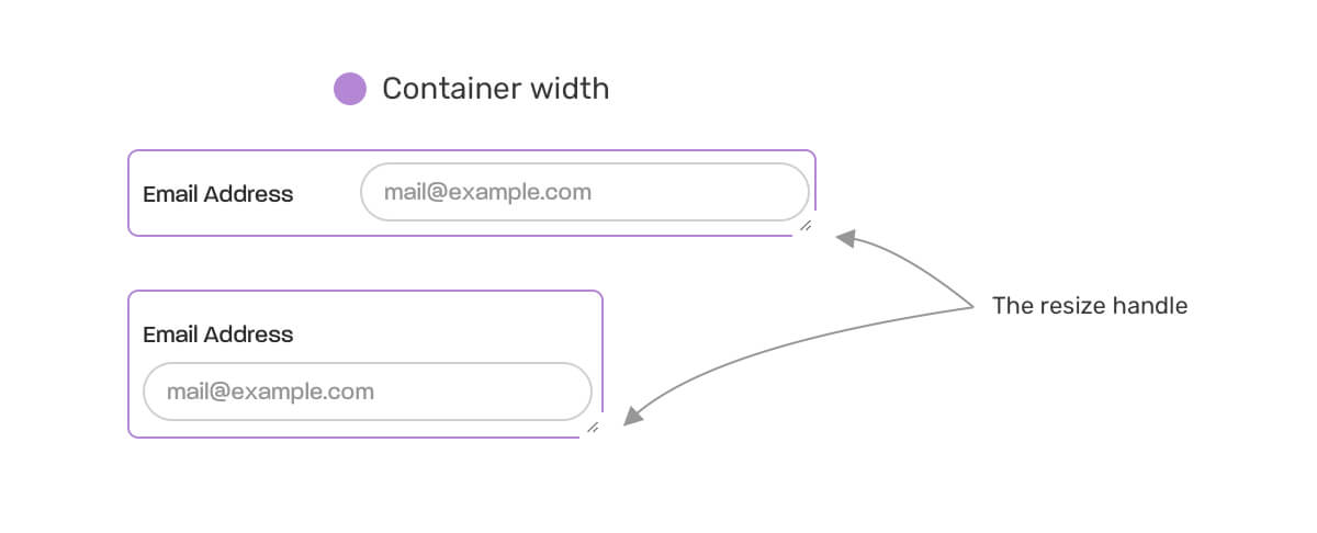
.parent {
  container-type: inline-size;
  resize: horizontal;
  overflow: auto;
}
I learned about this technique from reading this great write-up by Bramus Van Damme.
The short answer is no. You can’t see something like @container (min-width: value). I think it’s just a matter of time and this will be supported.
Yes! Sure thing. It’s possible to provide a fallback in certain ways. Here are two great articles that explain how to do that:
I enjoyed learning about CSS container queries and playing with them in the browser. I know they’re not officially supported yet, but this is a great time to play with it in the browser.
As front-end developers, a part of our job is to test and help the folks who work on implementing such features. The more we test an experiment, the fewer problems we will see once this is supported in all major browsers.
Thank you for reading.
I’m excited to let you know that I wrote an ebook about Debugging CSS.
If you’re interested, head over to debuggingcss.com for a free preview…
此内容由惯性聚合(RSS阅读器)自动聚合整理,仅供阅读参考。 原文来自 — 版权归原作者所有。