


I spent years teaching CSS layout on this blog. I put everything I know into The Layout Maestro course: 70+ lessons and 150+ interactive examples that teach you how to think CSS layouts, not just memorize syntax.
The overflow CSS property is common when building a website. It’s used for different purposes:
overflow-y: auto)overflow-x: hidden)Suppose we have a wrapper with the following CSS:
.wrapper {
  overflow-y: hidden;
}
Under the hood, the browser will add overflow-x: auto by default, resulting in clipping on both the horizontal and vertical sides..
Try changing the overflow-y to hidden in the following demo:
Browser computed styles
.wrapper {
overflow-x: visible;
overflow-y: visible;
}
The dimmed style comes from the browser's computed styles.
Notice that the computed style of overflow-x will become auto, clipping both sides. But why is that?
In the CSS Overflow Module Level 3 spec, it says the following:
The visible/clip values of overflow compute to auto/hidden (respectively) if one of overflow-x or overflow-y is neither visible nor clip.
If the overflow-y value is clip, the overflow-x will remain as is (visible). That means we can clip on one side of a container.
When the overflow is set to hidden on one axis, say overflow-y, the other axis overflow-x will become auto by default, resulting in clipping both sides.
This behavior isn’t always desired. In some cases, we want clipping on only one axis.
Additionally, the other axis will become scrollable, which may lead to unexpected results.
This is where the clip value becomes helpful. It’s supported by all major browsers according to CanIUse.
In the following example, I set overflow-y to clip. The overflow-x value will stay as is (visible). Now the clipping happens only on the y-axis.
Browser computed styles
.wrapper {
overflow-x: visible;
overflow-y: visible;
}
The dimmed style comes from the browser's computed styles.
Interesting, right? That’s how the clip value works with overflow.
Here are a few practical examples of overflow :clip in action.
The clip value is especially useful in hero sections with large feature images
In the following figure, we have an image that shouldn’t be constrained by its wrapper width. Instead, the image should be displayed with its original aspect ratio and let the browser crop as needed.

The HTML:
<div class="hero">
  <div class="hero-content"></div>
  <div class="hero-thumb">
    <img src="hero.png" alt="" />
  </div>
</div>
The layout CSS:
.hero {
  display: grid;
  grid-template-columns: 1fr 1.5fr;
  gap: 1rem;
}
Under the hood, the layout looks like this. The feature image is overflowing the Thumb grid item (its container).
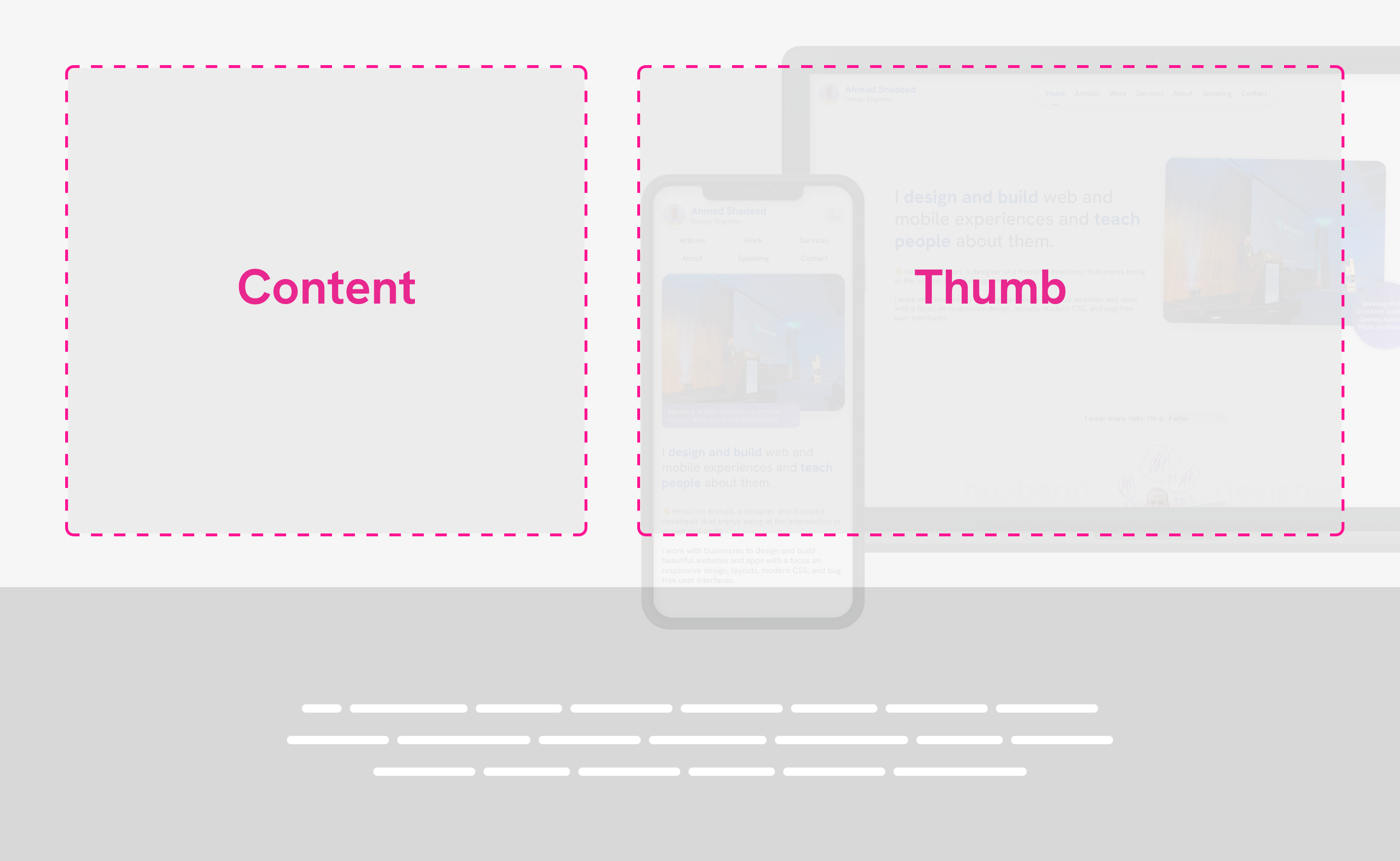
See the following demo, I added an outline for each grid item. Try to toggle the Show overflow checkbox and see what happens.
Blog Redesign Case Study
An exploration on how I redesigned my blog.

Lorem ipsum dolor sit amet consectetur adipisicing elit. Fugiat, dolor necessitatibus. Quisquam quis assumenda nulla commodi veritatis cumque natus dolorum nobis est neque.
This is what the image looks like. If we add overflow-x: hidden to the .hero section, the image will be clipped from the horizontal and vertical sides.
Lorem ipsum dolor sit amet consectetur adipisicing elit. Fugiat, dolor necessitatibus. Quisquam quis assumenda nulla commodi veritatis cumque natus dolorum nobis est neque.
To fix that, we need to use overflow-x: clip instead. The clipping will only happen on the horizontal axis.
.hero {
  overflow-x: clip;
}
Try it below in the following demo.
Blog Redesign Case Study
An exploration on how I redesigned my blog.
Lorem ipsum dolor sit amet consectetur adipisicing elit. Fugiat, dolor necessitatibus. Quisquam quis assumenda nulla commodi veritatis cumque natus dolorum nobis est neque.
We achieved a result that isn’t possible without using the clip value.
In this example, we have a decoration element on both the left and right sides. A circular button is centered at the bottom.
Some content will live here
Nature refresh
An exploration on how I redesigned my blog. An exploration on how I redesigned my blog. An exploration on how I redesigned my blog.
Why?
Some content will live here
<div class="container">
  <h1 class="title">Nature refresh</h1>
  <p class="description"><!-- Content here --></p>
  <a href="/why" class="button">Why?</a>
  <img class="decor start" src="decor.svg" alt="" />
  <img class="decor end" src="decor.svg" alt="" />
</div>
How can we clip the pattern on the left and right without affecting the button?
Using clip restricts clipping to the horizontal side only.
.hero {
  overflow-x: clip;
}
Try it in the demo below:
Some content will live here
Nature refresh
An exploration on how I redesigned my blog. An exploration on how I redesigned my blog. An exploration on how I redesigned my blog.
Why?
Some content will live here
On my website home page, there is a section I called “The Hats”.
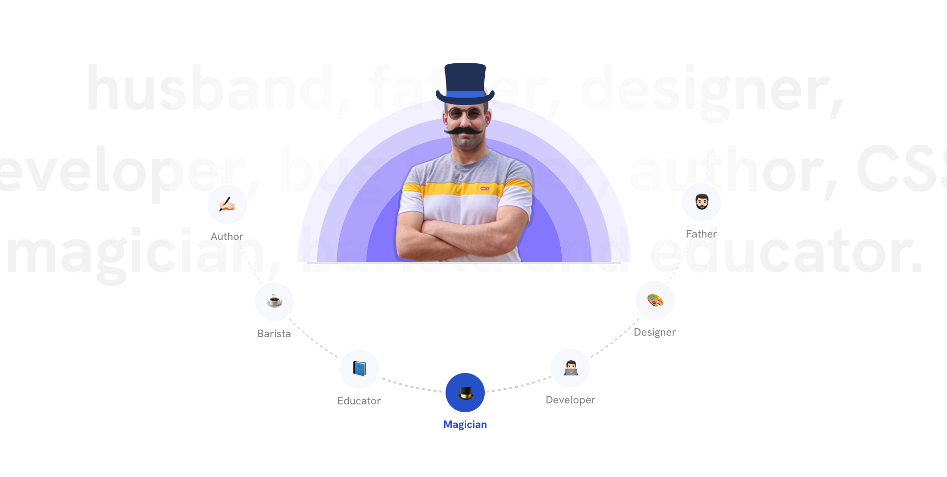
In there, my photo is in a fixed-width wrapper. In one of the hats, I needed to place a large circular visual effect and cut it on the vertical side only.
The problem is that the child is larger than the wrapper element. See the following figure:
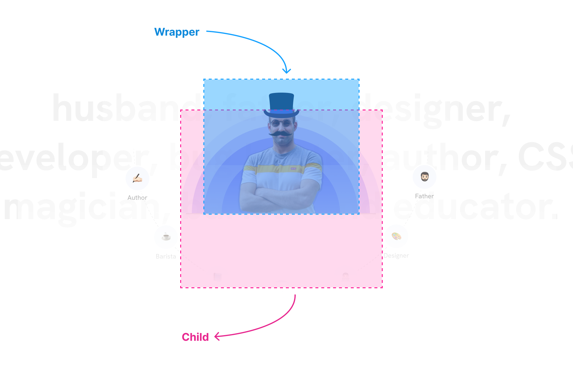
But..why didn’t you just make the wrapper bigger? I needed it to work well on mobile without changing sizes and I thought about using clip for that.
.hats-item {
  overflow-y: clip;
}
Play with the following demo to see it in action:
In the following example, we have page header with the following:
The content is pushed to the bottom to overlap with the page header’s boundaries. The thumbnail is placed at the far right and should be clipped if there is not enough space on the right side.
Here is the design:
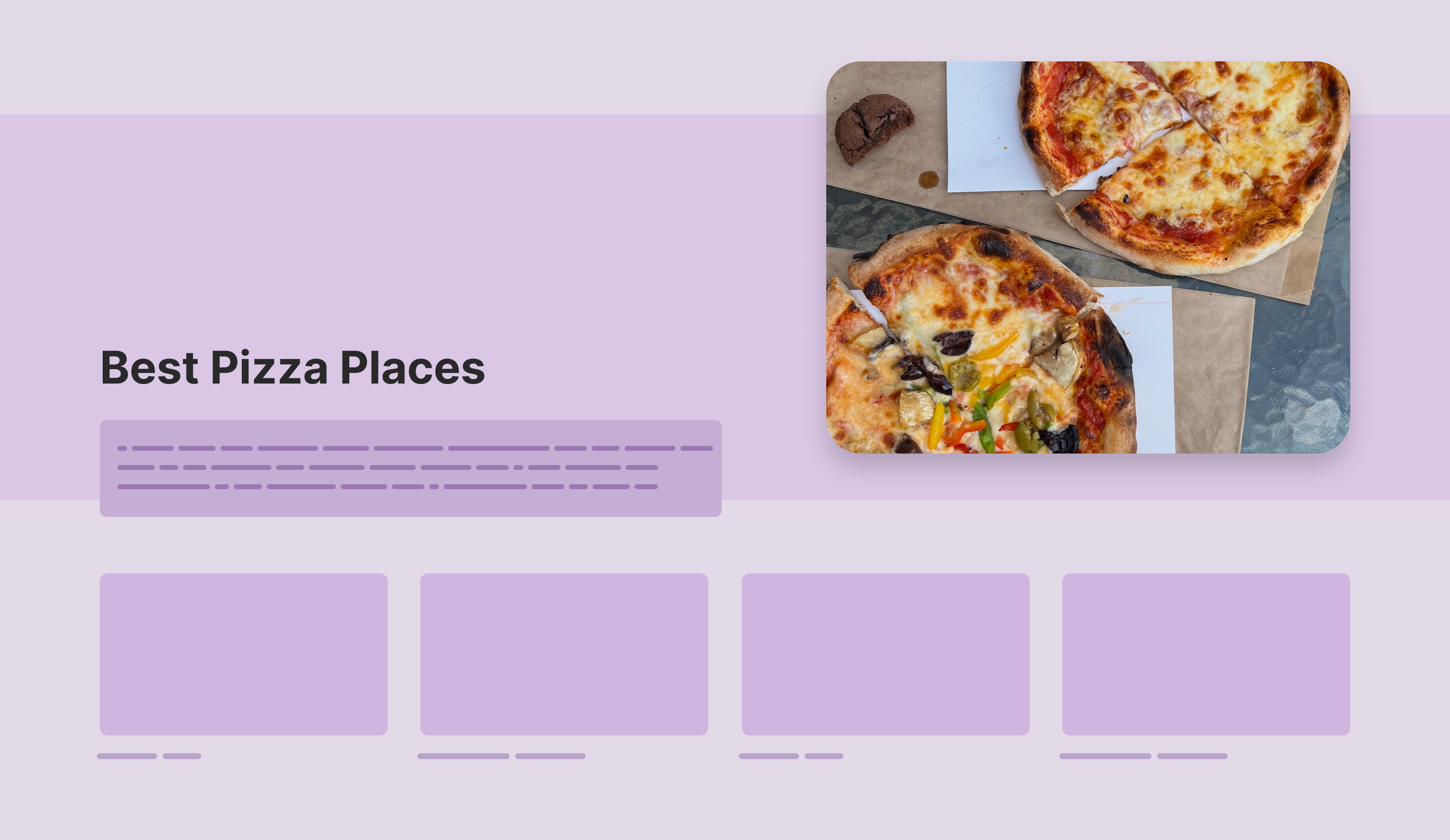
In the following figure, I highlighted the image (that should be clipped horizontally) and the content that should be visible.
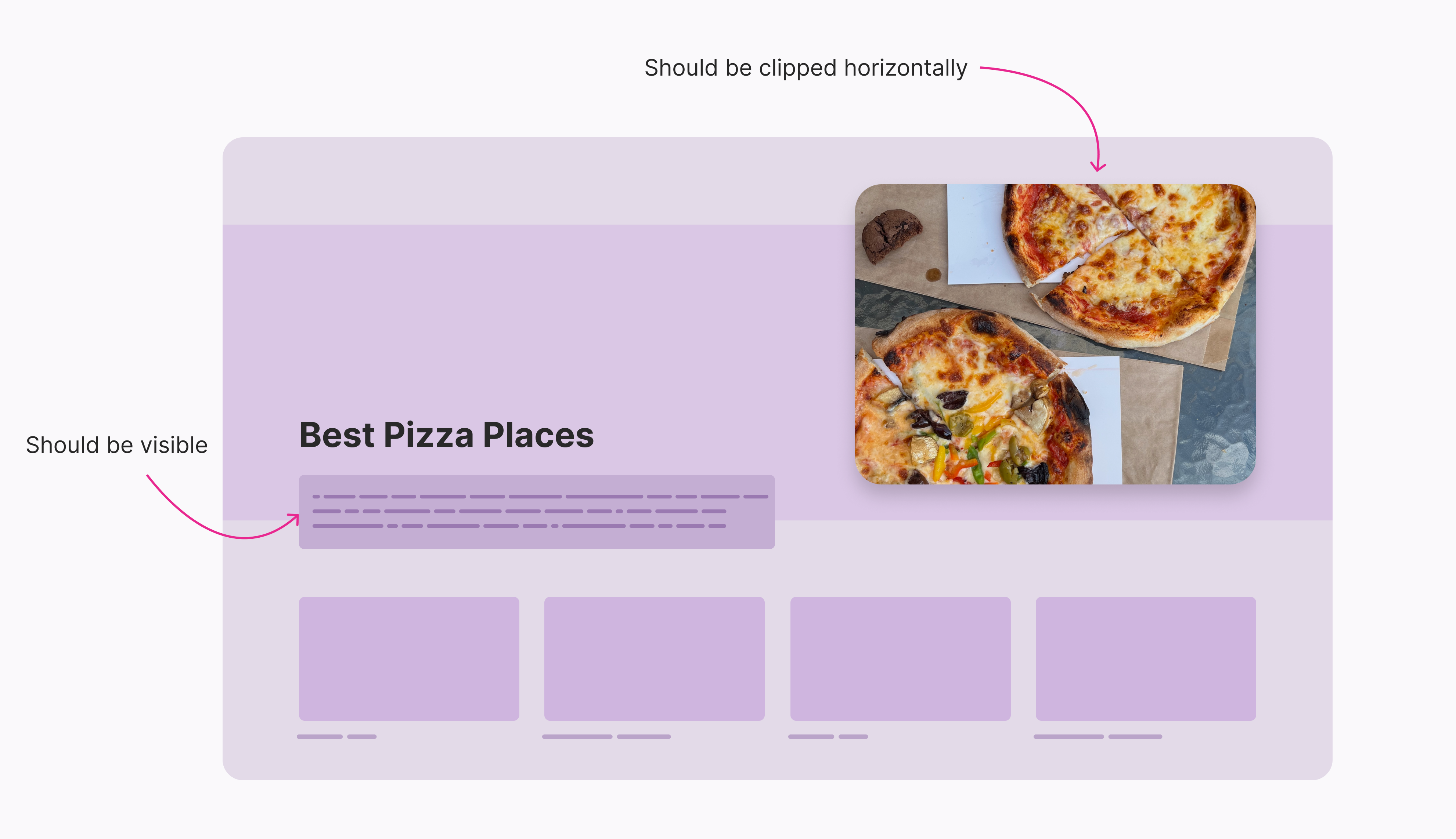
In the following demo, the default value for overflow-x is visible. Try to change it to hidden or clip and see what happens.
How it works?
Learn how pizza-making works in this step-by-step guide. We’ll walk you through everything from the basics to advanced techniques.

Lorem ipsum dolor sit amet consectetur adipisicing elit. Accusantium nulla officiis vero, animi ad atque velit, adipisci iusto voluptate debitis placeat culpa libero error doloribus quibusdam iste! Error, ducimus quo.
This isn’t possible without clip unless we add a wrapper (a hack!).
While using CSS scroll-driven animations, you might need to use overflow: hidden to clip the content of a container. However, this works against scroll-driven animations.
Using overflow: hidden will define a scroll container. To avoid that, we can use overflow: clip instead. In the demo below, the cat is supposed to animate from left to right, but it’s not working as expected.
Change the overflow value to clip and see what happens.
Have a look at this article by Bramus for more details about why using clip is the solution when using scroll-driven animations.
When using the clip value, we can add a margin to control when the browser paints the element’s content after clipping.
To do that, we need to use the overflow-clip-margin property.
In the following demo, try to play with the slider and notice what happens:
The dashed pink line represents the clip boundaries
The dashed black line represents the element boundaries
overflow-y: clip
overflow-clip-margin: 0px
By increasing the value of overflow-clip-margin, the boundaries of the clipped area increased.
In the above example, I showcased how the clip margin works by showing it on the vertical axis only. We can clip on one axis or both.
The support for overflow-clip-margin is incomplete and different between browsers:
overflow: clip)This example is inspired by this demo by Helen Chong.
The idea is that we need to add an outline on hover and focus. I added overflow-x: clip to avoid content overflow if one of the tags is too long.
.tags-list {
  display: flex;
  flex-wrap: wrap;
  gap: 0.5rem;
  overflow-x: clip;
}
Hover over the first tag to see the effect.
Let’s take a closer look:
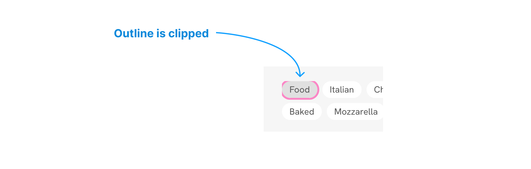
We can fix that by using overflow-clip-margin on the parent.
.tags-list {
  /* other styles */
  overflow-x: clip;
  overflow-clip-margin: 4px;
}
In the following demo, increase the slider and notice how the outline is visible as expected.
Try hovering over the tag at each increment to see how the outline begins to appear.
overflow-x: clip
overflow-clip-margin: 0px
Useful, right?
Here’s an interesting approach to using overflow-clip-margin for implementing a nested border radius by Adam Argyle.
.card {
  overflow: clip;
  overflow-clip-margin: content-box;
}
This works in Chrome only at the time of writing this article.
We want to conditionally add a decorative element at some of the corners.
By default, the decorative elements are outside the container boundaries:
.card {
  overflow: clip;

  &:before {
    left: -8px;
    top: -8px;
  }

  &:after {
    right: -8px;
    bottom: -8px;
  }
}
In this example, I want to show the decorative elements if the section contains an image.
.card:has(img) {
  overflow-clip-margin: 10px;
}
Play with the slider and see how the elements are shown.
overflow-x: clip
overflow-clip-margin: 0px
Feel free to ignore this use case if you think it’s useless.
The clip value can be useful in certain cases, as outlined in this article. Although it’s relatively new, it is well-supported across all major browsers. I hope you found this article helpful and that you’ll consider using clip in your projects.
此内容由惯性聚合(RSS阅读器)自动聚合整理,仅供阅读参考。 原文来自 — 版权归原作者所有。